


AstroCree
-
Posts
2,417 -
Joined
-
Last visited
-
Days Won
3
Posts posted by AstroCree
-
-
28 minutes ago, aawagner011 said:
The long sleeve option looks great.

I'm glad clubs have been bringing back long sleeves these past few years.
It's a good kit but again, I wish they weren't so afraid of blue anymore. A lot of their kits could've really used that as a secondary color.
-
22 hours ago, officeglenn said:
It was ruined the moment someone compared it to the sinking Titanic which, if there was ever a stronger metaphor for this club and their yearly title woes...
-
1 hour ago, spartacat_12 said:
You can do a whole bunch of former Mets from that drop-shadow era.
This is gonna be super controversial but the black uniforms originally lasted 15 years, plus a few more and counting with its recent comeback. Can an argument be make that, specifically the black home jersey is becoming more of a "right" Mets uniform? They've already lasted longer than the 80s racing stripes and those are super iconic for obvious reasons.
-
 1
1
-
-
My high school colors were Green, Black and White. The baseball team had a recolored Pittsburgh Pirates hat but the logo was green instead of yellow.
-
6 hours ago, officeglenn said:
Chicago Fire secondary:
At first glance, I wasn't sure about it. But it's growing on me.
I'm so glad we're moving past that "bland white kit" era. Anything is better than nothing.
-
7
-
-
On 2/12/2023 at 6:47 PM, NeauXone said:
That leaked one was obviously fake lol. I'm really liking this one though
The fake was better
-
On 2/8/2023 at 4:26 PM, ~Bear said:
Also, regardless of the uniforms, the Jets need to return to their classic logo as well. It was subtle yet clearly invoked the jet imagery they were going for. The current logo is an ugly oval. If it's supposed to be football-shaped...then why have another football IN the logo that tramples over the font?? No iteration of this logo has been very good, and it's time to let it die.
This is the worst version of the "football in football" logo for being the most visually bland. They won't let it die since it's the logo that represents their greatest achievement. Not just their lone Super Bowl but their overall playoff accomplishments, as limited as they are.
Whether they bring back the Namath or New York Sack Exchange era, I just need a change because last season was terrible. They wore green ONCE and it was mono on top of that. Even their endzones were black majority of the season. Green felt like an afterthought. That's a branding disaster to have your primary color seem less important. We went through all that trouble of fixing the damn color and they don't even wear it. BFBS needs to leave the Jets for good. It represents nothing but the lowest times of this already sorry franchise.
-
3
-
-
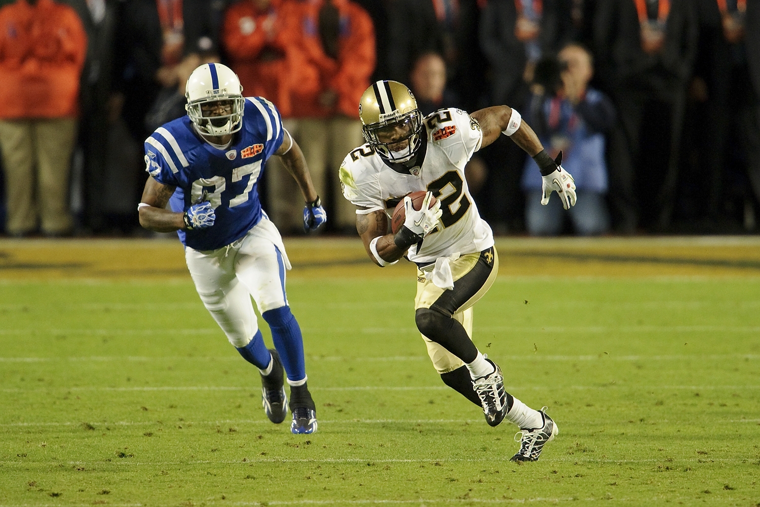
On 1/19/2022 at 2:30 AM, Cujo said:
I thank god every day the Saints wore gold pants that night.
-
5
-
 1
1
-
 1
1
-
-
Why did the NFL become so allergic to conference logos? This shouldn't be so hard.
-
5
-
-
6 minutes ago, gosioux76 said:
Is it just me, or does this Cardinals logo share a vibe with the peeing Calvin &. Hobbs bumper stickers?
They should've used this.
The Mets also screwed up. Instead of the obvious choice, being Mr. Met, they just went with their normal logo.
-
7
-
-
On 2/2/2023 at 8:57 AM, Brian E said:
the entire USA set needs an update. it's truly terrible.
btw, if MLB wants to make this a global showcase, how about some promotion? the tournament starts in just over a month. let's see some unis! and MLB has virtually no merch available. nuts.
Between MLB and NHL, I don't know who's worse when it comes to marketing their own game.
-
1 hour ago, WSU151 said:
The sleeves are just going to be a mess.
What is this? Just what are they doing?
-
3
-
-
as if these clubs don't already make a ton of money.
-
2
-
-
am I going crazy or have the Knicks not worn their primary uniforms in such a long time. Every time I turn on the game it's always their black or navy jersey. Did they lose their blue and white uniforms?
EDIT: I checked, they wore the white uniform last week.
Sounding like a broken record but this uniform matchup between the Knicks and Lakers just sucks.
-
2
-
-
do the flags have to be that big?
-
3
-
-
4 hours ago, DG_ThenNowForever said:
Sigh. I miss the Xbox days.
IIRC they used to play the Xbox 360 startup every time the game started.
-
1
-
-
I hope NYCFC don't go for a mono look. They need to breakout the navy shorts again.
-
2
-
-
3 hours ago, Cujo said:
Why do the Saints have to make this so difficult?
-
7
-
-
18 minutes ago, gothedistance said:
I do think NYJ's overuse of the white/black is a joke. But I don't mind the Jets wearing the black pants for this game with the Dolphins to avoid over-abundance of green.
This has never been a problem for their entire existence. Why would it suddenly be a problem now?
-
3
-
-
22 minutes ago, oldschoolvikings said:
Worst uniform season in NFL history?
I'm 100% done with this whole aesthetic.
-
11
-
1
-
-
nothing about what the Eagles are doing looks good.
Have we just gone crazy? What looks good about an all black uniform with little to no contrast? It's so BORING! All the character in the uniform is lost! I just don't get it.
-
10
-
-
I'm glad the Jets (Green) and the Jaguars (Teal) are out here with their always lively black and white uniforms.
-
3
-
2
-
 3
3
-
-
Jets wear green but keep the black endzones. Baby steps.
-
5
-
1
-
-
4 hours ago, Digby said:
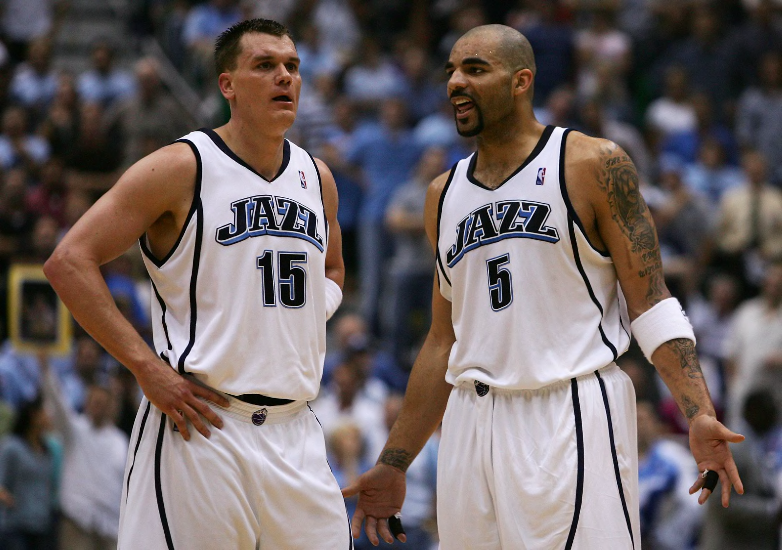
Reason I liked the later update was because of that side-stripe treatment (though yeah, the later-later kelly green jersey did it even better) and the updated number font. As other have mentioned, the angular look felt like a nod to the mountains and the music-note lineages at the same time. The initial fauxback rebrand, with the full stripes and basic block, felt too simple to me, and updating the color scheme but not changing the rest of it felt too odd to me, like it didn't hit its stride until the later modern touches.
On another note, funny to me how all the various Jazz design eras get brought up in these conversations...except for these. Most forgettable unis in NBA history.
Their best from that set were the blue alts.
-
12
-
1
-


 Borussia Dortmund have
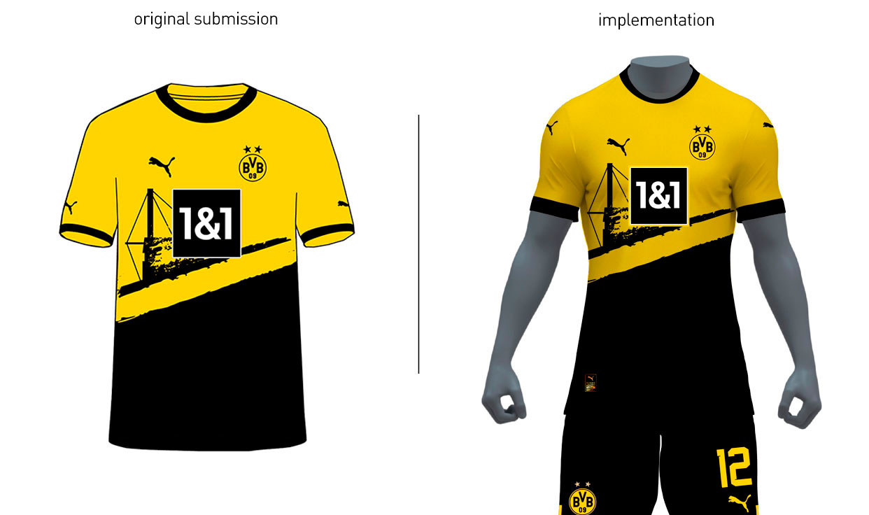


San Diego MLS expansion
in Sports Logo News
Posted
Daring today, aren't we?