


AstroCree
-
Posts
2,417 -
Joined
-
Last visited
-
Days Won
3
Posts posted by AstroCree
-
-
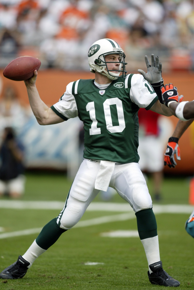
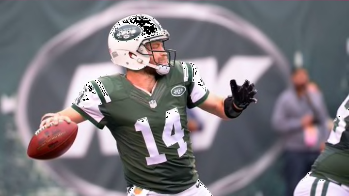
For whatever reason, the Jets at some point in the 2000s added green under the white sleeve. The away jerseys did the same adding white under the green sleeves.

This went on even under Nike until the uniforms last 2 or 3 seasons when they finally reverted back to the normal sleeves or at least how they're suppose to look.
-
17 hours ago, Old School Fool said:
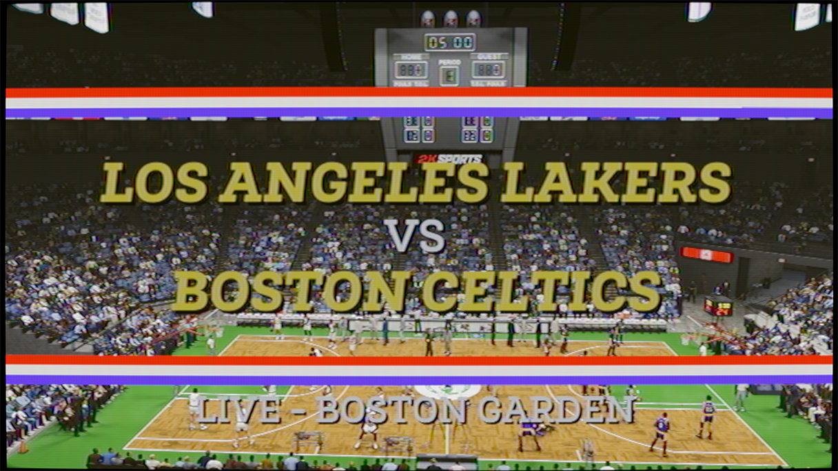
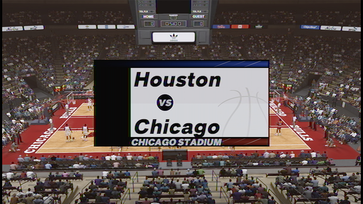
NBA 2K23 introduced a new mode in it where you can go back in time and play out 80 years starting from either 1983, 1991 or 2002. It's crazy stuff, they got everything in there a logo/uniform die hard could want it seems.
With those eras comes graphics packages and they did a great job with that one. The NBC and ESPN ones got me hyped. They don't have the licenses to the networks but they can use the general designs.
The game isnt out yet but it all seems to be pretty good detail wise.
That's almost 1 for 1 the old ESPN scorebug from the 2000s. Impressed with the detail.
-
 2
2
-
-
I never cared for MMA and Boxing. It's too barbaric. I find there to be a lack of class or respect from many of the fighters. My circle of friends talk about it all the time but I just cannot bring myself to it.
-
1
-
-
All I know is that I'm saving $110. Those just plain suck!
-
2
-
 1
1
-
-
4 hours ago, AFirestormToPurify said:
My disappointment is immeasurable and my day is ruined
I forgot this was a thing happening. Where would they even put the SCF patch or any commemorative patch?
-
7 hours ago, WestCoastBias said:
They need to go back to wearing these.
Align the numbers with the logo but these were never bad. I think they got a lot of undeserved hate.
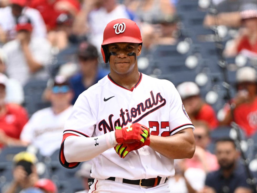
On 8/1/2022 at 8:08 PM, ltjets21 said:The Nationals really need to fix their script. The angle of it currently is absurd, look how much better the All star version is.
There's a lot they gotta fix. They need to go back to the red Curly W caps at home. The new ones are not doing it for me.
-
4
-
-
Does Starter wanna dip their feet back into the market? Surely it goes better than that AAF debacle.
-
3 hours ago, bowld said:
Heard a rumor a few weeks ago about the Mets rolling out black pants to wear with the black jersey. Take it for a grain of salt though as I can't even remember who mentioned it
I hope to god they don't.
-
2
-
-
ALL HANDS ON DECK!
-
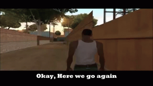
Gotta love the Jets just completely missing the entire
 mark but I expect nothing less from a franchise who are consistently inconsistent.
"How do we make this bad helmet worse?" is what they probably discussed.
-
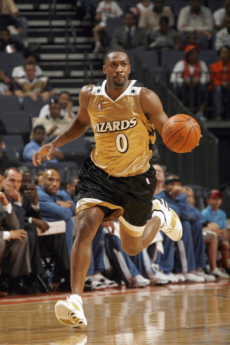
On 7/7/2022 at 2:02 PM, spartacat_12 said:
I guess this fits in this thread, but I really liked these uniforms.
and this jersey is forever immortalized on the cover of NBA Live 08
-
3
-
-
MLB really went years not wearing those awesome AMERICAN and NATIOINAL jerseys for the actual game but decided to wear these cheap walmart discount jerseys.
-
9
-
-
Almost like an ad ruins the entire aesthetic of a uniform.
-
8
-
-
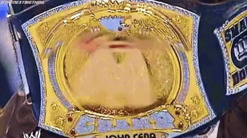
On 7/15/2022 at 1:35 PM, TrueYankee26 said:
Looks like something WWE would have designed for John Cena in 2004.
I hope it spins
-
2
-
-
It's been over 2 decades since the Oilers name was retired. In that time, the Texans have grown to be a natural NFL brand. Do people even wear Oilers as a nostalgic retro brand? They don't seem to even carry that retro cash grab the Expos, Nordiques and Whalers got. The brand is dead.
-
4
-
-
4 hours ago, Nordiks_19 said:
Well, it's official now, and along with a matching white at least
Oilers bring back the classics (again) until they get bored in a few years and bring back navy (again) until that gets boring and they bring back the classics (again) until...
-
3
-
-
4 hours ago, truepg said:
Even though to me the Utah Jazz is all Stockton-Malone purple mountains, I'll be all for it if they went straight up to this color scheme with the same color distribution. That good it was:
EDIT: Now that I think of it, Pelicans should've just stayed with it. The colors they switched to are very drab.
As a side note, there really are too many purple teams indeed.Very underrated set by the Hornets during their time in New Orleans.
-
5
-
-
Local users in sports logo forum says married couple can't be goofy at own wedding.
-
1
-
 20
20
-
-
4 hours ago, GFB said:
have these been posted yet?
they may just be knockoffs based on the early leaks
I'm pretty sure these were confirmed to be fake knockoffs. I hope the actual kit doesn't do 3 swooshes. That's just excessive. I know other manufactures do that but it's bad on those too!
-
2
-
-
1 hour ago, MJD7 said:
Maybe I’m stating the obvious, but it’s worth pointing out that the black/gold options are labeled as the “On-Field” hats, while the team-color versions are labeled “Workout,”
Bruh, it should be the other way around. I have a bad feeling about this years aesthetic again.
-
1
-
-
This U.S. Open Cup matchup between Red Bulls and NYCFC is driving me nuts because it's Red Bulls in white and NYCFC in orange.
-
2 hours ago, CaliforniaGlowin said:
Oof.
Toronto, my favorite American State of Canada.
-
1
-
-
What in the world is this? This is a joke right? This is starting and finishing a school project the night before it's due. It's like they made the throwback as consolation for how badly they messed up this rebrand.
Who the hell was in charge of this? Who are the testers? Who thought this was acceptable? Do they still have a job because they sure as hell should find new career after this! I need answers because this isn't it!
-
10
-
-
3 hours ago, Dekabreak said:
good god this looks like every "modern" script logo in the NFL. This sucks.


/cdn.vox-cdn.com/uploads/chorus_image/image/60673613/usa_today_10969830.0.jpg)


International (NATIONAL TEAMS) Soccer/Football Kits 2021/2022 (World Cup, etc)
in Sports Logo News
Posted
The slash should most def be a trademark design for all US kits. Even the waldo kit had a light slash.