


AstroCree
-
Posts
2,418 -
Joined
-
Last visited
-
Days Won
3
Posts posted by AstroCree
-
-
Man those photos better be the alternatives.
-
 1
1
-
-
Mets 60th Anniversary logo. Completely crossed my mind 2022 is suppose to be their 60th season.
-
2
-
-
24 minutes ago, BBTV said:
I thought that last year was going to be the first year for the new template, but everything got pushed back by a season because the world got sick, so this year would be it. What's weird is that I thought there were some photos taken that showed a couple one-offs of the new template (for some reason I'm thinking the Royals were one) but then when the Royals rolled out their updates, it was on the old (current) template.
TL;DR,
¯\_(ツ)_/¯
It was the Royals. That was a weird quiet rollout and they were never seen again. Makes me wonder if that was a mistake.
-
That DC logo was terrible. The Curly W should be the only cap logo the Nats need.
-
8
-
-
1 hour ago, tBBP said:

What this thread's about to become...
1 hour ago, GhostOfNormMacdonald said:Really? I haven't heard this one
To a certain extent. Yank is a derogatory term the British mostly uses to make fun of Americans but hardly anyone here even knows this so it doesn't work.
-
2
-
 1
1
-
-
17 hours ago, O.C.D said:
Are there any other MLB team names that people find problematic?
Atlanta Braves
-
5
-
-
19 hours ago, Echo said:
They did use the shield logo as a crest briefly in the late '70s. It wasn't well-received.
The then GM would later reuse this idea and use it on the Winnipeg Jets.
-
2
-
-
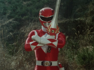
8 hours ago, SFGiants58 said:
So, how about letting Toei or Hasbro/Bandai buy the team? Granted, every video of the team would be copyright striked because Japan has no fair use laws, but I digress.
Texas Power Rangers
I'm all in on players performing an over the top pose before every at bat.
-
11
-
-
16 hours ago, spartacat_12 said:
The tough thing is that, aside from the Rockets, every pro team in Texas leans into a Western motif for their brands. You've got the Cowboys, Texans, Mavericks, Spurs, Stars, Astros (who briefly tried to emphasize the space imagery before going back to a basic star), and Rangers.
There's only so many ways to use the Texas flag/state outline/cowboy hats/boots before you start looking like one of the other teams.
Dallas Stars just happened to work out perfectly considering they were originally the North Stars
-
1
-
-
On 12/12/2021 at 12:11 AM, habsfan1 said:
If the Oilers make their navy blue alts their new primary uniforms, does that mean this becomes the new primary logo?
Oilers using navy was a mistake
-
2
-
-
10 minutes ago, DG_ThenNowForever said:
New York is so weird. I was in Manhattan last weekend when NYCFC clinched the championship game. You wouldn't know it just walking around; no one had on NYCFC gear, I didn't see it on any TVs passing by, no posters or banners, etc.
But it's also New York. If just 1 percent of the city cares, that's still a lot of people.
If it's any indication, the Hammerstein Ballroom was sold out for the watch party.
-
2
-
-
I'd like to see NYCFC try an orange kit. They haven't had a change kit I cared for since the inaugural season.
-
1
-
-
On 11/23/2021 at 1:04 PM, -kj said:
Norwich City just released a new club crest.
The crest popped more with the black and I liked the inaccurate lion. It had its charm.
-
Well, at least they're in on the joke too.
-
7
-
-
Black Fridays for the Mets are here to stay.
It was quickly pointed out that the replicas shown in the video and website are missing the neck piping. A slight redesign maybe? Seems weird to remove an element that's been on nearly every Mets alternative.
-
1
-
-
On 11/9/2021 at 5:45 PM, RyanMcD29 said:
I think that we should consider having Fox Sports' graphics department arrested
Why are they so huge?
-
3
-
-
12 hours ago, TrueYankee26 said:
2015 Mets forgot about the 2nd half of that plan.
-
2
-
-
Personally, I would've gone with the subway token logo on the shorts.
-
5
-
-
The glossy Nike logo is great because on the white jerseys, I can barely see them.
-
7
-
-
2 hours ago, Igor Coelho said:
It's shocking they never did a black alternative back in the day.
If legit, the only positive I see here is the classic wordmark. They should've never changed it.
-
3
-
-
23 hours ago, EddieJ1984 said:
This was the best they looked imo.
I thought it had way too much going on with the shoulder patches and chest number. I did like the orange trim. I have nothing against it.
-
Knicks throwback looks great. The shorts look shinny, does anyone else notice that?
-
1
-
-
Jazz have a wide variety of colors they can choose from and they pick Black and Yellow? Man, what the hell is going on around here? What is a consistent brand anymore?
-
3
-
-
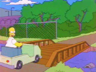
Man if this is how the rest of the Rangers season will go, this is gonna suuuuuuuuuuuuuuuuuck.


Washington Commanders to debut new NFL identity
in Sports Logo News
Posted
Holy ****, there's a way too much going on. With the name and slogan and everything in between. We need some breathing space.