-
Posts
2,418 -
Joined
-
Last visited
-
Days Won
3
Posts posted by AstroCree
-
-
My biggest issue with the whole Los Angeles Angels brand is how they have never once used Los Angeles in ANYTHING. It's not on their caps. It doesn't say it on their away jersey. Not even a simple sleeve patch. It's always "ANGELS BASEBALL". So how can they market to a city they themselves seem very hesitant on marking to anyway?
11 hours ago, DarthBrett said:This was my biggest fear. They really shouldn't be wearing these on the road (or at all in general)
-
 2
2
-
-
On 6/8/2022 at 9:19 AM, McCall said:
"Los Angeles" carries a lot more weight from a branding perspective.
except when the majority Angels fanbase is against it
-
 8
8
-
-
I like the new patch. Much cleaner. It doesn't need to say much, the cup speaks for itself.
-
 6
6
-
-
They've been nailing the last 3 City Connect uniforms. Green and purple is not a bad combo. This could be good for the Rockies to experiment with.
-
 2
2
-
-
-
1 hour ago, MJWalker45 said:
Liverpool wins the FA Cup and the quadruple is still alive. Chelsea chose yellow kits today, I guess hoping to change their luck from the League Cup.
ngl, losing 3 FA Cups in a row kinda sucks
-
 2
2
-
-
I am so in love with the retro numbers. This might be the best Dortmund kit under Puma. Surely top tier.

-
 1
1
-
-
6 hours ago, adsarebad said:
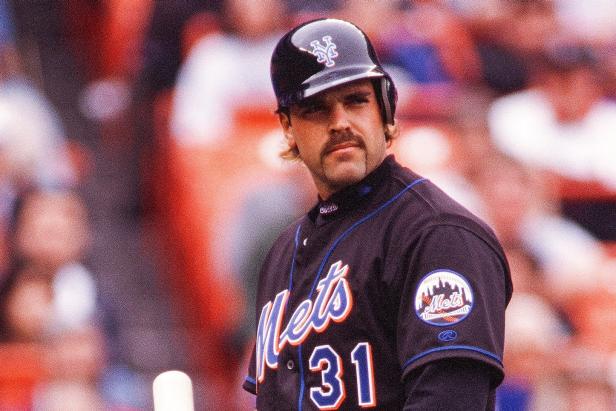
why do that Mets black jersey have the blue piping?
https://www.mlb.com/news/mlb-moms-to-follow-on-social-media
That photo was from a year ago.
1 hour ago, Marlins93 said:As others have said, the Mets had a great brand identity for decades before the introduction of black ruined it.
They've done worse.

The black jerseys are now a once a week home alt, so there will be weeks where we won't even see them. As long as they stay away from the drop shadows that infected all the others, it'll be fine. I doubt they'll ever do that again.
-
 4
4
-
-
7 hours ago, jmoe12 said:
The Reds haven't scored 7 runs in a game yet this season.
Big brain thinking. Can't blow a 7 run lead when you don't score 7 runs.
-
 4
4
-
-
The Oilers wanna be a navy team because it's the 90s and dark colors are in but then navy loses its luster so they return to their dynasty set in the 2010's because 80s nostalgia BUT THEN the orange throwbacks got popular so now they wanna be an orange team so they change uniforms again BUT THEN that wasn't enough, they had to bring back navy BUT THEN someone's navy boner went off and they created this all navy uniform AND NOW SAID "WE'RE ONLY WEARING NAVY ALTS IN THE PLAYOFFS"
I hate this team so much.
-
 2
2
-
 2
2
-
-
7 hours ago, gosioux76 said:
But my ideal Mets uniform would a return to the '86 Mets look, but adapted to the modernized button-down style like Minnesota and Texas have done recently with updates to their old pullover-style jerseys.
So their 1992-93 jersey?

-
 6
6
-
-
57 minutes ago, VancouverFan69 said:
Totally agree. The darker red and royal blue doesn't have as strong of a contrast as the classic lighter red. Also, the Canadiens need to go back to the single red outline around their blue font on their whites. There was no need to update on of the most timeless uniforms in pro sports history.
I must've missed something. Did Montreal change their shade of red?
-
3 hours ago, ltjets21 said:
What happened to the piping?
They removed it for some reason. It's really jarring when they put the 2 next to each other. It honestly looks unfinished. Many pointed this out on Twitter last night.

-
 3
3
-
-
Holy identity crisis Batman. What the hell do the Jazz want to be?
-
 2
2
-
-
4 hours ago, MJWalker45 said:
It'll go on the left sleeve per previous articles.
what about teams who already have a patch on the left sleeve?
-
 1
1
-
-
Welp. It's here, it's big and it's ugly.
This is so huge, there's no room for another patch. Let's say they get to the World Series next season, they won't wear a WS patch. Are we just done with those? This sucks on every level.
-
 2
2
-
 6
6
-
 2
2
-
 3
3
-
-
Meanwhile over in Tampa...
I hate everything about this
-
 4
4
-
-
7 hours ago, mmejia said:
Getting the criticisms out of the way. Don't like the navy pants but that's just the traditionalist in me talking.
But I actually dig everything else. Love the hat. As for the jersey, the Astros should look into keeping that font style and the gradient piping for their uniforms. It's the first real SPACE feeling uniform they've had since their late-90s set.
-
 2
2
-
 1
1
-
-
Not a fan of the new W Nats cap. I just don't like it. There's just too much going on for a baseball cap. The Curly W is just better. Also, they're doing that thing I hate when the cap and helmet are 2 completely different designs. I can't stand that.
-
 8
8
-
 1
1
-
 1
1
-
-
Apparently the Mets have dropped the Blue/Silver away jersey from their set. A little concerned now about the status of their blue jerseys. I know last season they hardly wore the home blue alternative.
-
 1
1
-
-
ESPN doing retro graphics for the NBA 75th Anniversary. It's a neat concept but they should really have the graphics pop in and out to make it a bit more authentic during the game.
-
 6
6
-
-
On 3/11/2022 at 12:39 PM, CreamSoda said:
That one was a thriller
It was so good, NHL and NBC destroyed all the tapes and the records that it ever existed.

-
 2
2
-
-
On 3/13/2022 at 11:17 AM, Silent Wind of Doom said:
It's an odd quirk of design with one-color marks on items alongside multi-color logos. Do you go with the most prominent color in the logo, or the outtermost, since that's what was chosen to sit on the background color? The white maker's mark was what Majestic also went with at least from the late 00's on. Similar things play out on caps (Minnesota, Boston, Seattle, Colorado).
Russell and Rawlings both went with blue and, while it is a better and more fitting choice, it's also hard to see. That alone is probably why Majestic, Nike and New Era on the hats went with white.

-
 2
2
-
-
Oilers flip-flopping between royal blue and navy is getting on my nerves.
-
 1
1
-


NFL 2022 Changes
in Sports Logo News
Posted
good god this looks like every "modern" script logo in the NFL. This sucks.