


kroywen
-
Posts
1,490 -
Joined
-
Last visited
-
Days Won
4
Posts posted by kroywen
-
-
11 minutes ago, Brian in Boston said:
The New Jersey Jackals of the independent Can-Am League have unveiled a new logo package.
Jackals Announce New Logo DesignsThat has to be one of the biggest upgrades of the year in any sport, at any level. The old logo was truly hideous.
-
 1
1
-
-
3 hours ago, DawgPacPBH said:
Nelson Cruz wore LeBron cleats and high socks a few weeks ago in Detroit


Interesting. I hate how that looks. Granted, that's a hideous shoe, but the high tops do not mesh well with high socks.
-
1
-
-
10 hours ago, Korkie said:
The other night Rob Manfred mentioned he was open to the possibility of east/west geographical realignment.
I was thinking about how it would work. I assumed they would keep the 3 divisions in each league approach and no franchise relocations.
Eastern League
Northeast Division
1.) Toronto Blue Jays
2.) Boston Red Sox
3.) New York Yankees
4.) New York Mets
5.) Philadelphia Phillies
Southeast Division
1.) Baltimore Orioles
2.) Washington Nationals
3.) Atlanta Braves
4) Miami Marlins
5.) Tampa Bay Rays
Central Division
1.) Pittsburgh Pirates
2.) Cincinnati Reds
3.) Detroit Tigers
4.) Milwaukee Brewers
5.) Cleveland Indians
Western League
Midwest Division
1.) St. Louis Cardinals
2.) Kansas City Royals
3.) Minnesota Twins
4.) Chicago Cubs
5.) Chicago White Sox
Southwest Division
1.) Texas Rangers
2.) Houston Astros
3.) Arizona Diamondbacks
4.) Colorado Rockies
5.) San Diego Padres
Pacific Division
1.) Los Angeles Angels
2.) Los Angeles Dodgers
3.) San Francisco Giants
4.) Oakland A's
5.) Seattle Mariners
The hardest part was sorting out all the Central/Midwest teams. Originally, I had the Chicago teams in the Central and it was called the Great Lakes division. I switched them with Detroit and Milwaukee since I couldn't justify Detroit, an eastern time zone team, in the WL. Plus, it protects the Cubs/Cards rivalry; protecting the major rivalries was key.
I like the end result. The leagues feel balanced and each division is a 3/2 mix of teams currently in opposing leagues.
I am a complete traditionalist when it comes to baseball (one of the very few things I can say that about
 ), so I'd never want to see this actually come to fruition, but as a hypothetical? It's brilliant. Preserves every major historical rivalry, allows for in-division metropolitan rivalries in all 5 metropolitan areas with multiple teams, and would minimize travel.
I've often thought a Yankees/Mets/Sox/Phillies + 1 division would be incredibly fun to watch, what with all the rivalries (NYY/BOS, NYM/PHI, NYY/NYM) and money to be thrown around in that group. I'd never actually want it to happen - the history and tradition of two separate leagues is just too great - but what a fun division that would be to watch. And I can say the same for Midwest and Pacific divisions above as well - lots of historical rivalries and big markets in each of those.
-
2
-
-
I love the Patriots' old AFL uniforms. They're one of my absolutely favorite football uniforms out there, and I wish the Pats would go back to them yesterday.
Except for Pat Patriot. Objectively, it's a terrible logo. A terrible logo on an otherwise beautiful uniform, but a terrible logo nonetheless. If the Pats were to go back to those beauts (not going to happen), or a derivative thereof (may happen once the Belichick era is over), I'd rather they put a modified version of Elvis on there.
To me, the platonic ideal of a Patriots uniform are a navy blue inverse of the red AFL uniforms (more or less their Color Rush jerseys paired with white pants), with Elvis on the helmets. Pat Patriot, on the other hand, belongs in 1960.
-
4
-
-
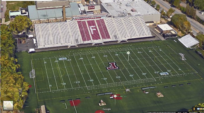
12 hours ago, Discrimihater said:
Woof...I live about 15-20 minutes away from an actual D3 stadium (at Carthage College) and went to UW-Whitewater. Can confirm both schools' football facilities being easier on the eyes than Fordham's (never been inside Carthage's gym).
From the looks of it, Carthage's gym is also larger and more modern than Fordham's:

versus

It's absolutely incredible that that is an A-10 gym. The A-10, as in a conference that usually sends around three teams to the NCAA Tourney every year, and is often considered a "high-major" conference.
The football stadium is somewhat excusable, given that they're on an urban campus in the middle of the Bronx, and space is very, very limited as a result (though I wish Fordham would relocate some of its "minor" athletic fields - baseball, softball, etc. - to a spot in Westchester, to free up space on campus).
But there's definitely room to build a larger and more modern gym - the only reason that hasn't happened is lack of funding and general apathy.
-
2
-
-
13 minutes ago, Discrimihater said:
There are high schools with better fields than what you described, and that's even if you leave out those stadiums in Texas.
Yeah, there totally are. This is our D-I football stadium, no joke:
Yeah, it's not just those super-rich high schools around Dallas that have better facilities than us.
-
1
-
-
15 minutes ago, ColeJ said:
my sister's family is one of those "if you didn't go there, you shouldn't cheer for them" people. i don't get it.
my family is from alabama, where you are forced to choose between alabama or auburn at birth. that IS pro sports in that state... so i come from an alabama family, and cheer for alabama...
i went to troy university, however. i'll be honest, i care more about if alabama wins than i do if troy wins, because the stakes are higher... luckily, i've never had to watch them play each other in football... in baseball or basketball or whatever, i'd probably hope Troy won, because that's awesome and I have a degree from there... but my saturday ritual involves watching alabama football, and maybe troy as the undercard if they're on and it isn't a schedule conflict.
i know a lot of people with very strong opinions on this topic. i've never understood that. it's sports, played at a high level. i'll watch it and cheer for whoever i feel like. i'll also grant that freedom to everyone else. lol.
This is exactly how I feel about my alma mater, Fordham, as compared to UConn. To be honest, I have no clue how Fordham's basketball team was this season, beyond "not good." I'm far more interested in UConn basketball because there are actually high stakes there. It's a hell of a lot more interesting than watching a team lose in front of a half-full 3,200 seat gym. I can count of one hand the amount of Fordham students and alums who have an emotional investment in Fordham basketball, and can guarantee that almost no one can name a single player on the team.
Funny story about that, actually. I went to one single Fordham basketball game during my time there. Sat in the student section behind one of the baskets, and all I can remember was the Sixth Man Club wiggling their fingers in the air and howling whenever a Fordham player was shooting a free throw toward that basket. A friend of mine (who lives and breathes basketball) and I just looked at each other, completely puzzled, and said "wait, they're supposed to do that to our opponents!" And I knew right then that that'd be the last time I'd go to a game.
-
1 hour ago, WSU151 said:
When your kids go to college, are you going to root for the school (and maybe get a shirt) even if it's not UW?
Seems like your kid wanting a UW shirt to wear around wouldn't be a real issue. I don't think I see the real benefit of the "You can't root for X college because you're still a kid" mantra.
I couldn't agree more. And what about those of us who go to colleges that don't have good athletic programs, or don't play in D-I, or those who don't go to college at all? I don't think we should be precluded from rooting for a major college sports program for the rest of our lives, just because we're not students or alums of a college with a strong D-I program.
I personally went to a school that is D-I, but has a laughably terrible athletics program. I knew tons of students who legitimately had no clue we were D-I, and earnestly thought we were a D-III school. Our basketball gym (most decidedly not an arena) was the oldest, and one of the smallest, in all of D-I, and yet we still couldn't fill it up for home games regularly. Our basketball team hasn't been to the NCAA tournament in over 25 years. Our football field was literally a single grandstand of bleachers on one side of the field, with a parking lot on the other side. There's D-III programs with better facilities than us. Being an urban school, we had extremely limited space of facilities, and were reliant on aging facilities that were the butt of jokes of students and opponents alike. I'll speak glowingly about my alma mater in almost every other facet - academics, our campus, our history, our student body, etc. - but let's just say that I never expect to be watching the old alma mater on the big stage in football or basketball.
But I am a Connecticut native, and I've been a UConn fan since I was a little kid. They were the one sports team that could unify the State of Connecticut - the state is famously divided in half between Boston and New York teams when it comes to pro sports. But I grew up when the men's and women's basketball teams were ascendant, and were the pride of the entire state.
Being from Connecticut, if often felt like the rest of the country only knew us as that strip of land connecting Boston and NYC, with a bunch of rich people and a name that no one knows how to spell. Or worse yet, "Connecticut? Is that a state? Where the heck is that?" I'm not sure if we're truly the most forgettable state in the country, but it certainly felt like it - we were a tiny state that didn't even have a cool trivia fact like being the smallest state or the first state. But everyone in the country suddenly knew what UConn was, even if they had no clue where that mysterious land of Connecticut was located. They were a point of pride for an oft-overlooked state.
I have no personal association with UConn, but they're my home state's team. Not just that, they're our only prominent team, pro or college. So I root for them. Except for that one time years and years ago when they faced my college... and we got trounced thoroughly.
")
-
3
-
-
24 minutes ago, DoubleStraps said:
Wow, I have no memory of the Cardinals ever not having front uniform numbers. I've seen the McGwire record-setting home run a million times, and in fact own that book thing Sporting News made, but would have bet every cent in my bank account that that uniform had numbers on the front. This feels like a Berenstein/Berenstain Bears thing here...
It's the perfect example of the Mandela effect - I bet 99 out of 100 baseball fans who remember that moment would think that he was wearing a front number when it happened. It looks incredibly strange to see that uniform sans front number, to the point that you can tell something is wrong, but can't quite put your finger on it (until realizing what it is).
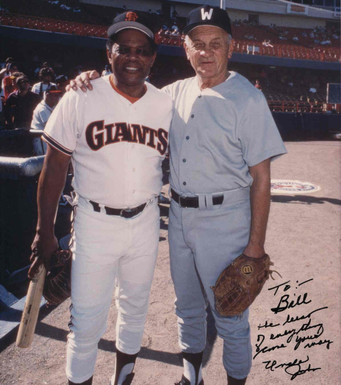
-
Willie Mays wearing an 80's era Giants uniform at an Old Timers Day:
-
3
-
-
39 minutes ago, Ferdinand Cesarano said:
The Cardinals will always look wrong without the front number. Unfortunately, they had the numberless front during two seasons in which players of theirs had great performances, 1980 and 1998.


I think that many people adjust their memories so that they "remember" those players in those pivotal years wearing the more typical uniform.


I think that's true - I doubt many people even remember that the Cards weren't wearing front numbers back in 1998 during McGwire's home run chase. Personally, I'll never look at that 1998 uniform and not think it looks so weird and incomplete.
I will say, for uniform nerds like us with an eye for these things, that McGwire might be the only Cardinal for whom the number-less uniform is the "right" uniform, given that the signature moment of his career happened in that uniform.
-
3
-
-
Here's a strange one - Jose Altuve on the Astros in 2012:

Brett Lawrie with the Jays in 2011:

J.D. Drew during his very first month with the Cardinals, as a September call-up in 1998. What's wrong about this uniform? It was the second of the Cardinals' two season experiment without front numbers. The front numbers would return in 1999, when Drew would stick in the majors for most of the season:

-
4
-
-
Eddie Mathews in his last season with the Braves, which also happened to be the Braves' first season in Atlanta. "A" cap, and uniforms sans tomahawk:
And even more jarring yet, here's Mathews during his managerial stint with the Braves in the early 70's, after their complete rebrand:

Keyshawn Johnson in the Jets' old threads. He wore these for his rookie and sophomore seasons in the NFL:

Kevin Dyson as a Tennessee Oiler in 1998, his rookie year. It was the last year before they became the Tennessee Oilers:
-
5
-
-
Having the same issue. The site is moving at a snail's pace for me. Browser agnostic for me as well.
-
10 hours ago, Bmac said:
My unpopular opinion? I love high top baseball cleats.

But, I will only accept the long socks look. I'm in the camp that feels baseball socks should always be visible.
Not sure high top cleats and high socks would really go together well, though. Not sure any player has ever really combined the two - I think almost every player who wore high cuff cleats also worse relatively low cut pants.
-
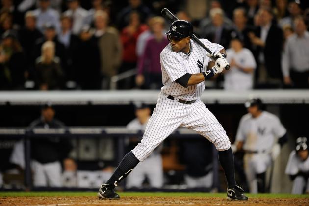
2 hours ago, the admiral said:
I agree with this on every team but the Yankees. They're the only team that shouldn't wear high socks. Soriano and A-Rod the only Yankees of recent vintage I can think of who did, and something about it looked off.
The Yankees, up until the late 2000s, had very few players who wore high socks (much to my dismay). Then, around 2009 or so, they became much more common in the Bronx again - guys like Damon, Gardner, Robertson, Granderson, occasionally Swisher.
I will say that long pants with pinstripes do tend to look better than long 'snow white' pants, but I absolutely love the look of the Yankees' uniform with high socks.
-
17 minutes ago, FinsUp1214 said:
That's part of why I'm a big advocate for socks being mandatory; as a uniform enthusiast, the designs of socks add something to a baseball uniform and gives it extra life. Those examples you used are perfect for what I mean (and some of the best socks in baseball history, among others). Each were intentionally designed to be part of the uniform and not a mere accessory; they were every bit as integral and essential to the team's identity as their caps were. Like the socks on a football uniform, it just completes and compliments everything in ways the uniform wouldn't be without them.
Sometimes the socks even make the difference for a uniform. Case in point (IMO), the current Cardinals. A good-but-sorta-plain uniform when worn with long pants, but when a player busts out those gorgeous striped stirrups? All of a sudden, the sorta-plainness of the jersey has something of great substance to compliment it. It gains a spark. It looks complete and the sorta-plainness even looks complimentary itself to the stripes. Nothing's "missing" anymore.
Or maybe in the cases on solid color socks/stirrups, that extra block of color on the bottom provides great balance and makes a great uniform even better. Big block of color coming from the cap, white or grey on the jersey and pants, big block of color on the socks. It's a great symmetrical and balanced look that certainly benefits even already-great looks like the Yankees, Tigers, Dodgers, etc.
Long pants don't look terrible in my opinion, and they certainly don't ruin a uniform. But baseball uniforms really lost something - indeed, a very valuable design element - when socks/stirrups became less of a thing.
I couldn't agree more. And FWIW, baseball uniforms are meant to be worn with high socks, and always were up until the 90s. Socks provide color balance to a uniform that long pants fail to do.
A baseball uniform generally looks best when the color of the cap matches the socks, and when the jersey and pants are either white or gray. The color balance of color-white-white-color is perfect. Even with alts, socks provide a much needed color balance, sandwiching the white (or gray) pants in between two blocks of color.
Combine that with the unflattering bagginess and sloppiness that is so common with long pants nowadays (the proverbial 'pajama pants'), and uniforms really did lose a lot when long pants became commonplace.
-
2
-
-
I suppose this thread just turned into further evidence that everyone has their own opinion about how/if stirrups should be worn.
That picture of the Cardinals from @FinsUp1214 shows how perfect those low-cut stirrups are. The striping possibilities are incredible and endless. I wish we could go back to the days of striped socks/stirrups that would become highly identifiable with a team:
-
5
-
-
1 hour ago, RichO said:
Yes on the low cut stirrups. I will take today's pajama pants over 80s ribbon stirrups 100/100. And 60s/70s higher cut stirrups just look wrong to me, but at least there's something there.
My pref list: low cut stirrup>high sock>high cut stirrup>pajama pants>ribbon stirrups>self immolation>2 in 1s.
I'd have to agree entirely on that preference list. As a child of the 90s, who grew up right after the "ribbon stirrup" fad ended, it looks so terrible to me. I'd honestly rather players wear pajama pants than those awful ribbon stirrups, though perhaps that's just because I'm more used to pajama pants (to my dismay).
High cut stirrups aren't terrible, and at least on the A's, can lead to a really unique and exciting look:

I wouldn't necessarily want the entire A's team is high stirrups like that, but a few guys? Especially some quirky relievers (who always seem to be the ones rocking the high stirrups as it is)? I love it.
2 in 1s deserve to be burned in a fiery pit and never seen again.
-
1
-
-
2 hours ago, insert name said:
I don't know how unpopular this is but I do not like the little tweaks made on the Mariners uniforms. I think they're a downgrade to what was a perfectly fine set.


I hated this update. I know that seems extreme for a simple change in outlines, but it actually gets to my post above - the silver outline in the middle effectively creates what looks like a gapped outline, since the silver is virtually indistinguishable from either the white or gray fabric from a distance. It looks especially bad on the home uniform, IMO.
The original version, with silver on the outside, looked far superior, since the silver basically blended in with the background. I'd personally prefer a simple blue-outlined-in-teal wordmark, but the silver was barely noticeable, so it basically created the same effect.
-
7 hours ago, mcj882000 said:
Maybe less of an unpopular opinion and more of a weird one, but I'm usually a big fan of uniform numbers with gapped outlines, like so:


I think it just generally makes for a really nice look... with one exception: the Montreal Canadiens.
I don't know exactly what it is, but to me that just looks awful on the Habs' white jersey; I think the old gapless look is much better:
I'm actually the opposite - I hate double outlines, especially gapped outlines, as a general rule. I actually think the Canadiens' look a little better than most, though I still much prefer the gapless outline.
The only example in your post that I think looks okay is the Penguins' jersey, since the Vegas gold and white never touch across the entire jersey (and thus the gapped outline maintains consistency across the jersey). But I generally think those gapped outlines add visual clutter, and make numbers far less defined.
-
26 minutes ago, Ark said:
On this board I'm surprised this isn't a popular opinion but stirrups should be required in MLB
At the very least, high socks or stirrups should be required. I hate the lack of uniformity with socks across baseball right now.
The thing with stirrups is that every fan prefers different lengths, and there's really no one "perfect" length. I'd bet it's usually based on what they grew upb with - fans who came of age in the 60s and 70s probably would prefer higher stirrups.
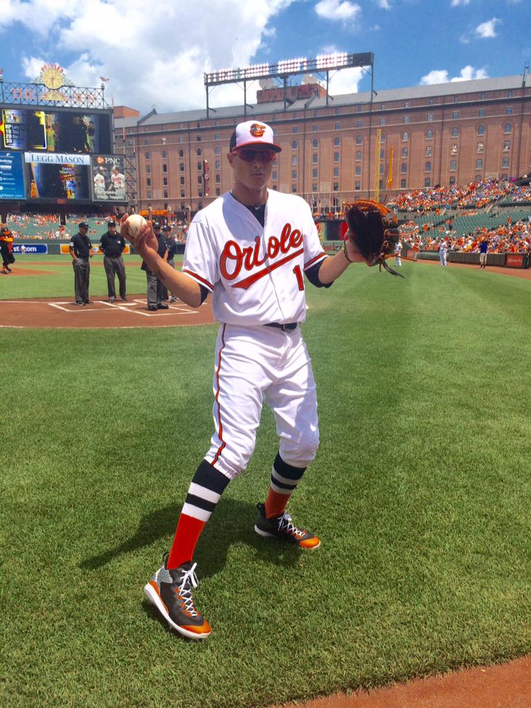
Personally, I'm a fan of very low stirrups, such as these:

On the other hand, I hate the very high stirrup look that was popular in the 80's.
I suppose the best solution is to say that every player has to wear their pants up to a certain length, and allow players to choose between high socks or stirrups.
-
If Shaq in Orlando is wrong, then I don't want to be right.
(I admittedly have watched very, very little of the NBA in the past ~15 years, but I still think of Shaq and Penny Hardaway when I hear of the Magic. It's a shame that they ran into literally the greatest team of all time in 1996, because that team was incredibly stacked and really fun to watch.)
-
2
-
-
In terms of location, Flushing >>>>> Belmont >>> Hempstead. Flushing has the trifecta of great subway, LIRR, and highway access from both the city and Long Island. Belmont has decent LIRR and highway access (better from Long Island than the city), and no subway access, while Hempstead is limited to extremely congested highways, and is incredibly difficult to access from the city (doubly so if you don't have a car).
The ideal scenario would be for the Islanders and NYCFC to both build venues at Flushing (or within a redeveloped Willets Point). We know from experience with the Mets (and the US Open) that Flushing is extremely accessible for both city and suburban residents, whether by transit or by car. There's space to build on there, whether it's the Citi Field parking lot (build a garage or two to replace capacity), Willets Point, or within the park. There's already two successful venues there - Citi Field and the USTA center - make it a true sports complex. And it's a hell of a lot better for everyone involved to be in a place with subway access, rather than way out at Belmont relying on special LIRR trains to get city fans to the venue.
At the end of the day, either Flushing or Belmont would be preferable to continuing the untenable situation at Barclays, or to the Islanders moving out of town entirely (which I find quite unlikely). But the Isles should absolutely pursue Flushing as their first priority (and NYCFC would be wise to try and partner with them).


Rare team matchups
in Sports Logo General Discussion
Posted
Here's a slightly different take on this topic. 14 years ago, the 2003 NBA Draft occurred. Aside from the legendary draft class (and equally legendary draft bust at #2 overall), take a look at the logo overlaps here:
2003 marked the debut of the Cavaliers' logo seen there, the debut of the Nuggets' new double blue/gold color scheme, while it was the second-to-last season of the horse's head in Detroit. Seeing the horse's head wedged in between those two logos really provides for a clash of eras.
The Raptors' logo contributes to that as well - while it would linger around for five more seasons in those colors (looking ever more dated by the year), it's an archetypal 90's logo next to two logos very associated with the 2000s.