


~Bear
-
Posts
863 -
Joined
-
Last visited
-
Days Won
1
Posts posted by ~Bear
-
-
Really like what you've done so far. The Blues identity is gorgeous, and the improvements on the Guards and Lancers look really good. I also really love the "LG" crown monogram that's used in the secondary logo and on the helmet; in general, the Guards identity feels the most "NFL-like" to me. Stellar job.
On the Archers, there seems to be a lot going on. I think having a bow-and-arrow and the Gateway Arch making an "A" is creative, but I don't really think it works here. To be blunt, an arrow was NOT the first thing to come to mind, so I'd make that point a bit sharper. Also, the color scheme looks muddled on the logo. This shows up on the helmet as well, in which the logo gets lost because it's so narrow and the outline blends with the red shell. At the very least, I'd put a different logo on the helmet. For me personally, I think the arrowhead A alternate logo is the strongest in this set and maybe something to work off of, since you still get to incorporate both the idea of archery and the Gateway Arch.
That being said, I do like the uniforms. The striping is unique in a good way. The number font is a little small, but I don't hate it. I'm not sure the beveling is needed in the yellow numbers, though. The color scheme works a whole lot better here and feels a lot more cohesive.
-
The bear logo is solid. It'll be interesting to see if it's used/how it looks on scorebugs this season.
As far as the wishbone C, it's a classic logo, but the fact it's asymmetrical has always bothered me. It looks like the C has a massive underbite, for lack of a better way to describe it.
-
 1
1
-
 1
1
-
-
7 minutes ago, Unocal said:
The better teams did not win last night.
Well maybe the Bruins shouldn't have blown a 3-1 lead over a team they finished 43 points better than! The Bruins lost 3 games in a row once all regular season. There isn't an excuse for them.
-
5
-
-
1 hour ago, ~Bear said:
I really thought Boston was going to make a deep run this year; they looked the part. Hats of to Florida, just goes to show how unpredictable the Stanley Cup playoffs are. Honestly the most entertaining playoff in sports.
It's cool to see Toronto in the 2nd round too. Between either Florida or Toronto, we'll have a team in the ECF that hasn't been there in a long, long time, which is always fun to see.
With the Kraken advancing, we are also guaranteed a Stanley Cup winner who, at the latest, last won the cup in 2006 (the Hurricanes). Only the Devils are the other team to win since the turn of the century. 3 teams left haven’t won the cup at all.
-
3
-
 1
1
-
-
I really thought Boston was going to make a deep run this year; they looked the part. Hats of to Florida, just goes to show how unpredictable the Stanley Cup playoffs are. Honestly the most entertaining playoff in sports.
It's cool to see Toronto in the 2nd round too. Between either Florida or Toronto, we'll have a team in the ECF that hasn't been there in a long, long time, which is always fun to see.
-
1
-
-
An upgrade! If any team should play into a more simplistic red and white look, it’s the Cardinals. Not a huge fan of the grey outlines on the numbers on the home jersey and the wordmark above is tacky. But the helmet is cool and the black alternates are actually a nice addition and not just an unnecessary BFBS. Overall, solid. Could’ve been a lot worse.
-
2 hours ago, BBTV said:
You're assuming there's significant crossover between fanbases. There's a difference between being a Knights fan and being a "sports" fan. For example, between tickets and merch, I probably spend thousands on Phillies and Eagles each year, and 0 on Flyers and Sixers. I simply don't care (unless the Sixers are in the finals, in which case I'll claim to have been a die-hard since day one.)
Even if the Phillies moved to Oakland (oh, the irony), I'd still spend 0 on the Sixers and Flyers. At least in my case, there's no competition for my dollar.
I do think you're underselling crossover fan potential a bit. Philadelphia is also a MASSIVE market that can afford to hold teams in each of the Big 4 leagues, notwithstanding each franchise's long history in the city. Regardless sure, many people might be "just a fan of x sport," but even if there's a split between 2 of the 3 teams in the city, that's significant. Most people aren't going to spend thousands between two teams in a calendar year. If the decision is to buy a Golden Knights jersey or an A's jersey, sure, diehard baseball fans are going to buy the A's jersey, but a lot of people are going to go for the jersey of the team that's competent and has a preexisting connection to the city.
Regardless, sports teams in an area are still going to compete against each other for marketing ground, as they are going to try and appeal to the general middle-class to upper-class base that are going to be spending sizeable amounts on merch and season tickets. I imagine it was a lot easier for the Golden Knights to cater to this crowd when they were the only sports team in town. Obviously, Las Vegas wasn't known for its hockey market when they first came to town, and I remember they would explain general rules before games their inaugural season. But, they had the advantage of filling a sports niche in a city that was lacking it and, through various factors including fielding a consistently successful product, built a strong fanbase. This avenue for "converting" fans is going to be a lot harder for the A's when the Golden Knights and the Raiders are in town. Hell, the Raiders already struggle with this, but only 8 or 9 home games a year is easier to get away with and easier to make an "event" out of than 81.
I don't know how many baseball fans live in Las Vegas. Maybe there is a sizeable, untapped market there. Maybe there are enough "baseball first" fans to cater to and that will buy season tickets; even if they aren't A's fans, maybe they'll go to enough games when their favorite team comes to town. Obviously, the team CAN succeed. But I look at the race among the Big 4 sports leagues to put teams in Las Vegas, and it doesn't feel like a recipe for success. There's a real chance that Vegas will go from 0 to 4 teams in under 20 years (which as an aside, I think it's an almost guaranteed recipe for disaster for an NBA team to go to Las Vegas). When the dust settles, is Las Vegas really big enough to allow all these teams to coexist? Is there enough fans of each sport to cater to in the market? And is the MLB team, a league that is already having to make radical changes because of its unpopularity among younger people, which is led by a cheapskate owner and constantly fields one of the lowest payrolls, going to be the team that wins out long-term? We really aren't far enough removed yet to judge Las Vegas as a professional sports market, but I have doubts. I'm open to being proven wrong, though.
-
Moving out of Oakland aside, is moving TO Las Vegas even sustainable long-term? I know the city has grown quite a bit, but they've gotten 3 professional sports teams really quick, and the NBA seems to have their sights set on expanding there in the near future. I know that the A's wouldn't be directly competing with the Golden Knights or the Raiders most of the year...but still. There's only so much disposable income people have to go to sports game and buy merchandise. Beyond that, the city is growing almost too quickly for the amount of water they have access to. They aren't a very big media market comparatively to other metropolitan areas.
The Golden Knights have been incredibly successful and helped the city heal after the horrible mass shooting. There's a deep bond there. The Raiders are an NFL team, and the NFL is always going to draw. The A's operate under a shoestring budget and are in the midst of what's probably going to be a long rebuild. If any of these teams are going to be the odd one out, it's going to be the A's.
-
I've never been convinced of anything more in my life that these uniforms are going to be TERRIBLE. I'm expecting awe-inspiring horror, and honestly, if it's not innovatingly bad I'll probably be disappointed.
-
12
-
-
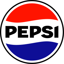
It's legitimately ugly. Firstly, we need BFBS....why? Pepsi hasn't used black in their logo going on 3 generations. Now, it's arguably the most prominent color in the logo. Also, because it hasn't been posted yet here on its own, here's a good look at the HIDEOUS black outline they slapped on:

It sucks. It's not as bad as the outline on this Pepsi logo, so congrats on clearing the bar that was laying on the floor. That doesn't mean this outline isn't bad. None of this even mentions the horrid font they decided on. It's like they wanted to continue the diagonal motif of the last logo somehow and then slapped it into sharp angles in the "P"s and "S" where it doesn't fit at all.
I think what is disappointing this update, too, is that they could've just straight up restored an old logo, and it would've been much, much better. And yes, Pepsi needed a better logo, but nothing about this logo says "Pepsi" other than it being a circle with some wavy red and blue blobs.
-
1
-
-
This is the best Super Bowl logo in a long time. Gorgeous.
-
1
-
-
So my high school, while I was there, pretty much exclusively used a rip-off of the Wisconsin Badgers "W", only slightly rotated and recolored to purple and gold.
Now, apparently they have two other logos they use, a W and an actual tiger. I haven't been able to actually find any other uses of these logos (recolored or otherwise) anywhere else, so I don't know if the school bought the rights to them, if they were exclusively designed for the school, or what. I honestly quite like the tiger head logo they use.
-
The Jets are in a really interesting situation with their branding and what they should do going forward. Their current set is painfully mediocre and should be changed when they get the chance. The helmets are fine, but the ugly shoulder stripe reeks of the 2010's Nike disasterclass uniform rebrands. The BFBS is probably the worst BFBS set in the league since the shade of green they use isn't bright enough to actually contrast against the black, and instead it creates a horribly muddled look.
In a vacuum, I'd say the Jets should revert back to a set inspired by their 1978-1989 look. I don't think there is any need for black in their branding. They've done it before, both in this historical example and also in their last set (albeit with a darker shade of green), and they pulled it off quite well. I'd also argue that it would preemptively differentiate them from the Eagles should they ever decide to return to a Kelly Green era-inspired set, although given their current success with the midnight green, I'm not convinced they would beyond their planned throwbacks.
Also, regardless of the uniforms, the Jets need to return to their classic logo as well. It was subtle yet clearly invoked the jet imagery they were going for. The current logo is an ugly oval. If it's supposed to be football-shaped...then why have another football IN the logo that tramples over the font?? No iteration of this logo has been very good, and it's time to let it die.-
17
-
-
Kansas City
-
 1
1
-
-
San Francisco vs. Philadelphia
Cincinnati vs. Kansas City
-
1
-
-
Jacksonville vs. Kansas City
New York vs. Philadelphia
Cincinnati vs. Buffalo
Dallas vs. San Francisco
-
Maybe this is an unpopular opinion but I actually quite like this Bengals’ uniform set up with the orange socks. When they go orange/black/white with black socks, it misses that “pop”, for lack of a better word, that the orange socks provide. The orange/black/black uniform is great in it’s own right, but I do quite like how the white pants seem to match with the white font on the black uniform, whereas the o/b/b kind of relies on players wearing white shoes/undershirts/other accent pieces to balance the look.
-
4
-
-
Seattle vs. San Francisco
Los Angeles vs. Jacksonville
Miami vs. Buffalo
New York vs. Minnesota
Baltimore vs. Cincinnati
Dallas vs. Tampa Bay
-
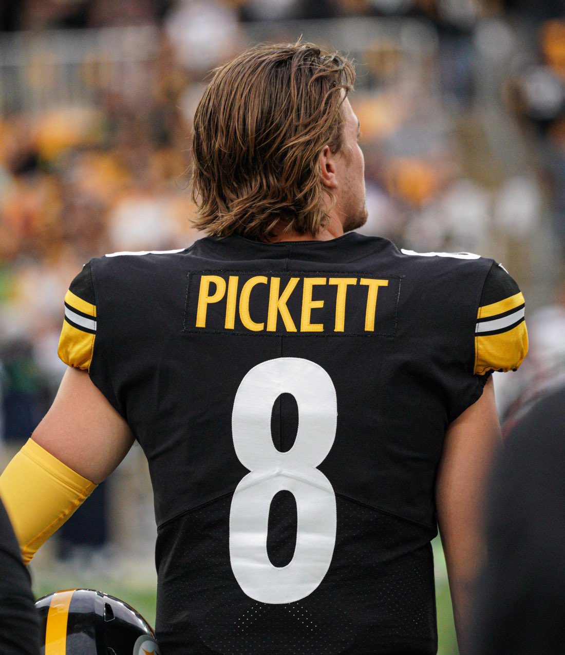
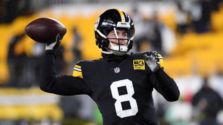
Not something I'd expect to happen this season, but perhaps something to think about for future seasons: the Steelers going back to the block-numbers full time. Steelers fans seem united in preferring the block numbers to the current curved and italicized numbers, so it wouldn't surprise me if ownership brought them back full-time sometime in the near future. It would also give ownership an excuse to bring in a different throwback, be it the "Batman" uniforms from the 60s or bringing back the "bumblebee" jerseys (not that they need another throwback jersey, but $$$).
I personally would welcome a change to the block numbers full time. I get block numbers are fairly common, but given the historical precedent of them having them + the classic "feel" it makes sense for the Steelers. Plus, and more importantly, they just look better. The font they have now looks awkward in certain cases (for example, Kenny Pickett's "8" jersey doesn't look that good in the current font, but looks a lot better imo in the block font). The only concern would be that they would look basically identical to University of Iowa, but given that Iowa based their jerseys off of the Steelers to begin with, I don't think it would be that big of a deal.
-
3
-
-
Kansas City vs. Las Vegas
Tennessee vs. Jacksonville
Cleveland vs. Pittsburgh
Minnesota vs. Chicago
NY Jets vs. Miami
Tampa Bay vs. Atlanta
Carolina vs. New Orleans
Houston vs. Indianapolis
Arizona vs. San Francisco
Dallas vs. Washington
LA Rams vs. Seattle
NY Giants vs. Philadelphia
LA Chargers vs. Denver
Detroit vs. Green Bay
Baltimore vs. Cincinnati
New England vs. Buffalo
-
Dallas vs. Tennessee
Arizona vs. Atlanta
Miami vs. New England
New Orleans vs. Philadelphia
Indianapolis vs. NY Giants
Carolina vs. Tampa Bay
Denver vs. Kansas City
Chicago vs. Detroit
Cleveland vs. Washington
Jacksonville vs. Houston
San Francisco vs. Las Vegas
NY Jets vs. Seattle
Minnesota vs. Green Bay
LA Rams vs. LA Chargers
Pittsburgh vs. Baltimore
Buffalo vs. Cincinnati
-
Jacksonville vs NY Jets
Buffalo vs Chicago
New Orleans vs Cleveland
Houston vs Tennessee
Seattle vs Kansas City
NY Giants vs Minnesota
Cincinnati vs New England
Detroit vs Carolina
Atlanta vs Baltimore
Washington vs San Francisco
Philadelphia vs Dallas
Las Vegas vs Pittsburgh
Green Bay vs Miami
Denver vs LA Rams
Tampa Bay vs Arizona
LA Chargers vs Indianapolis
-
San Francisco vs. Seattle
Indianapolis vs. Minnesota
Baltimore vs. Cleveland
Miami vs. Buffalo
Philadelphia vs. Chicago
Detroit vs. NY Jets
Pittsburgh vs. Carolina
Kansas City vs. Houston
Atlanta vs. New Orleans
Dallas vs. Jacksonville
Arizona vs. Denver
New England vs. Las Vegas
Tennessee vs. LA Chargers
Cincinnati vs. Tampa Bay
NY Giants vs. Washington
LA Rams vs. Green Bay
-
Las Vegas vs. LA Rams
Minnesota vs. Detroit
Baltimore vs. Pittsburgh
Cleveland vs. Cincinnati
NY Jets vs. Buffalo
Houston vs. Dallas
Philadelphia vs. NY Giants
Jacksonville vs. Tennessee
Kansas City vs. Denver
Carolina vs. Seattle
Tampa Bay vs. San Francisco
Miami vs. LA Chargers
New England vs. Arizona


2023 NFL Weekly Picks Contest
in Sports In General
Posted
Detroit vs. Kansas City
Cincinnati vs. Cleveland
Houston vs. Baltimore
Tampa Bay vs. Minnesota
Carolina vs. Atlanta
Arizona vs. Washington
Jacksonville vs. Indianapolis
San Francisco vs. Pittsburgh
Tennessee vs. New Orleans
Las Vegas vs. Denver
Philadelphia vs. New England
LA Rams vs. Seattle
Miami vs. LA Chargers
Green Bay vs. Chicago
Dallas vs. NY Giants
Buffalo vs. NY Jets