-
Posts
2,719 -
Joined
-
Last visited
-
Days Won
9
Posts posted by kolob
-
-
19 hours ago, habsfan1 said:
I'm not a Coyotes fan. But I like the Kachina uniforms for their uniqueness.
It feels like, for the most part, that’s where most people on this board fall. It’s sad to see the kachina uniforms go. -
30 minutes ago, CaliforniaGlowin said:
Looks like AI art to me
My first thought was Tron.
-
 1
1
-
-
39 minutes ago, (probably)notabandwagonfan said:
I don't necessarily hate the double number thing. I guess it's a fun quirk. I do like the name under the number though, that's fun and unique we really only see in basketball.
Overall, much better thought out compared to their first CC.
-
 4
4
-
-
3 minutes ago, spartacat_12 said:
Ugh, that’s very disappointing. I guess Smith doesn’t want them looking too similar to the Jazz, but not using purple is a huge missed opportunity.Yeah I'd rather have purple be the "tie-in" color.
-
6 hours ago, Bill0813 said:
In 1993 Georgia Frontiere wanted out of Anaheim. The league rejected her move to Baltimore, and later to St. Louis. When she threatened a lawsuit, the league allowed the move to St. Louis.
This was my first thought as well.
-
-
-
16 minutes ago, Sec19Row53 said:
Do they have an owner with deep pockets? Venues? Then why is it a concern to you?
This is my attitude about Vegas as well. The only sport I do worry about succeeding there is baseball. But, it's probably more of an A's issue than baseball issue.
-
I think the only reason the side striping is there is to carry over the angled striping from the 2016 jerseys narrative.
Completely unnecessary.
-
 7
7
-
-
4 hours ago, DJT said:
Maybe if Yeti(s) wins they will do another survey asking if it should be plural or not haha.
Gotta milk out all that free publicity for Qualtrics.
-
23 hours ago, chakdaddy said:
To me,nJazz mountains were part of Pistons/Bucks/Sonics/Rockets "slightly wrong palette" era. Ultimately I preferred the 80s Mardi Gras look, even the recent navy variation. Still, they're decent.
Strange we've never seen an angled J note to match the wordmark. The tail could evoke motion of a ski slope or avalanche.
I can't imagine adding a green or yellow to this. MAYBE replace light blue with green/yellow for an 80s fauxback or Mardi Gras palette swap version.
Seems like the red rocks are forgotten. Maybe let Utah HC have them as an alt
Honestly, sounds horrible. And, kinda sounds like the Jazz's aborted NBA 75 remix jerseys. Thankfully they got another year out of the original sunset jerseys. I am not a fan of "mountain" and "note" mashups.

NOTE: I actually do like the Mardi Gras colored State Logo.
-
 1
1
-
-
17 hours ago, pelicanfan said:
they should really just restrict it to icon and association jerseys for the finals. i give a pass for SOME alterations in the playoffs like the pacers. but you need to wear your core brand when you're playing on the biggest stage aka the finals. i wouldnt even include statement jersey as most teams now have a design thats jarringly different from the first 2 core jerseys.
Personally, I think it should be Icon, Association and Statement during the playoffs with the City and Throwbacks off the table. However, the NBA Finals, and maybe the Conference Finals should be purely Icon and Association. I am all for color vs. color matchups though if they clash.
And, this is a conversation for another time and thread, but I think the City jerseys should be purely for the NBA Cup Games. I could live with that, especially if the league is trying to differentiate the games.
-
 2
2
-
 1
1
-
-
22 minutes ago, DJT said:
Does this mean all teams will have that tan color? Not sure how I feel about that.
It seems like there's a grey version as well?

-
 1
1
-
-
2 hours ago, MalibuSunrise said:
Yeti has likely already won but I voted for Mammoth.
I'd really love to see Qualtrics numbers on the vote, because I am pretty sure Mammoth, Yeti, Blizzard and Outlaws are legit top four options, but I feel like Utah Hockey Club and Venom were thrown on there because one is the temp name and the other because it's a Ryan Smith favorite.
Heck, even KSL has basically reiterated that from this article.
QuoteIn KSL.com's fan straw poll, Yeti, Outlaws, Mammoth and Blizzard were by far the four most popular of the 20 initial names. Venom and Hockey Club got considerably less support, finishing 10th and 11th in our poll.
-
1 hour ago, SantosD_ said:
This guy has been a reliable source when it comes to Magic uniforms
I don't question the rumor considering how many NBA teams have gone back or with inspired old looks (ie-Cavs, Jazz, Suns, Kings, Wizards, etc.). Plus, the Magic's current look lacks character, the original jerseys have plenty of that.
-
 2
2
-
-
2 hours ago, WSU151 said:
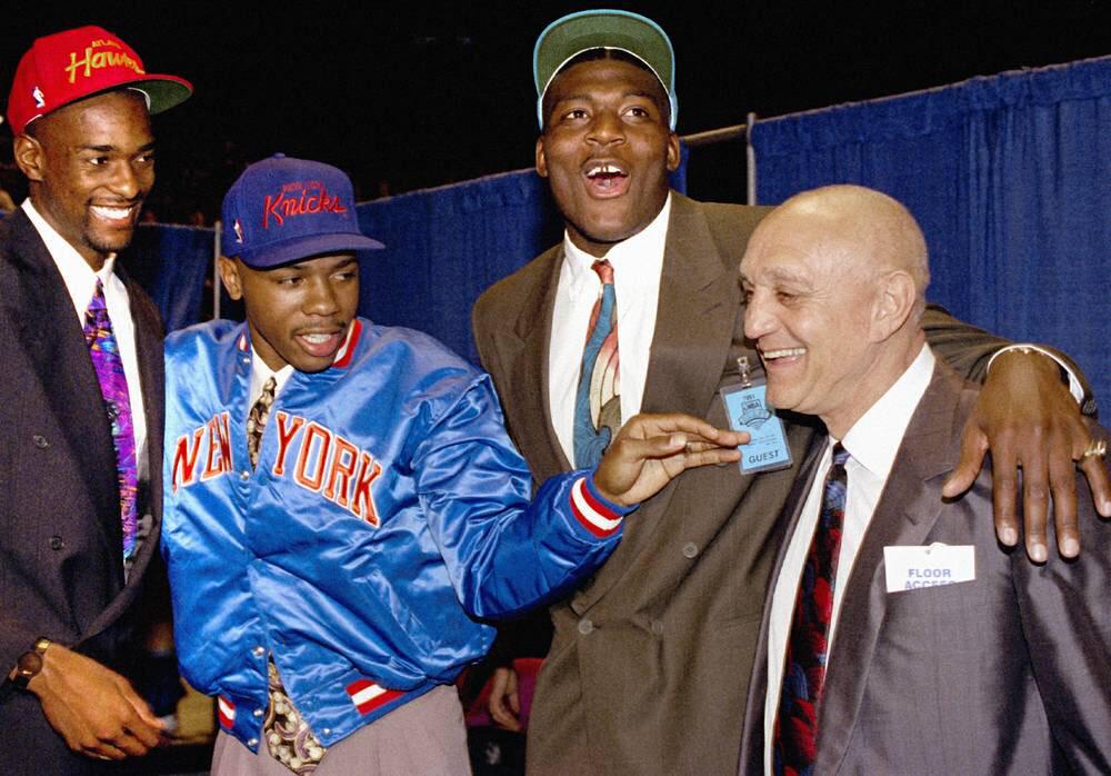
Draft hat preview:
My yearly obligatory "Bring Back the 80s/90s Draft Hats" post ...


-
 3
3
-
 5
5
-
-
2 hours ago, Foxxtrot44 said:
I can't imagine that Venom and Hockey Club were actually popular. I bet they are just there to eat up protest/troll votes. With the caveat that I'm assuming any non-Yeti votes are taken remotely seriously.
I think Venom is there because Ryan himself voted 20,000 times for it the past month.
-
 1
1
-
-
1 hour ago, Dynasty said:
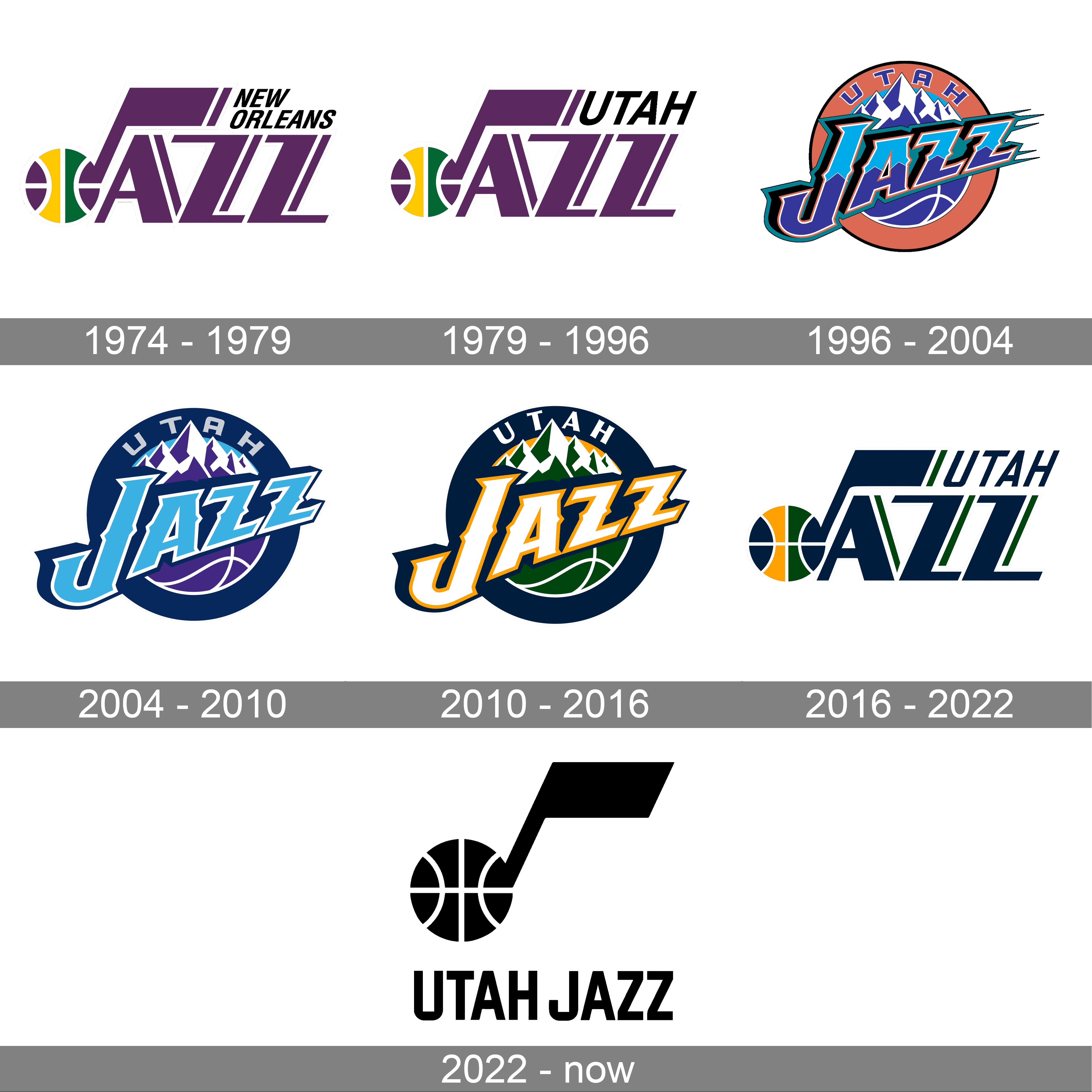
They really should've changed the name once they relocated from New Orleans. Unfortunately, they didn't. The fact that they're now using both the music note and the mountain imagery for their identity is just bewildering, especially if you don't know the history behind the team. I would prefer they just pick one theme and stick with it, even if it's the mountains and they become a Warriors/Lakers kind of identity.
Agreed. I feel like since 1996 we've spun into this Jazz > Utah > Jazz > Utah cycle. The more I go over these changes the more I don't like it because I don't think Utah and Jazz can visually coexist. It kind of has to be one or the other. This is said without even addressing the issue of team colors.
I love the Utah Jazz, but ownership should have jumped on the opportunity to change in 1979, 1984, 1996 or 2013. But, really, after 1996 it was too late.
-
1 hour ago, truepg said:
But the question is, what would the primary logo look like that these new uni designs require?
Nothing too exciting. There are color variations for black, purple and light blue background as well.
https://www.nba.com/jazz/mountain-basketball/brand


-
 1
1
-
 1
1
-
-
6 minutes ago, tBBP said:
Anyway, this looks to be all about "Utah" at the expense of "Jazz"
This has been the Jazz’s problem since 1996. We want to be Utah’s team, but the Jazz aren’t the Jazz without the note logo and classic colors (or close them).-
 1
1
-
-
Additionally, the Clippers also changed jerseys mid-season (around Christmas) in 1982, going from the baby blue and orange to R,W, B.
-
1 minute ago, DJT said:
That fall 25/26 city edition I’m just gonna speculate it’s a light blue uniform.
Same. Hopefully one that says Jazz. Though, I’m not entirely against a sunset version, maybe with Delicate Arch? -
10 minutes ago, shaydre1019 said:
I'm guessing just going "UTAH" is a workaround/loophole to use the old school aesthetic without actually reverting back to old logos, which is prohibited.
Which in today’s NBA is an arbitrary rule not really enforced (ie-Jazz note logo, 76ers, etc.) -









NHL Anti-Thread: Bad Business Decision Aggregator
in Sports In General
Posted
Yes, rumors. But, I think it's pretty safe to say it will most likely happen the same way New Orleans gave back the Hornets nickname and history to Charlotte.
In the case of the Jets/Thrashers/Coyotes/Utah HC, I think what makes "sense" is Jets 1.0 history goes to Jets 2.0, Coyotes history goes to Utah and Thrashers history stays dormant for a possible Atlanta franchise or possibly stays with Jets 2.0 until or if Atlanta gets another team.
Geez, such a convoluted process of make believe.