


kolob
-
Posts
2,719 -
Joined
-
Last visited
-
Days Won
9
Posts posted by kolob
-
-
Looks like baby blue, purple and black are the colors. Two similar purple mountain jerseys? And, nothing that says Jazz, just Utah.
Not sure I like this rebrand either? But, hey, no new colors!

-
 1
1
-
 1
1
-
 2
2
-
-
-
16
-
 6
6
-
 2
2
-
-
I'm sure I'm reading WAY too much into this, but it could simply be a set based off the purple city jersey from last year BUT the throwback mountain logo is throwing me off a little.
New throwback for next year? Completely different design?
-
1
-
-
Wow. We’re going into Season 10 with the current Bucks logo. Time flies.
-
3
-
1
-
1
-
-
4 hours ago, CaliforniaGlowin said:
If teams have to keep doing City uniforms, they should bring back their most popular ones. I'm sure fans will love to buy new vice jerseys. If it's all about sales and merchandise, why not maximize it?
Exactly. This is how “HEAT CULTURE” happens.-
3
-
 1
1
-
-
13 hours ago, Sykotyk said:
Think they should go the Minnesota Wild route. Make a logo that signifies their name, but also represents something simple and obvious when seen from afar. And yet ties into the name.
I could get behind that, and if the finalists are Yeti, Mammoth, Blizzard and Outlaws — 3/4 or 2/4 of those could or should use that treatment.
-
1
-
-
7 hours ago, Lights Out said:
I don't think any of those "logos" can be described as trying too hard.
Definitely not. I guess the right description on the state logo would be "forced."
-
11 hours ago, nash61 said:
It's a shame that the best Yeti logo has already been used. Those colours look awfully familiar, though...

Looks like a burly old man with fangs.
If Yeti is the winner they need to go with the route the Kraken did with their logo ... make the Yeti unseen or mysterious since no one has really ever seen one.
-
6
-
-
1 hour ago, Foxxtrot44 said:
All of the trademarked logos have been released.
They're undeniably logos.
https://www.ksl.com/article/51031788/utah-nhl-brand-revealed-applications-for-trademarks-filed-for-logosI don't mind this, even for the sweater ...
This on the other hand feels like it's trying too hard ...
-
1
-
-
4 hours ago, ThunderCeltic said:
So the NBA isn't bringing back the "Earned" sets? Toronto and Milwaukee won the title in theirs.
I haven't heard anything since 2021 and assumed it was dead. If they do anything with playoff teams the NBA Champion should get either a gold version of one of their jerseys or a special patch. Nothing more is needed.
-
1 hour ago, infrared41 said:
A women's league tried that back in the 90s (I think) and it didn't work.
Something Shaq and T-Mac have been proposing for the past few years. It's not a bad idea, but the reactions from most WNBA players has been pretty negative.
-
1
-
-
On 5/31/2024 at 6:25 PM, Haz_Matt said:
So, 4 states that surround Utah in 3/4 of the directions all fit the outlaw imagery but not the one in the center of them....

No, that makes sense. But, I guess what I’m trying to say is — historically speaking “outlaws” wouldn’t be one the first things that come to mind for Utah compared to the states I referenced.
The imagery of the west was won in this lawless — sheriff vs. outlaws — kind of way doesn’t really fit Utah in general when you understand how orderly most settlements were established (most were missions under the direction of Brigham Young).
-
1
-
-
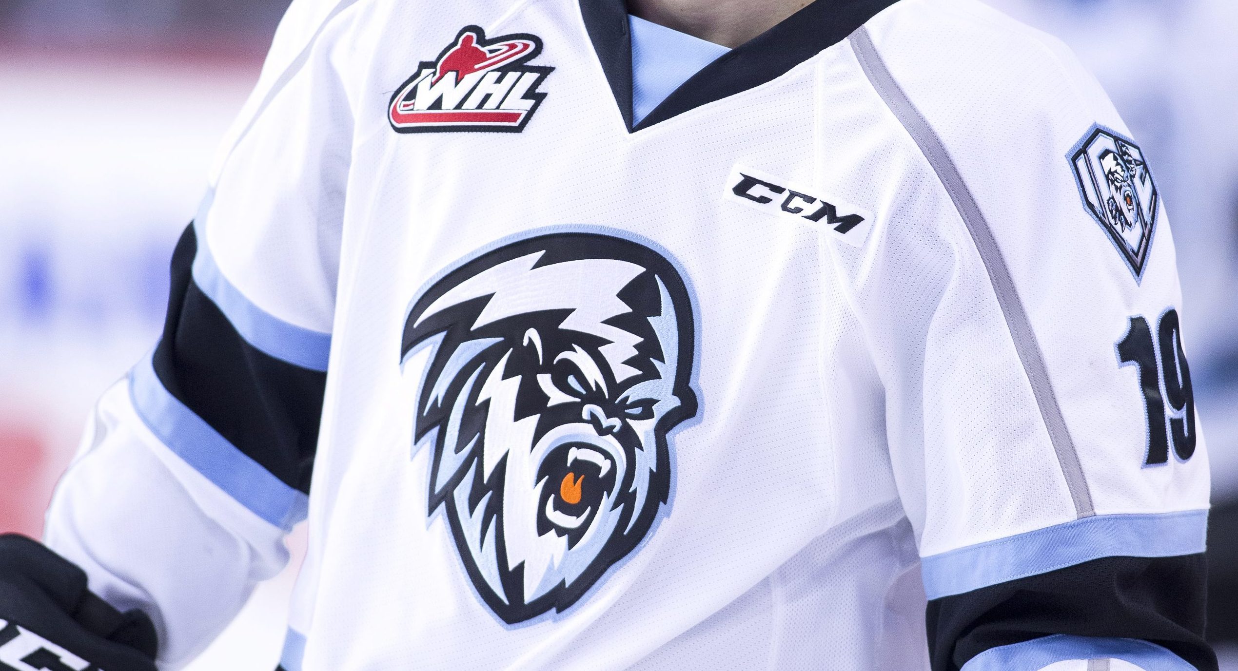
The logo makes me think Yeti is going to be the winner. I wish it was purple because of the over abundance of blue clad teams in the league.
But, I can live with the light blue. And, I don’t think this official marries the team to the color in the future (hopefully)?
-
The problem with "Outlaws" is that it just doesn't FEEL like a Utah name. Outside of Butch Cassidy, the outlaw imagery seems more appropriate for the Southwest (Nevada, Arizona, New Mexico, Texas, Oklahoma) and Colorado. Not Utah.
Then again, neither does Yeti or Mammoth either.
Only solution? ICE JAZZ!
-
2
-
-
7 hours ago, SFGiants58 said:
And the Colorado Avalanche is just “Avs” to most folks (“Av” referring to singular players).
If they go with Yeti, I'm nicknaming them the "Yeets" -- it's what the cool kids do, right?
-
21 hours ago, Foxxtrot44 said:
Quoting myself because I have no shame.
According to Smith in an interview today, the name contest has been whittled to a final four. Mammoth and Yeti are among those 4.I am sure it will come down to Mammoth, Yeti, Blizzard and Outlaws.
I won't lie, not much of a fan of either four.
-
1
-
-
2 hours ago, MDGP said:
Show me the rule, because literally the only place I have ever seen it referenced is on this forum and a single post on reddit.
Meanwhile there are plenty of examples through 2018 of teams not having to wait 5 years.
Philadelphia 76ers 2007-2009, 2 seasons
Minnesota Timberwolves 2008-2012, 2 seasons
Phoenix Suns 2013-2017, 4 seasons
Denver Nuggets 2015-2017, 2 seasons
Los Angeles Clippers 2015-2017, 2 seasons
Sacramento Kings 2016-2017, 1 season
Denver Nuggets 2017-2018, 1 season
Memphis Grizzlies 2017-2018, 1 season
And if they HAVE implemented a 5-year jersey rule since 2018 then it's pretty damn pointless seeing as the league completely reclassified how jerseys work and every team in the league unveils new jerseys every season with half of them wearing those "alternates" more than their supposed primaries.
People quote "The 5-Year Rule" like it's some unchangeable constitutional statue ... whether it's the NFL and NBA. The reality is, it will change if it makes sense (meaning $$$). The NFL does hold teams to a pretty stringent 5-year rule, which is good practice IMO. The NBA used to be that way, but since Silver has taken over that's changed, especially with bringing old logos back.
But, it seems like the NBA has a "5-Year Rule" on main logos with a more fluid "policy" on the jerseys, especially with Nike. I believe ... initially in 2017 the rule was Icon/Association jerseys could be changed every five years, Statement every three years and the City Jersey every year. Obviously, that was all thrown out the window when the Jazz kept their first City Jersey for 3-4 years along with a number of other teams.
So who knows anymore?
-
4 hours ago, spartacat_12 said:
I always thought the ban was on teams without black in their colour scheme coming up with a black alternate. The Jazz 90's third jersey often gets cited as the reason for this.
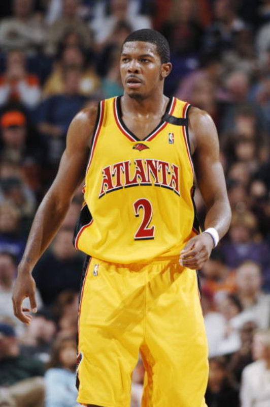
It could have been? But, that doesn’t necessarily negate why the Hawks, Magic and Suns didn’t have a black jersey during the early 2000s. -
3 hours ago, spartacat_12 said:
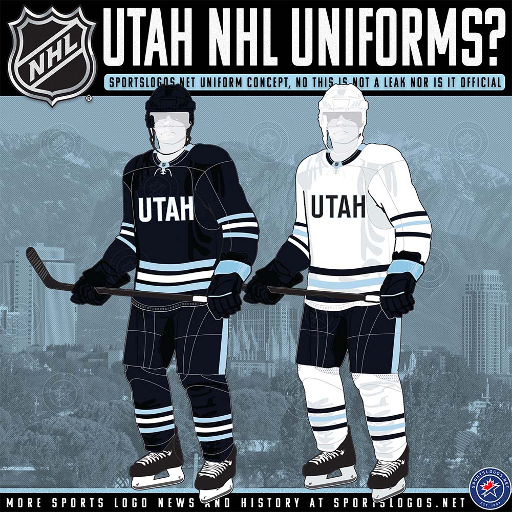
No one really knows for sure. The only concrete information we've been given is that the jerseys will have 'Utah' on them, and we don't even know what the style will be. Maybe it's the Jazz-ish all-caps wordmark we've seen them use so far, maybe they go with a diagonal script like the Rangers, maybe we get a University of Maine style wordmark. The mothership posted an educated guess on what they'll be today, but nothing is confirmed.
Whatever the final jerseys end up looking like, they'll definitely be available for purchase. The team isn't going to pass up the opportunity to sell temporary jerseys for $300 a pop.
Just put long sleeves on these and call it good! ICE JAZZ!
-
 2
2
-
-
5 hours ago, The_Admiral said:
I don't recall any crackdown, either (I'm on the side that this ban on black uniforms was misconstrued or made up), but it did directly give us the dress code.
I am looking for sources, but I believe in the early 2000s there was a "ban" on black alternate jerseys. It had nothing to do with "The Malice in the Palace" and I don't think it had anything to do with race? But, if I recall correctly, it was mostly to add more color into the league because by the end of the '90s a number of teams were kind of defaulting to black secondary jerseys.
It's why we had these ...
-
3
-
1
-
-
39 minutes ago, GhostOfNormMacdonald said:
Twins don't need a CC when they have these beauts. Whatever Nike has cooked up, just scrap it and wear this instead of the monstrosity that awaits us
Agreed. The “City Stories” should be simple. This is a good enough narrative.-
1
-
-
3 hours ago, truepg said:
It's not. That neon green doesn't make sense for the Timberwolves. And neither do we need any of that added Northern star BS in the identity that they tried to justify that shade of green with..
I don’t mind the North Star imagery. That fits any Minnesota team’s narrative. However, the Wolves current identity feels like Nike’s attempt at replicating the Seahawks identity in the NBA, especially when they broke out the neon green jerseys in the rollout.Personally, the double blue makes the whole set drab, regardless of how much Nike tries to throw the neon green in there to liven it up.
-
5
-
-
5 hours ago, SantosD_ said:
the current logo is better, could use a different font tho
Ehhh ... both aren't perfect and need fixes. I like the less abstract "shark wolf" of the older logo, but I do like the use of the North Star in the newer logo.
-
2
-
-
On 5/24/2024 at 10:55 AM, spartacat_12 said:
The City of Toronto is made up of six boroughs (Old Toronto, York, East York, North York, Etobicoke, Scarborough). I'm not sure if Drake coined the phrase, but he definitely popularized it. Now around the city you'll see plenty of small businesses incorporating "6ix" into their name.
How haven’t we seen this on a Raptors jersey yet? If the Nuggets can have an elevation jersey — surely we can “6ix” jersey?!#ButPleaseDont


/cdn.vox-cdn.com/uploads/chorus_asset/file/19930081/2675426.jpg.jpg)

24-25 NBA changes
in Sports Logo News
Posted
I agree. The white jersey has some problems with it that some small changes could tremendously fix. Either baby blue gradient or an outline would work as well like the original mountain jerseys. The Utah font needs to be purple IMO.