


CLEFAN94
-
Posts
133 -
Joined
-
Last visited
Posts posted by CLEFAN94
-
-
On 11/29/2022 at 5:20 PM, heavybass said:
Moving onto a team that has some close distance to an NFL team.... right before that said team became
rape enablers
BOWLING GREEN FALCONS
So Bowling Green got permission from the Browns to use their classic look and this was before they said Deshaun Watson... now the team is essentially stuck with said look as the allegations get worse and worse each day
Good work on the uniform, poor work on the description.
-
 1
1
-
-
Reminds me a lot of Temple withe those pants stripes…..
-
This has been an incredible series to follow. You did an amazing job on every set!
one question, would you be against doing the twice teased Atlantic Schooners? I’ve always wanted the CFL to be a 10 team league (ADD pet peave) and I think you’ve done the best representation of the league so far. I’d like to see what your take on them would be.
-
Love what you did with Memphis, the double blue works excellently.
Definitely a classic look there with the Ohio Je… uhh Bobcats
 good work Heavy.
-
On 11/20/2022 at 3:24 PM, heavybass said:
I apologise for Friday, I had a very :censored:ty day and the stress of this thread did not add to the mood I was in.... this is still paused.
I am not the best artist, that excuse is still valid.... if you have problems then PMs are open.Keep your head up, I’ve thoroughly enjoyed this series so far, and hope to see more soon, however, take all the time you need. It’s a shame to see a fellow artist get absolutely raked over the coals for a simple mistake, especially by someone who can’t finish their own projects…. but I digress………
-
I know you’re doing these in a certain order, but is Presbyterian on the list?
Good work on the latest trio of teams!
-
Arch behind sword is my vote.
I’ll also take a vote for OG or Inverse OG colors for the Brahmas
-
1
-
-
Iowa’s helmet they used against Penn St in 2019. Would make a nice update to their athletic identity. Gold face mask, larger hawkeye logo, thicker stripe & gold numerals on the back.
-
Interested to see where this goes. I like what I see so far.
-
On 10/29/2022 at 2:56 PM, heavybass said:
Next up from the trio of Wisconsin that doesn't play football... but this one has one of the worse looks that they changed to... so i said
 that and reverted back to their previous look but with a off colour that they'll work with.
UW GREEN BAY PHONEIX
Have you thought about using an Eagles’ style wing logo for the helmet? These are slick regardless, but that was my only thought.
-
Ball State is spot on, Marquette is PERFECT!
-
On 4/26/2022 at 2:55 PM, heavybass said:
Well wouldn't you believe I let this to dust... don't worry I haven't forgotten but considering there's now like 300+ teams that I am now doing, its ridiculous so much that I've decided to make it 20 teams per league which there's 16 divisions split in two each way... it's a lot.
Anyway time for the next team and they belong to the Great Lakes div.... and surprisingly they were part of a recent hockey controversy but their football team looks cool.... from Minnesota.MINNESOTA STATE MAVERICKS
Forget you already did these guys?

-
On 8/29/2022 at 8:01 PM, NH4 said:
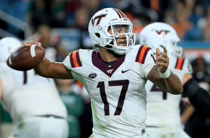
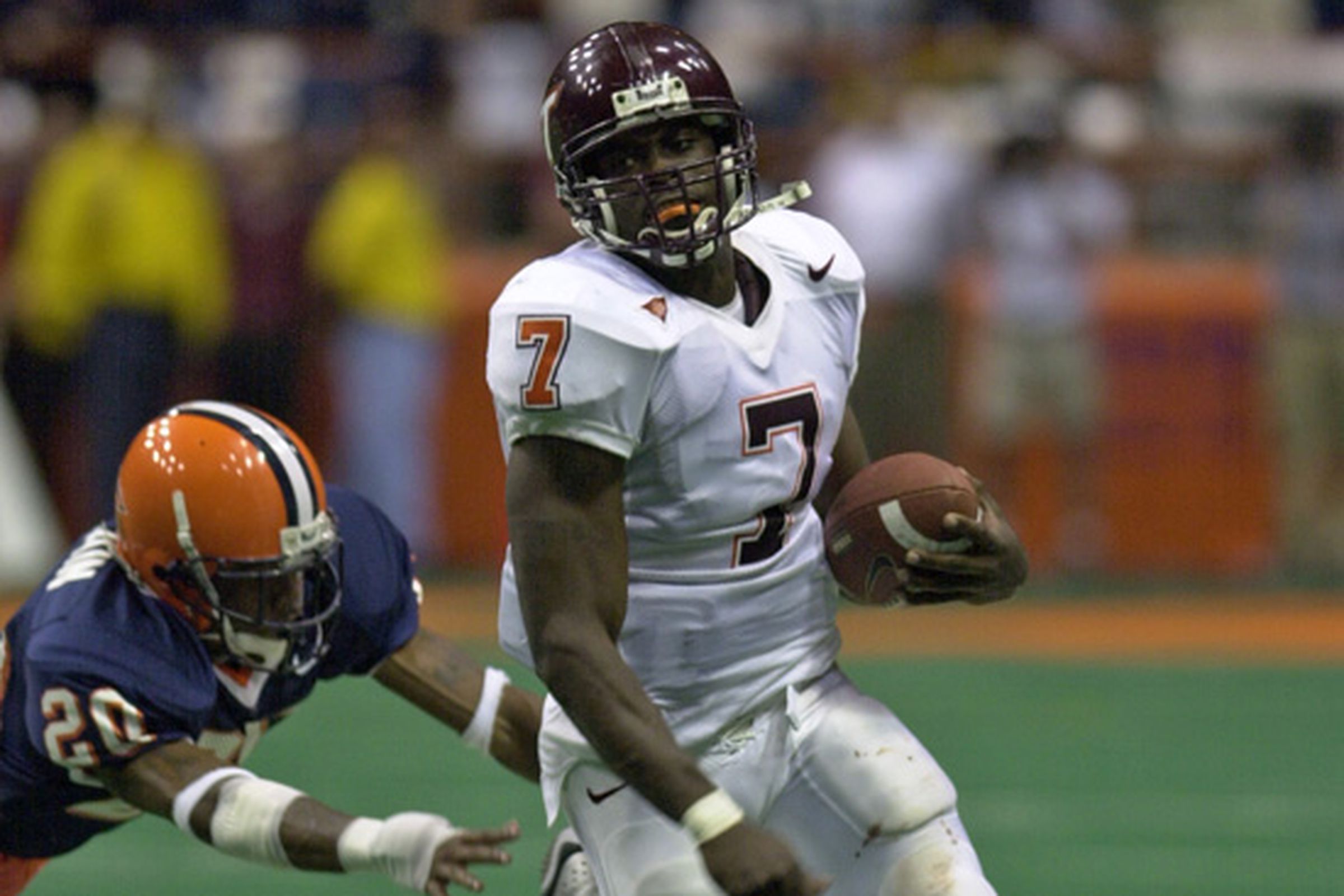
VIRGINIA TECH HOKIES
DESIGN
- I essentially went back to Virginia Tech's previous jerseys
- But I changed the sleeve numbers to be mismatched like the Michael Vick era numbers that the school and their fans love
HELMET
- Maroon helmet with maroon facemask
- I'm so glad VT removed the stripe because I think the plain shell is their best look
- "TECH" on the front bumper and "HOKIES" on the back bumper
- Hokie tracks on the back
JERSEY
- Re-added the traditional shoulder stripes
- Added an outline to the numbers
- Changed sleeve number color
PANTS
- Maroon and white plain pants
Up next will be Rice. Thanks for looking and as always, C&C is greatly appreciated!
Sorry to be so late to reply to this, just stumbled on it, big Hokie fan here, love what you did with the helmet and jerseys. Two questions, 1) would you be up to trying a pants stripe for any of the sets? 2) would you be against using Tech’s throwback white helmet with the “T-in-the-V” logo? If not it’s cool, just thought I’d ask.
-
9 hours ago, heavybass said:
Next up from Maryland is a non football D1 college AND is a basketball staple.... taking a bite out of the opposition.
UMBC RETRIEVERS
I figured I would go in the same path as the basketball team... all yellows for home and all whites for roads.
Good job on The Good Boys!
-
Cansuis gets an A+ excellent work!
-
These throwbacks are fantastic!!
-
On 8/1/2022 at 2:14 PM, coco1997 said:
Thanks, guys!
Let's wrap up the series today with another relocation swap!
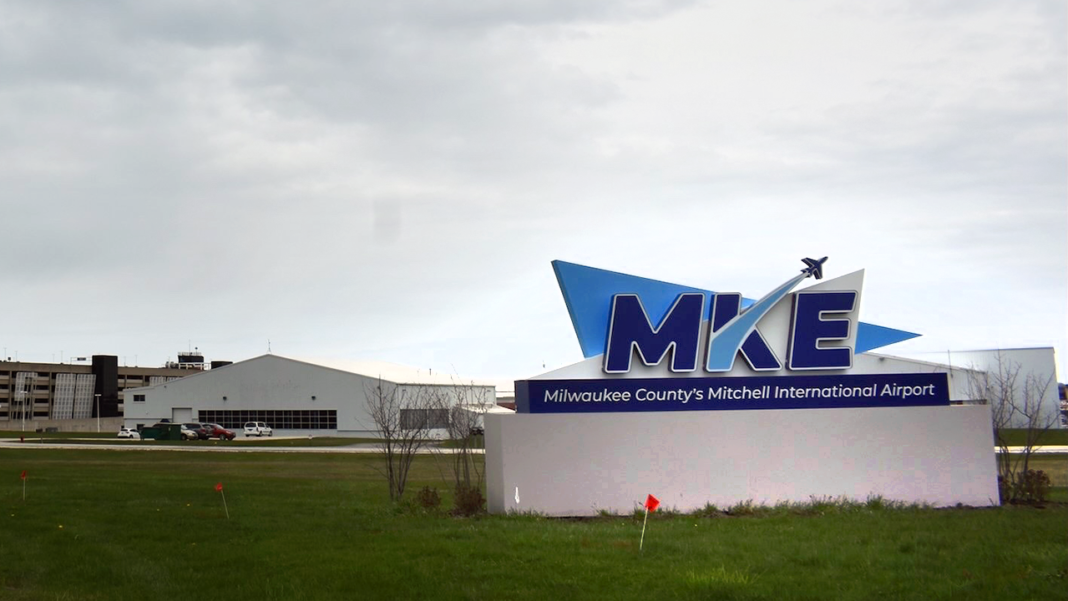
MILWAUKEE PILOTS:
The Seattle Pilots lasted only one season before moving east in 1970 and becoming the Milwaukee Brewers. But what if they had kept their name? For the Milwaukee Pilots, I took inspiration from Milwaukee resident General Billy Mitchell, considered to be the father of the U.S. Air Force and for whom Milwaukee's international airport is named. The color scheme is olive green (criminally underused across MLB save for the occasional tacky military appreciation uniforms) and athletic gold, which incidentally creates some nice visual synergy with the local NFL and NBA teams. The font for the script and numbers is Air Force and the crest is a modernized version of the original Pilots' alternate logo. Thanks to @NicDB for the consult on this one!
SEATTLE BREWERS:
It was a no-brainer to keep the "Brewers" moniker for a team based in Seattle, birthplace of Starbucks, meaning the name would now refer to coffee instead of beer. For the color scheme, I liked the idea of pairing the green from Starbucks' branding with a rich, deep, coffee brown color. I also used Santana, a typeface similar to one used by Starbucks, for the numbers and cap logo. The sleeve patch idea was inspired by Milwaukee's City Connect grill ball logo, which I reworked into a steaming coffee pot. Here's a better look at that logo:
And with that, unless there are any relocation or intrastate rivalries I missed, the series is complete! I'd love some feedback on the last few sets of teams, including from @vtgco, as his is always highly valued.Thanks for following!
that Milwaukee design really works! And Seattle Brewers could be a minor league leam, especially with that logo!
-
1
-
-
8 hours ago, heavybass said:
Again excuse with previous post... I got really occupied with the NFL/USFL merger thread.
So for the New England division we need a team that really speaks out in terms of competition... how about a team that is primarily known for it's ice hockey?
HERE COME THE RIVER HAWKS!!!
I mean you have to go nuts when it comes to UMass Lowell.
One of my favorites so far

-
 1
1
-
-
3 hours ago, PERRIN said:
Regarding the TV numbers, I tried both shrinking them and removing them altogether, and getting rid of them is the way to go.
As for this, as I said in the original post:
I saw that after I commented, but I couldn’t just delete my stupidity so I figured I’d wait to be roasted.


-
On 7/19/2022 at 8:53 PM, PERRIN said:
With the Texans releasing a new Battle Red alternate helmet, I took a stab at redesigning the Texans with an emphasis on red over navy, inspired by @nate.sweitz's Texans concept. Harnessing Texas flag imagery, the new uniforms rely on thick blocky stripes of color for a more modern look. Jerseys and pants come in red, white, and navy to be mixed and matched. The number font style invokes an ol’ western flair. For the throwback, I just said ‘screw it’ and gave the Texans some Oilers throwbacks. I don't care that the Titans own the rights. I make the rules here. I am a cranky toddler and the NFL is my sandbox. I put together a generic 1930’s-adjacent fauxback, but I wasn’t a huge fan. This is much funner.
That’s all for now. Made in Affinity Designer. C&C appreciated
Two small things, first, the tv numbers, like the others said.
second, I doubt the Titans would allow the Texans to use the Oilers trademarks, so the throwback wouldn’t work.
-
What template are you using for this? That’s probably a dumb question, but I’m new to doing these designs myself and would like to use it if I could
-
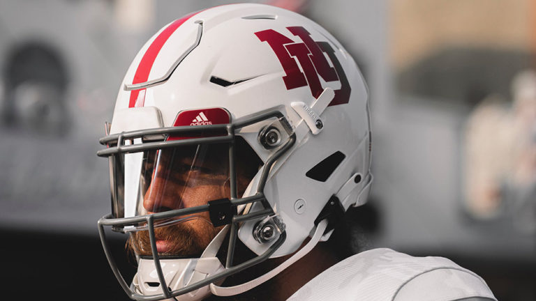
On 7/18/2022 at 6:42 PM, NH4 said:
NEBRASKA CORNHUSKERS
DESIGN
- Kept these jerseys pretty much the same but changed the helmet and pants a bit
- Removed the current N for the primary logo. I don't mind the current N but it looks so frail compared to the block N
- Nebraska used a block NU on some throwback helmets and I thought the block letters looked great
- I also made the numbers on the back the same as the jersey numbers
- I don't know when Nebraska changed from striped pants to plain pants but I re-added the double stripe to match the jersey
- Switched the font from a rounded font to a block font which matches the logo and jersey numbers
HELMET
- Changed the logo and numbers
- Added the Nebraska state silhouette logo on the back
- "HUSKERS" on the front bumper in the new font and changed the back bumper to "NEBRASKA"
JERSEY
- Changed the N in the chest patch to the block N
PANTS
- White and red pants
- Double stripe is added
SOCKS
- White socks with red accents
Up next will be Colorado. Thank you for looking and as always C&C is greatly appreciated!
I’m way too much of a traditionalist here, I’d keep the old “N” on the helmet

-
1
-
Glad to see this thread still alive. Was worried for a bit there. Good work Heavy
-
I figured I’d end up crashing through the thin ice at some point, don’t worry heavy, I’m just gonna go, that way you can continue your great work and enjoy it in the process. Having one less idiot to deal with will help I’m sure. Have a good one, and happy creating.
-
 1
1
-


 that and reverted back to their previous look but with a off colour that they'll work with.


/cdn.vox-cdn.com/uploads/chorus_image/image/64703625/163953228.jpg.0.jpg)
/cdn.vox-cdn.com/uploads/chorus_image/image/70822921/1235922646.0.jpg)
NCAA Arena Football Concepts: 252/384 - North Carolina A&T Aggies
in Concepts
Posted
YES! MTech looks fantastic!