


Section30
-
Posts
1,101 -
Joined
-
Last visited
-
Days Won
5
Posts posted by Section30
-
-
Missing the D in Bemidji, but otherwise I dig it
-
 2
2
-
-
8 hours ago, Sidney said:
Thanks man!! You got to convince them to change.... looool, tell me what you'd change on the font it is too generic, the gnawed wood? Once you tell me I'll make modifications.
Haha, I've tried
For the text I think it's mainly the gnawed wood, I don't think it really adds anything and would be hard to reproduce on small things
-
1
-
-
29 minutes ago, Sidney said:
Here is an update with different eyes... Which one work better??

As someone who goes to BSU, I would not be mad at all if they went with that logo on the right. I'm not a big fan of the BSU text though
-
3
-
-
Nechells and Manchester are both great, love the crests for both and the color schemes really help both teams stand out, well done!
-
Happy to see this return, Red Bull London looks nice and really realistic for this world, well done as usual!
-
2
-
-
All the updates are big improvements, especially the Mariners
Boston is giving me strong Maine Black Bears vibes and that is always a good thing. I really like the nautical flag designs in the collar and pants as well
-
Both of the new teams look great, I especially love the stained glass crest for Oak Park
-
1
-
-
Love the Twins, that number font is great. I do think that you should use the original block font for the throwback to make it an actual throwback though
-
2
-
-
It looks like an animation or drawing rather than a logo, and I don't see the need for all of the Dragon poses.
-
4
-
-
I also recommend imgur, it's free and I haven't had any issues with it yet.
-
2
-
-
I agree the socks are bad, but overall I kinda dig it as a one year jersey. I like the inverted mask, it looks meaner.
-
Ottawa looks amazing, I love the name and colors. I might suggest making the facial features more animated to give the logo a little more detail, but it looks good already.
-
Not a bad update, I always liked the "Screaming" part of the name but it's not the end of the world. I do think that the logo seems a little more E-Sportsy than a hockey logo if you know what I mean.
-
1
-
-
Minnesota looks incredible, I would love if this was real!
-
Absolutely killed Liverpool! I would be interested though to see what you could come up with for Anfield even though they're relegated.
-
Absolutely love the Wanderers!
The simple black and white checkers is gorgeous and the Elephant for the logo so unique, I love it!
-
Unreal look for Newcastle, I get major Flamengo vibes which is always a good thing!
-
12 hours ago, PascalHugo said:
I'm coming back!
Can't wait to see what you come up with! This is by far one of my favorite threads on the site, glad to see it'll continue!
-
1
-
-
Well, it's an upgrade, but it looks like it was made in the 2000s and is in need of an update for the modern era...
-
3
-
-
9 hours ago, Chromatic said:
Weird that a bunch of wealthy former athletes are sending their kids to a public school.
That's one of the cool things about Minnesota, a lot of our public schools are just as nice or nicer than private so a lot more people go to public schools since there's no real incentive to go to a private. With the exception of a few military academies and religious schools.
-
7 hours ago, Chromatic said:
Did Edina sleep with everyone’s moms or something?
Long story short, Edina is a rich suburb of the Twin Cities. Because it's rich it is nice, which causes a lot of former athletes to move there. Good genes, and money to burn on training kids from the time they can skate have caused a never ending pool of some of the best players in the state.
So essentially they're rich kids that dominate every year so we all collectively hate them.
-
15 hours ago, chcarlson23 said:
Edina has updated their white homes, and separated the stripes, just like their green road jerseys.
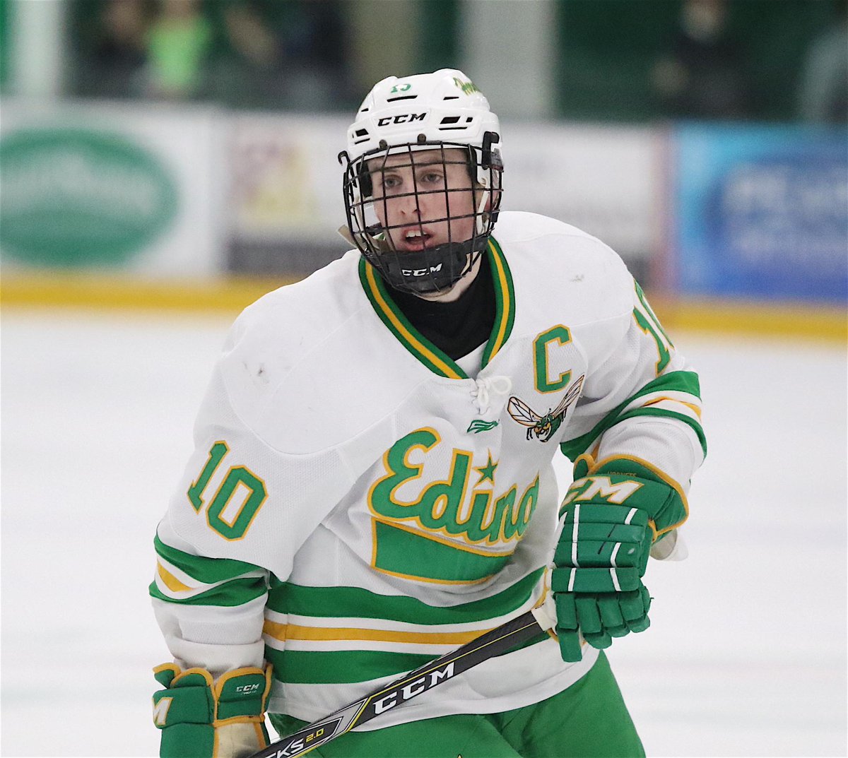

The women's team also has fantastic whites
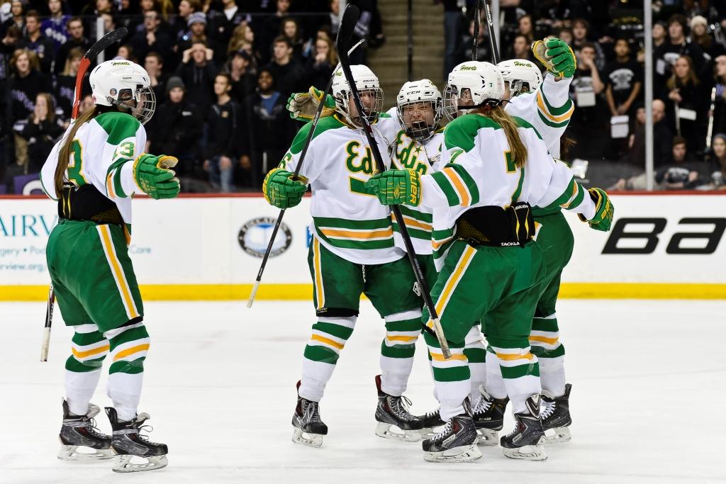
For being the most hated school in hockey, and maybe even in Minnesota, the Hornets are the best dressed team in the State...
They 100% are the most hated team in the state, which just makes it so much worse that they look better than almost every team on top of being dominant...
I would also throw Duluth East, Moorhead, Roseau, and the previously mention Cloquet along with Edina to make my top 5 looks in the state
Duluth East


Moorhead


Roseau


Cloquet


-
1
-
-
On 1/30/2019 at 2:51 PM, MJWalker45 said:
https://www.uniswag.com/blog/retro-weekend-for-pitt-athletics
Placing here because this fits better here than in college basketball. All of Pitt's teams will be wearing blue and yellow this weekend.

Why they don't just go back to this full time is beyond me
-
2
-
-
That Wild jersey would have been a great 90s alternate, but not so much for a new one.
-
1
-


Alternative Football Universe: Lega 1 (Summary)
in Concepts
Posted
The Iberaliga logo is beautiful, can't wait to see the clubs!