-
Posts
376 -
Joined
-
Last visited
Posts posted by andregunts
-
-

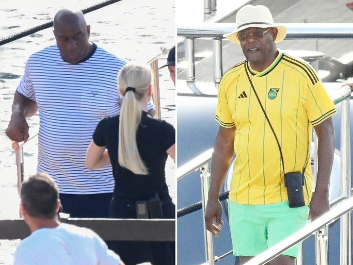
Samuel L Jackson rocking new Reggae Boyz kit, big match against ? Mexico later
-
 1
1
-
-
So I was at the adidas store NYC 2 days ago and I saw the Mexico women’s away and I was tempted to buy it but I decided not to because the men will never wear and then tonight I turned on the Haiti vs Mexico game and lo and behold. I’m going back to the store asap, that jersey is fire
-
 3
3
-
-

Brazil in black
-
 1
1
-
-
Argentina is playing Australia in a friendly and they are using Chinese characters for their names. Very different

-
im here to talk about kits and im like something isnt right, keep it going my man
-
On 5/30/2023 at 12:47 PM, aawagner011 said:
I am a bit confused with the new USA kits.
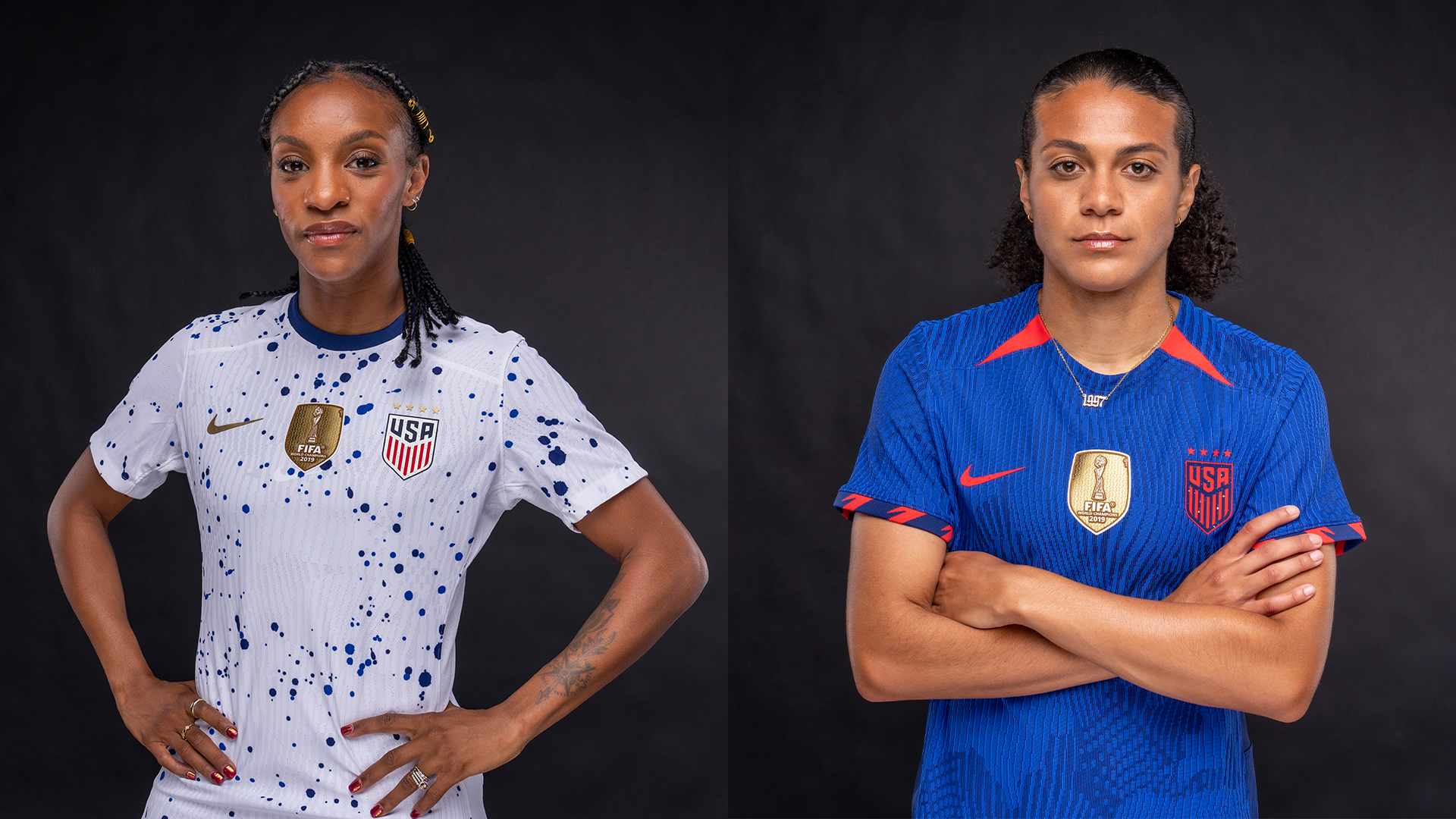
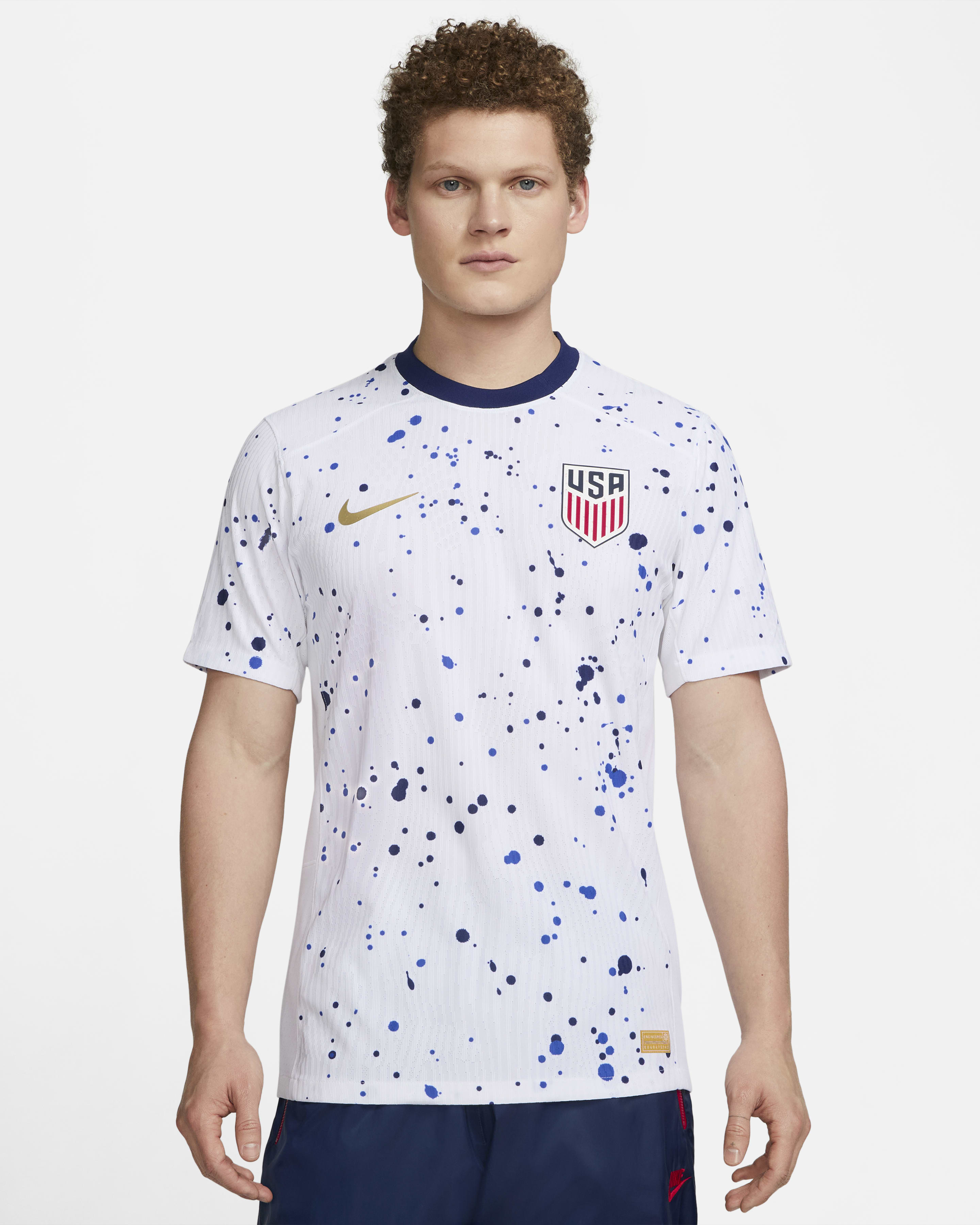
When they were revealed a couple months ago, they said the white shirt would only be worn by the women while the blue shirt would be shared by both the men and women.
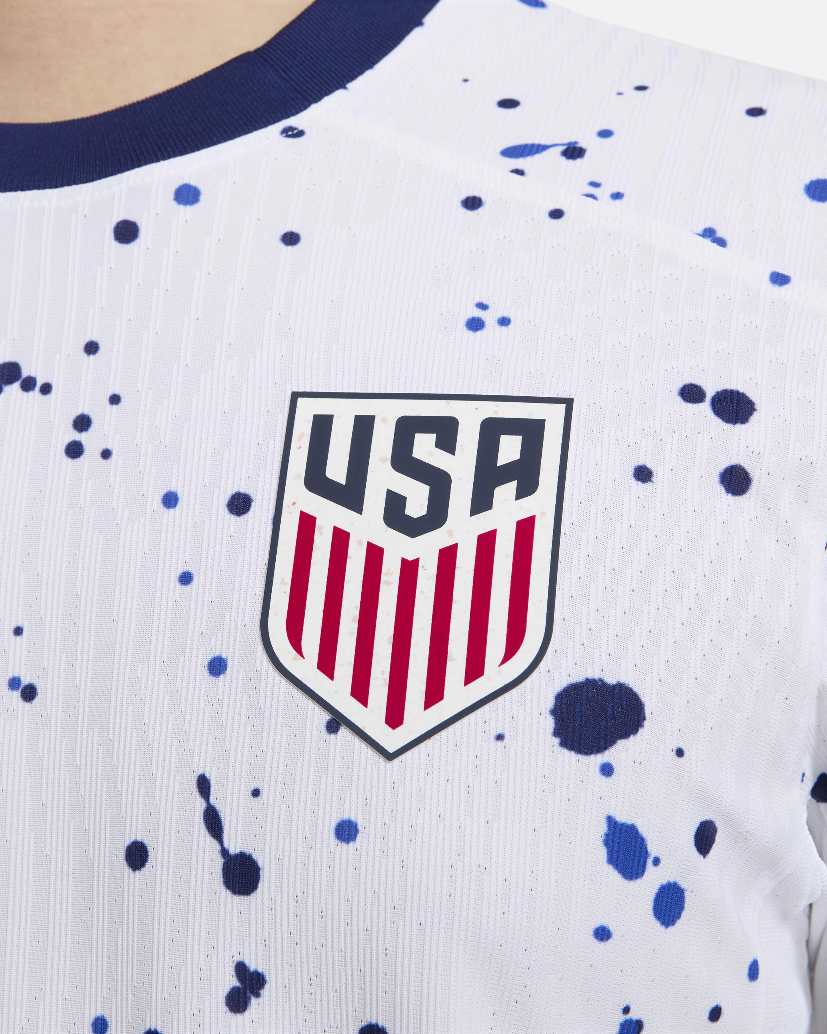
However, Nike now has an authentic match issue shirt listed as “coming soon” in a men’s cut without the gold women’s stars above the crest. It looks like a men’s only design.
Damn, I might buy...
-
13 hours ago, raysox said:
Here is the roll out of the city specific branding + motion package. Still not defending the literal PNG but this is super bold.
Whatever that was I loved it.
didn’t I tell you guys to be a little patient
-
 1
1
-
 1
1
-
 1
1
-
 2
2
-
 1
1
-
-
Guys it’s not 1930 anymore with a simple logo. Let’s see how the whole thing plays out and then we’ll see can look back and critique.
-
 1
1
-
 1
1
-
 2
2
-
 1
1
-
-
32 minutes ago, MJWalker45 said:
I think they should have done more work than what this is. Like I said earlier, there are plenty of logos that had to integrate multiple countries in Europe that they should have dug into for inspiration. The final logo looks like what you hand your design team as your starting point. It shouldn't have made the final cut. Changing the colors around the logo won't help this look any better.
Listen I get it, when you look at the initial logo at face value I was disappointed as hell too, but remember this isn’t just a simple “logo” this is a “visual identity” with multiple phases, the little promotional videos I have been seeing for the host cities I’m actually very excited with the way how it’s presented.
if for 2030 it’s the same template then I will be upset but I think for this one they are trying some other new things, just be patient
-
 3
3
-
-
Guys, I kinda get it.
First World Cup with 3 host, first World Cup with 48 countries. Do yall expect the same statis logo like its 1966 in England. I KINDA get it, Each host city will have its own color scheme and when you put them all together they will have this big colorful logo.
Not excusing FIFA, but they are trying a different marketing scheme.
I just dont think its the end of the world like some folks, and Im a guy that has went to 3 World Cups. So dont think im an outsider
-
 1
1
-
 1
1
-
 6
6
-
 1
1
-
-
In life you will learn to accept things for what it is

-
1 hour ago, Dnice said:
I don't get the push to introduce these so early.
the Wizards did the same thing too with their cherry blossom jerseys last year-
 3
3
-
-
so I live in Brooklyn not too far from the arena and I’m 38, black and kinda “urban”
I’ve realize this thread is filled with people “not” like me.
You guys cry and whine anything different and too loud. I knew from when I first saw it that when I came in here it’s gonna be a bunch of crybaby nonsense.
I LOOOOOOVVVVVVEEEEE THIS JERSEY.
what do you guys want another black/white Jersey that is almost identical to every other jersey that the Net has?!?!
remember this is a “city” jersey not the barn rural antiquated jersey.
its audacious and bold and I think it’s FIRE.
Keep crying guys, things are gonna get more different going forward

-
 14
14
-
 6
6
-
 1
1
-
 1
1
-
 1
1
-
 5
5
-
 1
1
-
 1
1
-
-
@MJWalker45 - youre right
Its never a one size fit all, some nations men and women wear the same kits, some they share one kit, some the men just wear the womens kits once.
-
Just want to confirm that all the Men will be wearing the same kits right?
-
ADIDAS CAME THROUGH

-
 1
1
-
-
-
-
 1
1
-
-
I hope to Jesus that they dont have that annoying "3" logo on the front of the kit, so annoying.
-
Got the away one last night too


-
 2
2
-
-

Got it -I was drunk as hell last night too btw
-
 3
3
-
 3
3
-
-
My favorite combination is Y/B/B I have only ever seen them wear it once


-
@MJWalker45 dont start me up bro
-
 1
1
-
-
13 minutes ago, Berlin Wall said:
Will they wear green shorts at home? They ever did that?
I have never seen them wear green shorts EVER too.










2023 International Soccer (National Teams)
in Sports In General
Posted
FIFA screwed Haiti today in WWC against China