


Gothamite
-
Posts
36,227 -
Joined
-
Last visited
-
Days Won
277
Posts posted by Gothamite
-
-
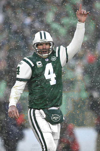
It's gonna be even weirder because he's going to wear a New York Titans uniform this season.


That's the one I'm buying.
-
And, not surprising, a whole lotta overlap between that list and the one that Sports Illustrated put together that kicked off this thread so long ago.
Different photos, though. I'll give 'em that.
-
Is that honestly the best photoshop job that the Sporting News can do? That couldn't have taken them more than a minute...
Hopefully EA Sports will do a better job when they issue their downloadable replacement covers.
-
Because he's two-timing them again?

-
And that's the funny thing, isn't it? I sat in the stands and saw Hank Aaron at the plate wearing Brewer blue and gold, so that's how I'll always think of him. Depends on your perspective.
Back to Favre photoshop jobs, Sporting News put up these covers for those who like their video games to be au courant. Print 'em up and apply to your snap case:


-
I'll do the honors...

That's pretty good, but this is the one I'm waiting for:
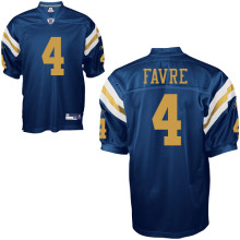
Just as soon as the Jets' online shop comes back up (crashed a couple hours ago, and still down)....
-
Super Bowl III was a great moment in time, but other than being lucky that the Colts offense had their worst day when the Jets defense had their best day
Any given Sunday, my friend.
Joe Willie Namath took the opportunities he was given and made the most of them. Nobody can diminish that.
Many people have said as much about three or four of the Patriots' regular-season victories last year, and they have been right. But if they had sealed the deal in Arizona, that wouldn't have mattered in the slightest.
-
You think "Jets" is a modern name?
To me, it just screams Fifties and Sixties. The Jet Age and all....
-
And that might be the worst of all possible worlds.
They should use the number font the players wore. Bad enough to use the current number font, but one that is neither?
And while we're on the subject, some of those retired numbers are questionable - seems to be more about dying early than being an outstanding player. Is their stadium under a power line or something?
-
Plus, keeping the correct logos from the time the team won them is a must as well.
That's what I hate about the Brewers' retired numbers. Hank Aaron didn't wear that goofy font, why should his retired number be saddled with it?
-
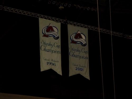
This one makes my head hurt. There is only one Stanley Cup champion per year.
Yeah, but there are many players on the team. Isn't "Champions" standard usage? Does any team use the singular in its banners?
Or are you talking about "1996 Champions" v. "1995-96 Champions?"
-
Yeah, but you've got to take some consolation in the fact that he sold his soul to win a ring that he didn't get.
-
Maybe, but I'm not really seeing that.
It certainly doesn't seem likely enough to motivate giving him the 'c'. More likely that they actually made him the captain for the game in recognition of who he is and what he's accomplished.
-
The thing I noticed is that they bothered to give him the "C". Why not let the regular guy keep it, for such a one-off appearance--jersey sales?
How would Mario Lemieux wearing the "C" affect jersey sales?
-
EDIT: Double post, so I guess I'll take up Chris' challenge:

Ten points for me!
-
FWIW, here's the original thread.
Inspired by the same SI piece, and running 25 pages....
-
Where are the lights? I don't see them in the picture.
Good catch.

Apparently the park is radioactive, providing its own internal glow.
-
Hate the netting, for the same reason that I hate Miller Park's roof - it's never really gone, even when retracted. It dominates the park.
I don't see how that system of cables and lines could help but be obtrustive, even when the tarp is rolled back. It'd be like watching a game under power cables.
-
-
Nope.
St. Petersburg is on the east side of a peninsula, bounded on the west by the Gulf and the east by Tampa Bay.

This stadium would open to the Bay, so no sun issues during evening games.
-
This comes up every now and again - I love this thread.
Mike Piazza as a Marlin always looked strange to me, but since he's become a journeyman it's less and less odd.
Funny, though - as a kid I watched Aaron play in a Brewers uniform (both at home in Milwaukee annd on the road in New York), so it looks somehow wrong to see him in anything else.
-
Just a vision of what a new domed stadium in the Tampa Bay area might look like.
Logo related so to stay on track, it says "for the Tampa Bay Rays...".
OK Gothamite, start you usual diatribe about how bad the Tampa Bay area is and how great New York is.

I have said no such thing, but don't let reality get in your way. They certainly didn't.
Yes, that would be a good stadium, and yes, the clamshell roof is very reminiscent of Miller Park. But all the wishful thinking in the world can't solve the two basic problems: 1) Tampans say St Pete is too far away, and 2) the team has a lease with the city of St. Petersburg. This fanfic doesn't even try to address them.
And how is this logo related, exactly?
Just because they use the new name? In that case, will we be treated to a long list of posts featuring newspaper articles on the team's transactions, roster, standings, and results? I think you might get a better response if you posted it in the proper forum - and I say that about many non-Tampa Bay threads.


Players in the "wrong" uniforms
in Sports Logo General Discussion
Posted
Bingo!