


throwuascenario
-
Posts
378 -
Joined
-
Last visited
Posts posted by throwuascenario
-
-
3 minutes ago, WSU151 said:
Agreed, but with that said, it's still a decent concept if the current logo is used.
I agree. I'd love to see the Cardinals add yellow to their scheme. The only thing egregious about the concept is the gradient number on the white jersey.
-
 3
3
-
-
I hate navy as a color for sports branding. It's just too bland and adds nothing. Other colors don't pop off navy like they do black and it's too boring to carry a scheme by itself. All teams that use navy would look better with either a lighter shade of blue or black. The only teams that should use it are ones that always have historically (Yankees, Red Sox) but even they would look better in black and it wouldn't even be that noticeable with how dark of a shade they each currently use.
This goes double if there is no secondary color, just navy and white.
Another one, unrelated:
I like the idea of a templated Super Bowl logo. It gives the game a cohesive brand and the similar patches tie all the games together. I don't love the execution, but it could be worse.
-
2
-
 2
2
-
 1
1
-
 1
1
-
 2
2
-
-
On 2/4/2022 at 3:42 PM, DCarp1231 said:
Not mine, but a coworker’s unpopular opinion-
“The Packers colors suck”
(He’s a Packers fan)
The only stipulation to have colors that don't "suck" in my book: have exactly 2 of them. Not counting white. If you do that, you literally can't have terrible colors. Not to say you can't have a good scheme with 1 or 3 colors, but it's not automatic like 2.
In other words: all bad color schemes in sports have either just one color and white or have some combination of 3 or more colors. But some do make it work.
-
1
-
-
Does this count? Same design but different template. Madden counts them as entirely different uniforms and the striping in particular does look clearly different.

-
4
-
-
23 hours ago, MJD7 said:
This is @nate.sweitz’s NFL Redesign series:
One of my favorites on the history of these boards, as well.
Any Cardinals redesign that involves changing the logo is a non-starter for me. Their logo is completely perfect now and should never be messed with again.
-
8
-
2
-
1
-
-
16 minutes ago, sayahh said:
The whole point was to get rid of any Native American imagery, which is what they promised to do. Removing the feathers and leaving the R within a circle would have visually made them "the Washington Republicans."
Reminds me more of
®
-
1
-
-
1 hour ago, Sport said:
Wow I never really noticed that. Some quick research shows that when the Patriots won at Arrowhead in 2018 they held the trophy presentation in the locker room. Looks like the Bucs got their trophy on the field at Lambeau last year so I guess last year.
I know a lot of people who went to Kansas City for the game and they said the Chiefs cut the audio and turned off the video on the scoreboards so they couldn't hear or see the trophy presentation. That's some poor loser bullshirt if you ask me, which is weird because everyone said Chiefs fans were overwhelmingly nice before and even after the game.
After thinking about it more, I wonder if it’s COVID related. Just no as not to cram so many people into a small indoor space. As for why they ever did it in the locker room in the first place, that beats me. It always looked so weird on TV.
-
2 hours ago, dont care said:
Do you not see the Rams horn? It’s the same concept.
Not as a 3 dimensional image. Unlike the Vikings helmet though, the horn (at least the old one) looks good even as a 2d image.
-
Not sure this is the right thread for this, but:
Does anyone know why the Bengals had their trophy presentation after the AFC Championship game at midfield? For years, they've always had it in the locker room if the away team wins. I never really understood the rationale for doing that in the first place nor for changing it now.
-
With Harbaugh announcing he's staying with Michigan, it looks like my Panthers are stuck with Rhule for another year. It was a pipedream, but I really thought we had a shot at excising that cancer from our organization. Oh well, I guess we'll have to wait a year. Sadly, this means we have virtually no shot at bringing Cam back and do have a realistic chance of running it back with Darnold. May as well just skip to 2023.
-
1
-
-
I have never, ever been able to get my brain to see the effect that they're going for on the Minnesota Vikings helmets. I know what it's supposed to be, but I just can't make myself see it as a 3D image. I've tried many, many times. For that reason, I do not like it as a helmet design. Their logo would look a lot better on a helmet.
-
The name isn't the worst possible option, but it's on the shortlist.
My order of names I heard (best first): Pigskins, Washington Football Team, Wolves, Red Wolves, Red Tails, Commanders, DCFC.
Uniforms are absolute trash. They didn't need new uniforms at all and already had among the best in the league. They're now in the bottom 3 of overall sets and have 2 of the 5 worst standalone uniforms in the league. If I was a fan, I would've switched to the Ravens this morning. There's always hope a bad uniform set gets changed, but you're never coming back from "Commanders".
-
4
-
-
1 hour ago, joekono said:
Should have taken the feather off spear(as to not insult the American Indian), call them the "Washington Warriors", done.
I like their most recent uniforms 100x better than these. Which seems like an unpopular opinion here. The yellow looks so much better than the gold and the outlined numbers are a lot better.
-
9
-
-
4 hours ago, Ridleylash said:
Unfortunately, the problem is with it in place a lot of the popular throwbacks that would need new shells just can't happen (like Bucco Bruce or Pat Patriot), so it's kinda a lose-lose situation.
Those teams are welcome to go back to those identities at any point. Until then, they should wear the brand that they've chosen to represent their team.
-
16 hours ago, BBTV said:
Some of the color rush matchups were worse.
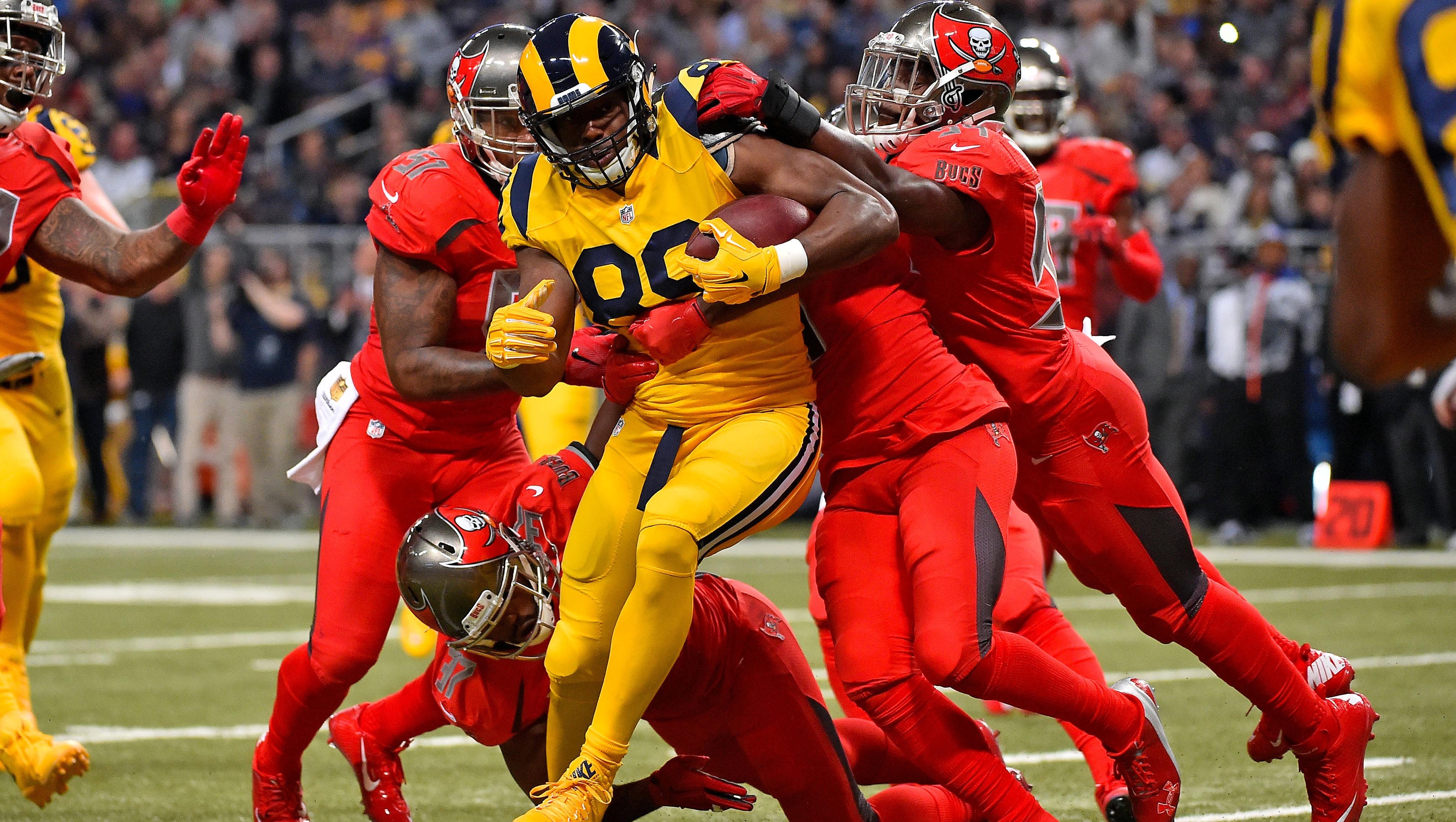
I don't think any of these are nearly as bad. The most recent Rams-Cardinals game combines two horribly designed uniforms with the bonus of monochrome. Plus bone. Plus red numbers on BFBS jerseys. All of these above have at least one team in a decent jersey if nothing else.
That Cardinals - Vikings matchup above is right up there though.
-
3
-
-
On 12/12/2021 at 8:47 PM, dont care said:
Right, they don’t look like the lightning because they look like the maple leafs
If they came out with those Day 1 as a franchise, that would be their identity. That's just what the Lightning would look like. No one would care that they sort of look like the Maple Leafs. That doesn't change the fact that they're horrible, bland, uninspired uniforms. But that's a different issue.
-
 1
1
-
-
On 12/11/2021 at 4:41 PM, KittSmith_95 said:
I agree with this, however, I do prefer when clubs have distinct shades of certain colours if they share colour schemes. There's no reason for the Lightning to use the same shade of blue as the Leafs, for example. Why couldn't they go back to the brighter blue of yesteryear?I would argue that the Lightning look bad - not because they look too much like the Maple Leafs - but because they don't look enough like the Lightning.
-
1
-
-
18 hours ago, LA Fakers+ LA Snippers said:
No.
And those are just a few examples.
I don't think any of those are particularly good uniforms, and all of them would be much better with a single outline. The only one that's even close is Dallas because it matches their logo. But I still think that a white number with silver outline would look better. On all the rest, the numbers look small and weak. Look at the Dolphins' change a few years back and how much of a difference a single outline can make.
-
1
-
-
This would only really be an unpopular opnion around here. But I don't think that every single team in each league needs to have a completely unique color scheme. I think it's fine that the Oilers and the Islanders used to have similar color schemes. Or the Penguins and Bruins. Or all the navy/red teams in baseball (although I hate the color navy in sports branding, but that's a whole different topic). If two teams look right a certain way, there's no reason for one to change just so that they're different.
-
9
-
-
On 12/6/2021 at 6:39 PM, DTConcepts said:
Not sure how popular or unpopular this is, but the Islanders look better with double outlines on their jerseys.
I hate the floating outline. I don't like a contrasting double outline either. Nor do I like a single color number. Exactly one outline is how every jersey, in every sport should be.
-
7 hours ago, DoctorWhom said:
Cam had like 8 TDS & 10 INTs last year. I think you're exaggerating how good he was.
Also I think the Patriots are better than their records shows. They could easily be 3-1 or 2-2 right now if Harris didn't fumble or that FG went through.
Mac is still a rookie so he does deserve a bit more leeway than a veteran like Cam. But regardless, the fact is you can't really blame him for these losses. If it was Cam,
1. He doesn't throw 20 straight completions for the go ahead score.
2. Even if he does, they wouldn't be blaming him for the loss or the bad start because those losses (outside of NO) were really damn close games and weren't lost because the QB played bad.
Cam had 20 touchdowns last year. It makes no sense to exclude rushing touchdowns. Mac Jones is on pace for 16 touchdowns (less) and 16 interceptions (more). I'm not saying Cam was great last year, but he was better than Mac Jones has been so far in every conceivable way. With a much worse supporting staff.
They chose to start a rookie over a veteran, so I don't get why that would change anything. I'm not criticizing Jones, I'm criticizing Bellichick/McDaniels.
These are the facts. The Patriots are scoring fewer points this year. The Patriots are winning fewer games this year. Mac Jones is on pace to score fewer touchdowns while throwing more interceptions this year. I just think the way that that those facts have been spun is funny.
-
1
-
-
19 minutes ago, DoctorWhom said:
I don't understand what your problem with Mac is. As a rookie QB he's done just about everything you could ask of someone in his position.
He outplayed Brady while being under far more pressure than he was all game. I doubt many (if any) of the rookie QB could have done better. Fact is he is playing better than the QBs taken before him.
The losses so far haven't been on him, at least not entirely. Miami was a game they 100% should have won, but fumbled it away. NO was just a bad game all around, and against Tampa again he did everything you could ask of someone going against Tom Brady. It's not his fault the Patriots were held to -1 rushing yards.
I don't have a problem with Mac, I just don't think he's done anything to validate the Mac over Cam decision. The Patriots scored more points per game and had a higher winning percentage last year with a roster that clearly wasn't as talented. I also think that if Cam had started this year and had the Patriots with the 27th ranked offense, everyone would be talking about how washed up he is. But when Mac does it, he's heralded as the next king. It almost seems like the narrative was written before the season and was going to be applied no matter what actually happened on the field. No matter what, Cam was going to get crucified if he had started and Mac was going to get every excuse imaginable thrown his way.
The Patriots are on pace to go 4-12. At what point does that become disappointing? Year 2? Year 3? Never?
1 hour ago, hugevolsfan said:Could Cam do better I seriously doubt he would as the Pats offense did not really fit him well.
Cam did better (points scored per game) in the exact same offense last year (except for not having their current top 3 receiving options).
-
3
-
-
12 minutes ago, DoctorWhom said:
Patriots have played some pretty stingy defenses, so I don't think it's entirely their fault. Biggest factor I think is not having Trent Brown. That Jets game was the only one he played in and since then he's faced a significant amount of pressure.
At this point I would 100% take Mac over Cam. Cam couldn't throw for crap & made a lot of dumb decisions. Mac is far more smarter and accurate than Cam was. Personally, I think he outplayed Brady despite the loss. Though of course the fact that Tampa has no secondary & Brady was unusually sloppy also played a factor.
Say what you want about Mac Jones, but given how he's played, what rookie QB would you rather have over him?
Cam had arguably the worst receiving corps this millennium last year. He didn't get any excuses from anyone so I wouldn't give Mac any. I don't know, I just think if Mac was so much smarter and so much more accurate, they would score more points or win more games than they did with Cam (neither of which are happening). And it's unfair to compare him to other rookies, because he wasn't competing with a rookie. He was competing with a former league MVP who by any measure has outperformed him in a Patriots uniform so far.
I would take Lawrence, Lance, or Fields over him. I feel like the others have so much more athleticism that gives them room for improvement. Jones is far closer to his ceiling and the Patriots offense has been basically horrible. A lot of that has to fall on the QB.
My main gripe is with his hype though. If announcers want to point out that it's his rookie year and he'll get better, okay. But to act like he had a fantastic game that Patriots fans should rejoice over when they scored 17 points is crazy.
-
3
-
-
I don't understand Michaels and Colinsworth's love for Mac Jones for the life of me. Am I missing something? The Patriots have the NFL's 27th ranked offense and are 1-3 with their only win coming against the Jets. They're averaging 18 points per game. Didn't he throw 3 picks last week? Cam at least had them .500 last year with no receivers and no defense. I can't think of what more he would have to do to prove everyone who wanted him over Cam wrong. Someone please help me out.


NHL Anti-Thread: Bad Business Decision Aggregator
in Sports In General
Posted
May have already been discussed, but has the NHL actually said why they're so deadset on making it work in Arizona? They have no arena and minimal fan support. There would be practically nothing to lose by moving. There are plenty of cities that have an arena already ready and none could really do worse in terms of fan support.