


pelicanfan
-
Posts
704 -
Joined
-
Last visited
Posts posted by pelicanfan
-
-
Clippers just revealed their rebrand. Thought i’d add some of my own pizazz to the court

Of course used their brand new logo at center court and wordmarks on the sideline. But i also added those flag emblems they use running down the baselines. as well as a nautical compass silhouette on the wood. i also had the idea of making the paint blue on one side and red on the other. inspired by their (once was) asymmetrical use of red and blue on previous jerseys
-
 8
8
-
-
2 hours ago, Telemundo219 said:
Surprised not by the rebrand but even the early reveal.....the early random reveal.
Overall I'd give this an 8/10. Most of the logos (the alt ones) are great. As mentioned above, the main logo looks like a cruise ship. Maybe if they were in San Diego, it'd be ok.
As for the uniforms, the white one is the best of the bunch. I think with both the red and navy jerseys, the wordmark and number colors should be switch (i.e. white clippers on navy and red numbers, white clippers on red navy numbers). Love the use of the nautical flags on the jerseys as well.i really like that side design they got going on with that jersey. no idea why it doesn’t carry onto the white and blue jersey. and speaking of which, i wish they opted for a light blue jersey instead navy blue one. too many navy jerseys in the league IMO. could have gotten our first return of a baby blue team since the grizzlies
-
anything is infinitely better than what they’ve had for the past years. i like the old school look. the logo looks kinda amateur-ish in my opinion but again, anything is better than what they’ve had. my only actual gripe is the use of navy. looks way too much like what the 76ers have been doing in recent years. and i’ve always said navy has been taking over the league just as much as black. it’s like a double edged sword
-
2
-
-
personally i think it would have been better if they brought back a jersey kobe actually wore. kinda like what the warriors did in their last regular season game at oracle. the gold wishbone jersey would have been a no brainer here. but i get this decision as well.
--
also since no one posted it yet. grizzlies decided to come out with a new alternate court midseason.
personally i dont like seeing grey courts anywhere outside brooklyn. aside from the tournament courts this is like the 2nd-4th time a team has come out with a grey court since the nets made it a thing? (mavs, cavs, okc, grizzlies)
-
4
-
 1
1
-
-
thank you so much everyone! glad you guys enjoyed my work
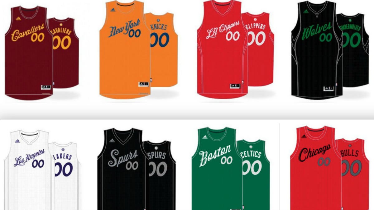
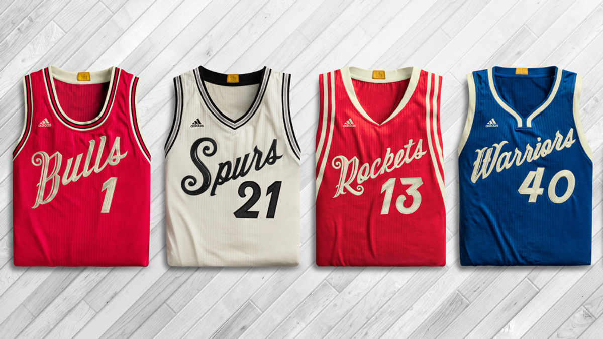
19 hours ago, MCM0313 said:Could we see a neon green jersey concept?
I had a few ideas but didnt think anyone would actually wanna see a neon green jersey lol. but since you asked i'll probably add them and whatever other ideas i have as time goes on. i've got quite a few more
-
1
-
 1
1
-
-
If you’re someone who pays attention to the Pelicans, you may have heard fans raving about this year’s City Edition line. To a point where many people are calling for the team to even rebrand into the theme. And honestly, its for pretty good reason. I’m not one to be impulsive but I really do think the Pelicans hit the mark this year and now have a great opportunity to rebrand (and i rarely give props to this team’s marketing.)
Purple and green is a color combination rarely used in sports. Let alone purple, *lime* green, and black. Not only is this so unique in terms of sports, but it also speaks to the VooDoo and supernatural culture of New Orleans. It’s something i never thought of before and I personally find it way better than the surface level stuff the team has done like Red-White-and-Blue and Mardi Gras. RWB is just way too commonly worn and Mardi Gras just looks odd outside of Mardi Gras season. So alternatively I think this spooky VooDoo theme would be the perfect concept for a rebrand.
So with that being said here’s my take on what a Pelicans “Skelican” rebrand would look like. Credit goes to the team for the coming up with the basis of all of this. I’m just branching off it.
So for the wordmark i actually had to recreate the font myself. The font the team used was a custom made one so i had no choice but to piece together every letter i can find from promotional pieces. i tried to upscale them as much as i can, put them all together on a template, and then put it through an AI font maker to clean things up. So it’s not perfect but it’s close.
For the middle logo, it’s of course the famous “Skelican” logo that many fans have been raving about. I couldn’t find any official file of it so again, i cut it and upscaled it myself. fun fact: there's still no official file of the logo anywhere so when you google for the Skelican all you can find is my edited version lol
And for the third logo, i have no idea if this would be legally allowed in the real world but i combined the old New Orleans VooDoo logo with the secondary "bird de lis" logo the team currently has. And then adjusted colors accordingly. This probably wouldn’t be allowed but it’s fun to imagine for concept purposes. And i’m sure the team can pull off something like this the right way if they wanted to.
And for this main logo, this surprisingly took a long time to make, longer than anything else here. But long story short, i managed to combine the smaller city edition logo with the bigger official logo the Pelicans have used (up until this year they decided to remove it for no reason) Also added a little drop shadow to the letters mostly so the NEW ORLEANS doesn’t just blend in with the green bones.
And for the jerseys, I actually wanted to do more but didn’t want to stray too far from the familiarity of the city jerseys. I have to admit I was not sold on the plainness of the official jerseys that came out so I added some more striping so the colors can pop more.
For the City Edition jerseys here’s some designs of my own that take a less traditional route. The first one goes all in with the skeleton theme with a bone-like font, pinstripes made of bones, and a skull pattern all around the uniform.
For the second jersey i was inspired by the one of the retro Hawks jerseys with the big bird in front. with how much the fans love the logo i thought this would be a bold but slick way to incorporate the logo and let it do the speaking.
And as a bonus here is my third city jersey concept, this actually came from an old concept I made before this season. As you can see I went for a ghosty teal color to pair with the purple. Added VooDoo doll stitching on the sides and used a haunted spooky font. Then i added the new logos and recolored accordingly
And if you’ve made it this far, congrats. I now lastly present my court design. Personally this is my favorite part as it required the most thinking from me. I was mostly inspired by the current home floor that includes Louisiana nature all around the border. So I took that same design and took it up a notch by using dead trees and *flying Pelican Skeletons* at the top. and at the very bottom of the court is the classic “Let The Good Times Roll” motto in French.
As for inside the court, I of course used the beloved “Skelican” logo at center court and in the 3pt arch’s I added more Pelican Skeletons. Is it a *little* horrifying? yea, but one can say that perfectly fits the vibe of New Orleans
edit: fixing some images that aren’t appearing let me know if there’s any empty pictures
-
7
-
8
-
 5
5
-
-
wow for the entire state of california? that is a LOT.. i know the pelicans do the same thing but y'know, its louisiana.
google says there's 3,892 highschools in california. so i am really eager to see how they will pull it off. i hope they can do it in a way where fans can come in and find their highschool's jersey (like have sections for certain regions, cities, disticts, etc.).
-
1
-
-
7 hours ago, CaliforniaGlowin said:
Looks like I probably won't get the rebrand I was hoping for

like the other guy said i really hope this is just a placeholder design. i’m surprised no one ever mentions this but half the time the clippers play at home they don’t even look like the home team unless they’re wearing their black jerseys.
-
1
-
-
better than what we’ve seen in recent years. the color palette is so much better. but i’m still waiting to see something “click” in terms of design. but this is a nice step in direction. not that bad considering they had to scrap the original jerseys they had in plan in 2021. which i remember not as much people liking but these felt like the last jerseys to really give a nod to the host city franchise
-
2
-
-
late and have no idea if somebody already mentioned this but i was just checking out some highlights of a rockets game from about a week ago and noticed that they actually have the full team name going across the baseline from top to bottom. not sure if this has been around all season or if any other team does the same but at last the world is healing
-
6
-
5
-
1
-
1
-
-
1 hour ago, MJWalker45 said:
Sleeves? No. They had Christmas jerseys before that didn't have the sleeves. They all had a similar wordmark but everything else was close to the regular uniform.
the ones on the bottom row are perfect to me. every jersey just following the same exact template as their base uniforms, except the front is replaced with a christmas style font. that is it. so simple yet effective. doesn’t require a bunch of money to make, saves our eyes from additional brand confusion that city/statement/earned/classic jerseys already bring, and well… fans love em
-
14
-
-
Phew after many hours over the course of about a month or two, i have finally created a whole set of City Edition court concepts for all 30 teams. Normally i don’t do this many. But with so many teams having lackluster jerseys this year I thought I would step in and try to make up for what fans have to go through this year with the jerseys. So yes, a lot of the designs are pretty extra or even weird. I really wanted to go out of the box this year and be a little more experimental with my work. Hopefully you guys enjoy.
(also i included teams that i already posted just cause this will probably create a whole new page and i might as well show all 30 teams)
Spoilerhawks- for the blue part of the court it’s suppose to resemble flying “wind” movements. i was inspired by their marketing pieces for the jerseys
celtics- left and right sides of the court featuring a side design resembling the ones on the jersey. center court are the official city edition logos by the team
nets- kaws made artwork in the arc and logo at center court. aswell as the kaws logo at the bottom
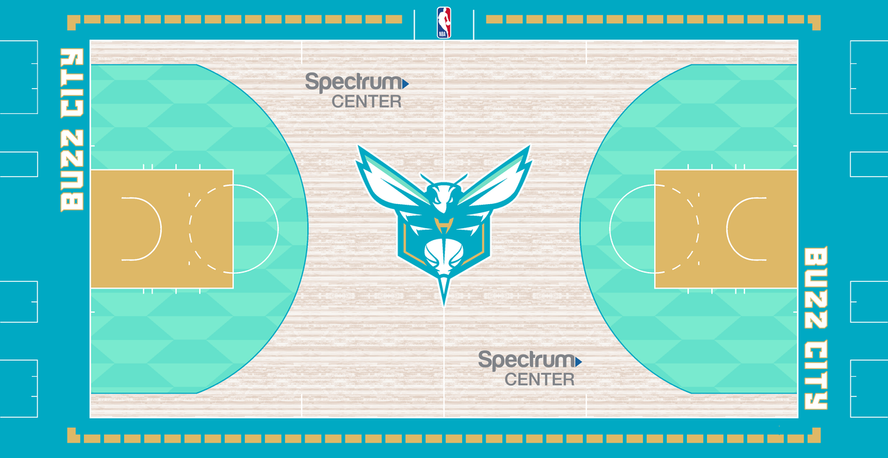
hornets- sort of an inverse of the city edition court they’ve been using. heavy mint and teal palette used to match the jerseys
bulls- really got stumped by them but i tried my best to play into the theater theme by making the top and bottom row of the court look like theater sign lights. also added the “madhouse on madison” with the bull logo
cavs- took the gold pattern from the collar and arms and put all around the court the border of the court
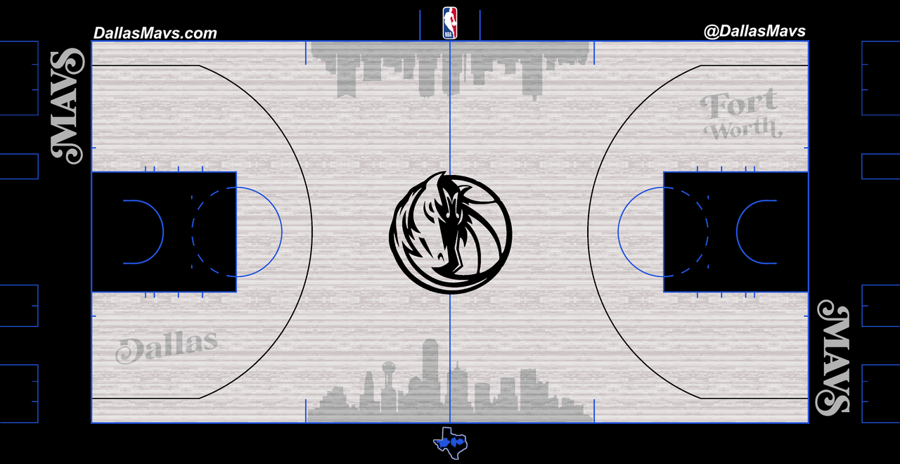
mavericks- wanted to represent both fort worth and dallas in this one court. so i featured both skylines on the court with these official wordmarks from the team feature the city names. also slightly adjusted the mavericks logo to fit the music theme, shout-out to anyone who manages to notice.
nuggets- used the fading line pattern throughout the border of the court and at center court is the giant 5280 logo with the thin mountain lines
pistons- bone pattern throughout the border. and i have no idea if this would even be allowed but i used the BAD BOYS wordmark on the sides. and of course the city edition “Detroit” at center court
warriors- with the warriors having so many black and yellow jerseys/courts, i wanted to switch things up and go no paint in the border and make something more distinct for the warriors. running down the middle of the court is a curvy stripe made to represent lombard street.
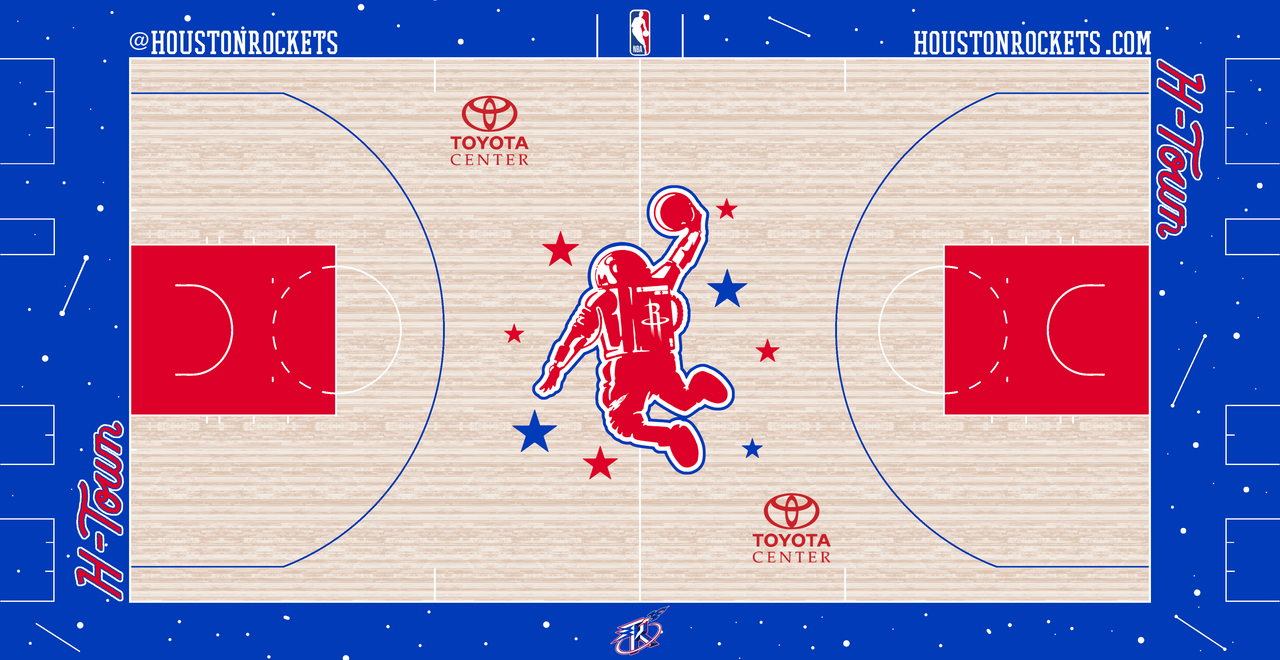
rockets- obviously couldn’t pass up on the space theme, so i went all out with a space design on the border in blue and with some hard researching and editing i managed to get a full cut of the astronaut logo at center court
pacers- paint splatter theme in the border with city edition logos on the sides and center court
clippers- apparently the clippers jersey were going for a cartoony theme on their jerseys this year. but obviously no one could tell so i did the bold move of putting mini cartoon basketballs (designed directly from the jerseys) all over the court. partly inspired by the 90s sixers court that did something similar
lakers- didn’t want to play too much with the lakers since typically they go for simpler designs and it didn’t feel right to do too much with them. but i did use the city edition old school don’t throughout the court
grizzlies- with their jerseys sole gimmick and design being centered around the MEM logo i of course put it all across the top and bottom of the court. i went dark mode with the court featuring an all black and white palette and dark wood
timberwolves- directly inspired by jerseys, more explained in previous post
pelicans- this is just a recolored version their regular court except with it uses their city edition logo at center court and their city edition font (which was actually impossible to find.) and yes this is the second court i’ve made now for the pelicans; the first one was actually just a concept i made on my own before the jerseys came out believe it or not
knicks- for the border i featured a triangular design made to resemble the knicks logo. at center court is their old school logo with the dark shadow. and on the sides of the court are the wordmark with the extra drop shadow. oh and i also added subtle pinstripes in the paint to resemble the jerseys
thunder- i used their city edition pattern all over the floor even on the wood the players step on most.
magic- i greyed out their signature parquet floor to match the palette of the jerseys. i feature their pattern on the border of the court
sixers- inspired by terminal market i used their city edition logo at center court which inspired me to make a line and dot design all around the border
suns- lots of color fading to resemble the jerseys, more explained in previous post
blazers- i really like the old school look that plaid comes with so left most of the court unpainted with the exception of the paint which features the plaid pattern inspired by the jerseys and center court logo
kings- surprisingly they have not used their anniversary logo at all on their courts so i took it upon myself to make an anniversary court for them
spurs- probably my favorite one i tried to utilize all the colors that come with their marketing around the jerseys. with the primary colors being brown and orange. i went for a western look so of course i used all their city edition wordmarking and went for a darker wood
raptors- i used a raptor claw design all over the border of the court and made most of the court primarily gold. the wood also aligns to point up to represent the north
jazz- plain purple court with mountain inspired wood stains that have a fading effect just like the jerseys
wizards- made a rusty design all over the court. their jerseys have a triangle motif so i used a triangle design all over the wood stain of the court
all star court- inspired by the tournament style with the full painted wood. i included some pattern designing on the border that’s often used by the pacers
and some comments on each court design. mostly keeping it short and sweet
-
6
-
3
-
-
14 hours ago, Old School Fool said:
Wondering what the neutral site games later in the In Season Tournament will look like? Here's the court from NBA 2K24. It's exactly what you expect.
Also yes, all 30 courts are in the game during the tournament. Play at your own risk.
i feel like a neutral court shouldn't be red and blue. given the whole concept of painting each tournament court to match the home teams, i feel like this court is just really misleading. i immediately thought this was a floor for the 76ers. even with the "in season tournament" logo at center court. my eyes skipped over it.
-
6
-
-
design aside my problem is that i feel like the tournament courts an extra layer of problem that city edition courts already gave us. the suns have technically 4 court designs now (its really 3 but still.) it just takes us back to the problem of brand identity. i really think they should have just made the tournament courts based on the core brand of each team and not the city editions.
i know people say that the jerseys are the reason why they can't tell whos playing who anymore but i think courts are making their way up to becoming a bigger problem. imagine the average viewer trying to figure out why the pacers play on a fully painted sky blue court, and then a nets style grey graffiti court, and then a plain navy blue court. it's just too much.
-
2
-
-
biggest takeaway for me this year is how the jazz are only wearing their city edition jerseys like 5 times or something. i forgot what the actual numbers were but i recall yesterday looking at their jersey schedule that they're wearing them once or twice a month for like 3- 4 months or something really low like that. huge bummer. saw lots of positive fan reactions and many people saying that those should be their rebranded jersey. and i know for certain the jazz team has seen all those comments. hopefully we'll see these again in the future...
-
1
-
-
using a slogan that involves the word "culture" on a jersey to me is wild. if they were gonna make a move like that i wish they could at least have a redeeming design template. it looks like their regular jerseys but they moved the HEAT name up to make space for the word CULTURE. who wants to spend money on that?
-
4
-
-
15 hours ago, Blindsay said:
Now this right here is some of your best work! Perhaps reverse the smoke and black? Also I have a feeling you got a lot of content to work with now that the Inseason Tourney Courts dropped
thanks! and yea i bet reversing the smoke and black would be a cool dynamic. as for the inseason tournament i was thinking of just carrying on with city edition courts as usual but probably slapping on the trophy logo somewhere for this year's occasion, but then i'd probably have to do that every year and turn this thread into making in-season tourney courts... so i may or may not try to come up with my own nba tourney template and make some tourney courts along with the city editions. hmmm
-
-
City “VooDoo” Edition court for the Pelicans.
despite the jerseys barely even having close to this much color, i thought it was only right to go all in for my team. for the center logo i took the pelicans bird-de-lis logo and merged it with the New Orleans VooDoo logo that was used for the AFL football team (obviously this is some rule breaking but i couldn’t help it) recolored accordingly and went all in with a gradient inner arc design. one side being a purple gradient and the other a ghosty green effect
-
5
-
1
-
-
1 hour ago, BShaw20 said:
Magic release the “city”
good design. actually some color on the collar and arms, there's a little zig zag stripe going down the side, there's a cool little pinstripe pattern all around the base, and the wordmark is unique and has some flair. design wise these are a really solid 8/10. but they suffer really badly from being lost in the crowd of black/dark jerseys this year.
-
3
-
-
57 minutes ago, Digby said:
LockerVision has a shockingly traditional Christmas Day on the books -- every game is Association (white) home, Icon (standard color) away, except for the 8pm EST game where Miami had to wear their red Statement at home (forcing Philly into their white jerseys). The past several years have seen a lot of City Edition showcases on Christmas so I find it refreshing and proper to get away from that on the NBA's ostensible marquee day.
heat and sixers killing my ocd. but everything else sounds good. i wonder if the league/nike is doing this because they actually want to be traditional or if its just because every single team playing on christmas this year is wearing a black/dark jersey with the exception of knicks and suns i think
-
take aways from opening night:
-it’s a shame that the nuggets didn’t bring back the unis they won the championship in. especially now that we know what they’ll be replaced by this season. i dont hate their statement unis but i think it would have held some more value if they just wore their regular icon/asc. jerseys that they've worn for years up to the championship.
-i will never stop complaining about that weird stripe the suns have on the side of their shorts. it looked minor in earlier images but in game it’s even worse. considering how we naturally watch basketball from the side view i don’t like the fact that i’ve inevitably seen that ugly stripe more than i’ve seen anything sunburst
-
2
-
-
what an incredibly disappointing year. these teams and nike have completely lost it. some of them have redeeming potential. like the wizards one isnt too shabby in terms of creativity. but i think we can officially say nike is running out of material and i dont mean just in a creative aspect but also physically too. is nike out of ink or something? i know i said this but every team this year is roughly having a black jersey or a jersey that's in a color they've already worn recently. i was hoping there would be an out of blue color but theres literally nothing. raptors have worn gold for years, jazz and suns are already purple teams (or at least the jazz try to be), the hornets are just wearing teal, etc. etc. closest we got is the kings wearing blue but they already had that same exact red and blue from a few years ago
even design wise everything looks cheap. like the nuggets are just bringing back the same template they used three years in a row from like 2018 to 2021. we already seen how hilariously bad the mavericks and bulls are the way there's absolutely nothing going for them but a name and number. and even then they've managed to screw those up with the terribly small size proportions. same thing applies to a lot of these jerseys. no out of the box designing or anything. everything's just a name and number. maybe lucky to see anything showing on the sides of the jersey.
-
8
-
-
its becoming more and more apparent that this year's city edition jerseys are mostly all in black/navy or a color that a team already frequently wears (hornets teal, suns purple, cavs maroon, and ill even count bucks blue since theyve worn blue for long enough.) the only out of the box jerseys in terms of color are blue for the kings and full on gold for the raptors. but even then we know they've had those colors in their arsenal. raptors especially. is nike just trying to save some money this year?
-
1
-


24-25 NBA changes
in Sports Logo News
Posted
I dont feel like digging up the image or link but it was back in 2019 when the Pelicans hinted at making their Earned Editions of the time a permanent jersey. a fan asked and they replied with some eyeballs emojis so make what you want out of that....
my guess is that they either bring those back or they save themselves some dye and use a basic side stripe template like for their 2021-22 city jerseys (those were decently popular aswell)
or they may just reuse the template that they currently have on hand for their statement jerseys. which i personally hope is not the case because i despise these jerseys and the generic striping....