


pelicanfan
-
Posts
705 -
Joined
-
Last visited
Posts posted by pelicanfan
-
-
Asymmetrical designs on nba shorts

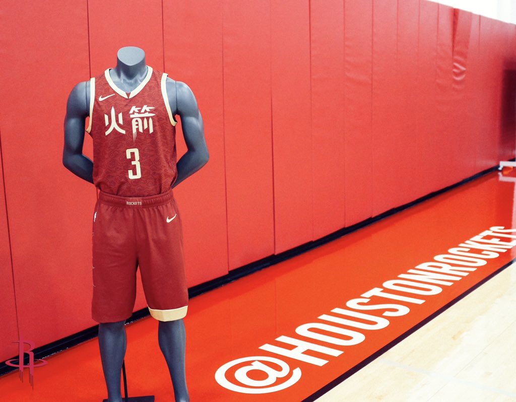
like why? Why would you want only one side of the shorts to have a stripe it bugs me so much
-
 8
8
-
-
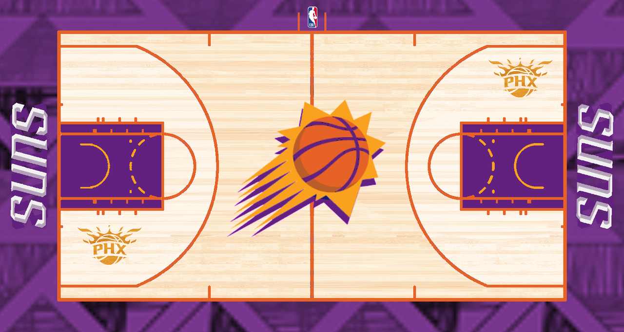
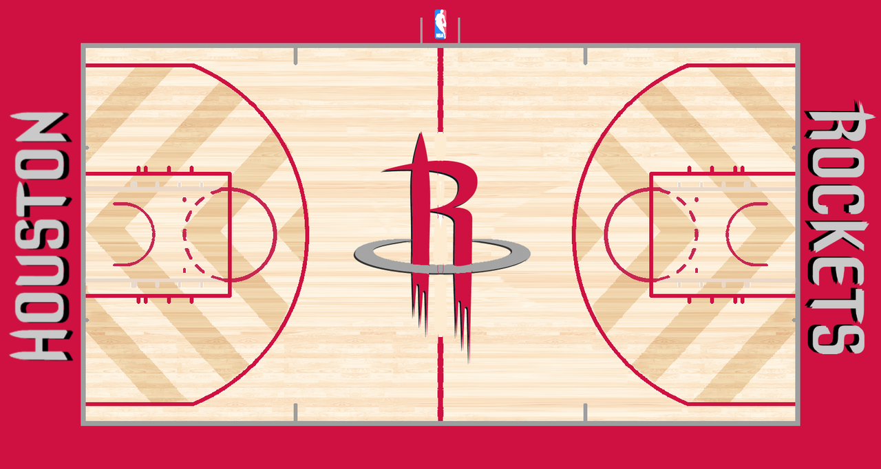
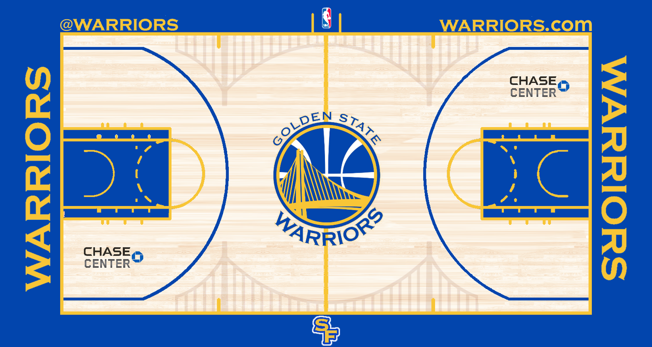
Update: Phoenix Suns
-
10
-
-
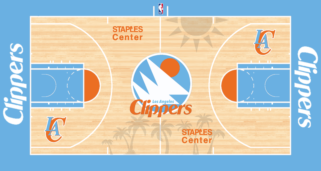
I mainly tried making these based off city edition jerseys or just making a new standard court. I use a lot of wood stain because that’s just my style and it seems to be the trend nowadays. Suggestions and ideas are welcomed.
edit: im making this edit almost 2 years after i started this whole thing. i just wanna say i apologize for how extra and low quality most of these designs on this first page are. i was quite new to the whole designing thing at the time.. i mean seriously, i copy and pasted a sun and placed it onto the corner of the clippers court like a kid's drawing, and slapped woodstain on everything. but nonetheless thank you all for your support and feed back over these years!
edit 3 years later: please just fast-forward to the more recent designs some of these old ones are making me cringe lol
Houston Rockets
Golden State Warriors
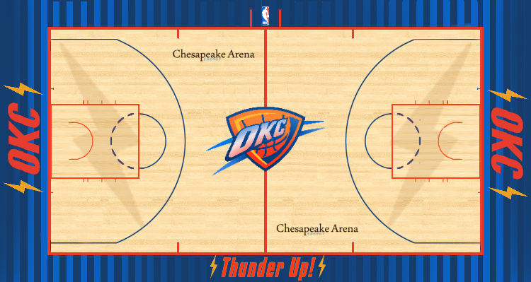
Oklahoma City Thunder
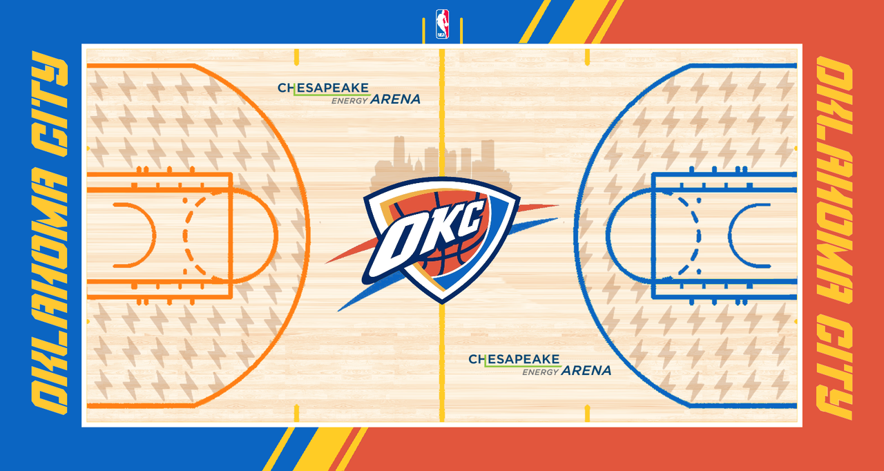
Oklahoma City Thunder v2
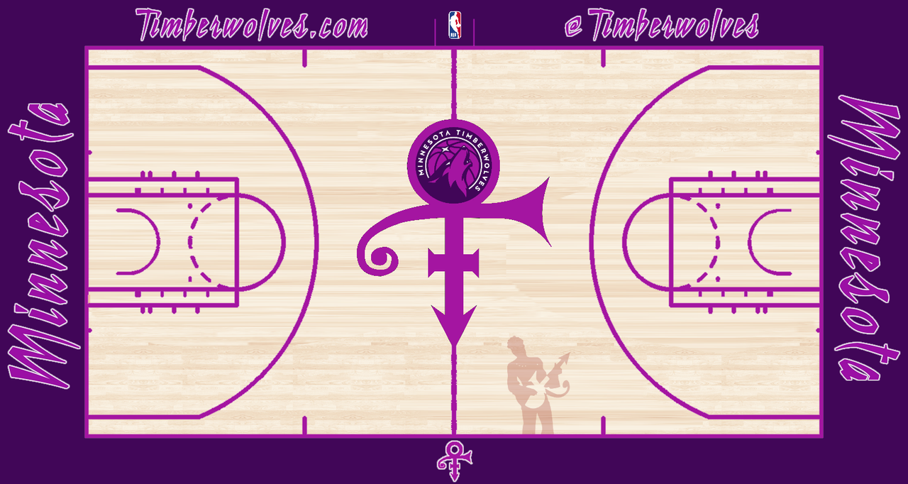
Minnesota Timberwolves
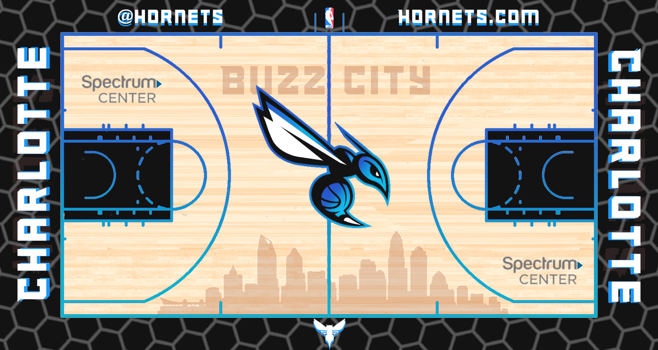
Charlotte Hornets
LA Clippers
Dallas Mavericks
New Orleans Pelicans
-
23
-
-
Anyone know how I can stop getting notifications from this thread? I’m new here. Also here’s my unpopular opinion: I hate the color navy in the nba there’s way too many teams wearing it. I do accept the pacers and pelicans usage of it tho
-
I have a dislike for the nuggets logo. I like their picaxe logo but their main logo that’s on the court just doesn’t work for me. The navy almost looks black and the bright yellow doesn’t really fit well. And then there’s some baby blue which isn’t that noticeable.
-
1
-


Little Things that Bug You in Sports Uniforms
in Sports Logo General Discussion
Posted
Yea those work fine and look great however when it’s tiny stripes or little designs then I see no point of it being on one side. Like these for example