


pelicanfan
-
Posts
705 -
Joined
-
Last visited
Posts posted by pelicanfan
-
-
1 hour ago, Germanshepherd said:
Even Kyle Kuzma, far from a reserved man in his fashion choices, thinks the NBA has gone too far.
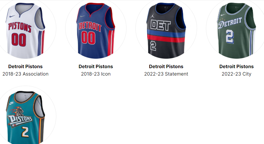
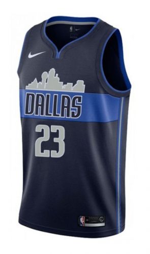
theoretically i dont think the city edition line would be this much of a problem because its only 1 in 4 jerseys changing every year. but once other factors roll thats when teams really start to lose their identity. like the statement editions. those were suppose to be just as consistent as icon and association jerseys but now we have the suns who have the pixel gradient jersey or the clippers with the mister cartoon street style jersey. neither of these teams' statement editions look anything close to their other two core jerseys. add that to the mix of city editions and now we have teams who have jersey sets that are split in half (2/4) with two random jerseys. maybe even more with throwback jerseys in the mix. (ex: pistons last season)

-
 8
8
-
-
11 hours ago, SSmith48 said:
Watching some Nuggets highlights, and it seems the court has a slight change where the hardwood has more color variation in between each of the individual strips. Some are darker, some are lighter. Results in a pretty cool/unique aesthetic, something a little more natural.
Here is last year's for comparison. Note the more consistent finish. And I don't believe that this is just a lighting thing.
wanted to mention this last night but thought id be the only person to notice haha. i feel like the altering wood tiles kinda gives off the illusion that the court is smaller than it actually is. or maybe its a new camera angle or something idk.
14 hours ago, Lights Out said:"Ass" is exaggerating it, I think, but they're very uninspired.
design wise its alright. its got a quirk in the "clips" wordmark i guess. but come on how many dark jerseys do we need? these would instantly look better in red or baby blue or maybe even orange. i see there's a cartoony influence to it, why not go all out with a bright color instead of numbing it down to navy? why not add some more pop on the trim or the sides? why not change the number font?
-
1
-
-
11 hours ago, fortunat1 said:
Looks like Memphis' city jersey leaked at some point yesterday. (Media day shoot + mock up)
i always wanted them to use the MEM logo thing on a jersey but the supporting design is almost identical to the nets once you remove the front...
-
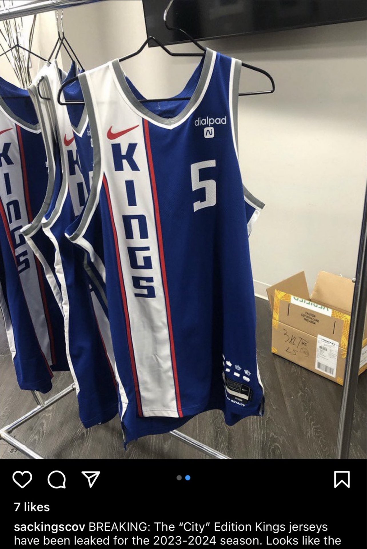
31 minutes ago, SantosD_ said:
Sacramento Kings city edition leaked too
i feel like these jerseys are playing some tricks on my eyes it’s obviously blue but i can’t help but to register it as purple because the piping on the arms and collar is the same exact one from their last purple set. also is it me or is that nike logo bigger than usual?
-
these teams have got to chill out with black and dark jerseys. not even in the sense that "black out" jerseys used to be a cool thing and its lost its magic now. but also in the sense that the whole league is looking more and more diluted. like if you wanna be one of the 20 something teams with black/dark jerseys you gotta at least make some redeeming designs. its really ironic how so far it seems to be the the jazz who are coming out with the least controversial jerseys this year that surprisingly aren't black or minimalistic.
from leaks and releases these are the teams so far coming out with new black/dark grey jerseys: kings, lakers, pacers, rockets (technically), warriors, mavericks, bulls, wizards, and nets (though i give nets a pass since their design is pretty crazy and they're the nets.)
then we're probably gonna get a handful of more (like raptors as always) on top of all the black jerseys that teams already have in their main rotation. like the suns who've made their statement jersey their whole identity this past year or kings who've decided to make their primary color black now...
-
1
-
-
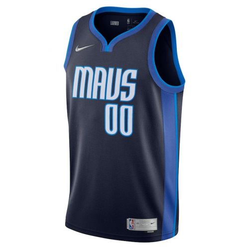
oh boy.....
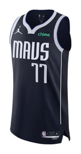
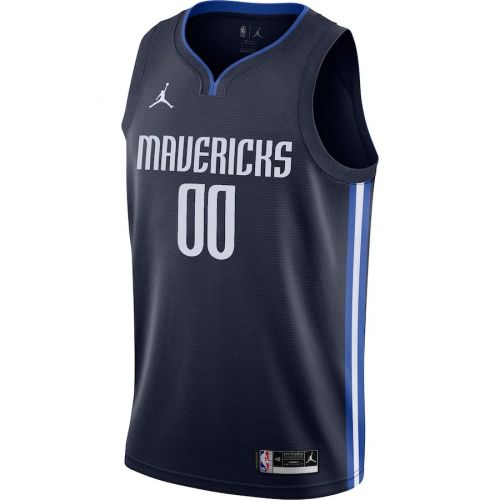
mavericks struck gold last year, bulls last year were solid as always. and now they've both just missed the mark. the mavericks one has some potential with the fancy font but the colors and design are so uninspiring. i've noticed that they just cant pull off dark jerseys no matter how many times they try:
Spoiler
though i did kinda like these:
as for the bulls, i think they were just better off just using that font thats on the bottom corner
-
1
-
-
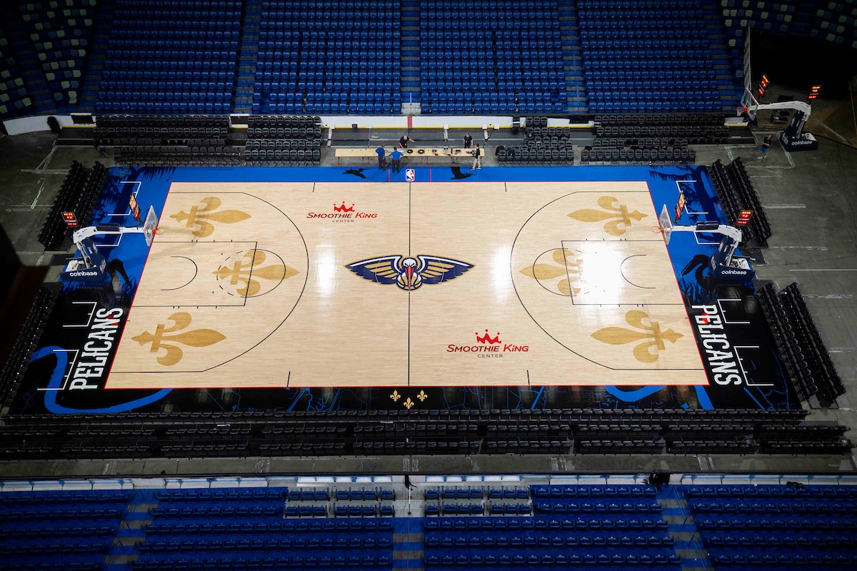
22 hours ago, SantosD_ said:
⚜⚜⚜⚜⚜⚜⚜⚜⚜
thats a lot going on for a regular home floor. but i’m not exactly complaining. might be by far the most jarring court in the nba but again, not complaining. the blandness of their uniforms will surely balance it out. they had the same court design for 9 years up til now, hopefully the jerseys are next to change
-
1
-
-
6 hours ago, Old School Fool said:
I definitely didn't expect a Lombard Street reference. That's at least what I think the inspiration is.
i like the idea, but i think they were better off referencing that street (if they are) through a side stripe design. the text on the jersey looks more wonky than curvy, especially when everything else on the jersey is so perfectly straight.
-
6
-
-
11 minutes ago, pepis21 said:
Yes, but that was becuase those unis were a leftovers from 19/20 season when nike put regular swoosh on retro.
Too bad they didn't use Wing Jordan logo for Hornets classic, but on the other hand Jumpman is a classic logo by itself.
yea i figured it had to do something with that.. living proof that those throwback jerseys were a cover up for that horrendous rebrand.
and yea the jordan wings logo would have looked awesome on the hornets throwbacks
-
i gotta admit the sponsor patches actually add a nice touch to the jerseys. the disney patch oddly fits perfectly with the starry magic theme of the jerseys. and i really like how nike started using their retro logo on all throwback jerseys (except for the jazz last year?)
-
3
-
 1
1
-
 2
2
-
-
is this the first time a wordmarked jersey has not described a team or a city? We've had silly nicknames like buzz city and clutch city or whatever but those still describe a city. "Heat Culture" is neither a team nickname or city nickname. its a whole different thing
also seems like the jersey will be using this font thats all over the heat culture shirts i just looked up
guess for some reason they've established that everything mentioning heat culture has to use this font
-
from what i can see with that little snip of the heat jerseys they almost look like a rockets jersey to me. the pure red on black and maybe the font (especially on the H) gives off that vibe. i dont know how to feel about a jersey saying "Heat Culture" but you gotta at least give it a cooler wordmark if you are.
As for the warriors, i oddly like the yellow-on darker yellow look on the black, just kinda wish they used a better font.
Jazz shorts already looks good as expected, excited to see the full uniform because it could be a glimpse of what the jazz could rebrand to after this past year's mess.
-
1
-
-
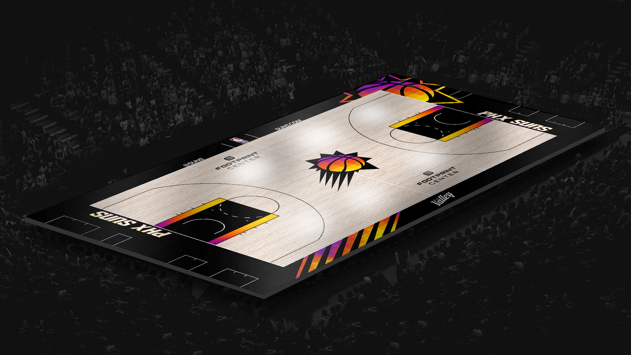
El Valle city edition court concept for the suns. wanted to make this before they officially announce the jerseys which will probably come with their own version of a court
of course all around the court is the gradient theme with colors to fit the new jersey. i got the el valle logo directly from the jersey leak and altered it to fit on court. also added the phoenix silhouette at center court which i thought looked cool and tied into the theme
-
2
-
 1
1
-
-
6 hours ago, pepis21 said:
Someone ask for City leaks? Here comes the Suns:
Imo it might be a really nice uniform.
looks really nice. though a part of me wishes that they continued the native american theme from last year. i wasnt really sold on last year's jerseys mainly due to the fact that they decided to make the front of the jersey their sun logo instead of anything native american. and i was hoping they'd dive deeper into the theme this year to also offset the fact that there's now a blue jersey sticking out of their entire franchise history of purple, black, and orange jerseys.
2 hours ago, Jay_Mellowed said:Wizards new court. They're going with a navy based court, one toned flooring, red court lines, with the ball and monument partial logo at midcourt.
too much like Minnesota for me. also i dont think ive seen a team put their name inside the 3 point arc in a while
-
dont really understand why a court for the suns would be so heavy on the black and dark indigo(?) i mean yea they have the black statement jerseys but the court still feels out of place for their brand because they're not a black and purple team. they're more of purple and orange team with a side of black. if they really like black so much they should have went for a more black and orange court to fit those statement unis they have. also the gradient design seems pretty out of place for the brand too. and no im not counting the pixel gradient design as that looks completely different. though i wish they did use that. because now they've got three separate gimmicks for their core brand right now. you got the sunburst on the icon and association jerseys, you got the pixel gradient on the statement unis, and now you got this kings-like gradient on what seems to be a full-time home floor now (team wearing association jerseys in the pic is why i say that)
i was kinda hoping they'd do something a little old school but also modern since that's pretty much what their new icon and association jerseys are now. maybe something like this:
and if they wanted a black court they could do something like this:
(designs by me don't mind me plugging)
-
16
-
-
full look at suns court
-
4
-
 1
1
-
-
57 minutes ago, NickSixers said:
Sixers jersey with updated drop shadow is up on Fanatics this morning
I feel like its a tad too thick but i mean i guess it doesn't hurt them either? the numbers and letters look kinda blocky but oh well... Also im surprised they still haven't brought back the iverson throwback jerseys yet. maybe just never found the right time?
-
i liked the big pelican silhouette in the arc as well. my only problem was that it just wasn't noticeable enough. like you can barely see it in most games. The overall idea is cool though, and it's been stuck with the Pelicans for nearly a decade now. Seems like the Pelicans are starting to scrap up some of their history. Already gone is the original red unis that was worn for nearly a decade as well and now (possibly) the pelican-in-the-arc court.
also wanted to include that one time the pelicans changed up the contrast of their court for one season. a lot of people said it was gaudy but i digged it, i'll take it over the all yellow looking court.
-
4
-
-
New court coming soon for the Pelicans, about time the creative department of this team stepped up (i've been criticizing them for years already if you dont know.) Also note it says this October. November is when the city editions supposedly unveil so this might mean this is a new full-time home floor. which might be a bit much for a normal home floor but at least the blandness of team's uniforms balance it out. i'm pretty satisfied
-
2
-
-
16 hours ago, SantosD_ said:
City edition jerseys debuting on november 3rd.
ever since the city edition line started to become a problem i always felt like the nba should just have designated days where every team collectively wears their city edition jerseys instead of teams having city edition days all over the place. i know all star weekend and christmas games have been some examples.
and i think it would be a good idea if they just did that for the in-season tournament. let teams run wild for a couple of weeks and have the rest of the season be mostly their regular jerseys.
-
6
-
-
Timberwolves City Edition court i made just s couple minutes after the jerseys were announced. i took the color gradient thst the jerseys have and put it onto the court with a somewhat water (?) design between the blue and white. used their city edition logo at center court. added the “land of 10,000 lakes” slogan at the bottom. and the wood pattern i just thought it would be cool to make it point up as a way of pointing up north (yes i know the raptors did this too) and it sorta resembles the shape of those triangle trees the wolves have had on their jerseys
-
7
-
-
not bad. i’m not sure if they really come off as basketball jerseys to me. and that says a lot when basketball jerseys can have literally anything on them. also i find it funny they did this reveal at a lake or whatever and the jerseys are just so modern and bright they feel so out of place. they were better off revealing this at a corporate office or something. i thought they were gonna do something a old school since it was trees that were initially hinted
i guess props to the wolves though for keeping their style mostly consistent ever since they had that rebrand. most of their jerseys and all their marketing have this really modern almost tech-like style. the font they always use, the simple lines, colors, etc. which is a total 180 from what their franchise used to be with the jagged horror-ish wordmark and trees everywhere. i still question if it fits this franchise and city though….
also they could have really picked a better stock image to use with that little pattern cause it’s really messing with me. what is it? it looks the rose that the warriors used for their city jerseys last year but it’s supposed to be water?
-
4 hours ago, truepg said:
The rays that were talked about were the ones surrounding the ball on the new jerseys in particular, not the actual streak/tail you are referring to.i still wouldn’t consider them as the rays though. otherwise the purple trail would be pointing away from the sun as how all sun drawings are generally depicted. i see the purple as just negative space instead of actually the sun itself. i mean that’s exactly what it is for the original sunburst. it still seems the same here except the part of the sun that surrounds the ball now has purple filled in with an orange outline. which i guess you can argue would be the rays now but then the trail part contradicts that
-
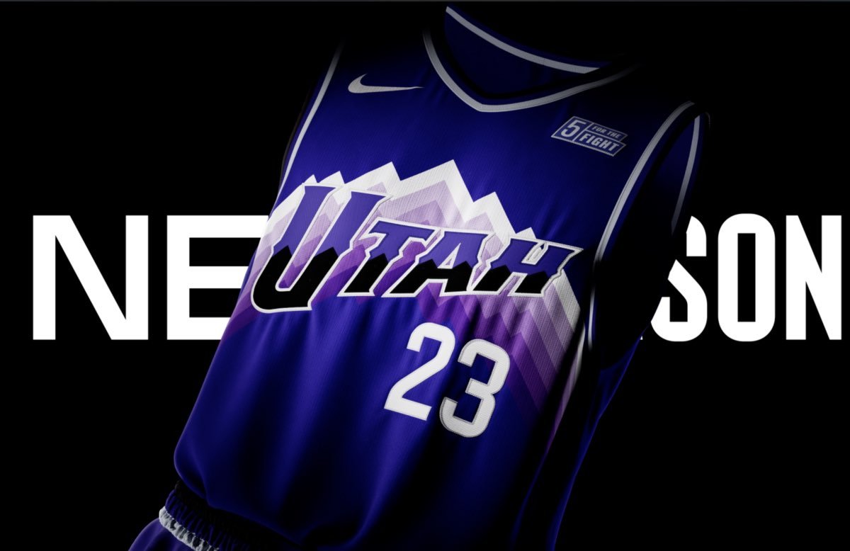
58 minutes ago, spartacat_12 said:
Well the Jazz will finally get to wear these alternate uniforms this season. Assuming they're a hit with the fans I'd expect the team to use them as the basis for the new set.
i'd hope so. that is a really nice uniform that still captures the spirit of the classics very well. the Utah wordmark is really nice too im surprised they never made one (or did they?) up until now. its always been just Jazz from my knowledge. now that they have two wordmarks in their arsenal and an original design coming up; i can't see why they wouldn't want to make a full set based on these. but then again how often do teams have an alternate they like so much they turn it into a set? i know the raptors did a couple years ago. but they probably wouldn't have done that if they didn't win the championship
-
1
-

/cdn.vox-cdn.com/uploads/chorus_image/image/72334028/1252003676.0.jpg)


 guess for some reason they've established that everything mentioning heat culture has to use this font


2023 - 2024 NBA changes
in Sports Logo News
Posted
its becoming more and more apparent that this year's city edition jerseys are mostly all in black/navy or a color that a team already frequently wears (hornets teal, suns purple, cavs maroon, and ill even count bucks blue since theyve worn blue for long enough.) the only out of the box jerseys in terms of color are blue for the kings and full on gold for the raptors. but even then we know they've had those colors in their arsenal. raptors especially. is nike just trying to save some money this year?