


Maroon
-
Posts
496 -
Joined
-
Last visited
Posts posted by Maroon
-
-
19 minutes ago, CrimsonBull9584 said:
I have a friend who is the Head Equipment Manager for the DC Defenders. I spoke to him yesterday, asking him if he could give me any "hints" about their uniforms. His response; "no idea".
Rather odd that the equipment manager, in November, doesn't know what the uniforms will look like.
That is very, very odd.
-
 2
2
-
-
This is the exact kind of look I was hoping for, and I like the wings on the helmet. If these are real then thumbs up from me.
-
When Oscar Taveras died.
When the 2004 Cardinals were swept in the World Series, as it was the first World Series the Cardinals had been in during my lifetime.
When Missouri State lost the MVC Tournament Championship game in an upset to Indiana State on March 6, 2011.
Every time the Patriots win the Super Bowl, but their championships over the St. Louis Rams and Seattle Seahawks will forever go down as my least favorite ones.
I've considered the Colts losing to the Saints in the Super Bowl, but as miserable as that was I have zero animosity towards the Saints for it so the hurt isn't quite as severe.
-
1
-
-
14 hours ago, QueenCitySwarm said:
While the A's moving wouldn't be ideal, my money's on Portland if it does happen. I think the A's identity fits really well there, and it provides Seattle another PNW AL team so they don't have such a bad schedule (though two Texas teams is what really does the damage). I think Vegas would be incredibly short-sighted (as I believe the Raiders moving there is) and would harm the A's and MLB in the long run.
Agreed. Again, while it'd be better for the A's to just stay put, Portland would already work well with the Green/Yellow scheme I think, and the AL West is where a Portland team would belong anyhow. IF the A's were ever to relocate, Portland really should be the choice.
-
1
-
-
3 hours ago, Bucfan56 said:
Three things:
1). Sacramento would be a head and shoulders better fit than Vegas for the A's.
2). Vegas is going to run out of water in the next half century and will collapse into the earth's mantle.
3). I won't be sad when this happens.
I have no connection to Sacramento. I've never even been there. But the whole Kings to Seattle debacle kinda permanently put me on Sacramento's side of things. If the A's ever relocate (although it'd be better if they didn't), Sacramento would be great.
-
I don't see it happening, but it would be miserable if it did. Not only is Vegas not even in the top five of cities that would be good fits for an MLB team, but to move such a storied franchise to a city devoid of baseball history would be egregiously bad.
-
2
-
-
1 minute ago, Ferdinand Cesarano said:
I appreciate the information. Glad to be informed.
-
1
-
-
15 minutes ago, Heitert said:
It actually does. I was thinking that last night. On top of the "hidden" 'STL', if you cut off the top of the logo where the curved lines of the wings meet straight lines, there's an arch right there in the middle.

This is a great find as well!
But then it begs the question... if this is all possible if the logo is upside down, why isn't that just what the logo looks like in the first place?
-
5
-
-
6 hours ago, Bucfan56 said:
That’s exactly how I felt about the AZ Hotshots logo. I like it so much, I actually found a way to get ahold of one of their helmet decals and I put it on my car.
Going off the "funny how we can have such different opinions of logos" theme, it's funny because I love the AAF logos and identities... excepting the Hotshots. I liked their colors and loved the uniforms, but never could quite get on board with the logo. Atlanta's logo was tops for me even though I was rooting for Memphis.
-
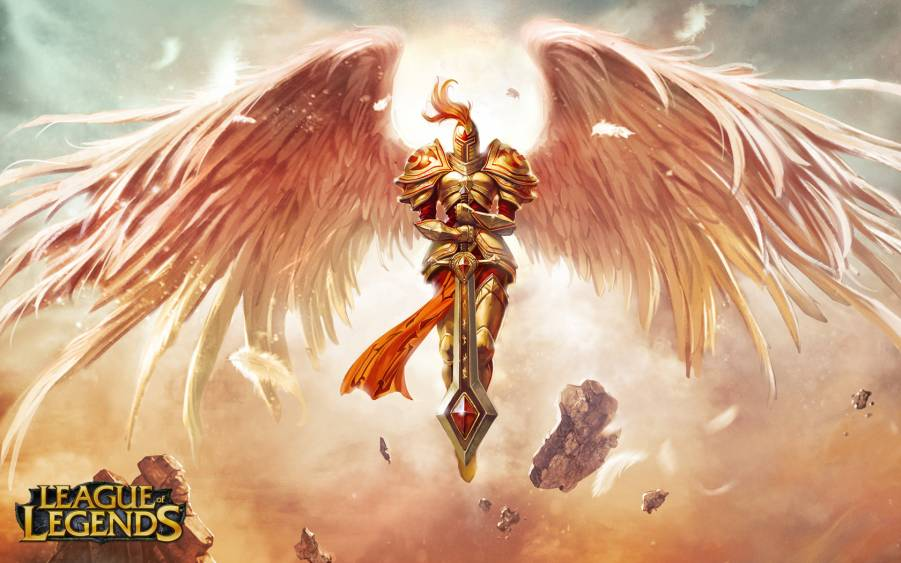
11 hours ago, Ark said:
A bit of a stretch but I see it
Is it just me, or does that actually make the logo better? This makes it look like the wings are enveloping a sword, almost evoking the feeling of some angel holding a sword.
Kind of reminds me of the old art for Kayle from League of Legends -
I've come to the conclusion that I like the St. Louis logo more than I did at initial glance (it looks better to me in the version that was published as their twitter handle photo rather than the 3D-ish version on the reveal show), but that the name "Warbirds" would have gotten across the same message as "BattleHawks" but without sounding contrived - and it would have played into the aviation theme better than the actual name.
The logo on twitter:
-
1
-
-
7 minutes ago, Lafarge said:
I now present my work of speculative fiction “SBNation/Bleacher Report’s upcoming/released within the past 20 minutes, unresearched, unclever, and overreactive article about the XFL Team Names,”
You nailed it: https://www.sbnation.com/2019/8/21/20826449/xfl-team-names-ranked-battlehawks
-
1
-
-
6 minutes ago, Bucfan56 said:
Y'all are trippin if you thing these are better than what the AAF put out. At least, logo wise, anyway.
Nah, AAF logos were hands down better. The only XFL logo that matches any of the AAF logos is the Guardians. Maybe the Vipers, but it has such a different vibe than what the AAF had that it's hard to compare. Otherwise, AAF logos win.
But it doesn't matter what your logos are if you can't actually keep the league open. Ultimately, if the XFL can stay open for a few seasons it'll be more notable than the AAF regardless of the comparative quality of the logos.
-
5
-
-
4 minutes ago, GDAWG said:
Seeing more people whine about how close the nickname is to "Blackhawks" who St. Louis fans obviously hate.
-
1
-
-
2 minutes ago, gosioux76 said:
Yeah, they're totally giving people too much time to realize just how much they DON'T like their team's names and logos.
Someone earlier was posting in defense of the BattleHawks name. Here's my problem with it. It's not only that it's generic and uninspiring, I hate any name whose root needs to be modified to make it seem more aggressive. Adding "Battle" to the name isn't a workaround. It's a sign that the name Hawks itself doesn't work on its own.
I agree with this take about the BattleHawks nickname. I have no problem with colleges like St. Joseph's and Quincy that just use "Hawks." But once it becomes Skyhawks, River Hawks, or War Hawks it just becomes a bit overdone. My only excuse for it is that they can refer to the historic St. Louis Hawks identity but without actually stepping on the toes of the current Atlanta Hawks.
-
2
-
-
16 minutes ago, pitt6pack said:
Doesn't seem like all teams have secondary logos. Houston appears to have one.
Ya, looks like Houston, LA, and Tampa have secondary logos as of right now, whereas none of the others seem to have a secondary. I wonder if that's permanent or if secondary logos will be developed for those teams later.
-
St. Louis Battlehawks: Generic name, but I'm okay with the logo (I think the wings are good and the sword is good, but the logo seems disjointed to me in terms of combining the elements into a cohesive piece) and it's not embarrassing which is what I feared. Also a chance that it links to the old St. Louis Hawks that brought the city a championship, so there's a connection. This will obviously be the club I root for.
Tampa Bay Vipers: Love the simple logo. Good identity in my opinion.
New York Guardians: I'm a fan of everything about this logo and team nickname. Probably my favorite overall identity in the XFL.
LA Wildcats: Love the monogram but the worst team nickname out of the bunch. A pro football team with a generic college sports mascot? Seems even more self-evident that this is generic and lacking imagination in that the logo doesn't connect with the team nickname at all.
Seattle Dragons: Good concept, don't mind the team nickname, but the logo looks super generic to me. Not bad, necessarily, just lacking in imagination. I agree with others that it looks like UAB's logo.Houston Roughnecks: Everything about this is good.
Dallas Renegades: I echo that it seems to reflect the Dallas Desperados logo which gives it a demerit, but not a bad logo and appropriate for the city without trying to be a Cowboys knockoff.
DC Defenders: Like the nickname a lot, but despise the logo. Definitely the worst out of the bunch. The shield looks bloated, the lightening disjointed, and it's just plain dull.-
4
-
-
26 minutes ago, Scrumptious Ham said:
Sorry, I don't like bikers or the biker culture. Call me immature, that's fine. I feel biker gangs are immature. I mean the crime syndicated ones. They suuuuuuuuuuuuck. Terrible people. But I think the non crime ones can be immature, too. Do the bikes have to be that loud? You got to do it in a quiet residential area? So now they want to make a football team out of that? Gross.
That's my opinion that I'm allowed to express. It's not racially motivated. It's not bigoted. It's my opinion on a very possible identity. It is a gun I will stick to.
Okay sure.
-
3
-
-
22 minutes ago, Bucfan56 said:
How dare you make assumptions like that. You can ABSOLUTELY race motorcycles.
… walked into that one. Got me there.
-
5 minutes ago, AgentColon2 said:
Yes, this is a joke lol
Sometimes I'm bad at picking up humor on the interwebz

-
1 minute ago, AgentColon2 said:
Stop being racist towards bikers or this thread will spiral out of control like the NHL thread.
I definitely think his comment was dumb, but can you be racist against.... something that is not a race? Or is that the joke?
-
36 minutes ago, buzzcut said:
Not if this tweet is indicative:
He then tweeted this:
OHNOOOOOOOOOOOOOOOOOOOOOOOOOOOOOOOOOO-
1
-
-
4 minutes ago, daniel75 said:
God I really hope Gargoyles isn’t a team name, that’s just bad. Try saying “Go Gargoyles” out loud, it’s not pretty.
On the other hand, if the fans call them 'Goyles casually, they can chant GO GOYLES and then it just sounds like "Gargoyles" so it works perfectly if you really think about it.
-
1 minute ago, GDAWG said:
Randy Orton, the son of Bob Orton is from St. Louis and is nicknamed the Viper.
And he's important enough to name a football team after him?
-
1
-


XFL 2023 Logos, Names and Uniforms
in Sports Logo News
Posted
Ya, I find that odd. Are they just waiting on announcing the supplier or do they not even have a supplier contract signed yet? You would think the supplier would want the uniform branded with their logo right off the bat, and somebody has to have made these even if they're just mocks.
Also, mark me down as a fan of the simplicity of the DC uniforms. It could have been easy to overproduce the lightening theme, but even if I'm not big on the lightening in the pant stripe, they pulled it off relatively tastefully. Also like that the obese shield wasn't included in the helmet logo - looks much better with just the internal logo elements.