


Maroon
-
Posts
496 -
Joined
-
Last visited
Posts posted by Maroon
-
-
Detroit vs. Kansas City
Cincinnati vs. Cleveland
Houston vs. Baltimore
Tampa Bay vs. Minnesota
Carolina vs. Atlanta
Arizona vs. Washington
Jacksonville vs. Indianapolis
San Francisco vs. Pittsburgh
Tennessee vs. New Orleans
Las Vegas vs. Denver
Philadelphia vs. New England
LA Rams vs. Seattle
Miami vs. LA Chargers
Green Bay vs. Chicago
Dallas vs. NY Giants
Buffalo vs. NY Jets -
I am not having a great season of predicting games.
Indianapolis vs. Denver
NY Giants vs. Green Bay
Detroit vs. New England
LA Chargers vs. Cleveland
Houston vs. Jacksonville
Atlanta vs. Tampa Bay
Pittsburgh vs. Buffalo
Miami vs. NY Jets
Chicago vs. Minnesota
Tennessee vs. Washington
Seattle vs. New Orleans
San Francisco vs. Carolina
Philadelphia vs. Arizona
Dallas vs. LA Rams
Cincinnati vs. Baltimore
Las Vegas vs. Kansas City
-
Miami vs. Cincinnati
Minnesota vs. New Orleans
Seattle vs. Detroit
NY Jets vs. Pittsburgh
Chicago vs. Giants
Tennessee vs. Indianapolis
LA Chargers vs. Houston
Cleveland vs. Atlanta
Washington vs. Dallas
Jacksonville vs. Philadelphia
Buffalo vs. Baltimore
Arizona vs. Carolina
Denver vs. Las Vegas
New England vs. Green Bay
Kansas City vs. Tampa Bay
LA Rams vs. San Francisco
-
Once again missed Thursday's game.
Buffalo vs. Miami
Cincinnati vs. NY Jets
Las Vegas vs. Tennessee
New Orleans vs. Carolina
Baltimore vs. New England
Detroit vs. Minnesota
Philadelphia vs. Washington
Kansas City vs. Indianapolis
Houston vs. Chicago
Jacksonville vs. LA Chargers
LA Rams vs. Arizona
Green Bay vs. Tampa Bay
Atlanta vs. Seattle
San Francisco vs. Denver
Dallas vs. NY Giants
-
Whoops, a day late for Thursday game.
New England vs. Pittsburgh
Carolina vs. NY Giants
NY Jets vs. Cleveland
Indianapolis vs. Jacksonville
Miami vs. Baltimore
Tampa Bay vs. New Orleans
Washington vs. Detroit
Seattle vs. San Francisco
Atlanta vs. LA Rams
Arizona vs. Las Vegas
Houston vs. Denver
Cincinnati vs. Dallas
Chicago vs. Green Bay
Tennessee vs. Buffalo
Minnesota vs. Philadelphia
-
Buffalo vs. LA Rams
New Orleans vs. Atlanta
Cleveland vs. Carolina
San Francisco vs. Chicago
Pittsburgh vs. Cincinnati
Philadelphia vs. Detroit
Indianapolis vs. Houston
New England vs. Miami
Baltimore vs. NY Jets
Jacksonville vs. Washington
NY Giants vs. Tennessee
Kansas City vs. Arizona
Las Vegas vs. LA Chargers
Green Bay vs. Minnesota
Tampa Bay vs. Dallas
Denver vs. Seattle
-
1 hour ago, gosioux76 said:
MLS expansion side St. Louis City SC this morning named longtime NY Red Bulls assistant Bradley Carnell as the franchise's first-ever head coach. LINK.
I can see the value in an expansion side picking a head coach this far in advance — you want someone to help build the foundation. But it has to be a challenge to find someone who doesn't mind sitting out a year. The first team won't take the pitch until March 2023.
Though I personally had no knowledge of Carnell prior to the rumors that St. Louis City SC was interested in him, I'm excited for the hire. International experience but has been in MLS for his coaching career, and even had a taste of a head coaching job as an interim in NY. He also apparently was being considered for an assistant position at Manchester United (or perhaps even turned it down for the possibility of being a HC in MLS). Seems like a pretty good resume to me. Now we'll just have to see how he does coaching a brand new roster in a year.
EDIT: Apparently he'd already committed to StL City prior to Manchester United calling.
-
 1
1
-
-
On 11/21/2021 at 6:53 PM, dubiouselemental said:
Just jumping on here to say that UCF stole that script logo.
I designed it back in 2017 for Hickory Christian Academy in Hickory, NC. You can see it all over their website.
http://hickorychristianacademy.com/hca-athletics/
This is part of the branding proposal I sent to them:
I've already been in touch with their brand directors to find out how they ended up with it.
Well that's a big yikes.
On a different yet related note, I love that entire branding proposal.
-
7
-
-
Just some further information about the name
QuoteCity was among the most popular of the approximately 6,000 submissions and suggestions the club received, and in the end it beat out United, Gateway and Stars among “the four names that kind of kept coming back up,” she said.
and
QuoteGateway would’ve been the most original and locally relevant choice, but for Kindle Betz that would’ve been a bug rather than a feature.
“You wouldn’t understand Gateway, necessarily, if you don’t live in this region,” she said, adding that the term could be misappropriated and used in phrases like “gateway drug.”
https://www.si.com/soccer/2020/08/14/st-louis-city-sc-mls-plans-carolyn-kindle-betz
-
10 minutes ago, SFGiants58 said:
I’ll add to my previous post: Microgramma/Eurostile just looks terrible here. I normally like those fonts, but here it gives off a generic vibe.
St. Louis City SC just seems like such a non-entity, even in the context of MLS identities. I don’t want North American-style name polluting MLS again, but something within a different European tradition would be nice.
Which is why I was really hoping for something from French naming conventions. That way it would still be Euro style, but completely unique among MLS.
-
2
-
-
2 minutes ago, gosioux76 said:
Better yet, replace the SC with STL or the entire acronym, STLCSC. That may be a bit clunky, but I don't know that it would look much different than if they were Roman numerals denoting a year.
Maybe that's another option: Don't put letters in that space, but the year established: 2023.
Or leave it blank. Anything besides the lonely "SC."
Also agreed. I'd go with STL out of those options, but all those suggestions work. Another option would be 1764 for the city's founding. And since the team is St. Louis City, it could work.

-
1
-
-
6 minutes ago, gosioux76 said:
Color that secondary mark and slap it on the jersey.
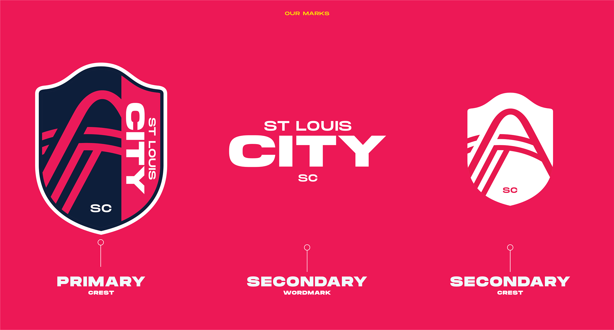
Ya, to be honest it's the better logo. It avoids the wordmark being a part of the crest (the biggest mistake they made in this whole thing, imo) and looks more complete without the arch and river being cut off. And if you want the full identity package just center it over the Wordmark and DONE.
-
2
-
-
Well this link certainly provided something I hadn't seen yet: https://www.underconsideration.com/brandnew/archives/new_name_and_logo_for_st_louis_city_sc.php
Hadn't seen that secondary crest before. Also, if you click on the link, it's mentioned that the "SC" isn't just "Soccer Club" it's also supposed to stand for "Soccer Capital" considering the city's history.
Also, for the record, this is their take on the logo:
QuoteThe name is kind of interesting in that, eventually, I assume, the team will simply be known as “City”, as in “Hey, did you watch last night’s City game?” or “I’m going to a City game” and that is a pretty powerful statement. I’m also intrigued that they went with “SC” for Soccer Club instead of the usual “FC” for Football Club as I know it’s a thing where football fans get upset when it’s called soccer. For a United States-based team I think this makes much more sense. The new logo, at a glance, looks good but there is definitely a sense that “a diverse group of over 20 local designers”, as the press release states, had a hand in this and interestingly not one of them could explain what the angled lines under the Arch represent. Lite sarcasm aside, the logo does have the right elements in it, I mean, how could you NOT include the Gateway Arch? I’m not sure the execution of it is quite right… it loses heft at the top but not enough to look as if it was done on purpose and the river lines are just slightly thinner but not thinner enough to look much different. The abrupt cut in the crest to fit the name vertically is, well, abrupt. I mean, it’s not bad, and as I mentioned, it looks good at a glance but there are some questionable decisions here and there. The secondary mark that shows the full arch is interesting but, again, there is something not right about the minimalist interpretation of the arch — like the curvature and depth is off. The wordmark is nice and chunky. Things get a little trendy with the stroked-type approach but no doubt looks exciting when animated. Overall, I would say this is pretty good and it’s a very convincing look — just a little off on some aspects that most fans won’t be bothered by at all.
-
1
-
-
9 hours ago, sc49erfan15 said:
This isn't difficult.
Say the word "clan" and upwards of 90% of North Americans are going to think you're referring to the Klan. 9.9% are going to think you're talking about Wu-Tang. 0.1% are going to associate it with Scottish families. Clearly the Simon Fraser Clan should be able to use the nickname "Clan," as there's absolutely nothing wrong with the word itself - but it's been ruined by another group. The swastika analogy mentioned earlier is spot-on. Simon Fraser has expressed desire to move away from any sort of remote confusion with the Klan. Can you blame them?
And plus, it sucks as a sports team nickname so it's a great excuse to go with a new one.
I guess something I've learned here from you and @BringBackTheVet is that far fewer people are just aware of Scottish clans. I guess as someone with Scottish heritage I just naturally associate the word with Scotland. I would have never imagined that other people's first thought would be to think of the KKK when they just hear the word "Clan" rather than assuming it referred to actual clans.
 white supremacists ruining perfectly good words.
-
2
-
-
1 hour ago, -kj said:
Eh. Having grown up in the area, I'm very familiar with the flag, and it took quite a bit to see those lines as representing the rivers.
As for the colors: I don't mind the magenta and navy idea... just don't tell me it's red.That's fair. I guess I I just automatically saw the rivers when I looked at it because I was anticipating that the flag would be incorporated somehow. My expectations informed reality, perhaps.
It's definitely not red. A friend of mine who is basically a soccer/football fan only and is also excited about this team has commented on how he's going to look like a dragonfruit at games.
-
11 minutes ago, UnclearInitial said:
The crest is a mess, the arch isn’t easily recognizable, the rivers don’t really read as such and the floating SC with the sideways script is just terrible.
The arch is immediately recognizable, and if you know the St. Louis flag the rivers make a lot of sense.
Agreed that the floating SC ain't great.
-
2
-
-
The whole shebang right here, including full colors:
-
1 minute ago, Magic Dynasty said:
The name isn't great, but at least it isn't yet another [City] FC. The red looks strangely pink, although that might just be my monitor. Their crest makes me think the jersey is either half-and-half or stripes, both of which I'd be okay with. They'll need to make themselves stand out, especially in a league that already has two teams that are red with navy accents.
In the livestream interview with the owner and chief "brand architect" they said it's 'City Red' but that it was intentionally shifted closer to pink. I'd describe it as more of a magenta.
-
2
-
-
Name: Not what I wanted for stated reasons, but their promotional materials certainly are trying to play up the concept that the entire Saint Louis metro area counts as the "City" that they're representing. It also seems they're wanting to go by "City" which is gonna be interesting considering there's two other "city" teams in MLS. People calling it STL City or Lou City and dropping the "SC" seems more likely. Their website (which is not up yet) is apparently stlcitysc.com and I can't imagine using STLCSC as a full acronym.
Colors: Straight fire. 100% support them as they are unique and should look amazing on a kit. interested to see how grey and yellow are incorporated.
Crest: My one critique is that the name is on the crest, and even worse, it's vertical. But the stylized arch and rivers are beautiful and I will hear no criticism of them.
-
1
-
-
6 minutes ago, gosioux76 said:
Watching the livestream, the blue almost looks dark purple next to this shade of red.
I don't see purple personally, but it's dark enough that it could even look black to me.
-
6 minutes ago, uk-owns-iu said:
Needs yellow
It's not on the crest, but apparently yellow is a secondary color. Per the Post-Dispatch:
City Red, River Blue, Arch Steel Grey and Energy Yellow.
-
1
-
-
8 minutes ago, WideRight said:
What exactly are the lines "below" the arch supposed to be? Is that the confluence of the 2 rivers? Looks more like fields of grain.
The video they showed in the announcement definitely says it's the confluence of the rivers.
-
1
-
-
If that leak is real (and it seems like it is based on other things out there) I really like the colors and the crest design itself. As I've expressed before, I dislike the "City" designation specifically because of local sentiments. But based on their promotional videos to this point, they seem to be leaning into the concept that the entire metro area is the "city" - which, even if that's not right, could fly in terms of a regional unity kinda way. I don't mind the "generic" feel of the name as much considering there's only two other MLS teams with "City" in their name, so it's not like just ever other SC or FC in the league.
I'd give it a 7/10 between name and crest. But to be honest I'll end up loving it in the end regardless.
-
2
-
-
29 minutes ago, shaydre1019 said:
I'm no English major, but i think they're pronounced the same.
Right. But the word "Clan" is and has always meant something different than the KKK to many other cultures and people. It's not as if actual Scottish clans need to start reconsidering what they refer to themselves as because another group used a similar sounding word. The use of "Klan" by the KKK does not make all actual clans in this world affiliated or associated with the KKK.
But, again, if enough people were getting confused then it was a good call to change the name.-
3
-


 white supremacists ruining perfectly good words.
2023 NFL Weekly Picks Contest
in Sports In General
Posted
Minnesota vs. Philadelphia
Baltimore vs. Cincinnati
Seattle vs. Detroit
Indianapolis vs. Houston
Chicago vs. Tampa Bay
Kansas City vs. Jacksonville
Green Bay vs. Atlanta
Las Vegas vs. Buffalo
LA Chargers vs. Tennessee
San Francisco vs. LA Rams
NY Giants vs. Arizona
NY Jets vs. Dallas
Washington vs. Denver
Miami vs. New England
New Orleans vs. Carolina
Cleveland vs. Pittsburgh