


Indigo
-
Posts
1,734 -
Joined
-
Last visited
-
Days Won
6
Posts posted by Indigo
-
-
52 minutes ago, Sport said:

This keeps coming up, but if Nike would just move their logo to the chestplate, there'd be enough room for TV numbers and full-length stripes (Pittsburgh), and maybe Carolina could still fit all three elements.
-
 2
2
-
 1
1
-
 2
2
-
-
-
3
-
 1
1
-
 4
4
-
6
-
-
If Carolina were to just thin the stripe out to a UCLA-ish size, maybe It would allow thm to keep all three elements.
(ignore the black helmet)
-
-
7
-
1
-
-
30 minutes ago, PERRIN said:
Love that look for Dallas. Perfect blend of modern type and classic striping. I'd love to see them go with something similar when they inevitably revamp their current set.
As long as Cuban remains the type of owner that he is, i don't see why the Mavs would want to change.
-
5
-
-
37 minutes ago, MJWalker45 said:
A friend of mine thought it was the Broncos playing at first. She thought they were their throwbacks.
Save for the helmet, she wasn't that far off.
-
23 hours ago, tBBP said:
Well, here's my counterargument...
I always thought those were one of the best NBA sets of its time; they'd also look right at home in the landscape of today's NBA. (Doggone it Toronto...why'd you have to ditch those???)
The irony of this is those are my favorite Raptors jerseys (and in my top-10 all-time NBA jerseys) and I completley forgot about them.
Light purple, black and red like that Raptors or the Monarchs further up look good. I just don't think the Raven's dark purple and black would mesh well with red.
-
5
-
-
30 minutes ago, MJD7 said:
If it were up to me, I’d drop gold pretty much entirely for the Ravens. Purple & black is a fine color scheme on it’s own, and the gold kind of detracts from the whole Gothic/dark theme to me, for whatever reason. If they needed to have another secondary color, I think red would be more interesting.
I absolutley loathe everytime red is mentioned as a tertiary color for the Ravens. I have not found a sigle example in sports where red and purple (and black!) work well together.
Most people's counter arguments are: "It's in the flag!" or "The Raven's eye is red!", and to that I say:
A) Gold is also in the Maryland flag, But Baltimore has just the right amount of flag imagery in their shield logo. They don't need any more than that.
B ) The Steelers have red and blue in thier logo, but you don't see them usign those on the jerseys. The Chiefs have black in thier logo, but they don't use it anywhere. Same goes for the Vikings. Not every logo color belongs on the uniforms.
-
5
-
-
There is a circle at midcourt. it's engraved in the wood. But what i'm saying (and what @Captain Invader's saying) is that the part of the circle that isn't under the logo used to be blank, but now they've painted a line on it.
-
1
-
-
Hey...I thought the Bucs had no running game!?!
-
How about something like this? Tapers the stripe, drops the logo but makes room for the TV numbers and the maker's mark.
-
11
-
1
-
-
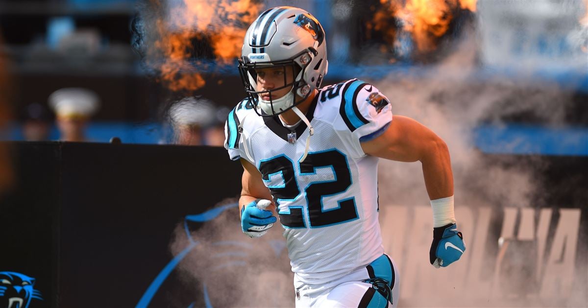
Since we
are(were) on the subject of eliminating TV numbers, what if the Panthers "UCLA-ed" thier stripes to something like this:-
1
-
2
-
3
-
-
1 hour ago, Sport said:
Good examples to prove my point. Both the Bears and Packers looked better and more like the classic Bears and Packers when the shoulders were empty. You can add the Chiefs in there too. The Raiders are probably the best example of not filling uniform space just to fill uniform space and looking better for it. Shrinking sleeve space necessitated the numbers move to the shoulders, but the better solution would've been not to use TV numbers at all because they're unnecessary clutter as the Pats, Chargers, and Bengals have shown.
I believe this was brought up a month ago and I mentioned how the Chiefs and Bears looked better (read:accurate to tradition) with numbers on the sleeve instead of the shoulders.
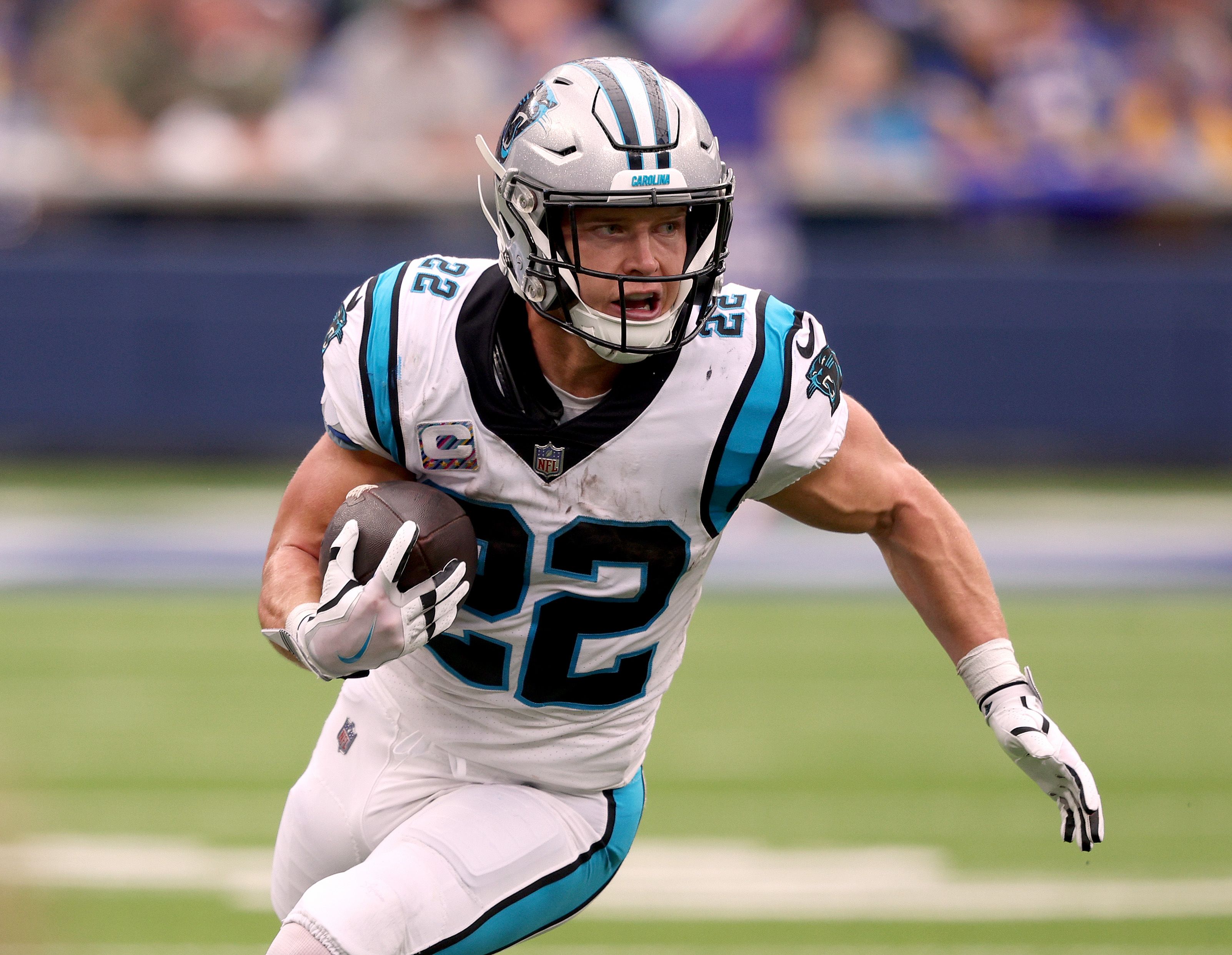
Look at Alexander in this picture. The entire top half of the jersey is cluttered, and it looks compressed, not "filled with design" or whatnot.
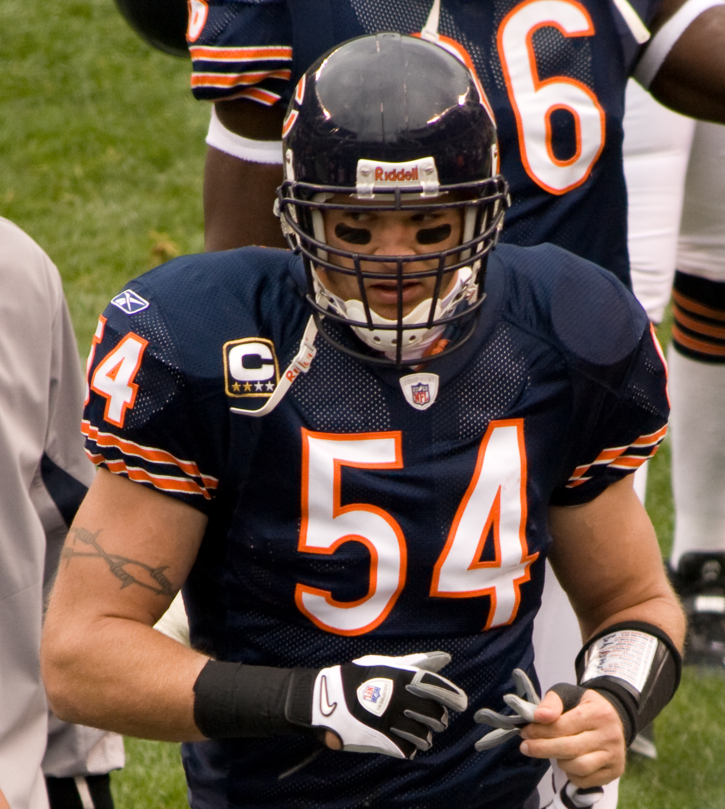
Where would you fit TV number on the Bengals jerseys without looking shrunken like Carolina?
-
3
-
-
2 hours ago, dont care said:
It’s always been
I just proved that it hasn't.
2017:
2022:
-
1
-
-
40 minutes ago, WSU151 said:
The circles are visible on those two courts.
What am I missing?
On the new cavs court, the part of the circle that nisn't covered by the logo is painted in.
-
2
-
-
16 minutes ago, NeauXone said:
Pretty sure that this has always been a thing if you look close enough, but I could be wrong.
I don't think so.
-
2
-
-
30 minutes ago, BBTV said:
Who's this Robert Quinn fellow - can he play?
He played in Dallas a couple of years ago and dropped 10+ sacks on the year while he was there. From what I've heard he's been on a roll in Chicago, so you guys are getting a heck of a pass rusher for just a 4th round pick.
EDIT: He broke Bears single-season sack record with 18.5, so...yeah.
-
3 hours ago, Pigskin12 said:
Challenge: Find a recent interconference matchup that looked this much worse the previous meeting (8 year prior).
Not 8 years, but Browns (AFC) vs Panthers (NFC):
2018:
2022:
-
5
-
1
-
-
3 hours ago, HopewellJones said:
God forbid someone has a different opinion!
If you're gonna be late, at least bring a valid argument instead of overused sarcasm.
-
3
-
3
-
-
48 minutes ago, FinsUp1214 said:
The Broncos uniforms not only revolutionized the aesthetics of the NFL, they revolutionized the aesthetics of the whole sport itself, regardless of level. I don’t think it’s any coincidence that Miami’s and Oregon’s respective pushes of the aesthetic envelope at the college level came very shortly after the Broncos, and were variations of the same futuristic side panel and number font theme. Then high schools all over America followed suit to the point that nearly every matchup was a “pointy side panel vs. pointy side panel” look for a number of years (and maybe even still today in some cases).
In terms of sports uniforms that “changed everything”, the Broncos have to be at or near the top. One could argue the Kansas City A’s pivoting to Kelly green and gold everything is up there, with its ushering a sort of color explosion in the 60’s-70’s MLB, and the Charlotte Hornets kicking the teal wave in sports off could be up there too. But the Broncos, at the very least, certainly revolutionized the look of football in a way I don’t think any other team has.
The irony in that is that the revolutionary idea no longer works in practice like it used too (with the main reason being age), but also because the sheer amount of copycats contributed to the dilution of quality in our minds. 25 years ago those jerseys said "futuristic NFL team", and now they evoke fellings of "low-budget high school team".
-
5
-
-
56 minutes ago, ripall90 said:
what is wrong with the saints unis?
If they wore gold pants consistently and exclusively, I could see how you'd have them number one. (I wouldn't agree, but you'd have a point). As it currently stands? Hell no. Dull shade of gold paired with all black or all white yoga pants is inexcusable.
The fact that you have them #1 and Seattle #2 is why I posted the GIF.
-
6
-
-
26 minutes ago, ripall90 said:
My ranking of all NFL uniforms (standard home and away)
2. Seahawks
1. Saints
-
4
-
2
-
-
11 hours ago, tBBP said:
Well...it wouldn't be the first time a team trades a highly-touted young player to a team in need at that position.
I said that to say...this just happened:
Jags gonna keep jaggin' apparently...
Etienne has become the starting back over there, and he has more chemistry with Lawrence then Robinson does. I knew this was going to happen eventually, which is why I was surprised they drafted Etienne with Robinson coming off a breakout 1000-yard season.
-
1
-
-
3 minutes ago, IceInMyVeins said:
The magic start wearing their current black uniforms w the nike branding in 2008 in the game instead of the blue jerseys until 2020.
2K only goes off of what's in their (outdated) system. Since the 2018 Nike jerseys looked the same as the 2008 jerseys, 2K never added the 2008 ones into the game. Then in 2020 the road jersey became black, so 2K changes that, but never re-adds the 2008 blue jerseys back into the game.


/cdn.vox-cdn.com/uploads/chorus_image/image/51667775/CourtEdit.0.png)
/cdn.vox-cdn.com/uploads/chorus_image/image/71348886/1089453514.0.jpg)

Just Another NBA Series--(13/32)-- Light The Beam!
in Concepts
Posted
It's been *checks notes* 4 months since I last posted on this thread, and i'm not going to pretend like I've been impossibly busy. I do, however, have 3 new teams to kick off the new season, starting with the Cleveland Cavaliers.
Cleveland has gone through a variety of differnt branding ideas in 50+ years, but they've always returned to wine and (some shade of) gold. This season they've swapped out athletic gold for metallic gold, combining that with a very bland jersey set. The 1980's/1990's mashup of their current wordmark stays, but the sword from the LeBron 2010's era returns.
Association/Icon: Wine/gold/wine (gold/wine/gold on the Icon jersey) trim is added to match the wordmark and give some character to the jerseys, while the Jazz's former pants stripe follows Donovan Mitchell to his new team.
Statement: The iconic (or infamous, depending on who you ask) black jerseys worn in the 2016 Finals return, only this time sleeveless and with the new "C' and color scheme.
City: A simple recolor of the Association jersey, but in the color scheme of the late 90's.