


Indigo
-
Posts
1,734 -
Joined
-
Last visited
-
Days Won
6
Posts posted by Indigo
-
-
18 hours ago, GDAWG said:
ESPN tomorrow: "The Bills and Chiefs were supposed to destroy everybody they play. They both lost yesterday. So what happened?"
-
Tennessee Titans
After all the Titans talk in the NFL 2022 thread, I decided totake matters into my own hands. i personally think that if they're gonna squat on the Oilers branding(which they have every right to), they might as well use the red and Columbia blue Houston was known for.
- Set is based off of the 1999-2018 set.
- Helmet is now light blue, taking cues form the XFL's Dallas Renegades
- Shoulder yoke now has navy/red/navy vertical striping on it, matching the pants and helmet.
- '99-'18 custom number font returns, this time double outlined.
- Alternate replaces red with yellow as a nod to Tennessee's two other pro teams, the NBA's Memphis Grizzlies and the NHL's Nashville Predators.

-
 3
3
-
 1
1
-
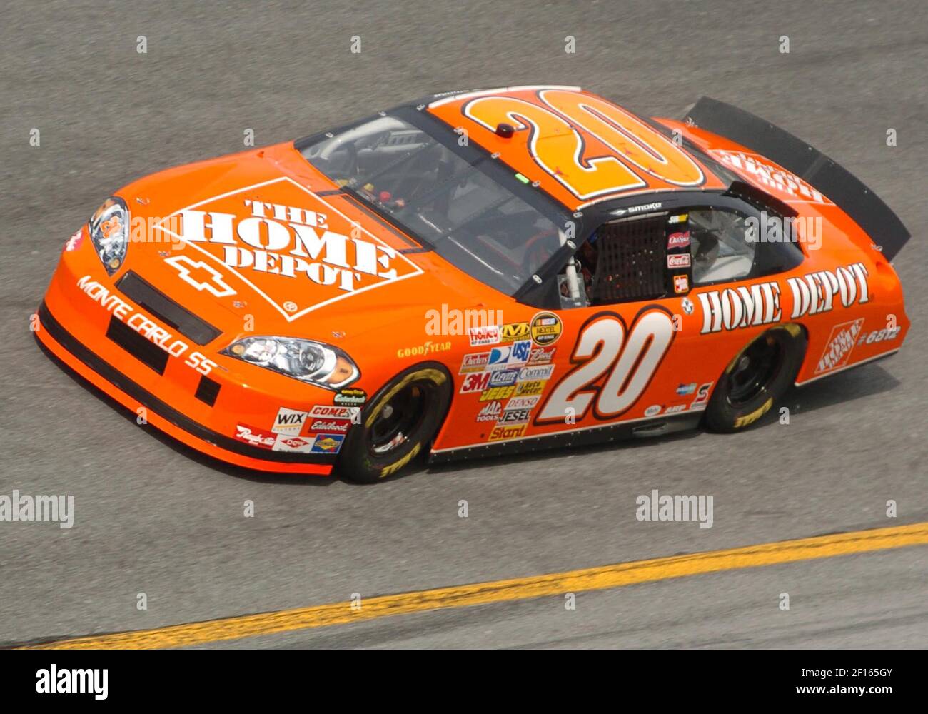
But at what point does having so many ads defeat the piont of advertising. Watching Tony Stewart race by in a Home Depot car does not make me want to go buy DirecTV because I saw it on the side of this car, and I can hardly see it because of all the other ads on the car. if your company doesn't get attention because of the sheer amount of surrounding ads, then there is no point to the ad.
-
1 hour ago, HopewellJones said:
That’s not at all what I’m saying…interesting interpretation.
You said the new jerseys are better than the old ones. By default, that means that the old ones were worse.
Since the new jerseys definitely and objectivley* (this board loves that word) suck, and the old ones were worse, that means that the old jerseys sucked worse than the new ones do. And that argument is exactly what @oldschoolvikingswas poking holes in.
I rest my case.
*plz don't fight me on this. You guys get all up in arms whenever some says "objectively". I'm just going off of the general opinion of this board
-
 1
1
-
-
16 hours ago, the admiral said:
I think it was the Bulls, and I recall them having a Green Week jersey and a slightly different St. Patrick's Day jersey. I guess there's nothing new under the sun when it comes to extraneous alternates.
After some research, it looks like you're spot on.
Here is Chicago's Green Week jersey:
And here are their (two!) St. Patrick's Day jerseys:
-
2 hours ago, HopewellJones said:
I've always loved uniforms that display the locale and the mascot equally. The Falcons uni fully displays "Atlanta Falcons." The old one has the "Falcons" script but already has the falcon logo, so it just reads as Falcons Falcons to me.
-
6
-
 2
2
-
-
1 hour ago, dont care said:
As I said what do they do after this 2 weeks when they need a backup yet don’t want to sign one to the active roster
They make a desicion (like most GMs do). Either sign the 3-string to the 53-man roster to be a backup, or just have one QB on the roster.
-
1 hour ago, SSmith48 said:
Denver has just unveiled their new Statement uniforms. As leaks suggested, it remains royal blue, but focuses more on yellow and red. Similar to previous Statement in theming, but a bit more colorful and distinct. I honestly think it's good, gives off Colorado/Denver flag vibes.
This should be thier main color scheme. Forget the navy blue.
The royal blue and gold are light enough to evoke the 2000s set, while the red ties into the 90s set, and all three colors relfect the Colorado flag.
#NoMoreNavyNuggets
-
8
-
-
41 minutes ago, aaa333bbb said:
Make it 3 in a row for the Bills' Blueberries
Are they seriously only going to wear blue pants because they keep winning?
-
6 minutes ago, ThunderCeltic said:
The 1990's is when the beautiful uniforms of the 80's got a 90's atrocity for most clubs.
1991-92 Philadelphia moves away from the classic 80's look for a cartoon 90's look. In 1994-95 they changed again to a more conservative look (The Allen Iverson rookie uniform). In 1997-98 the Sixers made Black the primary color and got radical with another set. Most fans (depending on age) love the Iverson jerseys but I guess I'm in the minority and didn't care much for them or their 07-09 remix. Thankfully in 2009-10 they went back to tradition and brought back red, white, and blue.
*side note the 1994-97 76ers uniforms are not in NBA 2k sadly.
1992-93 saw changes for the Phoenix Suns. I personally liked the 1992-2000 sets and also their previous 70's-1992 look. Then the suns went with a bland generic look for 2000-01. In 2013-14 they ditched the generic set and used a fauxback to the Barkley set. Then the NIKE takeover in 2017-18 saw Phoenix go backwards.
1992-93 Saw Atlanta abandon the Dominique Wilkins set for a more conservative look and remained until the end of the 1994-95 season which also included a Black alternate for that one season. 1995-99 Atlanta went with a radical 90's look then went bland from 1999-2006 and got worse with the 2006-2015 set. The 2015-2020 set was much improved and the 2020-current set is more traditional.
*side note the 1992-94 Hawks sets and their 1994-95 Black alternate are all missing in NBA 2k
1993-94 saw Denver abandon the beautiful Rocky Mountain Rainbow set for some rather bland ones used from 1993-2003. Most Nuggets fan prefer that set because of the 1994 playoffs. With the arrival of Carmelo Anthony in 2003-04 Denver went radical and made Carolina Blue their main color and was an improvement over the previous set. Denver made slight changes and went back to Navy under Nike. Current sets aren't any better than the 1993-2003 sets. They could do a rebrand with their City sets from 2019-2021.
1993-94 Milwaukee also switched from Kelly Green to Purple. The 1993-2005 sets were fair. They even brought back green in 1995 with infamous Green "Deer" uniform. Milwaukee went back to their original colors with their 2005-2015 set then went radical with their 2015-16 current set.
1994-95 Sacramento hopped on the purple haze movement and had several different looks to this day. They had bounced back and forth between purple as the "Icon" or black as the "Icon". I preferred their Red/White/Blue/Carolina look instead but to each their own.
1994-95 saw Cleveland jump on the 90's new wave of looks by going with Black and Columbia blue. For the 1998-99 campaign they took out the Columbia Blue and the uniforms were bland until the arrival of LeBron James with their 2003-10 look going back to original colors. The current Cleveland set for this coming season looks like G-League and practice jerseys.
1995-96 Saw Houston break away from their classic look for 90's pajamas with navy and pinstripes. In 2003-04 they went back to red but the 03-19 sets were pretty bland except for the Black alternate in 2016-17 which became the "Statement" in the new NIKE era. The 2019-20 current set was based off of their 2019 "Earned" uniform and was an improvement.
1995-96 saw Seattle rebrand from Green and Gold to Dark Green and take on a cartoon look. They did make the Finals but their 1995-01 look was bad but the 1999-2001 Red Alternate was slightly better. Seattle (along with Detroit) went with a fauxback of sorts to their classic 80's look. They remained until the move to Oklahoma City.
1996-97 saw Detroit break away from the Classic "Bad Boys" look to 1990's cartoon gimmick as Blue was replaced with Teal. They even had a red alternate from 1999-2001. They went back to traditional colors for the 2000-01 season. The had a dope red alternate in the mid 2000's but since the NIKE take over can't seem to get a proper "Statement" uniform.
1996-97 Minnesota took on a 1990's look and it was more popular than their inaugural 1989-1996 look. They finally made the playoffs after abandoning their classic look then rebranded in 2008-09 and then NIKE took over for the 2017-18 season and well.....
1996-97 saw Utah break away from the Jazz note and take on the mountains of Utah. Again depending on age, most prefer the 1996-2004 look over the classic 80's to mid 90's. Utah changed color schemes for the 2004-05 season and went back to tradition (sorta) when they brought back the Jazz note but Navy was the main color instead of purple. The new 2021-22 set is far worse than Cleveland's new set.
*side note the 1999-2004 Jazz Black alternate and 2006-10 Carolina Alternates are not in NBA 2k
1997-98 Saw the Bullets change to the bland Wizards. The 1997-2011 look was fair but didn't have the feel of the classic Bullets. Washing changed for the 2011-12 season buy going back to a fauxback Bullets look.
1997-98 saw the New Jersey Nets change color scheme to a bland set though they did make the Finals in 2002 and 2003 but mostly wore their gray uniforms. A red alternate replaced the gray and became the primary in 2007-08 and stayed until the move to Brooklyn. Now the Brooklyn uniforms..........................meh.
*side note the 1999-05 Nets Gray uniform is not in NBA 2k
1997-98 saw Golden State take on the 90's cartoon fade. They became popular due to their 2007 playoff performance but finally went back to their traditional Blue and Gold for the 2010-11 campaign and a dynasty was born.
1997-98 saw Indiana break away from their amazing 1990-97 look for their pinstripe set. They were ok and they made the Finals and some fans prefer that set over the classic previous set. The 2005-06 rebrand took place then the NIKE takeover happened in 2017-18 and Indiana still can't find an identity. They should base their Association and Icons on their Yellow Statement set.
1998-99 Orlando switched from the classic Shaq/Penny Hardaway look for some of the better late 90's 2000's sets. Then they went bland for the 2003-04 look but got slightly better with the 2008-09 rebrand. The current set is fair but their 1989-98 look is far better.
1992-93 Dallas switched from green to blue as the primary and then the 2001-02 rebrand came.
Thank you for watching NBA Uniform History! Tune in next week where we go even futher back -- the 1970s!
-
2
-
-
15 hours ago, PittsburghSucks said:
Kinda cool how Cleveland only uses the orange pants for divisional or primetime games.
-
2
-
-
34 minutes ago, FiddySicks said:
I’m never going to understand the hate for
the “Flaming Thumbtack” logo. That’s a GREAT logo, and looks awesome on the helmet.
Im with you and @Brave-Bird 08 on this one. In a league full of left -> right logos with sharp edges, the Titans' manages to fit right in and stand out at the same time. It looks bad on the navy helmet with the extra outline, but on the white helmet it's beautiful.
-
3
-
 1
1
-
1
-
-
44 minutes ago, DCarp1231 said:
In a world of gradients, what exactly would be stopping the Titans from doing gradient red numbers “to invoke the everlasting Olympic flame of
NashvilleAthens”?Red is a tertiary color for the Titans, so it would look odd on the numbers but not prominent anywhere else.
That, and the fact that it would be a horrendous gradient.
-
The Browns pants stripe doesn't match the iconic helmet stripe, and I think the Raves cold use some more gold, particularly on the pants.
Those are my only gripes with a solid AFC North, and solid series overall. Great job.
-
1
-
-
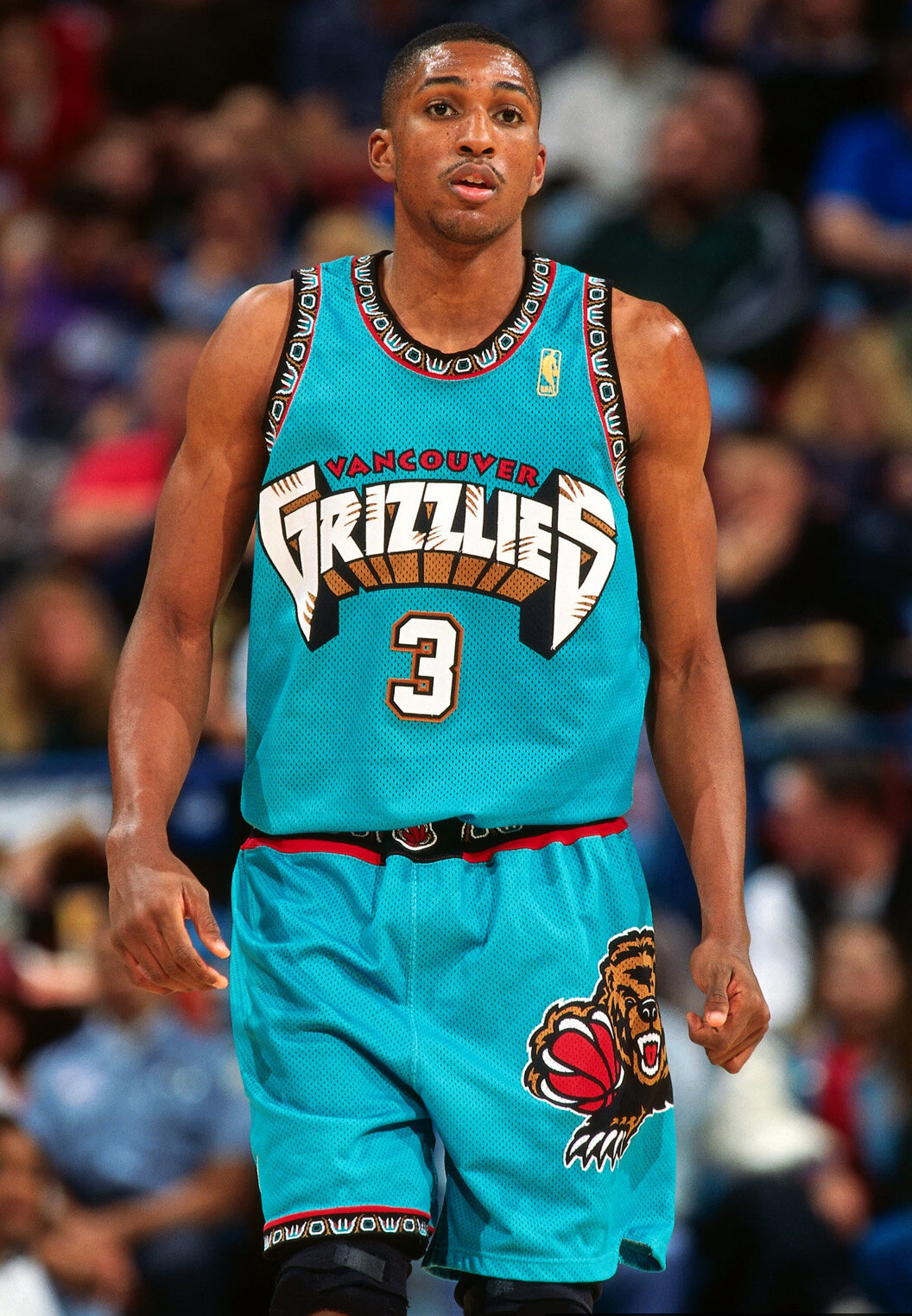
1 hour ago, sayahh said:
Would have loved to see how many teams would have kept their uni designs intact had they won a title in them, e.g., Vancouver.
Don't know, but I doubt many. Houston won back to back titles and switched jerseys the next year.
-
3
-
-
Madden 12 includes the Bills new uniforms for that season, but still has the colors of the old uniforms on the graphics.
-
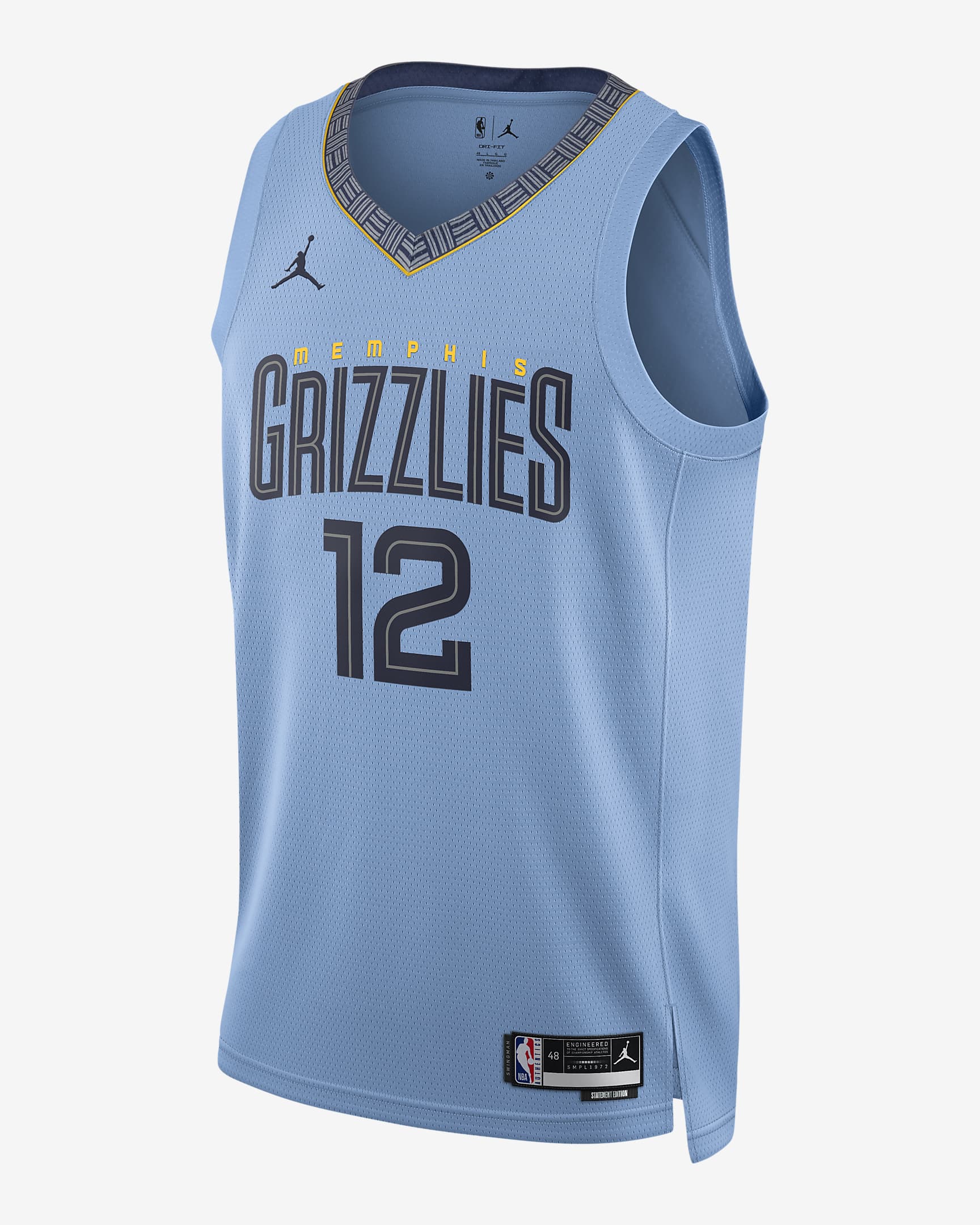
45 minutes ago, Conrad. said:
New Grizz Statement now on the Nike Europe site. Credit to this IG post https://www.instagram.com/p/CixgAWJs2Gu/
https://www.nike.com/es/t/memphis-grizzlies-statement-edition-camiseta-jordan-dri-fit-nba-swingman-HqKTHK/DO9531-422
Nice little callback to the Vancouver days.
-
2
-
-
4 hours ago, Old School Fool said:
The Bengals have 28 uniform combinations. Good lord.
...and that doesn't include the new white helmet.
Which brings up a good point: when do you guys think will be the earliest sighting of an alt helmet?
-
9 hours ago, pepis21 said:
Owned by Lenovo but only a Mobility part, Solutions is still a Motorola.
Kinda fascinatic how different discussion about sponsors is in NBA thread where we're talking about which one fits better and in NHL thread where we're talking about how RBC on Habs sweater and others are profanation.
That's because it's the first season, and we're not used to NHL ads. We've become desensitized to it over here in the NBA circle, and it's practically becoming a design element.
(check out the 2017-18 NBA thread; you see some extreme reactions to ads.)
-
1
-
-
12 hours ago, tBBP said:
This is the same thought I be having in the preseason and/or when starting QBs go down and their backups come in. I be like, "WHO?" like, I hear of some college QBs going into the draft...but then you get to the preseason and wonder where half these dudes came from. Like Cooper Rush, Tyler Huntley (who I kept thinking was Brett Hundley from UCLA a couple years back), Mike White of the Jets, David Blough in Detroit...like who are these guys, and where the heck did they even come from, much less how'd they make it onto an NFL roster? (Oh yeah, the guy who backs up Joe Burrow in Cincinnati...never heard of him, either. I can't even remember his name; I just know I never heard of him.)
Maybe this is why former starting QBs (who think they're still EliteTM) have issues becoming backups, because they essentially become no names. Take a casual NFL fan who just started watching three years ago. when this person hears the name "Joe Flacco" they go "WHO?" just like other backups. They have no idea Flacco won a ring, or that he was a decent game-manager at some point.
-
The fact that San Fran was circumstantially forced into starting the QB that led them to a Super Bowl and NFCCG appearance in 3 seasons is hilarious.
-
1
-
-
What if TEN used the Chargers old Angency font?
-
3
-
-
There's a midwest Motorola monopoly in the NBA. Indy, Milwaukee, and now Chicago all have Moto patches.
-
2
-
 1
1
-
-
1 hour ago, MNtwins3 said:
Can't wear alternates in the playoffs
-
3
-


Indigo's National Football League -- Ravens Update
in Concepts
Posted
Navy pants have been added above.