


chakfu
-
Posts
1,243 -
Joined
-
Last visited
Posts posted by chakfu
-
-
1 hour ago, Lights Out said:
Wouldn't it make a lot more sense to name these trophies after players who actually played for any of the teams in their respective divisions? I don't understand how a former Celtics, Hawks and Pistons player is supposed to relate to the Pacific Division.
Weren't enough western teams in their era.
-
1 hour ago, dont care said:
You must have been following a different thread because everyone and their mother talked about that reflection. But I don’t see how a regular redrock shirt from a random press conference is any indication of anything.
I thought it was the new wordmark, but one edge of the T has an angle that the jersey version doesn't. Didn't remember seeing the yellow secondary logo recolor either. For some reason I thought the shirt was referenced as a clue to the new set. Wishful thinking,, I guess.
As for the Commanders, it was just weird we acted like the identity wasnt confirmed after a clearly legit accidental reveal.
-
 1
1
-
-
9 hours ago, WSU151 said:
How does his shirt suggest anything?
Isn't it the new plain black/yellow workmark superimposed on a Redrock rainbow background??? That seems like a clue and is more coherent than plain black yellow out of left field. There's also a recolored yellow version of the Redrock gradient Utah outline.
I feel we've gotten so jaded about fake leaks and boys who cried wolf that we're missing out on fun speculation. We legit saw the commanders helmet in a reflection and...crickets.
-
2
-
-
On 2/27/2022 at 7:39 PM, pelicanfan said:
the new jazz colors have slowly grown on me. but then again it's just black and yellow
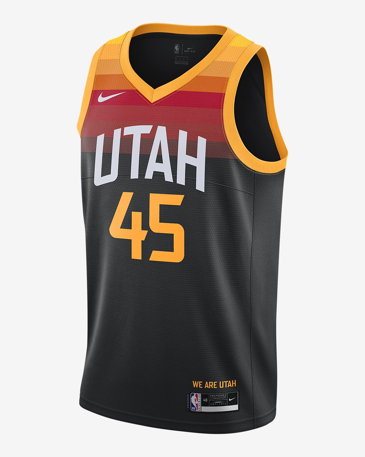
it just still really baffles me how they decided not to rebrand around the redrock jerseys. everything they need minus a white jersey is already there for them.

this could be their association edition
keep these and move them down to become the icon edition
bring these back and make them the statement edition. and then boom you have yourself a top 5 jersey set in the league
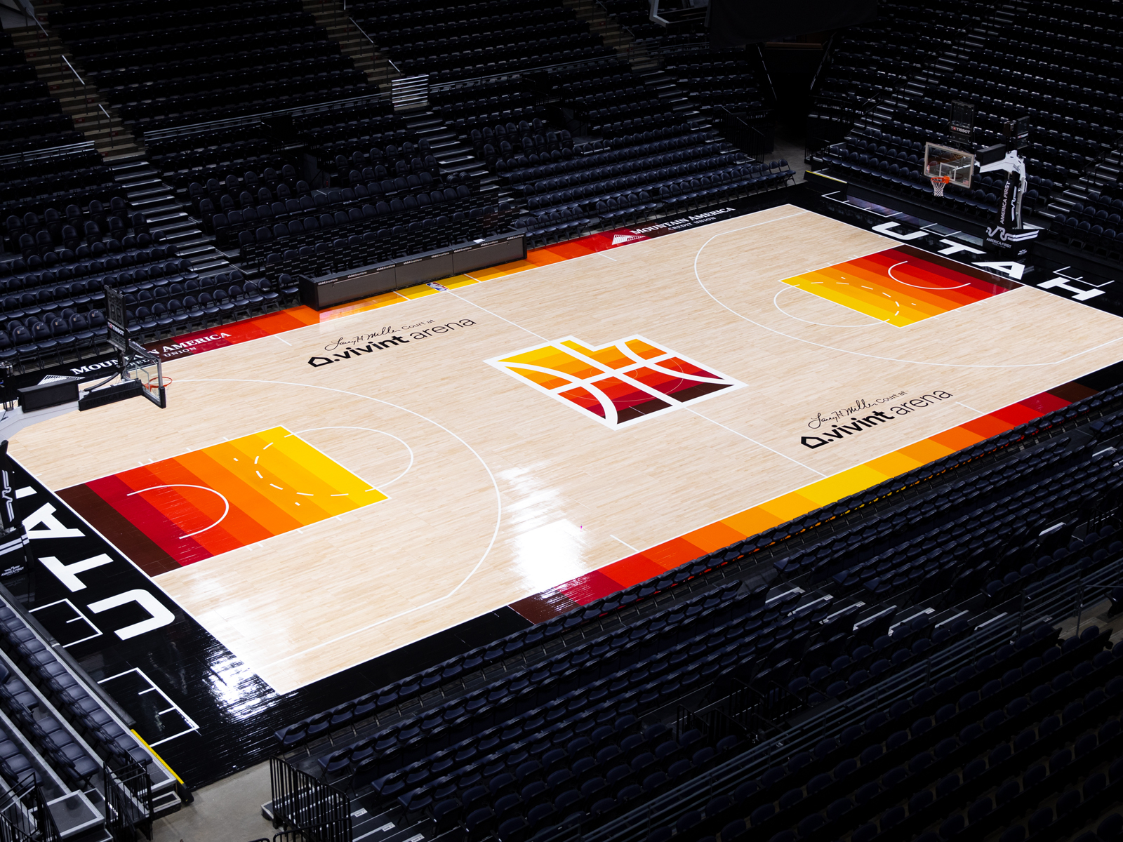
the logos are already there (they could make more matching ones if they want)
and they already have one of the best looking basketball courts ever.
I'm going to hold out hope that they'll do this, at least in some capacity. The owner's shirt suggests jt.
-
On 2/22/2022 at 12:34 PM, UnclearInitial said:
Ryan Smith looks like the type of rich douche who wears plain $500 “luxury” t shirts and baseball caps and desperately wants to look cool. Wade isn’t going to care about the history of the Jazz as much as what can look good on the runways and black is always a fashionable color. I would be shocked if the Jazz didn’t have a black primary if their color scheme is black/white/yellow
Interesting how the t shirt incorporates the desert rainbow city look with the new scheme.
-
I love the logo but think wacky identities belong at AA or lower. AAA should be idiosyncratic but traditional!
-
1
-
-
1 hour ago, NicDB said:
I'm one of them and I wasn't being funny. I'm actually surprised that the Bucks didn't shelve them once NBA twitter pointed out the connotation. Especially given all they've done locally to fight bad/corrupt law enforcement
The domestic violence component seems rather indirect but I agree with that the single blue stripe has a possible connotation of condoning police brutality. Also their secondary color is supposed to be red...and even purple worked...and here we have blue apropos of nothing??
-
3
-
-
I find it interesting how similar the Shuler/Frerotte and Griffin/Cousins situations were.
-
1 minute ago, Cujo said:
The blue tops don't blow me again, but every team's gotta have an alt jersey these days.
The blue pants tho

I like the thickness of the trim and boldness of the contrast. Reminds me of how the 80s Dolphins throwbacks are great, their recent update is ok, and their prior set with negligible orange was awful.
-
2
-
-
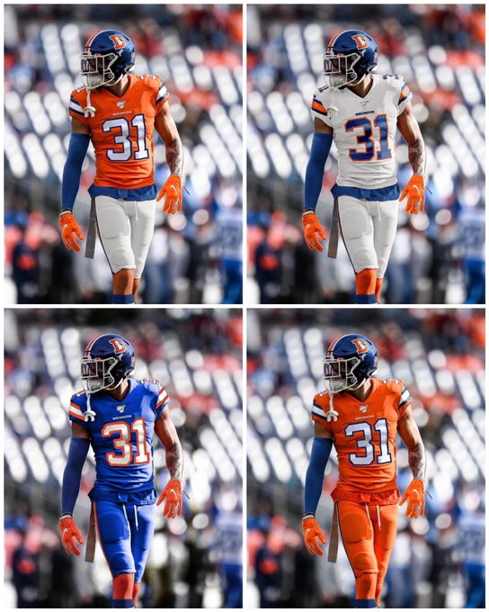
4 minutes ago, Cujo said:
The Broncos aren't modifying the cyberhorse unis anytime soon.
But if the day ever comes, I'd fully expect the makeover to look something like this:
A little gatorish but nice!
-
1
-
-
35 minutes ago, selgy said:
And if they would do more there would be people complaining "this isn't an expansion franchise" treat this team with respect.
Not everyone will be happy.Seems like admirable restraint to me.
-
3
-
-
1 hour ago, flyersfan said:
Forgive my limitations on Paint and a base template, but this should be a very close ballpark...
And yes, I'm well aware that the template's complexion doesn't match that of the player name & number I used, I just took that of the font we saw so I could get it right.
Not bad. Now, if alternate helmets are only for alts, does it go with the white, a different white, or an alt black?
The alternative palette and design strikes me as good radical rebrand for the Arizona Cardinals.
-
1 hour ago, Cujo said:
The closest thing to the Browns/Ravens relocation is the Winnipeg Jets of the NHL.
Like the 1996-98 Baltimore Browns, the Jets' records, history, lineage continued in Phoenix. When the New Jets came along, were the city of Winnepeg and new Jets franchise able to pry the old Jets records back from the Coyotes, 'fake' like the team just went on a decade-long hiatus, and say the Coyotes were just expansion?
The deals happening prospectively and retroactively make them entirely dissimilar .
-
4
-
-
2 hours ago, Cujo said:
Fixed.
Jim Brown, Bernie Kosar, Ray Lewis, Lamar Jackson all played for the exact same franchise.
How did they manage to rewrite history before it happened? Sounds more like an unusual history unfolding in real time.
-
3 minutes ago, DCarp1231 said:
I don’t know whether to be impressed or laugh
Complete with a redtails concept where the pilot looks white
-
11
-
-
2 hours ago, IceCap said:
Probably. It's a joke name. It isn't the end of the world. Chill.
We didn't get any more clear a view as what we could have speculated from other sources. It's like when this community did the same stuff with the now-current Vikings uniforms.
"So we can speculate, based on this blurry reflection, that the Vikings' purple jerseys will have white and gold sleeve stripes."What a revelation!
I mean look. If people wanna Zapruder Film through every piece of teaser footage then I can't stop them. But it never reveals anything interesting.
Speculate or confirm? W was always the likely speculation, but it could have been the rounded, stars, uniform #... do we even have another reliable source other than the teaser video and its unredacted version? Confirmation via a reflection seems like the greatest leak in uniform and message board history.
-
13 minutes ago, Survival79 said:
Clear side panels.
Flexible gorilla glass video screen side panels.
-
1 hour ago, IceCap said:
My objection to it is that you'll never get that clear image where you go "that's the logo!" Not unless the picture or video was captured with an insanely powerful camera. The types of cameras used for publicity shots or used to film footage for a teaser video aren't going to be powerful enough that you can pull an unintended reflection from the footage and get anything worthwhile. At most you get a vague idea of what it could be, which lines up with the other stuff the teaser video teases.
It all comes down to trying to read tea leaves.But...isn't the relection a pretty legit confirmation of a yellow W and its general style? We don't need a perfect vector art version, and that reflection is far more clear than an inkblot.
I can definitely see it as another annoying trope since it's usually a tiresome stretch of the imagination. But this time we've got a legit look at the helmet design from an unintended reflection. That's hilarious and pretty much a dream come true for this forum!!
-
4
-
-
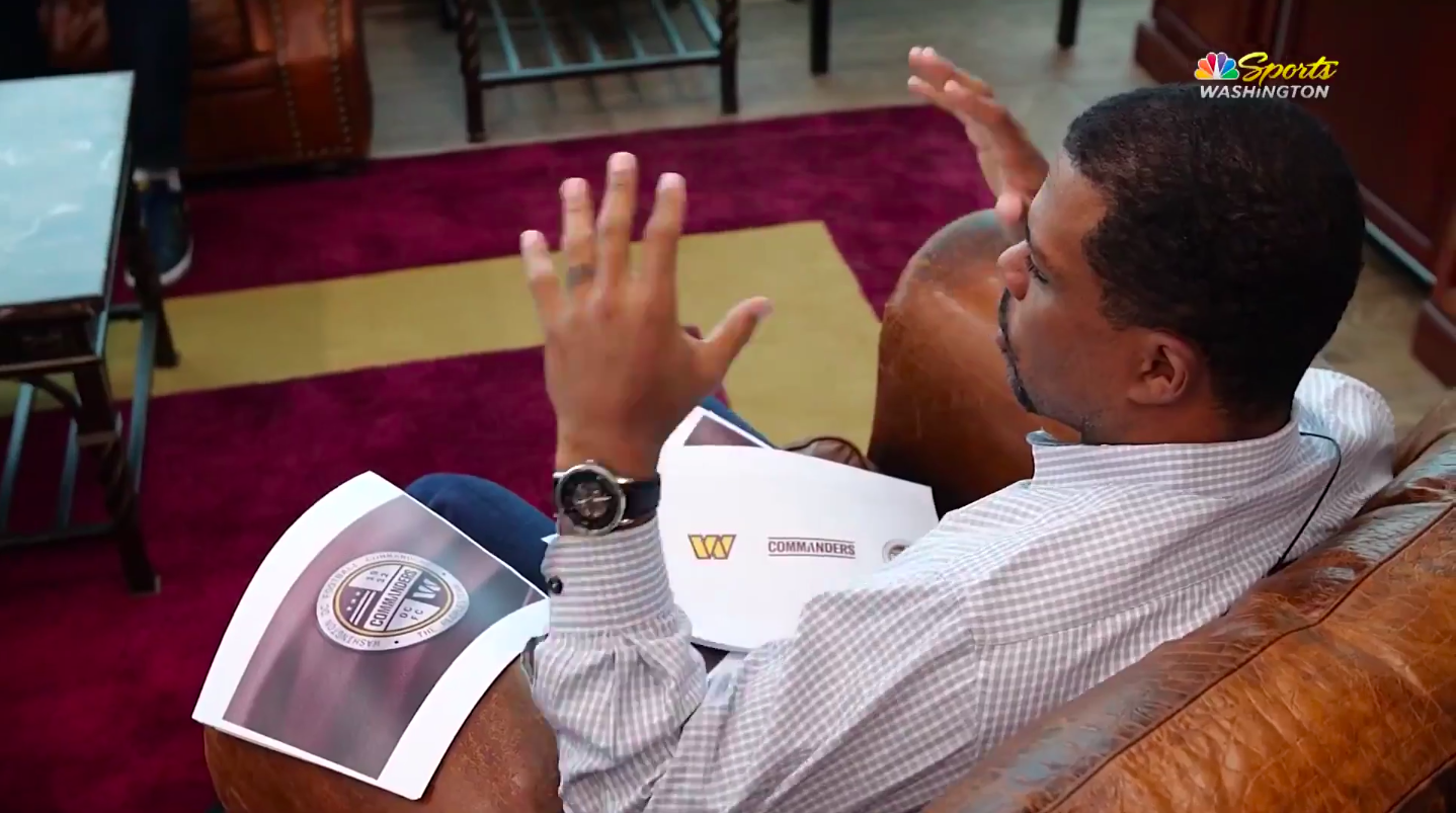
2 hours ago, Bill0813 said:
I found the photo in a Richmond newspaper article https://richmond.com/sports/professional/did-the-washington-football-team-accidentally-tip-its-hand-on-what-the-new-name-is/article_86202619-d101-5e63-815e-0273dbe7c226.html
Thanks! That explains it well. Unredacted version of teaser video aired on the team's local cable show.
Therefore not a hoax - either the real identity, a portion of the real identity planning, or -extremely unlikely - an extremely small scale, unprecedented attempt at misdirection.
Corroboration from the wordmark style sheet and the indirect uniform outlines/ stitching pretty well confirms that it's mostly the full identity. And a very decent identity IMO.
-
2
-
-
11 hours ago, Bill0813 said:
Here's another screen grab with a better look at the paper on the right.
What is this a screen grab from?
-
1 hour ago, Crabcake said:
Expecting better QC out of a Dan Snyder-owned team, talk about an evergreen joke.
I may have missed something, but where is that screenshot from? Looks like NBC or CNBC logo?
-
20 hours ago, Needschat said:
People, it could have been worse. They could have reached into the city's sports history and brought back the Diplomats. Fans and press would have a field day with the shortened name!
Worked for dipset...
-
2
-
-
7 hours ago, burgundy said:
I think "We will launch" is being extrapolated to mean more than it does because it's taken out of context. "We will launch" is not the entire sentence; it's followed by a dramatic pause for the date reveal. The entirety of what they're saying is "We will launch... 2/2/22".
Sure, it could have a second meaning, but it's likely they're just referring to the launch of the new identity.
Red Rockets
-
3
-
-
11 hours ago, AgentColon2 said:
I’m all for rebranding the entire league with pig/hog related nicknames.
first up: Philadelphia Rum Hams
Mockup request : Nippon Ham Fighters logo wherein a strong jawed cartoony batter wields a large bone-in ham, mimicking Harmon Killebrew or Julio Franco's stance.
-
1
-


2022-23 NBA Logo & Jersey Changes
in Sports Logo News
Posted
Really agree on this. Navy was close enough to purple IMO. They looked "right" for the first time in years. This is the double blue all over again.