


chakfu
-
Posts
1,243 -
Joined
-
Last visited
Posts posted by chakfu
-
-
Sentinels would be weird - practically same as Guardians.
I find it hard to imagine anything but the tried and true switch to Red______s.
I liked Redtails because of the history but supposedly it's not a finalist? "Tails" as a shortened form is awful.
Is Red Hawks really an option if trademarks eliminated Wolves? Hawks can also informally go with Hogs...I think it might be the best choice, Miami OH notwithstanding
-
 1
1
-
-
4 hours ago, guest23 said:
I don't think so. Given the history of bigotry in ownership and the horrendous track of the current regime the entire franchise has no belonging in the modern nfl. Send them to the history books where they can live alongside the Pottsville Maroons and Dayton Triangles.
Take the Ravens with them! (Clevejacking in progress)
-
1
-
-
12 hours ago, pelicanfan said:
was just about to say this. i always felt like more teams should incorporate their mascot/theme onto their main jerseys. those right there are a perfect example. another example is what the hawks *should* have done. which was to use the winged jerseys with updated colors for the main set.
Those are both pretty good but it can get cheesy fast. Never liked the NJ netting trim or Twolves trees.
-
4 hours ago, Lights Out said:
No thanks. It's a disjointed mess regardless of the collar.
I like how it pulls in the purple and even the blue...but no red?
The blue annoys me so much. Maybe it could work to help justify the purple (which was a cool scheme IMO - the best of the outlandish 90s color rebrands)
-
3
-
-
On 11/18/2021 at 8:13 AM, truepg said:
Always found that Nets wordmark ugly, and while they did the right thing in adding the Kidd era side panel pattern, the Dr J era stripe with the stars doesn't work there in such a narrow form. All in all very meh. Should've put the aforementioned side panels on both sides, they had always been very symbolic for the Nets to me.
The notch wasn't present in the big logo sculpture they repainted nor in the practice court graphics that we saw.
Seeing the logo in just plain black is very underwhelming, though. Would've benefitted of a yellow outline, if they're about to use it as a team color.
This is just the latest identity we'll desperately wait to be fixed, to restore the "real" colors. Whole league was basically finally ok; now they say they want to fix the chaotic historical palette by...complicating it more with one that's boring and completely unrelated.
-
1
-
-
10 hours ago, GMW79 said:
I have a bad feeling it's going to be a white J-note on a black background to further copycat the Nets. Hope I'm wrong.
With yellow to say it's ok. They're claiming they're simplifying the palette but are adding yet another unrelated combo. Navy/indigo was almost good enough, 1 step forward. This will be 2 steps back
-
4
-
-
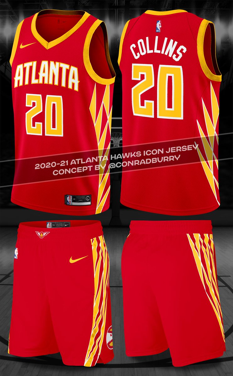
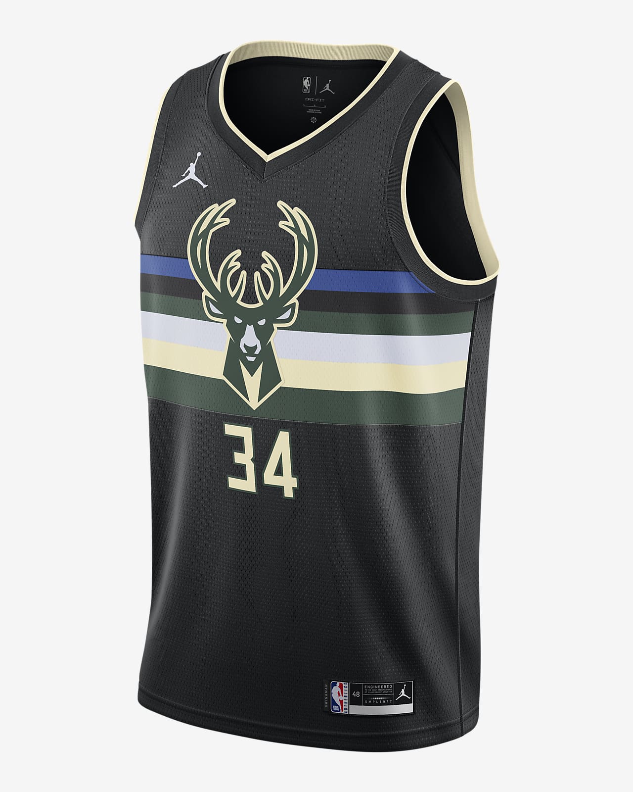
18 hours ago, pelicanfan said:
^heres the current statement jerseys for comparison

personally like this one more. keeps the deer while going all out with stripes.
Old one seems too sparse. Complete stripe fills things out better and the blue manages to be tolerable.
I like the number between the antlers but I think the deer head ought to be huge in order to work.
-
6
-
-
On 7/15/2021 at 3:33 PM, Shadojoker said:
Nets uniforms are so plain it's ridiculous they have gone this long without a rebrand. Same for OKC. Especially since they both have such a good brand to build off of.
As far as team name, I can't think of a worse brand than Nets. Inanimate equipment that only lends itself to way-too-on-the-nose netting designs.
I've come to realize an alt jersey can clash completely, doesn't need the same palette as the primaries. Black and white primaries with RWB 70s/80s stripes alt works.
Though I'd still like a full Dodgers crossover edition. Blue cursive Brooklyn on simple grays. Especially since gray and cursive both have been used in New Jersey Nets unis.
-
8 hours ago, kimball said:
They made it even worse a couple years ago with this subtle change …
Looks like a huge improvement to me. Orange trim and fewer words completely fix the wordmark and number and make it match and pop.
-
6
-
-
On 7/17/2021 at 10:09 AM, projectjohn said:
As a secondary logo, absolutely. Please don’t touch the primary logo, though. One of the few (maybe the only) branding/design decisions they got right during the 2010s.
The part on top reinforces my opinion that the primary logo is a piston in a chamber en face.
-
1
-
-
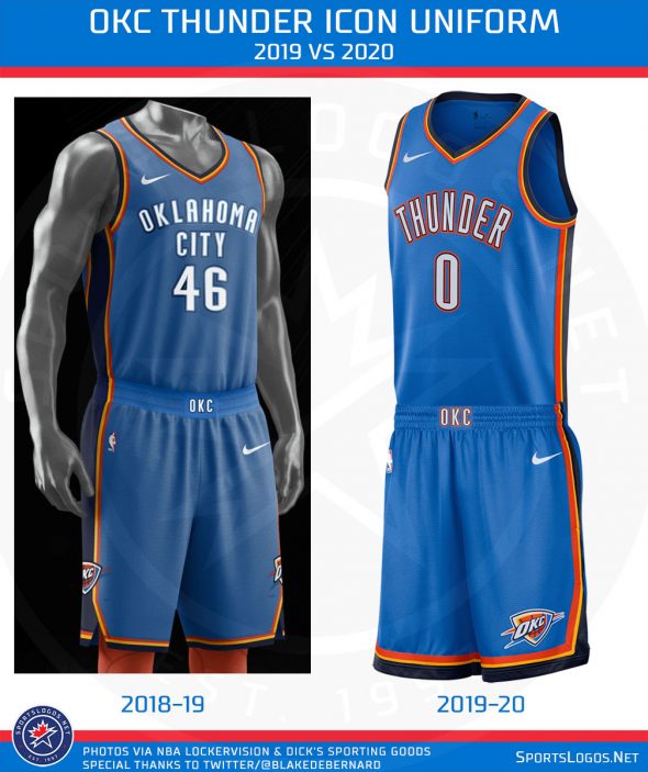
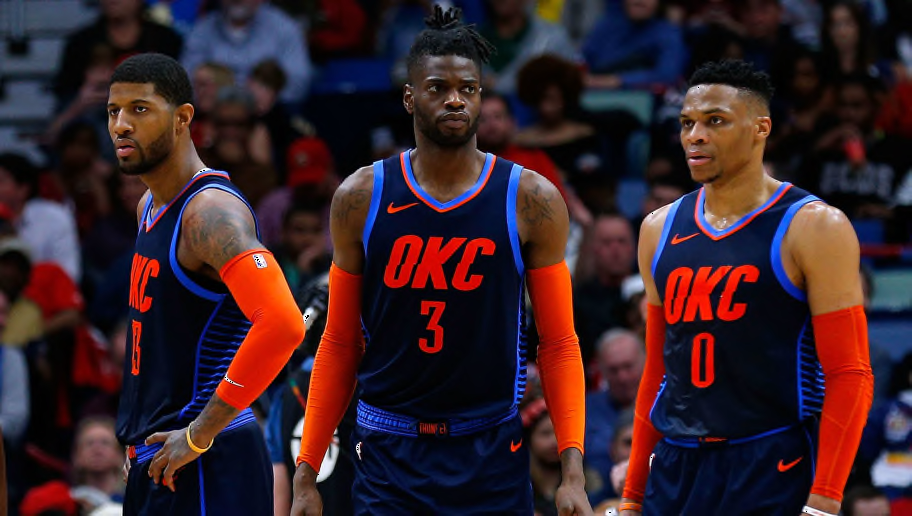
On 7/16/2021 at 3:55 PM, kimball said:
I can't give you OKC. The logo is soooo ... clip arty. I like the colors, but that's the only thing they go going for them. Basing something off their Statement Jerseys over the past couple of years would be a good direction.
Orange is underutilized. It's oven too beige and dull when it is used. Love the bold reddish orange like old shiny bobcats. Okc should make it theirs.
-
1
-
-
3 hours ago, IceCap said:
We'll get a Nets logo with an actual net in it...some day.
The 80s CAVS stole it.
-
4
-
-
55 minutes ago, MNtwins3 said:
I get where you're coming from, but using the Lions is a horrible example. They would never mix the color rush or the throwbacks with the other looks, because it doesn't fit. There is nothing wrong with mixing and matching your two normal pairs of pants just to mix it up on the road a little
If anything I'd be against locking them into a single potentially bad combo.
-
1
-
-
14 hours ago, _DietDrPepper_ said:
But white over white is their current primary road, which they aren’t allowed to wear the alternate helmets with. So either they make white over black the primary road next summer, so then white over white can technically be their color rush, similar to the Packers, or we get to see any early break in the rules to allow the all white look. Which for the record I’m not super thrilled about. The orange on the jersey will stick out like a sore thumb, and it just feels gimmicky and arena league.
I didn't think the pants really figured into the designations. If the white jersey is the primary road, switching the pants shouldn't change that. They need to make a 2nd version of white and call it color rush with a white helmet. In the meantime add some orange to the white road.
-
2
-
-
6 hours ago, DNAsports said:
For as much love as the Texans proposed white helmet gets and how 90% of fans want them to do a faux (or even true) throwback to the Houston Oilers,
1) it’ll never happen
2) they’d 100% do a red helmet to have the full battle red uniform
2 is probably right. But an alt white seems very plausible too.
-
2
-
-
I wonder what the definition of logo from the team's history. Helmet logos only? Or other logos from sleeves and other media? I'm sure we have a good idea of throwback options, nut what team's will be mixing and matching novel hemlet/logo combos to use with alts and color rush?
-
1
-
-
On 5/13/2021 at 12:33 PM, sayahh said:
I've always wondered why the away jerseys didn't have yellow numbers to match the yellow team name, but the white numbers on the purple jerseys grew on me. That said, these look perfectly fine to me.
Maybe the issue is white drop shadows? Seems ok on 80s yellows. But 70s had white numbers
-
On 5/7/2021 at 8:20 PM, SCalderwood said:
I definitely agree with you there... "hey look, we made the V look like a net" logos/uniforms were stupid.. I don't ever want to see those again. The mid-late 90s logos/uniforms were pretty bad also... their identity was just the word CAVS with a ball going into a net.
At least the Cavs seem to have realized this and have somewhat stuck with an actual cavalier theme/identity (and generally consistent color scheme) for nearly 20 years. I give them a lot of credit for that. With the exception of the black sleeved alternate, I actually think they've always looked really good since 2003, except for maybe CavFanatics and recent City jerseys (this year's suck). Yes they've made some changes here and there but they've managed to keep the same general theme and look continuing for a long time now, so good for them.
Agree but I'm still partial to the orange roads when they crept back into relevance.
-
1
-
-
On 4/26/2021 at 1:11 PM, henburg said:
Totally agree, it's so intense and vibrant. I love their color scheme in general, I really just wish that the rest of the brand could catch up with it.
I liked the original Bobcats too!
-
2
-
-
20 hours ago, dont care said:
I don’t think you can say that not being from the area. People actually from the area think differently. Cavs only mattered when they had Lebron and won the championship, now that he’s gone they are back to the bottom. Atleast the baseball team are always competitive
I am from the area and have little remaining interest my favorite baseball team when their best case scenario is heartbreak once a decade. Cavaliers have far more chance at contention than a AAAA team in a sport with no salary cap.
-
On 3/21/2021 at 12:20 PM, andrewharrington said:
I don’t necessarily like it, but I think I get why they do it. At this point, I their legacy is settled as a team that’s never going to be a permanently relevant NBA franchise and also a team that’s going to be third fiddle in its own city for eternity. It’s the Pepsi mentality of trying to constantly reinvent yourself in an attempt keep your target audience younger and fresher, since there aren’t enough old fans around to make building a “forever” identity worth the effort. It’s just life for lots of small- and mid-market teams.I think it needed the side panel on the shorts because it’s just so empty down there, but yes. These were nice. I wish the type was a little less bubbly, though.
Great news for the Cavs : they're only second fiddle. Baseball team is irrelevant regardless of rebrand. Browns are all that matter and their grip will only get tighter.
-
1
-
-
Posted this on Twitter:. Mb ball in glove except as beer mug.
M=fizz/head
b = beer Stein and handle
-
Oops wrong thread
-
And if you think that is self-righteous, just wait until you hear this one...I don't support walking into stores and stealing jerseys and CDs either!
Funny analogy since illegal downloads and counterfeit jerseys are both more copyright infringement / bootlegging than direct theft.
Semi-serious question: Is it illegal to make a homemade replica jersey for personal use? How about getting a blank jersey lettered instead of buying an official jersey with the same player's name?


Washington Commanders to debut new NFL identity
in Sports Logo News
Posted
RedHogs is such a minor league baseball name. Way too...flippant for a major league team
But it would be a natural informal spinoff from Red Hawks.