


VampyrRabbit
-
Posts
1,001 -
Joined
-
Last visited
Posts posted by VampyrRabbit
-
-
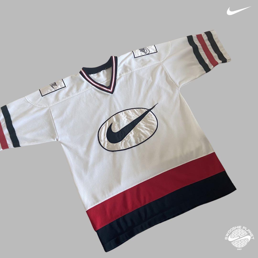
On 2024-03-18 at 2:13 PM, MJWalker45 said:
Per Nike:
"Canada’s 2024 Home kit celebrates the country’s sporting DNA. The shirt’s two-tone red features a rebranded Swoosh made famous on Nike hockey jerseys of the past".

I'll just leave this here.
-
1 hour ago, Pabig93 said:
Norway's new home kit is absolutely amazing. 10/10
I wouldn't call it amazing, it feels like there are too many shades of red and blue used and they could have used just one shade of red and two shades of blue. The mismatched cuffs and collar look odd too, and not really feeling the odd construction of so many of the collars for the Nike Jerseys this year. -
On 2024-03-15 at 1:47 PM, Section30 said:
Boston looks good and I like the overall look, but the stripes look wayyy too big
I get that the oversized stripes aren't to everyones taste, so here are the home and road with smaller stripes.
I would probably still choose the larger stripes, but I do like the smaller stripes.
And a road uniform with thick stripes with the black B and gold spokes version of the Bruins logo.
Calgary Flames
Home and road for the Flames, the striping is now a 1-1-3-1-1 ratio and Blasty is on the shoulder, I wanted him on the jersey, but decided to be subtle about it. Well, as subtle as a fire breathing horse can be. The main motif from the flag of Calgary serves as the Captain's patch, and the hangar effect is Onward, the motto of the city of Calgary. The strap for the home bucket is now white as it was from 1980 to 1994.
The alternate is a take on the 1998-2007 Blasty uniform, with the main logo having the white outline and black parts removed, to give the effect of Blasty looking out from the shadows. Like the home and road, the jersey uses the itallicised font.
C+C would be cool.
-
 2
2
-
-
On 2024-03-10 at 4:28 AM, vtgco said:
Curious, did you adjust one of the O letters in "Toronto?"
Not intentionally, the middle O in the SVG file readjusted itself during resizing for some reason and I only noticed long afterwards. I like the effect though.
Boston Bruins
Home and away for Boston are pretty much the classic Bruins look, with the return of the gold stockings. The stripe below the yoke has been squared off, and the stripes are larger. For the road, the white stripe between the sleeve end and the gold stripe has been removed. The bruins, the inner collar stripe and part of the NHL logo are brown as a nod to the first colour scheme of the team, generally I would keep the brown for Winter/Heritage classics and anniversary uniforms, but I wanted brown somewhere on the uniform. Hangar Effect is the script "Boston Strong".
The gold alternate jersey has the striping from the home stockings and the black and gold swapped on the central logo.
C+C would be cool.
-
2
-
-
On 2024-03-11 at 5:43 PM, ruttep said:
I don't mind this (their standard uniforms from last season were better overall), but I really do hope that they keep the simplified logo they rolled out for their centennial.
That colourway should work on both the home and road uniforms, the logo with the black B and outline and gold spokes isn't bad, just that I prefer a gold b and outline with black spokes.
-
1
-
-
On 2024-03-08 at 9:37 PM, GFB said:
the old logo is from the "beats by dre" era of the early 10s while the new logo actually has some modern character and that 't' could easily be used as a stand-alone icon for an avatar or app icon
The font is pretty dated and the colours are garish and overwhelming in comparison to the old scheme. It's not an upgrade. -
On 2024-03-07 at 2:17 AM, FrutigerAero said:
Amazing how people will defend Oakland as if they deserve to keep their baseball team while a team with similar success would be selling out all season long in Salt Lake City.
If the A's were in SLC currently playing in the last dual use stadium which got flooded by :censored:water on the regular and fielded a team that was on course for a third straight 100 loss season, with the owners blatantly sandbagging, there is no way on earth they would be selling out that stadium on one day, let alone eighty one of them.
-
6
-
-
On 2024-03-08 at 3:51 AM, BottomlessPitt said:
Vernon Krause, the billionaire spearheading the return of the NHL to Atlanta, said in an interview that if the NHL does indeed expand to Atlanta, that he hopes to drop puck for the 2027-28 season.
So that should mean that a Canadian city should get the franchise sometime around 2039.
-
19 hours ago, GFB said:
I agree, and add Vegas as a supporting point of this line of thinking as well.
Anaheim Ducks too. Those uniforms were horrible.
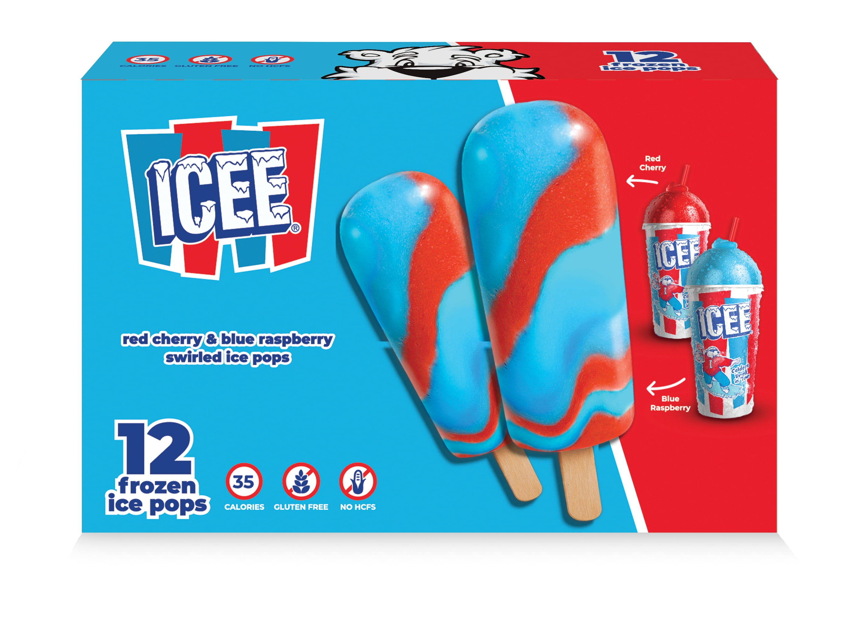
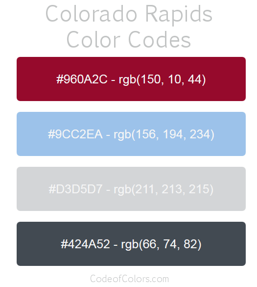
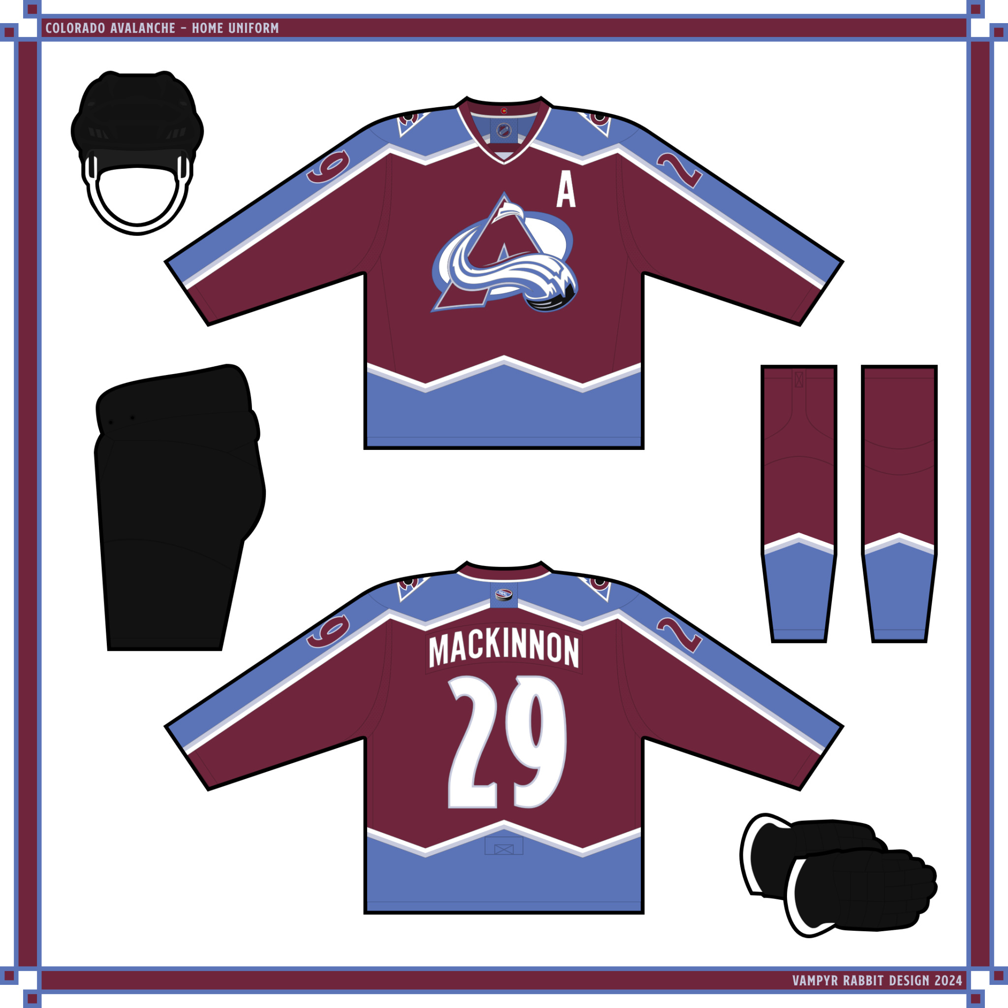
On 2024-03-08 at 2:03 PM, henburg said:The current Colorado Avalanche look just makes me think of an ICEE, especially when the red and blue flavors start to bleed together.
Those shades of red and blue contrast way better than the shades the Avs currently use. It's also more or less the classic scheme for Sicilian side Calcio Catania.
Quote
I think the Avs should keep their current shade of burgundy and find a shade of blue that works better with it rather than just using the same shades as the Rapids (or the Nuggets for that matter).
-
 1
1
-
-
On 2024-03-07 at 4:36 AM, FCMacbeth said:
I'm no fan of the Avs having black gear in their main set. Feels like they couldn't get any burgundy gears before their debut, so black got used instead as a placeholder. I get the steel blue and burgundy didn't get enough contrast when you look on the main set, but in my mind I felt navy blue would work well for the main gear instead of black.
Nevertheless, you make a good call on bringing back the extra trim on the mountain striping, as a way to bring in more balance to an unbalance colour scheme.
The team had black trim on their dark jersey, so it was probably a design decision to use black as opposed to being unable to get burgundy gear (and remember that originally the base colour was a lot lighter). For the current colours, I much prefer the black gear instead of the steel blue
For the concepts here, here is a set with just black breezers......
And a set with just black on the logos
I like both sets more than the all black gear, and at a push, the set with no black on it except the logos being the one I would choose.
New Jersey Devils
For the Devils, I decided to keep things simple and the result isn't too far from the 1992-2007 set. The stripes on the stockings have been doubled up, and on the breezers there is the wordmark taken from the Binghampton Devils logo. The Hanger Effect is an outline of New Jersey with the script "DEVILS COUNTRY" and a little green in there as a nod to the teams original colours in NJ.
The alt (no prizes for guessing what times of the year this would be worn) is a take on the teams first RR, with green breezers instead of red. The main logo and NHL puck keep the black.
C+C Would be cool.
-
2
-
-
7 hours ago, Brian in Boston said:
From the Oakland Athletics to the Las Vegas Armadillos, while still being dubbed the A's. At the very least, perhaps we'll see the A's adopting an alternate mark that replaces an elephant standing atop a baseball with an armadillo mounting a baseball.
But the white elephant is going to be perfect for the team in Vegas.
-
1
-
 3
3
-
-
Colorado Avalanche
Home and road for the Avs aren't too far from the original design the team used and won two Stanley Cups with. The black breezers and mitts along with the deeper burgundy introduced in 1999 are all here, but the blue is a new shade to contrast better with the burgundy, and a light shade of blue is introduced as an accent colour. On the shoulders is the mountain logo, and on the inside of the collar is the C from the Colorado state flag.
The alt pairs navy with blue.
C+C would be cool.-
1
-
-
This is pretty good. The home and road are really good.
Some suggestions -- The shade of claret is very purplish, and I would probably change it to a more classic looking shade to fit in with the theme of 150 years.
- Too much gold on the home. It makes sense having some gold on there, but it feels like there is way too much on the shirt.
- Aston Villa were the team that popularized Claret and Blue, so many teams followed in their footsteps and really the crest should be majority claret and blue, with the lion being claret. Also maybe use this seasons crest. The fans overwhelmingly voted for it as their new crest and Chris Heck (club president of business operations) decided to disregard that and introduce a new one without any fan consultation and imput. Also he decided to tell media to keep using the old Aston Villa logo, which the Daily Mirror (to their credit) decided to ignore and use the 2023-24 crest. Heck says the decision to go back to the old crest was due to the 2023-2024 crest "not having the desired impact", but considering that he told media to keep using the old one and that the 2023-2024 uniforms had serious quality issues which have affected sales, that lack of impact has a lot to do with him and nothing to do with the new crest, because he wants to go back to the old crest that the majority of fans had voted to change.
- The lack of the club motto on the shirt, which could go where the lion underneath the collar back is.
-
1
-
-
On 2024-03-04 at 11:49 PM, johne9109 said:
I agree the lighthouse is a great shoulder patch and should definitely be on their jerseys. The 4 stripes on the pants is a great touch; I'm surprised I haven't seen that more often as it makes more sense being there than being on the shoulders. The alternate took me aback at first but each time I look at it I like it more and more. It takes the most outlandish parts of the fishrman uniform and streamlines it in a great way. I love the use of teal as the main color and how it minimally uses orange. The 4 stripes/waves is a great touch that could be missed on first glance. Another great job
Thanks! I wanted an alt that was inspired by the Fishsticks, but was streamlined and used the navy and teal/turquoise, which if you get the shades right is a fine colour combo.
Now onto the team from the shores of Lake Erie....
Buffalo Sabres
The Sabres made the right decision to return to royal blue and gold, the home and road use mostly the style of the classic Buffalo Uniforms. The home has a contrasting collar and no white on the hem, sleeve and sock stripes. The stripes on the hose are doubled up, and on the road the stripes use an alternating colour style. On the breezers are the crossed sabres and on the inside of the collar are the lightning bolts and star motif from the flag and seal of Buffalo.
I like the look of the Sabres having shoulder patches on the home and road jerseys, but not having the main crest on there three times, so the shoulder patch is the B from the script on the 2010-11 alternate jersey inside a blue circle with gold outline.
The alternate is a reverse retro style using the 1996-06 colour scheme, B shoulder patches and the Goathead logo with the classic Sabres style, with the alternating coloured striping. I thought it was a missed opportunity for the Sabres not to have done a RR using the 96-06 scheme using the classic Buffalo style, so this is the direction I decided to take.
C+C would be cool.-
5
-
-
15 hours ago, Sec19Row53 said:
Does a kid in diapers need to attend a pro sporting event?
They need to learn the crushing dispair and the agony of defeat at a young age.
-
2
-
 1
1
-
1
-
-
On 2024-03-02 at 3:03 PM, johne9109 said:
Love the shoulder patch feels modern, yet retro at the same time and incorporates he DC flag as well great job. I'm not sure what it is, but it feels like there's something missing from the Caps home and away jerseys. The alternate looks fine, but something about the other two feels incomplete or off. Maybe it's the logo is angled in the alternate and not in the other two that's throwing it off or it could just be Washington jerseys are usually overly designed with wordmarks and stars and weird striping that a simplified design just seems off for them. Still really well designed
Probably a bit of both, it's a lot simpler than most Caps jerseys and it has the Weagle logo, there is a probable reason that it's not been used as a primary when you look at it alongside all the other primary logos of teams past and present. The wings of the eagle are raised well above the head, so there is a lot of empty space between the midline of the logo and the collar, which makes it feel a bit off.
The 95-07 primary leaves less space between the midline and the collar, which might help with the sparse look.
Now onto Elmont.....
These don't stray far from the classic Isles look, the home is a take on the 1978-84 look, the road from the same era. The breezers have the 4 stripe motif on one side, and on the shoulders is the lighthouse logo from the Fishsticks jersey, recoloured in royal blue, white and orange. I love that shoulder patch, and think it's long overdue an appearance on an othodox looking Isles jersey.
The alt is something new for the Islanders, using teal as the base colour alongside navy, and with a rejigged Gortons Fisherman logo on the front. The four stripes are present as a wave pattern on the sleeves, hem and hose.
C&C would be cool.-
1
-
 1
1
-
-
8 hours ago, Morgan33 said:
Here's the thing people tend to overlook about black on sports uniforms... Neither black nor white are technically colours. They are neutral shades. Putting the black equipment in the colour hierarchy of this uniform is like doing the same with the white uniform base. The actual colour hierarchy of this perfectly balanced uniform is Burgundy > Blue > Silver*. Just like on the home version.
*although silver could technically be classified as a shade as well,
Sasquatches are great, why did the Avs get rid of that awesome shoulder patch?
-
2
-
-
On 2024-02-27 at 3:18 PM, CRDesigns said:
Toronto looks great. The maple leafs text on the pants is a unique idea that works surprisingly well! not sure how leafs fans would feel about white gloves, but i personally dig it. Nice workThanks, here is a version with blue mitts.
Now on to the team from The District.
Washington Capitals
Home and road use a variation of the colour scheme introduced in 2007, and striping that is inspired by the jerseys from 1997-2007. The shade of red is called Red Tape a deeper, more cherry shade than the team currently use, and it's paired with an unsaturated shade of dark blue. On the front, the Weagle takes center stage, and the Alternate Captains patch is taken from the script on the 1995-2017 alternate logo.
On the breezers is part of the 1995-2017 alternate logo, and on the shoulders is a patch consisting of three stars and two sticks, mimicing the flag of D.C., with the script D.C. HOCKEY beneath. The hanger effect is the Capitol Dome.
A similar colour scheme used between 1995 - 2017 is used for the alternate, with the blue and bronze shades differing. On the front is the screaming eagle, the script that was on the 95-97 hem striping is on the breezers. Like the home and road, the alternate gets split colour hose.
The shoulder patch for all three uniforms, two red sticks and three stars, the D.C. HOCKEY script and a navy outline (Black on the Alternate).
C+C Would be cool.-
3
-
-
On 2024-02-25 at 1:45 PM, johne9109 said:
I like the choice of name and number font; a nice homage to Pike Place Market. The alternate is great.
Thanks. Any concept I do for a team from Seattle from now on is going to use Market Deco somewhere, it wouldn't feel right overwise.
And going from the newest team to an O6 team......
Toronto Maple Leafs
Home and Road for the Leafs, these were inspired by the 1927-37 home, with the current emblem on the front and the 2000 - 2010 name and (outline-less) number font. On the inside of the collar is a green band, a nod to the team colours when the team was known as the Toronto St. Pats. The blue used is a lighter shade than that the team currently uses.
For the Alternate, I decided on the Reverse Retro route and went with a combo that the leafs should have tried, with a 1967 style uniform with St. Pats Green replacing the blue everywhere except the inner collar band. The gloves, breezers and bucket are green, as I think that tan, cream and canvas should be for the Heritage Classic and not (semi) regular uniforms.
C+C would be cool.
-
4
-
-
It's okay, I get the change from royal to navy and the addition of the Pacific blue is great, though I wish the team had used more of it instead of just a little sliver on the collar and armhole trim.
Not feeling the logos, the roundel feels sterile with a type font that feels really generic and the ship looks more like a cruise ship instead of a clipper. I like the LA monogram, but while I like the idea of updating the scripts and they did get rid of the filled counters, it no longer looks like intertwined ropes with the home script.
It's a decent rebrand, but it could have been a lot better.
-
The Ducks would work a lot better with the actual plum shade of purple the team used instead of the saturated purple you've used. Similar story with the Stars, using the colours from 1997-1999 or similar would be a big improvement on the unpleasant green and chintzy sparkle gold effect used. The design for the Stars is good, but I think it would look so much nicer with the classic colour scheme.
-
On 2024-02-23 at 1:13 AM, johne9109 said:
I really like the use of a slightly bluer green and the addition of silver is a great touch that I don't know if it was intentional, but feels like a tasteful nod to their more eccentric uniforms from the late 90's/early 00's. I didn't think I would like the logo keeping the C white, especially on the white jersey, but it helps keep the idea of the orca breaking through the ice. The alternate doesn't look bad at all with the orca logo on it, but I think it would benefit from the updated skate logo that the Canucks introduced last season. Great start; looking forward to the rest
Thanks, the addition of the silver was intentional, originally I was going to just recolour the West Coast Express striping while leaving silver, but it didn't really work, so decided to update the current Canucks striping with some West Coast Express touches.
Here is the alt with the Flying Skate logo.
I prefer the Orca to the Skate myself.
On 2024-02-23 at 4:37 PM, CRDesigns said:
I love that youre using the puck logo on these jerseys. Nice touchThat logo is just great and it really should make a comeback, it feels more fun than the shield logo.
Seattle Kraken
Home and road for the Kraken. The team got their colour scheme pretty much spot on from the get go, so it's unchanged except for a more saturated and more pinkish red for the eye staring out of the depths and the red lines. The striping is similar to the RL Kraken, but with the hem striping matching the sleeves (flipped on the hem on the home) and with each stripe being twice the thickness of the previous.
The anchor shoulder logo is in an emerald shaped shield, and the Kraken part of the teams wordmark is on the breezers along with a red stripe. The font for the name and number is Market Deco, and the Alternate Captains patch is the A in the Kraken wordmark.
The alt has striping similar to the home and road, with the anchor logo taking centre stage without the emerald shield shape. The primary team logo is on both shoulders, and the TV number is moved to the yoke panel. The gloves, breezers and bucket are the same as the home jersey. I designed the alt as an alternate with a similar style to the home and road instead of harking back to a previous team from Seattle's hockey history (I prefer to save that for Heritage/Winter Classics).
C+C would be cool.-
5
-
-
New Oakland Roots jerseys announced.
The goalie jersey (middle) is supposed to be a tribute to Jorge Campos and the outfits he wore. I use the word supposed, because if your retinas aren't bleeding, it ain't a tribute.
-
5
-
-
Vancouver Canucks
Home and Road for the Canucks, these use the blue and green like the current set, as those are the colours that the team started in the NHL with and they should stick with them.
The blue is a shade between that used on their second RR and the blue the team currently use for their home and road, and the green is slightly more bluish than the current shade. The striping also has silver in it, I wanted some West Coast Express stylings in the uniforms and the silver in the striping and the angled sleeve stripes were inspired by those uniforms. Above the sleeve stripes are oversized stadium series style numbers. The stick in rink is on the shoulders, with white ice on the home and road, and on the pants sits Johnny.
The Hanger Effect are the Twin Sisters just north of Vancouver.
The Alternate uses the black, orange and gold of the Flying V jerseys, again with West Coast Express style striping.
-
5
-
1
-


My Ideal Fanatics NHL Redesign - Edmonton Oilers (11/32)
in Concepts
Posted
The Ducks look great back in plum and teal, though you've made a mistake with the striping on the hem, it should descend in the opposite direction on the back (as with the original) instead of the same direction for both front and rear.
Not a fan of removing the yoke for the Bruins and not a fan of the hem stripe style.