


ruttep
-
Posts
1,263 -
Joined
-
Last visited
-
Days Won
41
Posts posted by ruttep
-
-
57 minutes ago, CDCLT said:
The Canes' red helmet on the road looks great. It's excellent color blocking, pairing very nicely with the red shorts. I hope more teams start wearing colored helmets on the road. More color is a good thing!

-
 2
2
-
 3
3
-
 2
2
-
-
I feel like the Canes are a team that tries way too hard to be "cool" and "different" with their brand. It started out with the "Bunch of Jerks" thing, which I think was a good response to old hockey men throwing a tantrum, but between making the black warning flags their primary, a road uniform with a nickname on it, randomly shuffling between different red jerseys, and wearing the red helmets on the road, stop it. You look ridiculous. Innovation is welcome, but what the Hurricanes do doesn't make any sense.
P.S. you don't deserve to wear Whalers throwbacks, stop it. Same way I feel about the Titans wearing Oilers throwbacks. You screwed your former city over, you don't get to dress up in your former look to make a quick buck in merchandise sales.
-
4
-
 2
2
-
-
1 hour ago, spartacat_12 said:
Well they've already done it for both their road games so far this season.
Looks horrible
-
3
-
2
-
-
I prefer the bottom two to the top. But that's just me. At this point it's just arguing about personal preference. There isn't a right or wrong answer.
-
15
-
-
9 minutes ago, Old School Fool said:
The 49ers didn't even play the Jaguars until 1999.
Thanks for reminding me how terrible a darker shade of red looks on the Niners
-
2
-
1
-
-
43 minutes ago, Pigskin12 said:
I cannot be overstated how much better these Cardinals uniforms would look with red socks. There should be a rule against having that much white on a uniform.
I agree. The Cardinals should only have one pair of pants and one pair of socks: White pants, red socks. Just switch out the jersey as needed. Wear the white pants with the black alt as well.
-
4
-
 1
1
-
-
22 hours ago, JohnnyCowboy5 said:
What do you guys think of this
It's a fine opening (love the U2 music), but [MOD EDIT]
-
14 minutes ago, DCarp1231 said:
If you're gonna do a 90s theme (which I assume this is), you better wear teal/white/black again.
On another note, the Jaguars only co-existed with that 49ers logo for one year: their inaugural 1995 season. The Niners switched to the inferior updates to their 1994 throwbacks a year later.
-
3
-
-
4 hours ago, tBBP said:
"Tell us you like white facemasks without telling us you like white facemasks..."
-
2
-
-
14 minutes ago, Cujo said:
Shoutout to the Lions for wearing silver pants vs the Bucs -- the closest they can come to making this look like an old fashioned Lions-Bucs NFC Central match-up.
White socks tho for some reason
-
3
-
-
1 hour ago, Nordiks_19 said:
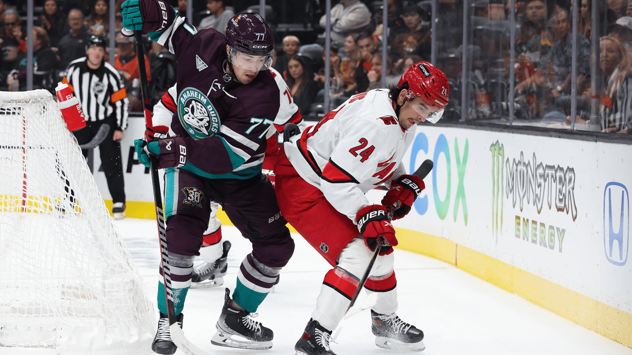
Any game last year when the Hurricanes had their red helmet on the road
So most recent would technically be Eastern Conference Finals Game 4.
Side note, red helmets on the road is completely atrocious. Please, Carolina, never do that again. You look like a minor league team that can't afford another helmet.
-
4
-
2
-
1
-
1
-
-
5 hours ago, jp1409 said:
Right on. White on black...
Checked the tweet where they announced this and Eagles fans are ridiculously hyped about this... thank goodness fans and players don't unilaterally decide on uniform combos.
-
 1
1
-
-
2 hours ago, HOOVER said:
This is the same striping pattern the team has worn during its entire existence. There is no reason to change them.Signed,
Chiefs Fan
PS. I’ve come to really dislike the Red on Red. It was cool…once. Don’t like it now. If they’re going to do it, they need to wear their White socks.
The stripe combo doesn't match because a red monochrome combo was never meant to exist. The uniform was never designed with this in mind.
-
6
-
-
2 hours ago, BrySmalls said:
Capitals Announce Blue W Third Jersey To Be Worn for 11 Home Dates During 2023-24 Season
Below is a schedule of the games the Capitals will wear the third jerseys:
Oct. 27 vs. Minnesota Wild 7 p.m.
Nov. 2 vs. New York Islanders 7 p.m.
Nov. 8 vs. Florida Panthers 7:30 p.m.
Nov. 24 vs. Edmonton Oilers 3 p.m.
Dec. 30 vs. Nashville Predators 7 p.m.
Jan. 7 vs. Los Angeles Kings 3 p.m.
Jan. 16 vs. Anaheim Ducks 7 p.m.
Feb. 6 vs. Montreal Canadiens 7 p.m.
Feb. 20 vs. New Jersey Devils 7 p.m.
March. 9 vs. Chicago Blackhawks 7 p.m.
March 30 vs. Boston Bruins 7 p.m.
Huh. It seems strange that this is season four of this alternate and they have yet to wear it against the Rangers.
-
Sabres are wearing their Rick Jeanneret memorial patch on the left side of the chest next to the captaincy patches... we all know why they left the other side open for now
-
 2
2
-
-
Come at me all you want-- these uniforms should have either been given to the Texans or left to the sands of time. The Titans don't deserve to wear Oilers uniforms after Bud Adams screwed the city of Houston over and withheld everything about the Oilers identity out of spite. Now they want to gloat that over Houston with these throwbacks and even wear them against the Texans?
 that. Give the Oilers identity back to Houston, or don't bring these back. I doubt many fans in Tennessee have much of a connection to these uniforms, either.
Imo should have been a Browns/Ravens situation (or more directly comparable, a Hornets/Pelicans situation). The old name/colors can go back to the original city for the new expansion team, while the moving team has to rebrand.
-
4
-
2
-
1
-
1
-
 1
1
-
-
5 minutes ago, Silver_Star said:
that look so generic. No striping on the pants?????!!!!! Ugly!!!!There aren't stripes on any of their pants. But I love this combo because it's the closest we can currently get to:
-
9
-
-
21 minutes ago, JohnnyCowboy5 said:
Video of how it looks on a broadcast:
Looks pretty good to me. I like the idea of having a special jersey to wear against Original 6 opponents in the centennial season, although I still wish they brought out one-off throwbacks to match each of their "era nights."
-
2
-
-
1 hour ago, Ark said:
I think adding black to the mix was a good idea for Calgary, like it was for the North Stars. Minus some of the design elements (that weird pedestal thing for one) I think these look great
At least it doesn't have the ugly black C, but the black outline inside the logo still ruins the flaming hot effect imo.
-
2 hours ago, AFirestormToPurify said:
Eggplant is vibrant?
Maybe vibrant is the wrong word to use. My point is more that it's nice to see more unique colors. No matter what you think about the quality of their current look, you have to admit it's a pretty generic color scheme.
-
2
-
-
1 hour ago, TBGKon said:
Orange isnt vibrant?
Not really when the jersey is mostly black
-
2
-
-
33 minutes ago, monkeypower said:
Ignore the question if you want but you can see some of the Ducks breaking in the 30th equipment.
Good. We could always use more vibrant colors in the NHL. Black, tan, and orange is such a boring color scheme.
-
31 minutes ago, Ti-Nick said:
^ Great matchup indeed.
By the way, could you tell me where you go to get nice game photos like this?
Google lmao. That image was from one of the dozens of articles about Crosby vs Bedard.
-
2 hours ago, DCarp1231 said:
Give me those Dolphins throwbacks, but with the double outlines and call it a day.
?? Double outlines are terrible. Makes the numbers less readable from a distance and imo just looks bad.
4 hours ago, goforbroke said:The Giants will wear their throwback navy helmets with their color rush this week, rather than their normal royal blue helmets with the throwback logo.
Don't care until they actually wear blue socks with their white throwback.
-
2
-
 3
3
-


2023 NFL Season week by week uniform match-up combos: From HOF Game to Super Bowl LVIII
in Sports Logo News
Posted
I just checked and the Colts don't have any primetime games, and I doubt they ever get flexed to a later time slot. This week is as good as any to debut these uniforms (Ideally, they would never be worn, but I digress).