


ruttep
-
Posts
1,258 -
Joined
-
Last visited
-
Days Won
41
Posts posted by ruttep
-
-
We were robbed of

-
 3
3
-
 1
1
-
-
1 hour ago, GFB said:
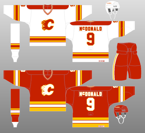
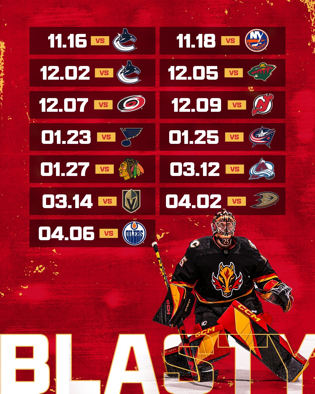
I will forever go to bat for this specific Flames uniform:
The colors are sharp and balanced. The sweater has this "charred" or "burned out" effect for a team named after fire. The uniform actually utilizes the yellow/white/black striping pattern found on the 90s set in a way that's actually appealing.
The problem with this uniform set was the dull white uniform and how the black outlines completely nuked the bright colors and "glowing red-hot" effect to the crest and numbers that makes the Flames old/current set so enjoyable:
I would enjoy it if the Flames brought back that 2004 red uniform as their alternate uniform and wore it a couple of times throughout the year to change things up as it does all the things I want from the Flames: it keeps the team in red sweaters with the flaming-C crest, yet it's different enough with the black equipment to give it a completely different vibe.
You know what, I agree that it could be a good alternate if you take away the black C (which I still think is terrible). Maybe put Blasty on a red jersey. At the very least, it will look better than the current all-black Blasty alt. But it should never take precedence over the classic look.
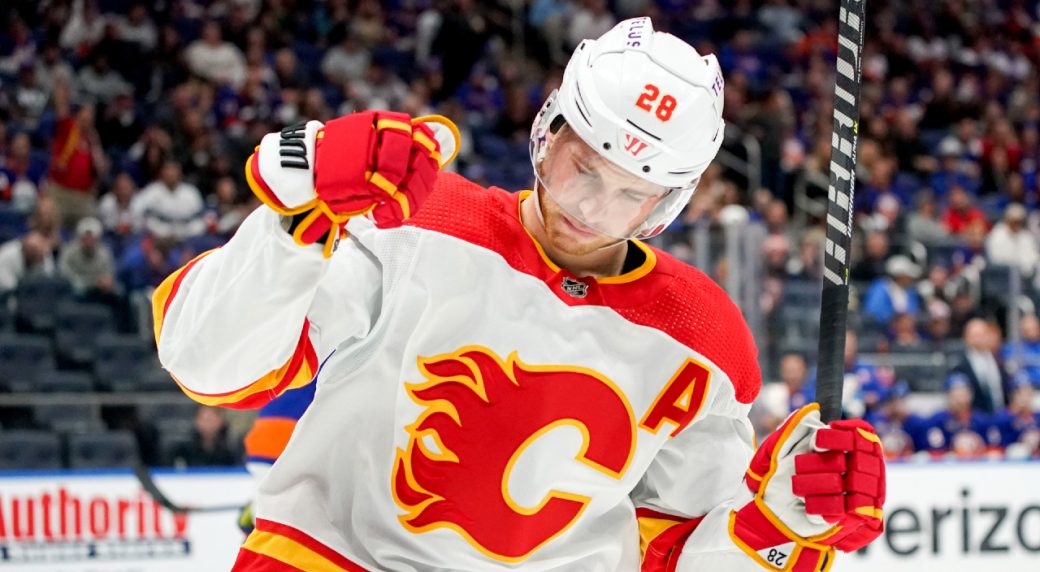
The Rangers white jersey is my favorite white jersey in the NHL, but Calgary's is my second favorite. It just has a lot of vibrancy and color that you don't see with very many white jerseys.
-
4 minutes ago, dont care said:
They are nonsense because they are either not true, or completely inaccurate. If you are going to pick apart a design atleast be honest about it. Saying the hem comes up too high when it doesn’t get higher than any other hem stripe, and the lowest point of the chevron less than an inch above the actual hem. Saying there is no flow or meaning to the point in the chevron when it is in the Middle of the sweater. What more “flow” or meaning do you need?
That wasn't me bro lmao. I just said I didn't like the black "C." I said the jersey with black wasn't bad, but wasn't great either.
The argument you're looking to pick apart was from @monkeypower.
-
1
-
-
5 hours ago, canzman said:
Commanders @ Falcons
Really, Falcons? You're gonna waste a throwback game on the terrible Commies uniforms?
5 hours ago, canzman said:49ers @ Browns
Also, this Browns look might become an eyesore in the bright sunlight of an afternoon game
-
8 hours ago, dont care said:
Your reasoning is nonsense though.
???
-
 1
1
-
-
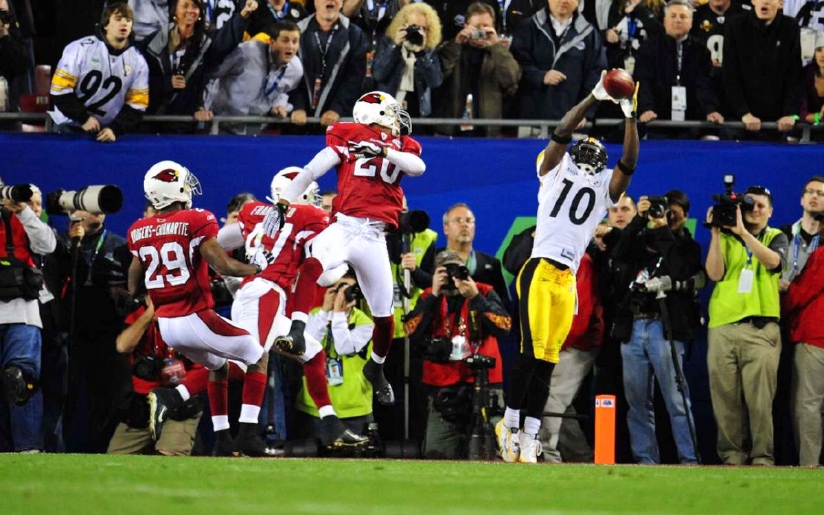
2 minutes ago, HOOVER said:
49ers vs Cowboys is always a classic and hard to beat, but I will offer that this one was really pretty today:
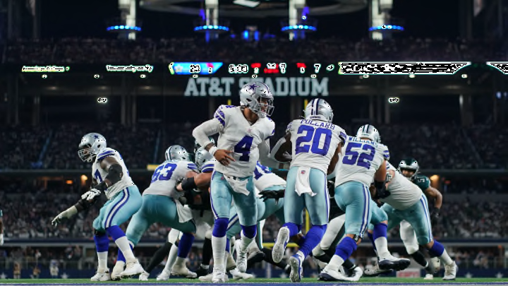
Chiefs in White-on-White is my favorite, and wearing their White socks with it takes me back. I think I prefer this combo with their Red socks now, but either is far better than when their White jersey is worn over their Red pants.
I don't think it's a bad look by any means, but I think that it should have been worn against an opponent that doesn't have white pants. For example, I love when they wear it against the Raiders or the Chargers in yellow pants:
-
10
-
-
53 minutes ago, monkeypower said:
What are you talking about?
"The chevron comes up far too high, taking up way too much space"? The chevron is barely the bottom third of the jersey and the highest point doesn't seem any higher than the highest point of any basic hem striping.
"the point doesn't follow a natural flow in any meaningful way"? It's the middle of the jersey.
All I'm saying is
>>>>>>>>>>>>>>>>>>>>>>>>>>>>>>>>>>>>>>>>>>>>>>>>>>>>>>>>
Any day of the week.
-
3
-
 2
2
-
 1
1
-
 1
1
-
-
39 minutes ago, GoGreenGoWhite said:
Best uniform matchup in the league is happening right now.
And you cannot convince me otherwise.
-
 1
1
-
1
-
-
1 hour ago, Germanshepherd said:
PURPLE SOCKS FOR THE VIKINGS!!!
Finally! Such an easy fix complete
Watch them not wear it again because they lost today
-
1
-
-
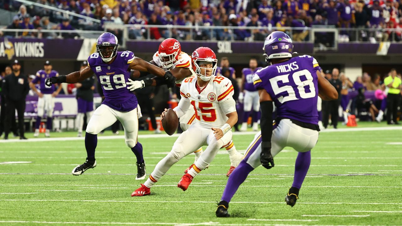
1 hour ago, simtek34 said:
I'm personally a big fan of the Chiefs White on White look, preferring it over White on Red. From what I can tell, everyone on the Chiefs has the striped White socks, it just depends who has their socks pulled up all the way and who doesn't.
Also my Vikings are finally wearing Purple socks with their White pants . So all and all, I would consider this a good uniform matchup, Would be even better if the Chiefs wore their Red socks., In my opinion, White pants and White socks, even with sock stripes, doesn't look that great. That goes for the Chiefs, Patriots throwbacks, Bears, etc...
Chiefs white on white isn't bad, but doing it 90s style with the white striped socks against a team that is also wearing white pants makes no sense. I agree that it could work with the red socks. The white socks should only ever be worn with red pants.
I still like white on red better though.
-
6
-
 1
1
-
-
7 minutes ago, dont care said:
Just because you don’t like a uniform, doesn’t make it a “wrong” uniform…
I mean, this is just my opinion. You're free to have your own. It looks "wrong" to me, but that doesn't mean it has to look "wrong" for everyone.
-
 1
1
-
-
9 minutes ago, gothedistance said:
This is the worst week of the 2023 season so far. In terms of quality of uniform matchups.
I will maintain that while there are some stinkers, there are also some (three) beautiful matchups:
Steelers/Ravens
Raiders/Packers
Niners/Cowboys
-
2
-
 1
1
-
1
-
-
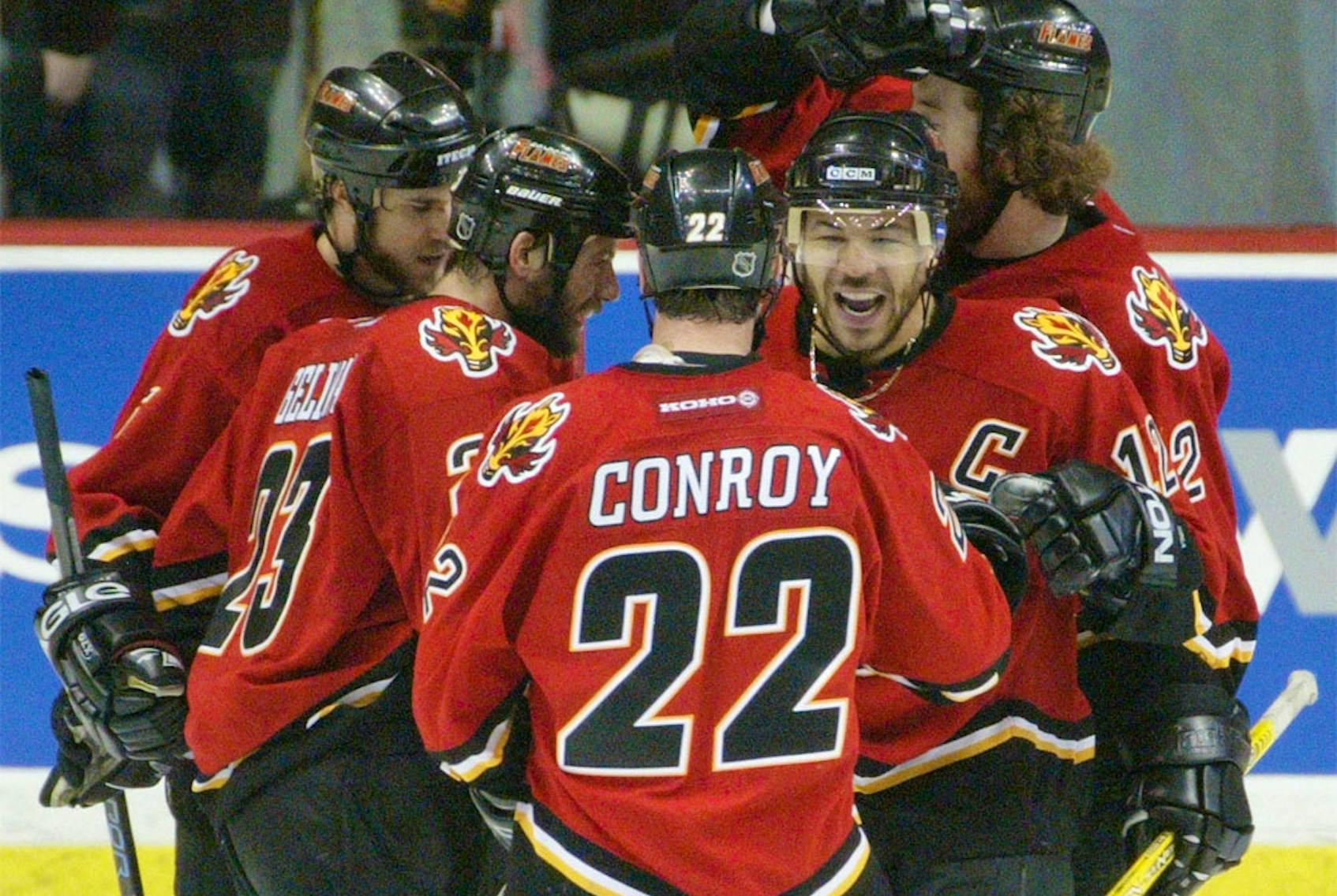
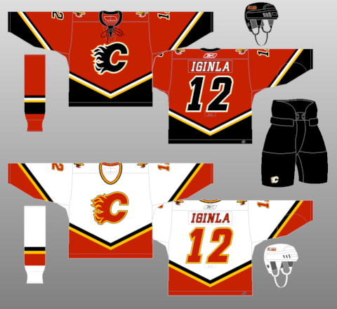
6 hours ago, the admiral said:
When you have a classic logo, you should make sure not to wear it 15% of the time and replace it with a flaming-snot horse from when the team really sucked and everyone wore unnecessary black.
It's probably to appeal to the smooth brains out there that still think there should be black in the Flames' color scheme.
This is not a bad uniform (I would argue it isn't anything special either), but it does not make sense for the Flames. It gets repeated a lot, but the black in the logo does make the "C" look "burned out"
-
4
-
1
-
1
-
-
16 minutes ago, JohnnyCowboy5 said:
So apparently we don't get a single game in the Battle of Alberta this year with both teams in their primary uniforms. Fair trade off for getting an outdoor BoA, I guess.
But since both teams went back to their retro looks, it's one of the nicest matchups in the league.
-
4
-
1
-
-
On 9/24/2023 at 2:54 PM, RyanMcD29 said:
Friend of mine was watching the Sabres-Caps game on NHL Network with the new Monumental Network feed and.... that scorebug seems a bit too large to me.
The size of that GMC ad is simply atrocious.
-
This "blue" color made it into a Super Bowl
Still can't believe these Cardinals uniforms, side panels and all, survived all the way until last year.
This Falcons uniform was not good either.
-
1
-
-
1 minute ago, WBeltz said:
Can't imagine what they'll do if they lose in black pants, maybe pull a Ravens and unveil special grey pants for a game

They'll randomly resurrect that gold uniform they wore once
-
5
-
-
54 minutes ago, Cujo said:
Just because "ItZ tRaDiTiOn!!!" doesn't make them good.
Soooo the Packers, Raiders, Chiefs all use MATCHING COLORS. I would take the Steelers out of the "great classic look" conversation because they bailed on block numbers. They also need logos on both sides of their helmet, but that's a whole nother conversation
Just curious, where does the 49ers uniform rank for you, because it can be argued that the 49ers gold pants are not the same color as the helmet
1 hour ago, Cujo said:Matching colors >>> Cowboys second-hand store home unis
Matching colors doesn't mean anything when you're matching
 with
with
-
2
-
1
-
-
14 minutes ago, BBTV said:
is Merton Hanks back in the building?
That's painting with a very broad brush. I've been here for nearly 20 years and the Cowboys have been criticized for their mismatch since the day I joined. It may be considered a "classic" look, but more in the "have had it so long that it's just who they are and they'd look weird any other way" sense, not the "timeless quality" way.
I'd personally rank the Cowboys in the bottom 3rd of the league until they do something about the black stripes and make up their mind about their silvers/blues/greens. Just because something's been the same forever doesn't mean it can't be improved.
The counter argument would be the Detroit Tigers, who fixed their mismatched Ds and have been widely criticized for it (by me too, but only because they kept the wrong one.) Maybe it'd be the same if the Cowboys did change, but I'd like to see them at least try.
I'd still rank Dallas ahead of (in no particular order):
-Giants (minus throwback)
-Eagles (minus throwback)
-Washington
-Falcons (minus throwback)
-Saints (until they get their act together and burn any pants that aren't gold)
-Broncos
-Seahawks (minus throwback)
-Titans (including throwback, they don't deserve to wear Oilers uniforms)
-Any combination that any team has ever worn where the pants match the socks
-
3
-
-
7 minutes ago, PERRIN said:
As much I loathe the mismatched colors and the two different designs on the home and away, the Cowboys' uniforms are at worst a B- and are still the best in the NFC East, save for maybe the Eagles in the right combos. They look miles better than at least a dozen other teams. Most of my frustration with them lies in how that B- could easily be an A+ if they just made everything consistent across both uniforms.
I agree. I just had to make the point that "iT's wOrSe tHaN bFbS" is ridiculous.
-
3
-
2
-
-
6 hours ago, Cujo said:
Nah. Any BFBS unis (unless it's Commie BFBS) are still far better than the Dallascowboys at home.
I could not agree less with this statement. Let's just agree to disagree on this topic because this is one of the hottest takes I've ever seen on this forum. You cannot tell me that this
is worse than
-
3
-
3
-
1
-
1
-
-
59 minutes ago, Cujo said:
I'll take the Jets' unis over at least ten other teams in the league. For being modern, they're miles ahead of likes of the Commies, Falcons, Rams, Titans the list goes on.
My point isn't about the overall Jets uniform design. I don't like it that much personally, but it's perfectly fine in today's NFL. I was referring to this post:
3 hours ago, Chi-Tex_Kidd said:Really the cowboys unis are the second worst
 all right let’s ignore the commies away, jets all black, saints color rush, bears orange, jets black pants socks with white jersey etc.
where a bunch of different combos were listed. I'm just saying, the Jets in white jerseys and black leggings are infinitely worse than the Cowboys. They needs to get rid of all their BFBS uniform elements immediately.
-
2
-
-
1 hour ago, burgundy said:
Tennessee's uniforms may be a pile of crap, but they're a cohesive pile of crap. Washington's uniforms are a collection of turds by three completely different animals.
I think the burgundy jersey could be salvaged into a decent look. The other two are simply horrible.
1 hour ago, Cujo said:The Jets don't even look bad!
Alright, this is a scorching hot take. This combo is pure garbage.
-
3
-
-
3 hours ago, MCM0313 said:
Off the top of my head, 49ers holdovers from ‘89 to ‘94 were…Steve Young, John Taylor, Jesse Sapolu…am I missing anybody? Was Romanowski still with them in 1994?
Cmon man, you missed an obvious one. Jerry Rice.


/cdn.vox-cdn.com/uploads/chorus_image/image/71654970/usa_today_19476470.40.jpg)


:format(jpeg)/cloudfront-us-east-1.images.arcpublishing.com/tgam/7ZA77WZA7FIHPDDAJOLO7AZFEA.JPG)


/cdn.vox-cdn.com/uploads/chorus_image/image/62983972/633954072.jpg.0.jpg)
/cdn.vox-cdn.com/uploads/chorus_asset/file/23027523/1230133207.jpg)
/cdn.vox-cdn.com/uploads/chorus_image/image/72719543/1680917575.0.jpg)

/cdn.vox-cdn.com/uploads/chorus_image/image/71645440/1440660207.0.jpg)

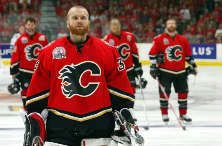
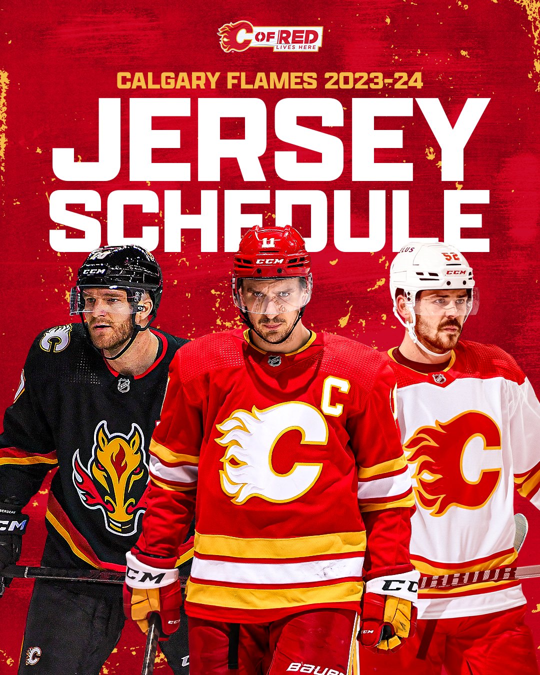
2023-24 NHL Jersey Changes
in Sports Logo News
Posted
I dunno. I think that black anywhere in that color scheme would have looked dated by now, no matter what. The only way I see that the 2004 uniforms would not have been eventually replaced is if they won the Cup that year...
I won't even touch the debate on whether that goal was in.