


udubfan19
-
Posts
128 -
Joined
-
Last visited
Posts posted by udubfan19
-
-
20 hours ago, SFGiants58 said:
Eh, that's not really the case anymore with City Connect. It's hardly a favorite of any Giants fan I know, and many of us were glad when their arrival got delayed this year.
its better than wearing literal d#dger blue

-
 2
2
-
 4
4
-
-
FINALLY! I have always disliked that angels CC jersey, the font 'angels' is in is so annoying and they can't even put a city name on it! I find it hard to "connect" with a city if said city isn't even in your team's name either. also, odd the yanks' still think they are above everybody when they have been paper tigers since blowing the 3-0 lead in 04' (save 2009)
-
 1
1
-
-
13 hours ago, JohnnyCowboy5 said:
outdated in 5 years


-
1
-
-
1 hour ago, Danny the Sheeb said:
Nike: What do you want these jerseys to look like?
Dodgers: We dunno lol, just give us something random.
It's like they decided the last ones were too conservative, so they put every out-of-the-box idea they could come up with in these, regardless of whether it made sense or not.
all to get swept in the NLDS (it would be funny if they choked the division too)
-
8 hours ago, throwmesomepics said:
This game didn’t feel real, odd visuals all around
odd game too
-
20 hours ago, Lights Out said:
I think green and athletic gold is less similar to other schools out there, at least in football specifically. With green and athletic gold, there's Baylor and... North Dakota State? With green and vegas gold, there's Notre Dame (alternates), Colorado State, USF, Charlotte, UAB.
you forgot oregon, is it because they lost to the same team twice?
-
road alt kind of looks like a spring training jersey, 'Anaheim' across the front would look better IMO
-
2
-
-
not the right team but most definitely the wrong uniform
-
2
-
-
20 hours ago, MCM0313 said:
Appoint a successor to Merton Hanks to enforce them.
appoint rex ryan
-
1
-
-
3 hours ago, VDizzle12 said:
That Missouri set was so popular other teams went with the same template. I remember Houston specifically going with it during the Case Keenum years.
Illinois was probably the worst offender of the "piping" look. With Oregon State and even Clemson not being far behind.
can't forget even more traditional schools such as Washington & Michigan had piping on their jerseys in the last NCAA game.
-
2
-
-
11 hours ago, burgundy said:
"32s" is a reference to 1932, not being the 32nd team.
32nd in standings
-
1
-
2
-
-
46 minutes ago, Sec19Row53 said:
I saw a Phillies cap in the same color/style this past week.
at least they actually have blue in their color scheme. a giant hat in dodger blue is forbidden.
-
what in the
-
 1
1
-
 1
1
-
-
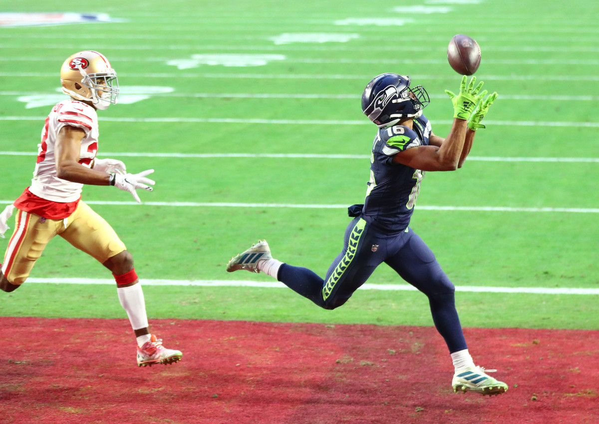
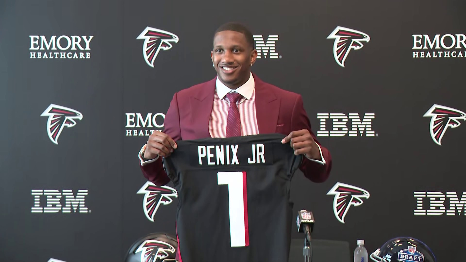
11 hours ago, Ark said:
Hey the Falcons gave away Vick’s number!!
2001: falcons changed jerseys 4 calendar years prior, draft a lefty QB named Michael who lost a national championship game and had an amazing deep ball.
2024: falcons changed jerseys 4 calendar years prior, draft a lefty QB named Michael who lost a national championship game and had an amazing deep ball.
-
1
-
-
y'all aren't gonna believe this:
-
 how denver should have honored those colors:
-
8
-
 1
1
-
-
10 hours ago, rfraser85 said:
I don't know about sales for U-H, but if the NFL did nothing, how many other college teams may try to do something like this? One imitator may not be a problem, but the potential for cumulative damage may be worth taking action.
That said, I agree that shutting everything down may be excessive. The Iowa Hawkeyes have been using Steelers look-alike uniforms for decades, so there may be a middle ground somewhere.
hell, Washington even did that designing theirs after the 49ers.
-
9 hours ago, schlim said:
I thought Seattle was 12.
could be, but I thought the stadiums were at 16
-
9 hours ago, Chromatic said:
Why does it have 5280? Does that number have any significance to the city of Denver?
On a completely unrelated note, does anyone know Denver's official altitude? I know its probably never been discussed before, but I sure wish cities would spam their official distance from sea level at every possible opportunity so we never forget how thin the air is there.
Seattle with a 16
-
I prefer the 2013-2018 font for WV, but the rest is a move in the right direction.
-
2
-
-
On 4/27/2024 at 7:36 PM, BBTV said:
Search feature. It's never been good, and it never will be. You do a search, and it returns x pages of results. If you don't get what you want on the fist page, and click another page, you get "you must wait # seconds before running another search." FFS - why do the search results show you that there's multiple pages, if you can't actually view them in less than a week? I'm not b-tching at the mods - I know it's just the forum software - but it's gear grinding, and dissuades anyone from using the search "feature".
also shows the same thread 74 times...
-
On 4/9/2024 at 12:53 PM, dont care said:
Is your “A” button broke?
i just saw this, and also just saw the a in marks isn't emoji.
-
10 hours ago, mcrosby said:
I'm struggling to come up with a good logo for Cincinatti. Would love to hear some suggestions!
-
3
-
 1
1
-
-
11 hours ago, TrueYankee26 said:
As for my Yankees I am glad the Astros aren't there lol
second that from seattle.
-
3
-


/cdn.vox-cdn.com/uploads/chorus_image/image/68627912/1294363610.0.jpg)
/cdn.vox-cdn.com/uploads/chorus_image/image/68614932/1294354144.0.jpg)


Inaccurate colors/uniforms in video games that should know better
in Sports Logo General Discussion
Posted
in MLB the show 24, the M's 1993 road throwback is missing the headspoon