


udubfan19
-
Posts
128 -
Joined
-
Last visited
Posts posted by udubfan19
-
-
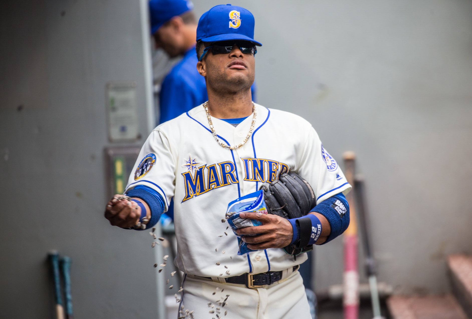
Houston looks like the 2017 Arizona jerseys.

-
 1
1
-
 1
1
-
 1
1
-
-
2 blues will end up looking like these, especially paired with white pants:
-
1
-
-
13 hours ago, burgundy said:
What the
 are you talking about? What does Cleveland have to do with this?
because its Cleveland, duh.
-
5 hours ago, BBTV said:
given the Eagles silver pants and helmets
what silver helmets?
-
1
-
-
23 hours ago, coco1997 said:
Thanks! I'm not convinced this version would have been that much better received, as I feel the biggest issues most people have with the Phils' new set is the wordmark and wonky numbers style, neither of which I really mind.
SEATTLE MARINERSHOME:
ROAD:
HOME ALT:
ROAD ALT:
CITY CONNECT:
Notes:
- It was an odd choice by Seattle to drop their gray road jerseys while keeping their Sunday home fauxbacks, because 1) the team now has gray pants without a matching jersey, and 2) their City Connect set is also blue and gold, which makes the fauxback, in my opinion, redundant.
- After ditching the team’s Sunday home fauxbacks, I asked myself, “Why can’t Seattle’s primary home uniforms be off-white?” I'm not entirely convinced it works, but you be the judge.
- The whole set uses a more vibrant shade of teal/seafoam green, similar to the one from the team’s Spring Training caps. The new home cap is also a recolored version of the ST hat, which swaps out the "S" logo for the compass.
- I decided to work up a new road alt design that replaces the “Seattle” wordmark with the “S” logo. I also streamlined the home jersey wordmark by dropping the second stroke around the letters.
- As I tend to prefer custom style numbers, I restored the M’s’ rounded numbers across the board.- I previously shared my Seattle City Connect tweak here, where you can read a breakdown of the changes I made. In short: The black pants are now white, newly added t-bars are inspired by the Steelheads, a touch of red comes from the Rainiers, and the crossed tridents on the cap bill were suggested by @Frylock.
C&C appreciated and have a great weekend!they just don't look right in cream, but the CC is definitely better than the current mess.
-
1
-
-
4 minutes ago, Brave-Bird 08 said:
We have gone from the NFL basically treating their team's helmets like primary logos to inevitably rotating through uniforms like college teams do.
Ick. This scares me, especially because I fear teams will use this opportunity to complete the "icy whites" look.
(Also, does this maybe clear up what's going on with Denver? Could be that white helmet is for an all-white alternate look, while the primary will be blue. We will see.)
man, I hope this is right and Denver keeps the blue helmet primary.
-
1
-
-
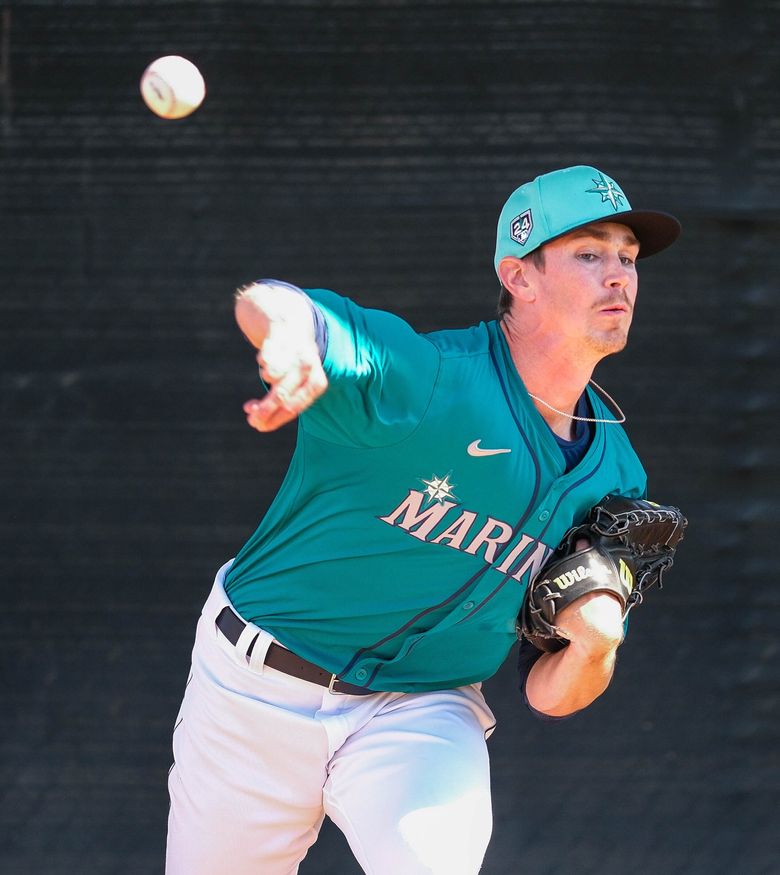
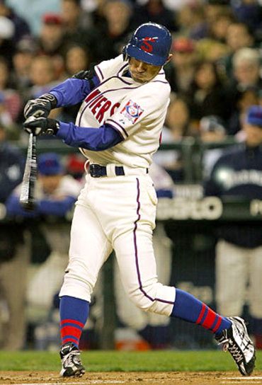
Ichiro in teal jerseys, which they only introduced in his 3rd to last year in Seattle.
-
5 minutes ago, HOOVER said:
In quickly trying to digest this new 3rd helmet rule, the last line of the policy seems to be the most significant:
"Each alternate helmet color must be tied to a specific optional uniform and cannot be mixed/matched with primary uniforms or mixed/matched with another optional uniform."
So, for example, if the Lions debut new uniforms, they could do something like this:
1. Primary (New Home/Away) + Primary Helmet
2. Classic (Barry Sanders or Thanksgiving) + Classic Helmet
3. Color Rush + Color Rush Helmet
Or, the Jets can now have a Green Helmet for their home/away Sack Exchange uniforms, a White helmet for a Namath throwback, and a Black helmet for Color Rush.This may not be as horrible as it originally sounds.
the lions already have throwback helmets? their also gray.
-
1
-
-
kinda looks like UW vs cal this past season
almost blue.
-
10 more posts until page 100
-
1
-
 1
1
-
 1
1
-
-
but the opposite. doesn't h
 ve to be your own picture.
-
Just now, BBTV said:
How is itnot?
thats not baseball. thats facebook!
-
35 minutes ago, Germanshepherd said:
New font for Nebraska?
It’s pretty much Washington’s font, I’d bet this is Adidas moving away from plain block for all its schools.
Not a fan if so, it just looks wrong.
looks way closer to USC's 2015 font.
than Washington's 2019- font
-
1 minute ago, BBTV said:
Most notably, Nike isn’t even allowed to contact teams and suggest changes. The teams go to the NFL, and the NFL goes to Nike. They are contractually not allowed to solicit. So them “pushing teams to change” isn’t even allowed.
Not only that, but they don’t do helmets or logos. The only logo they’ve done since the 2012 contract was the Rams, and that’s because the Rams specifically wanted them to do it. They’ve not done any other logo or helmet.
the colors are often dictated by the logos / helmets that the NFL/team pick, not Nike’s whims. Also, if a team “knows what they want”, Nike just does it. But it’s when a team just has some vague ideas, that’s when they’re instructed to “challenge” them and push the envelope.
It’s not like Nike has nearly as much influence as anyone seems to think they do, and there’s been several instances where teams were like “lol no”.
In fact, for the Bucs last set, Nike didn’t even want to do it - it was the Bucs owner that kept pushing for more and more wacky stuff, including materials on the numbers that Nike said was a bad idea because of how it’d get ruined in the wash.
They also tried to “fix” the Vikings numbers so each digit would be the same, but the Vikings loved the sail gimmick so
much that they insisted on the inconsistency.
Also, Nike design is free, but teams can still hire anyone they want to design uniforms. It’s just that since Nike’s work is already paid for, they just use them (from the neck down).
The guy is retired and has no reason to lie about anything, and admits that they’re instructed to think more about the younger fan than the older ones, and the “Nike speak” and storytelling nonsense is all contrived just for sales pitches and other reasons, but that on-field presentation comes above merchandising, and when we complain, they often do too and try to “fix” things that don’t come off as expected, but aren’t allowed.
TL;DR
Blame the teams.
It’s really a great interview. The guy was in charge of the Jets change, but was an old Jets fan himself and didn’t even want them to do it.
so the teams are to blame for the disappearance of low whites on the socks?
-
-
3 minutes ago, burgundy said:
I think you misunderstand what "threadjacking" is. Threadjacking is when a thread about a specific team/topic is derailed into discussion of a completely different team/topic. For example, if the thread were specifically about the Broncos new uniforms, and people start discussing the Browns, it's been CLEVE-JACKEDTM. But a thread about all NFL changes can't be jacked by any NFL team because they're all already included in the discussion.
However, this thread can get jacked by flags.
what i meant by TEN-HOU jacked was that they were talking about "statit's" and what they are called on reddit. not a change in the NFL.
-
13 minutes ago, Brave-Bird 08 said:
Are there any recent examples in other pro sports leagues of teams having uniforms literally not available before the season?
1970 brewers. not very recent. but they had to use the old pilots jerseys.
-
1
-
-
9 hours ago, Chromatic said:
What? Who are you? Discussing upcoming uniform changes of a team is not "jacking" a thread.
they stopped talking about the titans and texans (they didn't even talk about the uniforms, it was something about reddit.) only when i said "texan-titan jacked.
 " then they started to actually talk about uniforms. who pissed in your cheerio's?
-
 2
2
-
 1
1
-
 1
1
-
-
I had successfully un HOU-TEN jacked the thread. now its DEN jacked
EDIT: not yet DEN jacked
-
2
-
 1
1
-
1
-
-
does this thread still allow concepts?
-
6 hours ago, pitt6pack said:
You have a full list of games when they did this?
Easy update for me to make.
(Also, I have a separate thread for non-Super Bowl fields here, to post future things like this)
no list but probably the giants games in october that year.
also didn't know the existence of the other thread.
-
18 minutes ago, oldschoolvikings said:
Sure, they are the ones wearing it, but that doesn't mean they make good decisions. When my boys were 6 and 4 they wanted a say in what they should eat for dinner, but that didn't mean it was a good idea to serve them jelly beans and lemonade every night.
fair enough
-
1
-
-
8 minutes ago, Brave-Bird 08 said:
Shoutout to the Ravens for being self-aware enough to understand the gold pants were a huge mistake, then owning it publicly and making fun of themselves.
And also for showcasing how "player input" for uniform design decisions is NEVER a good idea, and that is a hill I will die on.
aren't they the ones wearing it? you wouldn't want to be told what to wear.
-
1
-
2
-
-
5 minutes ago, DCarp1231 said:
Top 15 for MVP isn’t exactly a distinguishing feat.
i know. he was top 10 twice during those 4 years though

/cdn.vox-cdn.com/uploads/chorus_image/image/61943063/usa_today_11539779.0.jpg)


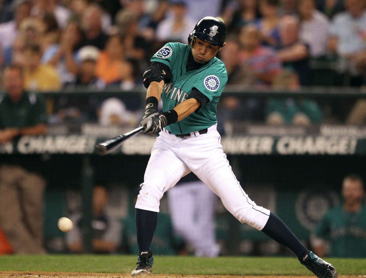 Ichiro in teal jerseys, which they only introduced in his 3rd to last year in Seattle.


/cdn.vox-cdn.com/uploads/chorus_image/image/72852349/1689520281.0.jpg)
MLB uniforms redesigned
in Concepts
Posted
numbers on concepts randomly chosen. 4 jersey limit (as MLB rules). also every jersey has NOB and only in block font. to prevent this. most alternates can be worn home or away
AL west:
SEA: the font from the wordmark in used on the jersey numbers, gray jersey is added over the cream jersey. and silver brim hat replaces all blue, and blue jersey has piping
TEX: i preferred the 2014-2019 jerseys over the 2020- ones, I don't like the rangers script, although having 'texas' on the home jersey is worse. red jersey added back for red-blue balance
ANA: they play in Anaheim. also added a blue jersey & hat
OAK/SAC/LV: the Oakland athletics of Sacramento & Las Vegas have good jerseys. but the yellow A on the all green hat looks much better than white.
HOU: orange hat added back & blue jersey matches others.
NL west:
SF: all jerseys match the home jersey better. alt bridge logo added to sleeves
COL: more purple is added to home jerseys.
AZ: gold/sand added back over teal, 'diamondbacks' added to white & black jerseys. also, the dark gray jersey was unique, so I brought it back.
LAD: on Jackie Robinson day, they wear jerseys without front numbers, and i think it looks better than front numbers that mismatch the back numbers. (also, a throwback to 1951)
SD: the blue-gold color scheme is vastly superior to brown-yellow, why celebrate 22 years of .436 ball with 1 90 win season? and they wore blue for longer as well.
AL central:
CWS: red or navy has been in use for the white sox for a vast amount of time more than black & silver. also throwback hats!
MIN: i prefer the current striping, but the previous gen of everything else for the twins. also, cream alt is back.
CLE: I hate almost everything about the guardians rebrand. so, these are close the 1994 jerseys.
KC: i prefer seeing the script on the away jerseys over block.
DET: I added a modified version of spring training jerseys from years back as an alternate, and the B-W-O striping on the road. (I remember seeing it somewhere on their old jerseys.)
NL central:
CIN: black brim replaced with white brim.
MIL: the ball in glove logo could work for any other ball club with MB initials. i prefer the previous set with gold & a logo with wheat in it.
CHC: old road script is back, also R-W-B striping. and your beloved red bills.
STL: st. louis added to road jerseys. red alt added over cream & powder blue.
PIT: only 1 black jersey is needed. also 'pittsburgh' is in the same font as the home jersey
AL east:
NYY: blue alt added with white brim hat. (also, one NY logo apparently.)
BOS: blue centric road from the 2013 team is added back with red outlines. blue & white on red jerseys flipped, and 2 alt hats are added
TB: modified 2007 set with font on back numbers. a devil ray is more intimidating than a ray of light.
TOR: navy added back to be more accurate to the WS jerseys
BAL: black is the primary over orange. old bird is back.
NL east:
PHI: more blue added and red alt jersey is back
NYM: pinstripes moved to cream alt, old blue jersey is back.
MIA: white M on hat.
ATL: i made a 2019-2023 blue jersey here, but i think blue on blue is more unique and less like CLE
WAS: nationals script in red on home, white on red jersey, 2023 road jersey added back.
requests now open