


udubfan19
-
Posts
128 -
Joined
-
Last visited
Posts posted by udubfan19
-
-
AFC north:
Bengals: reverted back to their previous design but removed the side panels, yoke, & drop shadow,

steelers: added a number outline, and white pants that they used from 1970-1971. also removed block font.
ravens: added stripes to the black pants & removed the helmet stripe.
browns: based it off their 2015-2019 jerseys. but used the proprietary font & removed the drop shadow & text. also, brown numbers on white elements.
-
AFC east:
patriots: I based it off their color rush from a few years back.
Patriots V2: per @johne9109's request, no silver.
Dolphins: based it off their 2013-2017 jerseys, the extra marine blue line is better in my opinion. also added an aqua facemask & a marine blue jersey.
jets: based it off of the 2015-2018 color rush jerseys with their 1998-2018 colors
bills: removed the striping inconsistency from their uniforms & added sock stripes.
-
NFC east:
cowboys: 1 blue, 1 silver. (& a silver jersey.)
eagles: not much change except the arrival of the rarely used green on green.
giants: based it off their 2015 set, made the stripes more consistent & added a gray jersey, it just seems right.
commanders: if I could change the name back, I would. but that's not a part of this series. instead, I used the superior uniform & made the stripes consistent.
-
NFC north:
bears: the away-jersey-stripe throughout. not much change except the old throwbacks are turned into the color rush.
packers: connected the sleeve stripes & added a number outline & a green & yellow color rush alt similar to their current throwbacks.
lions: based it off of their 2009-2016 jerseys, they a just a smidge better than the current jerseys in my opinion. added the black jerseys & blue pants.
Vikings: not much change except for striping consistency on the white elements, and a purple facemask. also removed the color rush jerseys in favor of the normal purple on pruple
-
NFC south
Falcons: as with the site, I based the jersey striping off the logos feathers, put back the old font & added a black matching jersey
panthers: not much change outside of their helmet stripe, & the jerseys stripe was made to closer resemble the pants stripe.
Buccaneers: I based it off the 2014-2019 jerseys, but the yoke is now just a sleeve cap & removed the stenciling in the numbers so it doesn't look like an alarm clock. + a pewter jersey
saints: not much change except for the removal of the color rush jerseys & a black stripe is added to the white pants & gold to the black pants.
-
I redesigned NFL uniforms, every team must have 2 mono-sets, (for color rush) & half-white socks are used for all non-color-rush jerseys. 1 helmet & no throwbacks.
NFC west:
Seahawks: I like their current jerseys, but i don't like that the sleeve stripe extends out.
49ers: I based it off their current jerseys with the old wordmark & red facemask. gold outline added for visibility on black jerseys.
cardinals: I bridged the way old & current jerseys and changed the striping on the black jersey.
rams: I used the 2003-2011 uniforms as a base, as they had gold pants unlike the 2012-2016 jerseys. added the 2015 color rush & a throwback.
rams 2: throwback centric with royal helmets& matching blue & white pants. per @Bomba Tomba's request.
-
I haven't run into this issue. most of my images are 1k - 2.5k pixels by 600 pixels.
-
3 hours ago, Hd1graphics said:
The Rutgers set looks very nice! out of curiosity why chose to use the large block N for nebraska, and as well as the move to put the nittany lion on penn state's helmet?
also, on Nebraska, the change is for consistency with their branding & other sports. and Penn state, on schools like them & Alabama, it's not like they would ever change their uniforms, and to me, the logo usually looks better on the helmet.
-
Iowa redone. (commentary back on big 10 post)
-
 1
1
-
-
5 hours ago, jbird669 said:
I still see a lot of red...
Notre dame's helmets have been updated.
-
3 hours ago, Hd1graphics said:
also, looking at about 4 schools you gave the northwestern stripe, specifically Iowa. I would definitely suggest maybe something a bit different, given that they play in the same division of the same conference.
now I see it. I will work on that.
-
7 hours ago, jbird669 said:
Why are the Notre Dame helmets red and yellow??
I fixed it:
-
6 hours ago, jbird669 said:
Why are the Notre Dame helmets red and yellow??
that's the lighting on the chrome helmet for the template, supposed to be the same color as the pants
-
this is a funny idea. whats next? fast food football uniform concepts?
-
 1
1
-
-
now I'm accepting requests.
-
Big 10:
Illinois: mostly their 2014-2016 set with a chrome helmet for the gray jersey.
Indiana: I prefer their Oklahoma copies over what they have now, but I added UCLA stripes to make them more unique. (forgot to credit @mahnkej for idea)
Iowa: I don't like the steelers nor their uniforms. and I don't like that the Hawkeyes copied them. so, I got the main idea from their throwback & @Brave-Bird 08
Maryland: I used the 2016 jerseys with @edjb93's helmet & pants design.
Michigan state: not much change from their previous set except for the pants & chrome helmet.
Michigan: added a white outline to the road numbers. (Cheaters, make sense for tom Brady's school.)
Minnesota: I based it off of their 2012-2017 design but added a yellow outline to the road numbers.
Nebraska: I put the 2 stripes back on their pants. USE THE HELMET STRIPES TO DIFFERIENTIATE.
Northwestern: not much change from their current set beside the pants stripes.
Ohio state: made the stripes change on different color elements + added all white & dark gray jerseys.
Penn state: added the logo to the helmet. removed the alternates.
Purdue: based off of their 2011-2015 set because I think it looks cleaner than the current jerseys.
Rutgers: I really liked @edjb93's concept, so I based mine off of it.
Wisconsin: not much change except for removing the break in the stripes. they have 2 helmet stripes, Nebraska has 1, Houston has 0.
-
2
-
-
FBS independents:
UConn: I based it off their 2015 jerseys.
Umass: I based it off their 2015 set, I added a black alternate that matches the rest of the set.
Notre dame: I kept the home & away mostly the same besides the number font. the thing is they say the green jersey is bad luck. they never lost wearing green w/ blue numbers though. EDIT: the helmet is more clearly shown to be accurate colors
-
3
-
-
Big 12:
Baylor: gold>yellow & they have historically worn gold. not yellow. but I don't want 2 shades of either color, the problem with their green & gold jersey.
BYU: I prefer the navy look over royal.
UCF: I like their 2015 jerseys. but I made black the primary jersey instead gold which was the primary back then.
Cincinnati: I used their 2015 sleeve & helmet stripe with their current pants stripe, I feel they match.
Houston: I liked their Nebraska - Wisconsin jerseys. so I used them & added a navy-blue alternate. think of the diff. like this: H has 0 stripes, N has 1, W has 2.
Iowa state: the UCLA stripes jersey is nowhere near as bland as the current ones. also, I brought back the chrome helmets.
Kansas state: added purple pants, otherwise not much change
Kansas: I like they ditched the Trajan font, but they now look too much like Kansas state, their rivals. so I brought back the previous - gen striping.
Oklahoma state: I brought back their 2011-2015 jerseys, but extended the pants stripe down to the edges of the pants.
Oklahoma: removed the stupid alternates. nothing else.
TCU: i brought back the Boykin-era jerseys withe the frog skin sleeves. i picture those jerseys when I picture TCU.
Texas Tech: not much changed from their current jerseys.
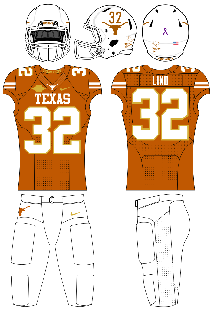
Texas: I added an orange facemask & black alt to the set & a jersey inspired by this jersey I had seen.
West Virginia: I prefer the 2013-2018 font over the 2019- font. so, I tied it together with more traditional striping that I modified.
-
2
-
-
ACC:
Boston college: I see eye to eye with @edjb93 on this one. combining the 2011-15 jerseys & 2016-19 jerseys.
Clemson: I modified the facemask, number font, & striping one white Pants.
Duke: almost no change to their 2015 set.
Florida state: almost no change to their 2020-2022 set except for the black helmet
Georgia tech: almost no change to their 2019-2021 set.
Louisville: almost no change to their 2014 set except for a chrome red helmet & black helmet.
Miami: heavily based off of @edjb93's concept.
NC state: I prefer the 2014-2017 jerseys over the 2018- jerseys. but the black jerseys at the time didn't follow the red & white, so I made them.
North Carolina: I am not a fan of the argyle patterns or the drop-shadow throwbacks, I prefer the 2009-2012 jerseys and the alternate chrome Carolina helmet. with no feet on it.
Pitt: not a fan of the royal-yellow look compared to the navy-gold look. 2014-2015 looked the cleanest though.
Syracuse: I like their 2014-2018 jerseys but I made the lines break 4 times to honor the legendary number 44 at Syracuse (and I didn't even use it on the jerseys *facepalm)
Virginia Tech: I used the 2010-2015 jerseys with consistent striping & the 2016- number font
Virginia: changed the font to block, it looks too much like techs',
wake forest: after taking 6-EVER (not 5-ever) to find the sleeve design from 2015-18, I gave up. but when looking for a substitute hyperlink for the website I put these on 1st, I found it.
-
1
-
-
SEC:
Alabama: no change outside of their helmets, where I thought the A logo looks better than numbers.
Arkansas: I based it of the 2014-2019 jerseys, but I removed the template filler & modified the pants stripe to look like tusks.
Auburn: I moved the helmet & jersey stripe down to the pants, added a small number outline, blue pants & the orange jersey.
Florida: I put the F on the helmet (to show the student's grades
 ) and made the striping different on white & orange elements, instead of having the same as blue elements.
Georgia: I made the white stripe & facemask black; it looks better to me. same with the 2013-2021 number font. I made the black jersey follow the rest.
Kentucky: I think the recent uniform change was a downgrade, the checkerboards look better. i think the jerseys before that one had better pants striping, so I added it there.
LSU: before you argue, HOW DO YOU FIND THIS SCARIER THAN THIS. only one looks like they can actually eat me, it's the ladder. also, I added a number outline.
Mississippi state: I think the ribbon look is more unique, so I used it. also, gray is demoted to accent color, it just doesn't look right on MSU's uniforms.
Missouri: the tiger stripes are way better looking than the plain northwestern stripes in Missouri's case. the problem is none of the jerseys were consistent.
Ole miss: not much change except for the removal of powder blue, it looks horrible & is unnecessary.
South Carolina: the 2 stripes look better & more unique than the northwestern stripe. & now the white helmet follows the black & garnet
Tennessee: the checkerboard looks better than the current uniforms, but I made theirs 3 squares think compared to Kentucky's 2 wide checkerboard. also 1 gray.
Texas a&m: I prefer the new number font but the old striping, I made the pants consistent with the jersey too.
Vanderbilt: heavily inspired by @mbannon92's concept. 4 stripes represent the commodores rank in the navy.
-
3
-
-
I started redesigning every power 5 & independent team's uniforms, I started some time in December or late November. i didn't account for event/alternate helmets (I.E BC's red bandana helmet)
jersey number is chosen to best represent the font. most of these are concepts or previous jerseys i saw and put on this template, as this is the closest to seeing it on field without photoshopping the uniform on the players themselves.
PAC 12:
Arizona state: based off of their 2011-2014 uniforms & @mbannon92's concept.
Arizona: I really liked their 2017-2020 uniforms, their current jerseys look basic & have striping inconsistencies.
Cal: I like their 2013-2016 jerseys more than the current ones, but I didn't like the collar, so I removed it and modified the striping next to it to point into the jerseys seam
Colorado: as I have seen before on this site, I too like the idea of northwestern stripes on the current jersey
Oregon State: their new uniforms are okay but I don't like the shoulder stripes, I think they would look better on the sleeves, I also swapped the numbers on the home & road jerseys to orange.
Oregon: their pro-combat uniforms were better than the current ones, also I prefer the wings on the helmet.
Stanford: I saw a picture of Richard Sherman in a cardinal uniform, I saw 2 stripes on the pants, never again did I see 2 stripes & thought they never existed. then I saw a picture of them from that era. up until today (3/23/24 edit) i never knew Stanford actually wore similar uniforms to the red alternate concept shown below
UCLA: their current jerseys are good, but I think the white & gold should be navy-dominant, and added navy & black alternates.
USC: I reverted back to their 2015 jerseys; the number font was better & I kept chrome helmets as alternates. I also added a yellow outline to the road numbers.
Utah: I prefer the mountains on the sleeves over the 7-stripe jerseys they have now.
Washington State: I based it off the 2011-2016 jerseys with the modern helmets, I also modified the designs on the sleeves & pants.
Washington: I used with the 2004-2008 jerseys with 2009-2013 pants and added a chrome helmet & black alternate that matched. GO DAWGS!
-
5
-
-
ah yes, a BFBS uniform in the 1950's
-
the Viking colors were decided because of the owner being an alumni of the Washington huskies, the colors are similar, but the Vikings never wore yellow pants. the purple/yellow combo is reminiscent of the Huskies jerseys at the time.
-
not the CP Panthers logo
 (i just saw this thread)


NFL uniforms redesigned
in Concepts
Posted
AFC south:
Texans: I like their current design. but I removed the red helmet.
Texans 2: red centric. per @Bomba Tomba's request.
Titans: reverted back to their old number font & added sword striping.
titans 2: white helmet & powder centric. per @Bomba Tomba's request.
colts: blue facemask & old font & sock striping.
jaguars: based it off of the 2013-2017 jerseys but removed the gradient & added teal pants.