


GFB
-
Posts
4,615 -
Joined
-
Last visited
-
Days Won
10
Posts posted by GFB
-
-
17 minutes ago, walkerws said:
What would you suggest? We’ve had a golden retriever, a caveman (the creator of B.C. Went to Kent), a golden palomino, Captain Flasher (a kid wearing a cape and Mercury helmet), and the Flasher (weirdo with a blue body suit and carried bolts. The students selected the golden eagle as our mascot in the 80’s and Flash is our beloved mascot in live and mascot forms.

this was the best concept Kent State had, it just needed to be executed a little better.
-
 2
2
-
-
The 17 looks bad because the "1" has serifs and the "7" does not.
-
2
-
-
5 hours ago, burgundy said:
I have a golf shirt this exact color, and the color was labeled as "Jazzy", for whatever that's worth. In certain light it can look more red, but it is most definitely pink/magenta.
Calling this PMS 1925 shade “magenta/pink not red” is a little harsh, IMO. It‘s unfortunate that the RGB shade the team is using is on the cooler side of the printed color... but, there’s only one shade on this “magenta” chart that is close enough to be considered near this shade of red (206)
Sidebar: you can approximate a Pantone shade’s color makeup from the number. For example, if you know your typical athletic red is PMS 186 or 187 and royal blue is PMS 287, you can place a purple closer to blue or red based on their number alone (259 is closer to blue, 234 is closer to red).In this case, Pantone 1925 has more blue in it that your average red, but it’s not breaking that line around 200 PMS to get into magenta.
This isn’t always the case as the Pantone libraries have expanded over the years to add new shades, but it’s generally a solid guiding principle.
-
3
-
-
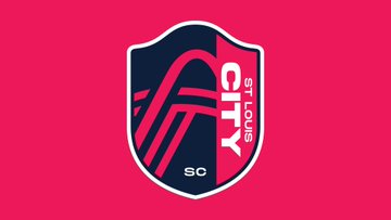
“You wouldn’t understand Gateway, necessarily, if you don’t live in this region,” is some of the most baffling and backwards logic I've ever heard, especially when you consider they ended up with "City" and went out of their way to spin it as "representing all the neighborhoods of STL." They're spinning a generic name that several other teams share as being uniquely StL, while discounting an actually unique name that would have only worked for STL for being too obscure (which, it's not).
I've been to St Louis once when I was 8 years old and even I know it's referenced as the Gateway to the West.
-
12
-
-
41 minutes ago, gosioux76 said:
Rotated text is in style?
Less so for logos, but in print/social design rotated text is very en vogue.
-
3
-
-
The colors are great; like the Cardinals, only bolder.
Everything else is not my cup of tea. I have a sinking feeling that the crest is going to look terribly dated in 5 years when trends change and rotated text goes out of style.
-
1
-
-
1 hour ago, hugevolsfan said:
The actual women of the Lady Vols fought to get that name back after it was decided they would just be Volunteers. I think they can be whatever they want to be called. If the women want to be called Lady "X' then let them be called that. I had no problem either way but everyone was gonna call our women's basketball team the Lady Vols because it was their brand.
Of course... I was making a broad point, not referencing one specific team. If the basketball team has fond memories of it so if they want to use it, they can go right ahead.-
1
-
-
1 hour ago, WSU151 said:
Female lumberjacks have been known as lumberjills. https://www.bbc.com/news/uk-england-17287811
Sure, and if the SFA women’s teams were named that, they would at least make sense (even if it was a pointless distinction). But instead they are the Ladyjacks which feels insulting and makes no sense.
-
2
-
-
Lumberjacks can be men or women. Bears can be male or female. Volunteers are a neutrally-gendered group.
The only time it makes even a little sense is when you have a gendered-nickname like Cowboys or Minutemen; but even then, you might as well just roll with that across the board.
Nobody at the University of Delaware is throwing a fit about the mens teams being called the Blue Hens and not the Blue Cocks.
-
3
-
-
Just a can-o-worms observation, but "Ladyjacks" sounds really dumb in 2020.
Figure it out.
-
It’s a great wordmark in theory, but it could really use a pro’s touch to clean it up.
For example, the awkward spacing between the outline of the A and the crossbar of the T’s is smack dab in no man’s land, the joint of the inner curve of the E is weirdly angular and all wrong, and NEW MEXICO needs to be shrunk down by about 20% because there’s more space between the W and M than between the wordmark and the edges of the crossbar.
-
7
-
-
On 1/24/2020 at 1:08 PM, Dante_X said:
Québec Remparts throwing back to 1983-1984 tonight:
The original version had a Fredericton Express logo on one shoulder and a Nordiques one on the other (Remparts were owned by the Nordiques back then). This one has a Nordiques logo on each shoulder.
The color balance of this sweater is absolutely beautiful.-
1
-
-
8 hours ago, MattMill said:
I think it's the 0s that make it the most obvious. The opening of the O seem to be the same general height and dimensions. In the Nfl and college, many 0s have their own character. These do feel too closely related.
I've never worked in apparel, but when you see something like this you have to assume that whoever is manufacturing the uniforms gave dimensions to the league and all the numbers had to be designed within those dimensions.
-
2 hours ago, DC in Da House w/o a Doubt said:
For the Defenders I think I see a hidden DC in their logo, but it might be a stretch. What do you guys think:
It's 100% intentional and you picked it out. The only bad thing about it is that whoever designed it didn't trust the idea and now the logo reads "DC - DC" for no reason.
-
4
-
-
Dallas, New York, and DC are the clear winners for me. Seattle is maybe the most bizarre professional football uniform I’ve ever seen in terms of color balance from home vs. road perspective.
-
2
-
-
9 hours ago, the admiral said:
https://www.sunfrog.com/alabama-quad-city-mallards-navy-blue-guys.html
I NEED THIS SHIRT. It's like when Chinese people want to wear English because it looks cool but the shirts just say, like, "Brooklyn Nonstop Orange Juice Intramurals." Now with algorithms we do it to ourselves.
This shirt made my day
-
2
-
-
Champion made the original XFL jerseys, they've become perhaps one of the most popular athletic brands over the last five years with Millenials and Zoomers, and would cost much less than merchandise deals with any of the big three.
-
3
-
-
56 minutes ago, gosioux76 said:
I don't know. I think that St. Louis one could be problematic. Certainly, you can apply the wings to either side of the helmet, but that's hardly unique anymore. And they'd probably sully it by trying to cram that sword down the middle, just like the logo. Or worse, they'd just stick the logo as its on the side of the helmets and call it a day.
I think that
GladiatorsGuardians could be wrapped to the back of the helmet, sort of like the old Michigan Panthers of the USFL. I'd like to see a Renegades helmet that employed those red eyes at the front of the helmet. The bottom third of the helmet would be blue to mimic the scarf and the top could employ some markings to illustrate the hat.
I'm just spitballin' here.
I think you could place the St Louis logo on the back of the helmet, have the sword act as the helmet stripe, and have the wings fold around the sides of the helmet.
You have the right idea for the Guardians; something in the vein of the Jacksonville Bulls, Michigan Panthers, and Memphis Pharaohs helmets:
-
2
-
-
11 minutes ago, Ice_Cap said:
My issue with it is that I prefer monogram logos to reference locale rather than team names. I would much rather see the alternate snake head logo become the primary than a V monogram mark.
It's a real concern, especially for a start-up league that needs the locations to anchor the franchises. I think it will come down to application... If they go out and support it with a strong secondary mark and they have a motif or identity they can carry out with the uniforms, the "V" will be a really good, flexible logo. If they don't really have any direction past this logo and it ends up on a white helmet or something, then I think it will fall into the generic, "create-a-team" pit of doom.
-
1
-
-
1 minute ago, Lights Out said:
They're all nice except for the Vipers and Wildcats. They really mailed it in with those.
Wildcats is really, really poor, but the "V" with two fangs has potential as a simple/non-mascot mark for the Vipers.
-
5
-
-
4 minutes ago, Ark said:
Possible uniform previews from the team trailers (some trailers have more than one uniform, and a few uniforms are reused in different trailers)
These are either pictures of uniforms from the original XFL (Hitmen, Enforcers, Xtreme, Demons I believe) or stock photos.
-
10
-
-
My knee-jerk takes:
As someone who cares about the helmets more than almost anything (which is where I think the original XFL did fairly well), I think St. Louis and DC have the most potential to give us a really cool helmet design.
-
The Cape Breton redesign is great and a huge upgrade (especially the CBE secondary mark). However, I think placing the text emphasis on EAGLES and not CAPE BRETON is a little bit of a blunder, because I can't shake this feeling like it's a stock art design on Shutterstock or a generic Create-A-Team design. That vibe may be due in part to the illustration and text styling as well, or due to the fact that Cape Breton is disconnected from the rest of the crest.
I think a small change like this helps make the primary design a little less generic.
-
4
-
-


College Football 2020
in Sports Logo News
Posted
I’m not disagreeing with you that this variation is somewhat boring, but if we take a step back and ask “what’s the best concept to build a Golden Flash uniform around?” then I think something in the vein of the Birmingham Bolts + 2020 navy blue Chargers uniforms is much more interesting than a golden eagle or any other random mascot.