


GFB
-
Posts
4,615 -
Joined
-
Last visited
-
Days Won
10
Posts posted by GFB
-
-
…or, better yet, the Evangel Lions.
-
 5
5
-
-
6 hours ago, stumpygremlin said:
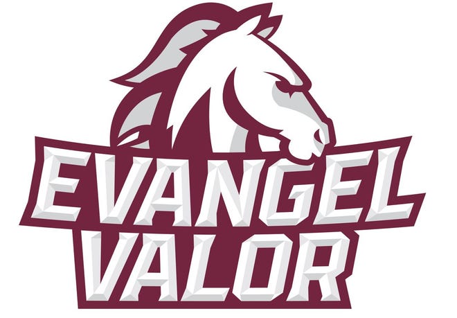
Speaking of schools dropping "Crusaders," Evangel University, an NAIA school in Springfield, Missouri, dropped the Crusaders nickname in favor of Valor. So the teams will now be known as the Evangel Valor.
New logo:

Should have been the Evil Angels
-
1
-
-
I always hated that Kings-chevron logo, mostly because it's inspiration was obvious:
An NHL team deserves a better identity than this.
-
6
-
-
This is the “Can I copy your homework? Sure just change it a little” meme with the Blue Jackets.
We want a C, a star, and the Ohio flag… but we need it to be different enough so we won’t face legal action.
-
2
-
-
2 hours ago, WSU151 said:
It's still a good looking jersey...I realize the dark jerseys are supposed to be superior as they fully encompass the brands, but this is one of the four or five exceptions in the league, I think.
This uniform is so, so dark… the black, red, green, and purple just bleed into one another and you miss out on so much.Even a small change like flipping the black and the green sections on the arms and hem would help break the design up a bit, considering that they’ll be wearing black pants with them.
-
3
-
-
Silver/white/white looks are the worst, and plain white pants with no stripes and white facemasks make this look even worse.
-
12
-
-
Yuck.
-
7
-
 1
1
-
-
I'm a sucker for when teams do single color names in the outline color of the number... It's why I think this:
...has a better color balance than this:
-
5
-
-
Doing a throwback is fine... However, doing a throwback of a throwback but putting it in your weird manufacturer's template from the same time period is a bridge too far for me.
-
3
-
-
This kit just made me yell "YOU'RE NOT MY REAL DAD" aloud, which is a strange but accurate reaction.
-
3
-
-
Man, I don't have a good grasp on where the line falls between cultural appreciation and cultural appropriation, but that Ajax kit feels like it lands on the wrong side of it.
-
2
-
-
I understand that there was some level of hyperbole/absurdity to your post @EddieJ1984, but there's probably a way to make your point without gatekeeping who is/was a real fan and who is not. For example, my personal fondness for baseball is tied more towards nostalgia and shared experiences with my dad more than anything that actually happens on the field.
As for people aligning themselves with brands, I don't think it's all that strange. Human beings loved to define themselves by what they identify with and what they don't. It's why some people get Tupac or Taylor Swift tattoos, add a quote from their favorite movie or sitcom to their bio, or add a bumper sticker to their car of the person they are voting for.
Someone who grew up always wanting Nikes but whose family were unable to afford them is going to react differently to a pair of running shoes with 8 swooshes on it than a person who grew up with a fresh pair of Nikes every school year. What one sees as a gross over-branding of a product, the other sees as a status symbol for their own personal journey.
People are full of tangled, complex motivations.
1 hour ago, philly97flyer said:I’m not being condescending to anyone.
 On 8/17/2021 at 1:42 PM, philly97flyer said:
I love the morons on here...
On 8/17/2021 at 1:51 PM, philly97flyer said:Welcome to the real world, bud.
...
1 hour ago, philly97flyer said:I’m simply pointing out that stuff like this is going to happen no matter what we all think of it.
How very brave of you.... thank you for your service.
Look, sarcasm aside, you're probably right: that's just the way the world works and this was probably inevitable. However, we are still passionate customers and consumers of the product, and if something is transpiring that makes us unhappy, we can still affect the outcome and create change (hello, European Super League). Will it happen in this case? Doubtful. But yelling from a soapbox at people who are upset to "get over it this is how the real world works" is weird and cynical and honestly a bit grim.
1 hour ago, spartacat_12 said:I feel like a more apt metaphor is when a celebrity/public figure buys a restaurant/bar/club. They aren't buying it because it's a wise, safe investment, they want to have a fun place where they can hang out with their friends and enjoy all the perks that come with being the owner. Most of them aren't using it as their primary income source, but at the same time they won't want to sink their money into it for too long.
Exactly. Owning a major league franchise is nothing more than a status symbol and a privilege for the uber wealthy... This notion that professional sports has always been a bottom-line business and that it must be profitable to survive doesn't sync with the fact today's owners are far wealthier now than at any previous point in history. And if an owner ever gets sick of throwing money down the pro sports hole, there's a hefty nine-to-ten figure parachute they can pull at any time by selling.
1 hour ago, spartacat_12 said:There's a difference between people wanting to wear apparel from an athletic/lifestyle brand that displays the logo and people wanting to wear apparel with the logo of a bank or airline slapped on it.
Going back to my point earlier about how people love to define themselves by what they identify with... I choose to identify myself with the Red Wings. I have jerseys and t-shirts and memorabilia because I have created an emotional connection with the team for years and years. But now when I want to identify with the Wings, I now also have to identify with Chevrolet or Rocket Mortgage or Delta Airlines and my lack of fondness for those organizations is going to negatively affect my Wings fandom.
Again, this is nothing new and something we've all been conditioned to ignore or placate to a degree, so there's no shock or pearl-clutching... It's just a bit of a bummer when you stop to think about it because it shouldn't be this way.
-
10
-
-
14 hours ago, BBTV said:
It's perfectly reasonable to lament ad creep in the 'sports logos' forum. Any "you're not a fan" nonsense doesn't belong here. Frankly, I'm not even sure if debating the financial aspect of it belongs in a forum dedicated to logos, uniforms, and general aesthetics, but I'm no mod.
That's a great word choice, BBTV. There's nothing wrong with being saddened by news like this and taking a moment to note that we're losing something intangible without slipping into extremes at either ends. This won't "ruin the game" or make me less of a fan, but I do value aesthetics more than most other fans and this endless endeavor to monetize every :censored:ing aspect of a sport I love so already wealthy owners can be even more rich just flat-out sucks.
Nothing is untouchable and everything has a price and this is the way the world works and it bums me out.
On a semi-relevant sidebar, there's been a subtle belief that has crept into the public over the last few decades with taxpayer-funded stadiums and CBA lockouts that owning a professional sports team is supposed to be a profitable endeavor. If you're wealthy enough to own a sports team, the benefit to ownership should be in the joy and perks of owning the team, just like the joy of having your name on a building at your alma mater, having a fleet Lamborghinis in your garage, or owning a villa in Ibiza would be. But like all of these things, owning a professional team should be treated like owning a very expensive toy, not like owning a very expensive business.
No one is forcing owners to carry these expensive burdens and there are plenty of other rich people who would love have these toys that they could sell for wild profits, so I need owners to stop crying poor at every convenient turn. Thanks in advance.
21 hours ago, RichardWitham said:the sky is not falling folks. the end of the world is not here. welcome to modern sports. the NHL will not be european soccer. if ya think that, you should go touch grass
22 hours ago, philly97flyer said:Yes I am SHOCKED that the masses are not rushing to the streets to protest…(checks notes)…ads on NHL jerseys. Also the people who are complaining about this were probably the most pro-lockdown people over the last year+, so guess what? That lost money has to be made up somehow. Welcome to the real world, bud.
18 hours ago, EddieJ1984 said:Sorry but if you've stopped watching MLB because of a Nike swoosh on the jersey (Oh no how DARE I say the name of the company!) you weren't a real fan of the sport to begin with.
Posts like these are the worst.
Everyone is entitled to feel however they want to. If you want to complain about it, great! This is probably one of the best places to do that because you're probably talking to someone else who cares. If you're personally unaffected, that's also awesome; you'll take every bit of this and future news in stride and never miss a beat! But you can also do that without demanding that the people who are bothered shouldn't be for *reasons*
You can be a grim, cynical realist without being a condescending
 to everyone who isn't.
-
20
-
-
Yeah, this sucks, plain and simple.
-
7
-
-
3 hours ago, DNAsports said:
So, tell me again why San Francisco can’t do 3 sleeve stripes and sock stripes?
Because 3 stripes = Nike's biggest competitor
-
9
-
-
33 minutes ago, WideRight said:
The Colts throwbacks are fine, but I think what they need to do is find a way to return to shoulder hoops that actually connect under the armpit.
It can't be THAT difficult to create a CCSLC post-bot where you input the team and the poster type (classic, new school, design snob) and it outputs the proper complaint...
-
19
-
-
16 minutes ago, Ridleylash said:
Eh, aggressivity is such an overrated factor in sports logo design. You look at pretty much all of the most iconic sports logos and you don't really see very many with a focus on it; the Leafs, Bruins, Habs, Rangers, Wings, Red Sox, Yankees, Dodgers, Warriors, Lakers, Celtics, Patriots, Giants, Packers...all utterly iconic sports logos, none feature aggressive elements.
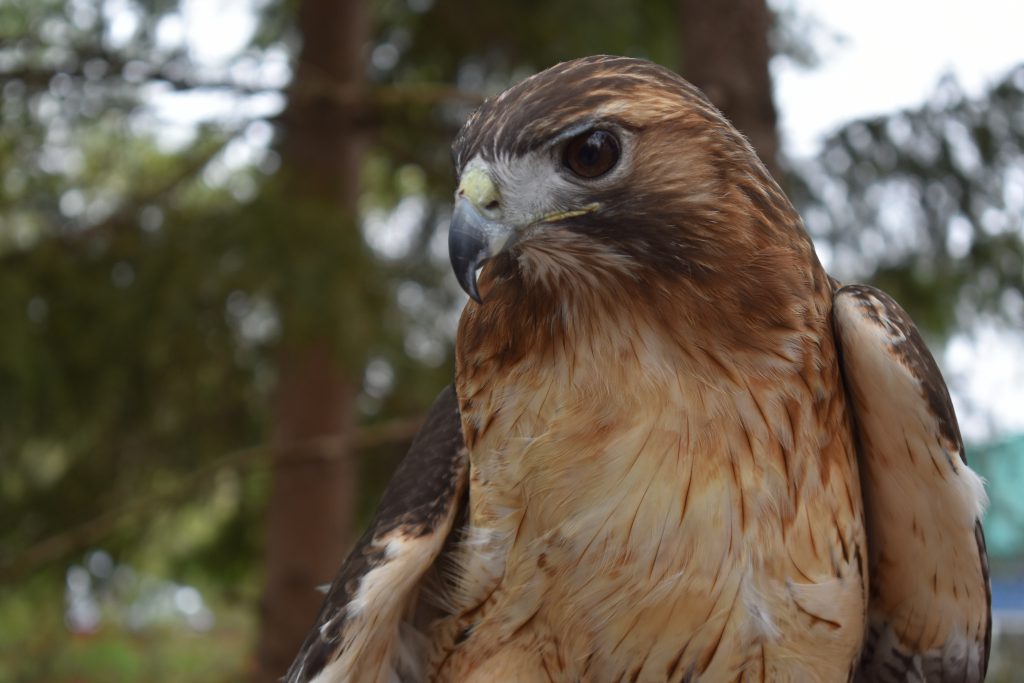
I never liked how the old hawk lacked a lower beak; made it feel incomplete. Plus, the new logo incorporating Mt. Hood into the design is a nice bit of local tie in comparison to it just being another "angry bird head" logo.
Funny you should mention that, because when a hawk is resting, it’s beak is closed and you don’t see the lower one:
It’s only when a hawk is acting aggressive that it opens its mouth enough to the point where you can see the lower beak.
-
3
-
-
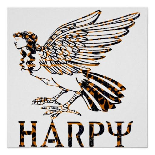
Instead of a double post, I'll just point out that adding tail feathers technically makes this a harpy, which can be considered a demon and very much not an angel.
-
1
-
-
The art direction is spot on. The name, the colors, the art-deco vibes, the typography; it's all really nice and perfectly fits the team, ownership and location.
With all that being said, I think this logo is average at best.
That's a rookie-level design mistake. Additionally:
- Shoehorning in the "hawk-tail" element does more to visually confuse the design then to add anything of real substance. ("Do angels have bird butts?")
- The curves in the cuts of the wings are sloppy and are randomly distributed. Look at the cuts in the tail: the top two "feathers" are small with rounded curves on the underside. That is followed by a thick "feather" with a half-rounded under-curve and a heavy cut, and that is followed by a smaller "feather" with a square curve and a lighter cut. None of the angles of the cuts are aligned, consistent, or follow any sort of planned pattern or logic.
The sharp, pointed curves of the "palm-wings" doesn't really match traditional art deco stylings (straight lines and curved edges). Take something like the NAIAS logo (which has some really similar to aspects to the ACFC angel) and how the perfectly horizontal lines naturally fit the LA art deco motif in a way that the more aggressive cuts do not:
I'm probably being harsh here, because when viewed in it's entirety, I do like the branding.
However, because we've known the name for so long and the typeface created by Matt Wolff was already in place and the art deco direction was clear. From a designer's standpoint, you can't ask for anything more: the table was set, bases loaded with a 3-0 count and a green light... and they hit a weak fly ball just deep enough to score the run.
Ultimately, I think it's a good example how important art direction is. My guess is that the things in this brand that resonate with people the most isn't the design itself, but rather the club name, the colors, the idea of an art deco angel, and the general vibes the identity gives off. Hats off to the decision makers here, they definitely picked the right target to aim for... I just wish the designer had done a little more with the ingredients that were at their disposal.
-
6
-
From a brand equity perspective, five-point stars are so common, that have a -- stretched-- star is something unique that you can somewhat call your own. I'm still getting used to it, so it does look a little weird at the moment, but that feeling might be something that goes away in time
-
2
-
-
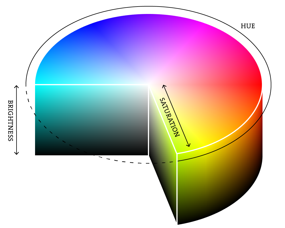
My post was specifically about the conflict of the Avs colors and not establishing a rule™ that you had to have all three tones to have a good uniform (in fact, I noted the opposite). I really like both the uniforms you shared, but those two color schemes have a few different dynamics going on.
First, here's the HSB scale that I'm using (in case you're unfamiliar with it):
Arizona's purple might not contrast with black on the brightness scale, but it certainly does on the saturation scale (the purple being heavily saturated and the black, not at all). The Rangers are a closer comparison, but the rich saturation of the royal blue and bright red helps push the two shades further away from one another. With Colorado, both red and blue shades are a "closer" distance from another because neither shade is close to fully saturated (I'm using Pantone values via TruColor here):
(black line is Colorado, white line is New York)
Perhaps the closest comparison I could make for Avs would be Minnesota, but that's another franchise that has struggled to balance their dark green and red colors over the course of their history.
However I will say that the area where both the Rangers and Wild pass the Avalanche is that both teams use the less-bright color in their palette for the helmets (Colorado's burgundy is about 15% darker than the blue).
If New York or Minnesota used red helmets, I think most people would agree that would look really off.
-
14
-
-
The problem with the Avs elimination of black is that the shades of blue and red have very similar levels of brightness; there's almost no contrast between the two.
To illustrate this, I'll use these desaturated photos. When you had black in the color scheme, the white and silver were the light-tones, the red and blue acted as mid-tones, and the black acted as your dark tones. While unconventional, black equipment balanced the uniforms out because there's almost no dark tones on the sweater outside of the hockey pucks in the logos.
Once you remove black from the color scheme, the entire uniform is solely midtones and highlights. Other teams pull off "no dark colors" looks well enough, so that isn't entirely the problem, but because there's almost zero contrast between the brightness levels of the blue and the red, there's something jarring and a bit off about it.
I'll be honest that the black equipment never bothered me and I much prefer it to the current blue equipment, but if the team was going to eliminate black, the better course of action would have been meeting in the middle of the black and current blue by using the navy the team had been using as an alternate...
The contrast is much easier on the eyes here in my opinion, others might disagree. Personally, I'd hate to lose the Avs current shade of blue for another generic navy team, but I do think it's a better solution to accomplish what the Avs were attempting to do.
-
24
-
-
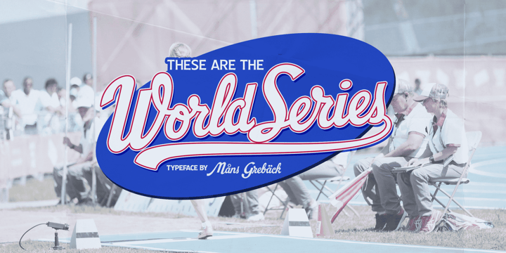
Not an answer to a specific request, but type designer Mans Greback just released a font based off of the 1987-1991 World Series logos.
-
1
-
-
I’m all for universities carving out their own identity in the market, and now that Oregon has (mostly) reverted back to their traditional colors, I think USF staking claim to neon green is smart on their behalf. Honestly, USF doesn’t have the tradition or naturally appealing colors that Oregon does and it suits the location of South Florida (more tropical).
Also, sandwiching the yellow-green between a yellow and a true green makes it much more palatable than how Oregon used the color (with blacks, greys, and metallics), similar to how the Milwaukee Bucks did in the Irish-rainbow era.
All that being said, those football uniforms take it too far. The chrome helmet finish doesn’t look good in neon green (something matte would work better) and the monochrome look doesn’t give your eyes a place to relax.
-
6
-


 to everyone who isn't.


2021-2022 NHL Jersey Changes
in Sports Logo News
Posted
I'm firmly in the Mighty Ducks of Anaheim > Anaheim Ducks camp myself, but it's probably because the Mighty Ducks were actually fun with Kariya, Selanne, 90s Disney, Wild Wing setting himself on fire, etc and the mid-aughts Anaheim Ducks were an affront to everything enjoyable about hockey.