


GFB
-
Posts
4,613 -
Joined
-
Last visited
-
Days Won
10
Posts posted by GFB
-
-
58 minutes ago, VampyrRabbit said:
The back of the shirt is the lighter shade of burgundy, which is why the shorts are that colour.The back of the shirt should be the darker burgandy as well then... doesn't change the principle , imo.
-
27 minutes ago, aawagner011 said:
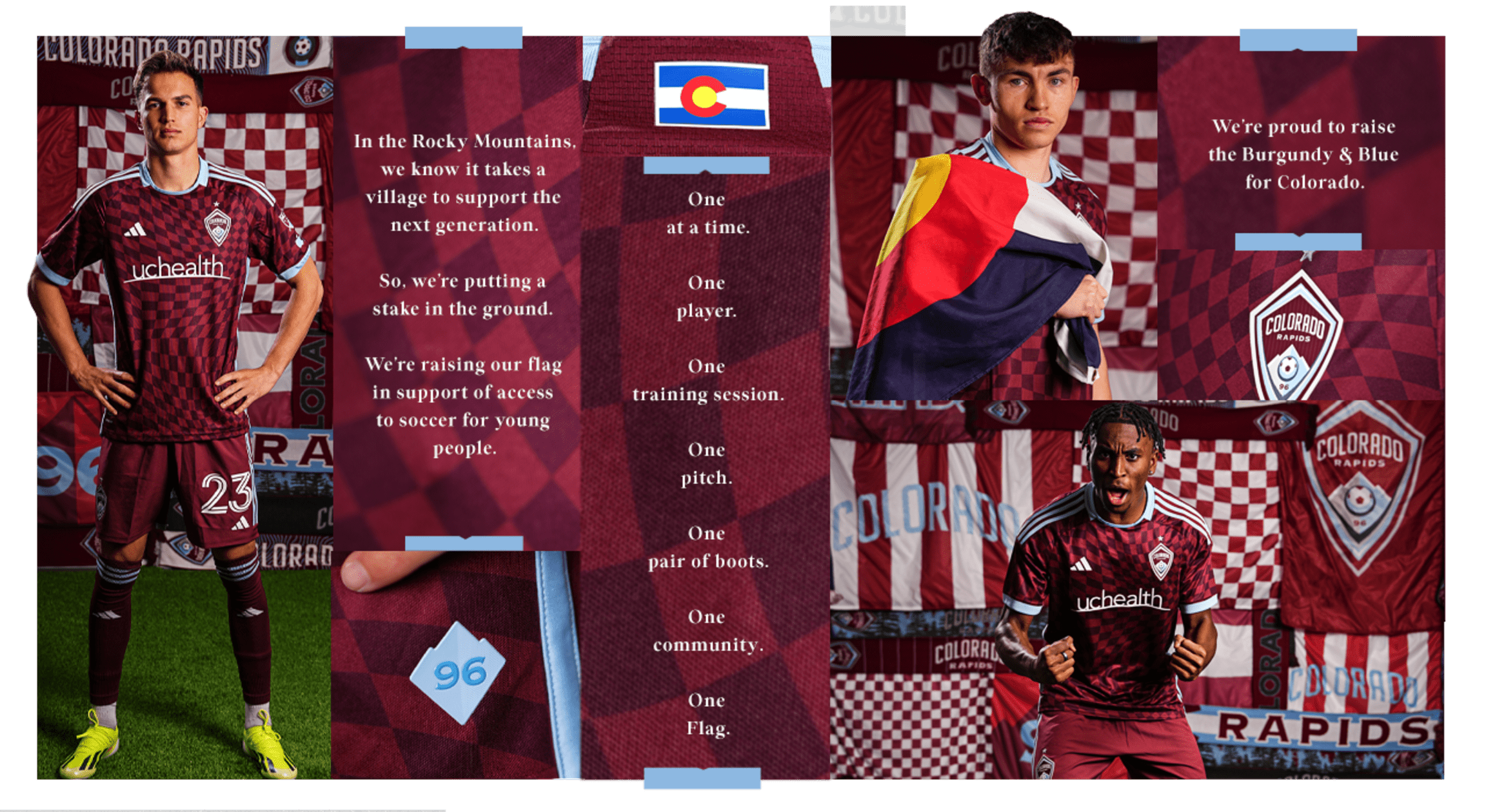
Colorado: it’s fine. I don’t mind the checkers. But I think their brand is a bit stale. Didn’t they have a kit with contrasting sleeves (either white or light blue) a while back? I think that could be a more signature look, and preferably with contrasting shorts, too.

I dislike it when the shorts match the lighter color in a tonal pattern. This top (which is perfectly fine) needs dark burgundy or light blue or even white shorts.
-
 3
3
-
-
Yeah, surprised to see the hate on the Sounders look. Kit of the year for me.
-
5
-
-
11 hours ago, GDAWG said:
Vrabel seems to me like a guy who doesn't want to deal with NIL or the Transfer Portal on a daily basis.
I agree, but Ohio State is one of the few programs in the country where they would support him with a GM to manage the roster and transfer portal, coaching assistants who double as ace recruiters, and a Head of NIL to deal with collectives where Vrabel could just be the football coach.
-
1
-
-
2 hours ago, GDAWG said:
Mike Vrabel taking a year off is something. I wonder if he will be commentating games or if he would be good at it.
Ryan Day's seat might combust if Ohio State doesn't have an undefeated type of season with that roster.
-
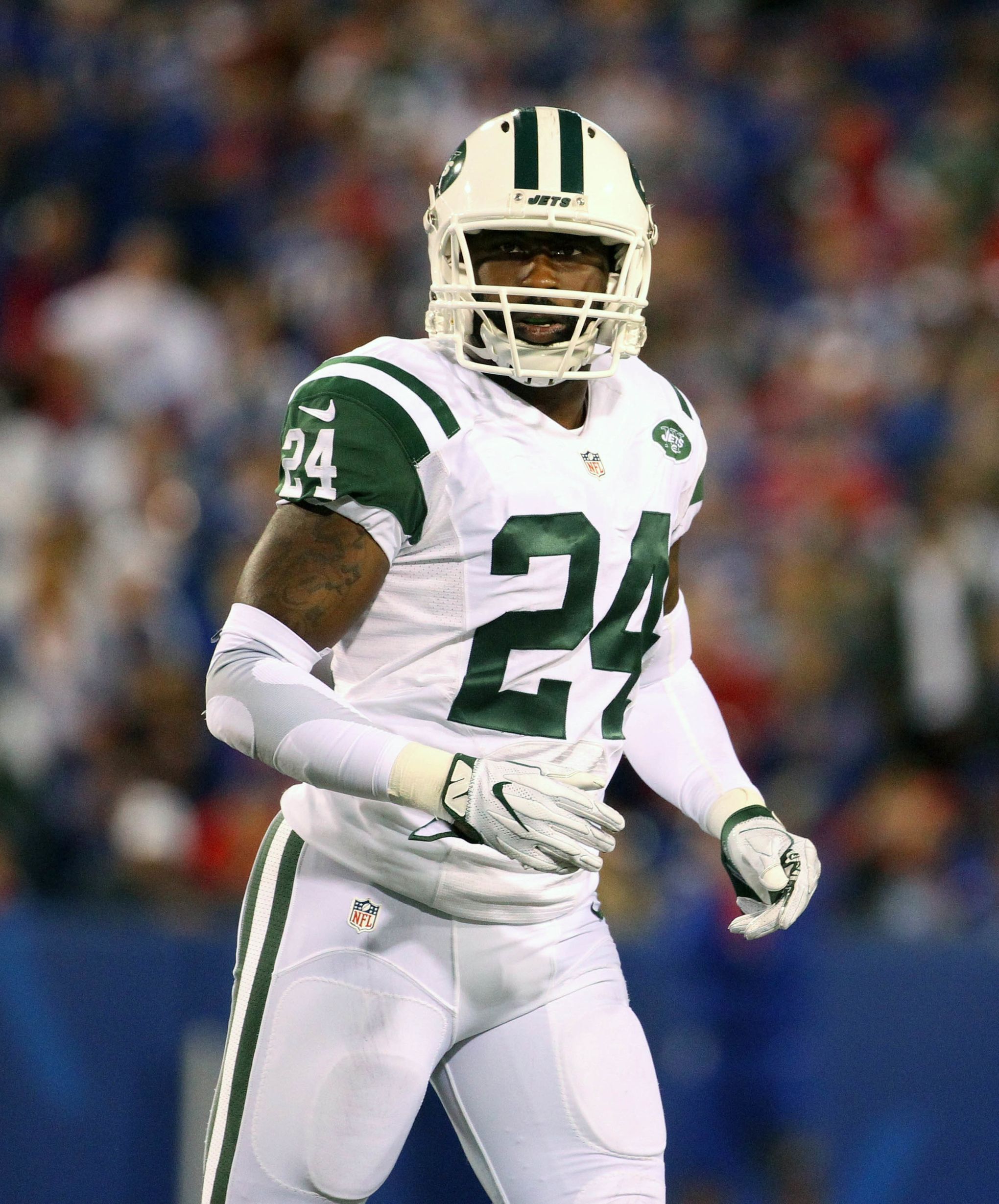
Because then it wouldn't clash or read against the three giant letters? The NOB is single color and the number is 2-color drop shadow, so the effect is mirrored on the front and back.
-
7
-
-
Don't shoot the messenger, but the Lions will likely be in all-white.
-
4 hours ago, DrunkKidCatholic said:
Unless you can convincingly clean up the shoulders on Namath/Parcells era uniform which always had issues under Nike.
This was always the funniest bit to me, that it’s somehow the template’s fault… when all that needs to happen is that the stripe insert on the green uniform flips from white-green-white to green-white-green and then the jersey is fixed.-
5
-
-
no surprises as the Lions continue to ride the monochrome train-
 1
1
-
 5
5
-
 1
1
-
 2
2
-
 1
1
-
-
16 hours ago, tBBP said:
Re: Detroit...it's my understanding that Stafford loved Detroit and Detroit loved him back when he was there; I don't think there's anything but mutual love and respect there between Stafford and Detroit. Now Goff on the other hand...oh I'm sure it'll be personal for him since the Rams straight up sent him out the door.
Stafford is going to get a huge standing ovation from Lions fans before the game and then will be mercilessly jeered over the entirety of the game
-
Just now, DCarp1231 said:
I could see them going the Chargers route. A very simplified uniform with a more modern number font. They’ll probably have an all grey uniform and potentially an all black uniform (if the rumors are true)
I'd like that (black uniform notwithstanding), but there are a few things at play that I find interesting:
- The majority of Lions fans (not me, just the general pulse of the fanbase) want to see the blue helmet with the mono-blue look or with the road jerseys. Not sure how the Lions get league approval for that, but the solution may be to not have a third alternate jersey or have the "color rush"/blue pants designated as the alternate (in addition to the throwbacks).
- The team/players don't seem all that fond of the 1950s throwbacks. Again, this is me reading between the lines, but I wouldn't be shocked to see the Lions go very modern with the uniforms and then replace the throwbacks with the 1990s throwbacks instead to change things up.
- With the prior point, do the Lions replace the 1950 logo on the blue helmet with something else? It makes some sense this year with the 90th-anniversary logo drawing from that era, but with the throwbacks seemingly falling out of favor, it's very disjointed going super-modern and then going with a throwback logo on the alternate helmet that doesn't match anything else.
- Can they finally get the "WCF" tribute off the uniform? There's no reason for it to be there, as Sheila is 10x the owner that her old man ever was, and is actively resented by almost the entire fanbase. I'd be surprised if it happens, but it would be a pleasant change.
-
I'll just say that nothing that the Lions have done recently (white pants, blue helmets, not phasing out the all-grey uniforms) has hinted at a return to a traditional look... My guess is that whatever they're going to do, it's going to be very modern with the majority of looks being monochrome.
-
7
-
 1
1
-
-
16 minutes ago, Jezus_Ghoti said:
Over/under 0.5 of these will be an actual upgrade?
I'll say that I am cautiously optimistic the Lions will be an upgrade because it will be a Browns-style return to the Barry Sanders-era uniforms, but I bet the other 2 are clear downgrades.
Was there a source for this that I missed?
-
I'm so happy... Short of a Lions Super Bowl win (the true holy grail), this was the thing I most wanted to experience as a sports fan. Just completely surreal.
2 minutes ago, MJWalker45 said:Michigan having film on him from this year, AND when he was at Indiana probably helped. It's pretty rare to play the same player 3-4 times in the last 4 years. Lots more information that wouldn't have been available if they were playing Texas or Georgia.
I don't think it's that complex. This Michigan defense was created to slow down downfield, NFL passing attacks to beat Ohio State. And for as good as Penix and those UW receivers are, they're no better than Stroud/Wilson/Olave/Harrison/Smith-Njigba. Texas would have been a much worse matchup than Alabama or Washington with those two monster defensive tackles and Michigan's offense living and dying with running the football, whereas Washington was a finesse team that Michigan could line up and bully on both the offensive and defensive lines.
Feel bad for Penix though... nothing but respect for that kid going all the way back to his IU days.
-
 1
1
-
-
I’m just on cloud nine at the moment… I cannot believe that I’m going to watch Michigan play in the national championship game… after all the years of Rich Rod and Hoke and just complete OSU/SEC dominance for two decades
Michigan played such a sloppy game on offense and special teams for the third consecutive year, but I feel the Rose Bowl justified my initial take on the draw:
On 12/3/2023 at 5:25 PM, GFB said:This Michigan fan thinks FSU got screwed, and this is coming from someone who would prefer to play Alabama than FSU.
Milroe is certainly capable of having a Vince Young-in-the-Rose Bowl performance, but FSU has significantly better players at the skill positions and along the front seven on defense. Plus, everyone assumes you have to beat FSU with a backup QB, while this Alabama team just needed a miracle to win the Iron Bowl two weeks ago.
-
1
-
2
-
-
Yeah, Oilers dress up doesn’t count. The colors don’t work with the Texans logo or name, so unless the NFL gives them back the moniker, then luv ya blue shouldn’t be involved at all.
-
11
-
 1
1
-
-
I’ve yet to see a Texans concept that’s better than what they have now… Just be careful what you wish for.
-
11
-
-
This Michigan fan thinks FSU got screwed, and this is coming from someone who would prefer to play Alabama than FSU.
Milroe is certainly capable of having a Vince Young-in-the-Rose Bowl performance, but FSU has significantly better players at the skill positions and along the front seven on defense. Plus, everyone assumes you have to beat FSU with a backup QB, while this Alabama team just needed a miracle to win the Iron Bowl two weeks ago.
-
2
-
 1
1
-
-
1 hour ago, Lights Out said:
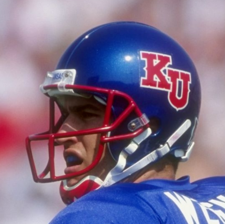
Kansas, Duke, and San Jose State all had actual royal blue helmets by the '90s. When some of the worst college football programs in America were getting it right in an era before big-money apparel deals, the only explanation for NFL franchises not being able to do it is that they didn't care enough about how they looked.
You'd see royal blue helmets in the 60s & 70s too when everything was still being handpainted by each team... it's the industrialization of the late-70s through mid-90s that I'm referring to. Those schools you mentioned started hand-painting their helmets again in the 90s (if you look at the finish and how they scuffed) because they only had to worry about 80-100 helmets per season vs. national supply chains and quick turnarounds like an NFL franchise would have to.
Kansas early 80s (lighten everything to match the eggshell blue):
Kansas late-80s (that didn't work, let's do what the Giants-do):
Kansas in the early 90s (fine, we'll do it ourselves)
Kansas in 1997 (finally)
....I don't believe it's a coincidence that within 24-36 months after that, the Giants switched over to that almost identical finish.
15 hours ago, BBTV said:
I’m going to disagree that the color was exactly the same as other stock greens, because each vendor was allowed to make retail jerseys for teams that they didn’t have the license for, and side-by-side, a Wilson Eagles jersey looked noticeably brighter than a Russel one, which was different than a Champion (which the jets wore).
Not doubting what the specs say, but I’ve seen them side by side and they were clearly different.
There are probably some slight differences between the textile colors between suppliers with different factories and all that... my point in all of this – to bring it full circle – is that I believe each supplier's intention was to match the stock green helmet option as closely as they could manage, not to tailor the shade of green to the specs that the team wanted... but again, total conjecture on my part that simply makes the most logical sense to me.
-
6
-
-
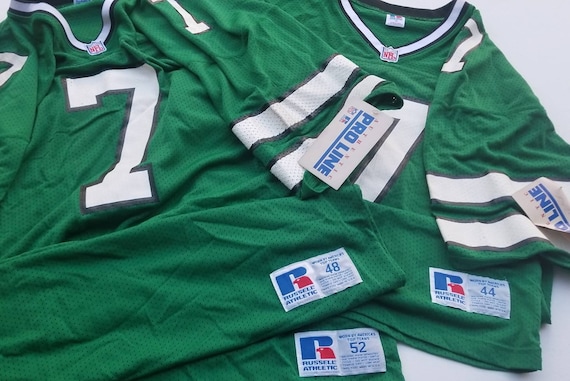
3 hours ago, BBTV said:
I have an authentic from 1991 (back when "proline" and authentics were just becoming a thing... and you couldn't get them with player names.
It's noticeably darker than the current ones. The fabric is obviously completely different - so I can't say that the dye is a different color or not - but they don't look the same.
The rained-on jersey looked closer to the original. Regardless, the helmet matches neither the dry nor rained version. They need to go back to the paint factory with that one.
Sure, if viewed through the lens of throwback accuracy only, I'll agree that they're too light.
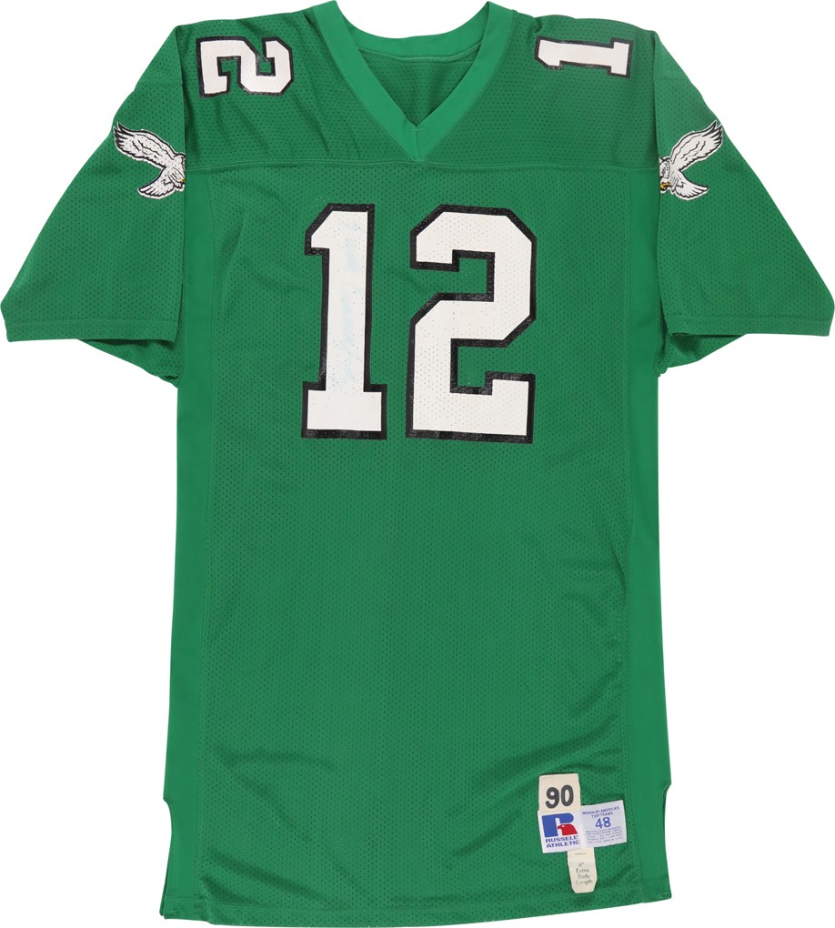
But the Eagles did not use a unique shade of green during this era and there's no difference between the stock greens used by other teams (like the Jets) over that period... So that jersey you had from 1991 is probably no different than the same color the Jets or Michigan State were using then as well.
I'm using these studio shots of items at auction as a comparison point because the lighting is actually somewhat consistent:
Stock green is just stock green for that period of time; just like there was no royal blue option. There was the "eggshell" blue that the Broncos and Ole Miss used, or the navy helmets that the Rams and Giants used... but no true "royal" blue until 2000ish.
So if a pure refabrication of the original uniform is the lens, then you're right, it's off.... But the other way you could look at it is that if the Eagles had the customization options offered to them in 1983 as they do in 2023, I think there's a fair chance that helmets/jerseys look exactly like this current version
-
4
-
-
It's hard for me to get upset that the jersey fabric got darker because the game was played in the middle of a monsoon, as the jersey was perfectly matched to the helmet in the previous game:
If the goal of a pure throwback, it is probably a bit too light... but to be honest, I don't have a great handle on what that Eagles shade truly was in that era due to how the Kelly Green seemed to shift depending upon the lighting/film:
...it does feel a bit like Schrodinger's color, where no one will ever be truly happy with it as everyone's memory of it is a little different.
-
18
-
-
As a big fan of the turquoise color Arizona introduced alongside the brick red, something was bothering me about the Diamondbacks home uniforms and the realization that they are off-white explains it:
The off-white "warms" the uniform, but that also alienates the bright turquoise in the color scheme as a super-bright "cool" color. The effect is jarring, especially when compared to the previous home turquoise set – where the color scheme shifted from cool-to-warm as you moved from light-to-dark.
-
10
-
-
Once again, the helmet finish makes the red too dark.
If the "candy" finish is a must for you, then they need to bump the red up a shade (from 187 C to 186 C / 185 C) to compensate.
-
1
-
 1
1
-
-
Nike using wraps to create texture is wildly different than Under Armour trying to implement a full scenic illustration. Nike's approach compounds the minor graphic detail on the helmet, which adds character to the uniform that the tiny decal isn't able to provide on its own, while UA's helmets never translate well when you're viewing from more than 3 feet away and have this "painted commemorative plate sitting on your grandmother's shelf" aesthetic that is truly repugnant.
Quotethe Maryland flag helmets were good
umm... no?
-
2
-
1
-
1
-

:format(jpeg)/cdn.vox-cdn.com/uploads/chorus_image/image/53469519/usa_today_9781117.0.jpg)


/cdn.vox-cdn.com/uploads/chorus_image/image/46000612/GettyImages-289941.0.jpg)


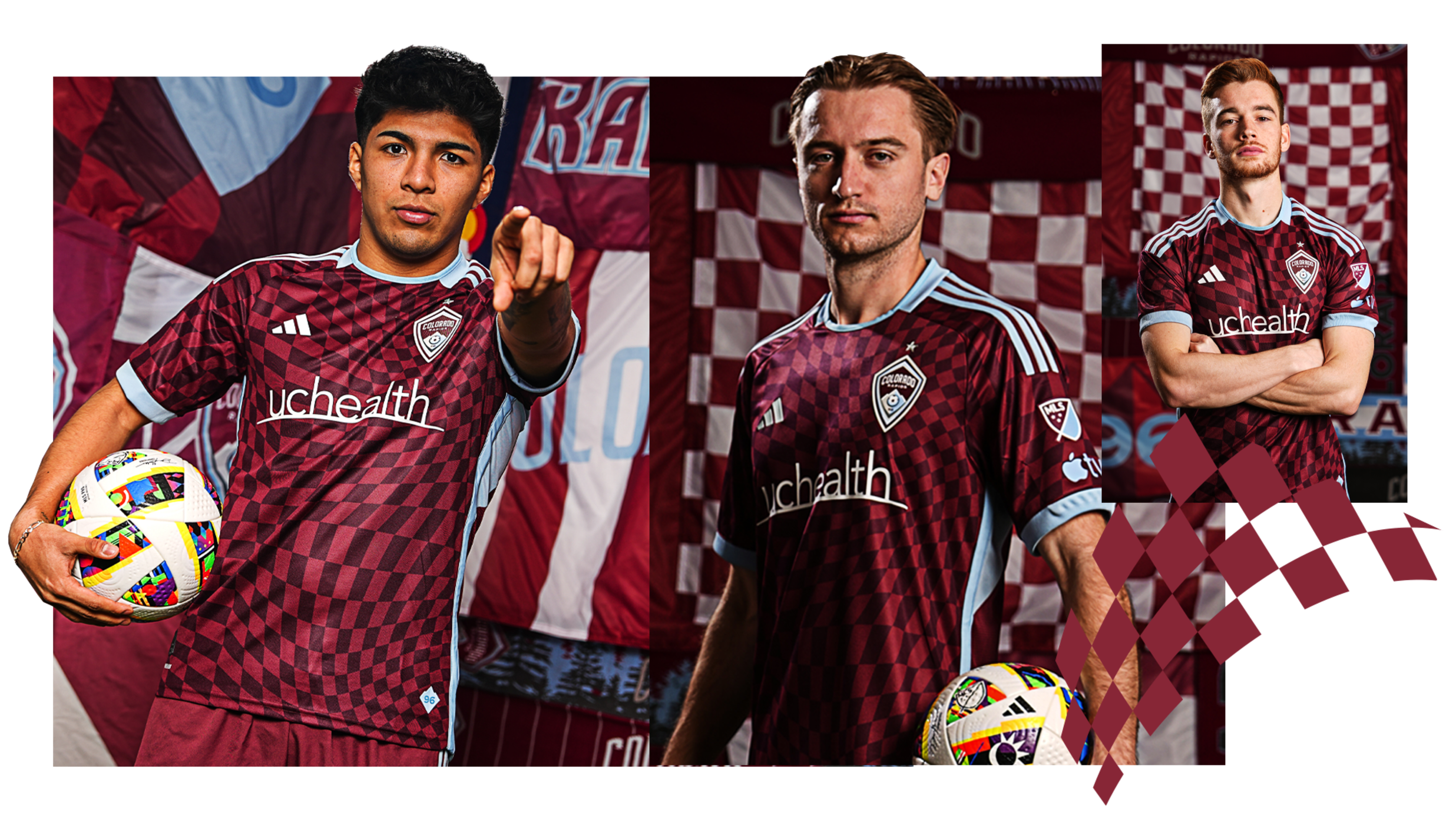
MLS Kits 2024
in Sports Logo News
Posted
The adidas stripes are single-color, so the yellow-and-white rule doesn’t quite apply here. If the stripes or numbers were navy trimmed in gold, then it’d be a “violation” of the rule (not really, but you get the picture)
Regardless, that’s the best Galaxy kit in quite some time. I’m on record saying I prefer the Galaxy when they emphasize gold oand as a non-sash fan (more Real Madrid-ish directions), the “ghost” sash accomplishes both.