


Ark
-
Posts
2,151 -
Joined
-
Last visited
Posts posted by Ark
-
-
17 minutes ago, Pigskin12 said:
Having a color TV has finally paid off this weekend. This game looks outstanding.
You got a color TV already? I got a color TV so I can see the Knicks play basketball-
 5
5
-
-
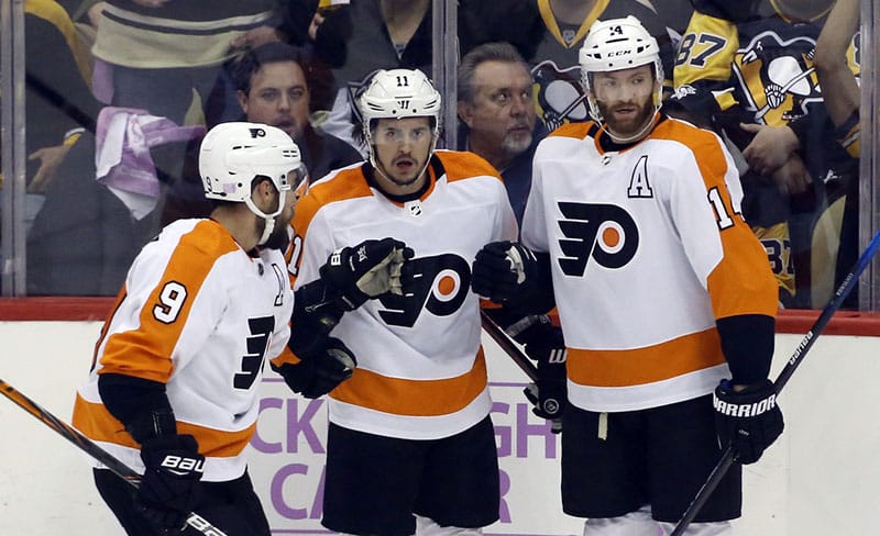
17 hours ago, ruttep said:

I cannot understate how much I like the new (old) shade of orange more.
Agreed but the old uniforms are better
Look at the outlines! Not to mention the standard name on back...
-
 6
6
-
 2
2
-
-
8 hours ago, Old School Fool said:
He pretty much summed up how I feel. When people say "It should be full time" I often wonder if they literally mean the exact look because that's not going to fly. Do I want the Bucs to wear orange more? Sure but how about we put orange with the current pewter look? How about the Eagles create a new kelly green look? The Browns went back to their classic look but you know what they did? They modified the look. That's what you should do. You wanna go forwards not backwards with aesthetics.
I don’t think any team is wearing the EXACT design they wore back then, they all have slight changes. See those complaining that the Eagles new kelly green is brighter than it used to be (even though it looked great)And more importantly, a lot of these teams went backwards aesthetically to begin with. Bringing back old uniforms is going forward aesthetically for some teams, and that is more true the nicer the throwback uniforms are.
-
1
-
-
35 minutes ago, ruttep said:
I simply can't get over the fact that they decided to wear this uniform against the Texans. Honestly, it's just a ridiculous troll job that you almost have to respect it.
If there was any way to get into the other team's heads with your choice of uniform, that is it. I doubt it actually affected anyone but it's an attempt. Maybe it would affect players from Houston, but even then most players now probably don't remember the Houston Oilers
-
1
-
-
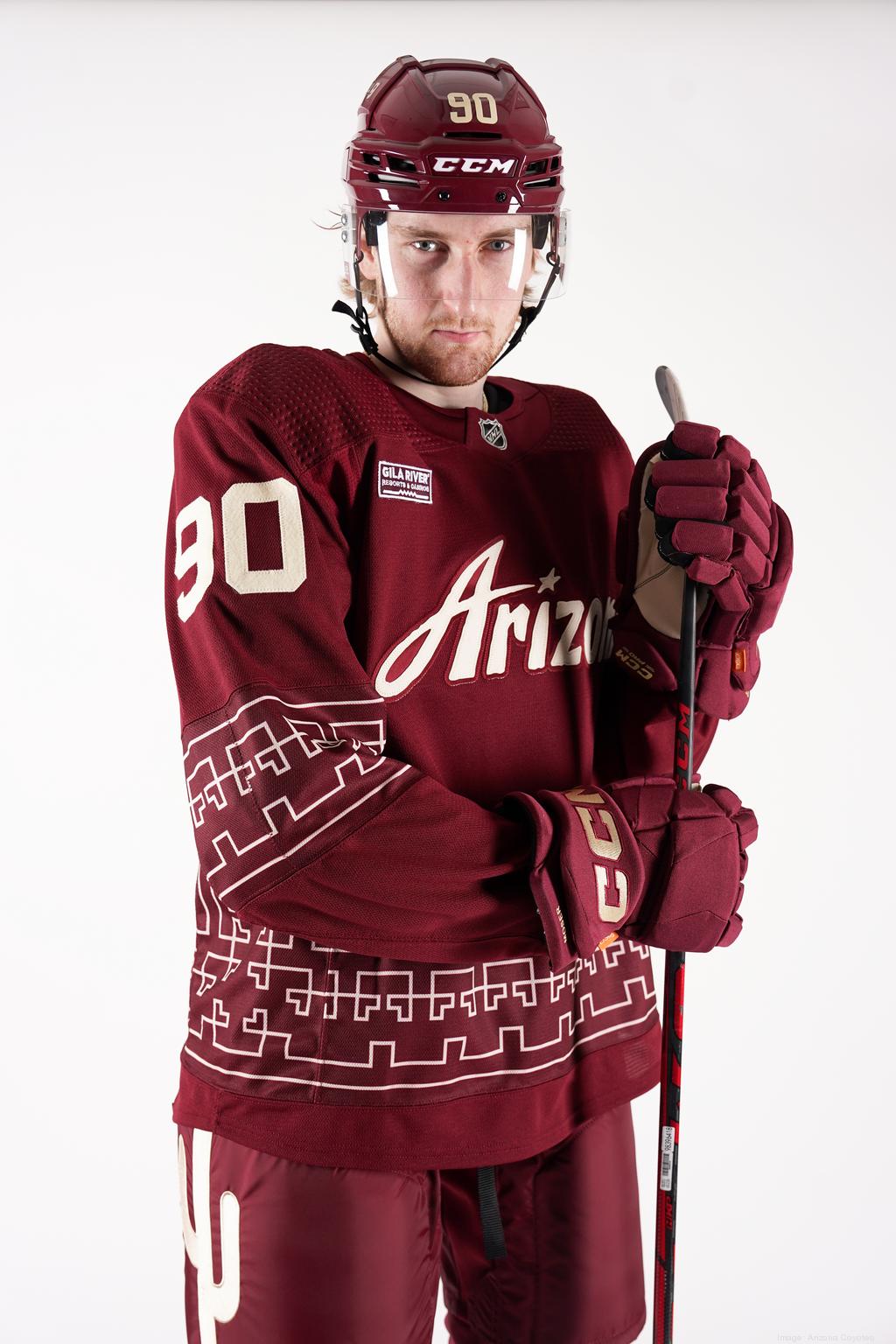
21 hours ago, elliott said:
Apologies if this has been talked about in this thread -- I have not seen anything about this, but it would appear that the Coyotes have new red helmets this season.
Tonight is the first time that the red alternates have been worn this season. The helmets have a matte finish (which I can't recall seeing in the NHL before? Anyone know??)
Last season, I am pretty sure there was just the normal "glossy" helmet finish.
Personally I kind of like it as something different in the league , and the matte finish plays off of the muted tones of the jersey.
These are pretty nice and a great fit with the throwback primary jerseys.
It's interesting how monochrome uniforms are hated in some sports and accepted or even liked in other sports though.
-
1
-
-
18 minutes ago, PrimalCookie said:
That reason is the Oilers are gone and the Texans aren't. Flip the order - Texans are the original team that left, Oilers replaced them - and those teams would be paying tribute to the Texans.
Eh, they might think the Oilers identity blows the Texans identity out of the water, and remember that the Texans won nothing so who really cares about them.
-
2
-
-
8 minutes ago, DCarp1231 said:
Texas Texans would be killer
Texas Texans of Texas
-
1
-
3
-
-
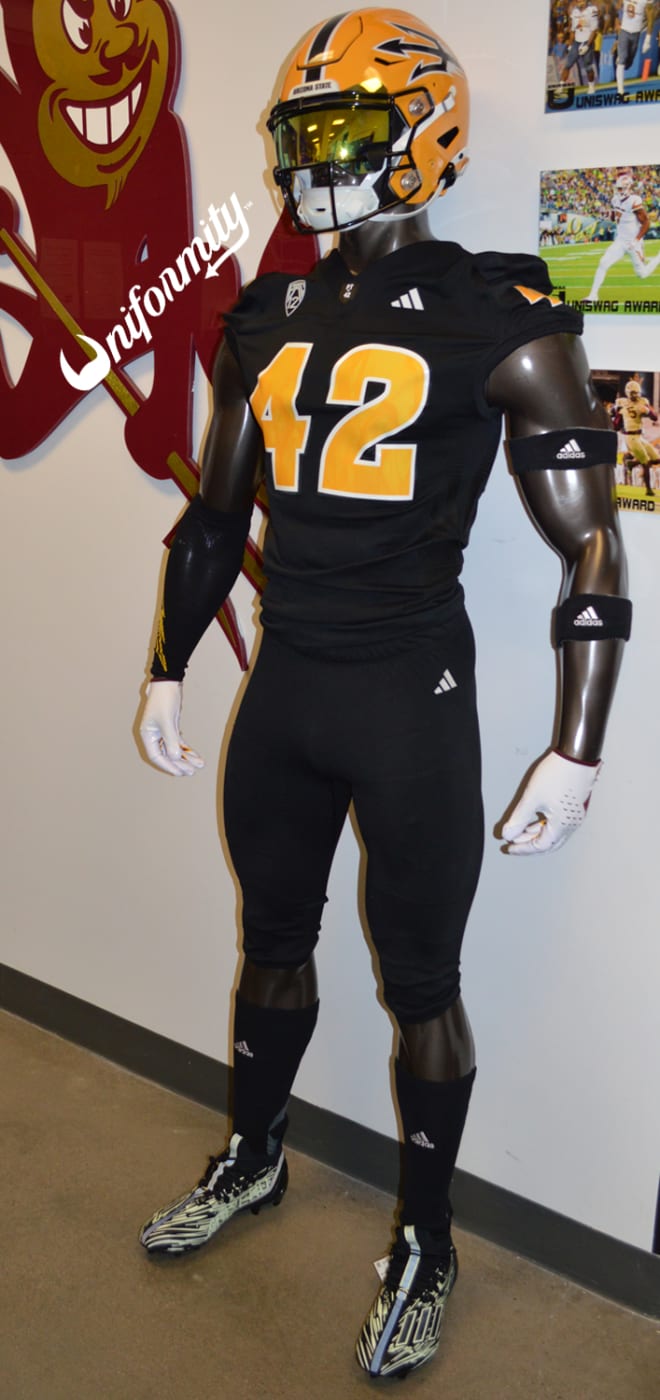
On 10/27/2023 at 6:10 PM, upperV03 said:
Arizona State is also going black, finally wearing their stupid glow-in-the-dark unis and pairing them with gold lids:
I don’t understand what makes them stupid? They look good and they actually glow in the dark which is cool.-
 1
1
-
-
He’s also wearing long white sleeves so I don’t get the hate, it matches.
-
 1
1
-
 1
1
-
-
People here really think the Dolphins primary uniforms are better than the throwbacks?
-
2
-
3
-
-
I was going to say I don’t get the vitriol, Lady Liberty jerseys are better and the LL identity is better, but these are a one-off design trying something different. So what?
But I do understand the vitriol, for some people things are either good or bad with no middle ground. Haters gonna hate.
-
3
-
1
-
-
Literally not a single plural ending with S
These executives must think women's sports are a joke.
-
1
-
-
Minnesota should add throwback helmets too.
-
1
-
1
-
-
Must be nice to be a professional logo designer these days
-
4
-
1
-
2
-
-
2 hours ago, Germanshepherd said:
Unintentional color vs. color tonight in the CUSA
Equipment managers need to make "mistakes" like this more often
-
8
-
-
The old Colts logo is like 90s McDonalds and the current Colts logo is like current McDonald’s
-
7
-
1
-
-
This is easily the best Astros logo and they should still be using it
-
7
-
-
1 hour ago, BBTV said:
ironically, they wore WAH the majority of the time. White was basically their home jersey. They wore white 6 of 8 home games in '95, and all 8 games in '96.
Looks like they only started doing this in the late 80s.
-
Unpopular or Popular opinion maybe: aughts is a horrible name for the 00s and should never be used
-
1
-
1
-
1
-
-
12 minutes ago, AgentColon2 said:
It still saddens me they chose pewter over silver. Only saving grace is that it’s a unique color for them.
It’s better for them, it’s like the color of their ship-
1
-
-
I thought the horse was shooting a laser beam. That was cool.
-
The creamsicle uniforms are just great, that shade of orange is beautiful.
So I wouldn't mind if they went back to the throwbacks full time. Especially because their early 2000s uniforms are better than their current uniforms and they aren't going back to those.
-
I was thinking about it and I wonder if the contrast between the dark navy helmets and the white facemasks makes for a more intimidating look.
-
The Giants new helmets look great
They look cool.
-
10
-
7
-


2023 NFL Season week by week uniform match-up combos: From HOF Game to Super Bowl LVIII
in Sports Logo News
Posted
Pic of Woody so I think it's No Nut November related