


Ark
-
Posts
2,144 -
Joined
-
Last visited
Posts posted by Ark
-
-
Who likes the contrasting nameplates?
-
 2
2
-
 4
4
-
-
Creamsicle Bucs vs. Lions is going to look good.
-
4
-
-
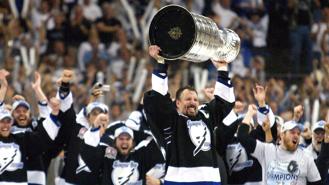
Interesting, looking back there aren’t that many teams with bad uniforms that lifted the Cup I wonder if there is an association between bad uniforms and being a bad franchise
-
I love the Vegas Gold jersey. I am a big of that sparkle fabric that was popular in the 90s and early 2000s, and now it’s all over the jersey. Awesome!
-
2
-
-
12 hours ago, ManillaToad said:

This is their best uniform.
-
9
-
-
Silver pants would look better but the black pants look good.
-
5 hours ago, Glover said:
Not a fan, this is too complex. Sort of like this detailed Seahawks logo
-
2
-
-
The gold uniforms are great and what they should have been wearing from the beginning.
The charcoal uniforms are boring and remind me of the black Flyers uniforms that took over the orange ones in the 2000s
-
3
-
 1
1
-
 1
1
-
6
-
-
21 minutes ago, BBTV said:
That's not a leotard is it?

-
3
-
 1
1
-
-
9 minutes ago, Silver_Star said:
That red is too bright. They should have stuck with Cardinal red, but oh well…..NIKE

I like that shade of red.-
1
-
-
What was there to watch for Twins fans during that era besides 1987 and 1991 highlights

-
2 hours ago, ManillaToad said:
Too bad they still appear to be bananas
It's more like a crescent moon next to a banana slug
-
4
-
-
44 minutes ago, DCarp1231 said:
It truly is one of life’s greatest mysteries how a lot of CCSLCers have what it takes to create incredible timeless identities for professional sports teams yet uniform manufacturers and teams employ absolute imbeciles for the process.
Imagine if one of us here got rich enough to buy a team. I'd definitely make a thread here asking to create new logos and uniforms and use the best ones for my team
-
4
-
-
The Johnny Canuck logo sucks. He looks like he's frolicking through a patch of flowers
-
4
-
1
-
1
-
 2
2
-
 2
2
-
8
-
 1
1
-
-
6 hours ago, MDGP said:
a Trademark Squatter who has claimed he'll give them up for free to the team.
Trademark Squatters really are the worst huh...
-
1
-
-
I really like the Reds new C logo
-
2
-
-
The tiktok designer's claim to fame is hidden elements... that CLE is not even a good hidden element.
-
11
-
1
-
-
The Jets primary logos are similar to the Yankees primary logo. Bit of a different situation but they are cool and I like them, especially the original.
They are also way better than the Capitals text logo despite having a similar design
-
What is the best Orioles logo? You want to answer that again?
-
1
-
2
-
-
I hope the bottom left wins, all the other ones are intimidating for intimidation's sake
-
2
-
-
22 minutes ago, Old School Fool said:
I really hope those perforated numbers aren't on every jersey, it will look stupid for teams like the Raiders, Bears and Packers among others.
The guy in the image is basically wearing a Raiders uniform and it looks fine.-
1
-
-
I don't agree with Ottawa pretending to be an Original 6 team.
That example certainly doesn't look bad, but they have much better options. Same with the Lightning
-
2
-
-
I hate how the helmet plume is turned into a circle/roundel element. It doesn’t look right.
-
I love that they used this Giants logo for inspiration, I hope the actual team does that too
-
10
-


NFL 2023 Changes
in Sports Logo News
Posted
I hate the matte finish
Nice design though.