


Ark
-
Posts
2,152 -
Joined
-
Last visited
Posts posted by Ark
-
-
I want to see Patriot Pats vs. Bucco Bruces
-
 2
2
-
 2
2
-
-
5 hours ago, throwuascenario said:
PPS: This past week was the exact right way to use a throwback. It should be as a once-in-a-blue moon special occasion with a REASON behind it. Using throwbacks as standard alternates drives me crazy.
What if the throwback uniform is much better than the main uniform, and what if the main uniform is garbage on top of that?-
7
-
-
2 hours ago, Ark said:
Why?The Giants have a great uniform set but because they are so classic they are also kind of boring. The navy adds extra color.
To the person who was confused, with this set the extra red helps with that also. The navy helmet just makes it better. -
16 minutes ago, Discrim said:
The return of the Giants' navy lids had me thinking about how weird it was that baseball teams who wore royal blue had no trouble getting batting helmets that matched their color, but football teams somehow were stuck with either navy or a badly clashing sky blue until the 2000 Giants. Yeah, as good as the Giants' looked today, no need for the navy helmets to come back as anything but a throwback.
Why?The Giants have a great uniform set but because they are so classic they are also kind of boring. The navy adds extra color.
-
 1
1
-
-
The navy helmet really makes the look for the Giants. I definitely did not think they would do that but they did and it’s great

-
9
-
3
-
 3
3
-
-
I actually like these all red Cardinals uniforms. The regular uniforms are awful and the red is nice
-
These Commies uniforms have to be the worst in the game. There are a few contenders but the camo and nameplate put these over the top IMO
-
 1
1
-
-
35 minutes ago, Cujo said:
If you like zebras, then yes.
I do.
-
 1
1
-
-
5 hours ago, tigerslionspistonshabs said:
The Cincinnati Siberians
Shockingly Siberian Tigers aren’t black and white. They are just regular tigers from Siberia-
1
-
-
Regardless of looks, I like when teams force the Cowboys to wear blue.
They should wear those 90s throwback more
-
8
-
1
-
-
Browns look FANTASTIC in orange pants.
-
10
-
-
The AFC South is one big mess
-
1
-
-
Making the oil drop orange is a really nice upgrade.
-
1
-
-
It’s just Land? What about Lake Erie?
-
1
-
 1
1
-
-
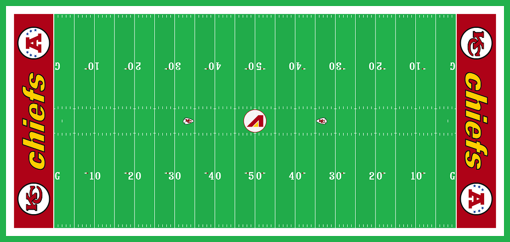
12 hours ago, Old School Fool said:
Old Arrowhead Stadium logo. It's a throwback to the 70's field design when they first moved into the stadium.
Honestly this looks terrible, but the fact they are doing it is really cool.I want teams to throw back to baseball diamond fields
-
1
-
-
It’s alright. The Suns could do way better.
-
1
-
-
Unpopular opinion? I like the Seahawks all green look. It’s a fantastic alternate uniform.
-
2
-
2
-
-
That is a downgrade from the standard jerseys (and they improved when they added black), so good thing they didn’t use it.
-
On 9/9/2022 at 7:22 PM, ramsjetsthunder said:
Come on y'all, these are the best (with white pants)
The orange here looks worse than the orange in the Elway pic.
Although they could be the same shade and it's just the better camera quality
-
1
-
-
13 hours ago, pepis21 said:
Speaking of Sabres, it always curious me (esepcially that Sabres team with Peca, Hasek and Satan was my faviourite one back in early 00's) why this logo is named a Goathead when it isn't a Goathead but Bisonhead, there is any explanation behind that?
Same reason the 90s Penguins logo is called the Robo Penguin even though it looks like an actual penguin-
2
-
-
I don't like what the Avs or Sharks are doing.
Avs - Nice home, away should have maroon equipment
Sharks - Nice away, home should have black equipment
The Sharks could try silver equipment as well. That is just way too much blue
-
2
-
1
-
-
28 minutes ago, AFirestormToPurify said:
Now THAT'S an unpopular opinion lol. But nah, the side piping sucks. The waist stripe on the pre-Edge version with the small arrows/beaks looked much better
I meant in comparison to the Capitals uniform. I'm sure they would have fixed the Edge mistakes in later years and have a great uniform today... unless they did a fauxback or something like the Panthers.
-
The Edge jerseys are pretty good for Edge jerseys. The main improvement they have over the original is the slimmer design. It just looks better.
Look at this pic, the Thrashers uniform is much better IMO
-
2
-
-
Shockingly Brian Burke's marketing decision aged like ice on the equator lol


Unpopular Opinions
in Sports Logo General Discussion
Posted
Looking at this uniform now, this is way too busy. Reminds me of how a lot of corporate logos have been simplified nowadays