Ark
-
Posts
2,155 -
Joined
-
Last visited
Posts posted by Ark
-
-
It's better than some of the soulless logos that are popular now, but it's a downgrade from the old one.
-
That Nats uniform would look better with grey pants
-
 1
1
-
-
2 hours ago, Glover said:
Canes are wearing these tonight
And off to a rough start. Down 2-0 to the Sabres after 7 minutes, and this is after they lost to the Sabres in Tuesday with the black pants. One of the worst organizations in sports history outplaying us. This jersey-pant combo doesn’t look bad, but the superstitious fan in me says just stop with the black pants unless it is with the black jersey.
Carolina Devils -
-
The Ducks identity is such a mess, it's understandable that they wanted to drop the Mighty from their name but that's all they should have done.
Thanks Brian Burke.
-
 1
1
-
-
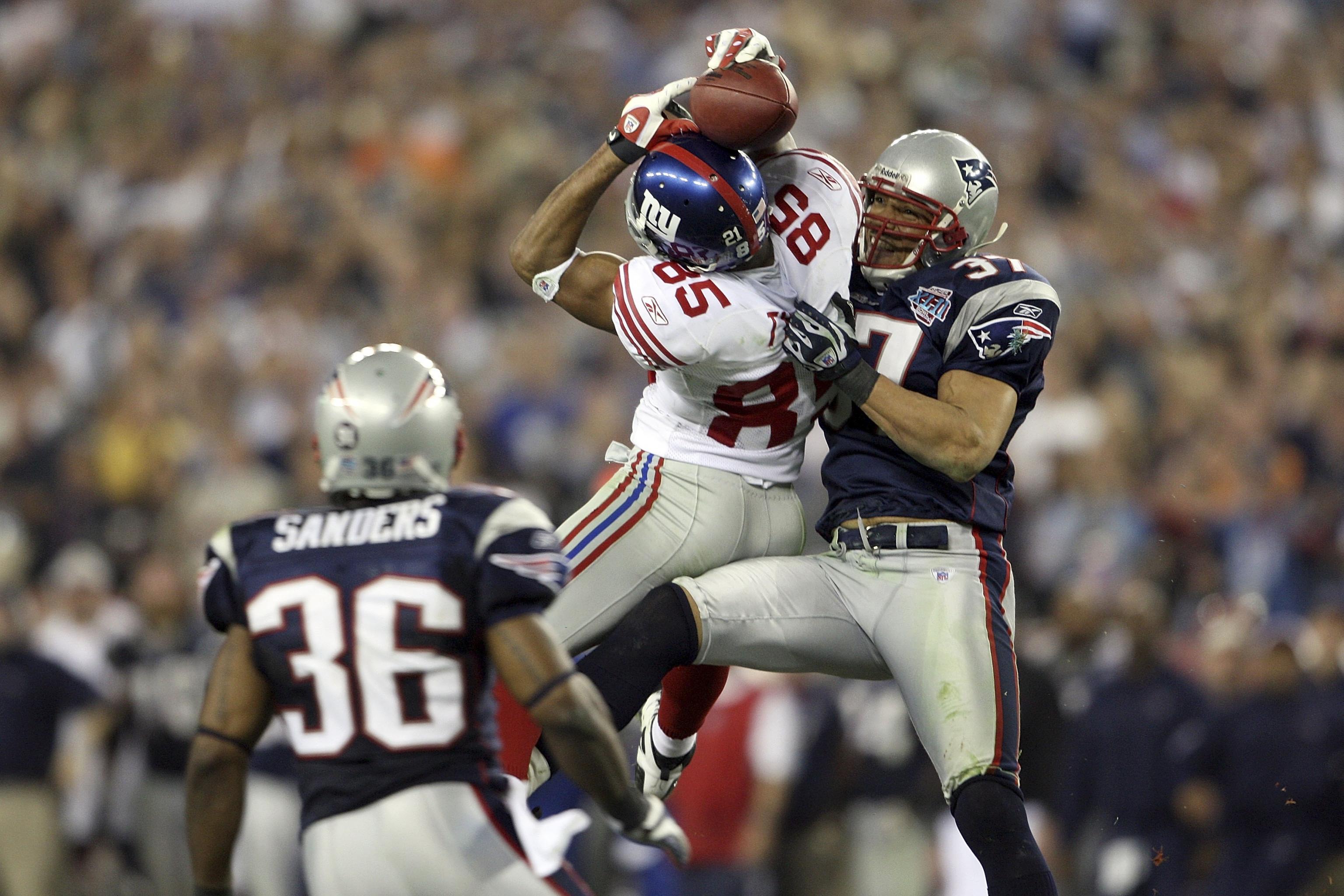
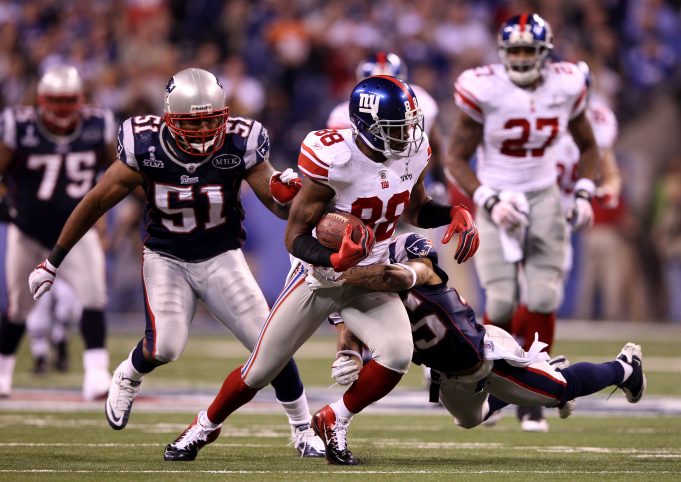
I always liked the Giants vs. Patriots Super Bowl uniform matchups as modern classics


-
 2
2
-
 2
2
-
 1
1
-
-
This was a great looking game


-
 3
3
-
-
20 hours ago, Morgan33 said:
Here's the league in 1991 where very single team has a traditional look. You know how many use Detroit's template?
Detroit and Pittsburgh
-
 1
1
-
 1
1
-
-
I like what the Stars did with their side panels more than what any NFL team has ever done with their side panels
-
22 hours ago, MJD7 said:
I can’t lie, I don’t hate this. I definitely don’t love it, but I do think it would be an upgrade, if ever so slight. *ducks*
They do look like the Arizona Ducks
-
On 2/2/2022 at 4:02 PM, Chromatic said:
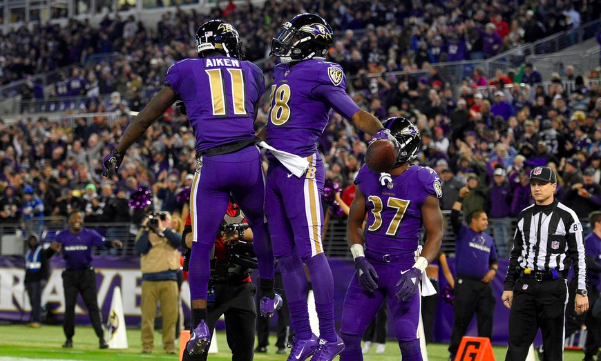
Speaking of Baltimore, I think this should be their full time Home and Away looks.
I know purple is their thing but I really think the black jersey and helmet with purple pants is the best they've ever looked. You still get a heavy dose of purple. Ravens are black birds too with a slight purple sheen to their feathers depending on the lighting. The colours are balanced so much better, and you don't get the horrible yoga pants look with the black socks.
They should be like the AFC version of Dallas and wear these when the other team wears white at home

-
 1
1
-
-
I really don't understand why people hate their uniform. Who cares if it doesn't match, it is iconic. They wouldn't be the Cowboys without it. As the above poster said, making the pants silver makes them look like the Lions.
-
 5
5
-
-
I really don’t think the Rams uniforms are bad at all, but they are significantly worse than the throwbacks which sucks.
-
 5
5
-
-
7 hours ago, YelichGraphics said:
Looks really good. -
-
11 minutes ago, BBTV said:
My gods - that NOB is horrible. Just looking at it gives me a headache. If the bottoms of the A, M, R, etc were flat, maybe it wouldn't play so many tricks with my eyes, but as it is, I'll need an advil if I ever happen to see one of their games.
I don’t mind it. That team’s identity has been bad since the 90s when they wore more red and dreadfully boring since they adopted the C logo. They are at least trying something new.-
 1
1
-
-
The previous set had some odd details but it looked so much nicer than the current “modernization”
-
The Knicks should bring back the Yankees NY logo

That is a really nice uniform.
-
 9
9
-
-
On 12/17/2021 at 6:18 PM, Echo said:
Unpopular opinion but I don’t hate these and I wish they were brought back as an alternate.They are unique and that’s a good thing. They are like the father of 90s jerseys.
These Knicks uniforms as well:

-
 4
4
-
-
They should modernize this set

I understand if they don't want to use green.
-
 7
7
-
-
17 hours ago, alecgoff said:
Mets removed the unnecessary piping on the front of the jersey. I'm not a fan of them wearing black jerseys, but these are definitely an upgrade over the 2021 uniforms
This looks so good.
It's a throwback to a great era of baseball.
-
 1
1
-
-
Lmaoooo that is hilarious.
The jersey says what it is
-
 5
5
-
-
Is this unpopular?
The Red Wings should wear their white uniforms all the time like the Cowboys do. They are much nicer than their red uniforms; they truly appear to have "red wings".
-
 3
3
-
-
Not sure if this is unpopular? I like the Knicks NY Yankees logo.


/cdn.vox-cdn.com/uploads/chorus_image/image/65406163/usa_today_13471974.0.jpg)


NFL 2022 Changes
in Sports Logo News
Posted
Unpopular opinion but the 49ers look much better with two shoulder/arm stripes because they match the design of the rest of the uniform.