


Ark
-
Posts
2,155 -
Joined
-
Last visited
Posts posted by Ark
-
-
Watching the Giants, players' shadows often make their pants look grey anyway.
-
-
16 hours ago, TheRealPepman said:

It's amazing how we see this uniform match-up first before the Golden Knights face the retro red Flames.
The road uniforms look so good, I want ice blue to become their primary color so much.
-
 5
5
-
-
"Gamble Responsibly" messages are going tp greatly increase soon aren't they
-
The Sabres eventually got a good "modern" version of their classic uniforms after years of this
-
9
-
-
I LOVE the shiny material on the logo.
-
5
-
-
It's not that difficult to have two different pants.
-
2
-
-
On 9/17/2021 at 3:33 PM, CreamSoda said:
Hopefully the Avs just used cheap materials for the rookie camp games and we see numbers that better match for the regular uniform. This looks so much better:
So much better than the baby blue we saw during the Rookie Camp games. GIF to show the differences:
It does look better but it doesn't look good.
Take a look at the socks. Blue/Grey/Burgundy. That should be the theme for the entire uniform. The shoulders and waist should have a blue stripe next to the grey stripe like the classic uniforms did. The numbers should be burgundy with grey and blue outlines. And yes, the pants should be burgundy.
-
4
-
-
The Avs road uniforms are a hot mess.
-
6
-
-
4 minutes ago, ebod39 said:
They are not. From the official press release: "The two stars in the crest reference Gemini, the twins constellation".
oh...
Well it norks both ways lol
-
The two stars are definitely homages to the North Stars.
They wish they were the North Stars so much. So do I...
-
1
-
-
Is the Flames red darker?
I like it.
-
The Pistons had it right in the 2000s when they used the horse logo in moderation
-
32
-
-
5 hours ago, QCS said:
The best Nets logo is the one their 2K League team uses.
Brilliant.
This would look great paired with the New Jersey Nets' net side panels.
-
6
-
-
I would like to see purple and white versions of the Suns Valley uniforms.
-
9
-
-
The NBA's 75th anniversary logo is very reminiscent of the NFL's 75th anniversary logo, which I like a lot.
-
4
-
-
I just want to say that the idea of a giant football player in New York City makes for a great logo.
This wouldn't be a good primary logo today as is, but it could definitely be simplified and made into a modern classic.
-
14
-
-
30 minutes ago, selgy said:
I dont think any of the Patriot unis have been good
28 minutes ago, ManillaToad said:I think all of the Patriot unis have been good

-
9
-
-
If they introduce silver pants at home, their uniforms are basically modernized versions of the old set.
It would be a better set in every way, but I will always have nostalgia for those classic uniforms when they were the team to beat.
-
11
-
-
2 hours ago, oldschoolvikings said:
In the following picture, neither team looks good
I disagree. They both look good, and this is arguably the most defining look of the 2000s vs. the most defining look of the 2010s.
-
13
-
-
This is brilliant.
-
1
-
-
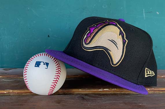
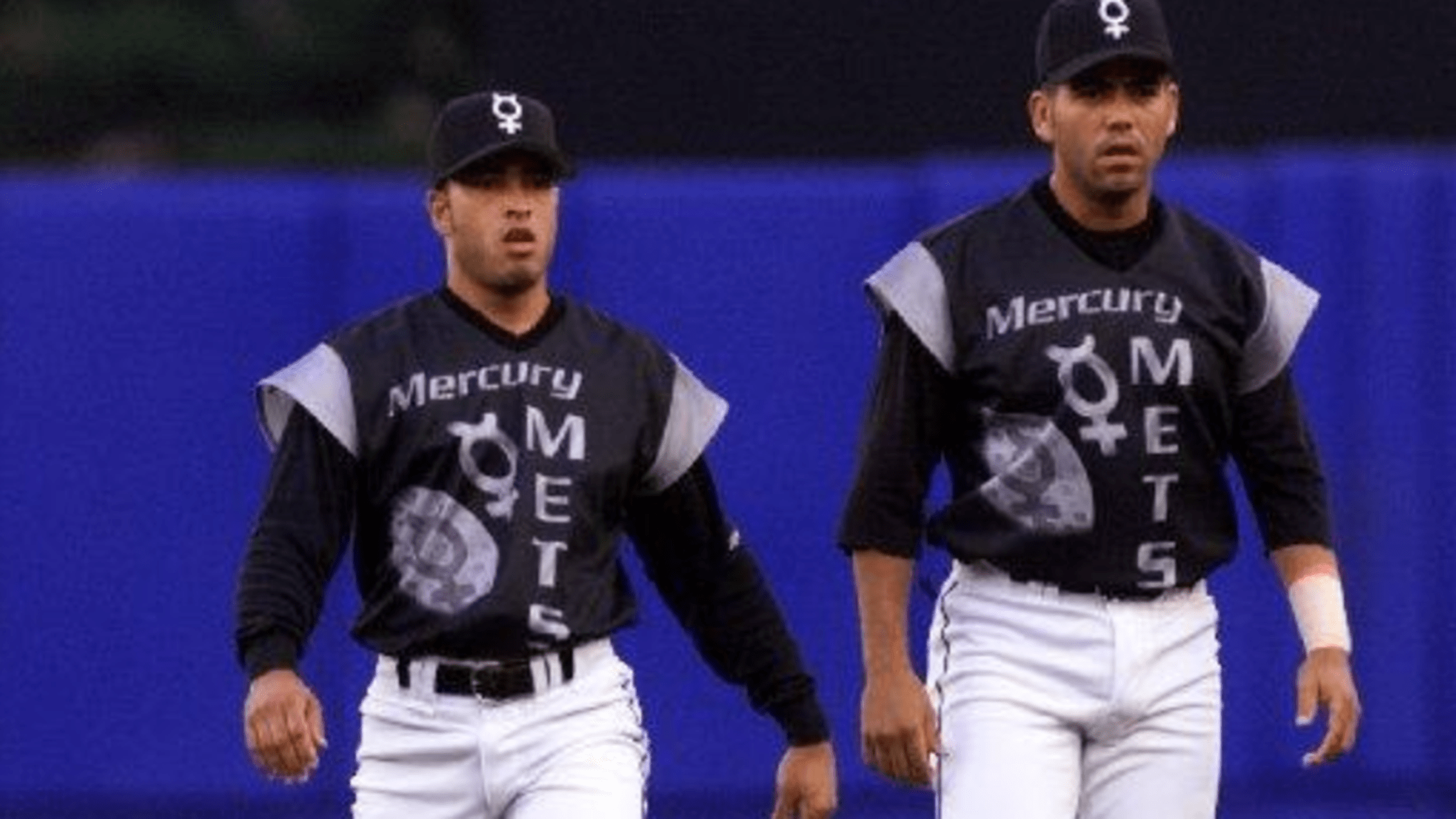
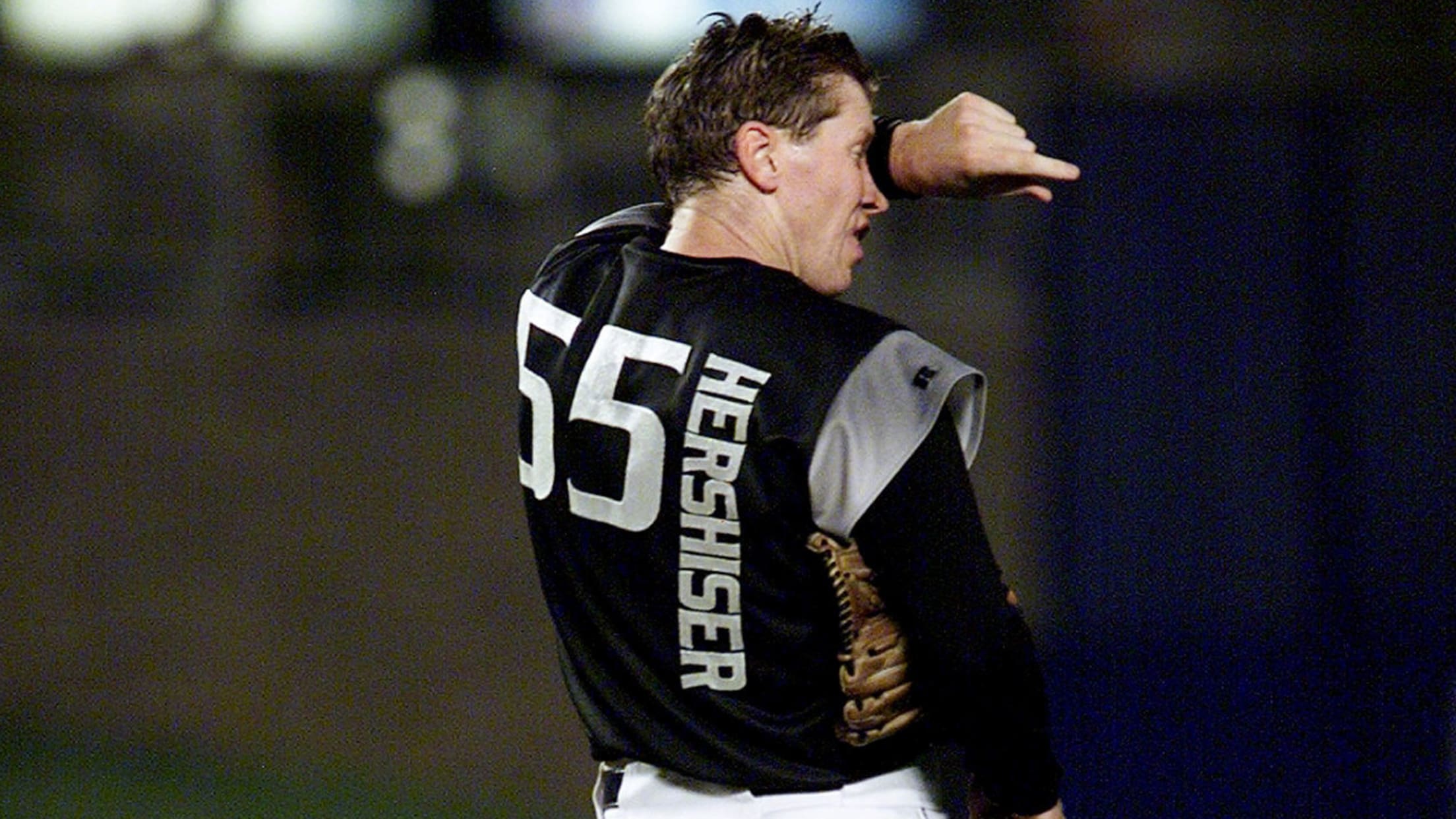
I like the Turn Ahead the Clock uniforms but I REALLY like the Mercury Mets
What a creative and fun idea.
-
2
-
-
I think the Washington Football Team will use that name permanently, and that's a good thing. They will make more people angry than happy with whatever name they go with, so they're better off staying generic. A name like that is unique to the Big 4 North American sports leagues and helmet numbers is a unique detail in the NFL as well.
I hope the "Cleveland Baseball Team" becomes the Cleveland Spiders, though.
-
1
-
-
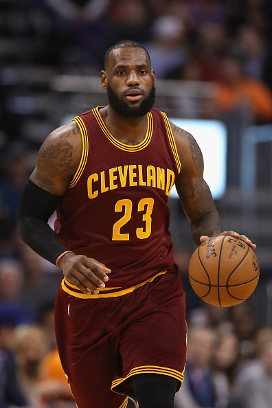
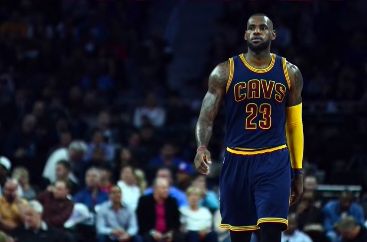
21 minutes ago, Old School Fool said:
Cavs got it right in 2003 and proceeded to screw it up after Lebron left for the Heat.
This is their best set:-
11
-


/cdn.vox-cdn.com/uploads/chorus_image/image/46905782/usa-today-8638492.0.jpg)

2021-2022 NHL Jersey Changes
in Sports Logo News
Posted
Again use burgundy pants and fix the stripes on the road and it is a fantastic set.