


Ark
-
Posts
2,155 -
Joined
-
Last visited
Posts posted by Ark
-
-
The Edge jerseys are pretty good for Edge jerseys. The main improvement they have over the original is the slimmer design. It just looks better.
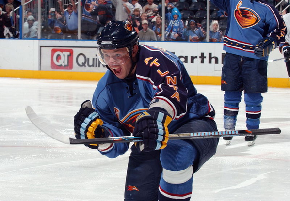
Look at this pic, the Thrashers uniform is much better IMO

-
 2
2
-
-
Shockingly Brian Burke's marketing decision aged like ice on the equator lol
-
2 hours ago, AFirestormToPurify said:
Original jerseys in black, orange and gold
As terrible as I thought their current identity was, these are actually beautiful.
-
4
-
-
6 hours ago, dont care said:
Yea, logo is trash. Asymmetrical shoulder yoke is bad. Wordmark on the sleeve is super bad. Really the only thing that’s good about them is their colors
I vehemently disagree on the asymmetrical shoulder and wordmark. That is the best part about it other than the colors.-
2
-
-
I love these uniforms
-
5
-
 4
4
-
-
Kovalchuk deserves to have his number retired by that franchise much more than those two do.
-
2
-
 2
2
-
 1
1
-
 2
2
-
-
I hope someone buys the team and rebrands them again.
-
8
-
-
I prefer the W Jersey that was similar to the Expos retro jersey.
-
1
-
-
5 hours ago, VDizzle12 said:
Browns are deciding between 4 field designs.
2 have variations of the elf logo at midfield. The other two have it in the endzones.
Great move. Now make one of the the primary logo and ditch the helmet.
My pick would be the running elf.
I like the website name . -
nvm
-
The stripes should be a mix of the previous ones and the ones from this era
Previous ones
-
4
-
1
-
-
The old pant stripes are way better than the new ones IMO
-
4
-
-
2 hours ago, gothedistance said:
I didn't get Madden 22. The last Madden game I got was the one with Lamar Jackson on the cover. It was worth getting because of the 8 new uniforms in 2020, and because of the new stadiums Sofi and Allegiant. This year there's a lot of new additions regarding the uniforms, so that will be enticing to buy M23.
Anyone getting the game?
Madden’s gameplay and presentation are pretty bad… they are apparently adding stuff but I have zero faith in the developers.-
4
-
-
3 hours ago, DCarp1231 said:
With the reveal of the Giants throwback helmet, it begs the question-
Why couldn’t the Bengals have gone with a script throwback helmet instead of this poorly teased and absolutely horrendous white tiger helmet?
The what?Poorly teased, yes, but it looks great. And the script Bengals helmet is in fact bad.
-
3
-
-
I love the Giants era-accurate helmet!
-
I like these, but I wish they were Oilers blue or a very close shade if they are not allowed to use that.
-
On 6/12/2022 at 3:54 PM, Ark said:
I hate when stirrups are worn like that. Much prefer this look, but you rarely if ever see it anymore
It seems like people disagreed with this? Why do you disagree? What are your thoughts on stirrups?
-
It looks better with the light blue, otherwise they have one of the most boring identities in MLB.
-
1
-
-
I hate when stirrups are worn like that. Much prefer this look, but you rarely if ever see it anymore
-
1
-
3
-
-
1 minute ago, dont care said:
The giants CC uniforms? No way
No, the Angels.
-
1
-
-
They really look like the Phillies to me with those uniforms.
-
I really like the touch of black, but the shoulder stripes look unfinished and the center stripe thing is just weird.
-
The Patriot head shoulder stripes are top tier design. I would love modern version of these
-
5
-
1
-
-
The Panthers remind me of the 2000s Sharks. I think those jerseys would also look weird if they were transferred to modern jersey templates with no/minimal alterations.


/cdn.vox-cdn.com/uploads/chorus_asset/file/20790696/95783293.jpg.jpg)

Unpopular Opinions
in Sports Logo General Discussion
Posted
I meant in comparison to the Capitals uniform. I'm sure they would have fixed the Edge mistakes in later years and have a great uniform today... unless they did a fauxback or something like the Panthers.