


Ark
-
Posts
2,140 -
Joined
-
Last visited
Posts posted by Ark
-
-
8 hours ago, Morgan33 said:
there was no reason to change either of these things...

There was. The Reebok Edge debacle.
-
2 hours ago, j'villejags said:
Is a 'shadow' uniform just another way to say a black uniform?

-
34 minutes ago, DCarp1231 said:
All of these throwbacks are incredible, but if I had to pick the worst of the bunch? I’d say Tampa Bay. As far as the best, 100% Minnesota.
Using the matte helmets ruins Minnesota’s throwback IMO-
 1
1
-
 1
1
-
 3
3
-
 1
1
-
-
The Angels should go back to their late 90s-early 2000s identity.
Embrace the Disney connection, be different.
BTW it’s really too bad they didn’t wait one more year to rebrand because then that identity wouldn’t be forgotten to time.
-
 1
1
-
1
-
-
41 minutes ago, WBeltz said:
I never had an issue with Washington Football Team, and I actually liked it because it was one the nose (of course they’re a football team) and I think it was a different in terms of North American sports naming conventions and it felt unique and different. The uniforms maybe should’ve had a shift due to three looking the same as the prior name, but I was fine with the numbers on helmets, and the consistency of the look.
I think the uniforms basically looking the same is a good thing IMO. And the helmet numbers added diverging new.
They obviously can’t go back to the original identity and WFT is the next-best thing.
-
13 minutes ago, PittsburghSucks said:
Major Tuddy stays or we riot!!!
Is he supposed to represent a capitalist pig?-
1
-
1
-
 1
1
-
-
Washington Football Team is probably their best option.
-
3
-
 1
1
-
1
-
7
-
 1
1
-
-
1 hour ago, randyc said:
They should just become the Tennessee Oilers again.-
4
-
1
-
-
47 minutes ago, _RH_ said:
It's a shame we can't throwback to the pants that better match the finish on the helmet:
Ahh - "progress"!
The blue is much more vibrant and overall the throwback uniform looks better.-
2
-
-
The Seahawks throwbacks are better than the regular uniforms and they have no reason not to be wearing them permanently
-
2
-
-
7 hours ago, bob95 said:
We may see the end of the Astros blue alts next year due to the new Nike template.
That is a good thing IMO but they need to bring back that sunset gradient somehow.-
4
-
-
You can tell the grey is the same as the grey on his shoulders. It’s like this
A and B are the same color.
-
4
-
-
3 hours ago, justin23iu said:
Goodell is anti-uniform ads. As long as he’s at the helm, I doubt it happens. He believes, correctly IMO, that the monetary gain loses out to the “cheapening” of the brand. I hope he holds the line.
He held to that line while he re-signed the EA exclusivity deal for football video games, so he better. -
What does this have to do with the Marlins baseball team?
-
 1
1
-
-
The jersey gradient is subtle and great.
-
So they are going to introduce superior uniforms for one season then take them away, that will be interesting
-
3
-
-
21 minutes ago, VampyrRabbit said:
I wish there were colour vs colour games in the NHL. San Jose vs Vegas might work as one.
Interesting idea.
Montreal vs. Toronto
NY Rangers vs. New Jersey
NY Rangers vs. Philadelphia
Philadelphia vs. Pittsburgh
would be some good ones.
-
2
-
-
9 hours ago, CaliforniaGlowin said:
Ducks is a silly name for a team imo. I would love Oregon if it wasn't for that.
They should try the Mighty Ducks
-
1
-
1
-
-
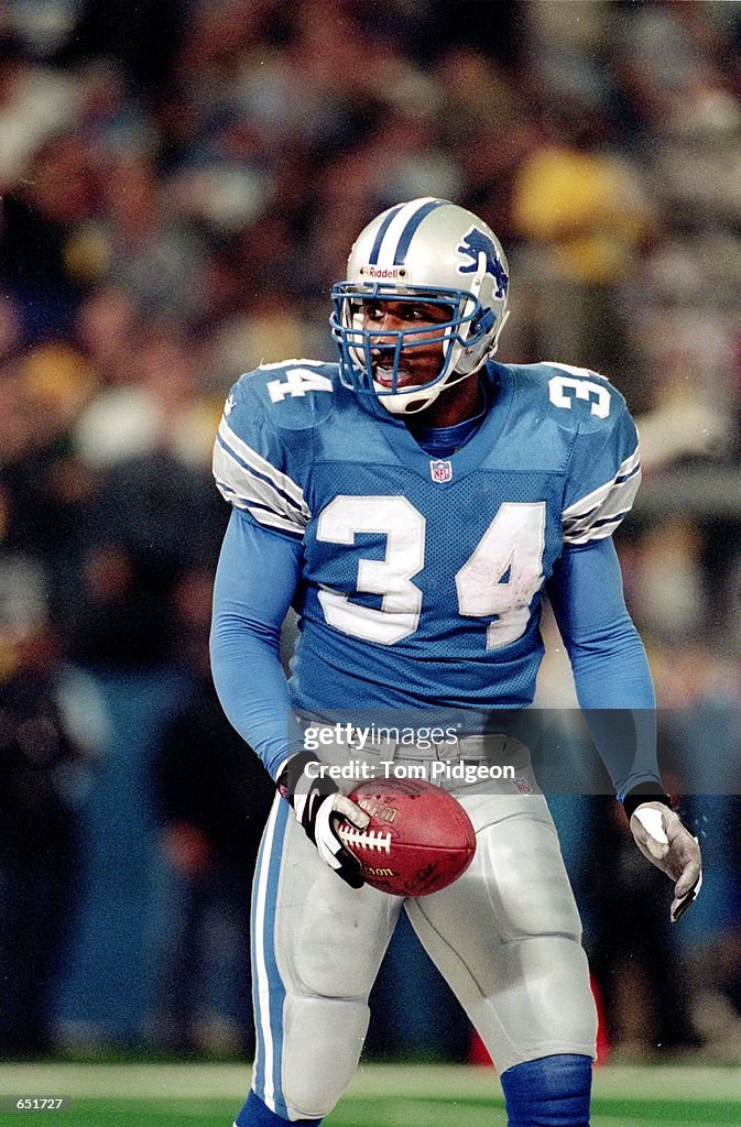
5 hours ago, Carolingian Steamroller said:
Let's interrogate that for a minute.
Here's the Lions home uniform in 2002. Now let's see what changes were made:
These uniforms are fantastic. Beautiful to look at. All they had to do was make small changes from this to conform to modern templates.-
9
-
-
Having the old owner's initials on the sleeve just like the Bears is such a mistake for multiple reasons. I hope they rebrand away from that.
-
6
-
-
I hate the matte finish
Nice design though.
-
2
-
-
Who likes the contrasting nameplates?
-
2
-
4
-
-
Creamsicle Bucs vs. Lions is going to look good.
-
4
-
-
Interesting, looking back there aren’t that many teams with bad uniforms that lifted the Cup I wonder if there is an association between bad uniforms and being a bad franchise


College Football 2023
in Sports Logo News
Posted
I like the all-green look, sorry bros