


Mingjai
-
Posts
1,896 -
Joined
-
Last visited
Posts posted by Mingjai
-
-
17 hours ago, ltjets21 said:
They are Navy Blue. This year their colors are navy and orange
So they are. I saw the pics of their New Era hats and figured they were still black with just a logo change. But on closer inspection, the hats are dark navy too.
-
Was watching a bit of Taiwan-Netherlands. I can't tell if it was the lighting, but Netherlands' jerseys looked navy blue. Even the coaches' gear looked navy. Probably just the way fabric reflects the lighting.

-
On 3/3/2023 at 12:59 PM, WestCoastBias said:
Also, I think Washington's "W" just looks wrong on a baseball hat. They should go with a more classic version of the "W" like what Don James used to wear. Could be a little close to Washington State's "W" baseball logo though.
Agreed. That classic W would look much better for baseball. It would be similar in concept to what Minnesota baseball does with their caps—using their historical unbordered M—compared to the rest of the athletic department branding.EDIT: Just noticed that the Gophers are using a different Minnesota script than the original for their throwback pullovers. Strange because Gopher hockey sometimes uses a script that looks pretty close to that old baseball script.
-
 4
4
-
 1
1
-
-
2 hours ago, the admiral said:
What if they used some variation on the plum flower from the Olympic flag as a cap monogram? That might be kind of interesting. Hope it wouldn't get them invaded by the official partner of the Los Angeles Rams, though.
I think the plum flower a great idea as well. They have so much potential and all we get is that crap. -
6 hours ago, sportsfan7 said:
Personally, I'd say that nowadays I hear Row the Boat about as often as Go Gophers
It’s funny, I refuse to use “Row the Boat” except when specifically referring to Coach Fleck himself: “Ol’ ‘Row-the-Boat’ should have gone for it on 4th down there…” -
9 hours ago, gosioux76 said:
Growing up, I recall referring to the University of Minnesota as "U of M" more often than not, and that's still the most common reference when I go back home. But as I've moved across the country in the past 30 years, I've learned that nearly everybody has a "U of M," it seems.
(As an aside, I went to the University of North Dakota, so when I see people with Gophers gear, I don't reference it, but I do use it as an opportunity to ask if they're from in Minnesota. So if someone does that to you in Chicago, it could very well be me.
") )
)
I’m an adopted Minnesotan—went to Minnesota for grad school and never really left (even now I split time between Chicago and Minnesota). I say still U of M when I’m in the state, especially instead of “the U,” because as a third generation BYU grad, “the U” refers to something much more heinous than the U of M (either Minnesota or Miami)… -
I’m just putting this out there, but Taiwan (or officially Chinese Taipei) baseball needs a rebrand. That CT logo just looks bad. I’m sure they could come up with a really traditional looking interlock CT, or even better ditch the C altogether and just use a T (T for Taipei when China inevitably complains). As someone with Taiwan ties, I own a couple of these hats and wear them fairly regularly, but yeah, not good…
-
2
-
-
On 2/23/2023 at 10:38 AM, 8BW14 said:
Here’s my little stump speech: Colleges and universities really don’t need nicknames for their athletics teams, IMO. We are much more tied to the colors and university than the nickname. People will say “I’m a cowboys fan or a Yankees fan”, but more often than not when we are talking about college it’s “I’m an Illinois fan or “Go USC!” There are exceptions, of course, but I don’t think it would be that weird if college athletics didn’t have official nicknames.
I don’t really agree with you about nicknames, especially with all the great nicknames out there.Maybe this falls under one of your exceptions, try living in Minnesota and telling people you’re going to the Minnesota game. You could be referring to the Vikings, Twins, Wild, Loons, Wolves, Linx, or any one of many University of Minnesota sports teams. So in the state of Minnesota it’s always the Gophers in general or Gopher hockey, Gopher football, etc., in particular.
On 2/25/2023 at 5:25 AM, chcarlson23 said:As a Gophers fan and someone who’s lived my whole life in Minnesota up until a couple of months ago, yes, I do say Ski-U-Mah to anyone wearing Gophers stuff haha. I mean it’s part of the school fight song, “Rah Rah Rah for Ski-U-Mah” and the U uses it in a lot of branding. So most Gopher fans should know it, and even people who go to the U of M, who don’t care for sports are probably familiar with Ski-U-Mah.
I think you’re in the minority though in saying “Ski-U-Mah” to folks, though it might be increasing since the school has started using more in its branding. They school didn’t really use it as much in branding before when I was there in the 00s.
In Chicago, I get “Go Gophers” by at least a 10:1 ratio, and I almost exclusively say “Go Gophers” to fellow fans. I guess next time I get a Ski-U-Mah on the street, I’ll know it’s you! (Or PJ Fleck, but he’d say Row the Boat first… )
)
-
5 hours ago, BBTV said:
I might be wrong about this, and feel free to correct me, but I believe that's only a military thing - specifically a US Army thing - and anything else is just trying to emulate that, and may or may not actually be in adherence to flag code.
It’s more than a US Army or even US Military thing, at least in practice. Many transit authorities also adhere to it when they affix flag decals to the sides of buses or trains. New Era generally adheres to it when putting US flags on hats.But you may be right about flag code—I’ve never looked it up to see if the “canton on the right when the flag is on the right side” is actually in the flag code. It might just be a military reg (as your suggest) or even accepted practice.
-
2
-
-
On 2/9/2023 at 10:11 AM, Seido_Ace said:
WBC hats are now live on New Era's site: https://www.neweracap.com/collections/world-baseball-classic
I imagine Fanatics/MLBShop will update today as well especially since the official roster reveal is scheduled for this evening (6p ET).
Is the US the only country in the WBC (or in general) with the rule that the canton must be on the right side of the flag when the flag is placed on the right side of the wearer/vehicle?Australia, New Zealand, Puerto Rico, and South Africa seem like they should be flipped horizontally, but maybe their flag usage doesn’t demand it.
-
13 hours ago, B-mer said:
I actually kind of like the Caps jersey. It’s a logo that works well for that purpose since it has the negative space feature of the Capitol.
That exactly why I like it was well. Such a simple logo that uses negative space lends itself well to being “oversized”—though to me, it’s more being directly integrated into the overall jersey design than merely oversized. I’d like to see how a red version of this jersey looks.
-
1
-
-
2 hours ago, MJWalker45 said:
I would have expected new uniforms if Fleck left, but not sure what they would do other than possibly moving to the Vapor Fusion templates.
Even if they kept everything else, switching to gold numbers and collar should be a no-brainer…(So says every Blues fan over 40…)
-
4
-
-
Seems to me Minnesota should be up for new uniforms, though I’m a little reluctant to see what Row-the-Boat comes up with this time (whenever that is…).
-
3
-
-
27 minutes ago, MJWalker45 said:
The one advantage with colleges is that Prime can change how he addresses to minimize the potential of wearing Nike. He could also wear unbranded Under Armour shoes as well. There are soccer coaches that will do that if their team's contracts with adidas or Nike say they have to wear the team's branding.
I seem to recall pictures of LSU’s Les Miles wearing Zephyr hats that were rebranded as Nike. Am I just imagining that?-
1
-
-
9 minutes ago, TenaciousG said:
Washington Huskies too - I call their current colors blurple and tan versus the purple and gold they are supposed to be. But i won’t lose any sleep at night over my rivals’ continued botched branding.Completely understood. I feel the same way about Utah. If you can’t beat ’em, at least you can make fun of what they’re wearing.
-
4 hours ago, WSU151 said:
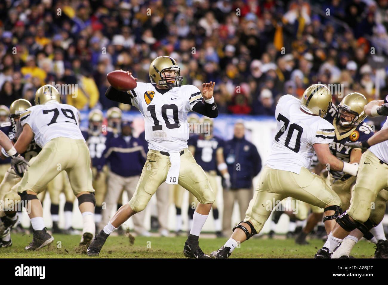
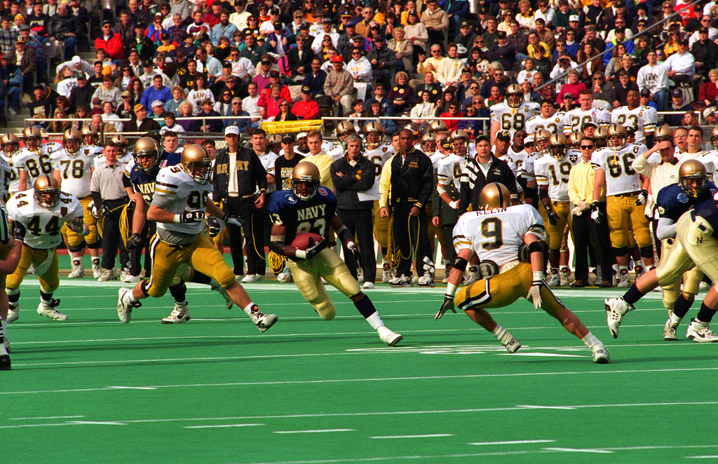
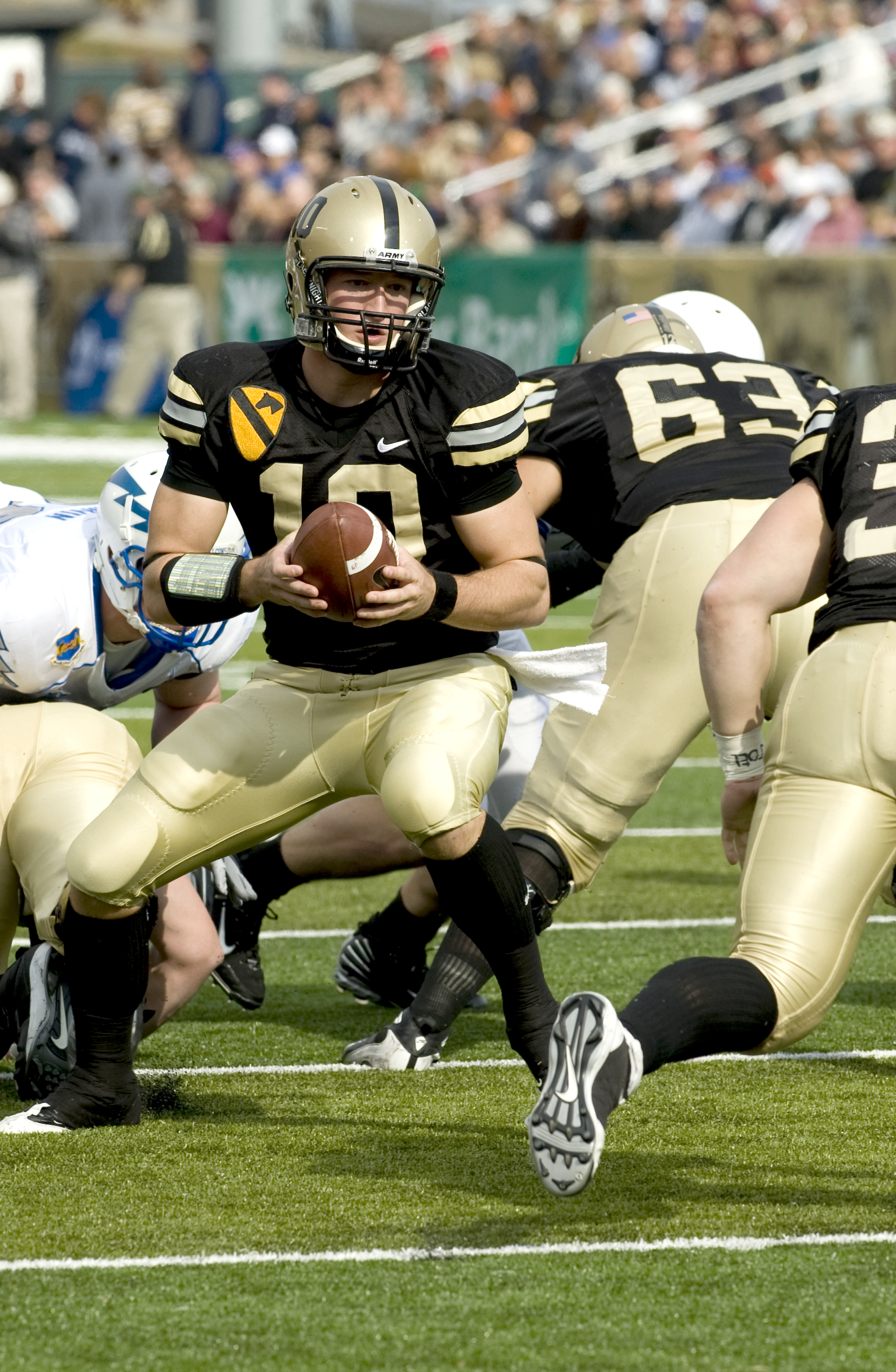
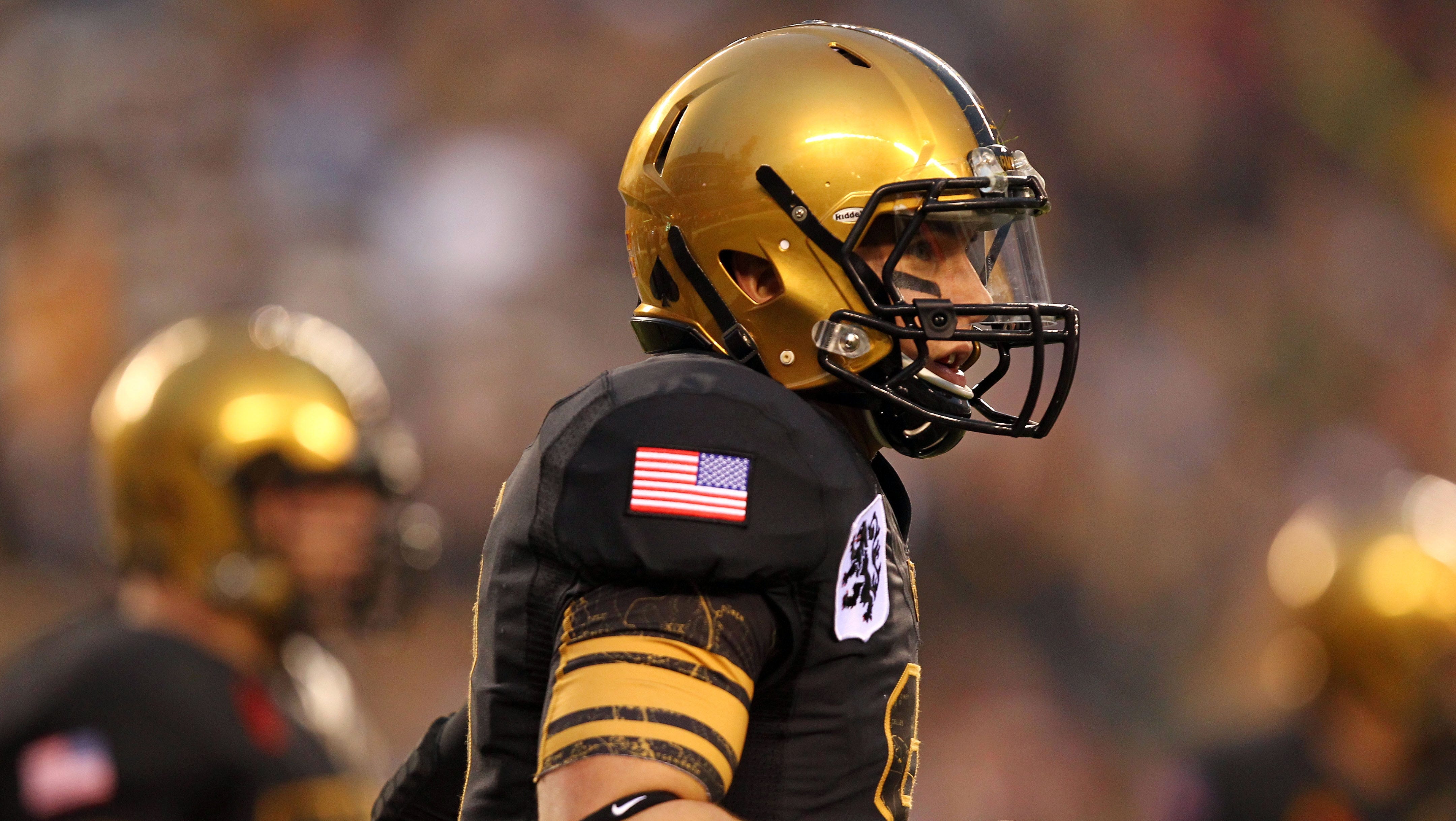
CBS Sports Network is airing vintage Army/Navy games this week, and right now they're showing the 2006 game. Both teams wearing traditional unis (gold/white/gold and gold/navy/gold). Seems like this game was 40 years ago, not 16. It's somewhat amazing how much things have changed since the mid-2000s.
And for what it's worth...strong nostalgia for when Army when the brassy/copperish gold helmets in the 90s (which I assume is a similar gold to what Purdue used back in the day) along with the old gold pants.
The set in the top picture (home jersey below) would be killer with the coppery old gold (the same color they used in the 2012 Navy game).
This should be Army’s regular gold:
-
17
-
-
2 hours ago, Bmac said:
No, New Era offers two shades of navy, and the Twins already used the darker one. They continue to use the darker one. Jerseys have been darkened to match.
I’ve always thought the Twins should be using New Era’s lighter navy (just Milwaukee using it now?) versus the midnight navy (basically every other navy team). Here was their chance to fix it and they decided not to. I guess I can see them needing the darker navy to make the unbordered red pop a bit more.On the topic of New Era navy, it drives me crazy that New Era uses the lighter navy for the Chicago Bears hats when their on-field uniforms have always seemed midnight navy.
-
1
-
-
5 hours ago, aawagner011 said:
France is wearing all navy blue as we speak, against a side in all white
Sorry everyone. I guess I jinxed it.
Hopefully it was just because Tunisia was the home team and chose to wear all white, forcing France into a shorts change.
-
4 hours ago, aawagner011 said:
I agree but I feel like a lot of that has been shaped by FIFA and their regulations around contrasting kits. The US still tends to wear navy shorts when it can (seems like we usually do against Mexico). But when you see teams like Germany wearing all white, Argentina pairing their stripes with white shorts, France winning the final in all navy, you can understand why the US has leaned more towards all white. Just the way the sport is heading. To me, the all white doesn’t feel as egregious as some of these other countries who have to modify their kits. I’m okay with it.
But France has worn the traditional bleu blanc rouge in both matches this World Cup. The designated home side should chose their preferred primary and leave it to the away side to figure out clashes. I don’t know who selects the US kits, but I don’t think the FIFA clash refs are the issue anymore. US needs to be wearing blue shorts. -
9 hours ago, fouhy12 said:
I hate how much I've come around on the black socks for the Bruins. I don't like admitting it, but they look good.
5 hours ago, Echo said:In a vacuum the black socks look good. If you were designing their uniforms from scratch I'd say gold socks looked ridiculous. But taking their history into account the gold socks just say "Bruins" to me.
7 hours ago, infernoqueso said:I see the Bruins socks in the same boat as the Blues' numbers. Probably looks better now with black socks and white numbers, but the yellow socks/numbers just make those uniforms more unique and are a part of their identity.
2 hours ago, wildwing64 said:The black Bruins socks look correct, but they feel wrong.
The yellow socks added more colour to the uniform and enhanced their big and bold look.
I understand the sentiment that black socks look good, but gold socks look right. But to me, the gold socks both look good and right with the current look because they provide a balance the gold shoulder yoke. Black socks might, however, look better with the 1980s uniform set.-
7
-
1
-
-
10 hours ago, Carolingian Steamroller said:
I wish someone would try their hand at using the new M logo with the constellation of Gemini around it rather than the single star.
It'd be a cool astronomical reference and distinguish from the North Stars/Wild traditions.
Minnesota uses the North Star because of the state motto “L'Étoile du Nord,” meaning the Star of the North. As a result, one of Minnesota’s nicknames is the North Star State.-
1
-
-
On 11/22/2022 at 10:23 AM, MJWalker45 said:
The best NASA tribute uniforms were the ones done by UCF. This uniform is nice enough, but that helmet has too much detail. And if it's cold enough, I wonder how much of that could chip off over the course of the game.
Purdue’s were better than Navy’s as well.But it’s weird to see Navy pushing its connection to a civilian agency. Maybe next year, Navy can play tribute to former Navy grads who work for the Department of Energy with a big atom on the side of their helmets. They could even borrow Army’s mascot to do the kicking.
-
 1
1
-
-
3 hours ago, FinsUp1214 said:
I’m generally not the biggest fan of gold/yellow hockey sweaters, but I think this Blues one is excellent. I think it helps that’s there’s a significant amount of blue in the uniform to balance it out, but in any case, they look great to me. It was a really good idea to reference the ‘67 prototype instead of re-hash one of the other throwbacks.
Never realize how much being a Gopher fan has influenced my hockey aesthetics—I’m accustomed to gold jerseys to a degree that in many cases I prefer them. Most of my Gopher jerseys are gold, not maroon or white. My favorite Bruins jerseys are their gold 2010 Winter Classics and the original those were based on. I think of the Preds as a gold team, not a blue team. And I’d like to see the Wild, Sharks, Kings, and Pens do gold-based reverse retros.
I’m sure if my favorite team weren’t gold, I probably wouldn’t feel this way because gold, whether athletic or Vegas, is an in-your-face color (I guess old gold is more low key though).
-
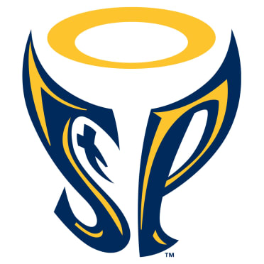
7 hours ago, Burmy said:
And here are the last days' logos.
St. Paul Saints (AAA International League)
Plays up the "saintly" factor with the halo and the cross-T. I predict it WILL find life even after the promo is done (largely for any Faith & Family Nights that may happen there)
Though not, I imagine, on Athiest Night with the Mr. Paul Aints:-
1
-


:format(jpeg)/cdn.vox-cdn.com/uploads/chorus_image/image/43516810/6731465.0.0.jpeg)
/cdn.vox-cdn.com/uploads/chorus_asset/file/6589565/Winfield_Dave_04.0.jpg)


/cdn.vox-cdn.com/photo_images/1452577/GYI0062480216.jpg)


2023-24 NHL Jersey Changes
in Sports Logo News
Posted
I’m curious—anyone here know if manufacturing locations actually changed during the Reebok-Adidas shift or was it just the same facilities retooling to a different template and slapping on a different logo?