


Mingjai
-
Posts
1,896 -
Joined
-
Last visited
Posts posted by Mingjai
-
-
25 minutes ago, joekono said:
Should have taken the feather off spear(as to not insult the American Indian), call them the "Washington Warriors", done.

The should have taken these uniforms, swapped the spear for something from their new identity, and called it a day.
-
 5
5
-
-
16 minutes ago, Crabcake said:
Warriors also is about as generic as you can get for a name and immediately would cause them to suffer from Texas Rangers syndrome, i.e. your team name having a much stronger public association with an entirely different franchise.
Yeah, I suppose most people think of a different Texas Rangers franchise:
Or maybe even this:
-
2
-
-
On 1/22/2022 at 4:54 PM, DG_ThenNowForever said:
Good points. I said "dome," but I meant "field." Silverdome, Three Rivers, Riverfront, Busch, even Olympic Stadium -- they all had some kind of charm. The Metrodome always looked so grim on TV.
You should have seen it in person…-
2
-
-
15 hours ago, VikWings said:
Janikowski looks like he's wearing a low end fan replica lol.
He had to order one in goalie size.-
1
-
-
Slap a Flaming C on this and Bob’s your uncle.
-
2
-
-
2 hours ago, Cujo said:
As author and founder of the term CLEVEJACKED


 , I feel I deserve immunity from any ridicule or backlash which stems from a proper Chris Creamer Sports Logo Community message board Clevejacking.
No one is above the law here at CCSLC. You Clevejack a thread, you live with the consequences.-
21
-
-
21 hours ago, kiwi_canadian said:
I think for two reasons.
1. Starting in 2010, countries were no longer allowed to use federation logos on the front of their jerseys when participating in the Olympics.
2. I think that the Olympics are when Nike shows off their new templates for their next cycle of jerseys for the top divisions in the World Champs (mens, womens and mens U20). We saw this with the last batch of Nike jerseys that were debuted at the 2018 Olympics and pretty much every team in the World Champs went with that template that year up until now.
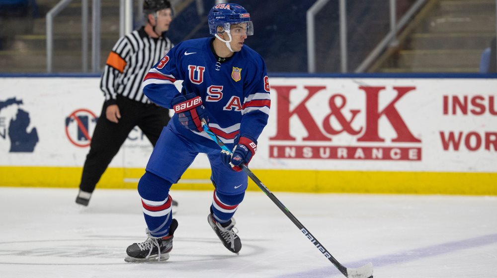
The no federations logo rule dates back to 2008 (though it wouldn't have affected hockey until 2010). As I recall, it was sprung on teams shortly before the 2008 games, which is why we saw crap like this:
-
On 12/22/2021 at 8:10 AM, Giantsgustav said:
More pictures of the USA Jerseys
So the US is a blue lids team now? They were a white lid team for as long as I recall. Or did IIHF finally get rid of their stupid one helmet rule. Now they just need red breezers.-
1
-
-
On 12/15/2021 at 2:51 PM, QCS said:
Diagonal letters always look bad, especially for such a long word like "Pittsburgh". The Rangers are the only team that should be using them and only because of historical context.
Maybe my aesthetics are shaped by being a fan of college hockey, but I think shorter words look worse diagonally than longer words. I also don't think that the Rangers should own such a traditional hockey look just because they're the NHL team most associated with it.
-
2
-
-
1 hour ago, spartacat_12 said:
That's the case with these as well, and people don't seem to have a big problem with them coming back as a throwback:
Not the first to say this, but those Blues jerseys would look good in the current two-tone blue:
-
19
-
-
4 hours ago, Chromatic said:
Fitteds are definitely a safe choice. The biggest issue with hats is the inconsistency in sizing. Like I said earlier I have a pretty large ballhat collection, and part of the reason for that is that finding a hat that actually fits me is rare enough that I feel I'm missing out if I don't buy it. So when I find myself trying on a hat in a store and it actually fits my head the way I like I end up buying it.
Snapbacks, on top of looking like you won them from a claw machine most of the time, rarely fit, and when they do its usually only backwards and then you're stuck looking like a pokemon trainer.
Dad hats almost always fit, but they also permanently look slouched and beaten.
A truly well fitting fitted hat is amazing, but its like finding a needle in a hay stack. I've had sizes up from what I normally wear be too small and sizes down too large. There is no consistency or quality control, I've ordered several 59/50s online and ultimately sent them all back. I'll only buy them in stores if I can try them on first. I prefer New Era, but as much as people crap on Fanatics I've found their fitted hats actually consistently fit the same across the board much better than New Era.
Maybe its because I'm approaching my 30s, but I've started liking the 39/30s/FlexFits more and more, which is somewhere between a dad hat and a fitted. They feel like a nice age appropriate compromise where they still have the somewhat rigid structure of a fitted with the comfort and fit of a dad hat.
Thank you for coming to my TedTalk about baseball hats.
This is the key to online shopping for fitted hats:-
1
-
-
On 11/1/2021 at 10:39 PM, Bmac said:
The gray sweaters are still around as an alternate, worn this past weekend:
Ugh. Spoke too soon.
-
1 hour ago, gosioux76 said:
These are gorgeous, and I love the hanger-effect collar. But i still wish they'd put the new Hawks logo as the jersey crest already. I'm certain the only reason they haven't done so is to appease the fans who refuse to accept they're no longer the Sioux.
Even Gopher fans like me can admit these look nice. I'm fine with North Dakota using a wordmark on their hockey jerseys. I think their Hawks logo is a little too simple to be the primary crest of a hockey jersey.
-
1
-
-
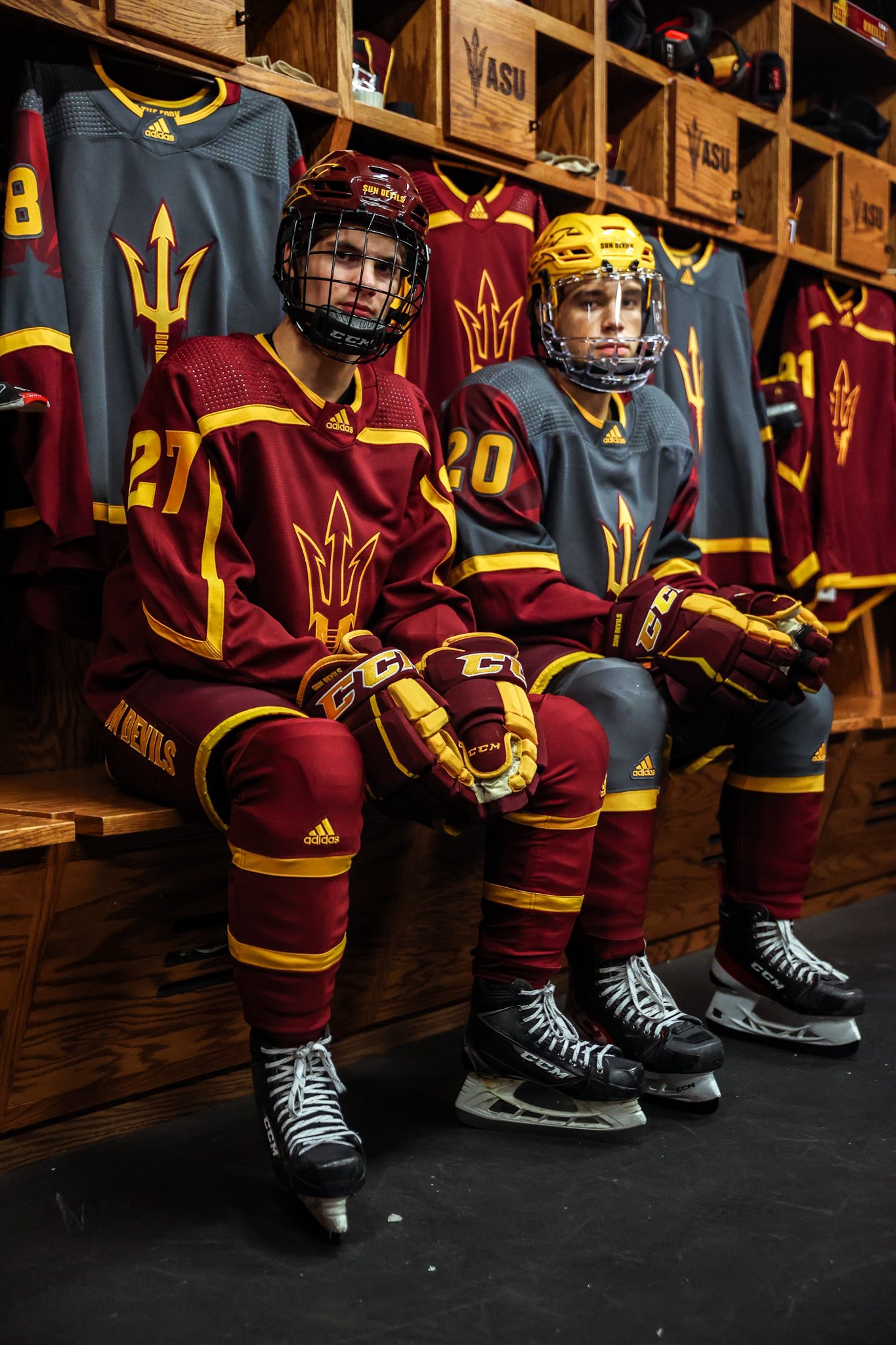
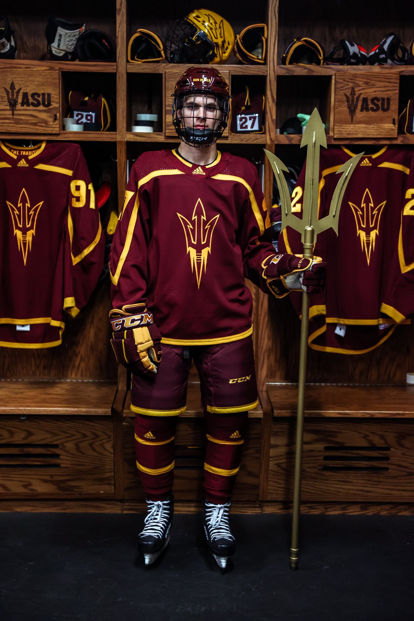
5 hours ago, Bmac said:
There's a college hockey uniform changes thread every few years, and I figured instead of making new ones every so often we could just use this thread yearly.
*****
A few changes for the 2021-22 season:
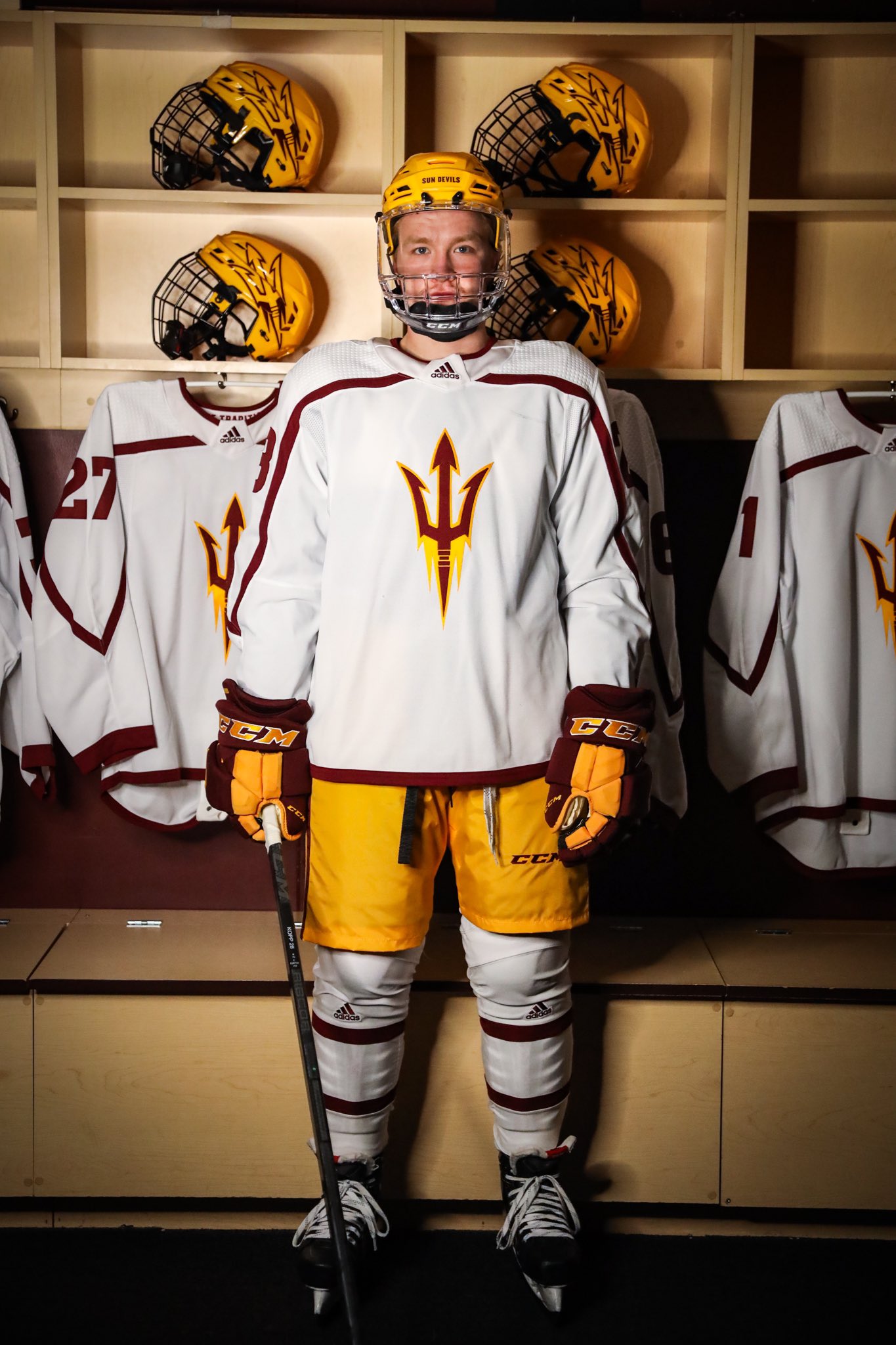
Arizona State with new home & road sweaters, paired with a variety of helmet+breezer combos:
Does this mean no more grey? Good. I like the maroon set and the gold breezers. But the white jerseys need some more gold.
-
3 hours ago, AFirestormToPurify said:
Pantone 281C is almost navy blue. It's certainly not as vibrant as the bright royal blue the Rangers use or even as light as the royal blue the Islanders, Sabres and Blues use. I would definitely call them a dark blue team
And of course it's arbitrary. I only said I thought there were too many dark blue teams in the league. You're also arbitrarily not counting dark royal blue as dark blue. I only stated my opinion that a rare matchup with both teams in bright red looked good. No need to be pedantic and reply with a "uhm, akshully" post about navy blue jerseys which I've never mentioned in the first place
Qualitatively, I’ve never considered Toronto, Tampa Bay, or Vancouver dark blue teams, especially in terms of their actual textile colors.-
3
-
-
1 hour ago, AFirestormToPurify said:
"A race is a grouping of humans based on shared physical or social qualities into categories generally viewed as distinct by society. The term was first used to refer to speakers of a common language and then to denote national affiliations."
No need to be pedantic. I get what you're trying to say but again, a mod resolved the issue. A sports logo forum isn't the place to be discussing this. Let's move on
I only draw the distinction because Equal Protection jurisprudence under the 14th Amendment draws the same distinction. That is all.
-
1
-
-
13 minutes ago, AFirestormToPurify said:
Or maybe you should learn to detect casual racism better? Either way, the other mod deleted the harmful comment, and rightfully so cause this kind of comment was uncalled for and out of topic especially on a forum about sports uniforms. There was no need for you to chime in when the issue was already resolved. No need to drag this out any further
* ethnocentrism or offensive based on national origin. Probably not racism because by most definitions, French Canadien is no more a race than, e.g., Pennsylvania Dutch. It's important that since the original post is now censored, at least we can properly characterize what was offensive about it.
-
2
-
-
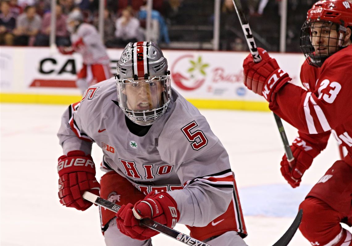
9 hours ago, AFirestormToPurify said:
You mean aside from the incomplete sleeve stripes, weird collars with the fake rubber laces, the shoulder numbers, whatever the hell is going on with Ohio State's weird shoulder yoke and the Spartans whole uniforms? A few teams turned out okay but there's too many uniforms that look weird in your post and you cherry picked the "best" ones. I wouldn't wanna see what you consider are the "bad" ones lmao
I wasn't exactly cherry-picking. I image searched the NCAA D1 Nike schools I knew off the top of my head (not hard as a Gopher fan, because all of the B1G except Wisconsin and Notre Dame are Nike) and then picked some illustrative images. I didn't pick what I considered the best looks, just the schools' typical looks. And yes, Ohio State clearly is the worst of the bunch, but they're not really a traditional hockey school.
My point is that because many of these schools are traditional hockey powers, they've clearly instructed Nike to give them traditional looks. Sure, there are some Nike-specific quirks, like the collars and the incomplete sleeve stripes, but those are minor compared, e.g., to Edge 1.0 or Nike Swift. And even though Nike uses templates for national teams (surely inspired by what it does for soccer national teams), schools like Minnesota, Michigan, etc., have avoided using those templates.
I didn't say every look Nike would create for the NHL teams would be good, I just said Nike would do okay. Probably no better or worse than Adidas. Sure, the Nike collar is weird. So is the Adidas collar.
-
19 hours ago, AFirestormToPurify said:
Looking at the other big 3 leagues, I'm really glad Nike isn't outfitting the NHL. Which is a shame because their jerseys from the late 90s were pretty good
Why? Nike seems to do fine with their NCAA teams. I think they would do okay outfitting the NHL.
-
2 hours ago, Nordiks_19 said:
That Wild jersey looks like a Christmas tree
Also, the San Francisco Giants look like Halloween...

-
8
-
-
1 hour ago, gosioux76 said:
I'm with you. I grew up with the North Stars and badly miss having that logo in the league. But I find it mildly painful to see the Wild cash in on that nostalgia, knowing they'll never adopt those colors and that logo will remain in the archives for perpetuity.
I think I'd appreciate it more creatively if the Wild designed a fauxback meant to look as if the team existed 40 years ago. That seems more in line with the spirit of this program anyway. If your hockey roots are too new, then imagine what it would look like if you'd been around since the dawn of the league.
A fauxback meant to look as if the team existed 40 years ago... isn't that what these were?
-
4
-
-
1 hour ago, chcarlson23 said:
The name doesn’t stem from an actual lighthouse, or the area having some kind of nautical connection, it’s definitely more spiritual in nature. This is not meant to be evangelism, just an identification of what the reasoning for the mascot is. Jesus says in Matthew 5:14-16 “You are the light of the world. A city set on a hill cannot be hidden. Nor do people light a lamp and put it under a basket, but on a stand, and it gives light to all in the house. In the same way, let your light shine before others, so that they may see your good works and give glory to your Father who is in heaven.”
So this is why a beacon works so well. It’s a literal light source that illuminates the dark, guiding people to safety. This is what Christians believe, and being a private Christian university, it makes sense that they chose this name. My high school has the same name for the same reason. And we’re not on a lake or anything like that, we’re just in the suburbs.
I'm still waiting for a Christian school to go with the nickname Snakedoves or Dovesnakes based on Matthew 10:16: "Behold, I send you forth as sheep in the midst of wolves: be ye therefore wise as serpents, and harmless as doves."
-
3
-
-
On 6/12/2021 at 8:32 PM, Digby said:
Feels like every Euro group stage is 3/4 red v white, so it goes.
Yet another one in Belgium vs. Denmark...
-
On 6/14/2021 at 12:55 PM, upperV03 said:
Fantastic matchup between Poland and Slovakia, featuring two of the nicest individual kits in the tournament:
Poland looks good. Too much monochrome in international soccer these days.
Take France-Germany for example: Both teams could and should be wearing their iconic looks. France should be wearing white shorts while Germany should be wearing black shorts.
-
2
-


/cdn.vox-cdn.com/uploads/chorus_image/image/37158396/20140308_jla_sv7_139.0.jpg)


/cdn.vox-cdn.com/uploads/chorus_image/image/55058275/111938198.0.jpg)


/cdn.vox-cdn.com/uploads/chorus_image/image/68642719/gallery_image__27_.0.jpg)


/cdn.vox-cdn.com/uploads/chorus_image/image/68715084/657214874.0.jpg)


/cdn.vox-cdn.com/uploads/chorus_image/image/68915610/EvrzGwlUcAMD_vW.0.jpg)


Seattle Sounders FC announce plan to "explore the club's identity"
in Sports Logo News
Posted
I wonder if you use the trademarked building as a part of a whole skyline--e.g., the Mets or the 80s Supersonics--could you get away with claiming fair use? I can see arguments both ways, but as a matter of public policy I would fall on the side of the combination of unique buildings is what creates a certain city's skyline, and images or renditions of that skyline should not be protected. An owner of the rights for an individual building should fail to show a likelihood of confusion or that their brand was somehow diluted by the use in a skyline.