


Mingjai
-
Posts
1,896 -
Joined
-
Last visited
Posts posted by Mingjai
-
-
Can't wait to see how the Chicago Red Stars' branding shames the Fire's again this season...
-
 2
2
-
-
On 12/11/2020 at 10:03 AM, the admiral said:
I never thought of it that way before, but now I only will.
Bring back Field's.
And Dayton’s.
-
9 hours ago, shstpt1 said:
Coastal’s field looks great under the lights, but in daylight? Not so much...
Disagree on Coastal's field looking great under any circumstances. The field looks like old-school Astroturf (or various knock-offs), which is not a good thing.
-
5
-
-
26 minutes ago, sleuthpanther said:
I have similar feelings about Minnesota today, they used to look so good

Ugh. Rival game and the Gophers don’t even wear school colors.
This is a game that should be color versus color: Gophers in gold and Wisconsin in red.
-
1
-
-
On 12/12/2020 at 5:52 PM, _RH_ said:
Yikes I can't believe that got approved! But don't throw the baby out with the bath water:
Or this one, every bit as good as UCLA-USC:
-
15
-
-
2 hours ago, guest23 said:
While it may not translate well on the other side of the pacific rim, I do love me some college rivalry jokes between the original land grant institutions and their satellite agriculture campus siblings that grew up to be big universities looking for some damn respect. Or in extreme cases, I once heard a trucking school in idaho became a full accredited college by some stroke of luck.
Go Broncos...
-
1
-
-
4 hours ago, guest23 said:
Well technically it is the los angeles branch of the university of california system so that is a very accurate translation. Brand recognition is highly subjective and my ucla centric anecdote was likely publicized from the school themselves via the latimes or some other online source where they paid for their own research/ranking and obtained a favorable ranking.
Right, but by translating it as "branch" as opposed to "campus" creates the perception is that it's the subordinate branch to the University of California, which rightly or wrongly everyone perceives as Berkeley.
-
On 12/8/2020 at 2:45 PM, guest23 said:
It depends on how you measure and how you define the scope of the brand. If we keep it to athletics and domestic recognition then I would agree with you. If you include the entire university and global name recognition you will get a very different outcome. I can't remember where I read/heard it but ucla is ranked as one of the top collegiate brands globally and their recognition in asia is huge. So while alumni base and athletic success are top factors stateside, marketers are always searching for that incremental revenue where jordan/ucla branded merch may be an international sales bonanza.
Of course, if you're going global recognition, Stanford and Berkeley are easily the biggest brands in the Pac 12. And Northwestern and Duke are without question the biggest brands in the B1G and ACC. These schools struggle to compete with schools Harvard, Yale, Princeton, Columbia, UChicago, and NYU for global brand recognition. That's primarily because very few outside of the US except US expats care about college athletics. And I doubt international merchandise sales drive much value.
Based on my experience in Asia (China, Taiwan, Hong Kong, and Korea), I wouldn't characterize UCLA's recognition as huge. It's a known school, but just within the Pac 12, UCLA is definitely behind Stanford and Berkeley, and probably behind USC as well. Heck, in Chinese, UCLA's name is "California University, Los Angeles Branch," making the school seem like some branch school, inferior or subordinate in some way. (For the record, in Chinese just as in English, Berkeley is usually known as Berkeley. Or sometimes you here people call it "California University," the equivalent of Cal I suppose.)
-
1 hour ago, TenaciousG said:
I think they’re decent but Army and Nike win the uni battle yet again. I swear sometimes UA thinks all you have to do is throw together a mishmash of random elements... you don’t necessarily make it need to all look good together.
Army/Navy should be a color vs. color game too.
Unless one team is willing to go gold jerseys, I don't see the game working out well as navy versus black.
I always watch Army-Navy, but never consistently cheer for a specific school (my family ties are to the Air Force). Generally I cheer either for the underdog or for the team with the better uniforms. Looks like it's "Go Army, Beat Navy" again for me this year.
-
2
-
-
I prefer metallic gold. Idaho should be metallic silver and metallic gold with black accents. The state and school colors are silver and gold. It's a very underused color combination.
-
2
-
-
8 hours ago, guest23 said:
looks like the champion font by the looks of the 5...fun fact that purdue from that era was basically a recolor of wyoming (excluding the helmet) where tiller coached prior.
Yep, I remember those uniforms.-
1
-
-
2 hours ago, upperV03 said:
2016 was definitely a rough year in terms of uniforms (and in terms of the play on the field) because it was just all over the place with a bunch of one-offs and a lack of a consistent design direction. 2017 was better, but still sort of a mishmash of different pieces. Although the 2018 set had its issues (numbers that were too large and an insistence on mono combos), that really was the start of the Ducks getting back on track. Last year’s set fixed the issues of the 2018 set, and was essentially getting back to the basics, while also retaining some flashy elements like the winged helmets and the unique number treatment. I suspect the next set will be a bit flashier and more experimental, but the current set was/is a necessary retreat back to something simpler and more cohesive IMO. Last year they actually wore 12 different combos in 14 games, and they were all what I would describe as “good” combos (some better than others, but all good). Last year they essentially rebuilt their uniform foundation, with tasteful mixing and matching and a set that was fairly simple and cohesive. It may not be everyone’s cup of tea, but I can tell you that for most Ducks fans we are pretty satisfied with the current direction, with the hope that they’ll build on the current set and get back to something that’s not as barebones but that is still cohesive and unified. Just for fun, here’s a chart showing all the combos worn last season:
Now I will say I absolutely agree with @oldschoolvikings that they need to focus more on the apple green and yellow, and wear the dark green or black sparingly in comparison. I don’t agree that they should get rid of those colors altogether, though.
I'm in the eliminate altogether camp. Their school colors are so amazing, to use anything else dilutes the effect.
-
5
-
-
On 11/7/2020 at 9:17 PM, fouhy12 said:
Is it just me, or does the orange on Clemson's pants not match the orange on the helmet or jersey at all? Maybe the lack of purple next to it is messing with my eyes.
Maybe it's the juxtaposition of seeing them with a team wearing gold helmets and horrible mustard pants that tricks your mind into thinking that both teams are mismatched.
-
1
-
-
1 hour ago, MJWalker45 said:
Indiana's Salute to Service uniforms will not be worn because the Big Ten says they don't contrast enough from Michigan's road uniforms.
Is lack of contrast a euphemism for ugly?-
5
-
-
I think nominally these are alternates, but they shouldn’t be:
-
5
-
-
Looks like BYU is halfassing a Gifford Nielsen throwback when they play at Houston this week (Go Cougars!). All they did was switch the normal facemasks to grey--no old school helmet logo, no TV numbers on the sleeve (though I'm not sure where numbers would fit). Maybe what they actually wear in the game will be different, but I'm not holding my breath. This is basically like the Manning era Colts wearing black shoes and saying the Unitas look was back.
-
Unicorns. A national symbol of Scotland.
-
5
-
-
If they really wanted to channel the Ligue 1, they would be called AS Saint-Louis.
-
3
-
-
2 hours ago, pianoknight said:
Objectively better design. It's also such a nitpicky thing. I'm not saying that the original walls weren't built for racial reasons, but this feels like a thousand times more trivial than fighting about more overt things like "Washington Redskins."
Baby steps...
-
2
-
-
On 6/2/2020 at 1:33 PM, GFB said:
Nobody at the University of Delaware is throwing a fit about the mens teams being called the Blue Hens and not the Blue Cocks.
The blue hen is a specific breed or strain of chicken that is the state bird of Delaware. Apparently there are male blue hen chickens.On 6/2/2020 at 1:42 PM, hugevolsfan said:The actual women of the Lady Vols fought to get that name back after it was decided they would just be Volunteers. I think they can be whatever they want to be called. If the women want to be called Lady "X' then let them be called that. I had no problem either way but everyone was gonna call our women's basketball team the Lady Vols because it was their brand.
Agreed. It’s up to the teams what they prefer to be called. Louisiana Tech women’s basketball still goes by Lady Techsters.
And Hawaii women sports teams are called the Rainbow Wahine.-
2
-
-
2 hours ago, hawk36 said:
First thing I saw with the numerals in that color was Denver Broncos.
I saw Chicago Bears...
-
2
-
-
The old logo--though not without its flaws--has character. The new logo is generic among current designs, though I do like the mountains incorporated into the shield. They really should have just focused on cleaning up the old tiger.
-
1
-
-
On 11/1/2019 at 11:26 PM, panthers_2012 said:
I forgot they were changing their name. I liked Osprey.
Me too. Logo updates are really all that was necessary. The name is fine. -
On 8/31/2019 at 11:55 AM, BringBackTheVet said:
Except that wasn't really happening - or, at least the 'last updated' dates on the threads in 'general discussion' would indicate that. Not sure anyone was missing out on discussion of NFL uniforms (which, one could argue, falls into the category of 'general discussion' since a lot of it is not around actual or announced changes, but more... well, general discussion) because the entire community was bumping a thread about chartreuse.
What's the exact rule over what goes in one vs the other? It seems obvious, but it's really not. I don't see anything in General that belongs in News, but some of what's in News could also qualify for General.
Agreed with a previous post that this isn't worth fighting about too much and in a month we'll probably be used to it, it just seems unnecessary, as the reasons given don't (at least to those of us without the inside knowledge) don't seem to have actually been happening, and now creates another forum to have to go back and browse, vs the one-stop shopping we've enjoyed for years.
EDIT: some specific examples -
- some guy designs his own unofficial Fighting Hawks logo - is that really 'news'? It's not a real sports-team logo.
- LA Clippers might change logo. There's no real news there to discuss, as nothing has been announced, and there's no designs to discuss.
- Mega Threads often contain pages of us just 'discussing' things like gray facemasks, rather than actual 'news'.
- Seattle Brand Discussion - granted there's some news regarding name votes, but nothing tangible. It's more 'general discussion'.
- High-School football?
- Inverted football jerseys? That's basically an advertisement, not 'sports logos news', since it has nothing to do with anything that will ever see the field.
I agree with this. General discussion is broad enough that anything, including news, qualifies. But in the news forum there is plenty of discussion goes beyond simply news and should be put under general discussion. It’s hard to draw a distinction between the two.
A better solution would be to go back to the combined forum and allow topics to be tagged as either “News” or “General” and add the ability to filter along those two broad categories. If for some reason someone wants to filter on one or the other they can do so, otherwise if they want to view the two together, they can also do that.
-
5


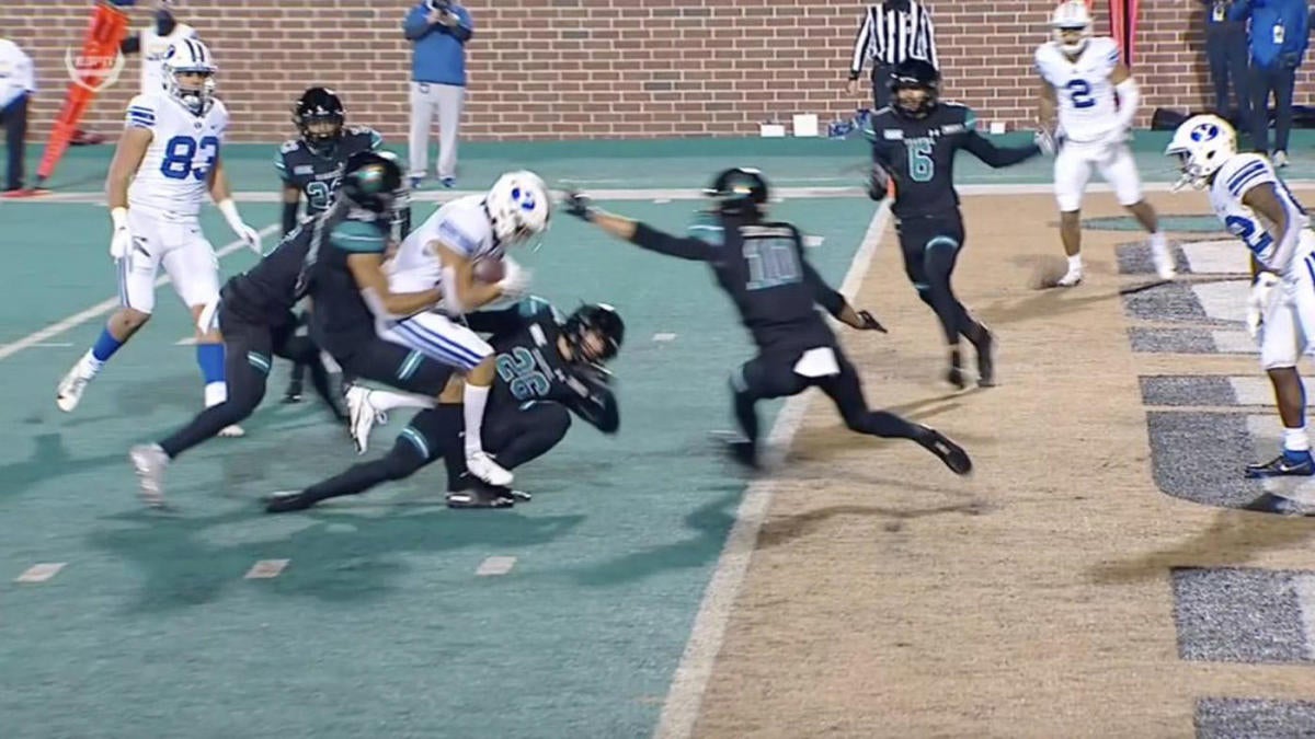


/cdn.vox-cdn.com/uploads/chorus_image/image/67574698/Zach_Wilson_NE29256.0.jpg)
.JPG)

AHL/ECHL/Minor/Junior League Hockey Changes
in Sports Logo News
Posted
So do Providence: