


Mingjai
-
Posts
1,896 -
Joined
-
Last visited
Posts posted by Mingjai
-
-
6 hours ago, tomh22 said:
The Kings looked beautiful last night. Shouldn’t matter what Gretzky wore, Luc is wrong. Their best look ever.
Ranks in top 3 all time
Penguins powder blues
Hawks whites
Kings current white reverse retro
Blackhawks whites aren’t even their best jerseys…-
 2
2
-
-
2 hours ago, maz said:
The idea that the Rangers somehow own the idea of putting your name diagonally on a jersey always has and will be ridiculous to me. (And I say that not as a Pens fan, but as a fan of the look. I loved when Colorado did it, for example).
Having that been said, IIRC, original Pens jersey in 1967 featured this because their first coach was a long time Rangers player and coach, and he liked the look of it, so he asked if the Pens could do it. So there is a modicum of truth to the idea coming from the Rangers.
Agreed. I actually associate the diagonal letters more with college hockey than the New York Rangers. I assume lots of colleges and high schools did diagonal letters because it was cheaper and easier than a custom crest. -
6 hours ago, Ridleylash said:
Refs don't wear Cooperall-like pants, either; they wear long-legged hockey pants, like these;

Well then that’s what the Flyers should be wearing to complete their look (with stripes, of course)—the modern day equivalent of Cooperalls. These presumably solve your heat and dangerous issues? -
1 hour ago, Ridleylash said:
The NHL won't let Cooperalls be worn in games again, considering the first run quickly made problems apparent; the lack of friction compared to normal hockey pants, for one thing, which makes sliding on the ice insanely risky at the speeds modern players go. In addition, they ended up retaining heat a lot more (and when you're working your legs as much as you do in a hockey game...well, let's just say dispersing heat is kinda important).
Perhaps less obviously bad for the players, they also just looked really friggin' dumb on ice hockey players. It works with roller hockey, but the two sports are very different beasts.
Makes you respect the refs even more, since they have to skate around wearing those unbearably hot and insanely dangerous Cooperalls. And the refs don’t get line changes to rest like the players do.-
2
-
-
7 hours ago, simtek34 said:
Looking at them side-by-side, it looks like the print version of it, whenever we see it, will probably look very similar to the cap version. Ever since 1961, the Print/Jersey version of the TC logo has always been thicker than the cap version. With how things have progressed in the past sixty-two years, it seems like there won't be much changed. For comparison, here's the 2D print version of the outgoing logo, which has remained the same since 1961.
One thing I do with the Twins would tweak is to adopt the print version of the C on their hats. I would be the reverse of me also wanting the Blackhawks adopt their jersey shoulder patch as the print version of the tomahawk-C logo.-
2
-
-
23 minutes ago, WestCoastBias said:
Yep, that’s why I qualified it. I remember my USC buddies would get so riled up hearing Keith Jackson say “Southern Cal.” Made me start using it too just to annoy them.
-
5 hours ago, tron1013 said:
Arguably OT, but South Carolina is returning to its historic branding as USC, as opposed to the much maligned "UofSC" that was implemented in 2019.
And, yes, I'm aware of the other USC's claim to that name. That being said:
4 hours ago, WestCoastBias said:IMO, there's only one USC and it isn't South Carolina.
2 hours ago, CDCLT said:Every time I spoke to guidance counselor in high school, I'd say I wanted to go to USC, then clarify that it wasn't the one that was close. I could be wearing a cardinal and gold sweater that says "USC Trojans" and people would still think I'm going to the worse Carolina.
I wonder what the geographic limits of this are. I’ve lived in the West and the Midwest, and USC always meant Southern Cal (as Keith Jackson used to say). Does USC=Gamecocks extend much more beyond the Carolinas? -
3 hours ago, oldschoolvikings said:
That’s an odd take, to me. In my grumpy old man view of uniforms, the only reason to put numbers on the shoulders, in fact the only reason any team ever put their numbers on the shoulders, is the the sleeves were occupied with stripes or logos. In my mind, if there’s nothing happening on a jersey from the side view other than TV numbers, they should always go on the sleeve. Shoulder numbers are just an unfortunate compromise we’ve made to the shrinking jersey.
And speaking of stripes, Pitt should just get rid of the TV numbers altogether and go with sleeve stripes instead.-
1
-
-
10 hours ago, Kevin W. said:
The Wild and Canadiens both use different designs for their home and road jerseys rather than color swaps.
There are quite a few teams who’s homes and aways are more than just color swaps: Detroit, NY Rangers, Chicago, Dallas, Buffalo, Carolina, Nashville. Even the more extreme examples like Minnesota and Montreal never bothered me, but I guess to some people it’s all a matter of degree, and the Wild’s looks were too disparate for many. And I understand and respect that.-
1
-
-
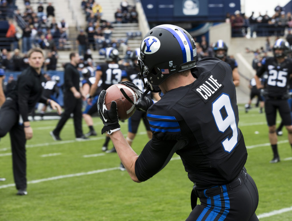
And I though they had bottomed out last Saturday… ugh.
https://twitter.com/byufootball/status/1579484862427590656
-
 3
3
-
 4
4
-
-
On 9/29/2022 at 1:16 PM, BoysClub said:
I know it is the "Sports Logo News" section, but I felt this was the most appropriate place for anyone interest. Since January I've had a gut feeling that UNLV will announce their jump to D1 NCAA this year. Originally it was based on loose context like:
- UNLV's ACHA program skyrocketing to unbelievable heights in a very tight timeframe (quality and funding).
- The US Hockey Hall of Fame Game is being hosted in Vegas this year, featuring North Dakota and ASU (a desert school that made the jump from club to NCAA in a similar way).
- ASU's D1 ACHA team will travel up with their big brother to play a few games against UNLV the same weekend.
Yes, I know the game always includes North Dakota and I know that it commonly takes place in Las Vegas, but it just feels like an event that UNLV could use as a spotlight. I also just learned that UNLV will be playing the defending NCAA national champions in a couple days. Could mean absolutely nothing, but Lindenwood stopped in Colorado to play an exhibition game against DU around the same time last year, and Lindenwood is now D1 NCAA.
Just throwing it out there to see if anyone knows anything or has similar suspicions.
On 9/29/2022 at 1:44 PM, colinturner95 said:I think it's a matter of when, but nothing seems concrete at this point. Plus they'll need a heavy influx of cash to make the jump. Difficult, not impossible.
When I played against the club team in 2016, they were a D2 ACHA club team and were already a formidable opponent. And they're slated to play against the UAA Seawolves this season, the NCAA Division 1 team. Again, I think its a matter of when, not if. But not sure "when" is coming.
The more NCAA hockey teams the merrier. I just hope they aren’t a big of goons as ASU was when they jumped. Dirtiest team I ever saw… I’m also interested to see how long it takes St. Thomas, who jumped from D3 to D1, to become competitive. With their location in St. Paul, I fully expect them to surpass Bemidji in couple of years.
I still can’t believe the state of Illinois is a top producer of college hockey talent (outside of the 3 Ms of course) and yet there isn’t a D1 program in the entire state. Either U of I or UIC or both should have D1 teams. But I digress.
-
13 minutes ago, GriffinM6 said:
That's a shame. this would've been a great looking game if BYU were wearing royal.
Yeah. Rumor among BYU fans was 1996 throwbacks. But alas…-
1
-
-
BYU announced updated blackout uniforms for Shamrock Series game vs Notre Dame. I’m a fan of BYU’s traditional uniforms, so not a fan of the gradient helmet. But at least they’re not using the inverted colored logo (white oval, blue Y) they normally use with their blue helmets.
https://twitter.com/BYUfootball/status/1576934572448567298?s=20&t=Mn8vNFHQXQW7p7nkpmCyiQ
Here are BYU’s previous blackout uniforms:
-
 2
2
-
1
-
 1
1
-
-
21 hours ago, aawagner011 said:
4) the powder blue can coexist with the navy. The Ole Miss uniform is a classic and comes from an age when everything doesn’t have to be perfectly matching. The navy blue stripe on the pants works fine with the powder helmet. I even liked that time they used the powder helmet with the navy jerseys.
I’ve been saying the same thing about UCLA—they should just go back to the lighter powder blue and bring back navy as an accent color. -
4 hours ago, aawagner011 said:
My counter to all of this SEC mascot discussion would be that I view the teams mostly by the university name. Unlike professional sports where the match up is the Falcons vs the Saints, for college football, it’s mostly viewed as Georgia vs Auburn. Sure, it’s also the Bulldogs vs the Tigers, but it doesn’t seem too dissimilar to the way it’s handled in European soccer. Arsenal may be the Gunners and Manchester United may be the Red Devils, but those nicknames aren’t used as the primary identifier for the teams. Same with college football.
3 hours ago, jn8 said:Thank you for saying this. My body is physically pained whenever I have to hear someone at work talking about the “Hawkeye” game. I know it’s the same thing, but it just feels wrong. They’re Iowa. That’s how my brain sees it as correct. I have no valid reason for saying so, but it’s reassuring to see that someone else’s opinion can validate my own.
Understood. But in some places where the pro sports teams are called by the state’s name, you have to use the nickname—e.g., using Minnesota would be completely ambiguous in the Twin Cities, so Gophers it is.The habit even carries over to in-state college hockey: you have UMD or Duluth, St. Cloud, Mankato, Bemidji, and the Gophers.
-
6
-
-
On 9/27/2022 at 10:22 AM, MJWalker45 said:
How many Tigers are in that league? Three? They like collecting things in sets of three. Hahahahahaha!!!!
Need a third Bulldogs. Guess that makes Louisiana Tech an instant SEC expansion candidate.-
1
-
2
-
-
1 hour ago, tBBP said:
And this brings up another point concerning color theory: certain colors work more effectively in limited doses. Yeah, they're the Golden Knights (only because the US Army wouldn't allow Bill Foley to use Black Knights; otherwise we're not having this discussion), but the original design of those sweaters served to highlight the gold in a way that helped it stand out against the darker gray and black. (For what its worth their gray sweaters are one of my favorites in the league.) Now that's been shoved to the side for MOAR GOLD and it just doesn't look right for a full-time look. That said, I also agree that the white parts of the "gold" jersey should probably be black, as well.
I don’t think the Army wanted them to use Golden Knights either, as that is the name of the Army’s premier parachute demonstration team (Army’s equivalent of the USAF Thunderbirds or USN Blue Angels). And Black Knights of course is the nickname of West Point’s sports teams.On the gold question, I don’t mind teams wearing athletic gold jerseys or helmets full time. I’m a Golden Gopher fan, and while I prefer the hockey team in gold jerseys, I also appreciate, to your point, that by using maroon jerseys, the gold jerseys seem more special. I like the Bruins in gold as well, and wouldn’t even mind if they switched to gold full-time if they based it on their 2010 Winter Classic jerseys (not that they ever would). But Boston and Minnesota’s athletic gold (and Michigan’s maize) look good as hockey jerseys.
In VGK’s case, I just don’t like their particular gold for hockey jerseys. It’s not a good shade for a jersey, let alone a full-time jersey.
-
Vintage Minnesota Hockey storefront has some good examples of the evolution non-NHL jersey aesthetics:
https://classicmnhockey.com/collections/frontpage
https://classicmnhockey.com/collections/classic-mn-gophers-hockey-jerseys-1
Their history section also has some great charts showing the jersey evolution of Minnesota’s 4 primary hockey universities (sorry Bemidji and St. Thomas):
-
 1
1
-
-
41 minutes ago, upperV03 said:
This has been my lone gripe with the Nightmare green color since it debuted back in 2019. In person it generally looks like it’s supposed to look, like a very dark green, but on TV (especially during a day game), it can and often does have a a brownish tint to it. The Ducks had the same issue back when they used to use forest green (Michigan State used to have the same problem), but it’s more pronounced with this darker shade. I’m a big fan of the Nightmare green color, and have been since it debuted, but they need to tweak the fabric swatch to more reliably look like it’s intended to look regardless of lighting conditions. The helmets are pretty consistent in how the color shows in different lighting, but the fabric needs to be a closer match. They also should try and make sure that these are only worn for night games, because that’s when they look the closest to their actual color.
Nike’s dark colored matte fabrics all suffer from this problem. Navy blue schools like sometimes BYU or maroon schools like Minnesota have jerseys that seem one shade darker than they should be. Back when the fabrics had some sheen, these colors looked more rich and saturated. From a physics perspective, it’s like the matte absorb too many adjacent color frequencies.-
2
-
-
13 hours ago, Sodboy13 said:
I was specifically thinking about how pretty much every on-field NFL jersey pre-Nike lockdown was made by Ripon Athletic, and the Champion/Wilson/Puma/Reebok/Russell/Starter/LogoAthletic logos sewn on the sleeves were basically the extent of those companies' involvement in the manufacture.
Interesting that Adidas' jerseys are being made by S&P. I think they made jerseys for Nike/Bauer back in the 1990s.
If Vintage Minnesota Hockey linked below is right, SP has been making U of Minnesota’s Nike/Bauer/Mission/Easton-branded jerseys since the Gophers originally switched from Champion to Nike in 1999.https://history.vintagemnhockey.com/page/show/893654-u-of-m-uniform-evolution-1922-2014-
-
2
-
-
4 minutes ago, WSU151 said:
Robo Penguin and Pooh Bear aren't as egregious because in the end the animal being described is the same.
A goat is quite different than a buffalo.
I don’t disagree (how could I?), but the bigger main point is that fans who dislike a logo will come up with a pejorative shorthand to describe it.-
1
-
-
On 9/4/2022 at 8:12 PM, oldschoolvikings said:
*Excepting Hockey.
Agreed. In hockey, refs routinely call over captains (or alternates) to explain a call or addressing behaviors they want to end. I’ve always assumed that by rule, only Cs and As could formally address the refs to complain about calls or seek explanations, which is one reason why goalies rarely wear a letter. So it makes sense for the hockey refs to be able to identify the Cs and As.I’m a lifelong football fan, and I don’t see the same logic applying to football. Maybe my perception is wrong here, but other than the coin toss, to refs ever specifically address the team captains? Do refs ever need to know who the captain is? I figure they just assume whoever comes out for the toss is the captain.
-
3
-
-
14 hours ago, pepis21 said:
Speaking of Sabres, it always curious me (esepcially that Sabres team with Peca, Hasek and Satan was my faviourite one back in early 00's) why this logo is named a Goathead when it isn't a Goathead but Bisonhead, there is any explanation behind that?
58 minutes ago, Ark said:
Same reason the 90s Penguins logo is called the Robo Penguin even though it looks like an actual penguin
And the same reason the late 90s Bruins bear logo is called Pooh Bear even though it’s a fairly accurate rendition of a bear (c.f. Meth Bear for a less accurate rendition).-
1
-
-
9 hours ago, AFirestormToPurify said:
I know this is HIGHLY subjective, but 68 is the only truly bad number in there lol
By bad I mean 62, 63, 75, 78. Anything in the 90s can't be bad by default since the digit 9 looks so good. But I'm not gonna try and convince you, I've always been weird with numbers so maybe that's just me!
Come now, 37 is a bad number. It’s like you showed up for intramurals, they passed around the laundry bag of jersey vests, and you ended up with the last vest, which was 37.-
1
-
1
-


:format(jpeg)/cdn.vox-cdn.com/uploads/chorus_image/image/52030207/usa_today_9708288.0.jpeg)


MiLB & Marvel "Defenders of the Diamond" logos
in Sports Logo News
Posted
Hail Hydra!