


_RH_
-
Posts
1,099 -
Joined
-
Last visited
-
Days Won
1
Posts posted by _RH_
-
-
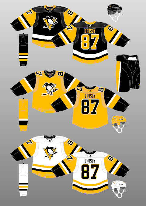
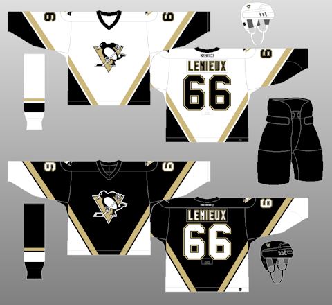
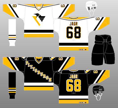
Out of curiosity, is it unpopular to really dislike the current Penguins unis?

The striping patterns are just so disjointed every game I end up thinking this is probably one of my least favorite sets in the league. The colors and logo are great (even though I personally loved the gold), but the other templates they have used would be vastly superior:
-
 4
4
-
-
KC Mavericks (ECHL):
sorry I can't find better photos but they were worn against Fort Wayne on 12/7
-
1
-
-
On 5/23/2019 at 10:21 AM, jefrsn said:
I think it's a good modernization and Rickabaugh created a more complete and unified package than what they had.
~2,800 students. 14 logos.
-
1
-
-
Upgrade; I prefer the new logo and wordmark! However, why does the "U" fall under the logo?! Move it a few more pixels! Also, the more I look at it the more I see the Broncos logo (in the mane).
-
3
-
-
I did some Googling due to the CBJ prototype thread, and as an Avalanche fan my brain locked up for a moment due to this image:

-
Two days ago Forbes released their LIST of NHL franchise values. 8 of the 31 teams operate at a loss. Only 10 are apparently worth $650M or more (the expansion fee). I'm no businessman, but something doesn't add up here.
-
2
-
-
Looking at the islanders rack...check out the last jersey, has that sleeve pattern been seen before?
-
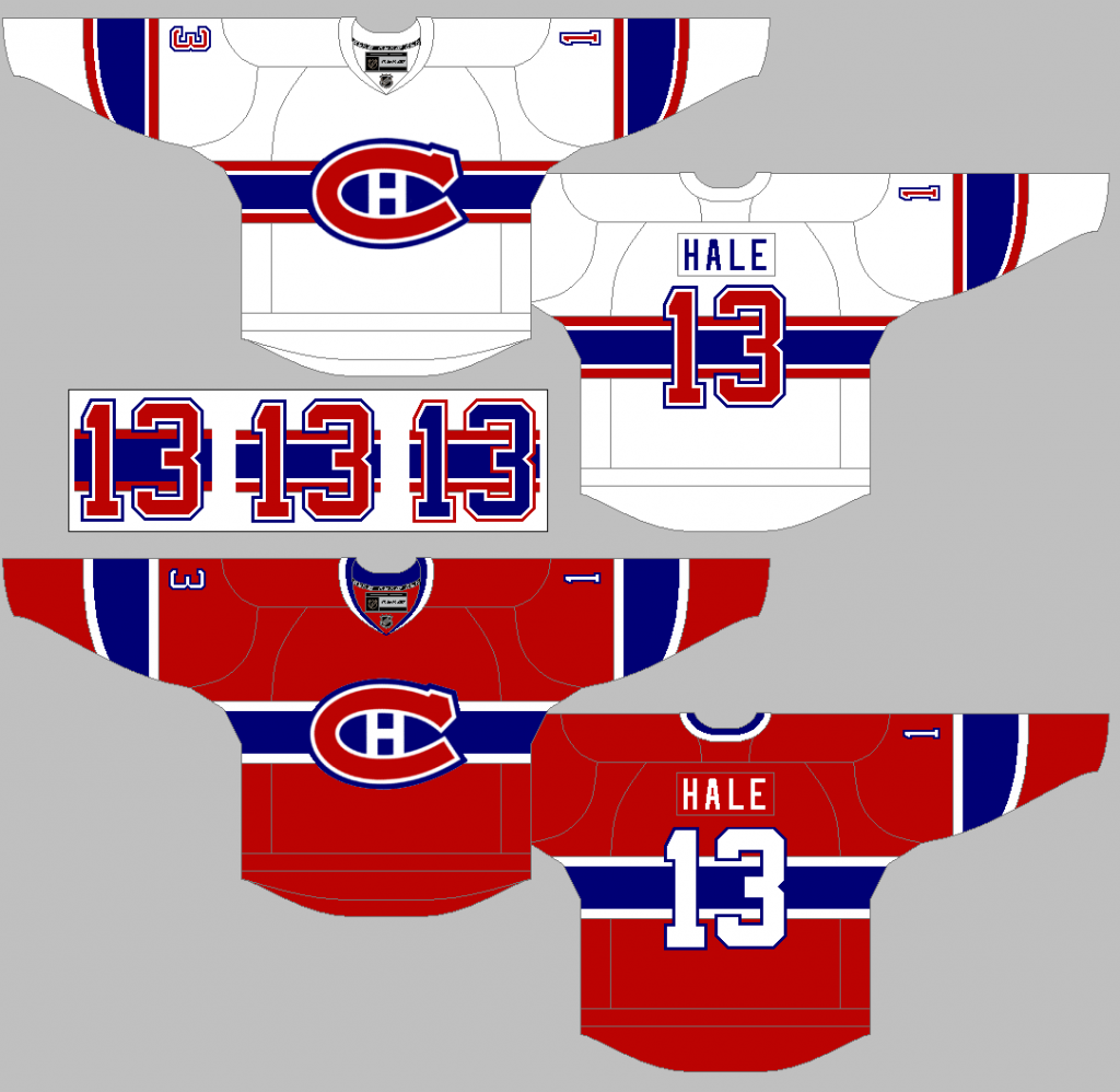
It's funny that the Canadiens white jerseys were mentioned, because I always thought that I was in the minority (liking the striped version). Maybe, as previously mentioned, it's a problem with the contrasting colors (see alternatives in the attached image below). I just wish the MTL home and road jerseys shared a template, that looks way cleaner to me. Although to be honest I really like the red/white/blue appearance of the shoulder panel, white jersey, and blue pants.
For me, the thing I don't really "get" on the Habs is the striping at the very bottom of the jersey. It doesn't match the other stripes and just detracts from the main chest stripe. Something like this would be ideal, in my opinion:
-

I remember first seeing this about a year before the red was unveiled.
I, for one, think that looks pretty cool! Although the red stripe at the bottom looks really out of place.
In regards to the Jaguars, I know there are pictures of the actual jerseys out there somewhere, I'm not seeing them at the moment. Maybe someone else can upload them.
Here are a couple pics for the Avalanche logo selection process:


MLS Expansion Club St Louis City SC Unveils Name and Logo
in Sports Logo News
Posted