


kiwi_canadian
-
Posts
1,851 -
Joined
-
Last visited
Posts posted by kiwi_canadian
-
-
New Zealand based Super Rugby teams have released their kits for the upcoming season. They made a switch from Adidas to Classic and the results are... disappointing.
Crusaders:

Blues:
They are going with 3 kits, the third being a retro.
Hurricanes also going with 3.
Chiefs:
Going with 3 as well.
Highlanders:
-
Not too sure, but I know that Stade Français Paris, Union Bordeaux Bègles and Castres Olympique in the French Top 14 use them. US Carcassonne, FC Grenoble and Provence Rugby from the French D2 league also use them. In Italy's top league, Rugby Rovigo Delta use them. So not the first brand you think of for rugby but they've been in it for a while. I think at one time they might have been the kit supplier for Italy as well.
-
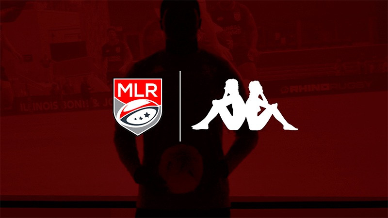
Major League Rugby has announced that Kappa will be their new kit provider for the next 3 years.
-
 1
1
-
-
This is a bit old but Germany has adopted a new nickname, the Black Eagles and they have this to go with it:
-
1
-
-
11 hours ago, ruttep said:
Yeah I assumed they were putting up the 2023-24 season page, but that's not there yet either.
It goes up on the first day of the regular season I believe. If you go to the individual teams, the new stuff for this season is there.
-
On 9/23/2023 at 4:13 PM, ruttep said:
Anyone know if the new Winnipeg jersey is a special jersey or the official alternate? Is the current throwback alternate sticking around?
They are a special jersey and will only be worn 3 times during the season.
Dec. 4th vs. Carolina for Military Appreciation night
Jan. 27th vs. Toronto
Apr. 1st vs. Los Angeles for the RCAF's official 100th Anniversary
Their Heritage Blue jersey will be worn 11 times this season.
-
It appears Poland has a new federation logo to go along with them recently being promoted to the top pool at the IIHF World Championships. I'm interested to see what Nike does with their jerseys.
Old one for reference:
-
2
-
-
18 hours ago, jonny24 said:
Don't like the Arrows rebrand at all really - exception being the wordmark.
1. Departure from the Blue, White, Gold colour scheme they've been building up, quite nicely IMO. Don't like Red+White+Blue when we're the only Canadian team in a US league, and there are alraedy 2 otehr RWB teams.
2. Ham-fisted "Canada's Team" approach every single logo in this country doesn't need a red maple leaf. The Arrows are not team Canada (thank God), and people know where Toronto is. Or if they don't they're too dumb to matter.
3. Inconsistency - the wordmark font and wings aren't in the crest at all. It looks like two separate rebrands that share colours.
4. The crest is too busy and too cartoony. It's going to look horrible when embroidered. The current TA monogram looks classy as hell.
5. Before, the use of "Arrow" was flexible. It could be the jet, it could be bow+arrow, it could be whatever. Arrows is really good name that just needed a bit of tie in to something so it wasn't just generic. The Avro Arrow didn't need to be the whole identify.
I really don't like the "Canada's Team" stuff either. I can bet a lot of Canadian rugby fans on the west coast actually support the Seattle Seawolves more than Toronto.
I'll reserve judgement on the colour scheme until I see how they execute it on their kits... Same with the logo. The logo is busy and I wouldn't be surprised if they are most likely will sublimate them which makes really complicated crests easy to use... Having said that, I do have an authentic Seawolves jersey from a couple years ago and Paladin did stitch the logo.
-
Apparently the Spring Boks have a second alternate kit for the RWC:
-
1
-
-
Sale Sharks:
Glasgow Warriors:
Bristol Bears:
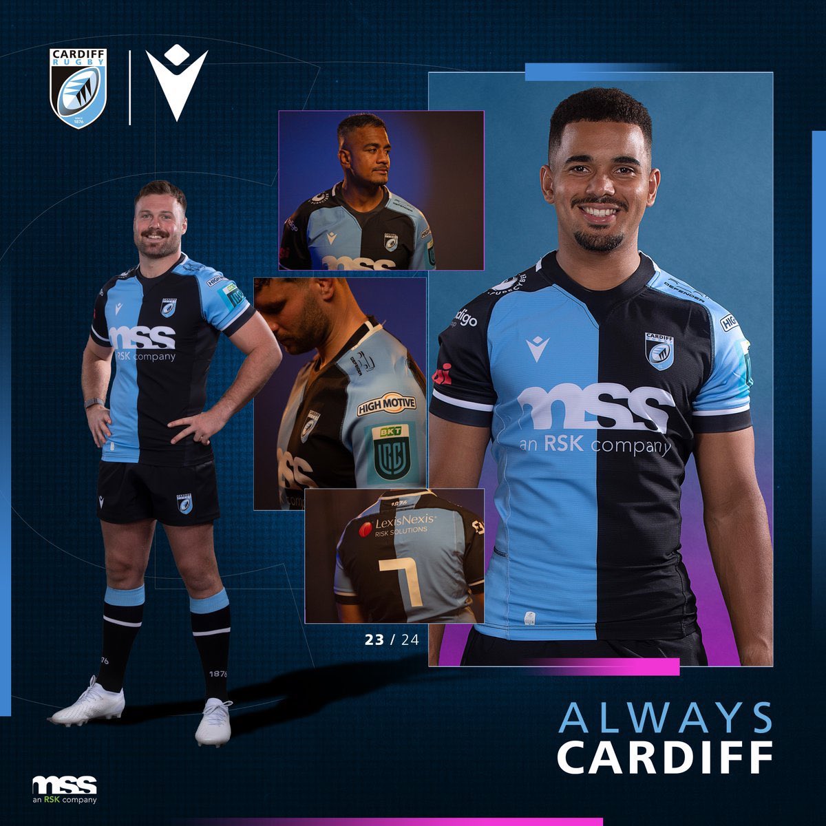
Cardiff Blues:
Connacht away:
Osprey:
-
Well it is a rebrand for the Arrows. They have totally taken on the Avro Arrow theme.
-
Also something interesting perhaps happening with the Toronto Arrows of the MLR. Their instagram has been releasing a few black and white images of the cityscape with a new colour scheme as well as a new wordmark and a date for 05.09.23 with a title of "From Above". The new wordmark simply says "Arrows RC"
Looks like a possible rebrand and dropping the blue and white to a grey, red and light blue colour scheme.
-
Leinster away:
La Rochelle away:
-
Toulon away:
La Rochelle:
Lyon:
Saracens home:
-
Romania:
South Africa RWC:Georgia:
-
Not Rugby World Cup related but here are the current Hon Kong and South Korea kits:
-
Namibia:
-
Bath's new kits:
Northampton:
Toulouse home:
Scarlets:
Gloucester's heritage kit:
Execer Chiefs:
Perpignan:
Harlequins away kit:
-
On 7/18/2023 at 7:55 AM, colinturner95 said:
https://www.cbc.ca/news/politics/nike-permanently-ends-hockey-canada-support-1.6909029
Nike announced it's ending its partnership with Hockey Canada.
That has to do with all their off ice gear and fan stuff like t-shirts and hats. Nike still has the contract with the IIHF and will supply their jerseys on ice.
-
1
-
-
New Lienster Castore kit
-
Samoa will be kitted by Macron.
Wales:
-
Racing 92:
Harlequins:
Leicester Tigres:
And it rather big news, after 23 years with Adidas, all 5 NZ based Super Rugby teams have signed a kit deal with Classic brand.
-
Was away for a bit and there have been quite a few RWC kits released:
Italy:
Fiji:
Scotland:
Ireland:
Chile:
England:
-
New Toulon Nike kit:
New Zebra Parma logo:
New Munster kit:
Toulouse Nike away kit:


NHL Anti-Thread: Bad Business Decision Aggregator
in Sports In General
Posted
Same with Marty McSorley