


Brian E
-
Posts
1,156 -
Joined
-
Last visited
Posts posted by Brian E
-
-
on namath era vs. sacks exchange:
to me, the namath era was the perfect '60's uniform. but with the modern tailoring, i don't think any ucla striping looks good. while i'd gladly take the namath era (only in kelly green) as their alternate uniform, i think the sacks exchange is superior, especially for the year 2024.
it can't be ignored that, in my opinion, the '80's era jets logo is the only good logo they've ever had.
perfect scenario to me is:
NYSE era in green over white as primary home
NYSE era in white over white as primary road (both paired with current green helmet with the 80's logo)
namath era in kelly green as their alternate (paired with an alternate white shell and the namath-era throwback logo)
NYSE era in white over white (paired with the alternate white shell with the '80's logo rendered in metallic green)
-
 1
1
-
-
i know i had brought up the jets a couple of weeks ago. currently, all jets jerseys in the current design are on sale on NFL Shop and Jets Shop. the legacy jerseys are not...
-
5
-
-
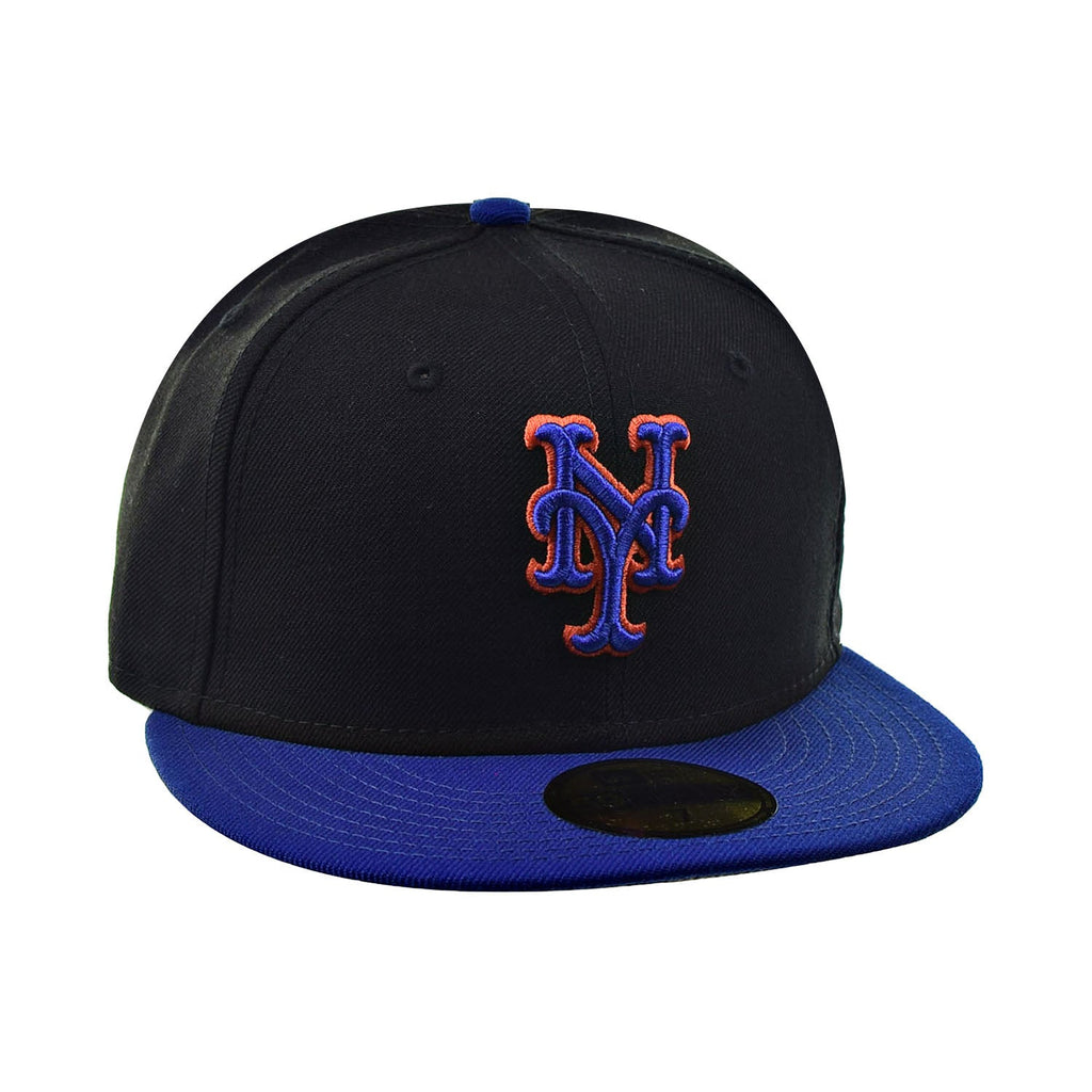
i was at one of my local DSG on friday, this is the mets replica in the new template. first impressions: it's nice to have the front number and the sleeve patch. in-person, the smaller rear number/name makes it look like a youth jersey from behind. $175 retail.
also, to add fuel to the "mets are updating the black jersey" fire: multiple players in pinstripes in the new template. only black jerseys they had were the old template (obviously leftovers from last season).

-
not for nothing, but just because a team did a pullover doesn't mean it has to look like it's out of the '70's. two button oregon (so you know nike did it) pullovers:
-
8
-
-
On 1/6/2024 at 6:24 PM, YELDARBfield said:
This is anecdotal, but I work for a Minor League team. When we run auctions on game-worn jerseys, the button-down designs consistently do better than pullovers. I think it seems more "authentic" or premium because of both the tradition of button-down baseball jerseys and the construction adding a perceived quality, kind of like stitched numbers vs. heat pressed.
that's really interesting. makes sense. i wonder if it's a chicken-and-the-egg scenario though. like, if on-field authentics were pullovers, they'd be more in demand on the game-used market.
i also think this is a generational thing, to a degree. most kids that grow up playing nowadays are used to pullovers. even all the big showcase brands, like perfect game, use sublimated pullovers for their workout shirts and a lot of their game stuff. wonder if the pullover may phase in as those groups get more buying power.
-
i know "tradition" and all, but if nike was insistent on this template, why didn't they just go to full pullovers instead of button-downs? button down jerseys don't really serve much in the way of in-game function, and i'd venture to say that it may even hurt them in retail. i don't know, seems wild that of all the innovation and everything, we still go with buttons because that how it was done for the majority of the game's history.
-
5
-
 1
1
-
 1
1
-
 1
1
-
-
Just now, dont care said:
Why would woody Johnson be at a tailgate? You think he would bother coming down from his ivory towers? There is nothing about them changing.
both brothers often visit the metlife tailgates early in the day. the typical "man of the people" PR stuff.
-
1
-
-
13 hours ago, AstroCree said:
What a useless change for change sake. It doesn't even match the jersey anymore.
Should've just brought back the blue brim cap.
so, while i have many fond memories of this cap, i think the black brimmed version is superior. when combined with the black crown, the blue brim gives off a very purple vibe to me. i do think the mets are probably updating the jersey to match this, which i like a lot. i did this (very crude) mock up over two years ago and i think it's superior to the current black alt.
-
3
-
2
-
 2
2
-
-
mets modified their black alt cap:
-
 1
1
-
1
-
1
-
 1
1
-
1
-
-
any truth to the idea that the jets are getting new sets in 2024? jets fans on X seem convinced that because the five years are up and that everyone loves the sacks exchange throwback that they're going full-time throwback next year. one dude claims woody and christopher johnson basically confirmed that to him at a tailgate. lots of hearsay and inferences, but wondering if there's any truth to it?
-
just to dive into the jets thing:
starter was their supplier when they originally switched to the fauxback and they looked awesome. nike had it two years later, and again, did a great job. when reebok got it, the templates really started to change and it got sketchy on certain position cuts right around the mid-00's. and nike's second foray was a mess, mostly because of all the mismatched greens because of the difference in fabric. that jets look isn't really viable anymore because with the current tailoring, UCLA-style stripes are a headache. all they need to do is go to a modernized version of the sacks exchange set, or just take some of the dumb elements off their current set and add some traditional striping and they're good to go.
-
6
-
-
11 hours ago, hormone said:
With all the light weight, form fitting, etc any lingo they use or tech they come up with, why don’t they use sublimated/screen printed numbers? I mean I’m glad they don’t, but wouldn’t that be better? Won’t that be lighter or more form fitting? I’ve noticed that’s really become a thing in college baseball
it's probably a matter of time. if i had to guess, baseball will be first to go sublimated because the players are so used to it growing up. a ton of travel organizations and even the showcase brands like perfect game used sublimated (it's an easy way to get a bunch of different looks for not a lot of money). once MLB figures out they can sublimate everything and charge mega money for it from fans that want the authentic look, there will be no going back.
-
lukas says on uni watch that one more team may be adding a throwback. any chance it's the jets, considering @WSU151's tidbit about "legacy" helmets?
-
2
-
-
1 minute ago, gosioux76 said:
Maybe this is a minority opinion, but I'd much rather see a retro-inspired alternate than something that makes the team look like cosplayers for a city tourism board marketing campaign. I don't care if it's called "city connect."
And as to why the Mariners would sell a City Connect with Griffey's name on it? I'm sure it's because they have data that says anything sells better in Seattle with Griffey's name on it. If someone likes Griffey and they like that jersey, I'm not going to judge them for buying something they like.
right, they do it to capture the older demo. the ones that say, "i do like that jersey, plus you know griffey [or aaron or clemente or whomever] won't get traded!" (again in griffey's case)
my favorite met of all-time is mike piazza. when the mets get their CC jersey, would i get one with PIAZZA 31 on the back? nope. but hey, that's just me. you can buy a new jets jersey with namath on the back and an islanders new fisherman with bossy. i've seen people put current islanders on the back of the '90's style fisherman. not my thing, but to each their own.
-
3
-
-
On 2/15/2023 at 8:34 PM, hormone said:
I love the teal and F logo. The problem with the marlins is, they have a sick obsession with black. It morphed into a silver-black from the original set. Then they redesigned and instead of owning orange and all the bright rainbow colors, it morphed into black. This recent redesign took black to such a new level, they give you a hat logo and overused alt that are nearly illegible. With Miami and sunshine and flashy colors, they literally could have embraced teal OR orange OR this new blue and chose to emphasize black each time
perfectly said. i would love them to focus on any of those. heck i've always wondered if they've ever considered some combo of a green/orange to pull from the university of miami fan base/appeal. might cause brand confusion now, but i thought it would have been sharp.
on a separate note, do we have any indication (besides the couple of sock leaks) who is in line for a 2023 city connect?
-
17 hours ago, CaliforniaGlowin said:
Ooh that grey Yankees hat is tough!
agreed., but i think that version is just a fashion. last year, they did the same thing: they had the official version of the ST/BP cats, then different color options that were never worn on field.
for example, the mets have the white front panel listed as "2023 on field batting practice cap," then have a black version that just says 2023 batting practice without the words "on field."
-
1
-
-
17 hours ago, TBGKon said:
Thats about normal for MLB merch too. Usually the spring training gear is released in February, so with WBC rosters set to come out next week or so, the gear probably isnt far behind.
yeah, you're probably right. just wild to me, because you know they'll over-order on inventory and then be selling the stuff at a 40% discount in april. might as well try to move some stuff now, even if it's not player-specific.
-
2
-
-
On 1/29/2023 at 4:06 PM, -Akronite- said:
The US cap logo is atrociously outdated. An interlocking US would look so much better. I saw a version of something like that years ago but can't find it now.
Of course, I don't think anything can match the beauty of the DR's cap (either version). Though I've always been fond of Mexico's as well.
the entire USA set needs an update. it's truly terrible.
btw, if MLB wants to make this a global showcase, how about some promotion? the tournament starts in just over a month. let's see some unis! and MLB has virtually no merch available. nuts.
-
9
-
-
1 hour ago, SSmith48 said:
They seem to be running out of ideas. They had some neat concepts back in the day, but they are looking increasingly like the design was scraped out of the bottom of the proverbial barrel. It's disappointing when we've had these in the past:
these were solid. the best BP caps, IMO, were the ones that these derived from. they premiered in 2013. "diamond era" performance mesh, 59fifty base, and all kinds of good alternate logos.
-
5
-
-
-
1 hour ago, TrueYankee26 said:
In a graffiti looking font too lol
dude, you know one of our teams is using 'GOTHAM.' probably mine. they both used neon in their marketing material last year. i wouldn't be surprised if the mets used a neon-type treatment. would be a nice nod to the players that used to be on the exterior of shea.
-
1
-
-
18 hours ago, TrueYankee26 said:
I think this is the last year of City Connects releases so my Yankees should be getting one released this year. I really hope it is good. Something hip hop, NYPD/FDNY or Yankee Stadium themed would be fine.
"so invert the pinstripes and put 'THE BOOGIE DOWN' on the front? DONE!" - a nike exec somewhere, probably
-
3
-
1
-
-
the isles have a MASSIVE problem with the rear hem striping. it doesn't connect to the front. do fishermen have tails or something?
-
 1
1
-
1
-
-
isles looks better than the mock up gave it credit for. also think adidas's 3d effect makes the logo pop nicely.


MLB 2024 Uniform/Logo Changes
in Sports Logo News
Posted
i dunno, man. i just feel like this was a cool direction to take that jersey. it'll read fine on TV with better resolutions than they had back when they first introduced it in 1999, and i feel like it needed to be spruced up. think it's going to look good on-field.