


Davidson
-
Posts
2,307 -
Joined
-
Last visited
-
Days Won
4
Posts posted by Davidson
-
-
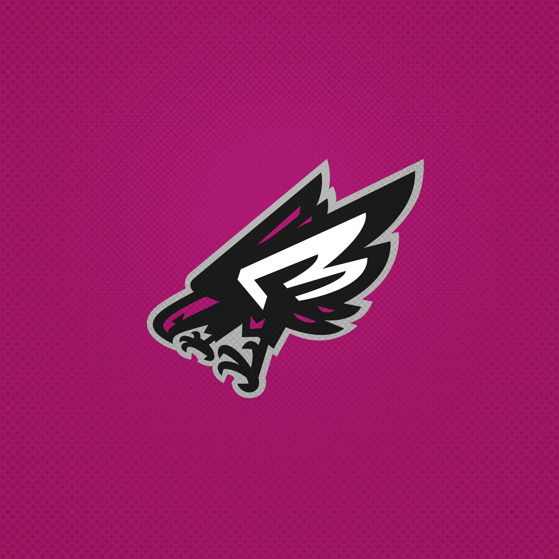
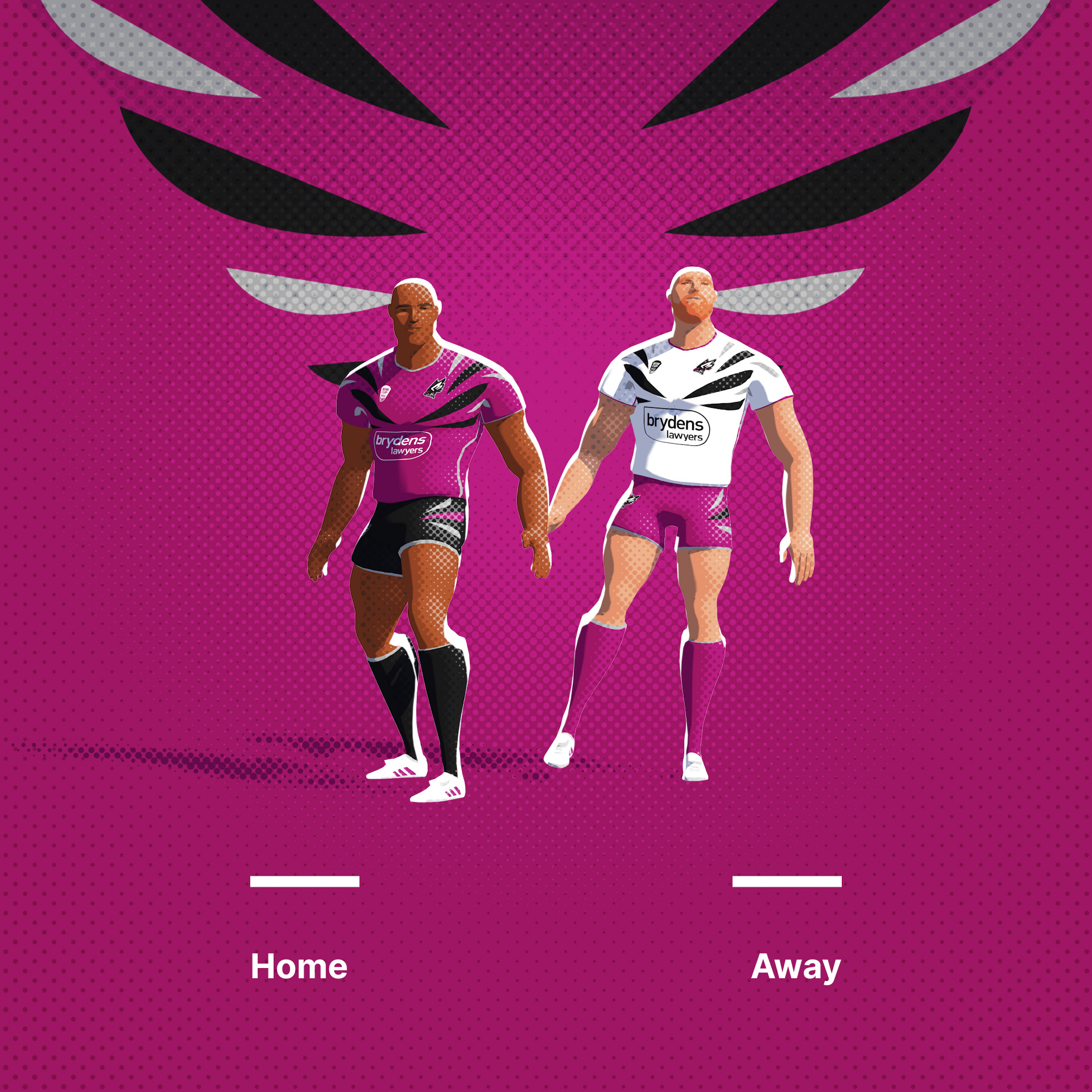
Okay, last one! Blacktown Sea Eagles. Bit of an awkward shape, but something different.
Original Logo

-
 3
3
-
-
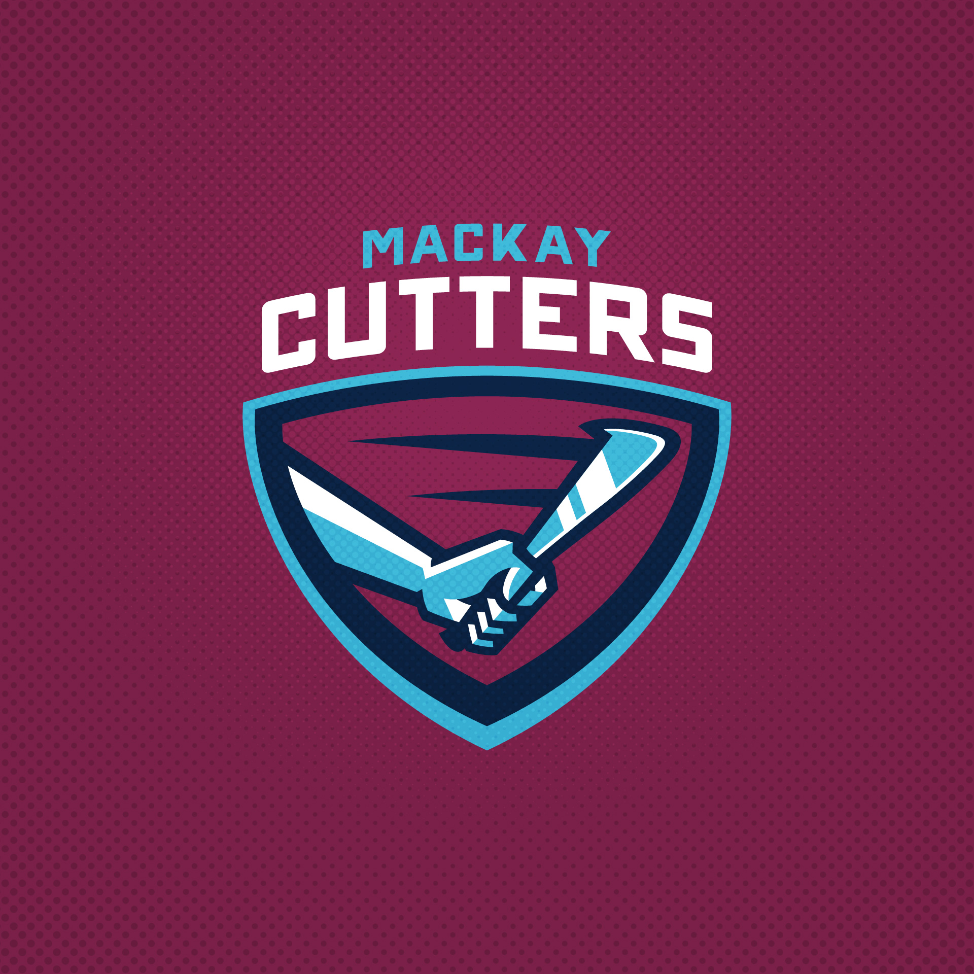
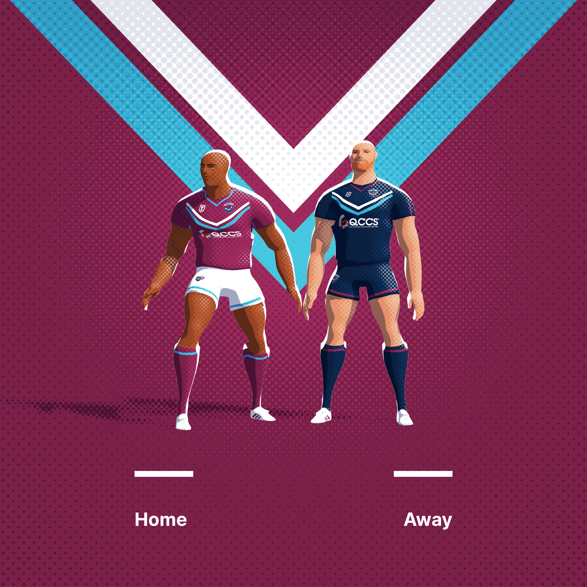
Mackay Cutters. A unique mascot as far as I know, the cane cutting blade is pretty cool.
Original Logo
-
3
-
-
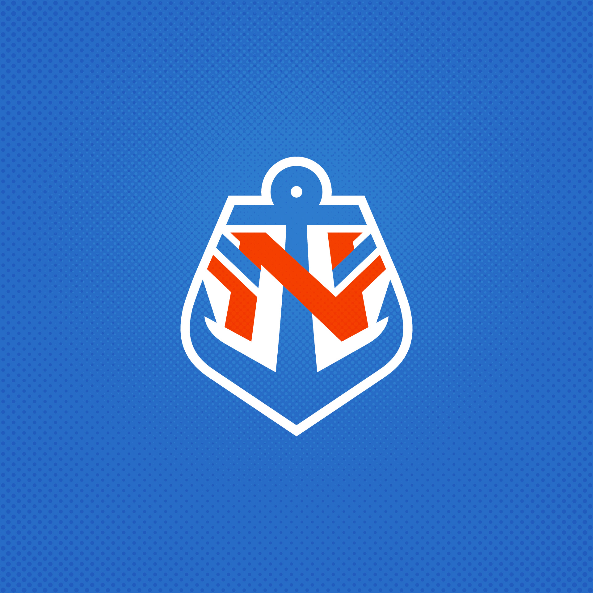
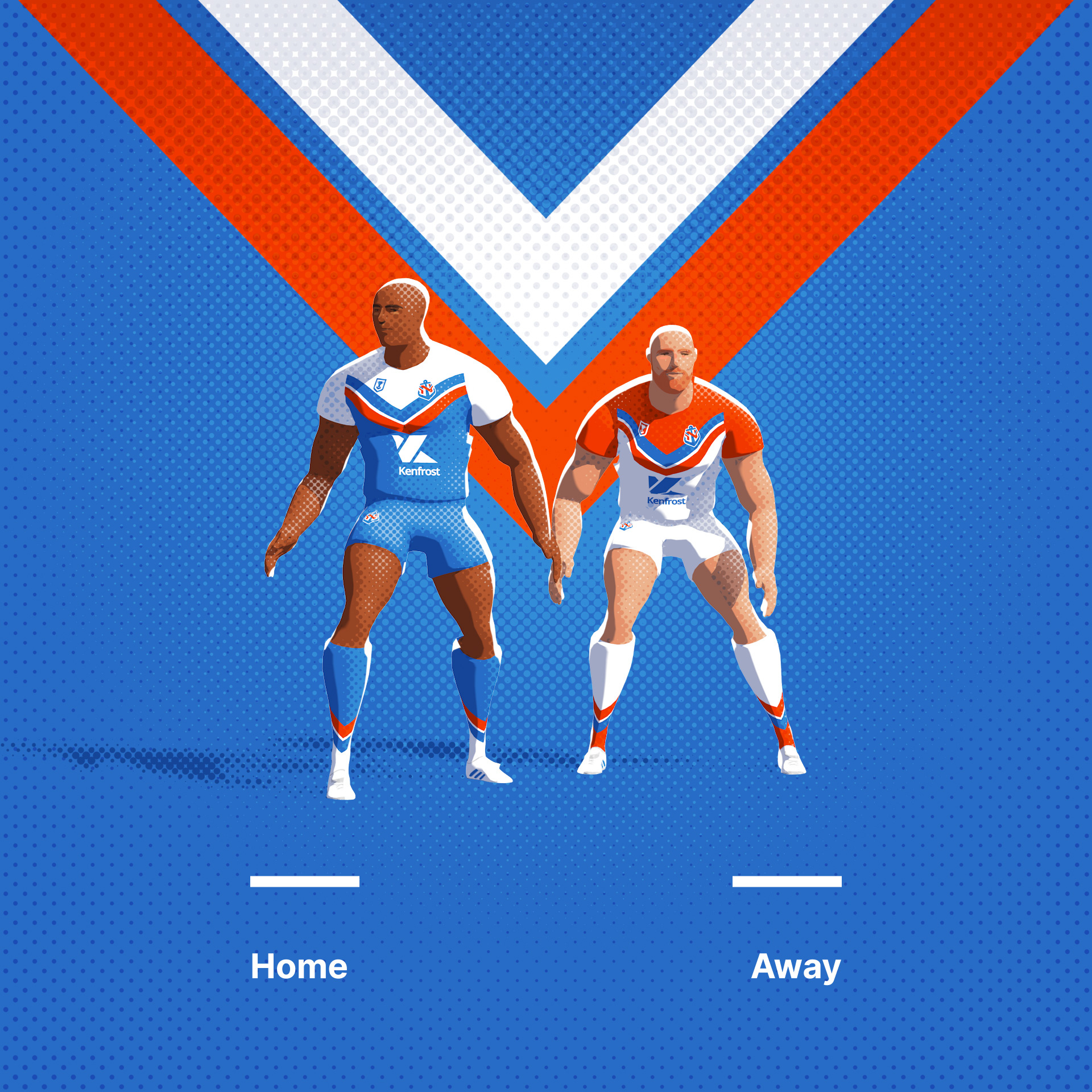
Northern Pride. Their brand is terrible and doesn't even reflect their own colours, so I chose a nautical theme and featured their uniform chevrons.
Original Logo
-
4
-
-
On 11/22/2023 at 2:28 PM, LaGrandeOrange said:
I assume you've completed these and are just posting them now, but would you be interested in keeping it going with the French Elite 1 or some of the top national teams? Most of the national teams have lacking aesthetics compared to their relatives in other top sports.
Ha, yeah. I'll be finished tomorrow. Three left then I'll post all 63 together. I think I'm done now, feel like I scratched the itch, so to speak.
-
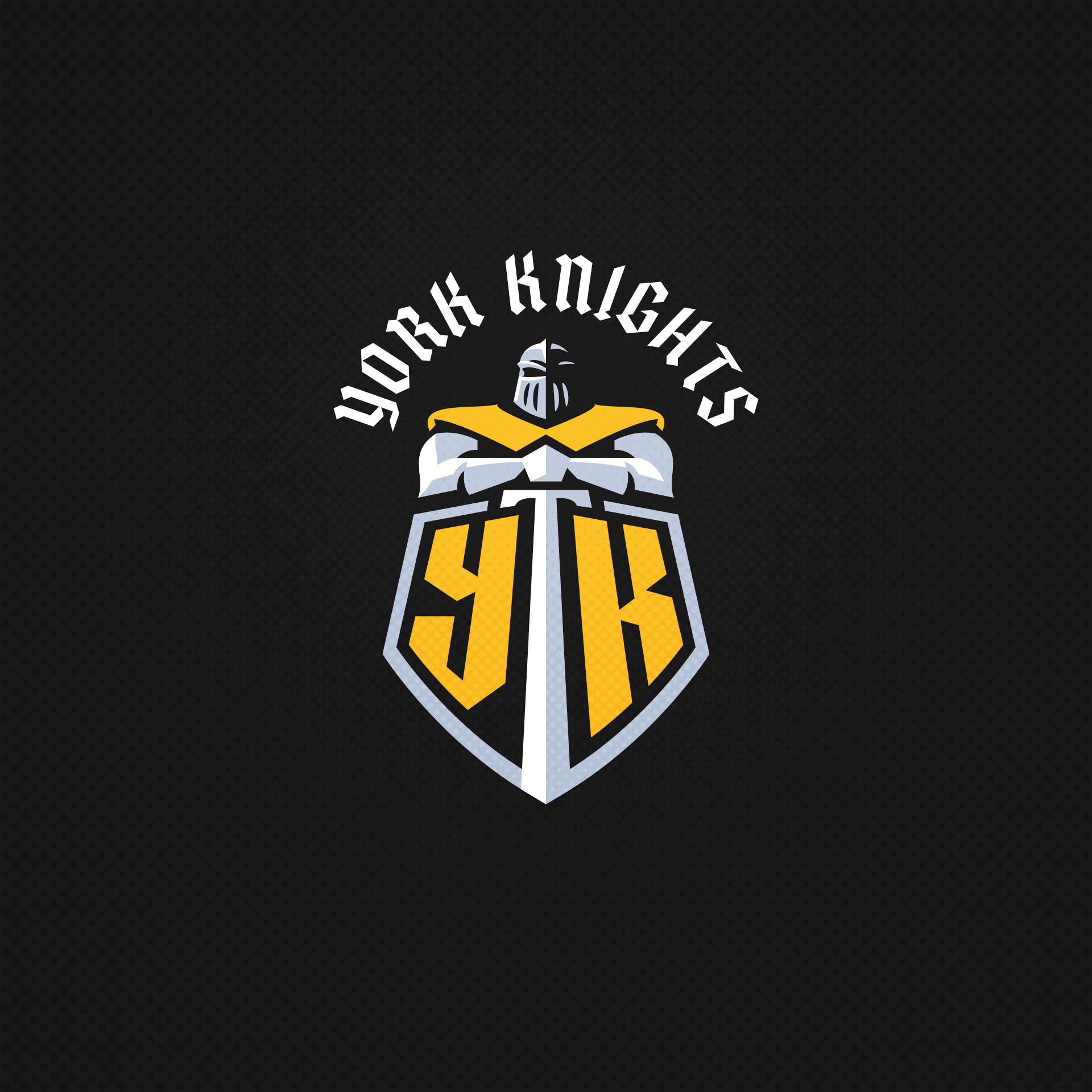
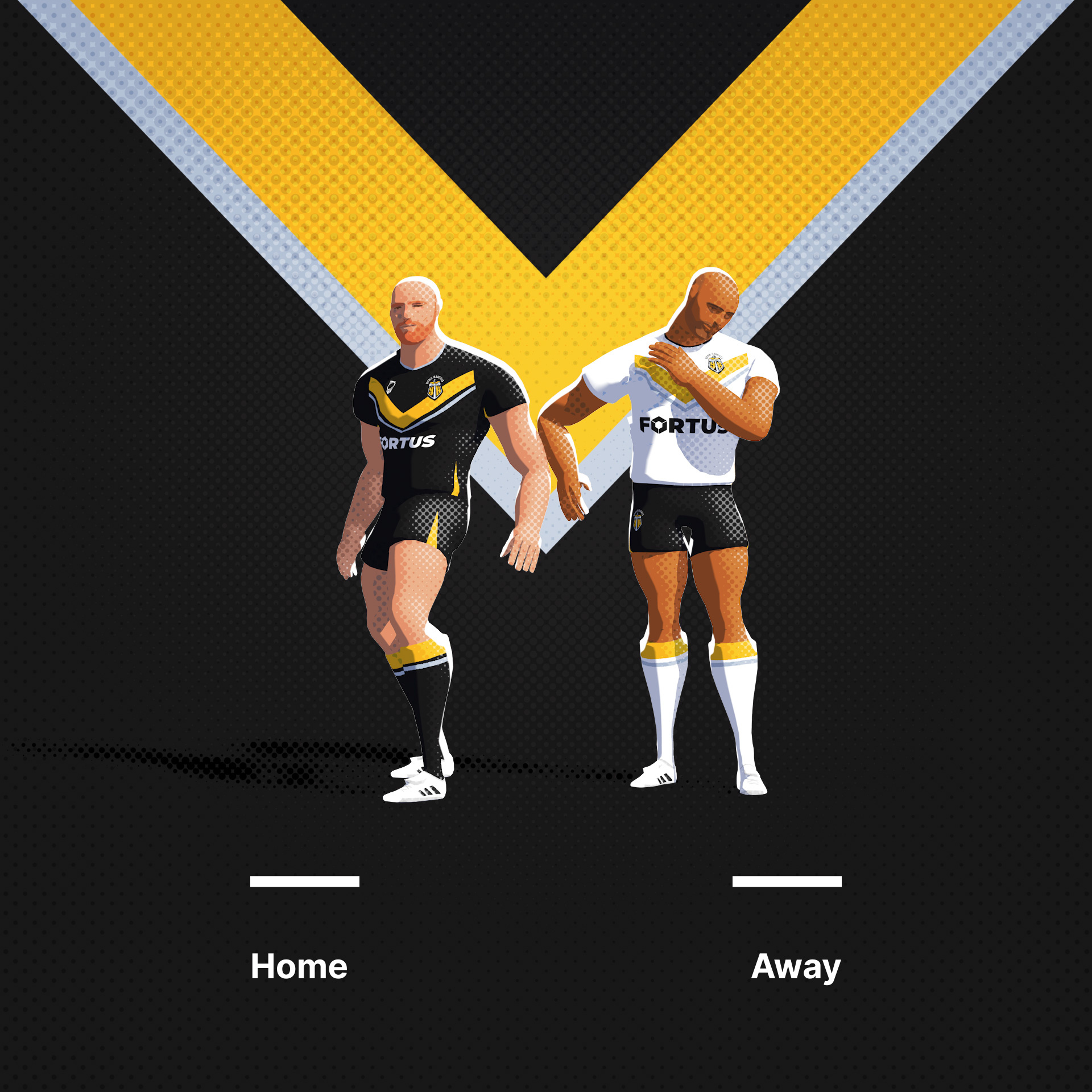
York Knights. Their current logo is pretty decent to be honest, so this is just a alternative...
Original Logo
-
2
-
-
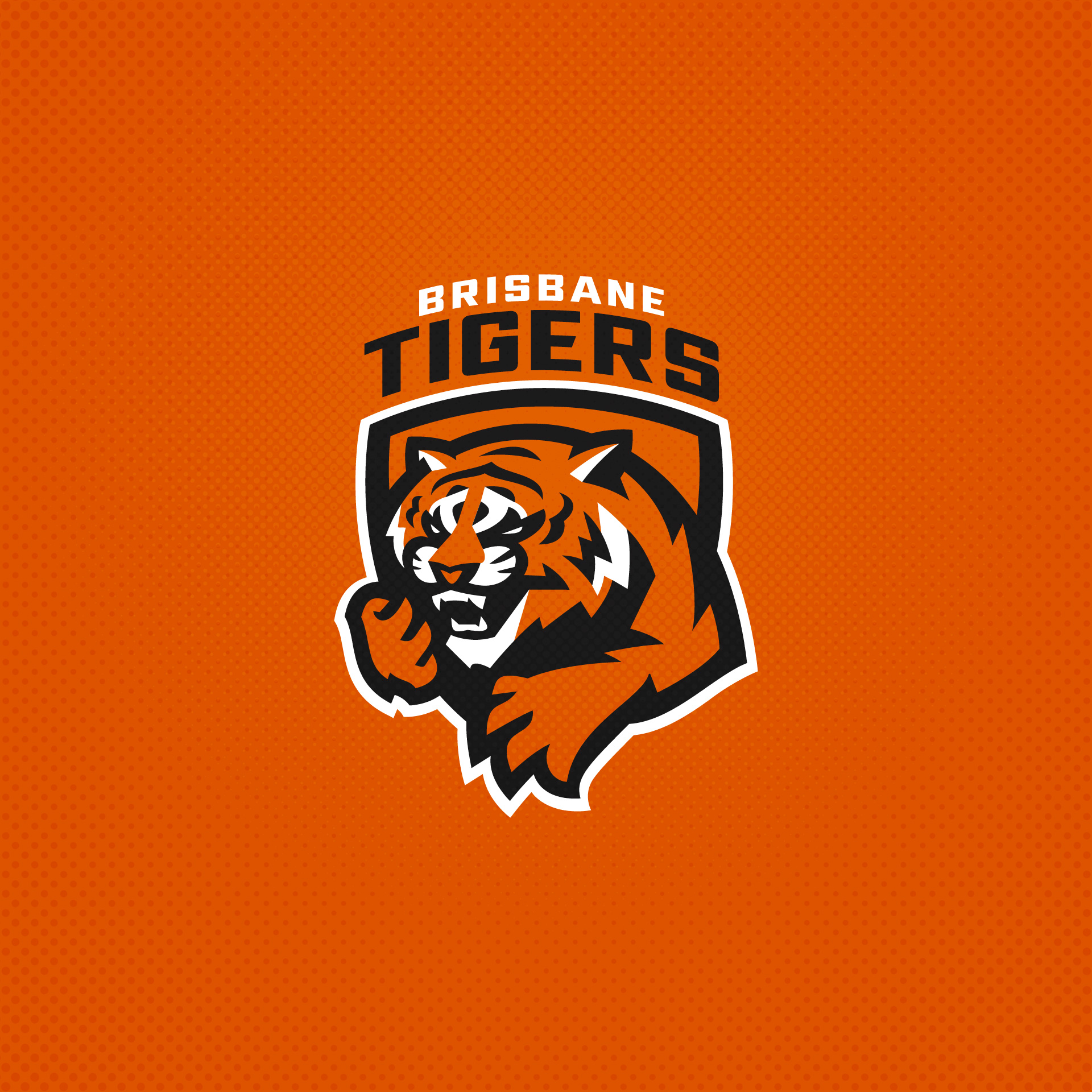
Brisbane Tigers. A slightly different manner of Tiger logo. Actually used AI for some inspiration oon this one.
Original Logo
-
2
-
-
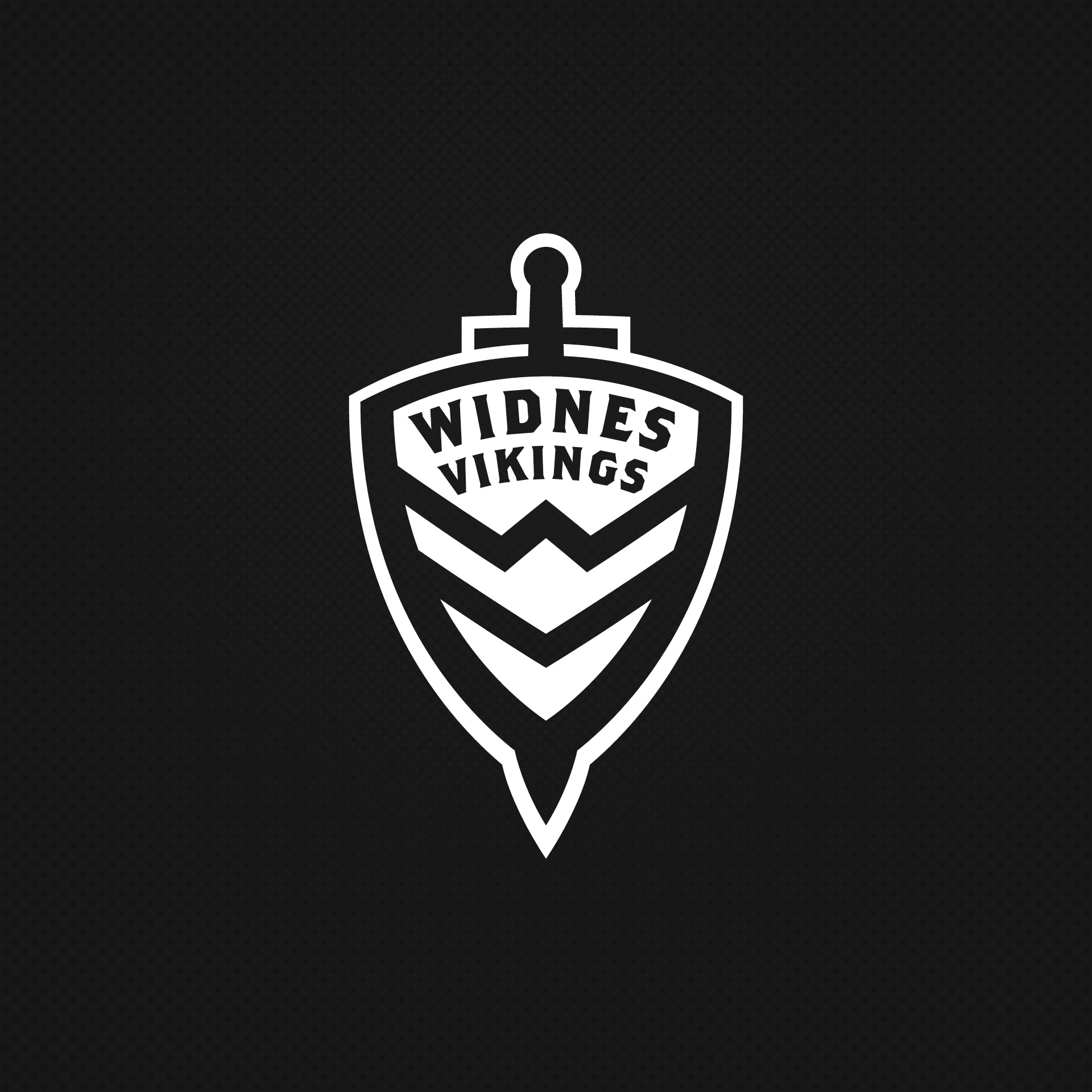
Widnes Vikings. A team that has quite a progressive brand relatively. I have tried to use the team initials in a similar way. The initials also feature within the uniform.
Original Logo
-
5
-
-
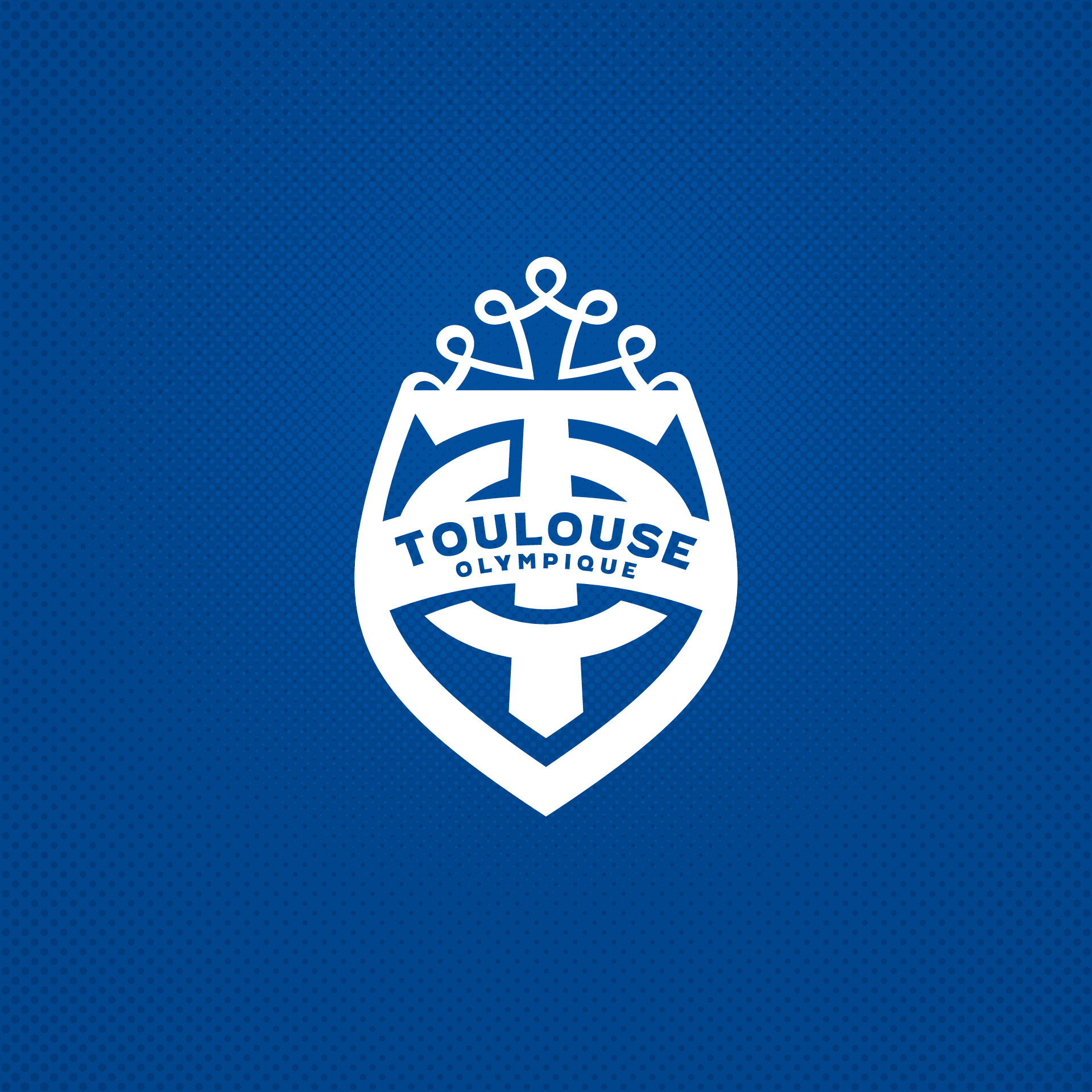
Toulouse Olympique. Slight variation on a theme. One of a couple of French Clubs in RL.
Original Logo
-
5
-
 1
1
-
-
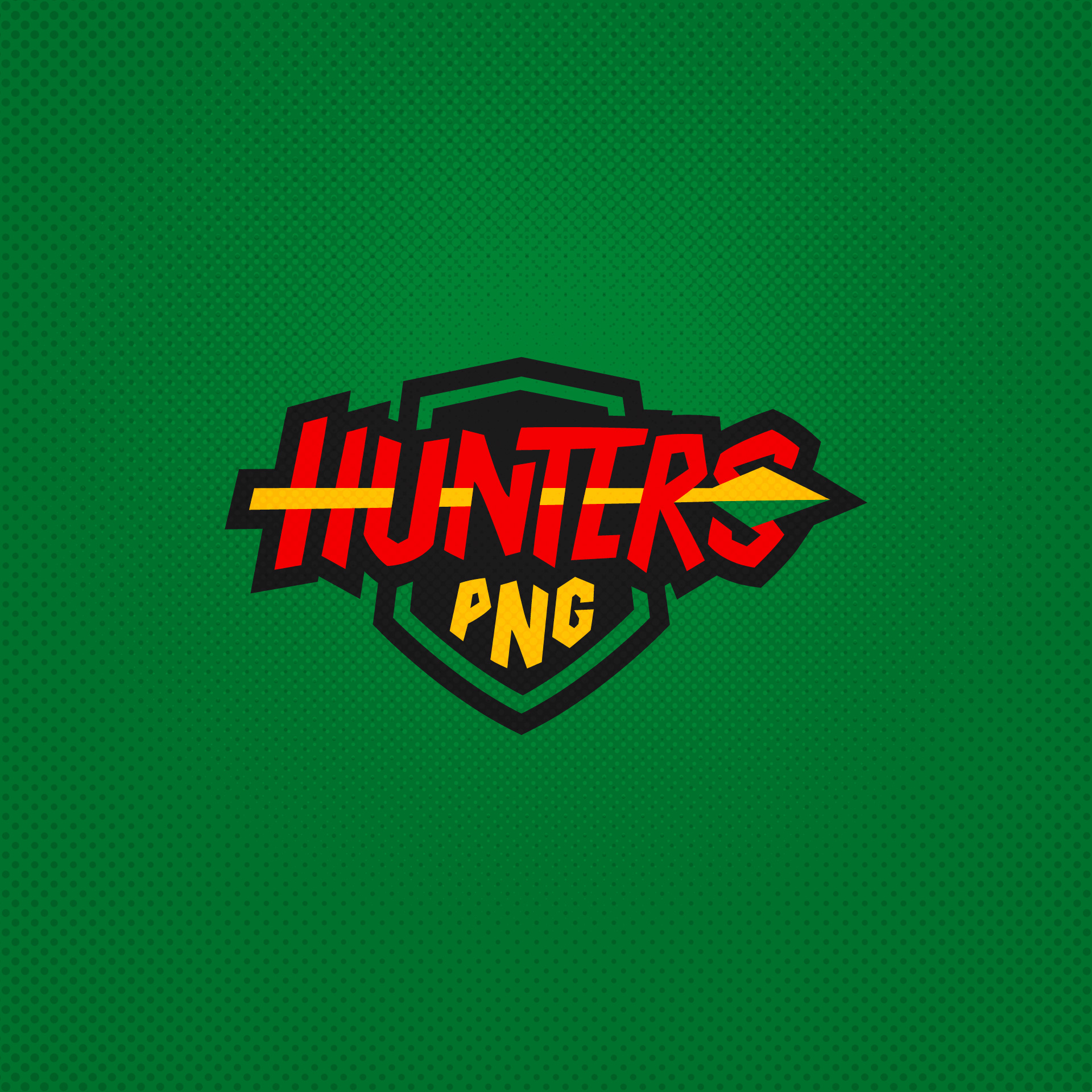
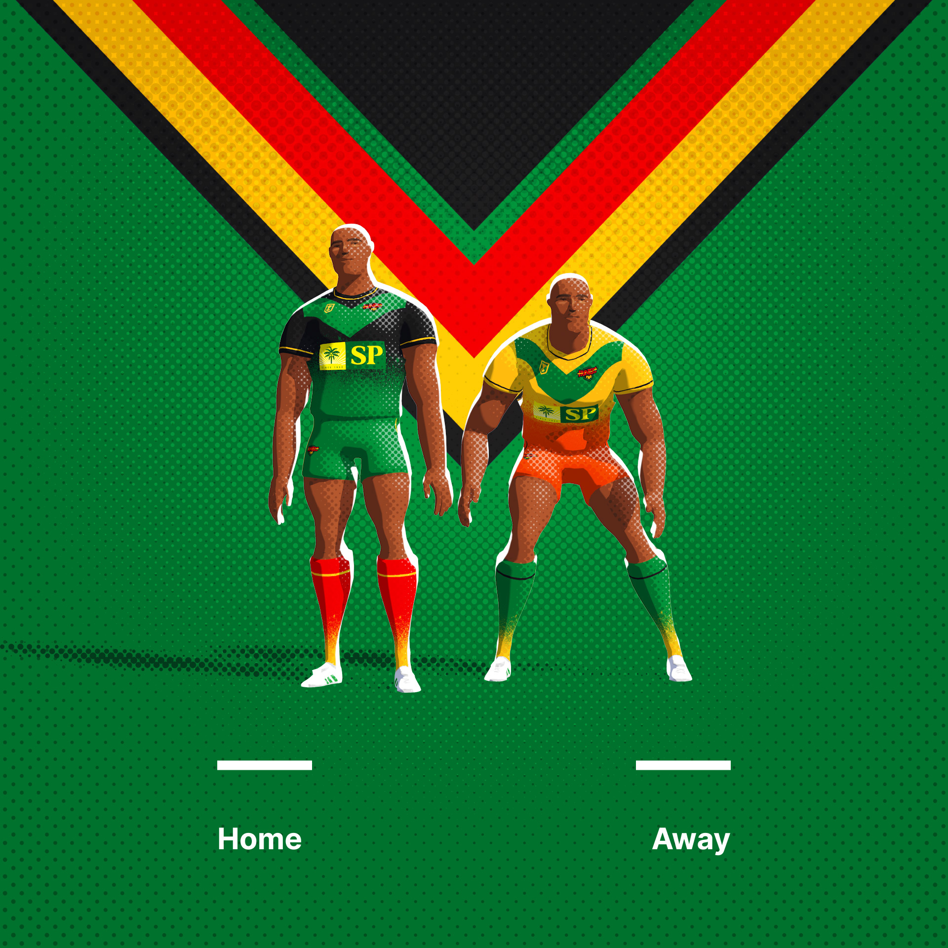
PNG Hunters. Their current logo is a bit of a mess with a sponsor lock up. I have tried to simplify the elements here.
Original Logo
-
2
-
-
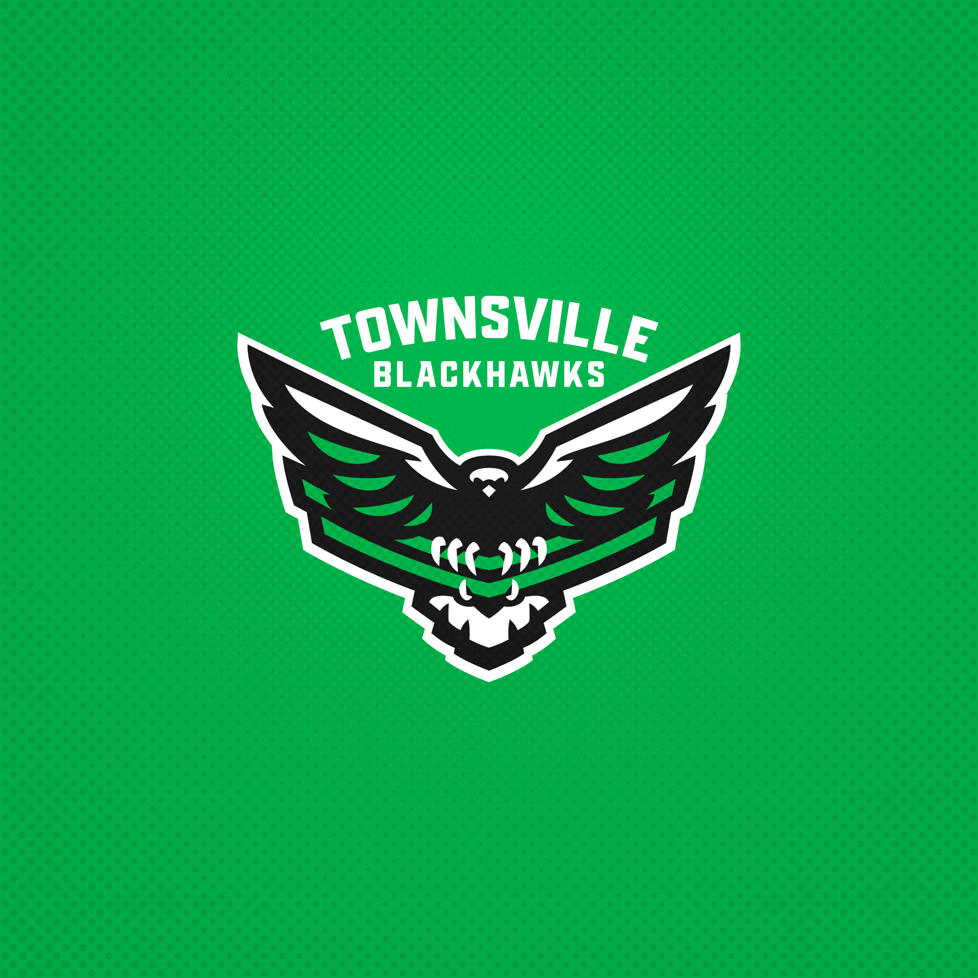
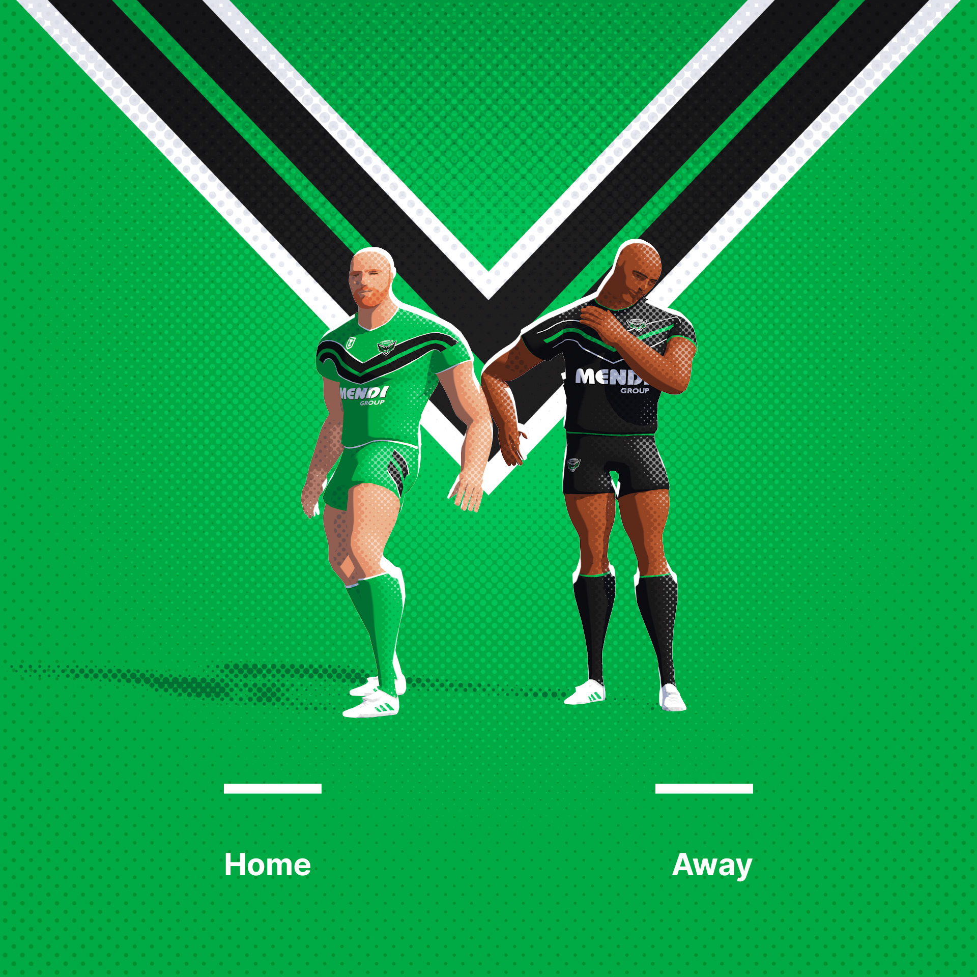
Townsville Blackhawks. I have a few logos like this in this series. In this instance I wanted the bird to interact with the brand elements, in this case the chevrons.
Original Logo
-
4
-
-
14 hours ago, slapshot said:
I don't know what to say that hasn't already been said. I've been following on Instagram and you've knocked it out of the park with this series. My favorite is Barrow - so fun and exponentially better than the existing version.
While I don't think every logo update has been a significant improvement, you've done a great job of simplifying what had excessive colors/gradients/outlines. The fonts are a bit too consistent though...in a vacuum they look good, but seeing them all series-wide I think you could use a little more variety.
For Featherstone - the original crest had a top hat, but you removed it for your version. Did it hold any significance? Maybe there's a way to keep it in there somewhere while still keeping the cleaned-up look?
For Hull, I really like the original - I think they had a very creative way of making a negative space sparrow head within a crown, so you had a challenge to improve on it.
Ah thanks. Appreciate it. Yeah, I've made 63 of them, so there will definitely be some overlap...
The Featherstone Rovers 'Hat' is actually a knights helmet. There are colour renders of the logo that make that more clear.
The Hull Kingston Rovers logo is great. Check out their rebrand here:
-
Interesting idea. Ive lived in the UK my whole life and never encountered a hornet if I'm honest, though climate change seems to have introduced some Asian hornets in the South East apparently. Only issue with the Wasps connection is that The Stoop, the stadium attached to Twickenham is the home of Harlequins, the long time rival of Wasps. nice rendering of the logo.
-
3
-
-
-
-
3
-
1
-
-
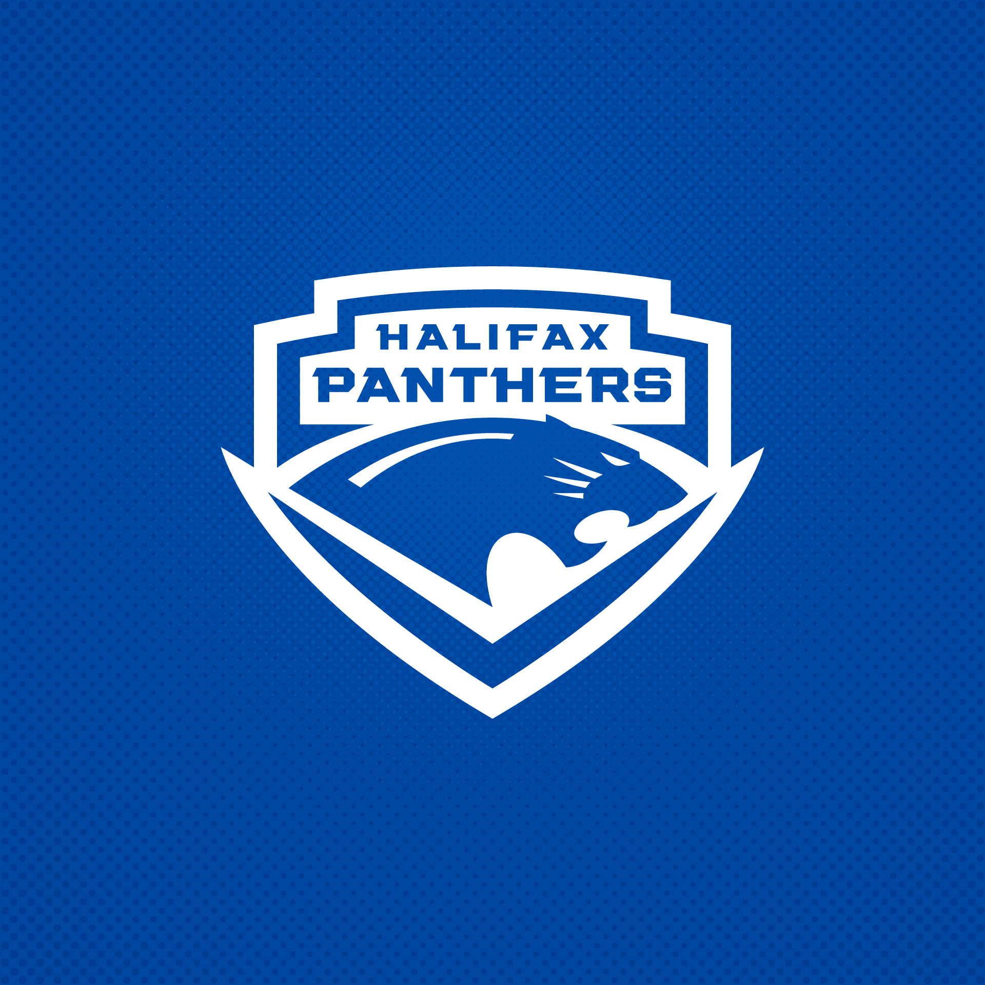
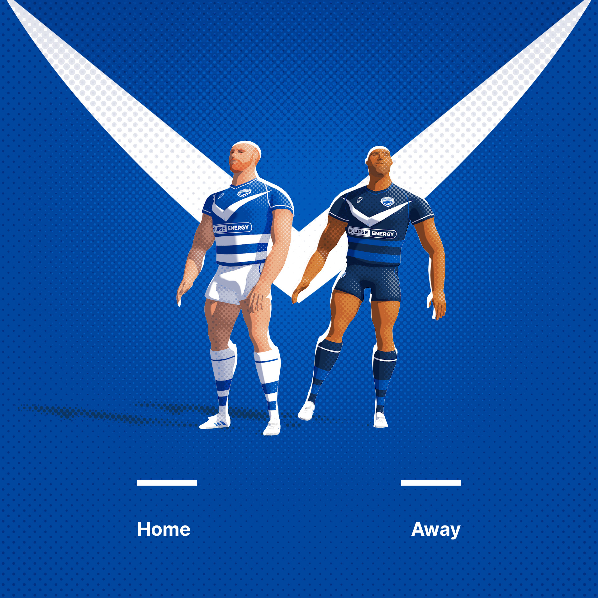
Halifax Panthers. The Panthers current logo seams to feature a number of blues that don't really match the rest of the brand or any historic brand elements. I have simplified the colours and logo.
Original Logo
-
1
-
-
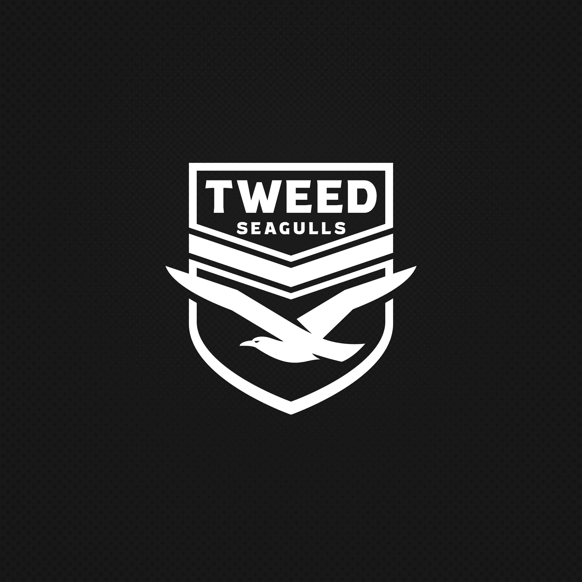
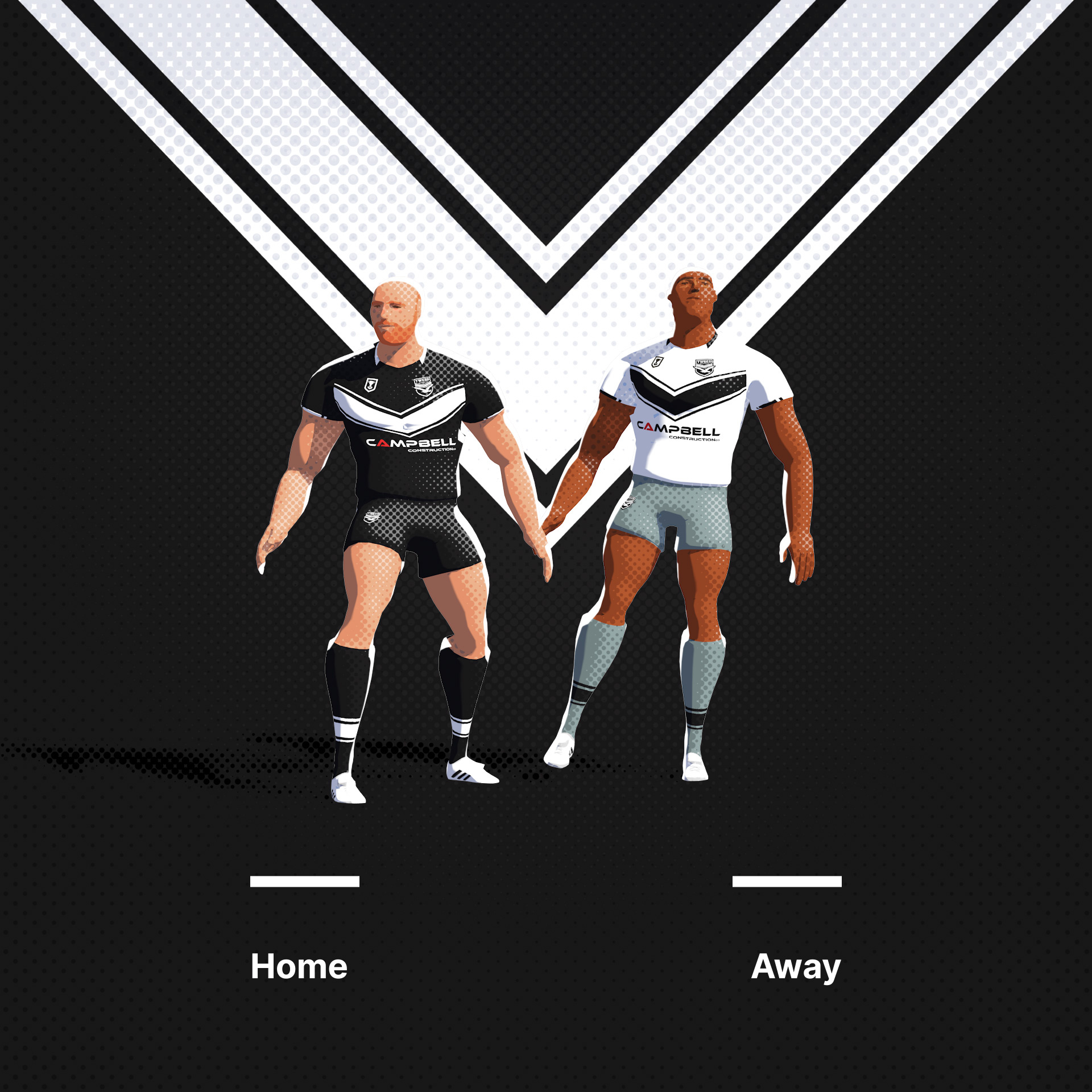
Tweed Seagulls. I tried hard here to work some brand elements into a Seagull design. Moderate results.
Original Logo
-
5
-
-
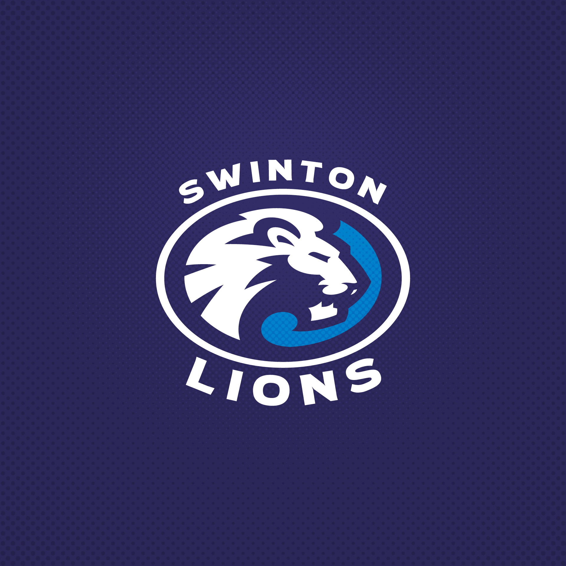
Swinton Lions. Lion head logo instead of the heraldic style symbol. Going to stack the rest of these up, so they're all published by Friday.
Original Logo
-
4
-
-
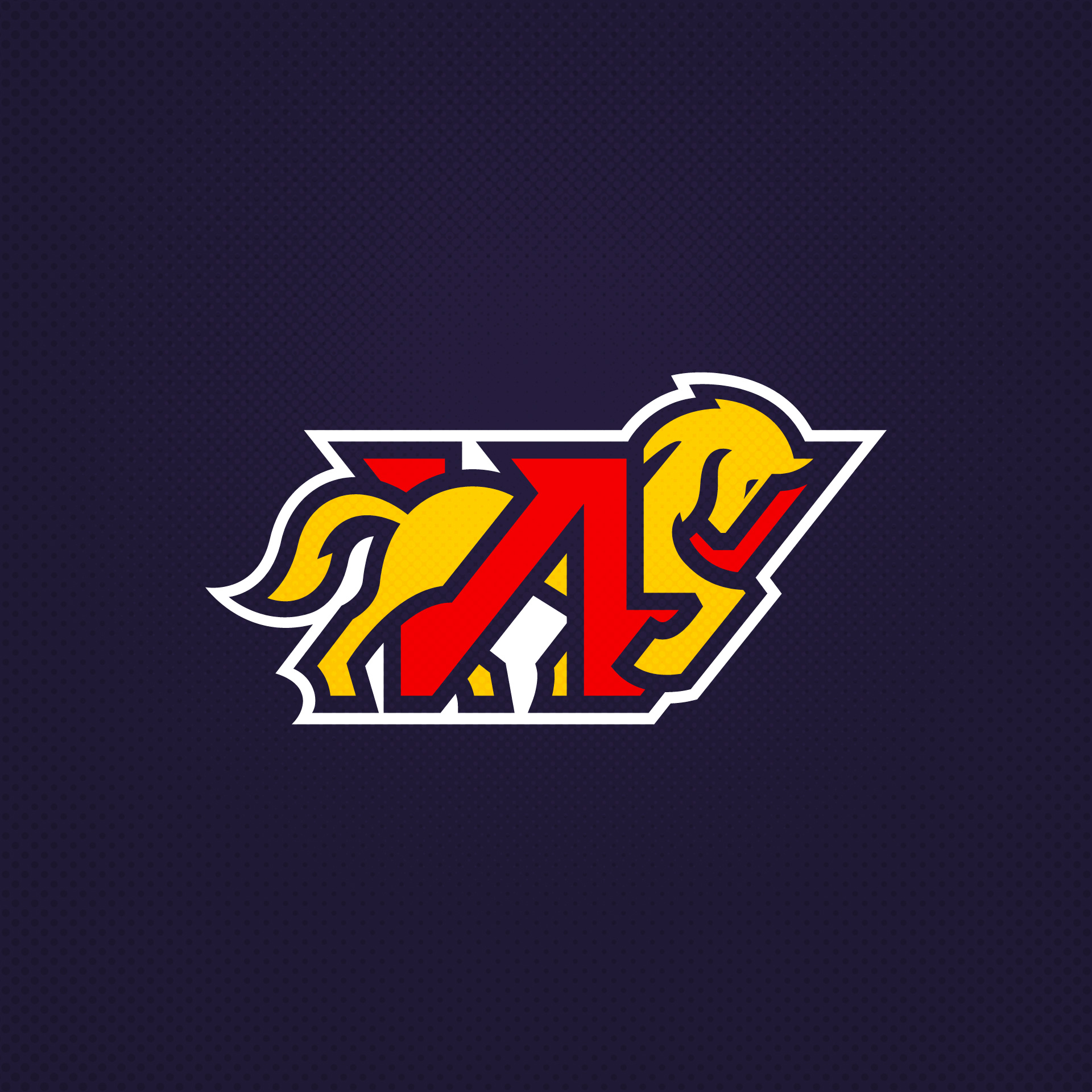
Western Clydesdales. A simplification of the elements of the current logo. I wanted to get across the nature of the Clydesdale working horse and its profile.
Original Logo
-
9
-
-
-
5
-
2
-
 1
1
-
-
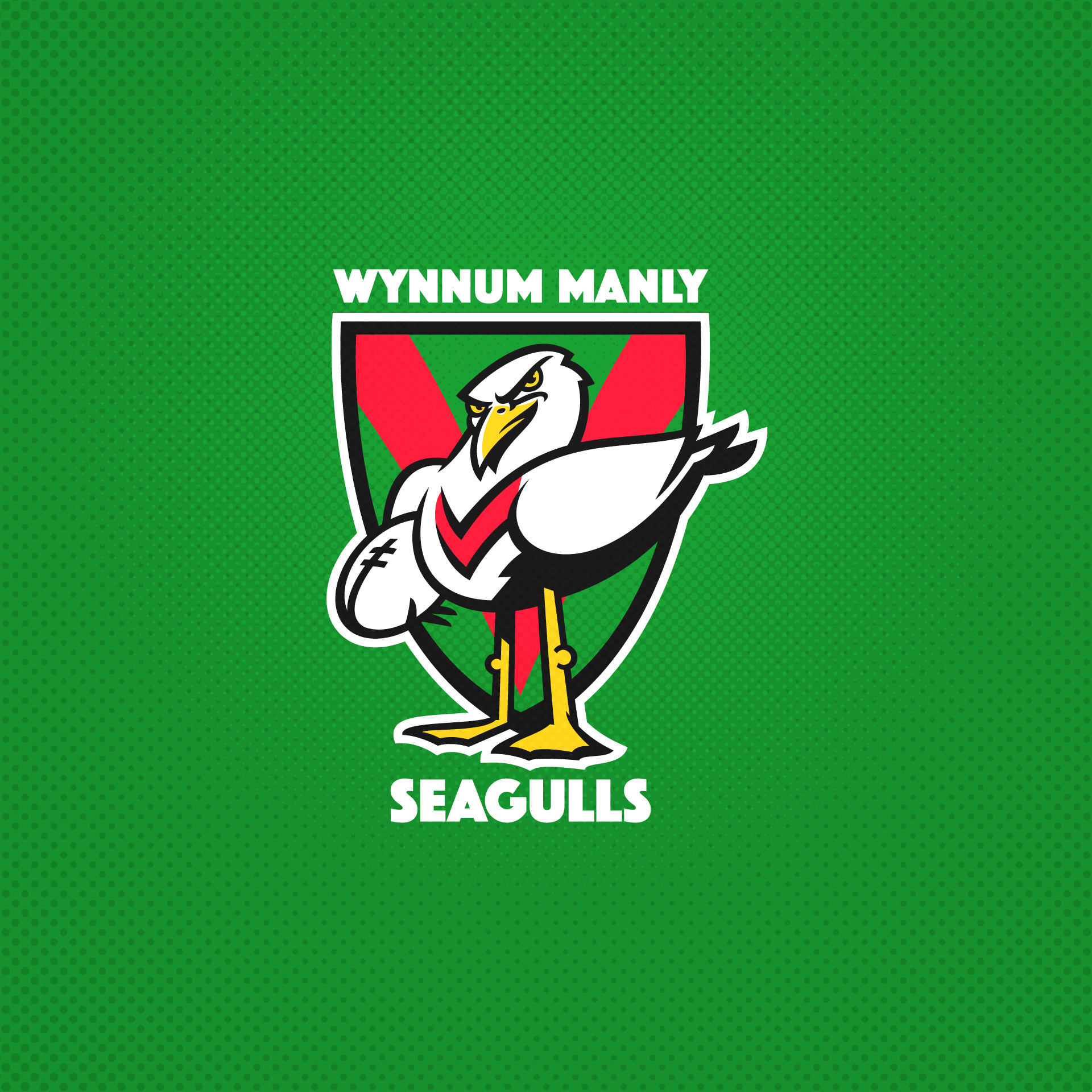
Wynnum Manly Seagulls. I very rarely make anthropomorphised logos like this, but I wanted some distinction from the other Seagull. Gulls are pretty dull birds to draw also, so that's why I have spiced him up slightly.
Original Logo
-
4
-
-
On 11/17/2023 at 4:34 PM, McQ said:
You were one of the people who got me into sports design many years ago, so it's great to see you getting back into it. All of these are incredible. The last few are some of my favorites so far.
Ah, thats great to hear. It really doesn't seem like that many years... God, I'm old now.
-
On 11/18/2023 at 5:09 AM, neo_prankster said:
Did you accidentally make a better version of the Los Angeles Rams current secondary logo?
I actually like it.
Haha, yes, that was what this was originally intended as. See below for the original edit:
-
1
-
-
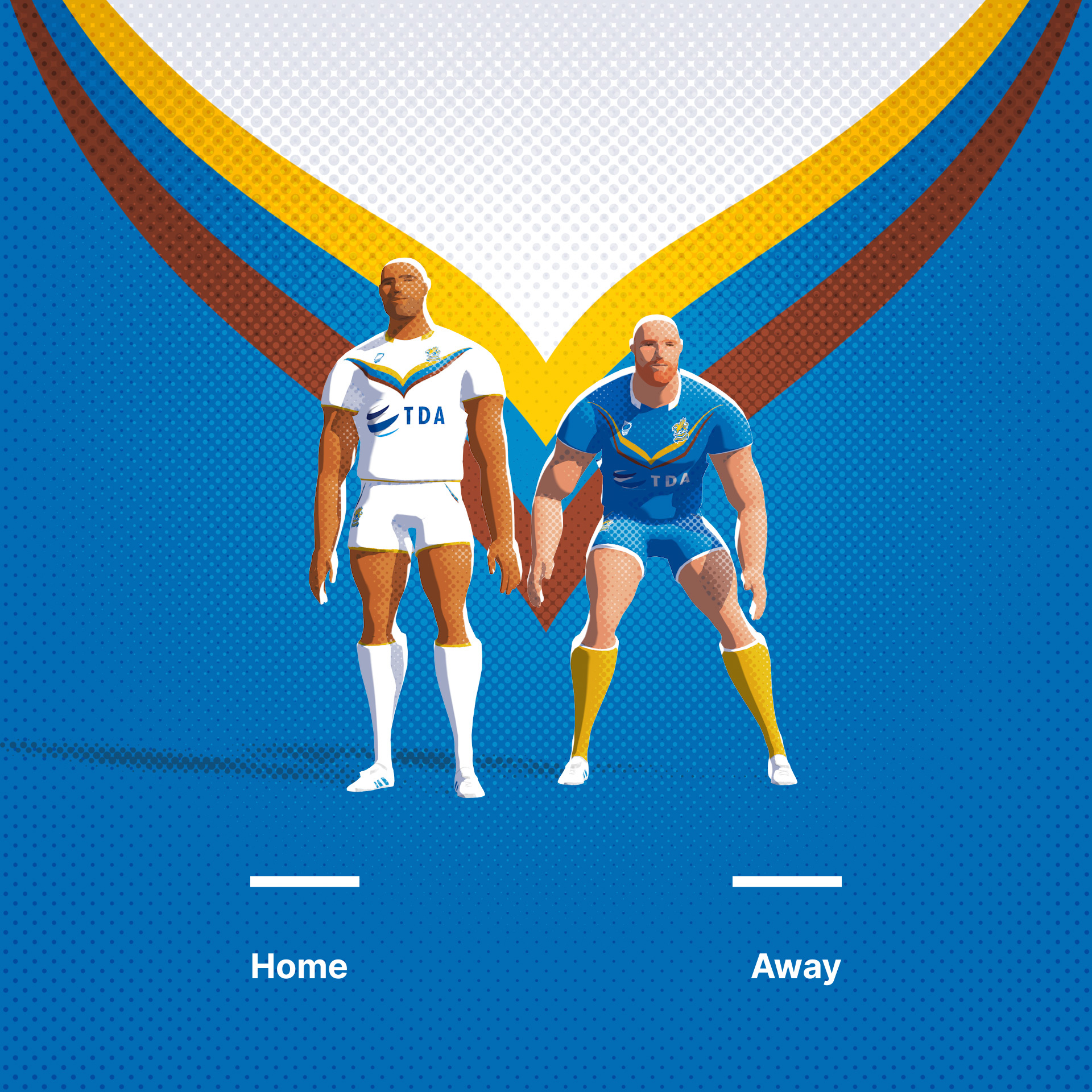
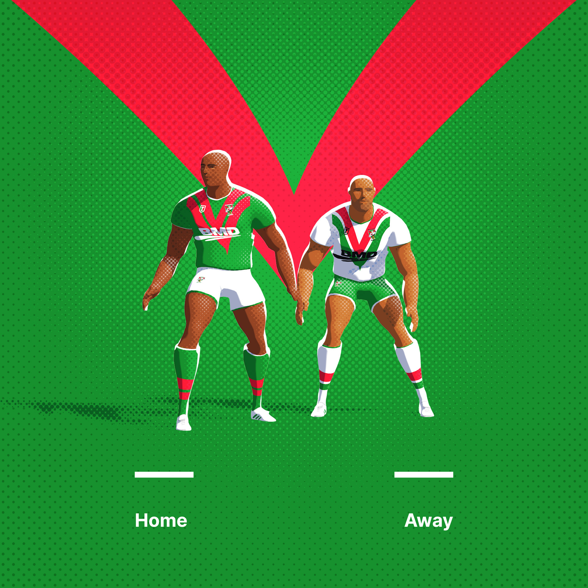
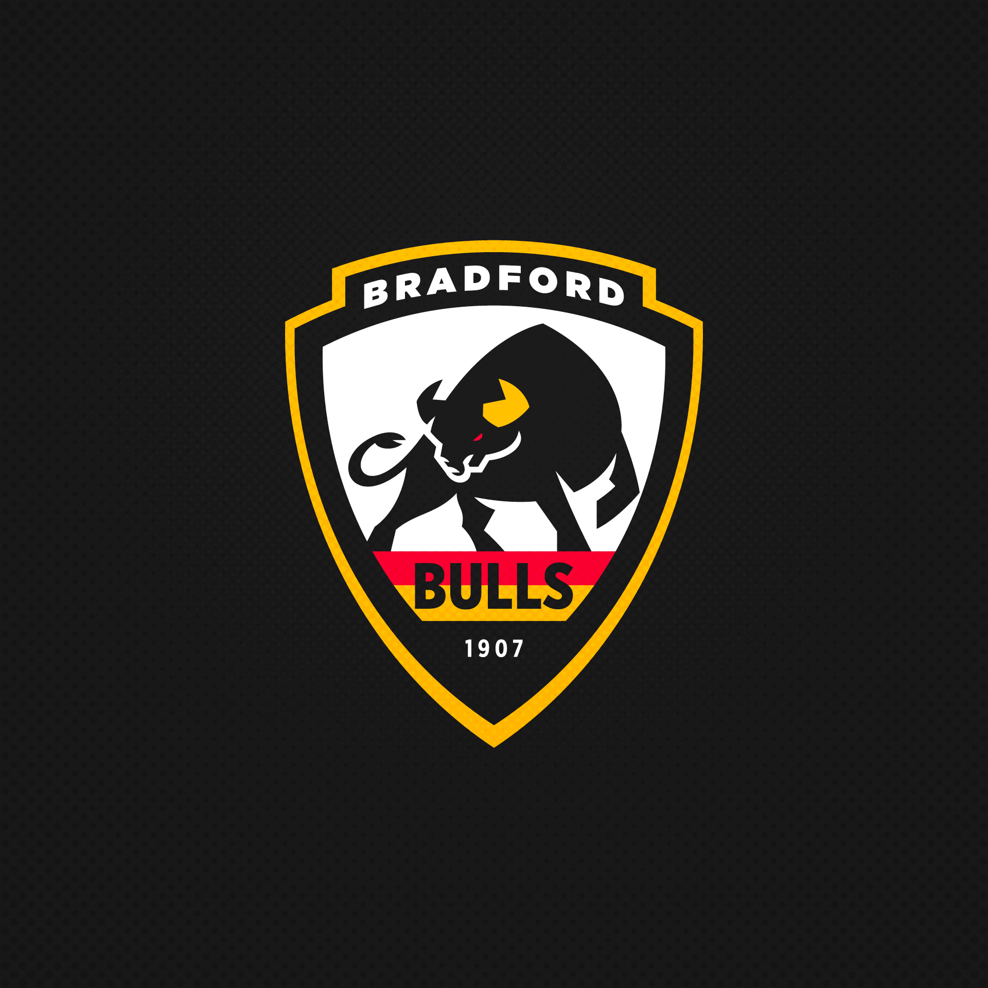
Bradford Bulls multi-time Super League champions fallen on hard times. Cool mascot and cool colour scheme to work with.
Original Logo
-
9
-
-
18 hours ago, VampyrRabbit said:
The Magpie on the crest looks far more like a European magpie than it does an Australian one, which is a pretty big problem as they are very different birds. It would be perfect if the crest depicted an Australian Magpie.
Nice point, I see the Magpies are lighter the further south you go in Aussie and more black the further north.


Rugby League Branding Exercise
in Concepts
Posted
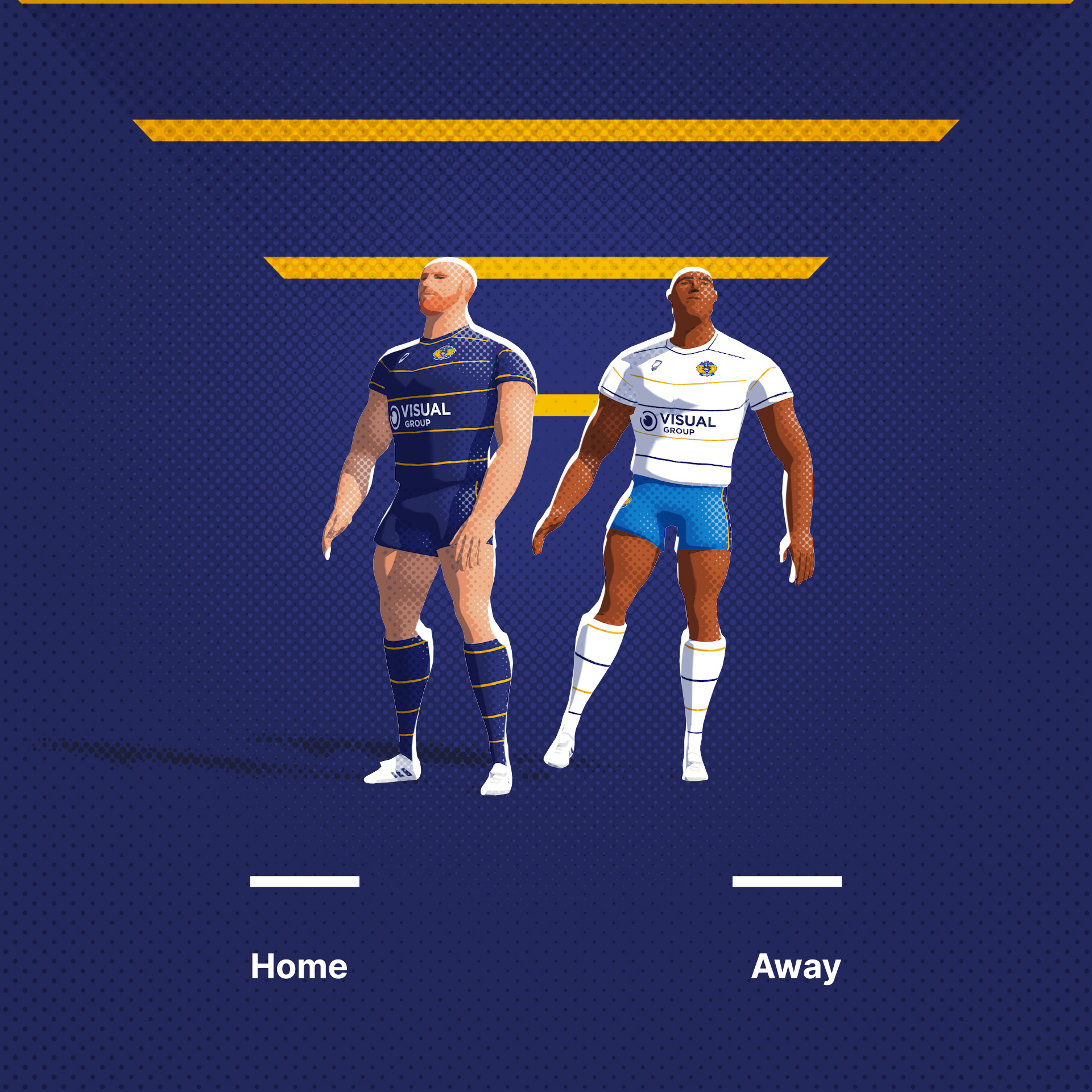
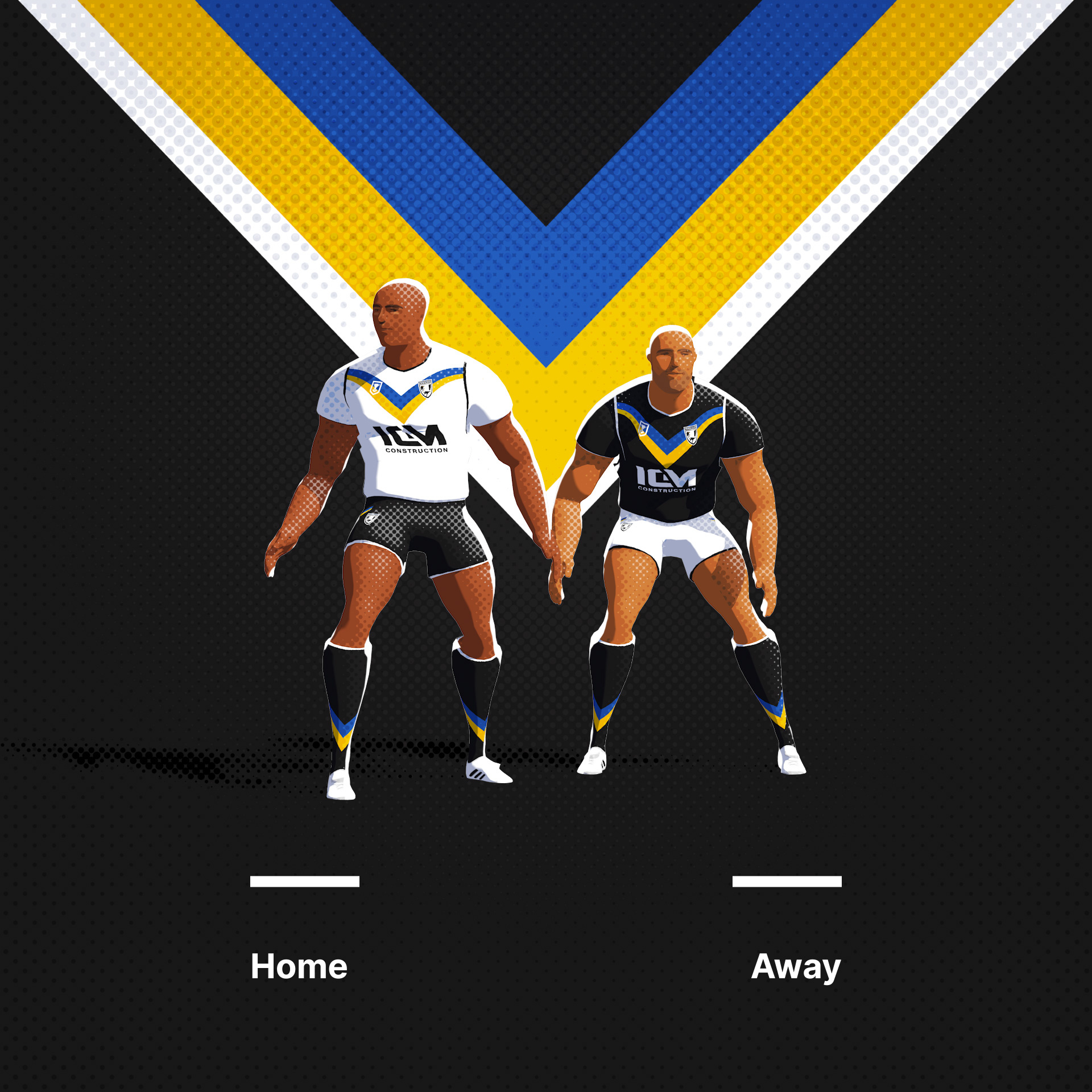
Okay, thats a wrap. Many thanks for all the comments on these, Ive really enjoyed making this series. I might be back to do something else at some point. Any ideas you have stick them below, perhaps I can make similar animated characters for such a project. I think there might be a way to use UVs or Normal Maps to make an animated version for Photoshop?
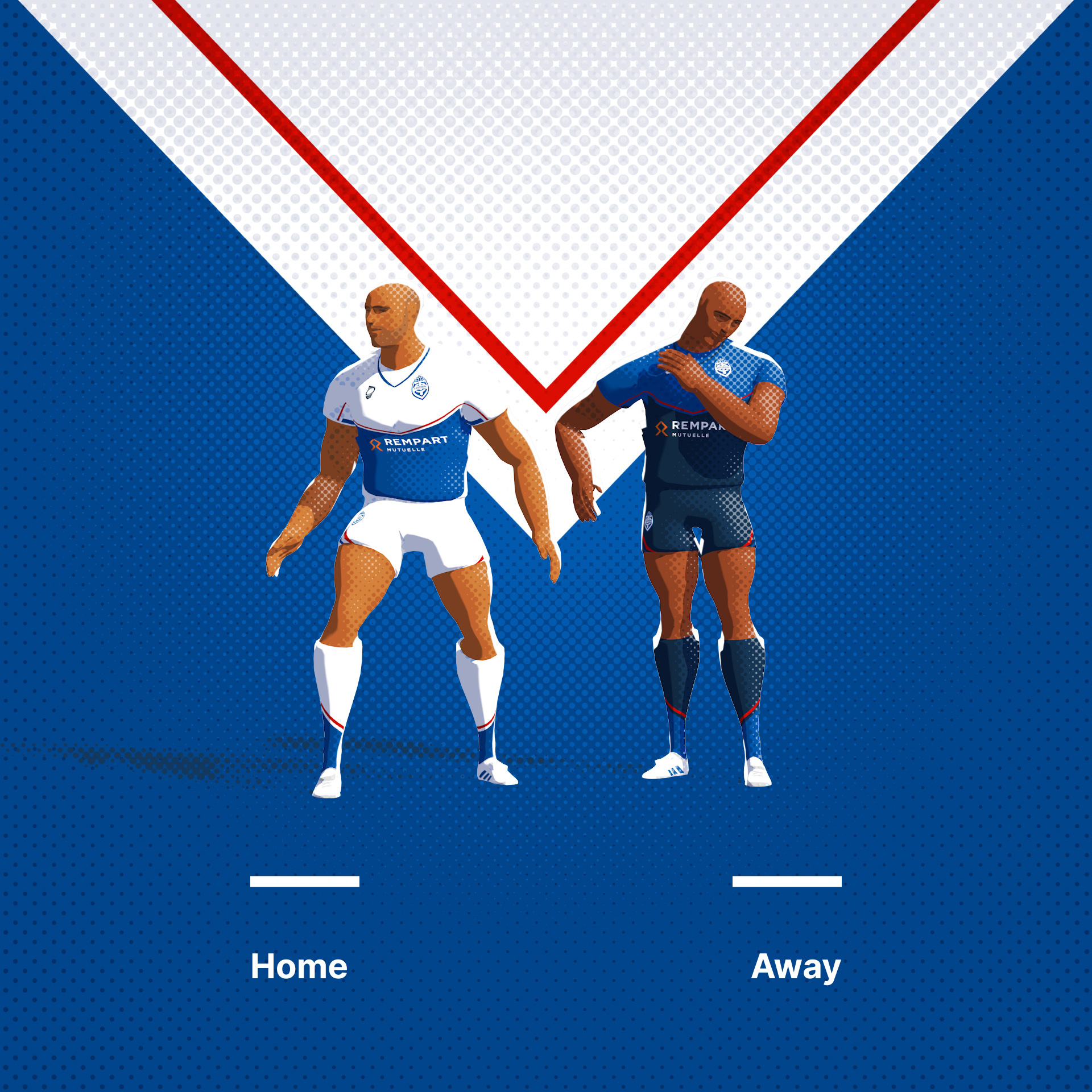
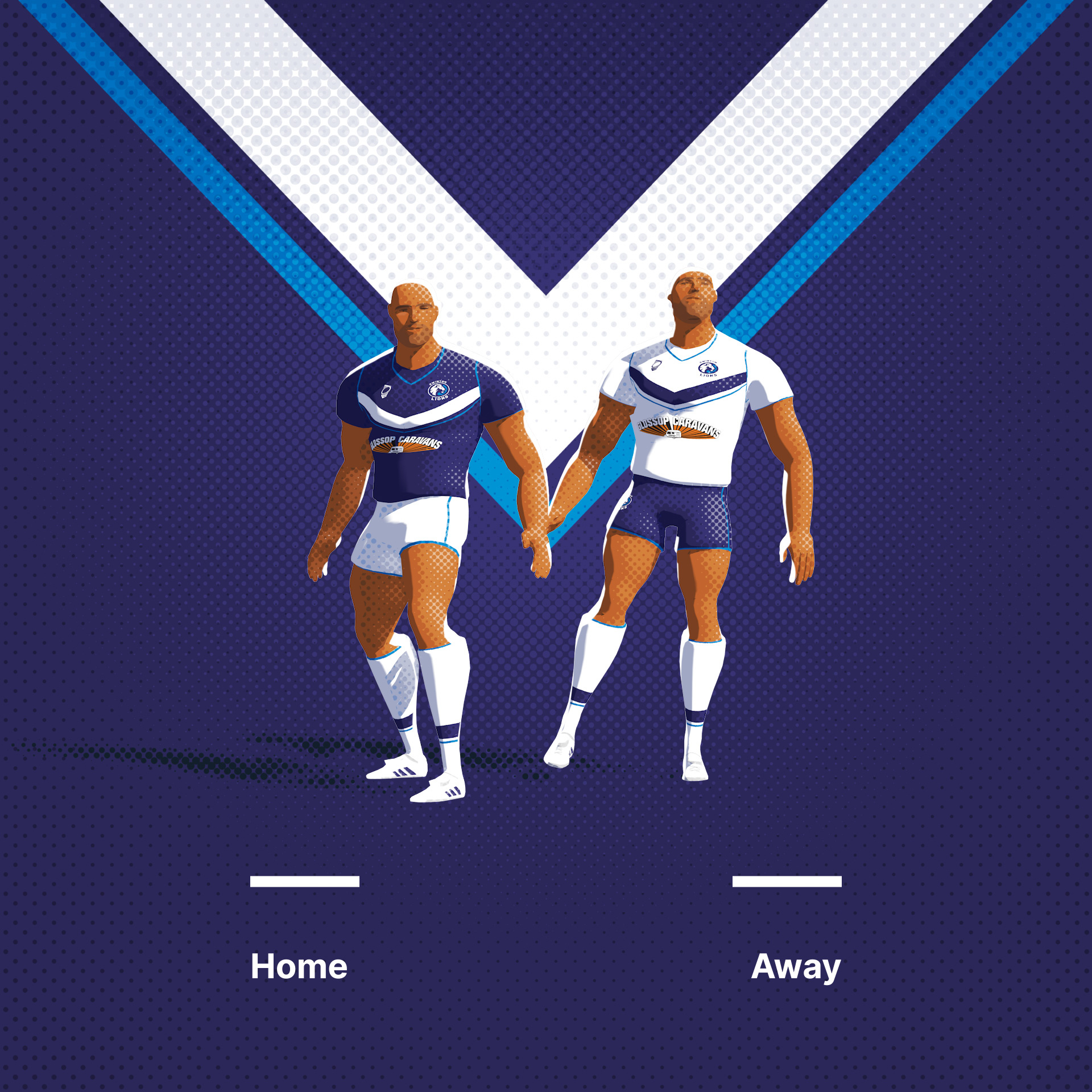
Anyway, here are all the logos together along with the uniforms.