


Davidson
-
Posts
2,307 -
Joined
-
Last visited
-
Days Won
4
Posts posted by Davidson
-
-
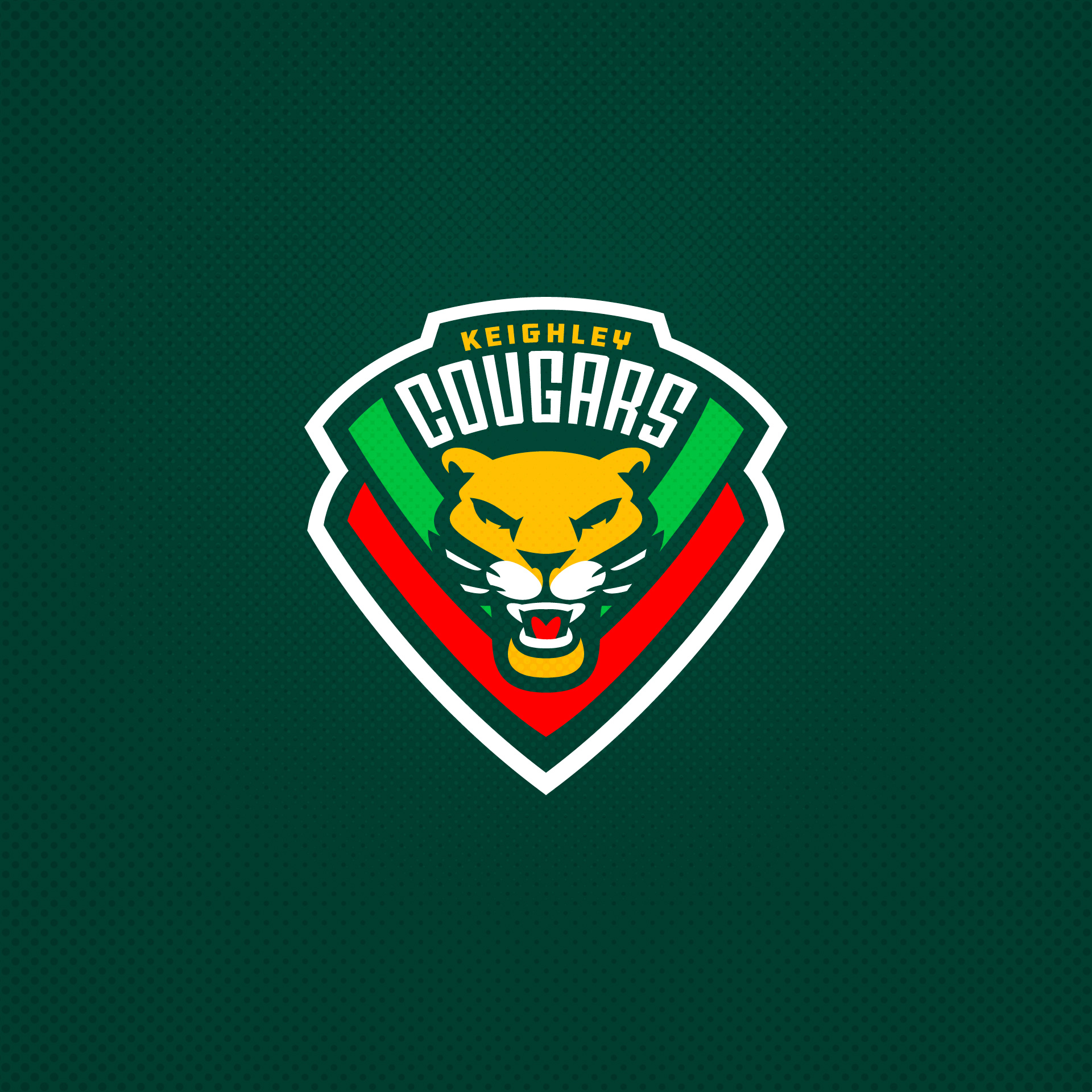
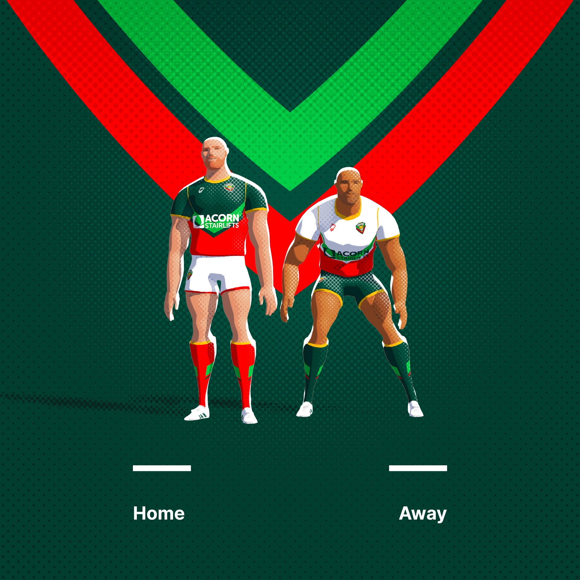
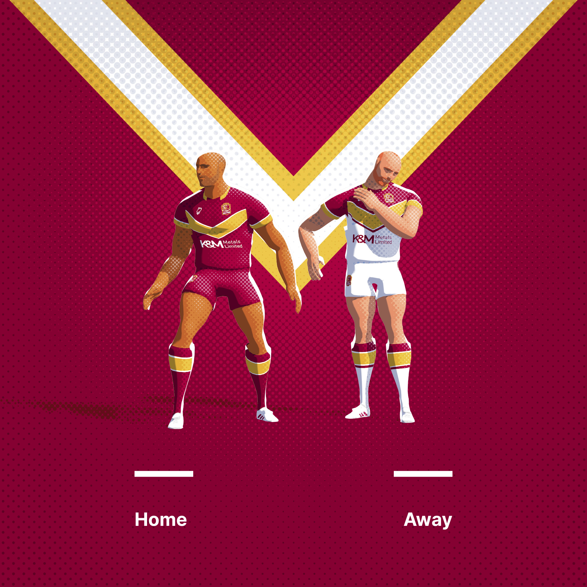
Keighley Cougars. A unique set of brand colours and elements. I have tried to tie them together a little.
Original Logo

-
 8
8
-
-
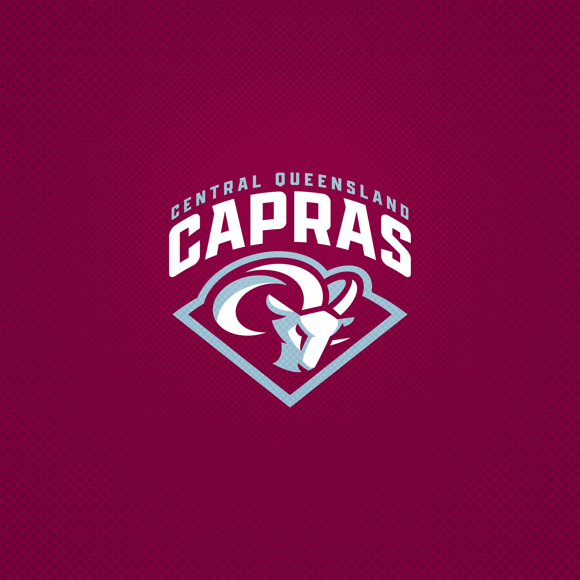
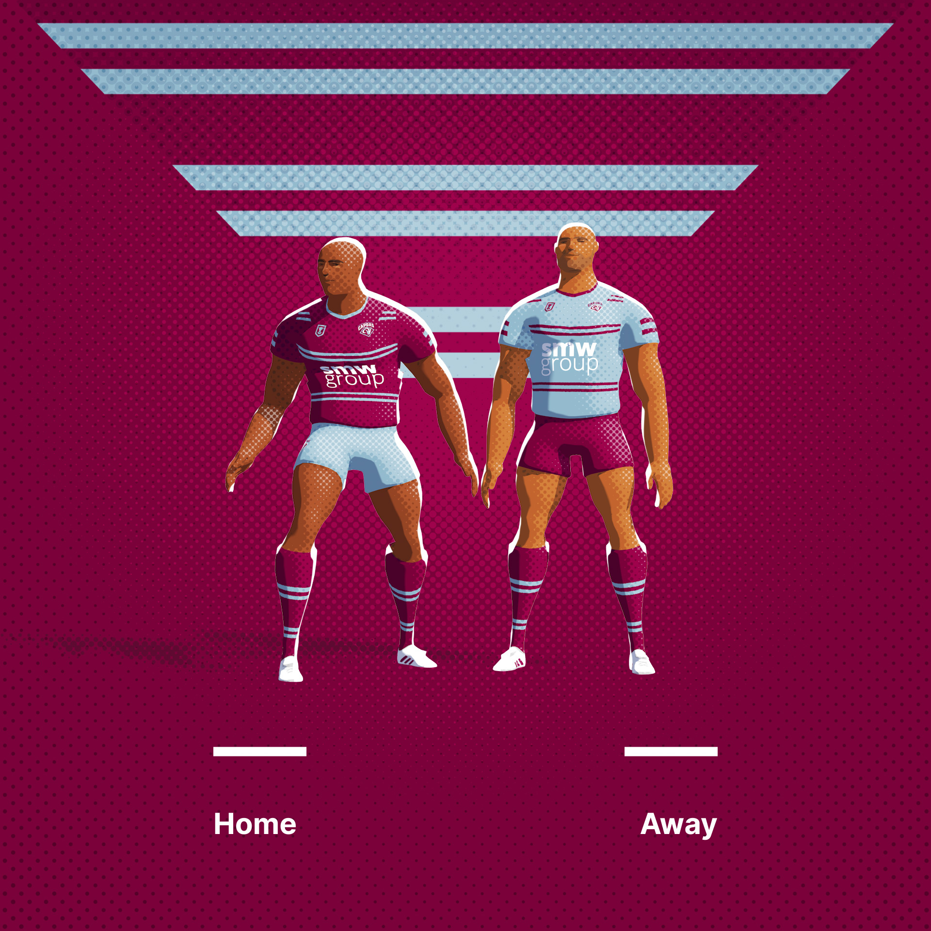
Central Queensland Capras. Simplifying the current logo and palette. Maybe a hint of the LA Ram in there also.
Original Logo
-
3
-
-
-
7
-
 2
2
-
-
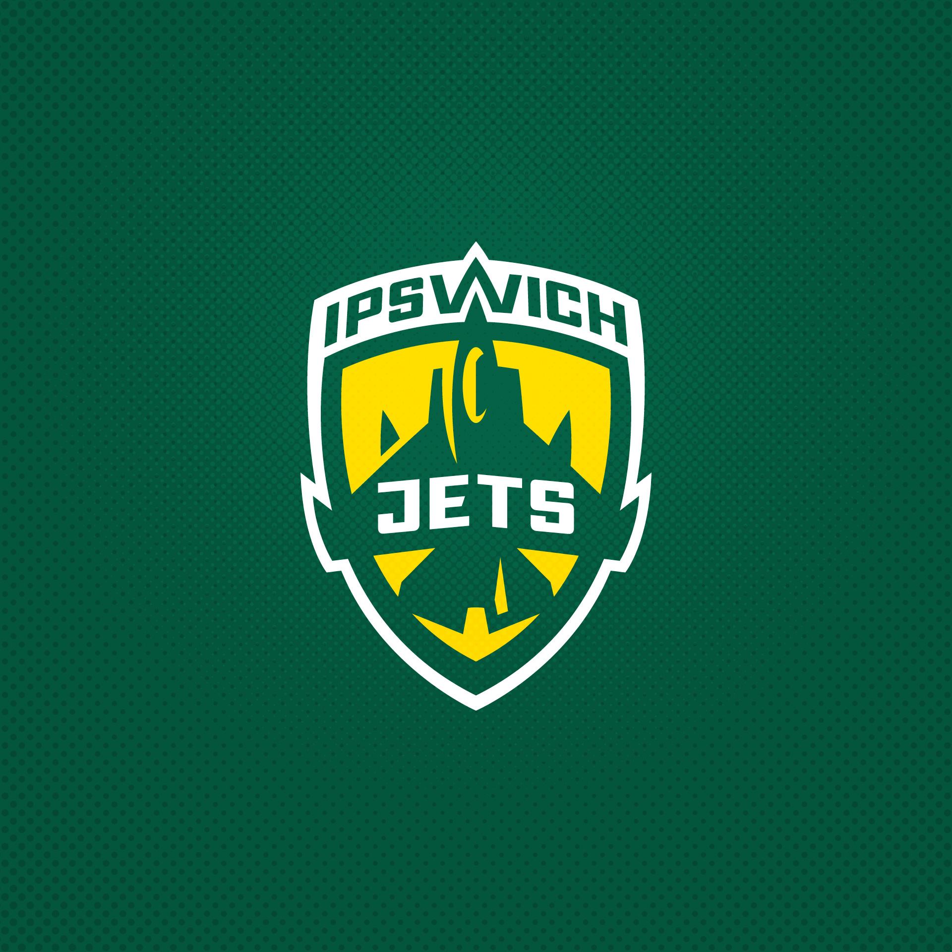
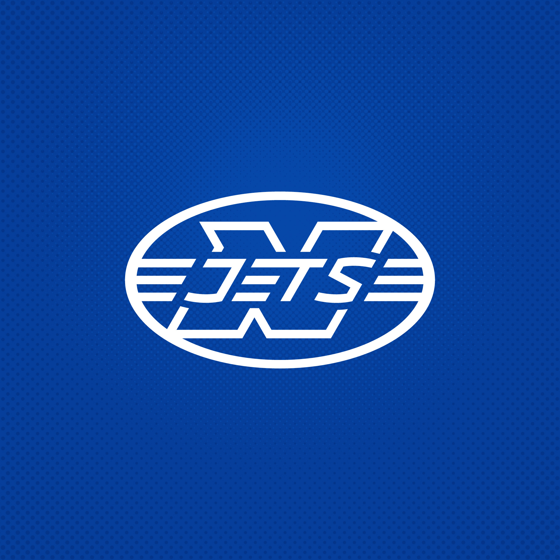
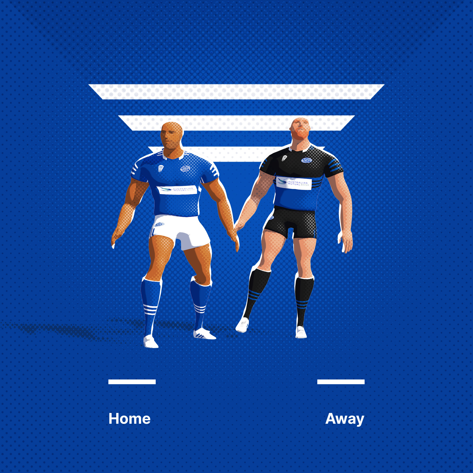
Ipswich Jets. One of the teams in NRL 2 levels that share a mascot. This creates a bit more space between these guys and Newtown
Original Logo
-
4
-
 1
1
-
1
-
-
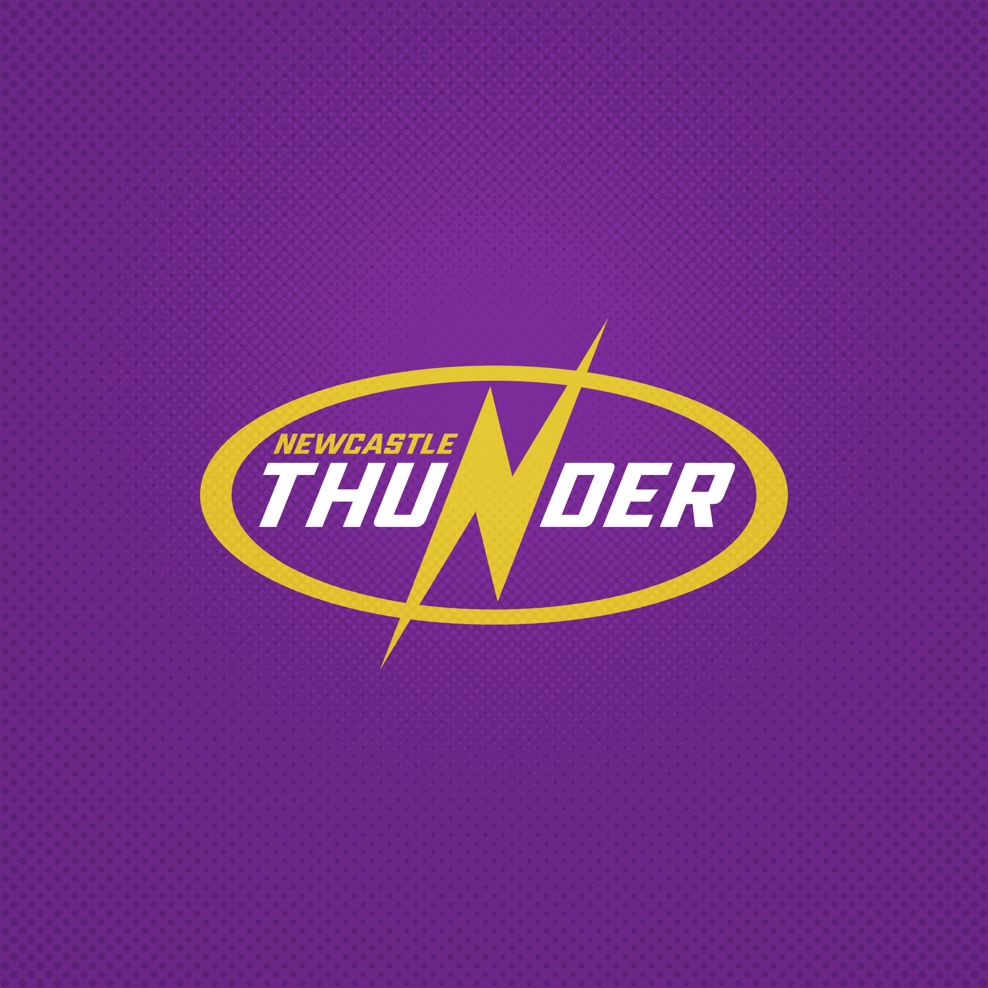
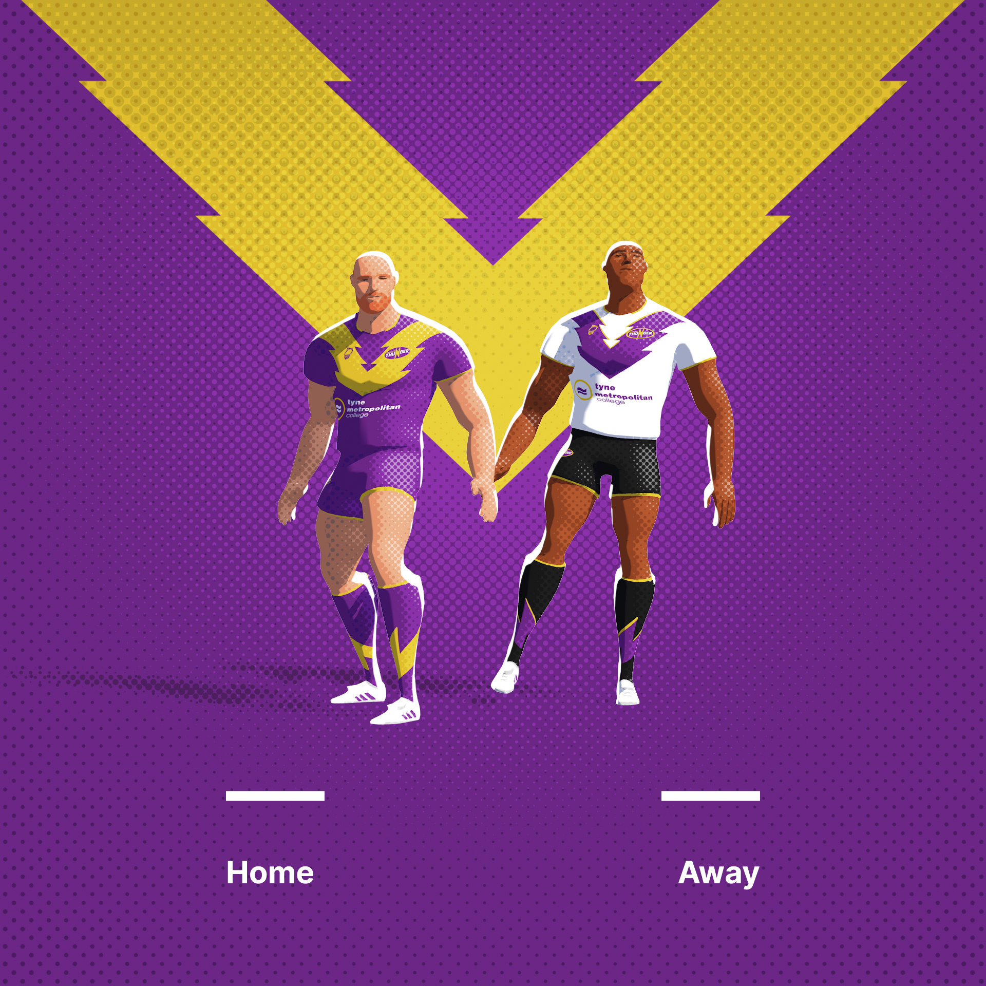
Newcastle Thunder. I like thunder and lightning themed teams, but this is a pretty simple update.
Original Logo
-
1
-
-
1 hour ago, Bomba Tomba said:
I noticed most of these designs have the V-shaped thingy across the chest, is it really a common design element in rugby?
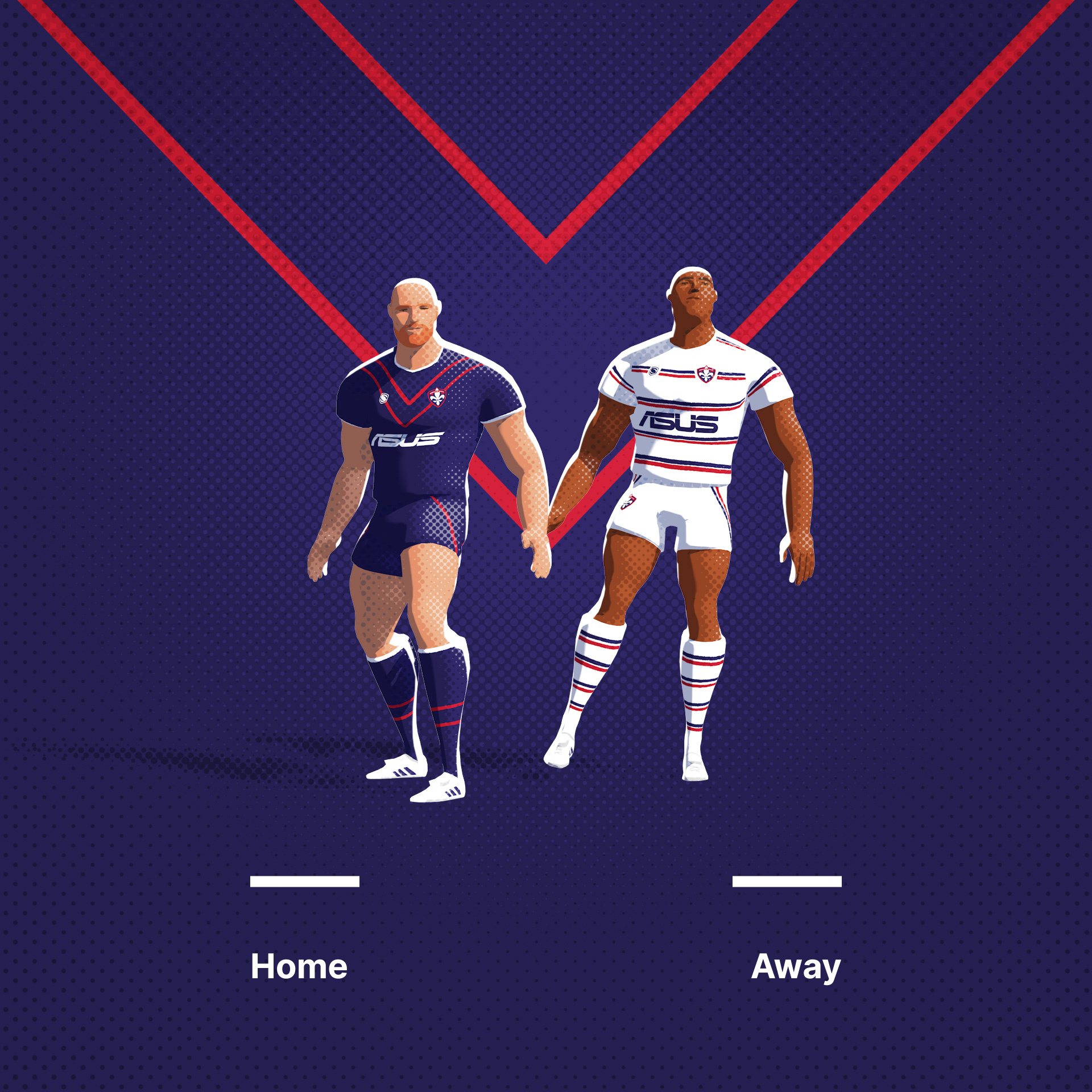
Yes, it’s very common in rugby league, though oddly very rare in rugby Union. It’s hard to say exactly why, but the standard answer is that when the codes split (Rugby League went professional in 1895 and union was, until the mid 90s, an amateur sport) it became the dominant code in only a few areas. Principly the north of England where it was born and Australia. Common in Australian sports design was the V-stripe design on cricket jumpers. As sports clubs in Australia were often multi sports organisations, these designs became uniform across all their teams. This became a popular element throughout the game as it sought to be different and appear aesthetically separate from Rugby Union. It’s now common in the UK and France also.
-
2
-
-
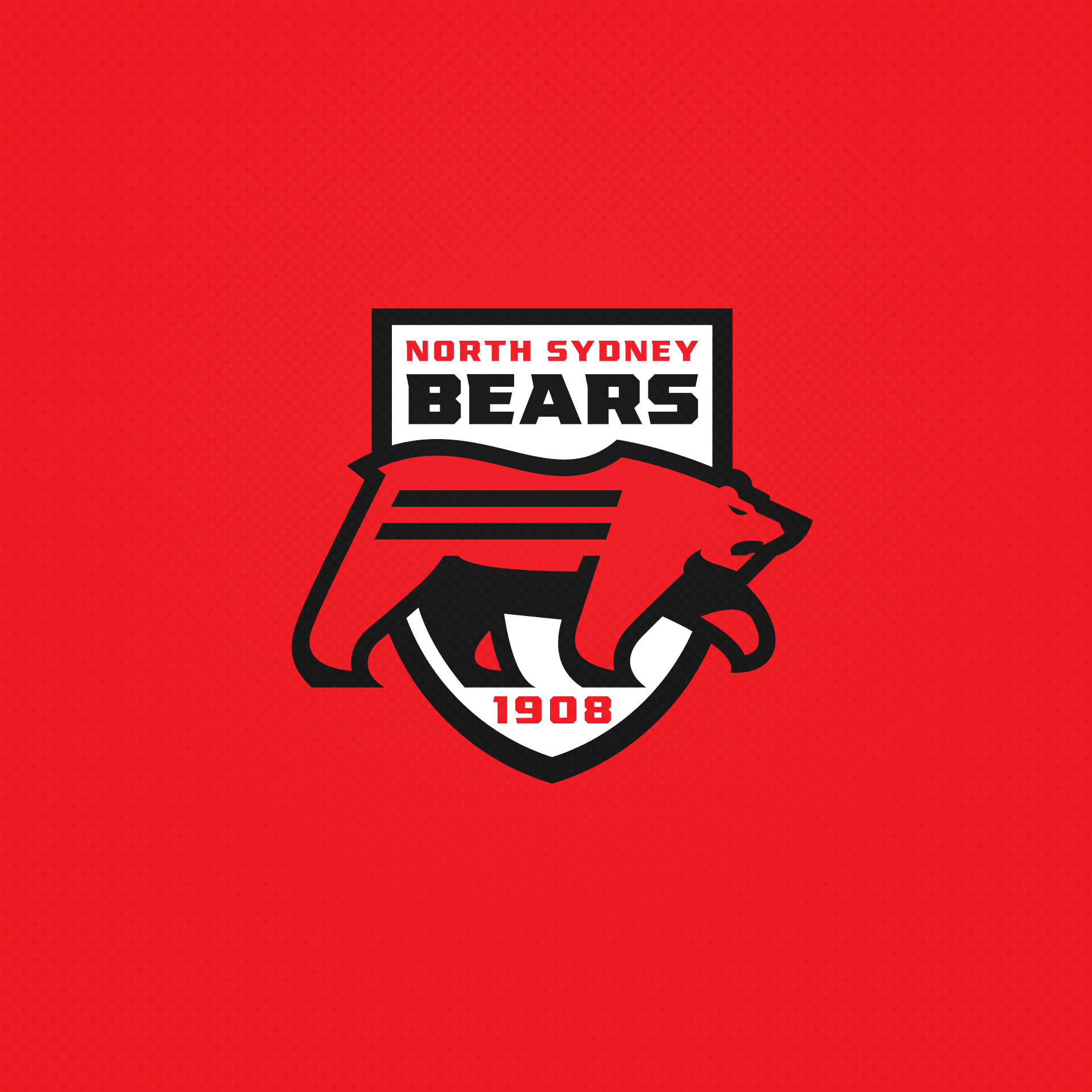
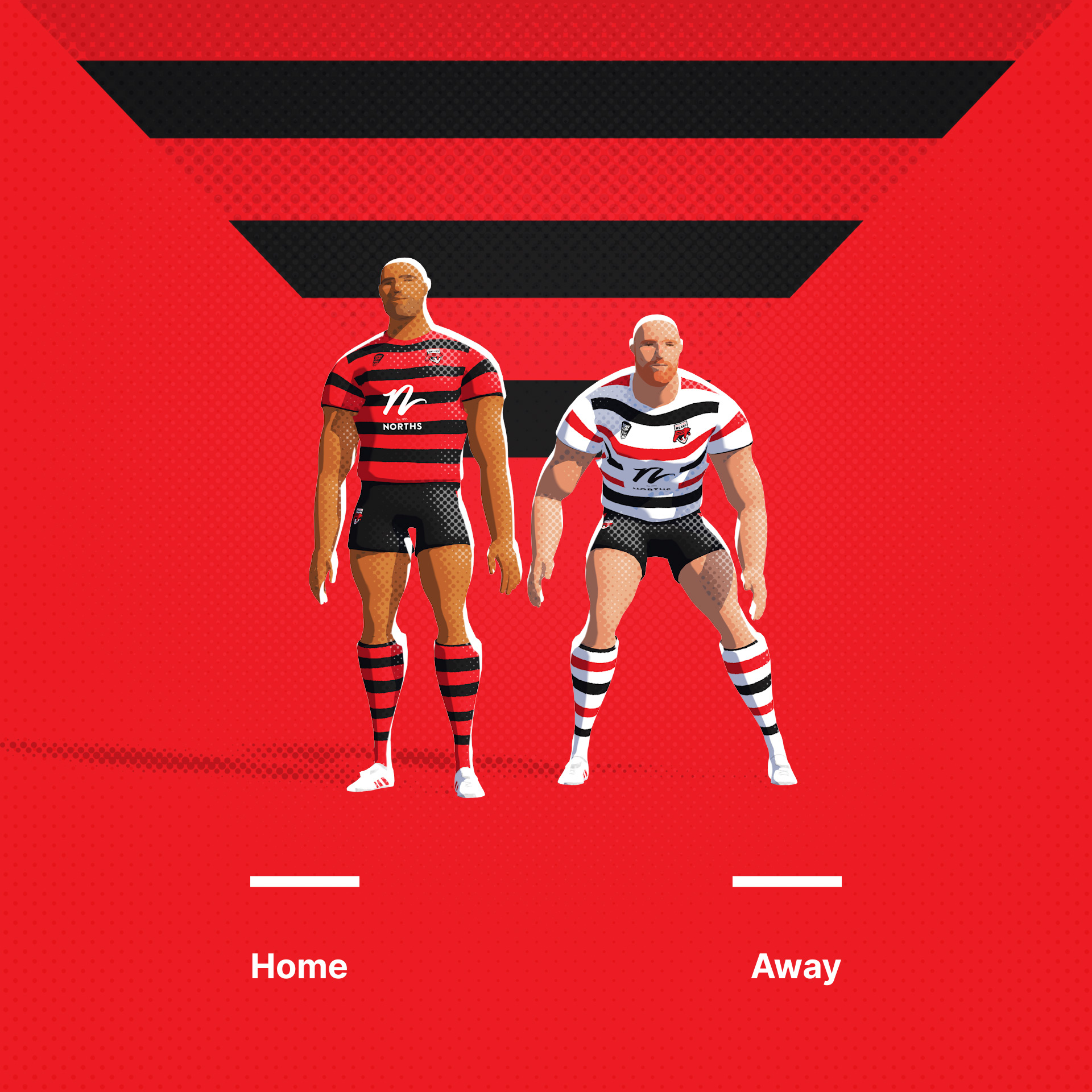
Burleigh Bears. One of two teams essentially currently sharing the same logo. This differenciates them from the North Sydney lot.
Original Logo
-
3
-
-
-
6
-
-
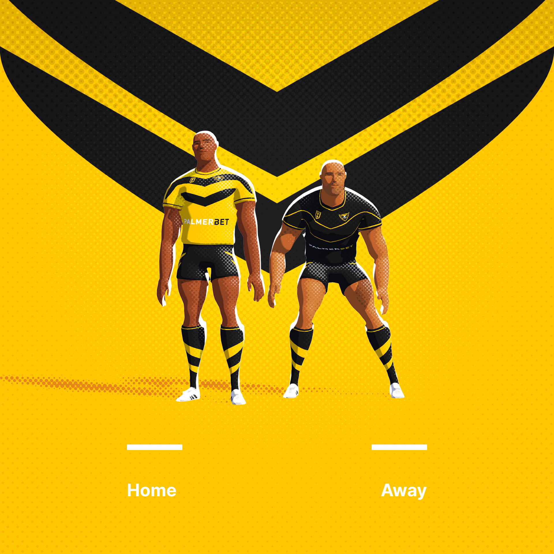
SC Falcons. Working the chevron into the logo. I have a loaf of spread winged birds now...
Original Logo
-
6
-
-
19 hours ago, LAWeaver said:
I don't know a thing about rugby but I know good design when I see it. Loving this series, top notch work as always.
Many thanks!
-
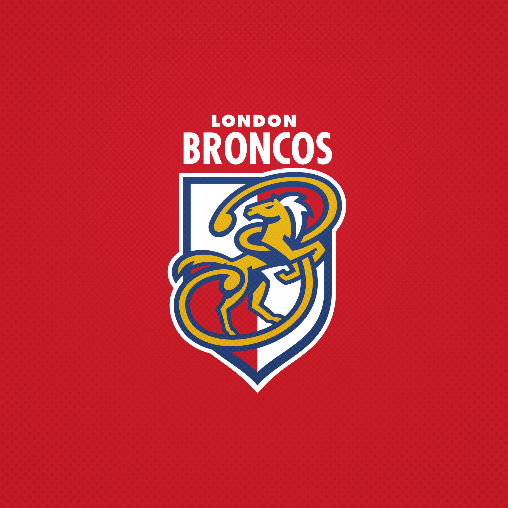
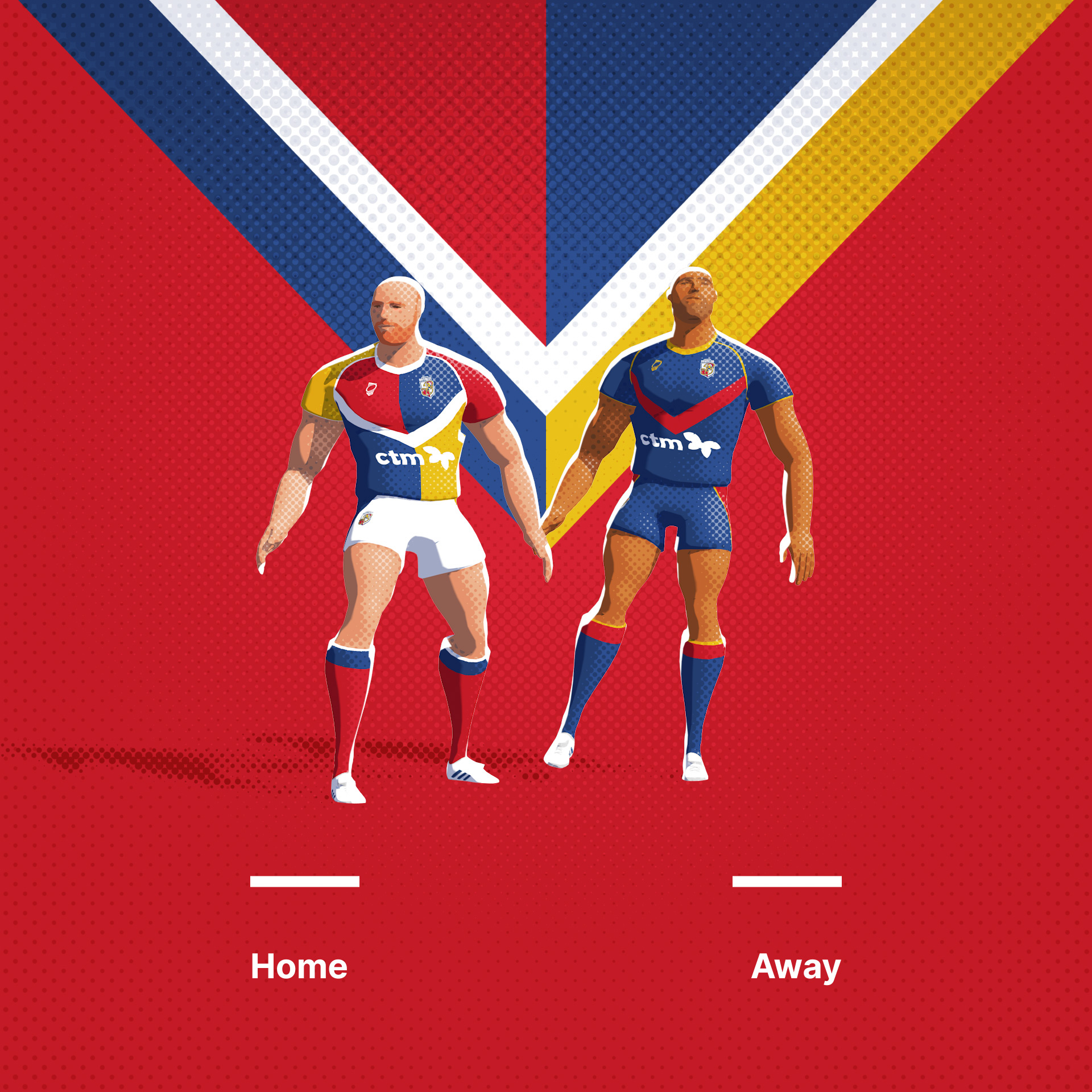
The London Broncos. Born in the mid 90's, the southern satellite to the northern game have consistently debased their brand since the outset. Have retuned to the primary colours and quarters look from 1996.
Original Logo
-
3
-
4
-
 1
1
-
-
-
4
-
-
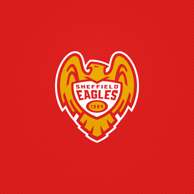
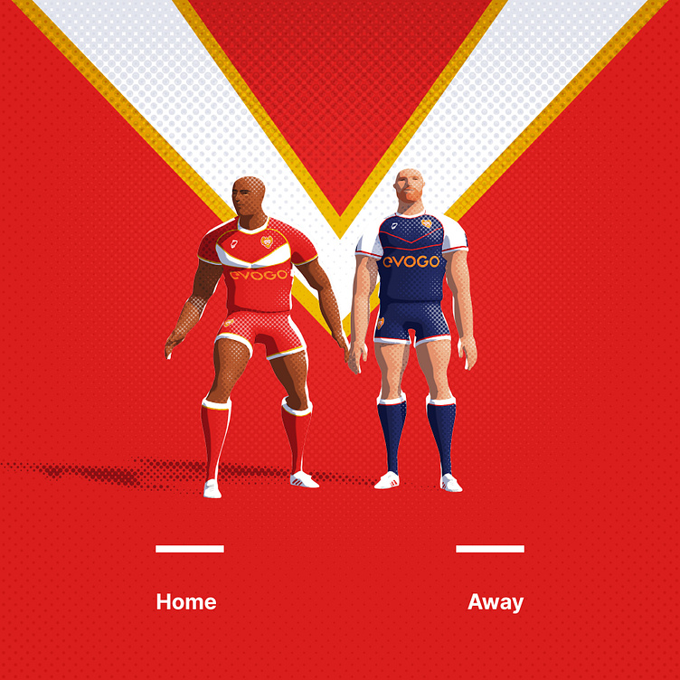
Sheffield Eagles peaked with a Challenge Cup win over Wigan in the 90s. This uniform set seeks to honour that old outfit.
Original Logo
-
3
-
1
-
-
-
5
-
2
-
-
-
5
-
-
8 minutes ago, raysox said:
that raiders logo is so sharp, I love the lighting and sharp angles. There's a lot of bad logos in the RFL Championship, so i'm excited to see where you take them
Haha, indeed there are! Thanks man.
-
The Norths Devils have a quite campy devil head mascot. Again, Im not a huge fan of mythical humans, so I've significantly reduced the complexity. As a side note, I'm continuing with this series into NRL level 2 teams of the QLD and NSW Cups.
Original Logo
-
1
-
-
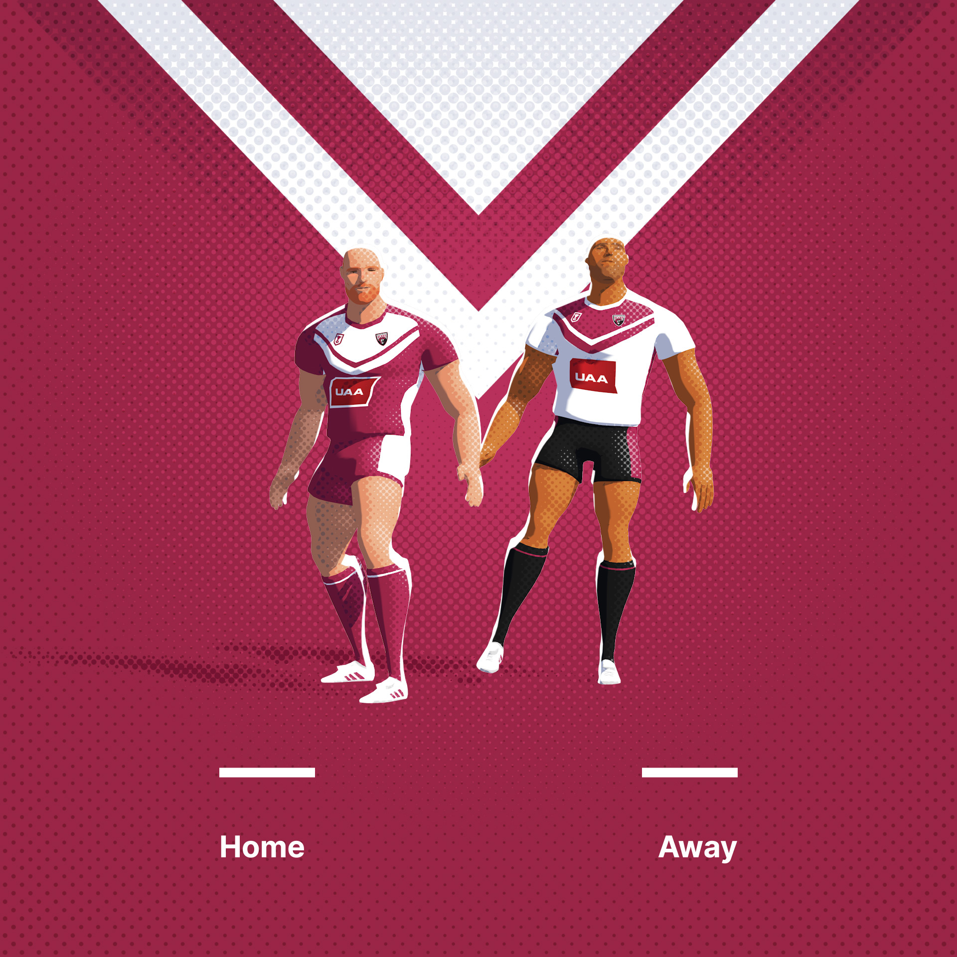
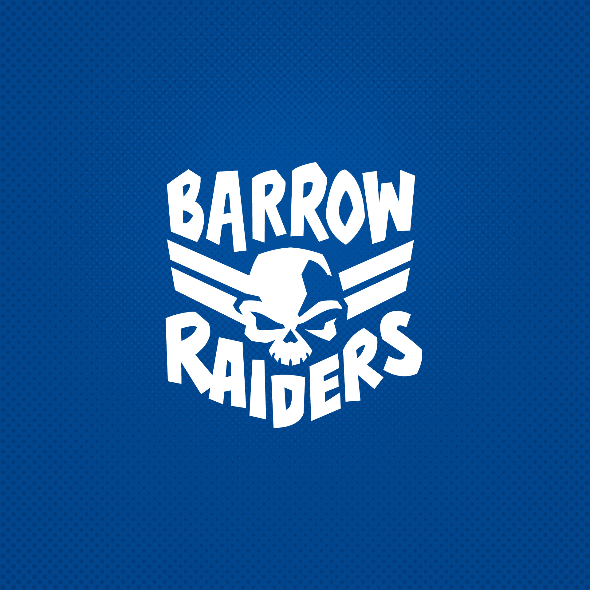
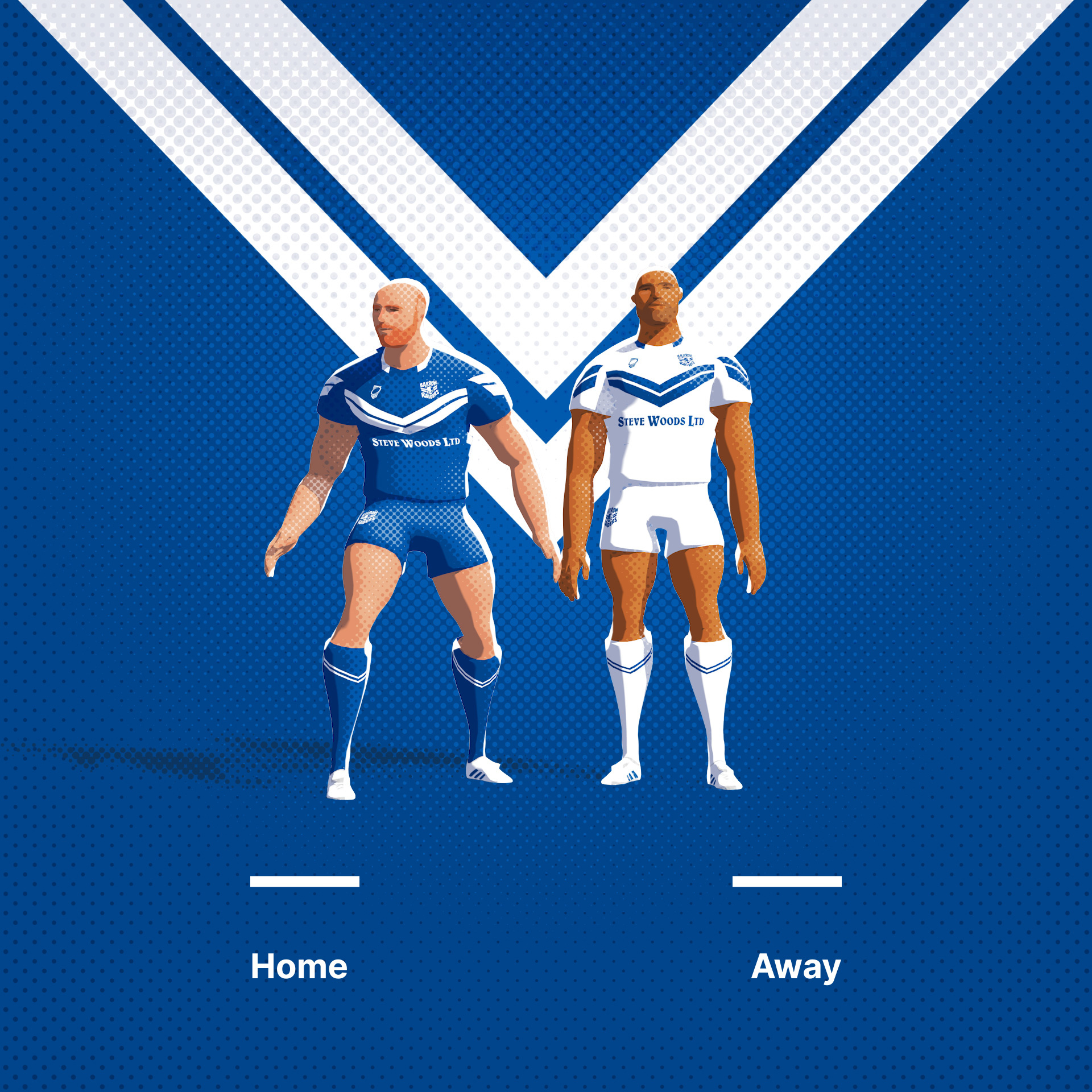
Okay, so I've really enjoyed this and I think I'll do one more league... The RFL Championship, the UK second tier. Barrow Raiders up first. Their current brand is really poor, so I went for something that featured some of the uniform and a new Raider mascot.
Original Logo
-
2
-
-
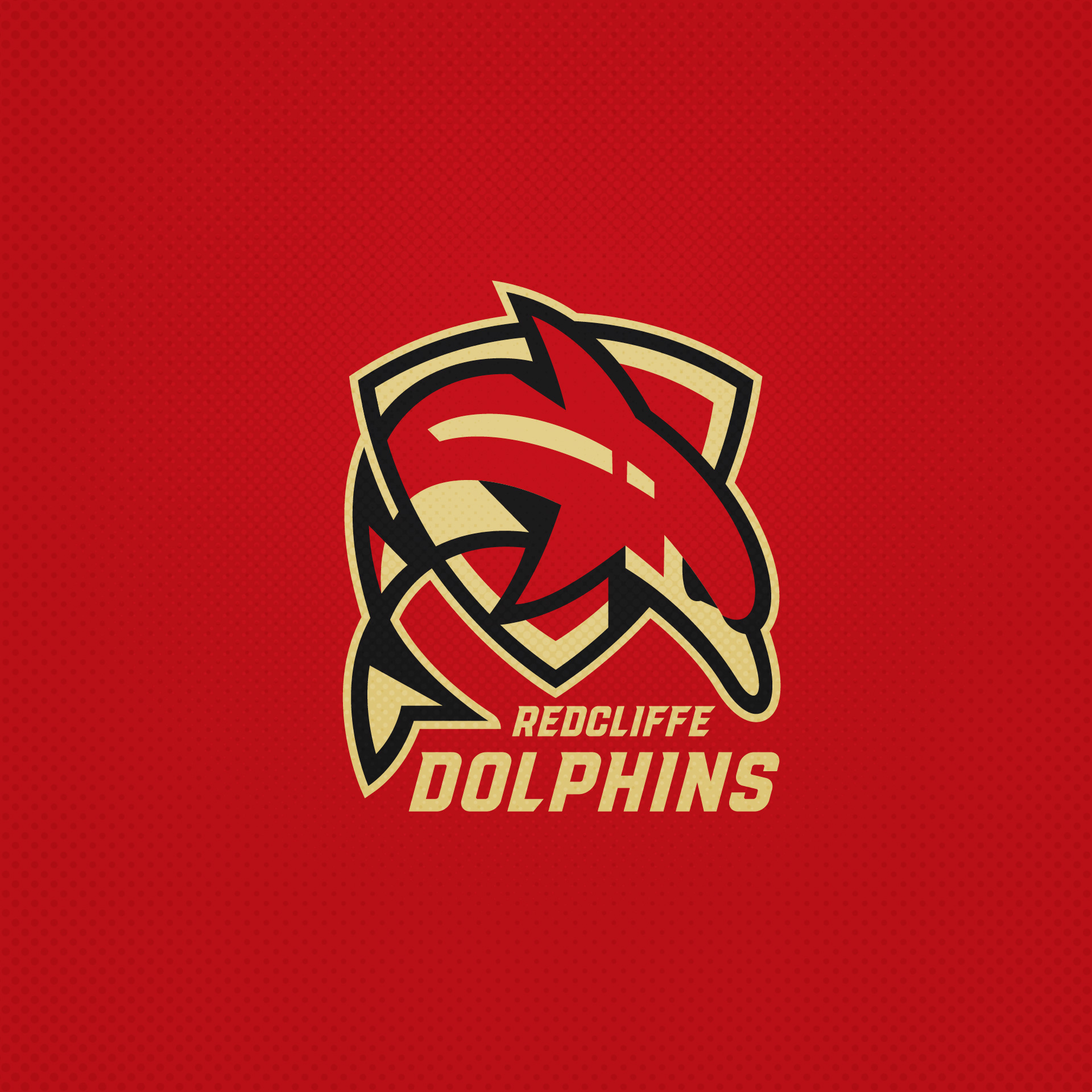
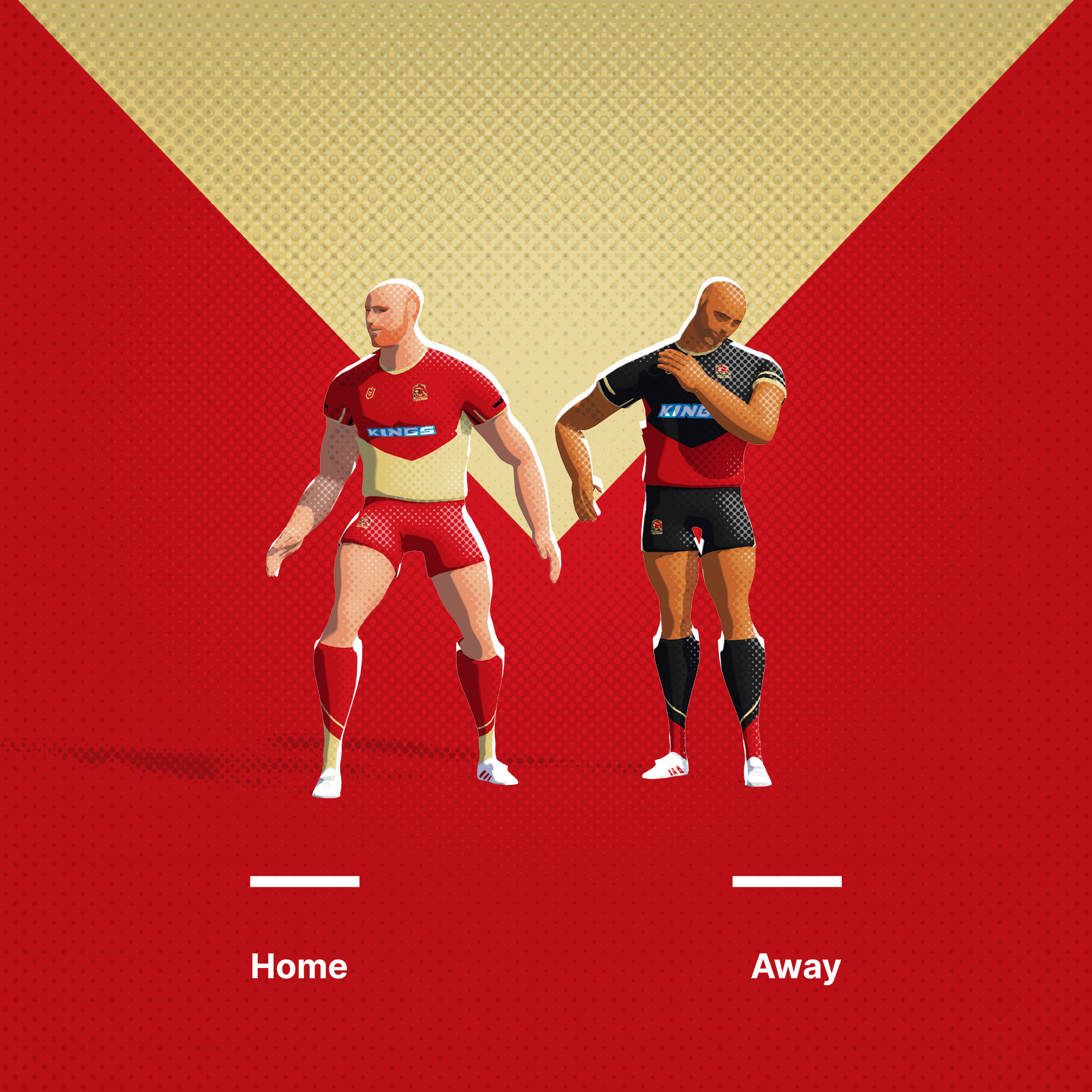
Dolphins (NRL). The NRL's newest expansion. For the purposes of this, I have named them for Redcliffe as I don't like a disembodied team... What they have presently is pretty terrible, I assume they are mid rebrand.
Original Logo
-
5
-
-
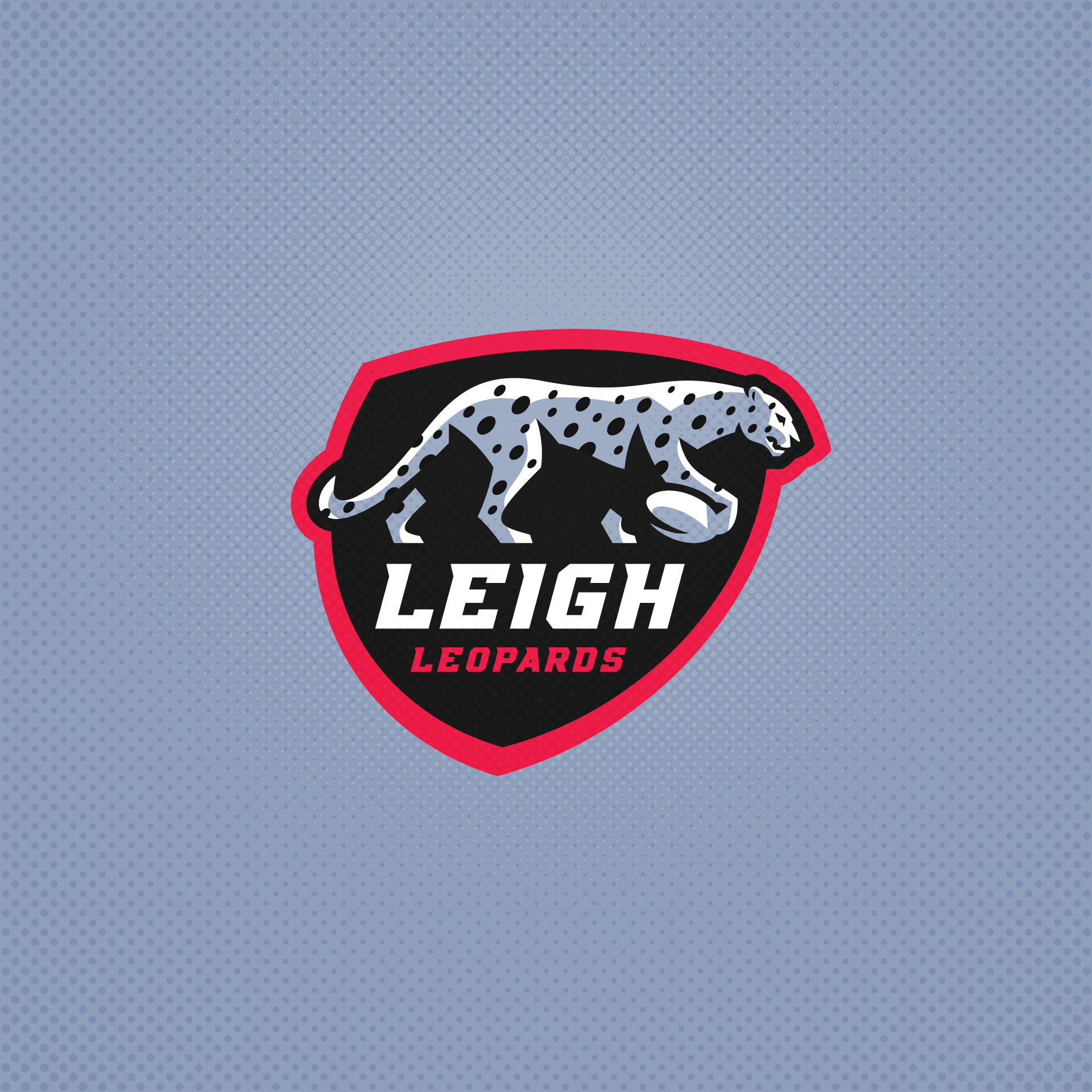
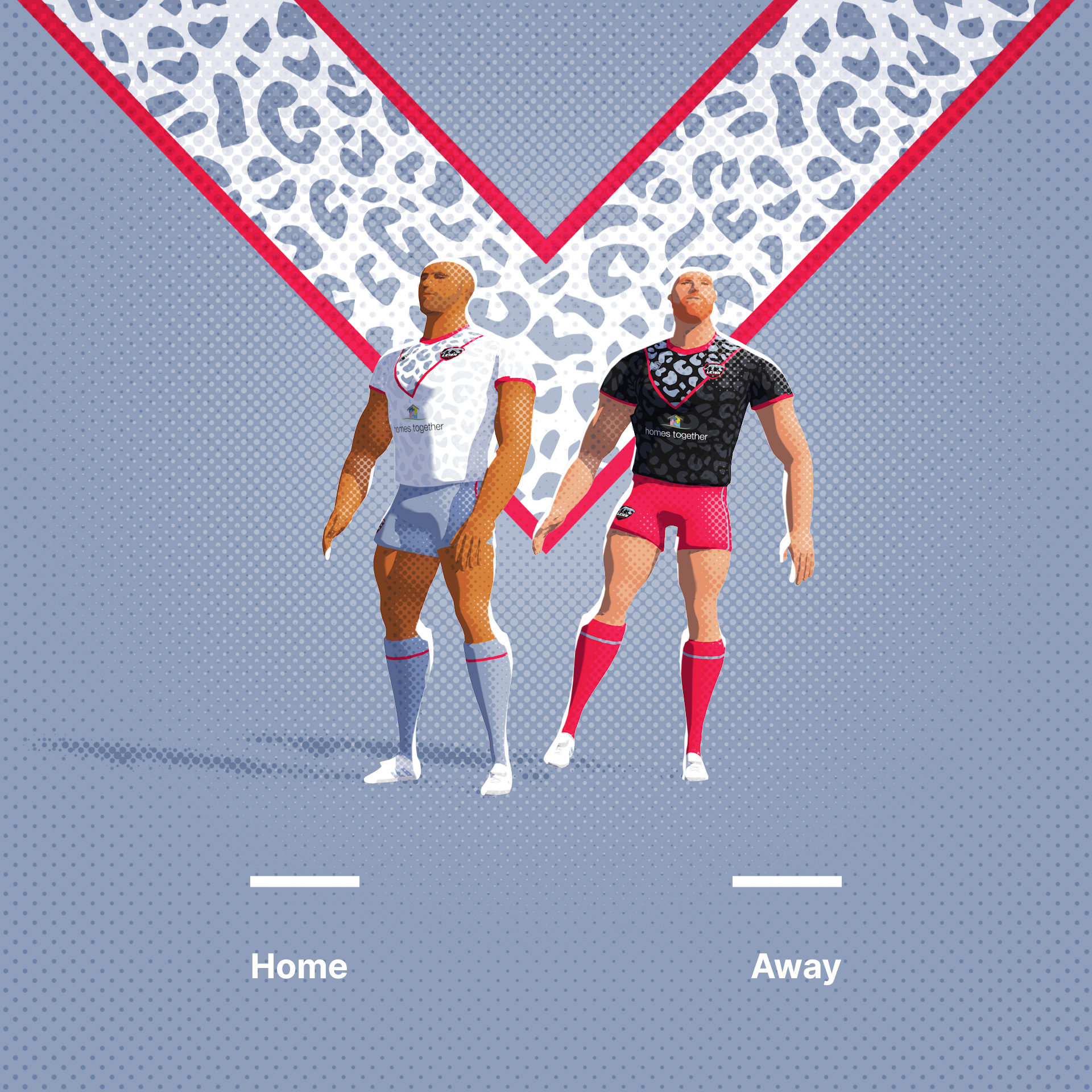
Leigh Leopards. Owned by a man with a penchant for leopard print. One of those sports brands that hangs off one man. The Al Davis and Oakland Raiders of the North of England.
Original Logo
-
6
-
1
-
3
-
-
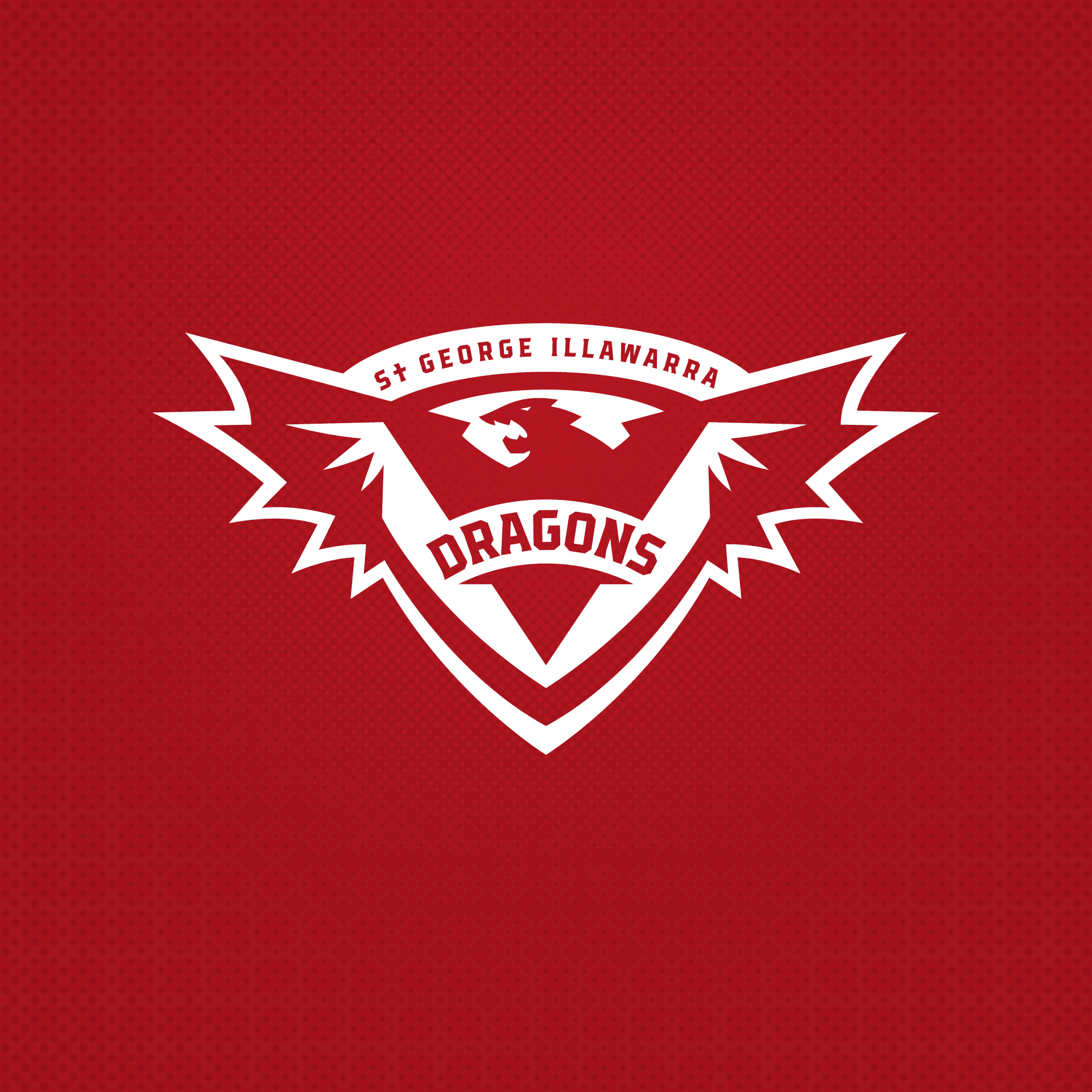
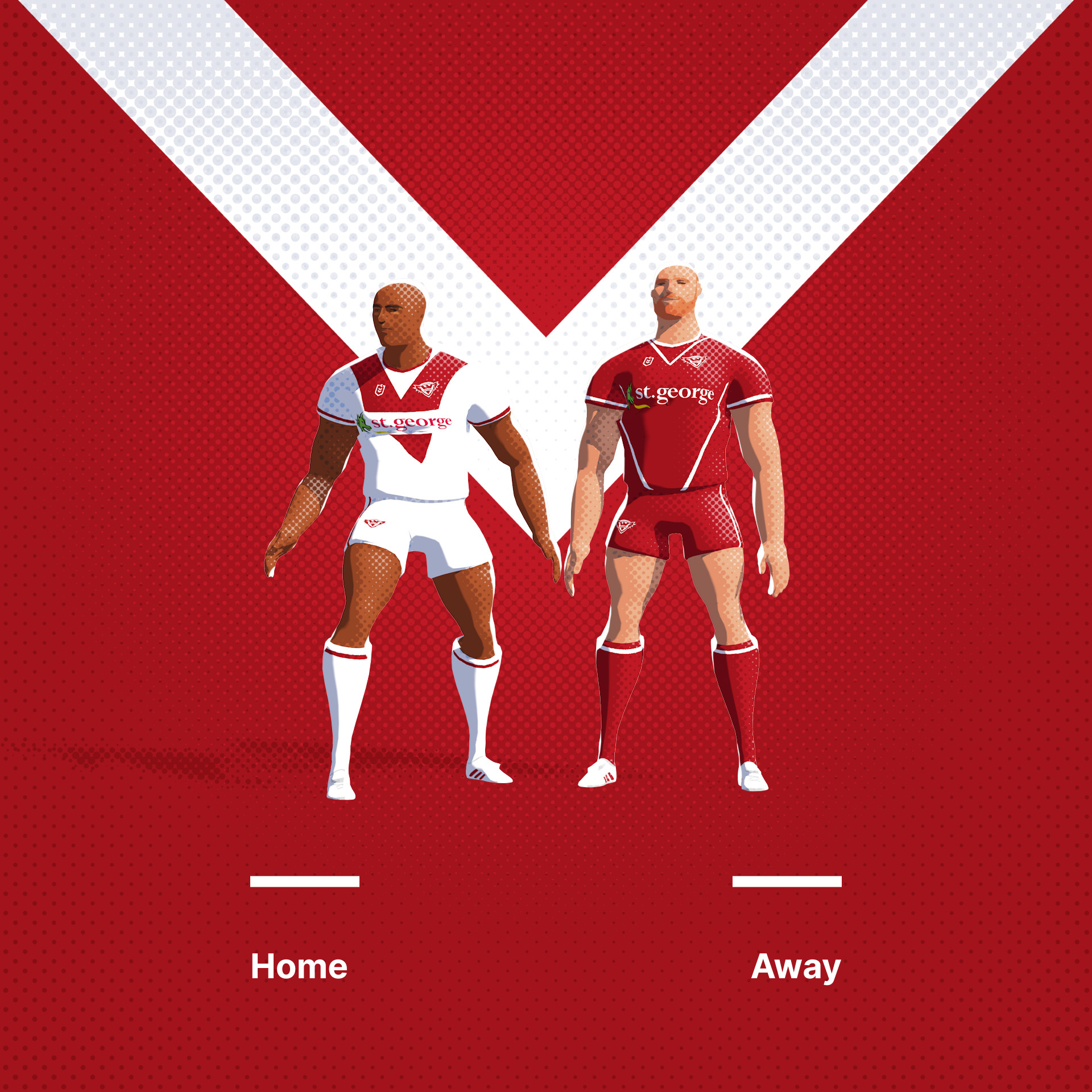
St George Illawarra Dragons. Dragon, shield and V. The type is difficult to jam in there.
Original Logo
-
3
-
-
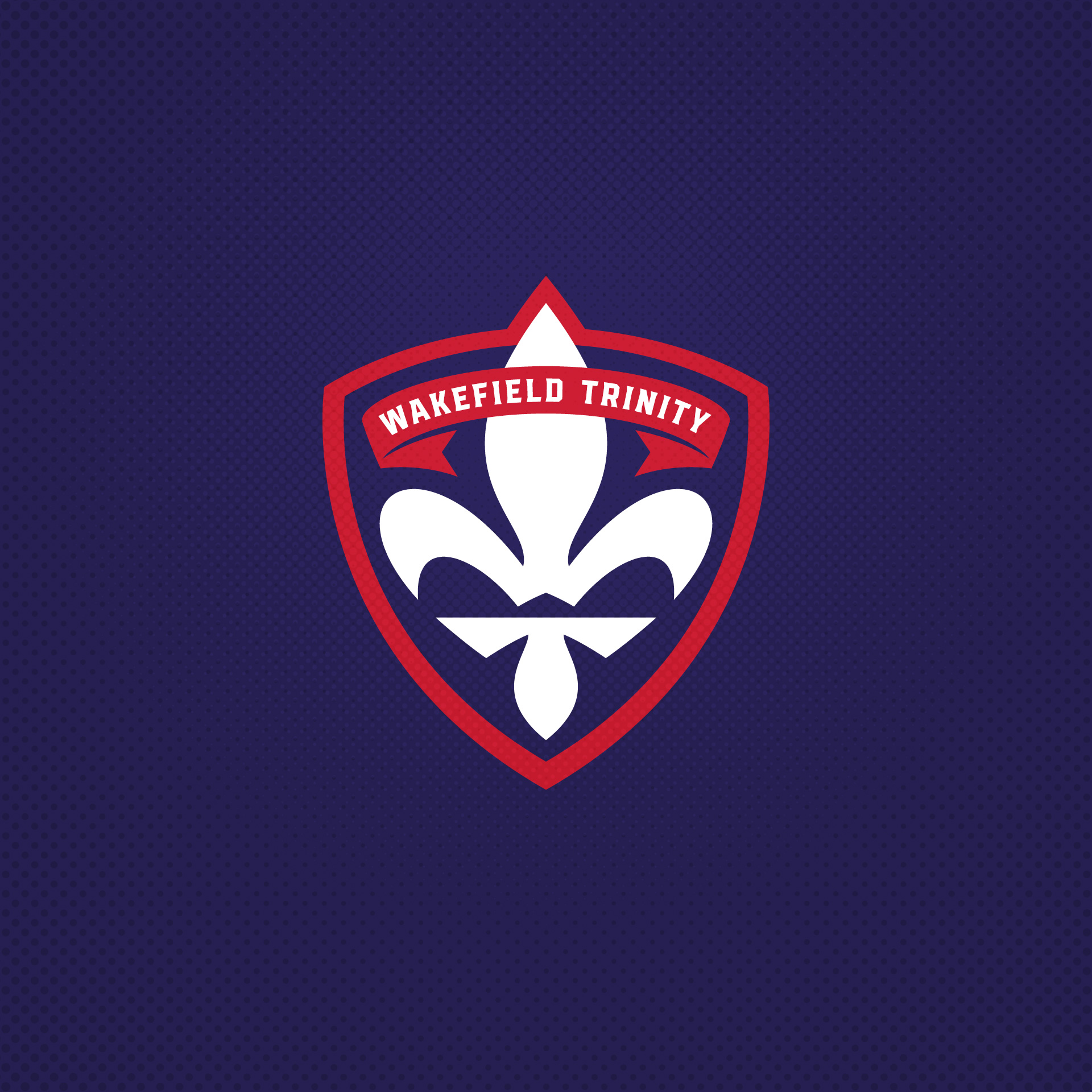
Wakefield Trinity. Again, I have stolen the easter egg from the current version of the logo, so this is very much just a revisit and an attempt to incorporate the type differently. I think the T is a bit clearer, but the W may be less so.
Original Logo
-
4
-
1
-
-
5 hours ago, VampyrRabbit said:
Penrith is great. The Panther looks a lot better in a different art style and off the roids.
Haha, yeah, its a bit crazy the current one, eh.
-
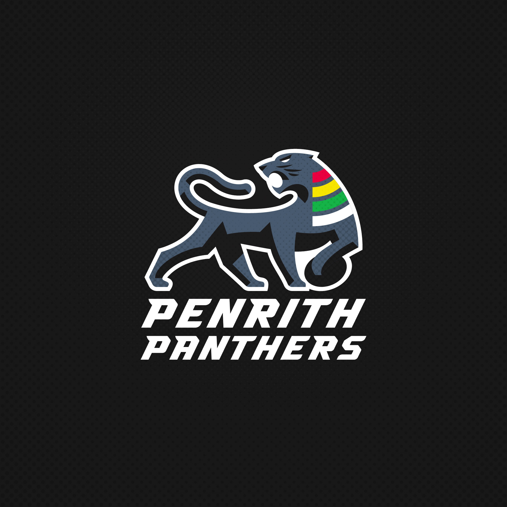
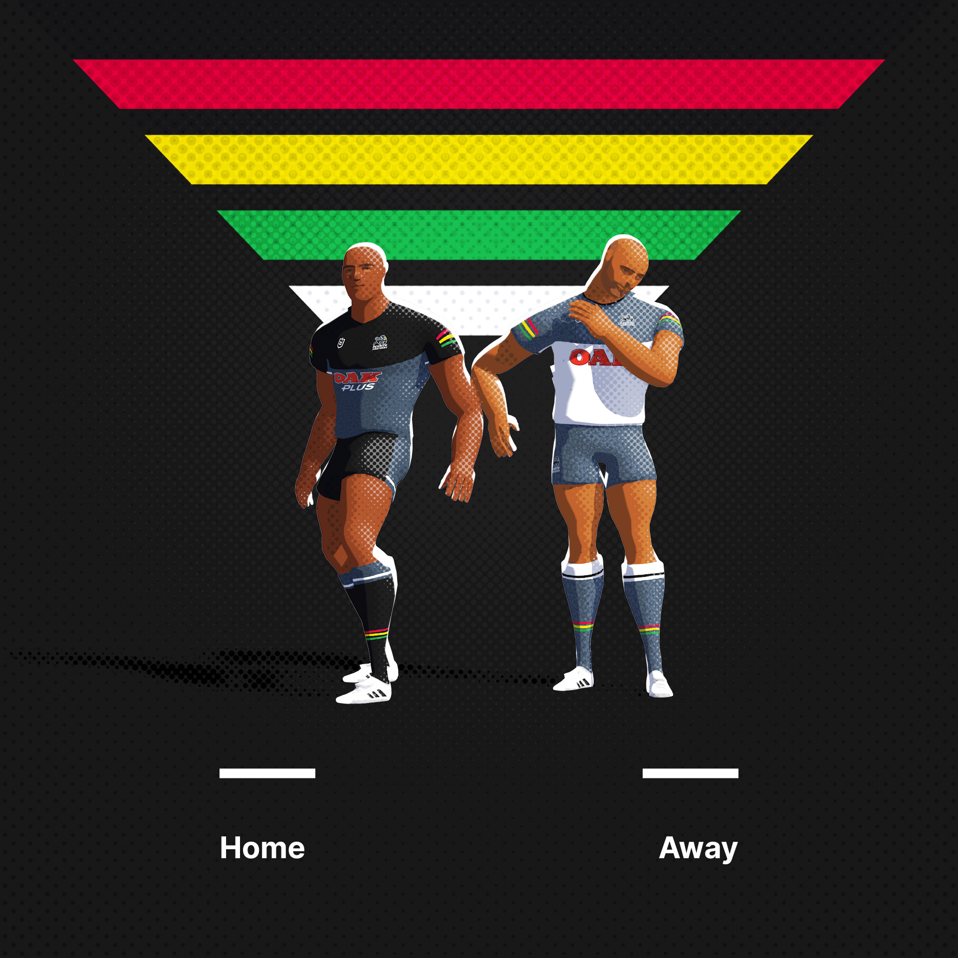
Penrith Panthers. I wanted to establish a secondary dark colour between the black and the primaries. It also helps define the shape of the Panther.
Original Mark
-
7
-
1
-


Rugby League Branding Exercise
in Concepts
Posted
Western Suburbs Magpies. A bit of negative space to use the very limited palette.
Original Logo
Western Suburbs Magpies