


Davidson
-
Posts
2,307 -
Joined
-
Last visited
-
Days Won
4
Posts posted by Davidson
-
-
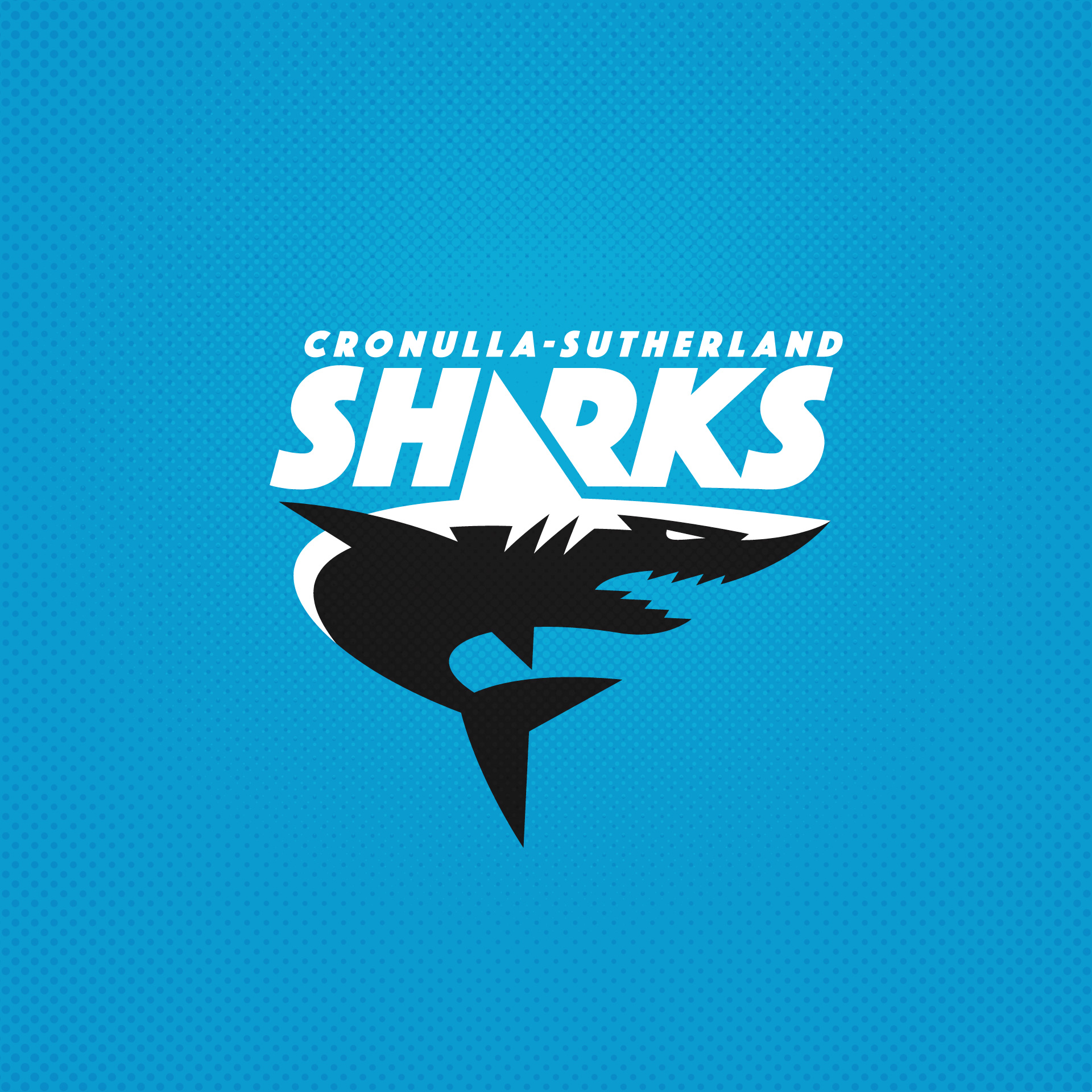
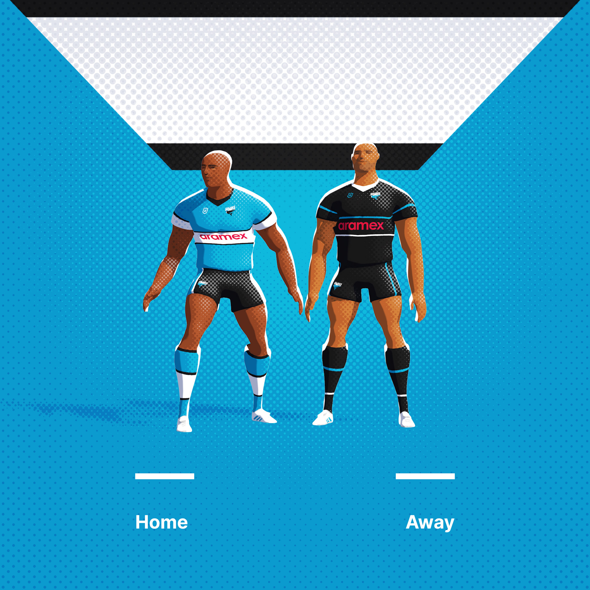
Cronulla - Sutherland Sharks today. Not an original logo/type lockup concept, but I wanted to make it work here and give the overall shape a crest outline. I like the idea of using the colours of the logo rather than a keyline to create separation using a few colour ways.
Original Logo

-
 5
5
-
 2
2
-
-
Thanks for the feedback guys, I'm glad people have enjoyed these. Next up, it's St Helens. The Saints play in the English (and a bit French) Super League and current World Club Champions.
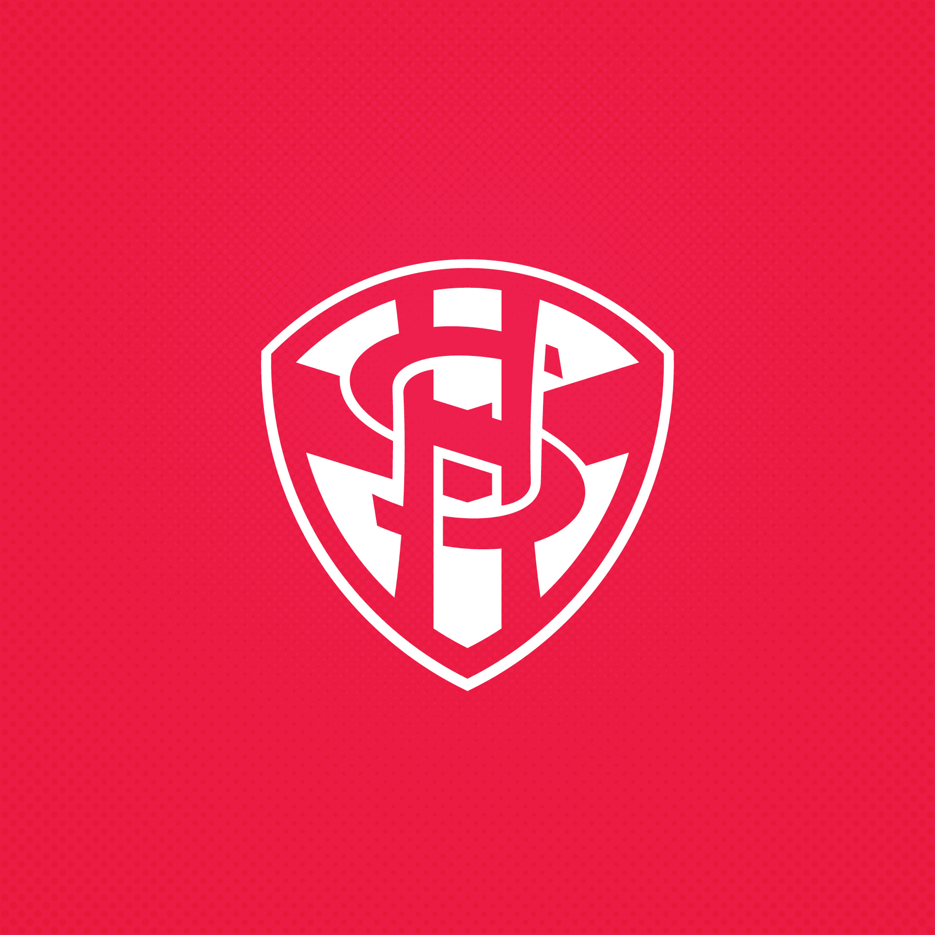
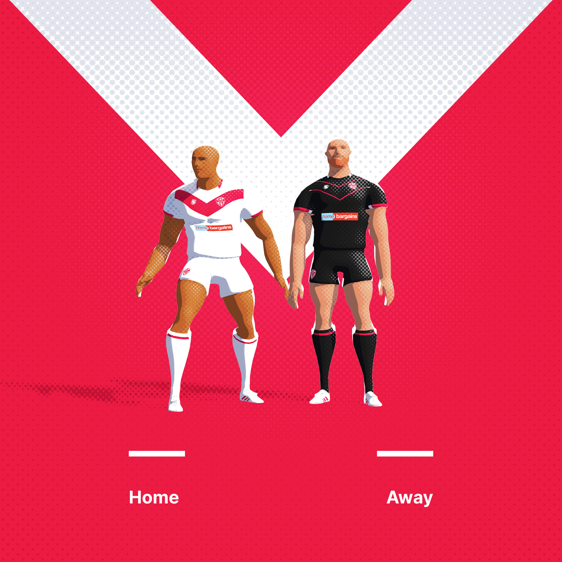
St Helens RLFC logo suffers slightly from the Liverpool FC crest (from just down the road) in that it has grown in size and complexity as a series of outer crests have been added to the original.
This design comprising just the core brand elements of the monogram and the chevron from the jersey seeks to reduce it back to a simple original look.
Original Logo
-
4
-
1
-
-
1 minute ago, the_grateful_ted said:
Outstanding can’t wait to see more! Wouldn’t be surprised if that roosters concept is still my favorite when the series gets wrapped up

Ha, damn. It's my favourite, thats why I posted it first. Enjoy the downhill slope...
-
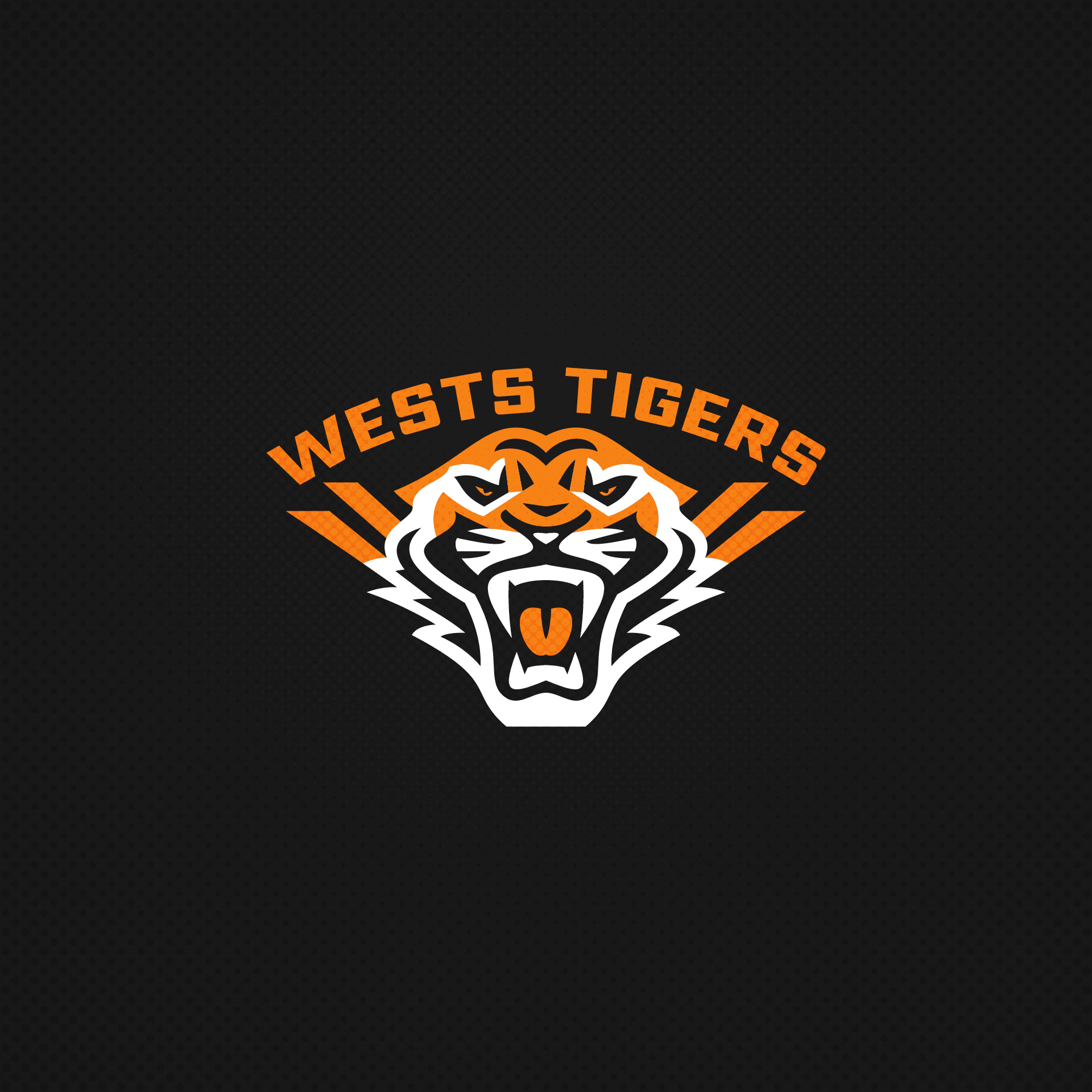
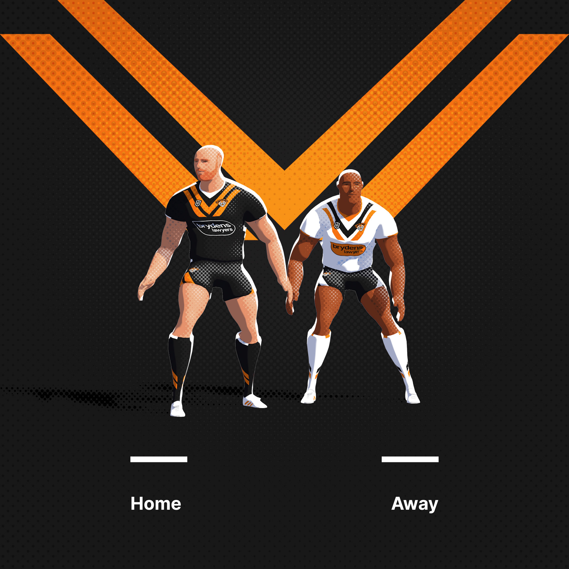
Next up, the Wests Tigers, a unification team comprised of the Western Suburbs Magpies and the Balmain Tigers. I can't take much credit for this logo as its mostly an evolution of the original.
Original Logo
-
6
-
1
-
-
Hello CCSL,
Been a while since I was last here, ten years it seems!
I have moved away from sports branding in recent years as I have been running an animation company.
We work a great deal in sports (we work with F1, the NFL, Canadian Olympic teams, Rugby, Baseball, Basketball etc), but I have had little chance to work in sports branding in recent times.
Recently I have wanted to get more involved in sports design and as such decided this month (with a little down time) that I'm going to work on a small project.
This project brands all the top grade footy teams of the NRL and Super League (domestic Rugby League competions of Australia and the UK). I hope you enjoy, I'm trying to post one a day.
Click on the team link to take you through to Dribbble to see the accompanying animations for each team. Stills of the Logo and Uniform, I'll post here. I hope you enjoy.
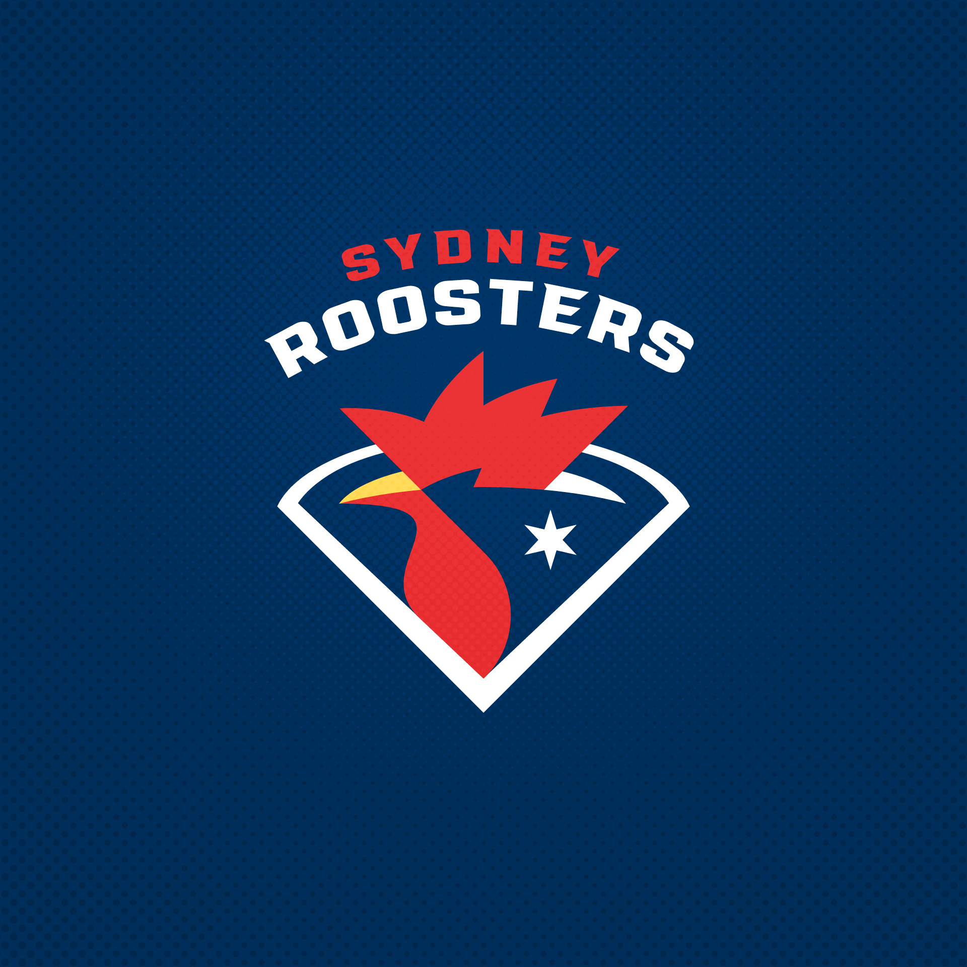
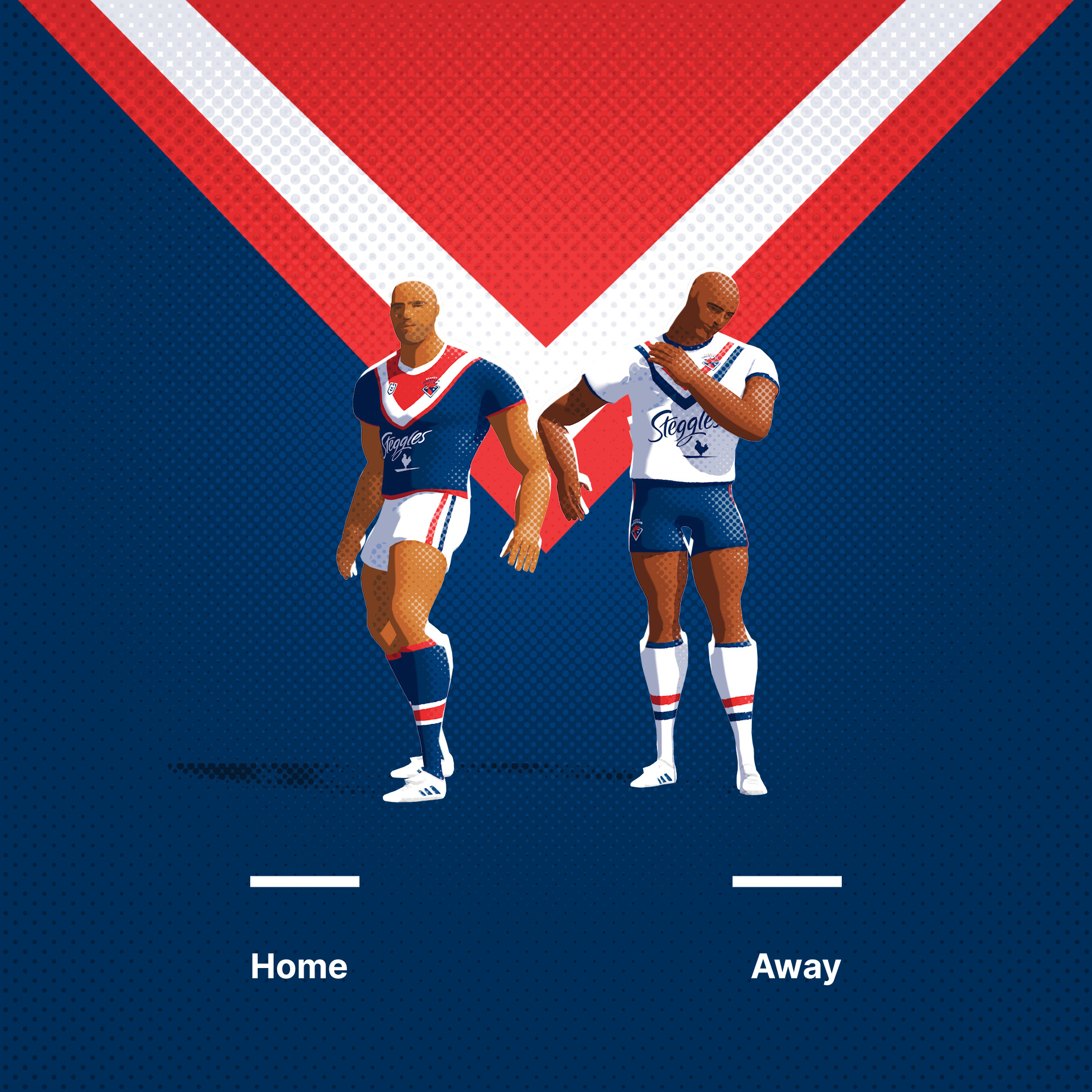
First up, the Sydney Roosters, bonus points for identifying the local icons.
Original Logo
-
8
-
1
-
 2
2
-
-
Ah, I'm touched. This will go with my Bafta.
-
6
-
-
Not a full uniform, but...

The somewhat infamous original logo for the Jacksonville Jaguars, bound to be the franchise's primary logo but unused due to a potential lawsuit by Ford.
Actually, this logo of a jaguar looked to much like Jaguar's jaguar so in actuality, Jaguar had beef with the Jacksonville Jaguars jaguar logo.
...and who owns jaguar?...
Tata Motors
true that. till 08 and at the time of the jags, twas ford.
I know. I was attempting to be a smart ass.
Interesting how Jaguar went from being owned by a bunch of asses to being owned by boobies.
its sad, this is the way the entire british car industry has gone.
jaguar - tata
land rover - tata
mini - bmw
bentley - vw
aston martin - still sort of british but owned by kuwaiti consortium
mclaren - daimler and ron dennis and tata
tvr - russian guy
mg - Nanjing Automobile Group
only car manufacturers left are bristol caterham, morgan, nobel, ascari and a few others even ive never heard of.
-
Not a full uniform, but...
The somewhat infamous original logo for the Jacksonville Jaguars, bound to be the franchise's primary logo but unused due to a potential lawsuit by Ford.
Actually, this logo of a jaguar looked to much like Jaguar's jaguar so in actuality, Jaguar had beef with the Jacksonville Jaguars jaguar logo.
...and who owns jaguar?...
Tata Motors
true that. till 08 and at the time of the jags, twas ford.
-
Not a full uniform, but...
The somewhat infamous original logo for the Jacksonville Jaguars, bound to be the franchise's primary logo but unused due to a potential lawsuit by Ford.
Actually, this logo of a jaguar looked to much like Jaguar's jaguar so in actuality, Jaguar had beef with the Jacksonville Jaguars jaguar logo.
...and who owns jaguar?...
-
not sure where to put this, but this seemed like as good a place as any.
here is a link to quiet a decent (free) vector football template.
-
okay, so not the worlds best example but this is how i do it.
quick sketch of the face and then block it in.
kneck, chin and jaw
eyes
nose and those lines around your mouth and
mouth and detail.
its impossible to just draw a face from just the shapes. you need some sort of a sketch.
well i do anyway.

-
no idea what mesh objects are. the sad fact is i reckon you need to do a bit of drawing. not too much, just basic facial structure. nose, brow, eyeline, chin and cheeks etc. that helps.
i started drawing myself in the mirror and then seeing how simple i could make the shapes and still have them recognisable. ill try and do a tutorial or something helpfull
at some point.
-
OK...here's what i would like help with if someone would like to take the time to show me.
I've been seeing this effect done on various things like the NHL logo's and what not...i'd like to know how to achieve that look.
Here's an example of what i'm talking about incase anyone is lost...

well people achieve the so called web 2.0 'look' a few ways. in this case, the overleyed shape is on the bottom
and is the rectangle with the concave edge.
its an overlay with a black to mid grey gradient with an overlay transfer mode.
you see this sort of thing with screens and multiply gradients too.
-
Does any know where I can go to find Illustrator cheap? The disc that I dug up a little while back was no good and the program wouldn't load.
Or is anyone willing to sell and old version of Illustrator they don't need anymore?
I just fool around with making logos and stuff in my spare time so I'm not really looking to make the investment required to get the newest version.
If anyone is interested you can PM me or e-mail me at: undergrounddyer@yahoo.com
Thanks.
download inkscape instead. ive tried it. seems good for free.
-
you dont need to offset it. just stick outer outlines below inneoutlines if you catch my drift.
-
draw an obect around the bit you want to remain visible. select both (making sure the mask is on top) and hit ctr or apple and 7. roberts your mothers brother, its masked.


Rugby League Branding Exercise
in Concepts
Posted
The Leeds Rhinos. A simplification on the theme. I wanted to reduce the complexity of the current mark because... when you're a hammer, every problem looks like a nail, I guess?
Enjoy! I have added current /original logos to previous posts for context.
Original Logo
Leeds Rhinos