


Davidson
-
Posts
2,307 -
Joined
-
Last visited
-
Days Won
4
Posts posted by Davidson
-
-
A take on the Parramatta Eels. Such a cool mascot. I like their use of a historic logo, but I wanted to wrap one round a shield.
Original Logo

-
 6
6
-
-
13 minutes ago, raysox said:
This latest one is really smart, could see it as a genuine alternate logo to the current brand.
Thanks dude, much appreciated.
-
3
-
-
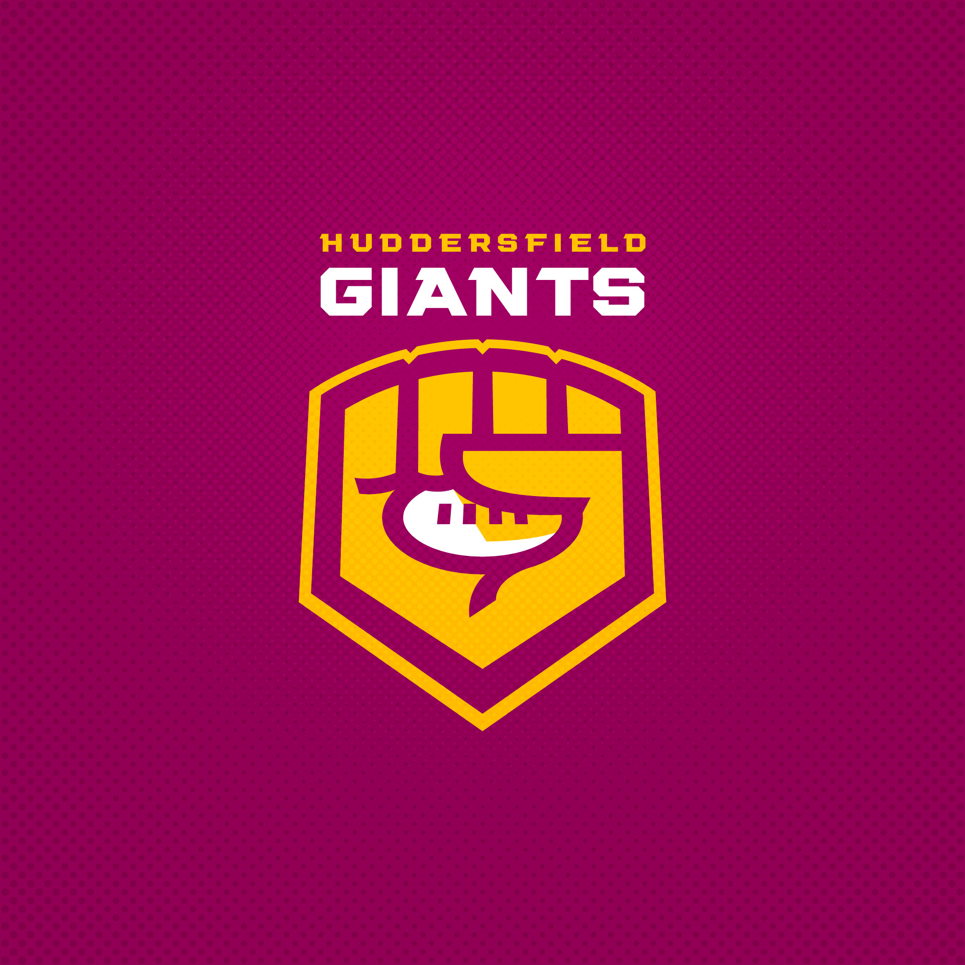
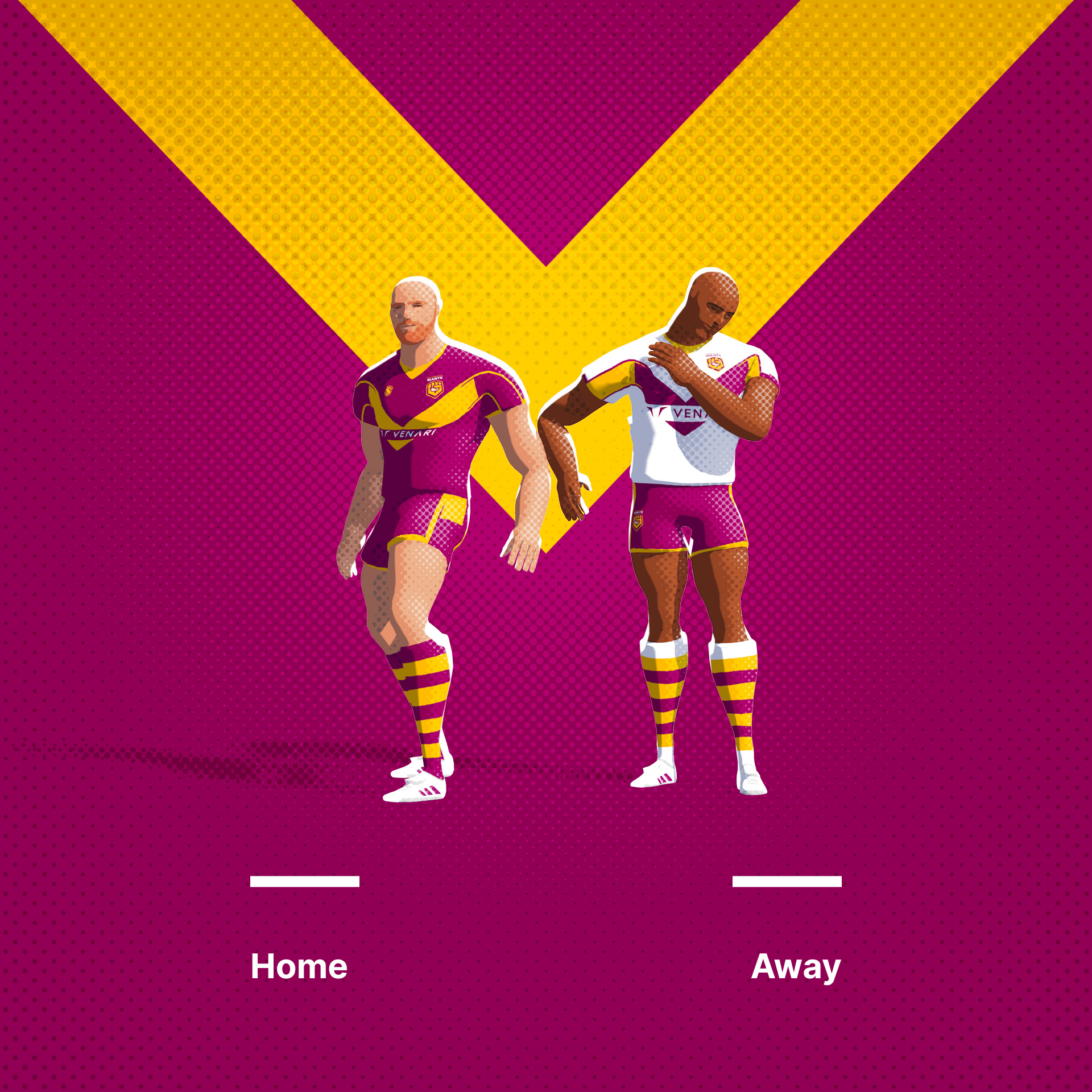
Huddersfield Giants. I always find depictions of mythic creatures like giants a bit awkward, so I thought I'd try and work a letterform into something that depicted enormous size.
Original Logo
-
8
-
 1
1
-
 1
1
-
-
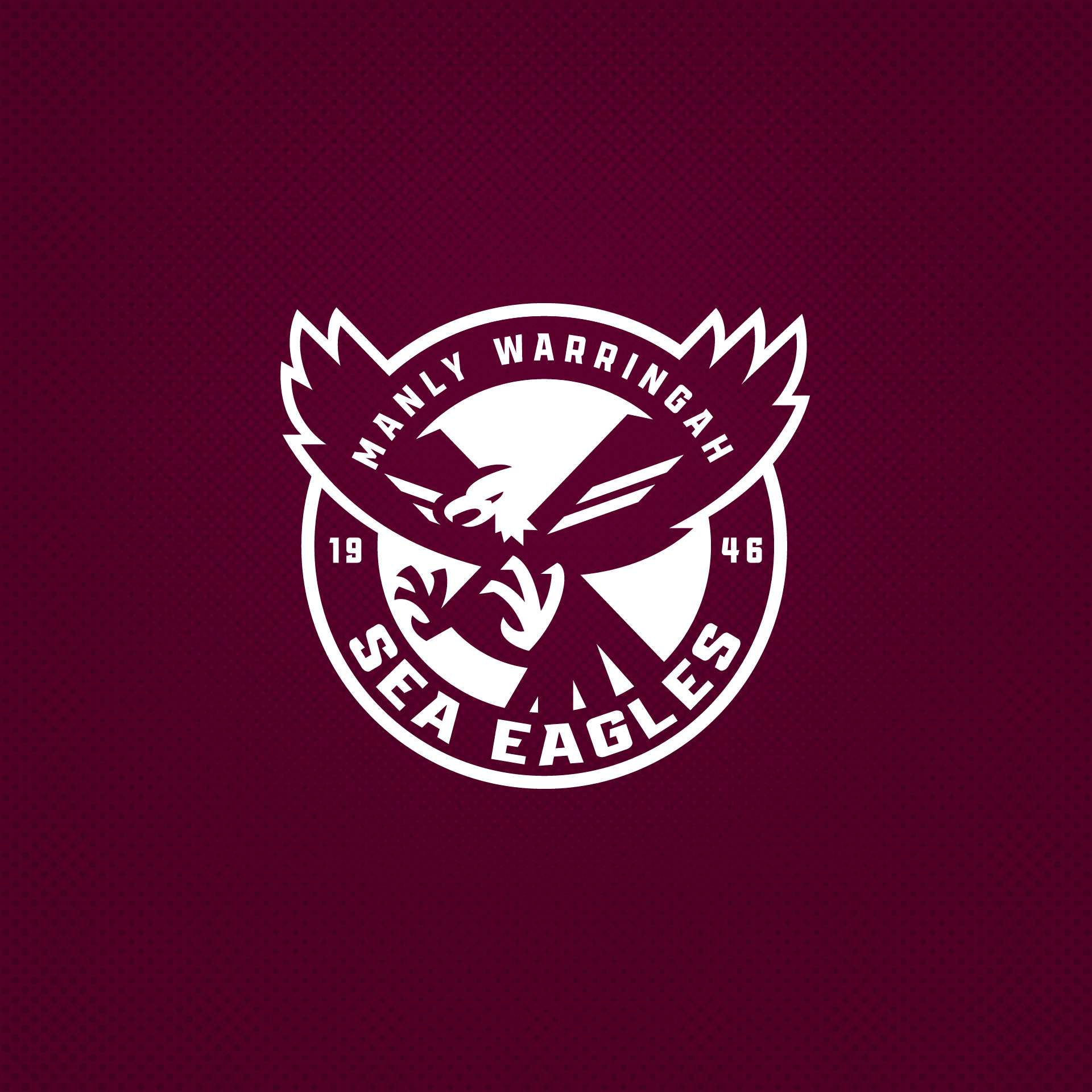
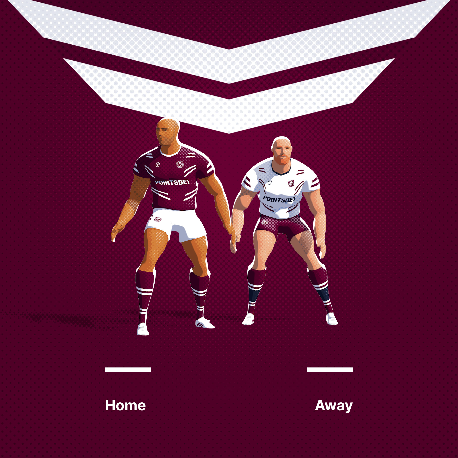
The Sea Eagles logo contains a vast amount of type, is top heavy and over-relies on a rondel. This one is no different. Enjoy. NB, interestingly, they seemed to have changed their logo of 25 years just 3 days ago!
Original Logo
-
7
-
1
-
-
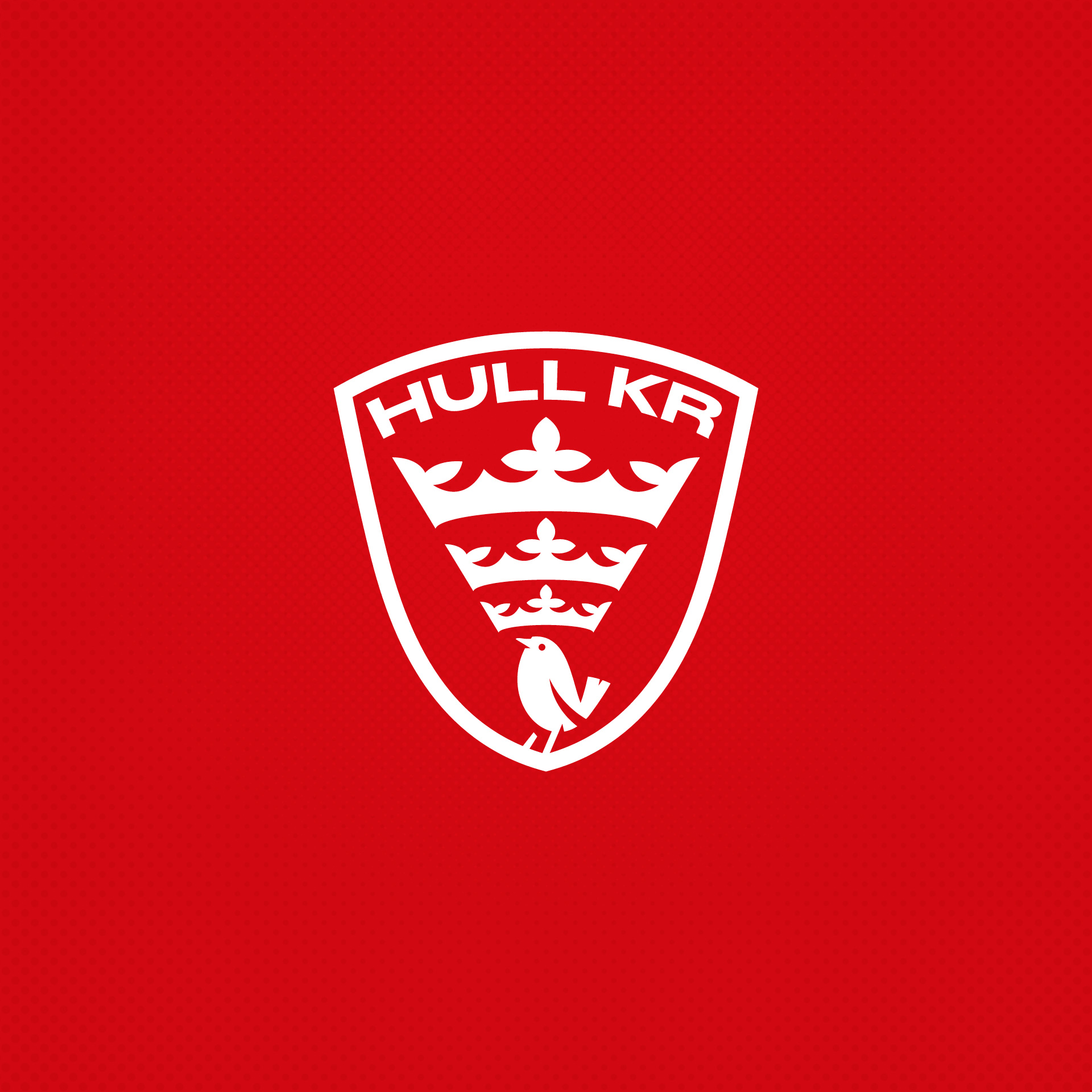
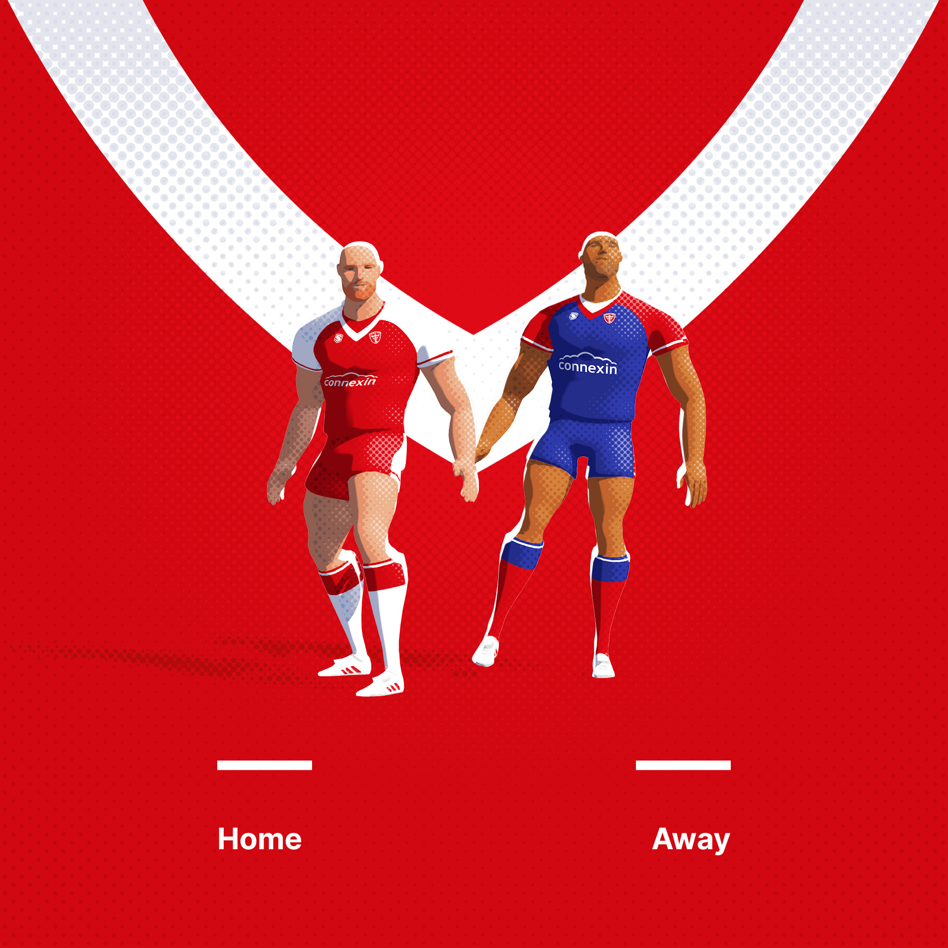
Kingston Rovers are slightly the 'other' team from Hull. Their current logo is great and this is really a weaker version. I did want to feature the actual Robin mascot however.
Original Logo
-
4
-
1
-
-
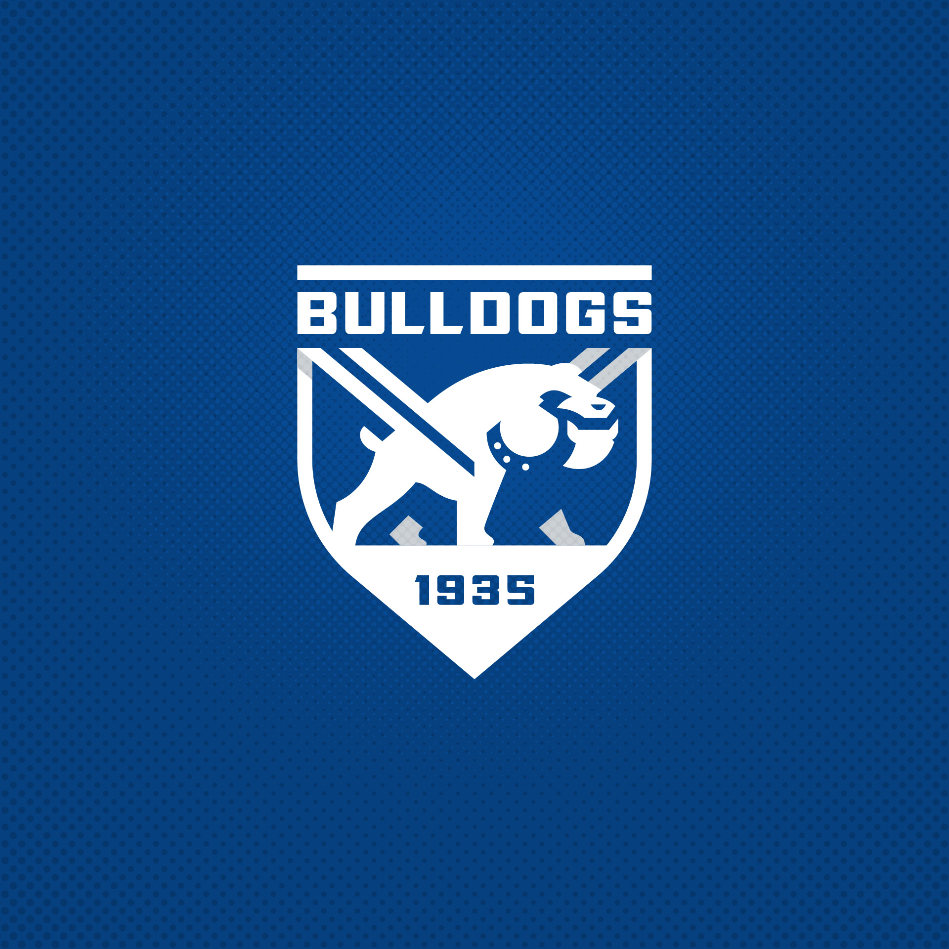
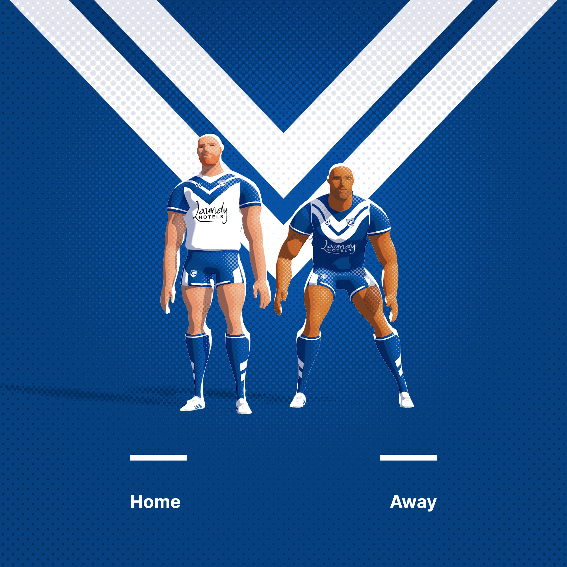
Canterbury-Bankstown Bulldogs. I wanted to incorporate the v-neck into the dog himself. Mixed results.
Original Logo
-
2
-
1
-
-
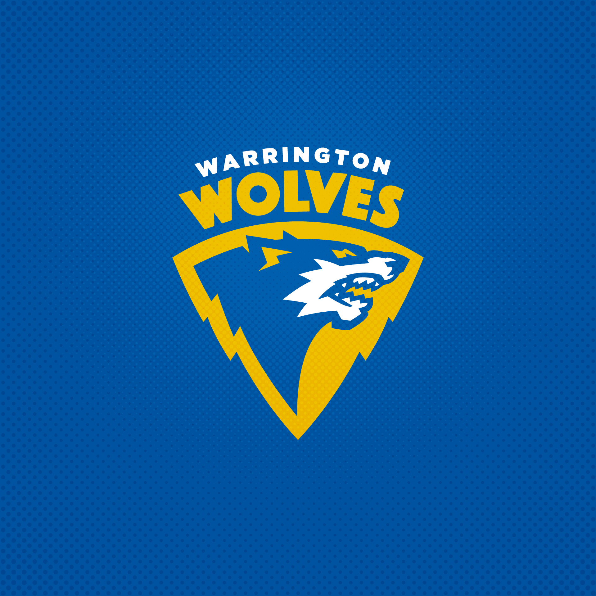
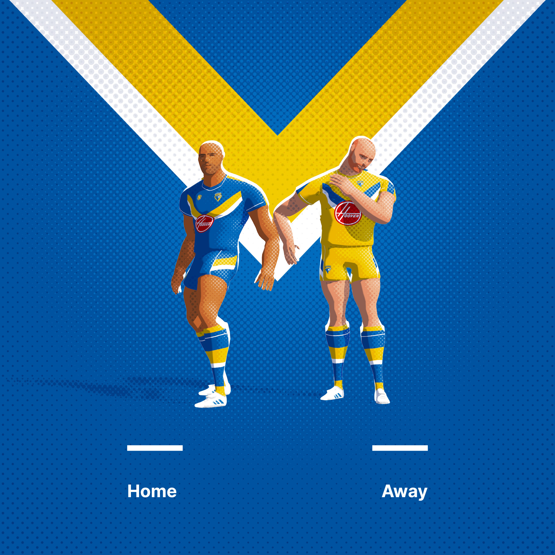
Felt like the current Warrington Wolves logo felt a bit cyber and lacked fierce nature of a wolf. Have sought to work that in here using their traditional triangular containing shape.
Original Logo
-
7
-
-
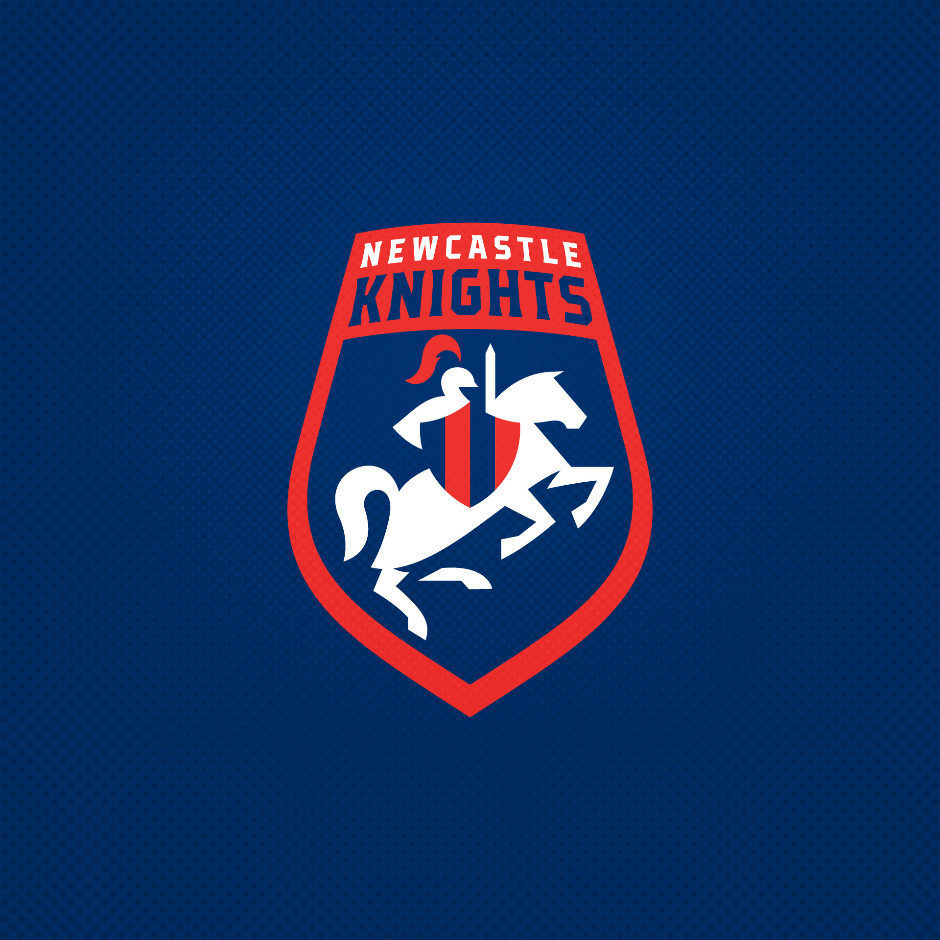
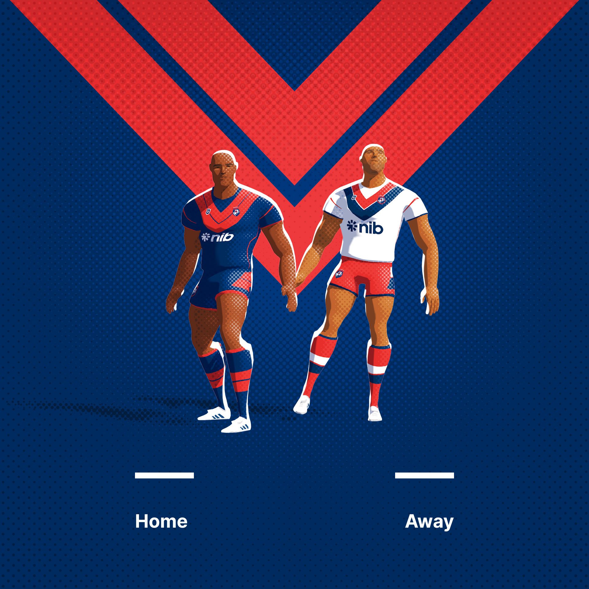
Newcastle Knights. I wanted to use the shield based concept for the knights logo with some negative space implying the containing shape.
Original Logo
-
8
-
2
-
-
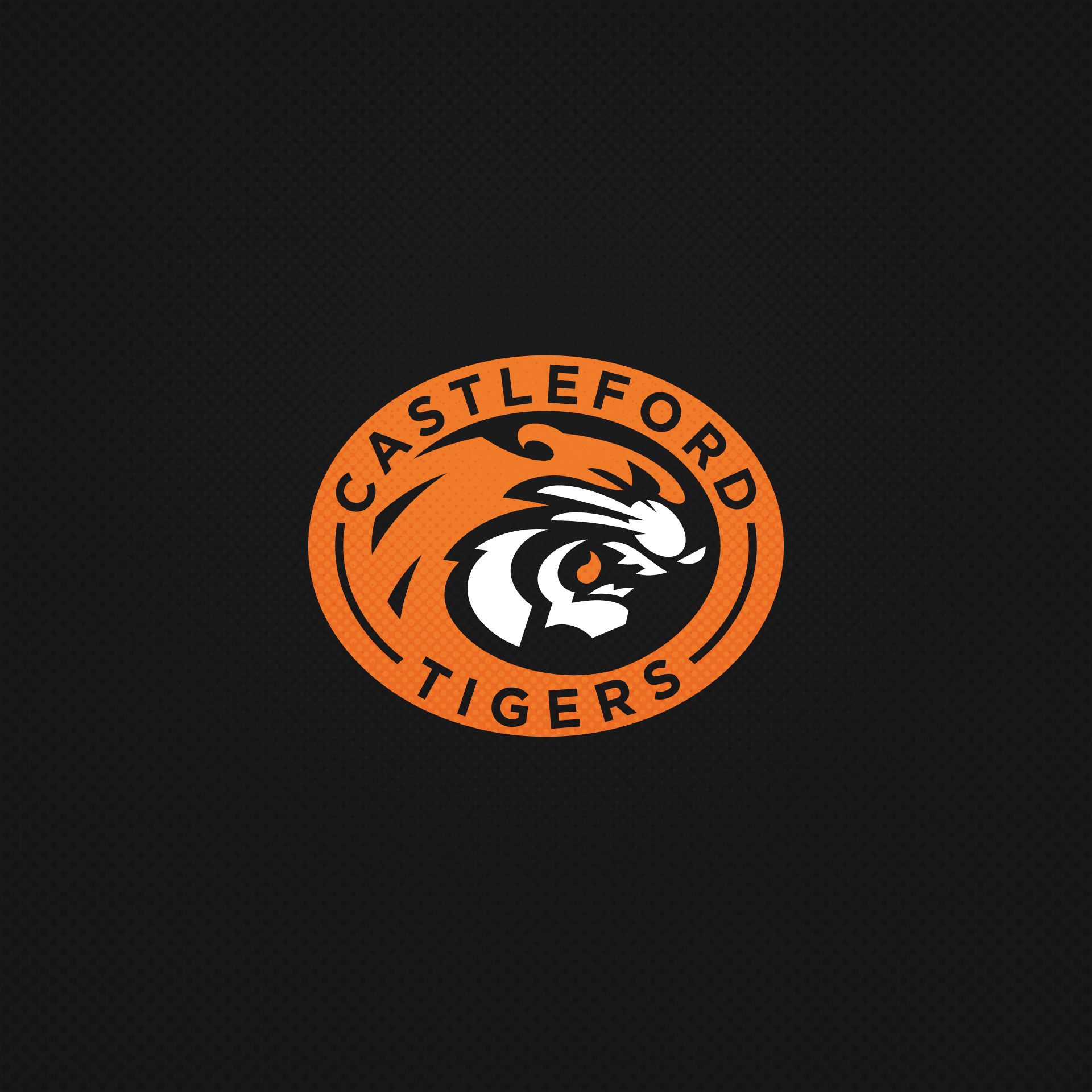
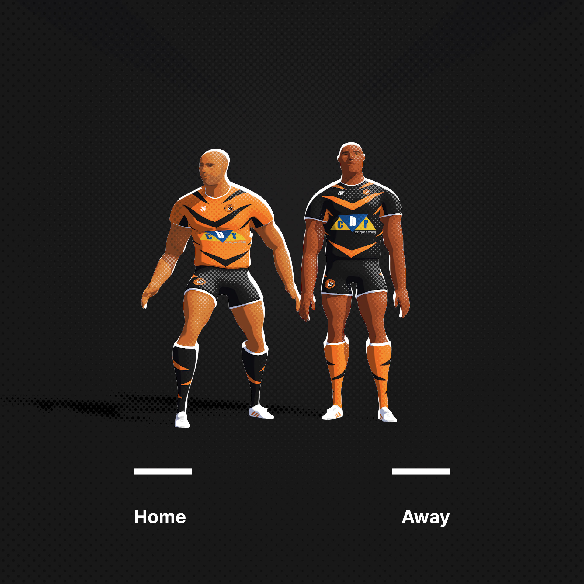
Castleford Tigers, being a popular motif in sports, but especially Rugby League, I have chosen to go all out and away from the Balmain bar stripes model.
Original Logo
-
7
-
-
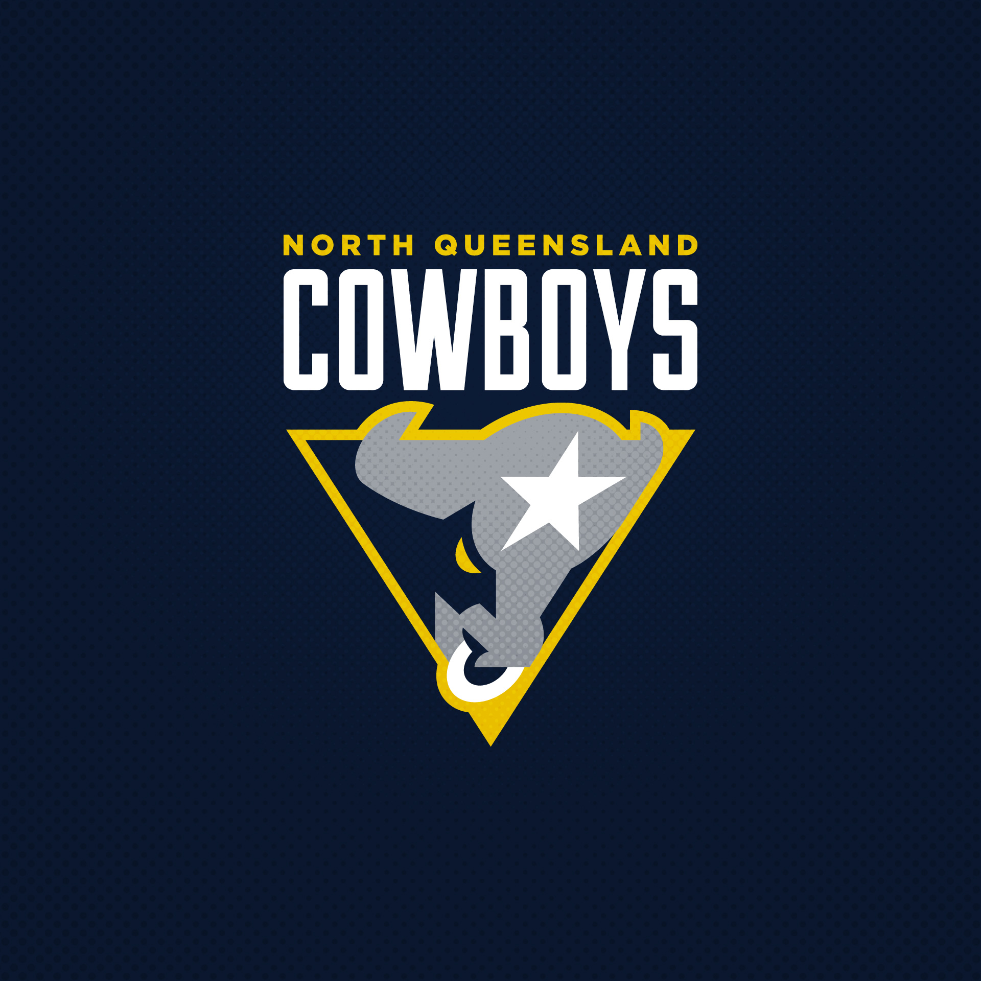
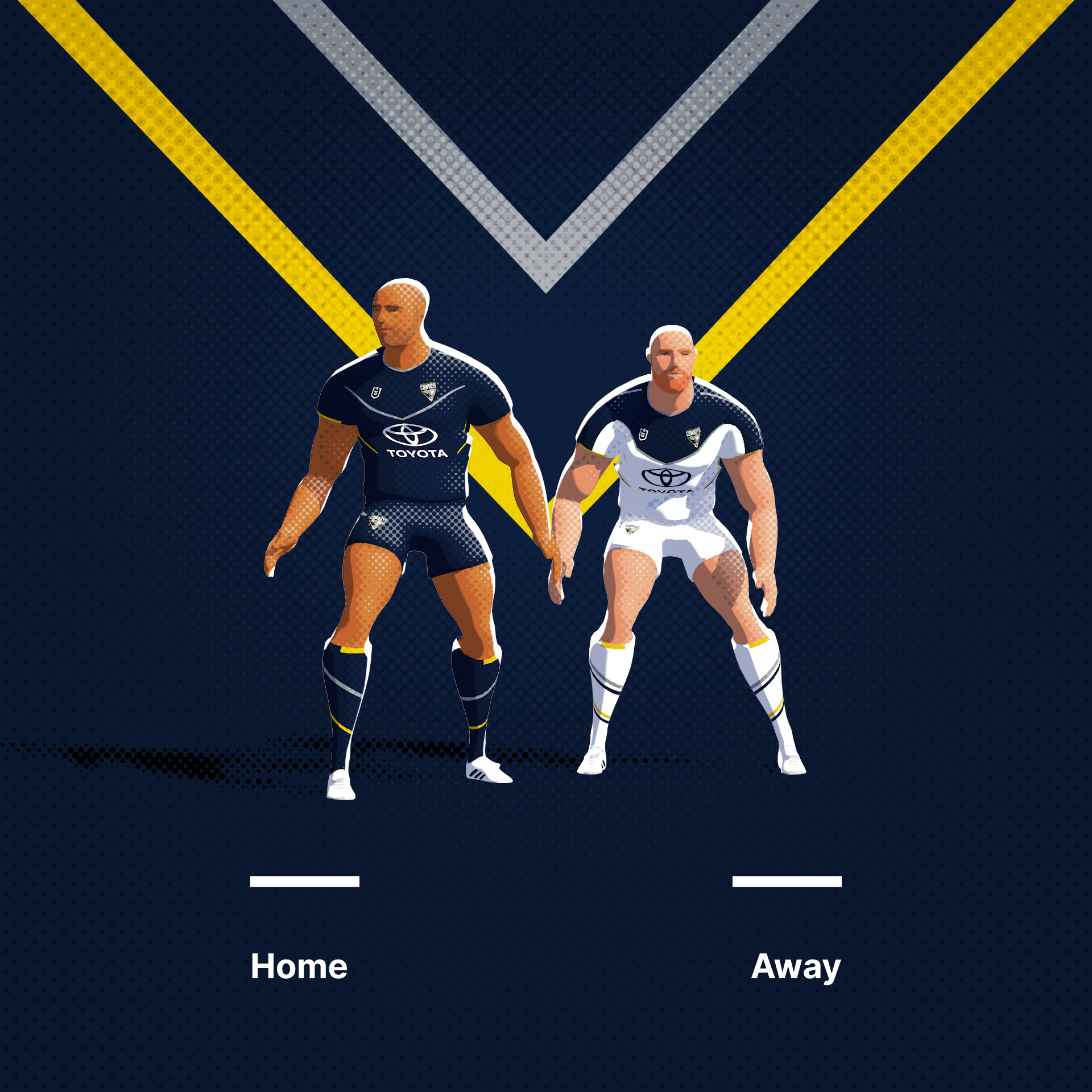
North Queensland Cowboys. I added an actual steer to the Cowboy's logo to add to the star / horns combination.
Original Logo
-
2
-
-
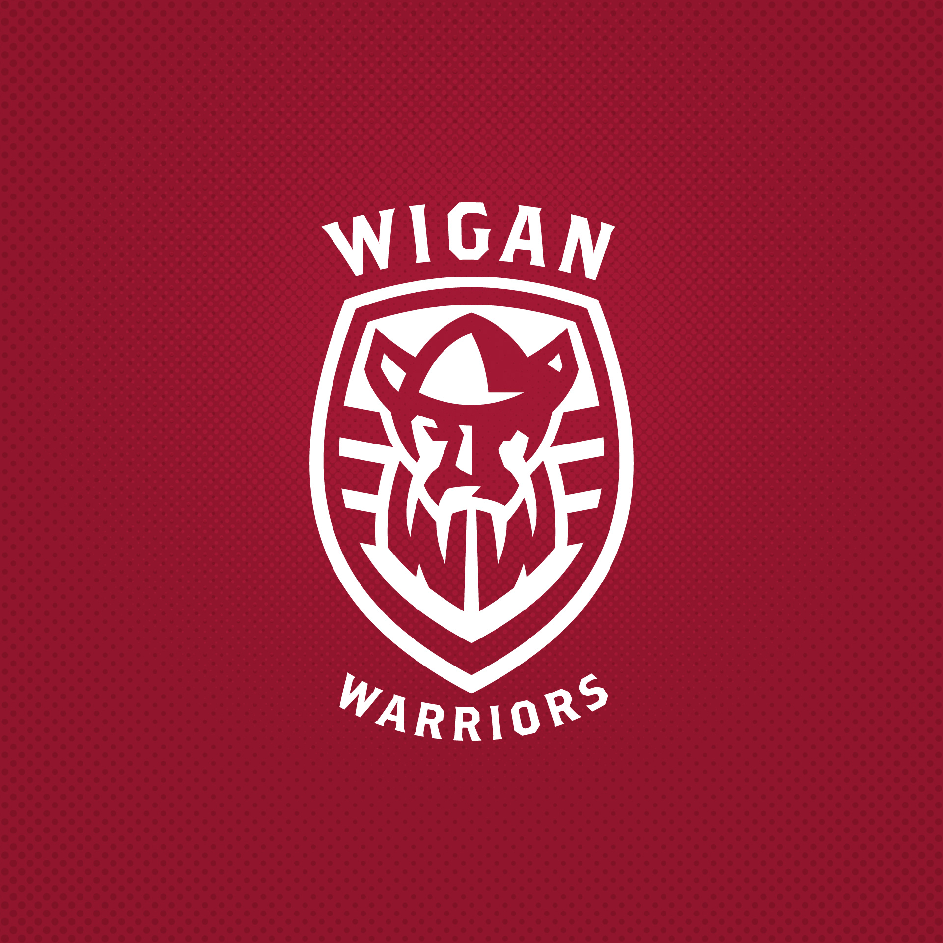
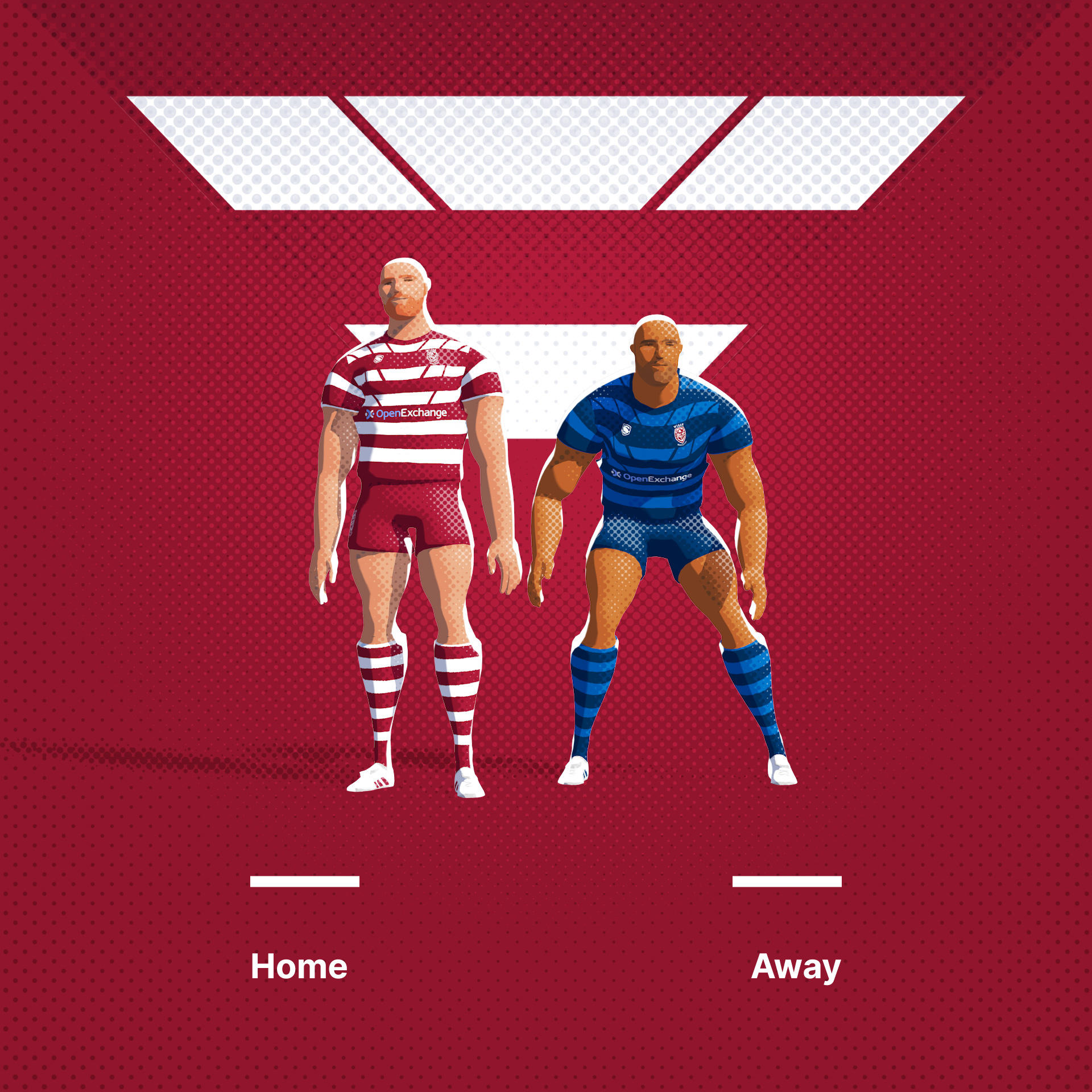
Wigan Warriors. Maybe the most successful UK Rugby League team. Here, I have stolen the concept from their relatively new rebrand. A couple of nested W's in the Warrior's beard. Wont the Super League defeating the Dragons at the weekend, so a great team to start the week with.
Original Logo
-
5
-
-
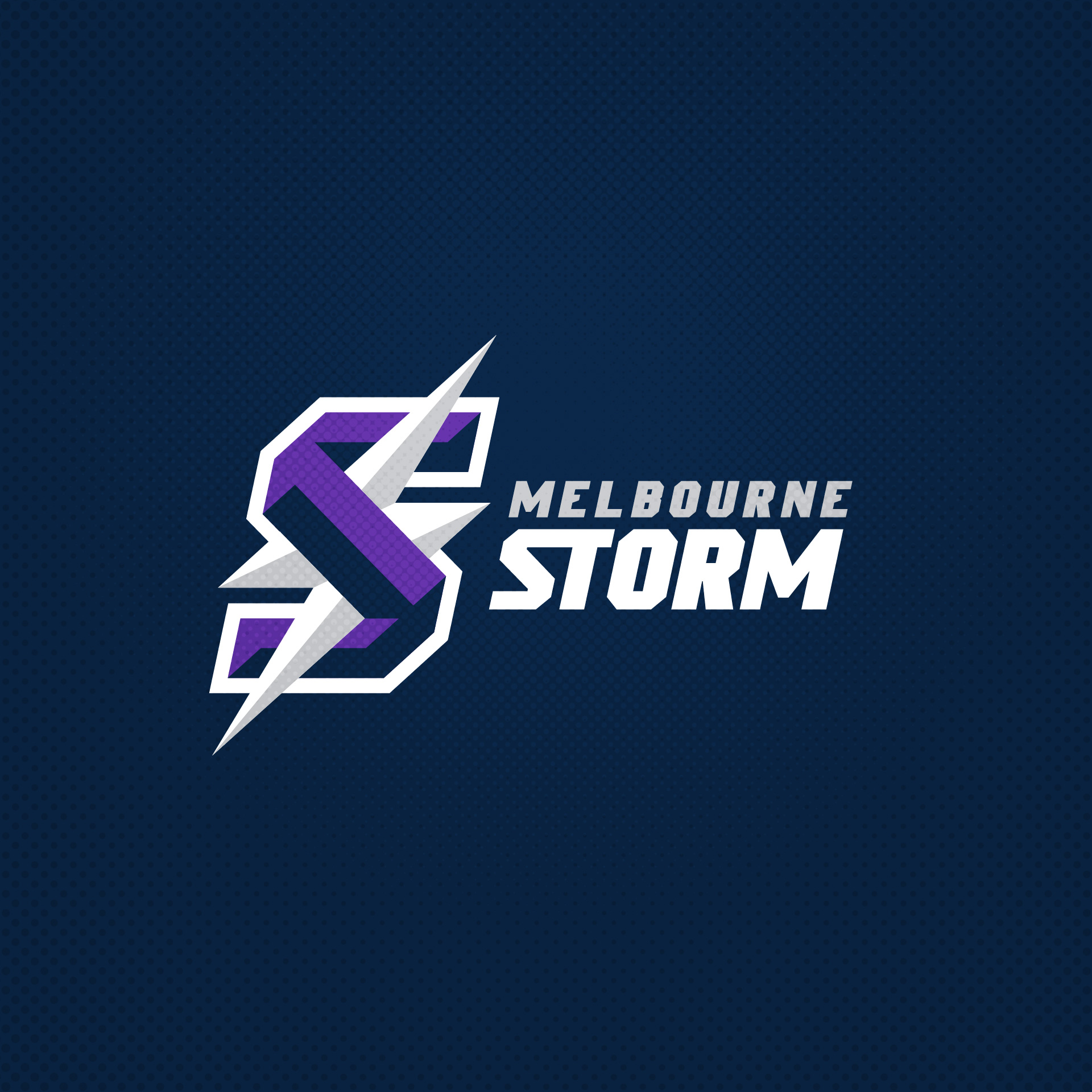
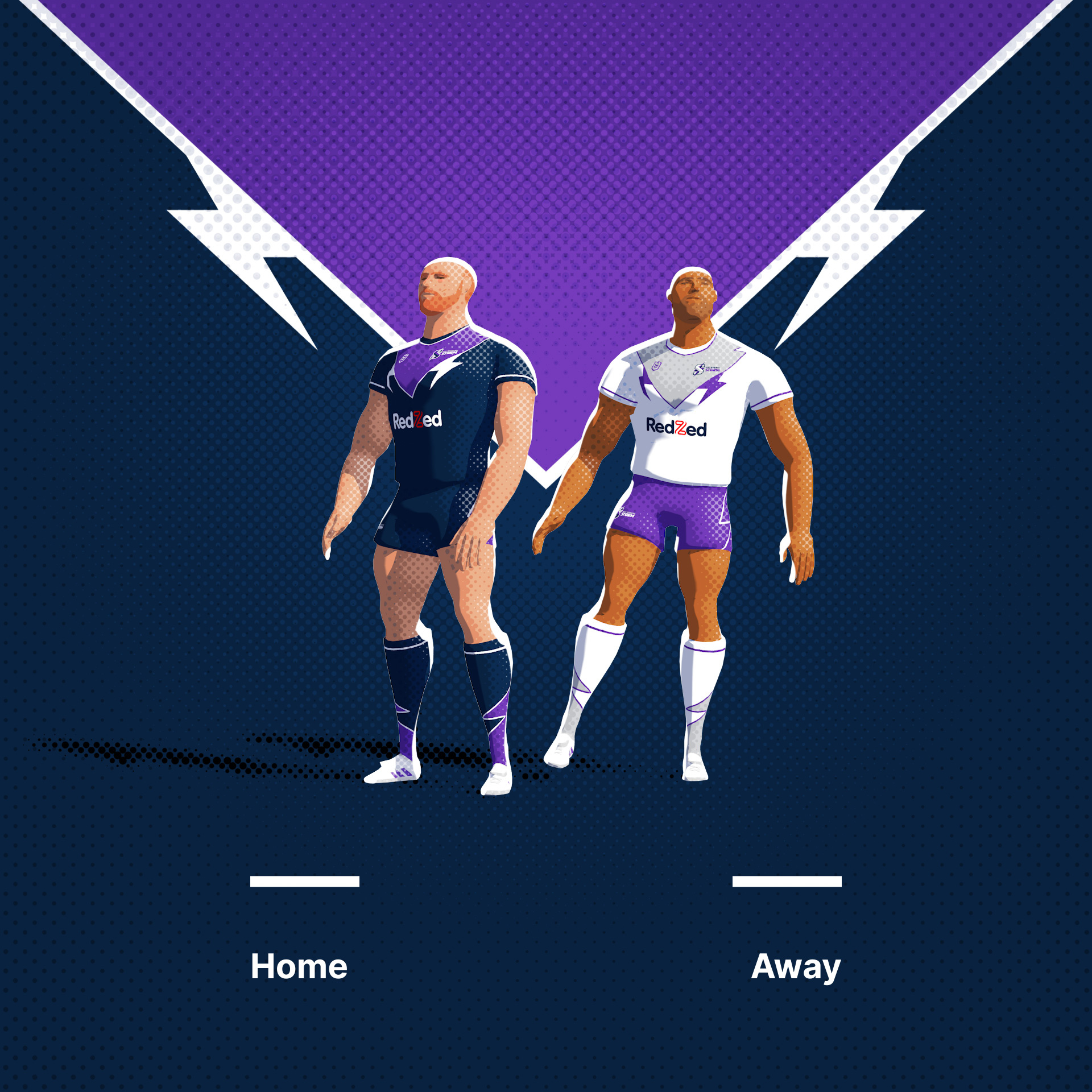
The Melbourne Storm. I'll never understand why they do down the lightning motif. What's tougher than purple lightning? Nothing, that's what.
Original Logo
-
3
-
2
-
-
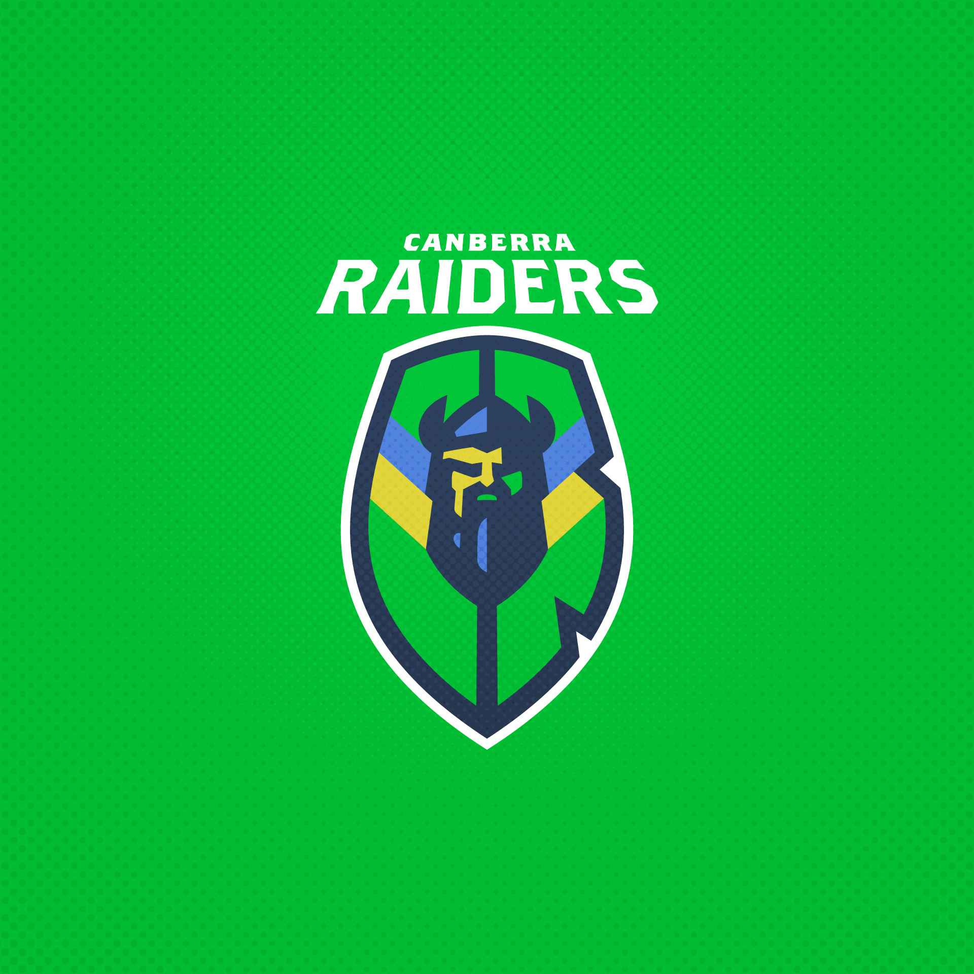
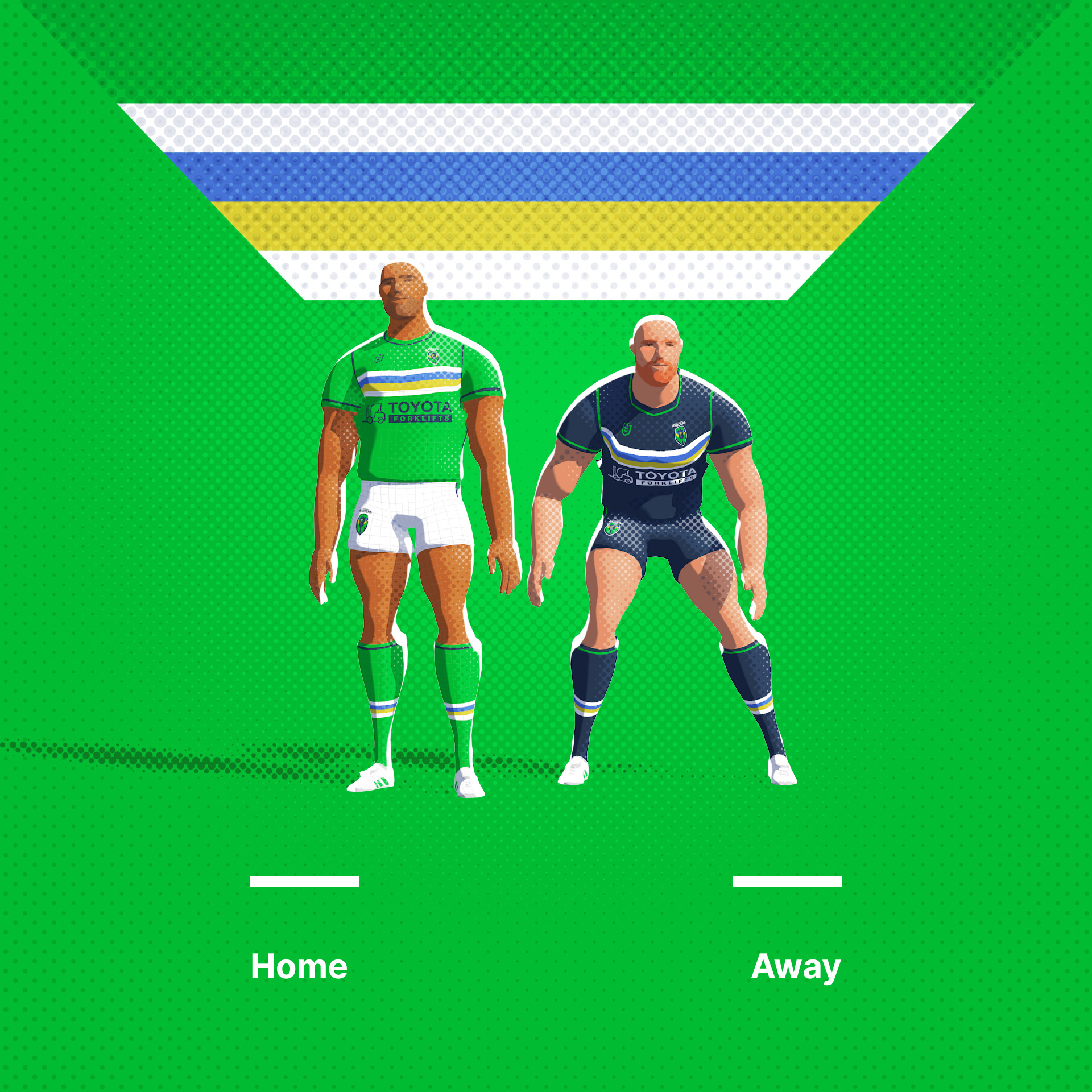
The Canberra Raiders use the colours of the ACT (Australian Capital Territory), blue and yellow as well as one of sports nastiest greens. With this logo I have tried to feature a nondescript 'Raider' shield with an easter egg.
Original Logo
-
5
-
1
-
-
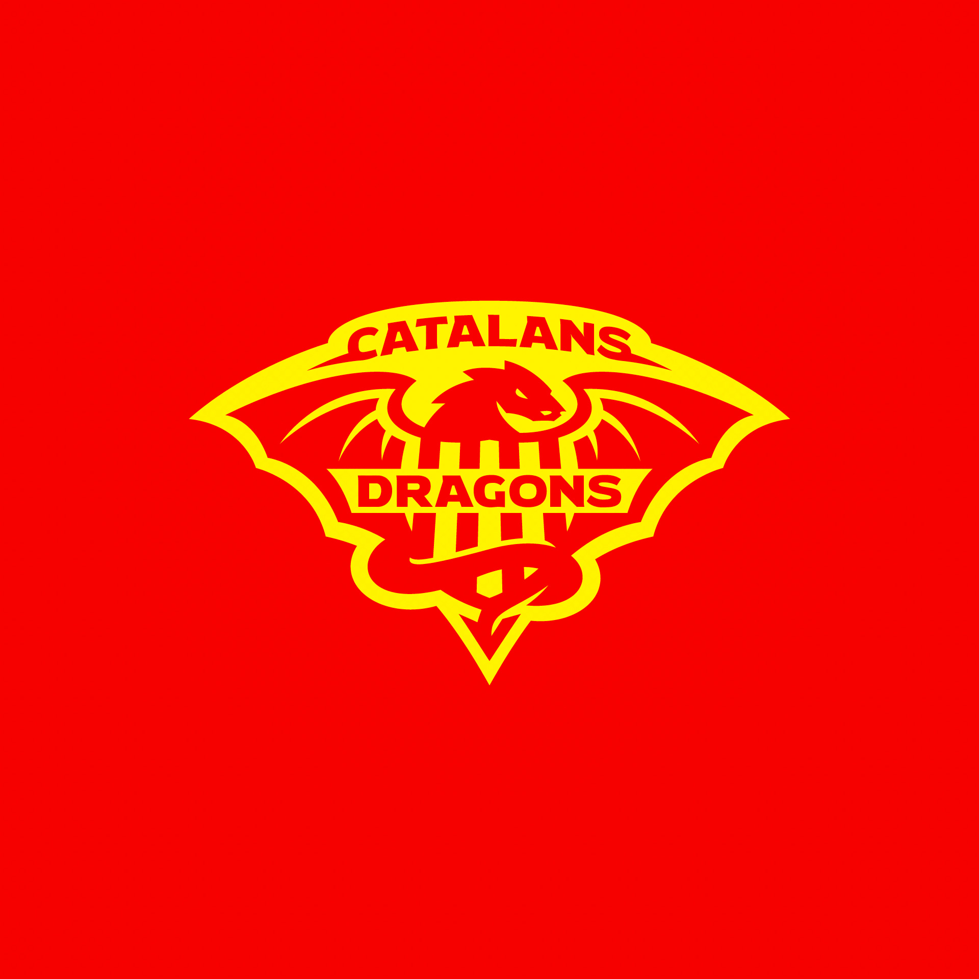
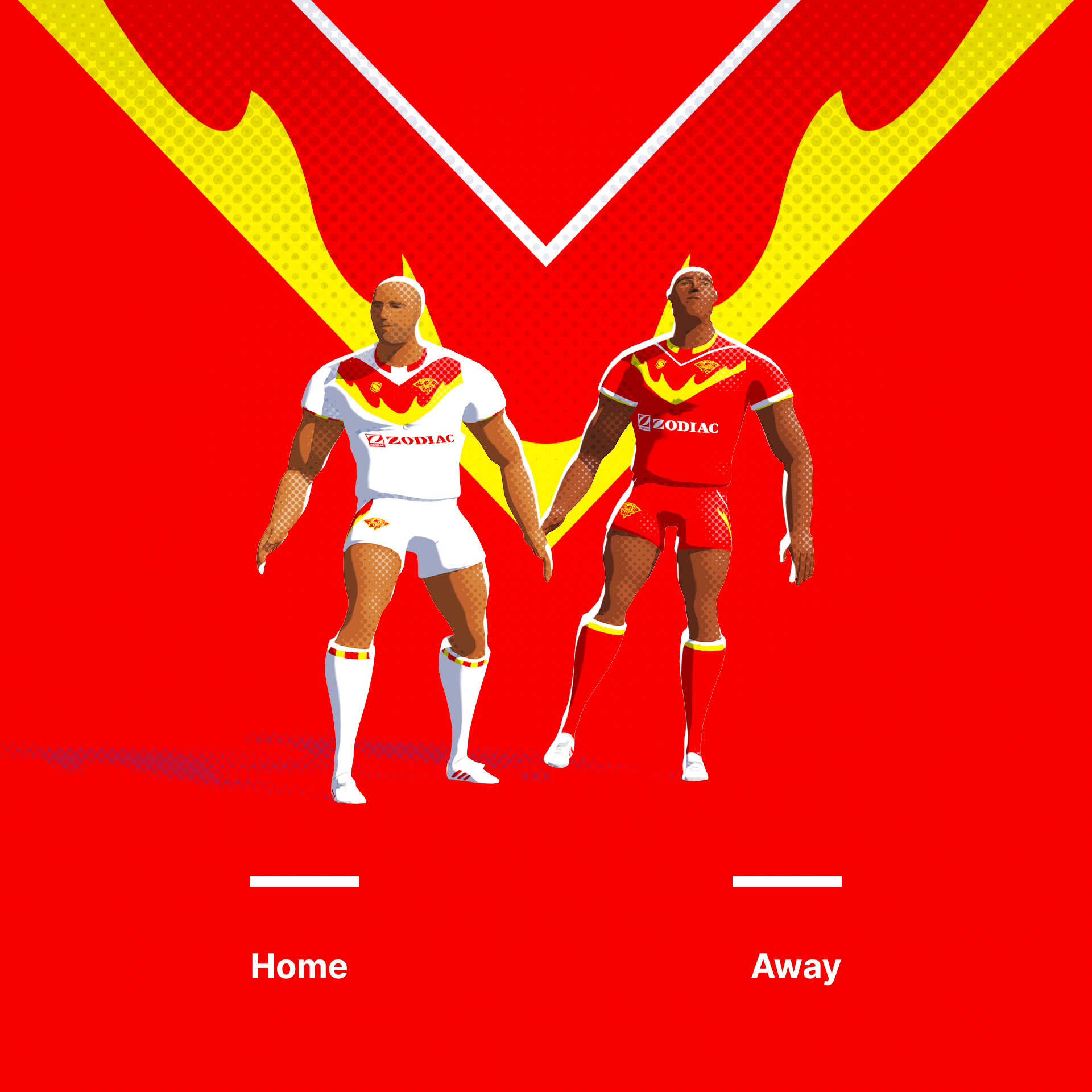
Catalans Dragons. The only French (Perpignan) club in Super League, the Dragons logo features the four red bars of the flag of Catalonia. Wanted to inject a little more fire into the standard V neck shapes.
-
7
-
 1
1
-
-
5 hours ago, raysox said:
Excellent so far. Commented this on IG, but really love the NZ in the Warriors logo. The Gold Coast Titans one is particularly exceptional.
Thanks man!
-
2 minutes ago, Brian in Boston said:
Phenomenal... absolutely PHENOMENAL! One of the finest marks I've ever seen. A truly outstanding piece of work, Frasier.Thanks Brian, appreciate you saying. Very kind.
-
16 hours ago, Section30 said:
The sun tying into the helmet crest is incredible
Thanks very much!
-
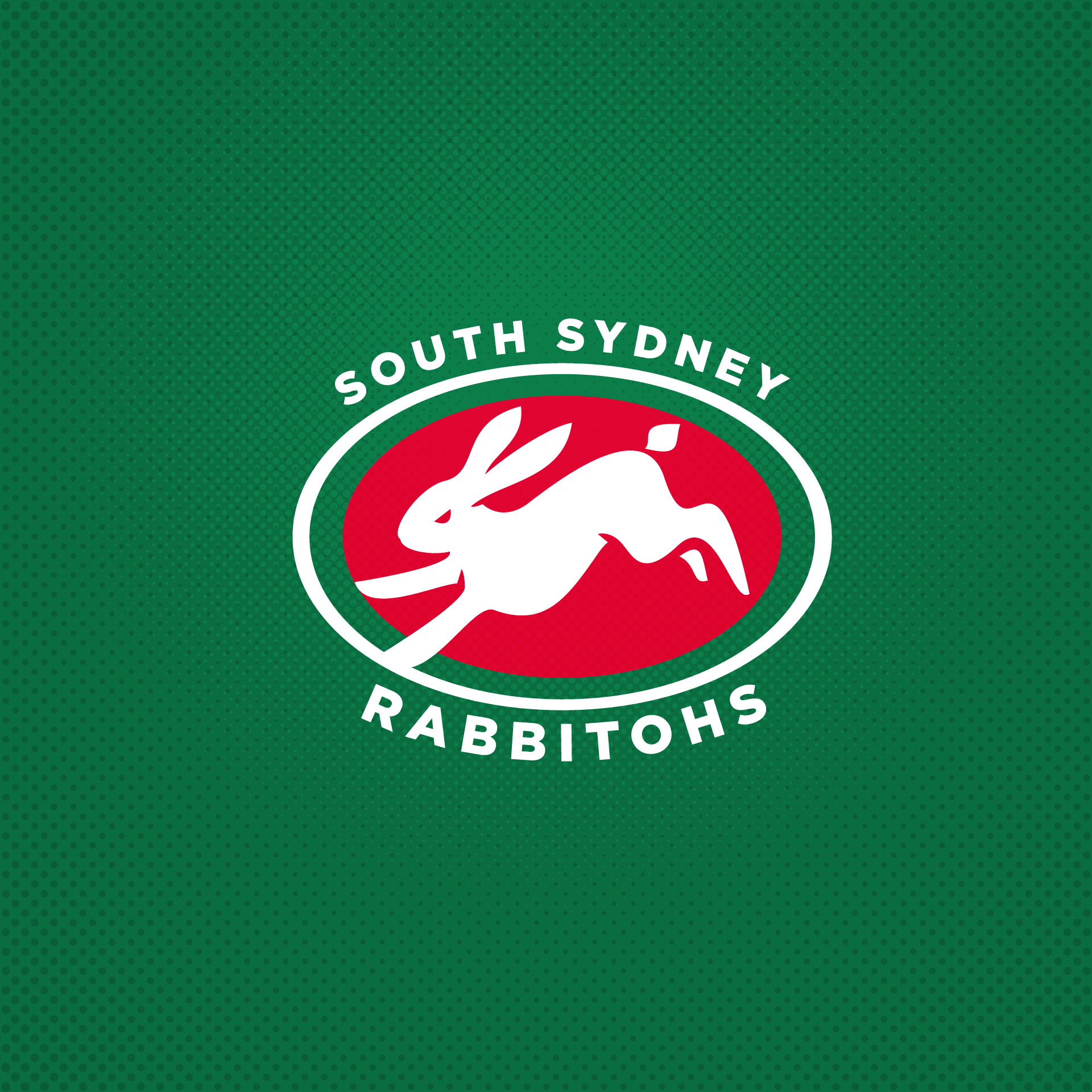
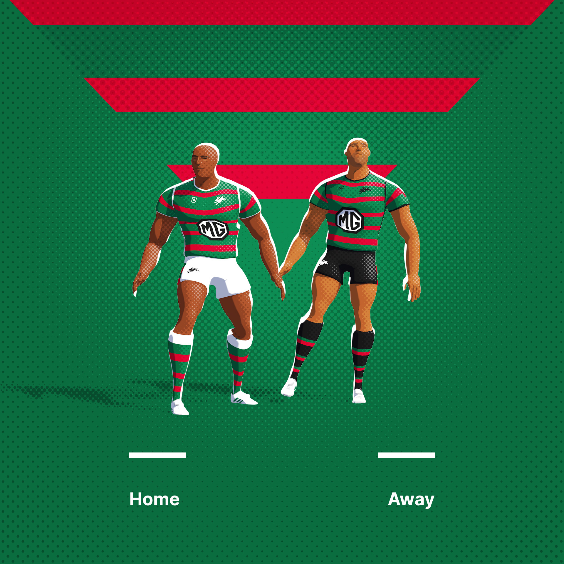
South Sydney Rabbitohs, One of sport's unique brands. The Rabbitohs have such an original palette that they barely change the uniforms for away fixtures. I like the solo Rabbit logo they currently sport, but feel like he's more chunky and less athletic than he could look. Here's my attempt.
Original Logo
-
8
-
-
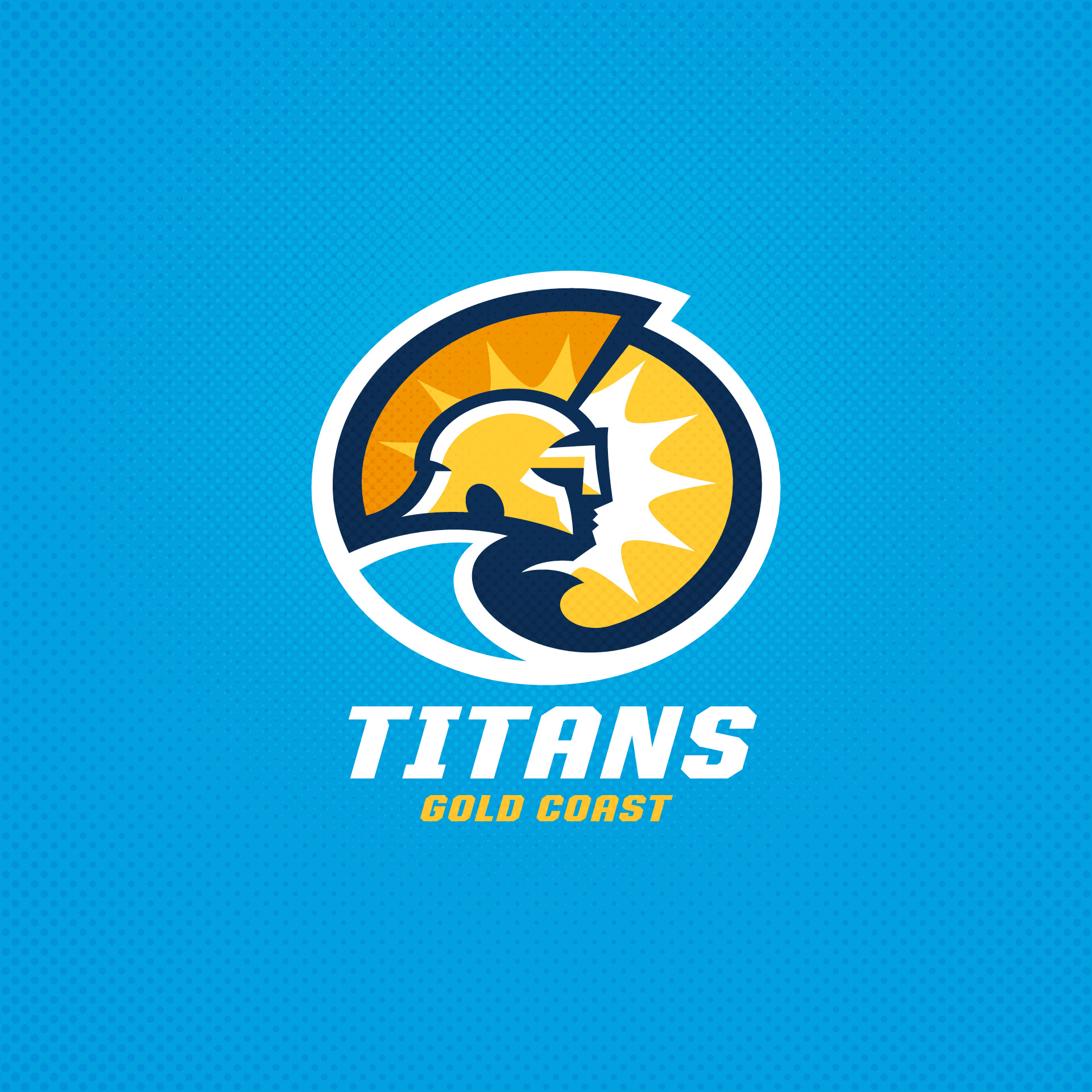
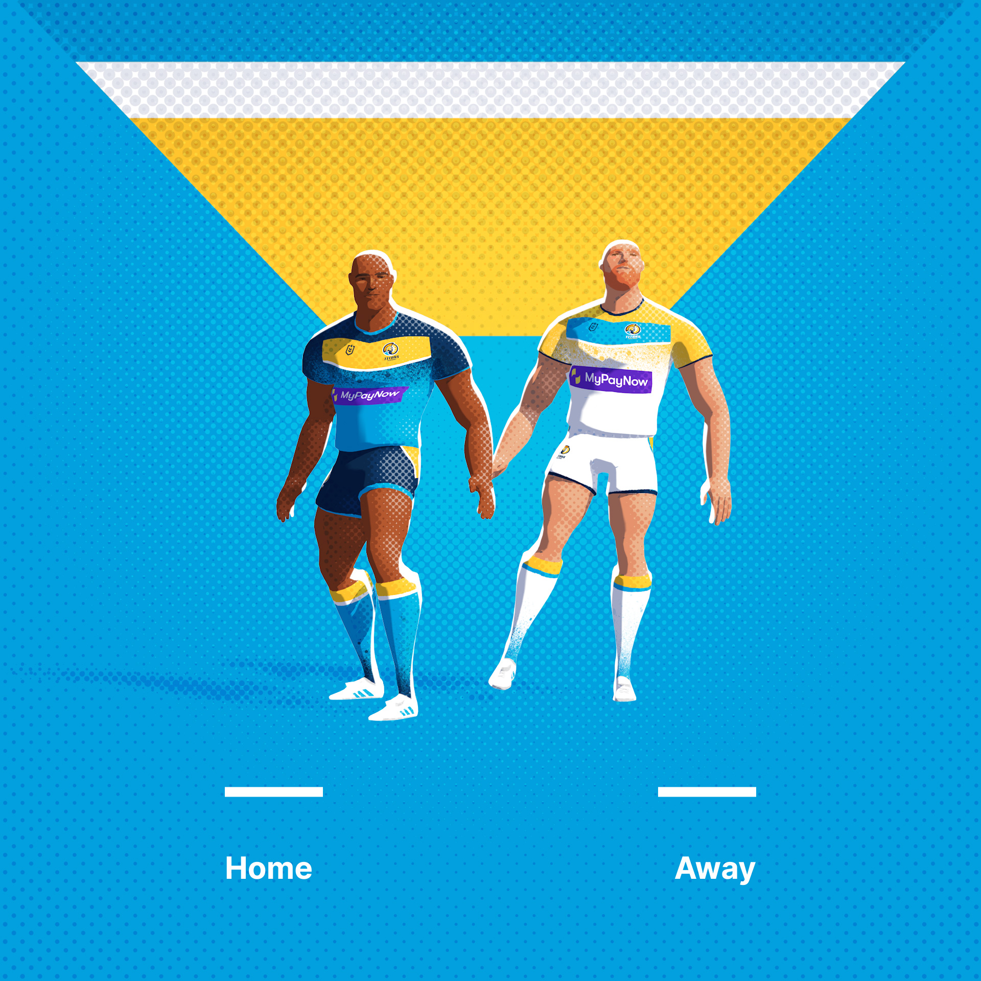
Gold Coast Titans, a relatively recent addition (2007) to the NRL. Always a little sad when teams choose names that have no local significance, so I've tried to work in a coastal / sunshine theme.
Original Logo
-
6
-
4
-
2
-
-
-
13 hours ago, Akuma said:
Great work as usual mate! Would you be able to do the Castleford Tigers next? I feel they are WAY overdue for a rebrand!
Getting there. Have nearly finished the whole NRL & Super League.
-
On 10/8/2023 at 8:38 AM, vtgco said:
I love love love the rooster with the Sydney Opera House and what looks like a hidden, blue Made in Australia kangaroo! Gorgeous logo that's light-years ahead of the IRL logo.
Also really clever use of the NZ text; nice cleanup work overall. I'm a little curious if the left side of the N could also have a side divot to mirror the Z, just so the face has two eyebrows and to match the Z's bottom divot.
That Sharks logo is also gorgeous! Love the lockup and color options. The triangular, unbounded composition is just so pleasant. Would also work excellently for San Jose hockey.
The Rhinos shield is really good, except the ears kinda feel more like antennae to me?? Idk...
Also the whole animations and presentation are just so breathtaking. I didn't think it was possible to make halftone even better than it already was

Thanks, much appreciated.
I think the chip in the side of the N would slightly confuse the N to be honest, I dont think theres a neat way to have a very symmetrical NZ monogram tbh.
Re the Rhino ears, they curl up into these funny tubes, I was trying to get some of that into them, but I can see what you mean.
-
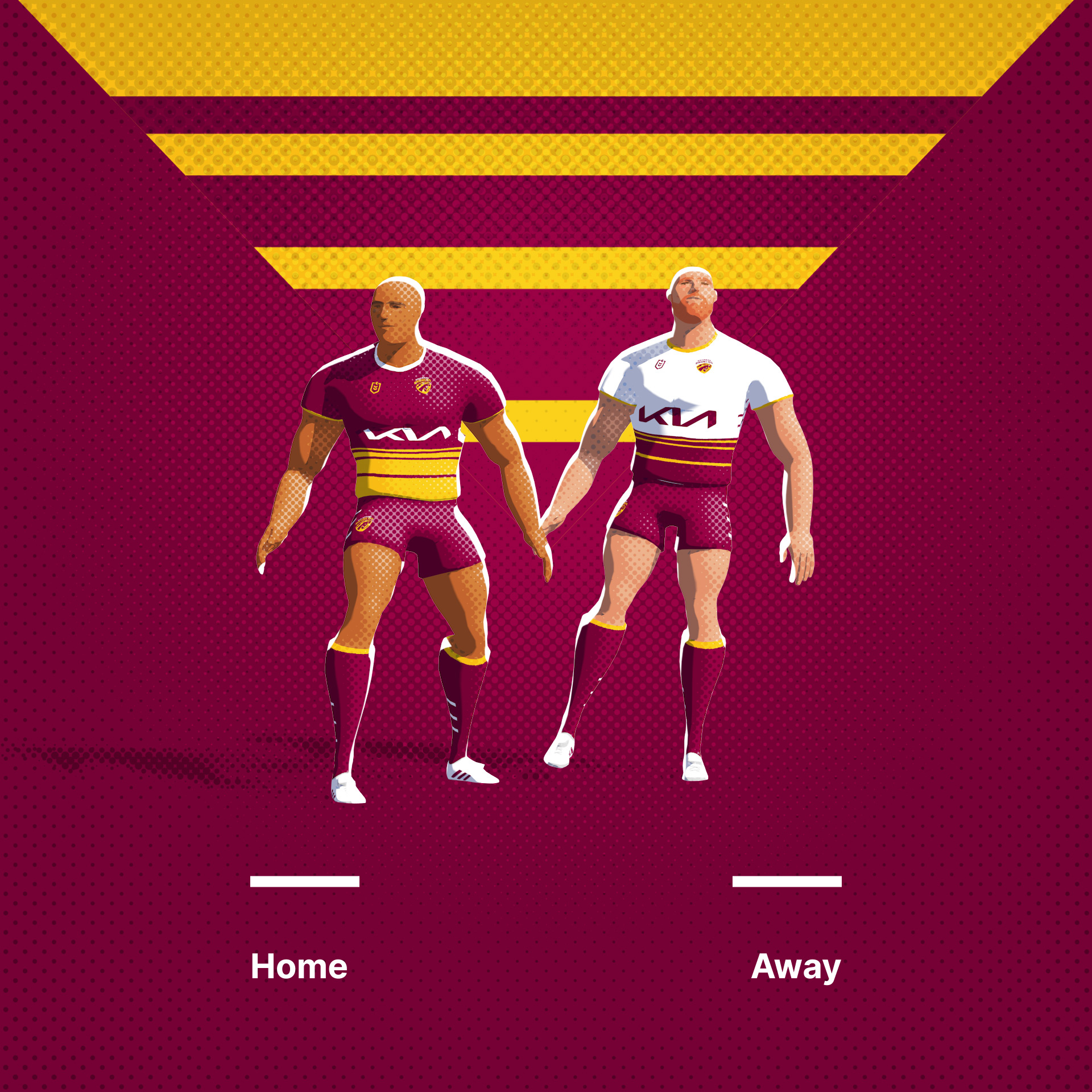
Monday and its the Brisbane Broncos! Something goes a bit awry on the nose of the current logo. Have tied the horse head into a more conventional shape.
Original Logo
-
6
-
-
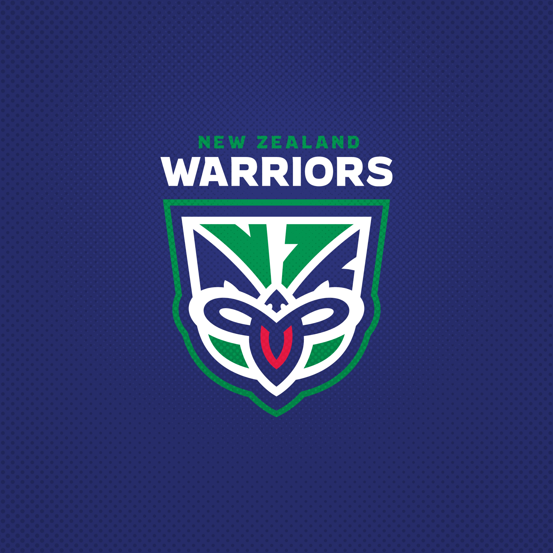
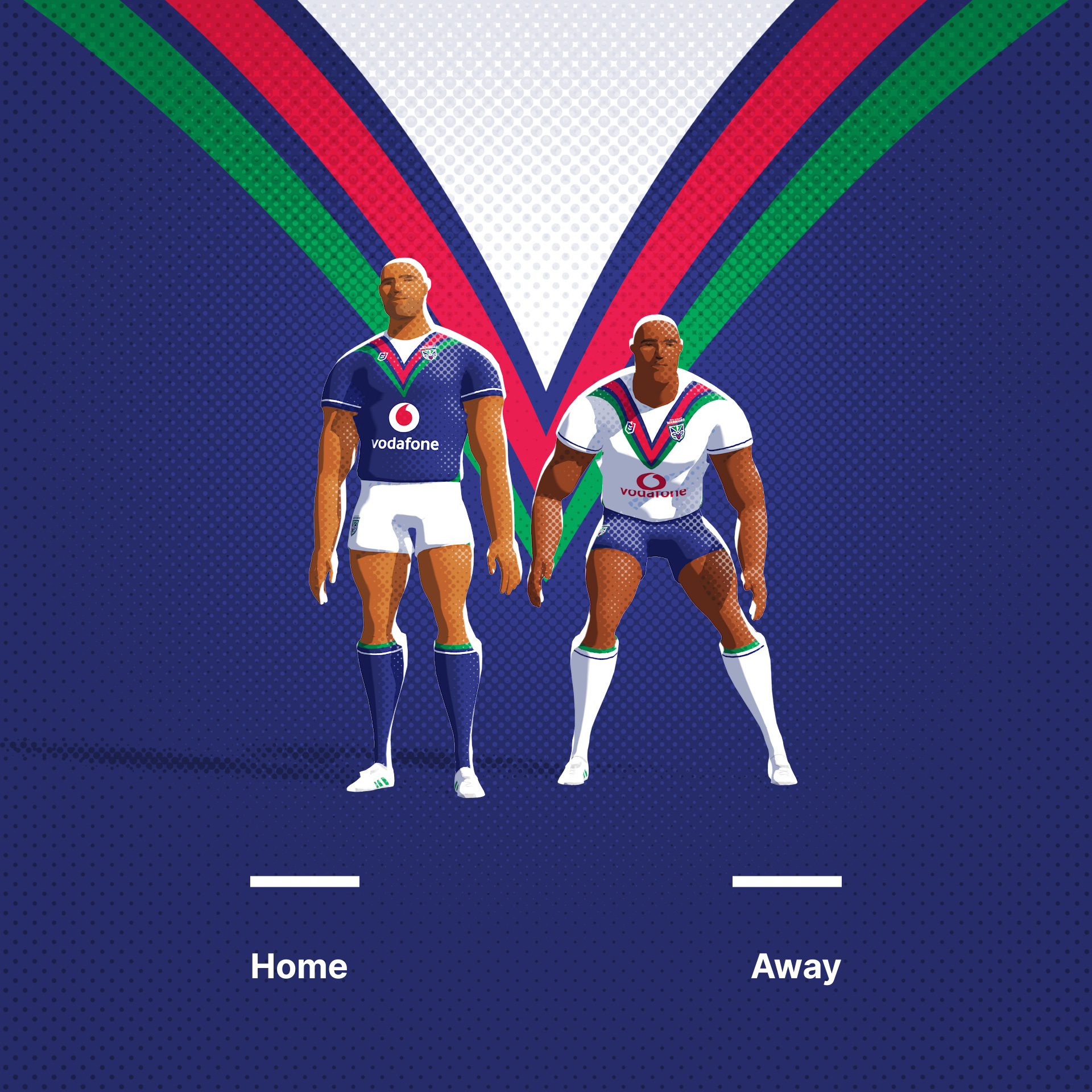
The New Zealand Warriors. A modified take on the Tekoteko. An easter egg in the eyes that I always wanted to work in.
Original Logo
-
8
-
2
-


Rugby League Branding Exercise
in Concepts
Posted
Salford Red Devils. Great name for a Manchester based team. I wanted to tie up the various implied elements into a simple crest.
Original Logo
Salford City Reds