


guest23
-
Posts
3,600 -
Joined
-
Last visited
Posts posted by guest23
-
-
2 hours ago, gosioux76 said:
I think what you're seeing here is more about a broad disdain for alternates in general than a severe dislike for this one, particular example. Because if this example seems distasteful, then surely they all will. And I don't disagree with that sentiment, outside of the occasional throwback.
I hate that the team used an updated color rush as their default white set and did not go with a orange trimmed default away jersey and that the league is so stubborn that they are forcing them into an inferior set just for the purpose of wearing an alt helmet.
-
2 hours ago, upperV03 said:
After yellow/green/yellow, this is about as good as it gets for the Ducks. Wish they went with green socks, but overall it’s a fantastic look and sure to be one of their best combos (if not the best) of this season. They haven’t worn G/G/Y since the 2013 game vs. Oregon State, and prior to that hadn’t been worn since 2005. The ‘13 combo had dark green helmets, while this version has the more fitting apple green lids. Despite being somewhat of a rare combo for the Ducks, it’s one that’s been worn by some true legends of the program:
For those that may not be aware, those pics are of Ahmad Rashad (Bobby Moore at the time), Dan Fouts, Haloti Ngata, and Marcus Mariota.
If they actually had a true primary home uniform GGY would be my pick. It's a shame it's the rarest combination.
-
 1
1
-
-
On 9/27/2022 at 11:30 AM, WSU151 said:
It looks like Arizona has ditched the navy facemasks this year (which is a downgrade in my opinion); all four games so far have white helmet/white mask:

I think the blue masks look superior but I love these uniforms and hope the program can at least be pulled into mediocrity from its current state or we are likely to see the next coach or two go full fleck and destroy a great look.
-
1
-
-
2 hours ago, jn8 said:
They should both schedule Indiana as a non-conference game
The helmet and uniform manufacturers laud these choices for their economies of scale.
-
3 hours ago, Sec19Row53 said:
You're right about the pants being necessary in some cases. Maybe. A single pair of pants of the correct light color would work for every team, IMO.
Regarding the second point - how would you differentiate an 'overall alt-design' rather than 'just another mix-n-match'. I think I follow you, but I'm curious.
Let's go all the way with brown helmets, gray masks, tan pants, white socks, and black shoes...only differentiator is the jersey.
-
4 hours ago, DCarp1231 said:
named after a football dude not a color...get some education ricky
-
 1
1
-
 3
3
-
-
1 hour ago, -Akronite- said:
If you think an "icy white"
 is a concept without merit for FSU, I can't really argue with you. That said, I think this is a fine uniform when taken as a whole:
- Helmet logos are pretty neglible, especially from a distance. Could've been slightly improved by putting gold in there instead of white.
- Disagree on the jersey design. The new uniform highlights it's pattern while the old tucks them under the sleeves. Don't know much about the previous design on the collar but I think I prefer the new one, tho it could be a little less busy.
- Font is clearly improved IMO.
- Red/gold would look terrible below an otherwise all-white set, but I'm not big on plain pants in most instances anyway.
FSU has looked better but they look good here.
It's not as ugly as the rams white horn set but the 2 color helmet, 3 color jersey, and 1 color pant look is bush league. fsu only needs one helmet outside of a one-off and the white pants can be used as an alt look but require 2 garnet stripes.
-
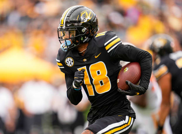
3 hours ago, nuordr said:
These are my favorite helmets from Missouri with the current uniform template:
I am not a fan of this mizzou look at all. It seems like they are trying to be florida and with the cocks using a similar design. Then you have auburn as well with similar striping. Time to go back to this look:
-
4
-
-
38 minutes ago, BigDmo said:
All this arguing about stripes is pointless when you don't mention the cuts of modern jerseys. You can complain all you want but this is the modern way. We will never return to the days of yore with monster shoulder pads and 4XL jerseys with borderline long sleeves.
Where exactly are you supposed to put a full sleeve stripe on a jersey like this?
This cut just ain't coming back
You're correct but you need to compare apples to apples...using a qb jersey as an example of an old cut is not really an accurate portrayal...also is that an on field elway jersey, a retail authentic, or a counterfeit?
-
2 hours ago, BBTV said:
There's not really any visual difference between how those "terminate" and how ones that go to the seam "terminate". That's pretty much what I was getting at when I said to make a logo patch that's just the stripes. Now seeing it in action... it sucks.
This issue exists because they are applying a graphic to the sleeve cap after the jersey is assembled which reduces the printable area. Custom uniforms are assembled after the striping is done to the individual pieces then sewn.
-
Maybe it's an unpopular opinion but I think the oregon's contrasting mask/shell combos are downright ugly. Last week's helmet was fcs quality and this weeks reminds me of a high school all star uniform.
-
 1
1
-
-
4 hours ago, jn8 said:
Hot take: Da Bears should match the pants to the sleeve
Not that hot but for teams with traditional uniforms and striping you can get away with jersey and sleeve stripes mismatching if you have another element to tie them to. For instance you can have helmet/pants stripes match and a different sleeve pattern or you could have sleeves/socks stripes match and have a nice cohesive look. Bears with blue pants and when they've worn white pants in the 2k's have worn white socks with white jerseys so it ties out with the socks causing less of a clash with the pants. 9ers could do this as well with road socks but they abandoned stripes long ago.
-
3 hours ago, DCarp1231 said:
Sorry you don’t understand 1 of the 6 pillars of character.
Try 0/6. I sure got suckered into an a+ troll job

-
 1
1
-
-
58 minutes ago, DCarp1231 said:
Source: Trust Me Bro
Sorry you don't understand how sports media operates and how beat reporters get their stories.
-
 2
2
-
-
3 minutes ago, DCarp1231 said:
Being respectful surely is such a PR move
It's all theatrics to create a narrative of some tradition or lineage for these storied franchises. Sportswriters and fans eat that sh-it up...
-
3
-
2
-
1
-
-
Just now, DCarp1231 said:

I’m not defending Snyder in any way, but good grief. Not everything is a product of him being the absolute worst pro sports owner.
Also, FWIW, Theismanns’s number isn’t retired. Anyone could theoretically wear it, but again, it’s up to the player and franchise’s discretion what happens to the numbers. “Punk kids” literally have no say in the process.
I think you're missing the point. It's not unsurprising that a hotshot rookie would ask for his college number but the team obviously has final say on number assignments and if they thought 7 was off limits that would have been the end of it.
-
1
-
-
8 hours ago, DCarp1231 said:
Gonna be devil’s advocate here and say that’s it’s not really the “punk kid”’s decision to unretire a number. They’re just requesting to wear the number and it’s ultimately up to the retired player and franchise they played for to decide whether or not a young player can wear it.
The most popular example, Joe Theismann didn’t have to let Dwayne Haskins wear 7, but he said yes anyway stating “I've given him permission. Not that I feel like I needed to, but he was respectful enough to ask… He doesn't need to worry about, 'Well, I wish I could've worn a different jersey. I wish I could've worn a number.'“
https://www.nfl.com/news/dwayne-haskins-gets-theismann-blessing-to-wear-no-7-0ap3000001029306
the team could have just shot the whole nonsense down and said no pick another number...it's more likely that jt was pressured to relent doing so snyder could further boost up the local hotshot draft pick by unretiring one of their most popular player's numbers.
-
2
-
4
-
-
Funny that I created the same concept years ago before color rush existed. I went with a navy mask and no logo but otherwise the same. I also considered the nagurski throwback striping pattern but on a navy jersey as a color rush fauxback. That would be interesting.
-
1 hour ago, jerrylawless3 said:
What I find so strange about the "Fleck"ing of his program's uniforms is that PJ Fleck has said before that his favorite college football uniforms are Penn State's. I guess this is a case of catering branding toward his coaching philosophy and not actually making good looking uniforms.
Time to de-fleck the gophers.
-
2
-
-
9 minutes ago, DCarp1231 said:
Washington is finally retiring Sonny Jurgensen’s 9. Ceremony will take place in Week 18 vs Cowboys.
So we can expect a bad cycle of news for snyder around week 17.
-
7
-
 3
3
-
-
3 hours ago, Sport said:
I can't believe those uniforms debuted in 2005 and not 2002. They were out of style the moment from the first snap of the first preseason game. I can't believe they're still wearing them.
Related: the Cardinals have my least favorite helmets in the league, but the all black alternates are not the answer.
They look like the Falcons.
The judges would have also accepted: They look like louisville.
-
5
-
1
-
-
58 minutes ago, KG_grfx said:
I agree it's a massive upgrade, I always would get so frustrated seeing them wear those old 2000's jerseys in the late 2010s, especially when they go their new stadium - they just felt so out of place.
My only issue with the new uniforms is little design choices that I feel will be outdated in 5-6 years, like the shadow stroke behind the numbers, something I think is a little out dated, and I'm not the biggest fan of the triangle stripping down the side of the jersey and pants. It feels a little unnecessary and random, like they just wanted to fill space.
Also, they can only wear the read Jersey with the black pants, because of their whole gradient look of that uniform, and that to me is a bit of a bummer cause we can never see the classic red and white uniform that they wore all the time in the 2000s and 2010s.
I definitely think their new look is an upgrade but again I just feel like the uniform will be out dated in like 3-5 years, kinda like what happened with Tampa Bay in 2013, although I never really liked those uniforms to begin with.
Had they kept the gloss black helmet (superior), taken the old # font replacing the shadow with an outline, and avoided all of the other gimmicks they would have evolved from the old set into something sleek and modern. Like the rams they added too many trendy and tacky elements for this set to have any staying power.
-
4
-
-
3 hours ago, VDizzle12 said:
Wish they would have gone with non-metallic helmet stripes/facemask. There's just too much shine going on in that helmet. The purple on the rest of the uniform looks to have more of a matte non-glossy finish. It would have created a nice contrast in textures.
The whole thing is tacky and there's no reason for the uniform to exist. I get the impression that adidas has a huge surplus of metallic gold heat applied material and is looking for any excuse to put it on a uniform.
-
4
-
-
5 hours ago, Bathysphere said:
Well sure, the helmet isolated won’t look too bad when you don’t see how badly that finish doesn’t match the burgundy fabric of the rest of the uniform.
ski u mah
-
1
-


/cdn.vox-cdn.com/uploads/chorus_image/image/71351109/usa_today_19026624.0.jpg)


:no_upscale()/cdn.vox-cdn.com/uploads/chorus_asset/file/22519348/2025502.jpg)


NFL 2022 Changes
in Sports Logo News
Posted
Which is why they should have created a white jersey with the sleeve caps from the orange jersey then you have a perfect white/orange combo and the current w/w is designated as an alt.